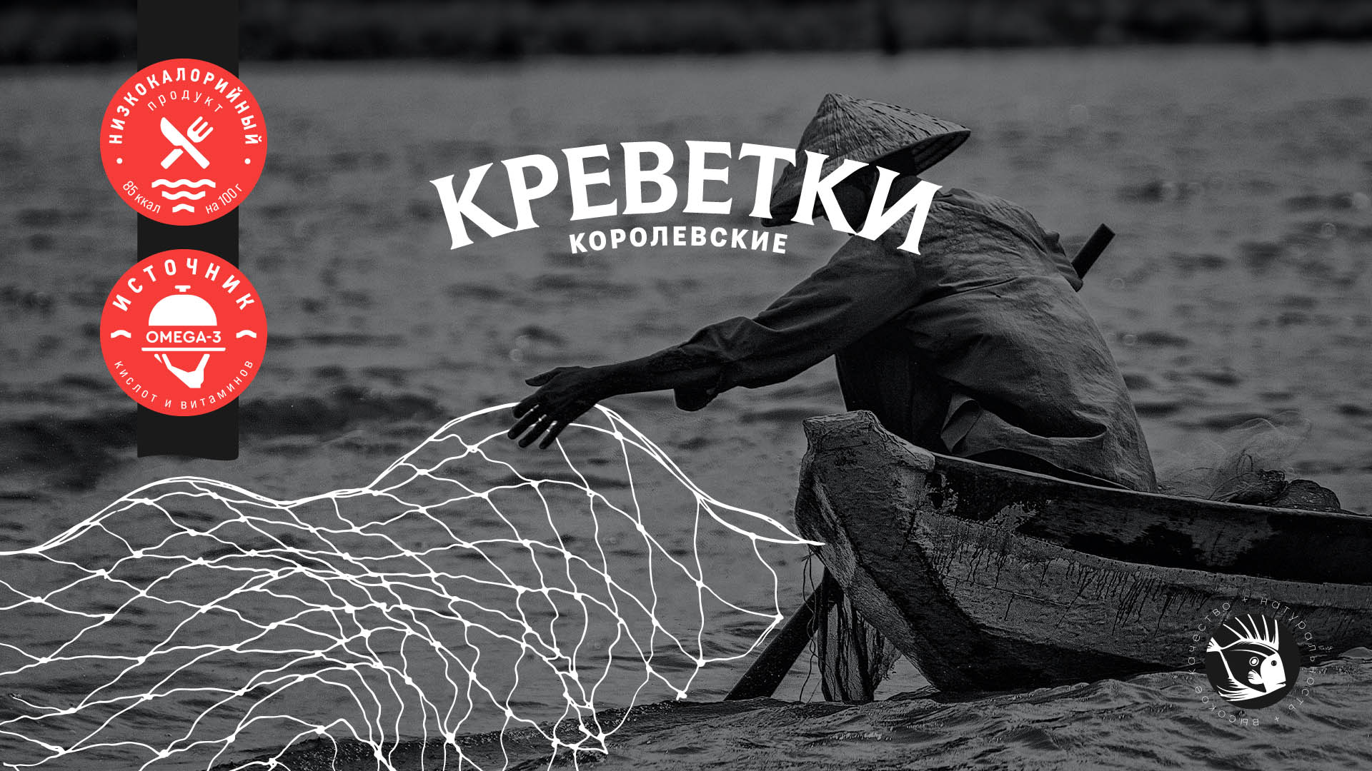
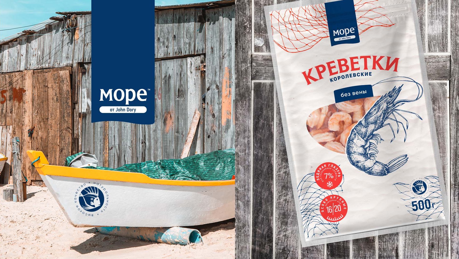
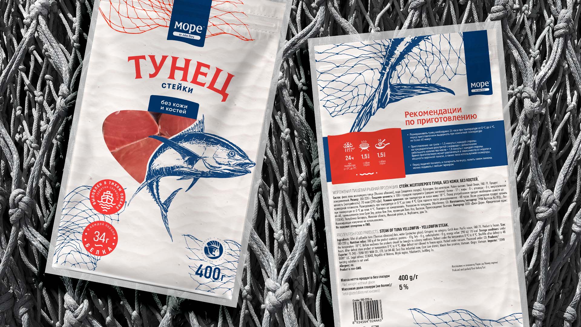
John Dory is a brand with 7-year history, built on associations with chilled fish and seafood. Another step for development was the entry into the market of frozen products with a new line of “МОРЕ от John Dory”, which retained the connection with the umbrella brand as a sign of quality. So, there was a need to develop packages for several frozen products – tuna steak and shrimp.
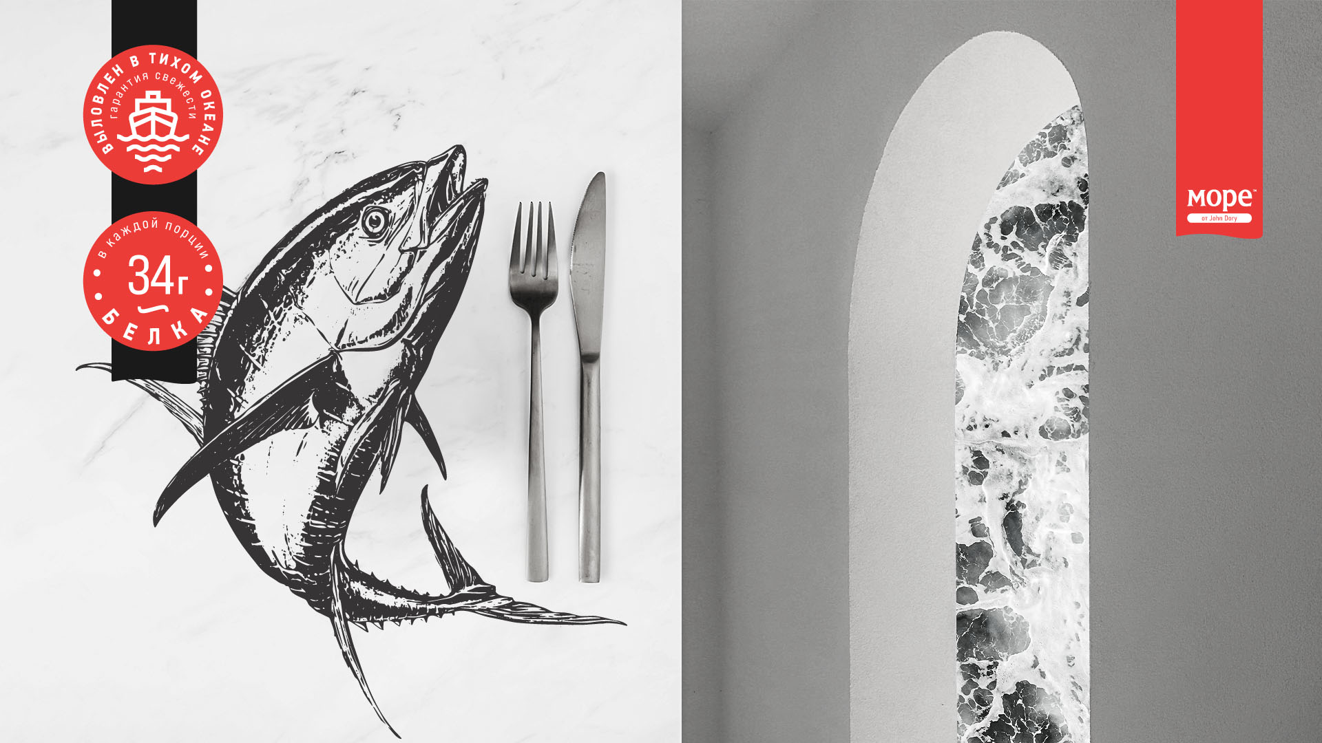
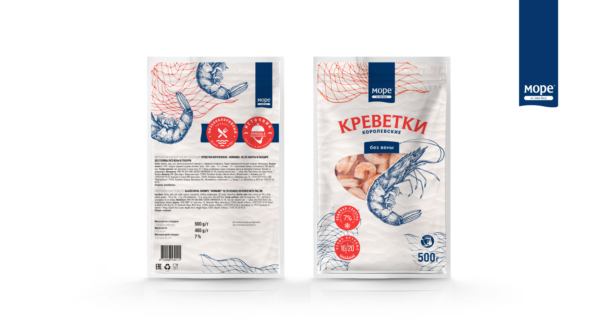
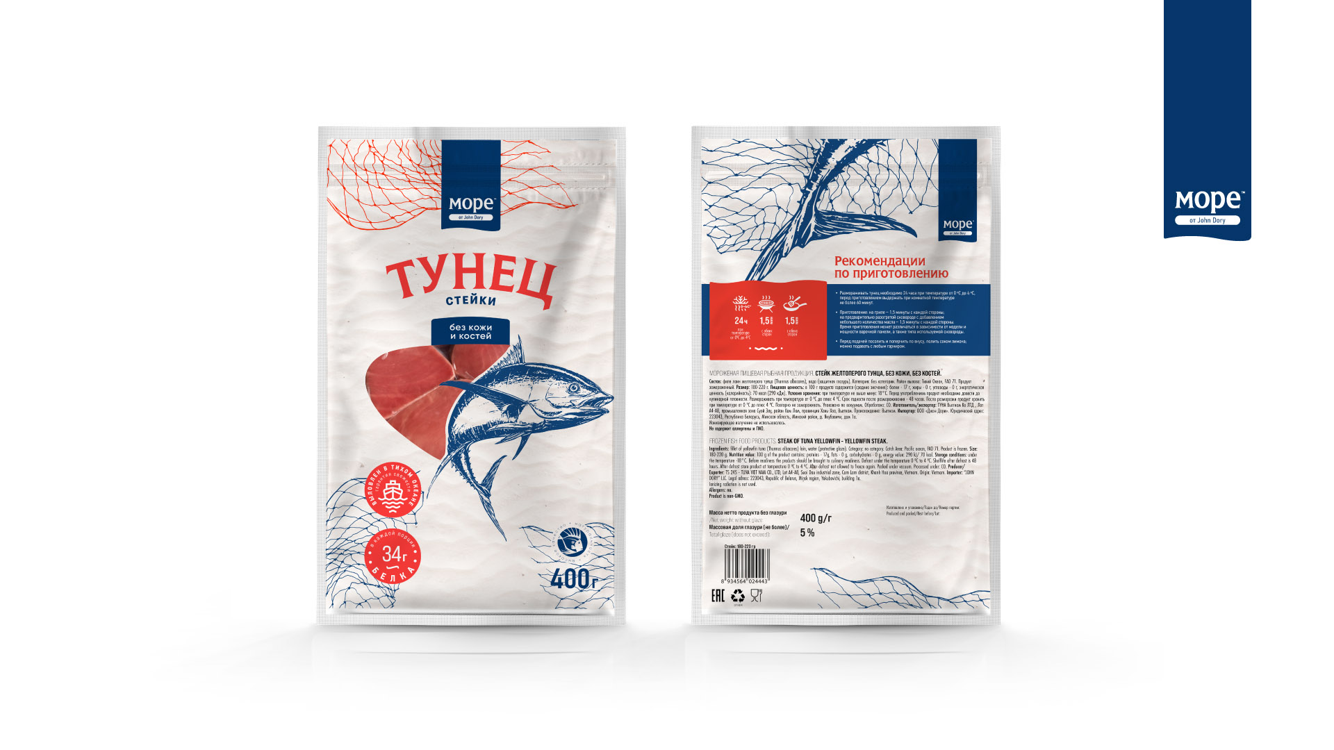
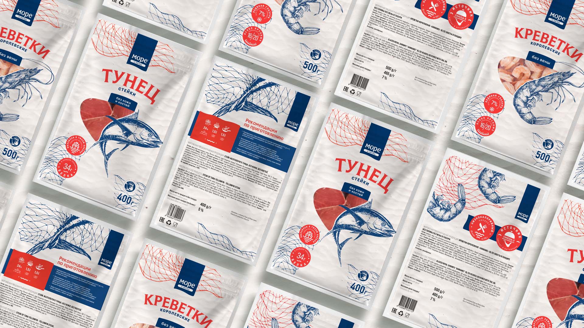
First of all, in the packaging design we made the product focus. We showed recognizable illustrations of shrimp and tuna on the packaging. Imitation of beach sand became the background. Also we reflected the main competitive advantages of the products on the front of the packaging and provided a transparent area to show the package content. Colour palette basis consist of scarlet, bordered by bright orange and shades of blue. Main font reflects the brand idea “МОРЕ от John Dory”.
CREDIT
- Agency/Creative: Moloko Creative Design Agency
- Article Title: Frozen Food Products Packaging for John Dory by Moloko Creative
- Organisation/Entity: Agency, Published Commercial Design
- Project Type: Identity
- Agency/Creative Country: Belarus
- Market Region: Europe
- Project Deliverables: Graphic Design, Packaging Design, Tone of Voice
- Industry: Food/Beverage


