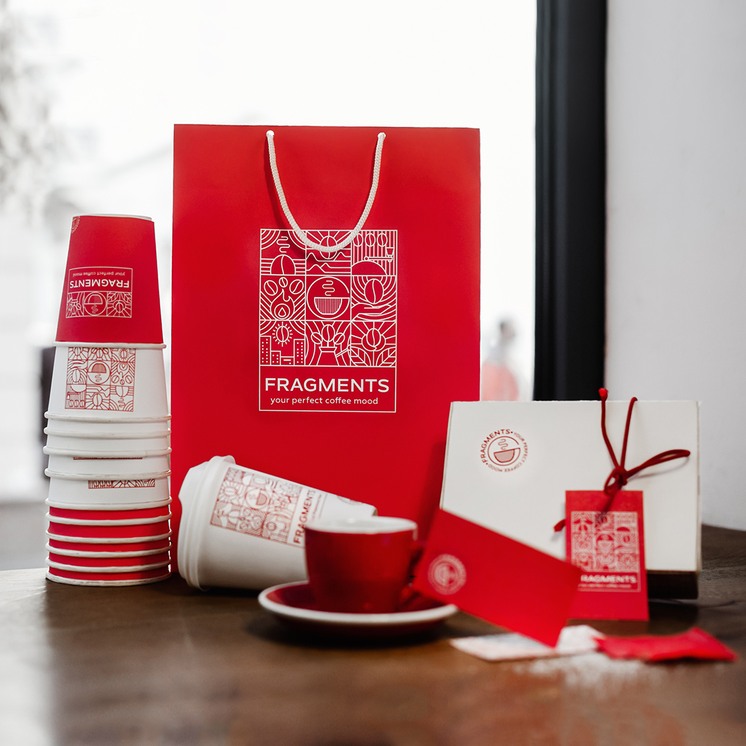
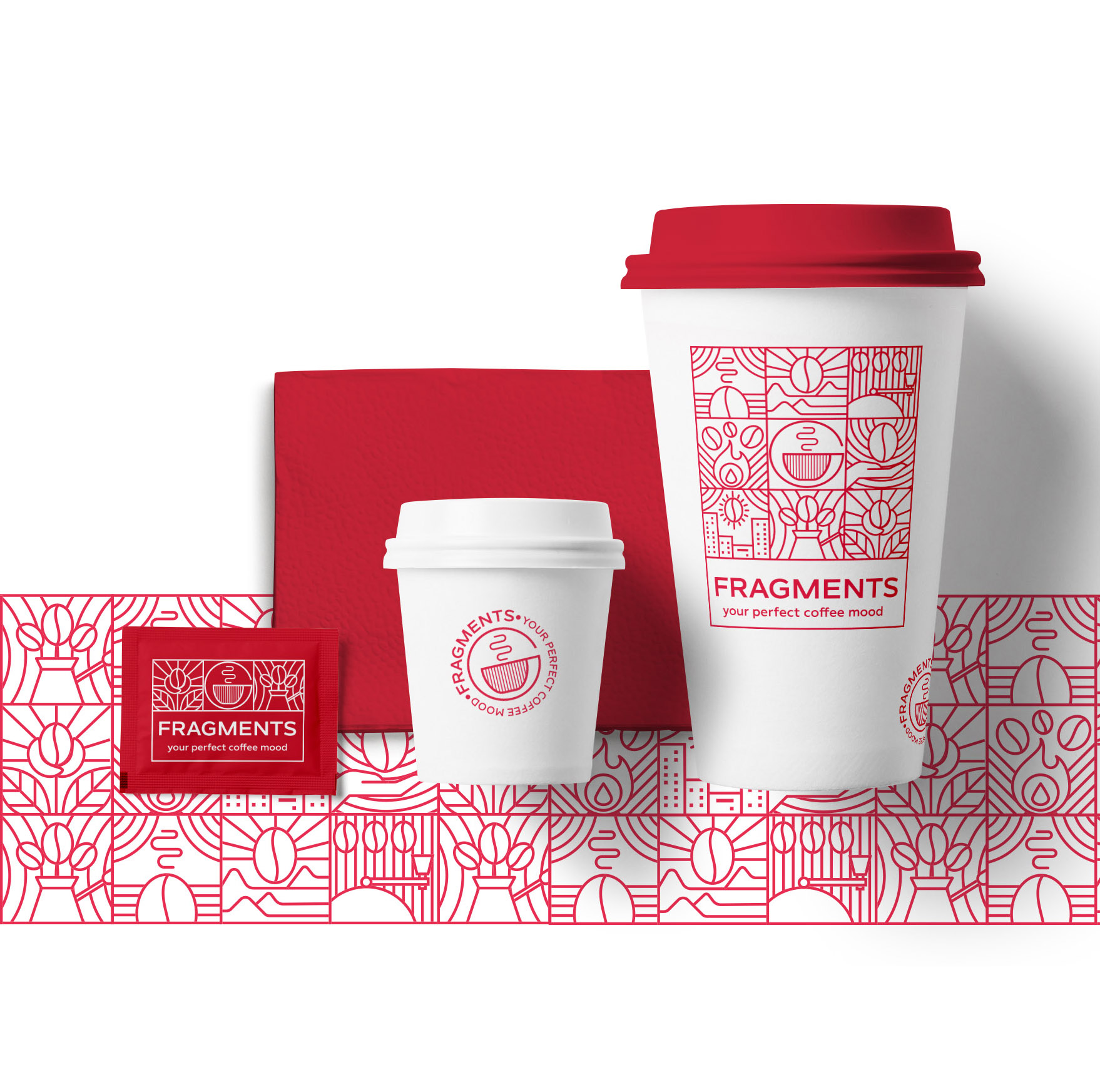
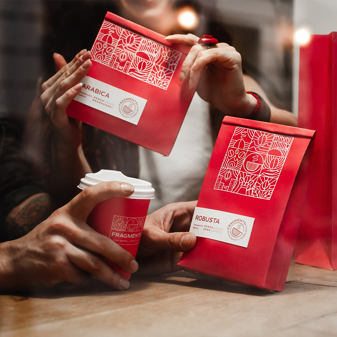
Coffee like a fragment of your every single day – this was the main idea of the client. Accordingly, I created the logo fragment), which transforms into the pattern – coffee fragments. All the icons resemble the fragments of the day. When we wake up – we think about coffee. That’s why the icon of the coffee bean looks like the sun, which rises above the city. All the icons are associative arrays, evoked by coffee and coffee aroma. They are connected with the moments, when we stop among the daily routine to drink coffee and to be with ourselves, to think about something pleasant, something inner. When we make coffee, we take a break in the middle of a hurry-scurry day, and we stop to have a pleasure.


CREDIT
- Agency/Creative: Olena fedorova
- Article Title: Identity and Packaging Design for Fragments Coffee
- Organisation/Entity: Freelance, Published Commercial Design
- Project Type: Identity
- Agency/Creative Country: Ukraine
- Market Region: Europe
- Project Deliverables: Brand Identity, Tone of Voice
- Industry: Food/Beverage
- Keywords: brand-design, packagingdesign,, red, coffee
FEEDBACK
Relevance: Solution/idea in relation to brand, product or service
Implementation: Attention, detailing and finishing of final solution
Presentation: Text, visualisation and quality of the presentation


