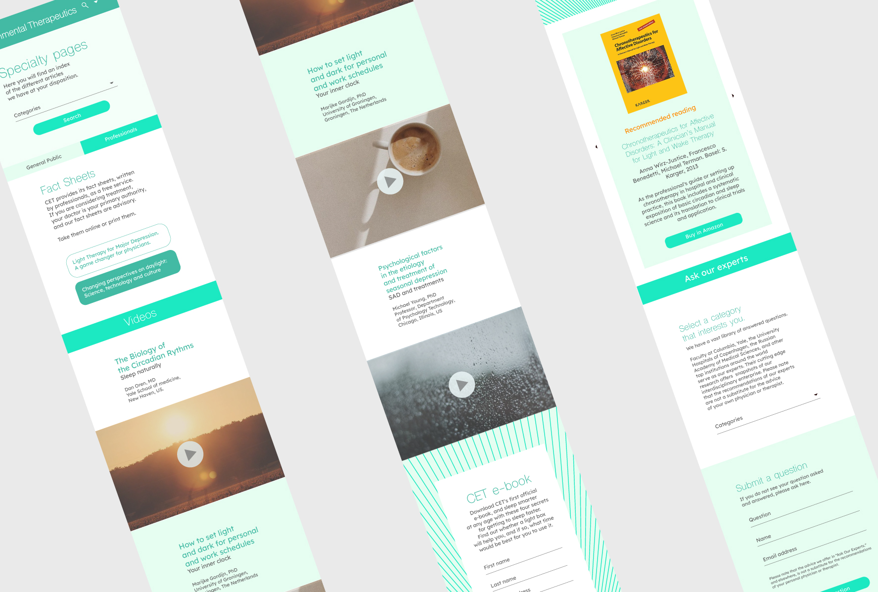
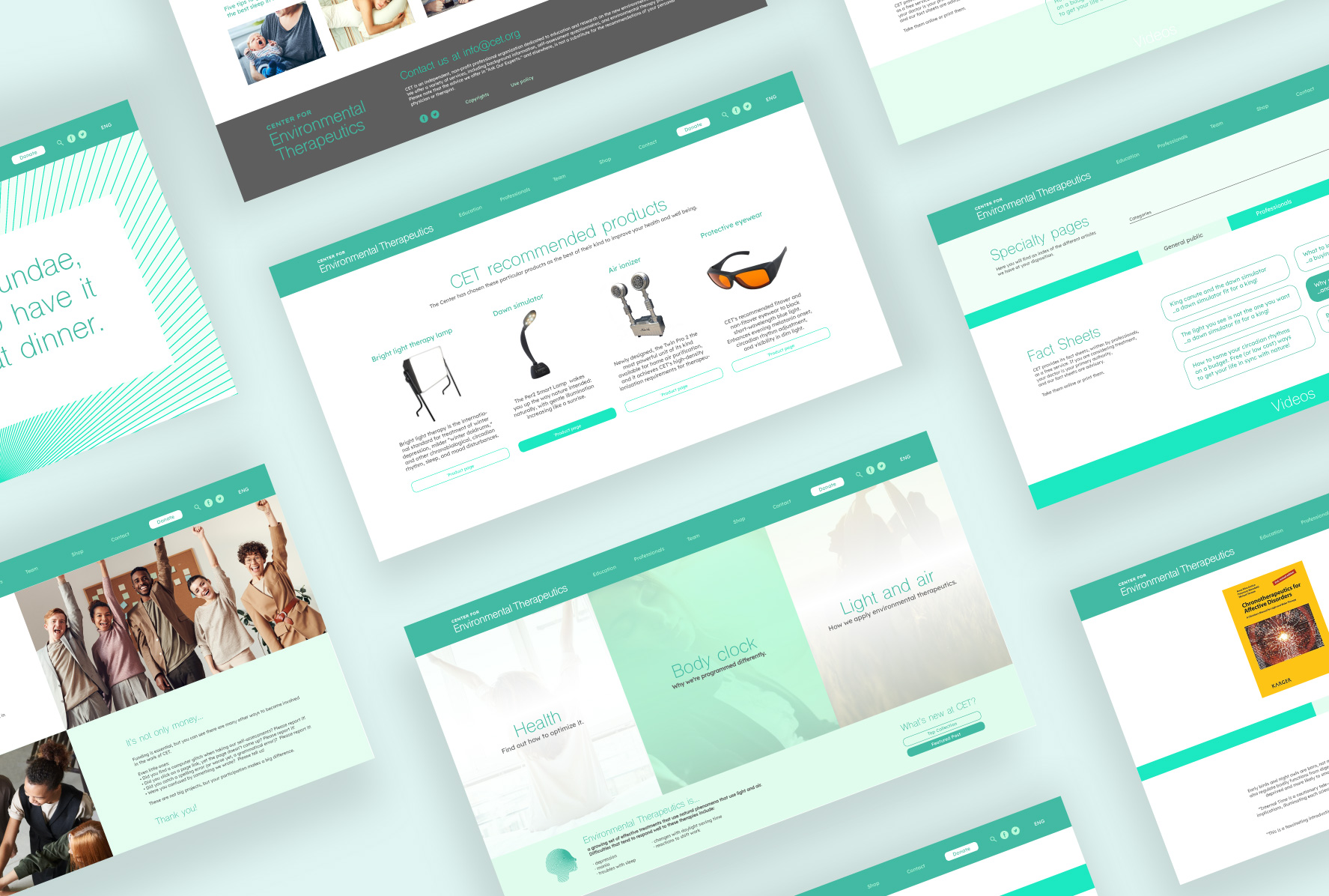
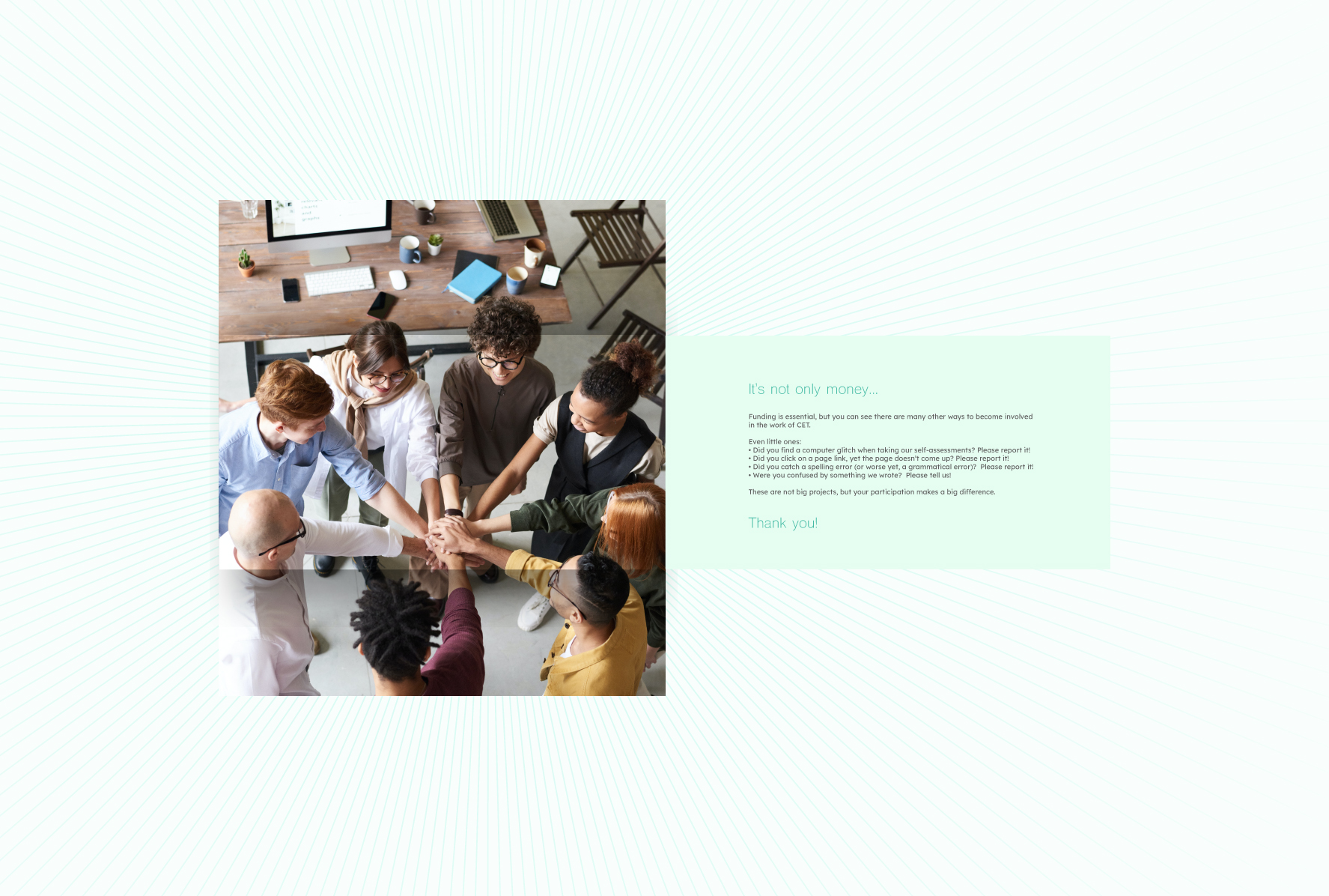
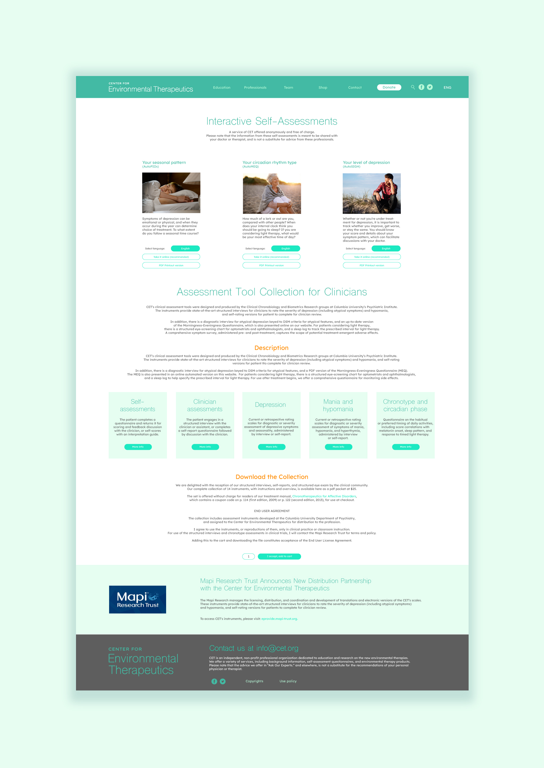
Cet.org is an independent New York-based organization dedicated to educating and researching the benefits of natural phenomena, primarily light, as a treatment for depression, mania, sleep problems, and schedule changes.
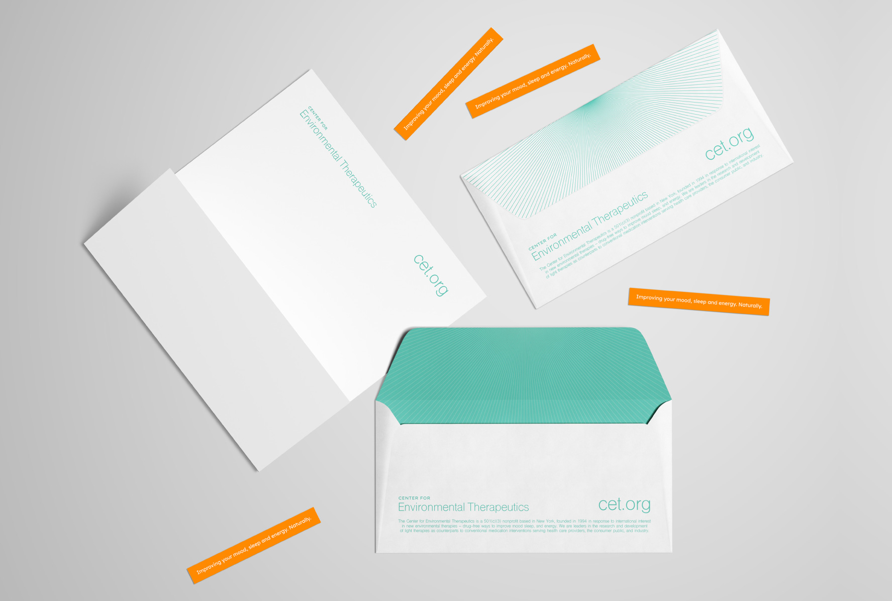
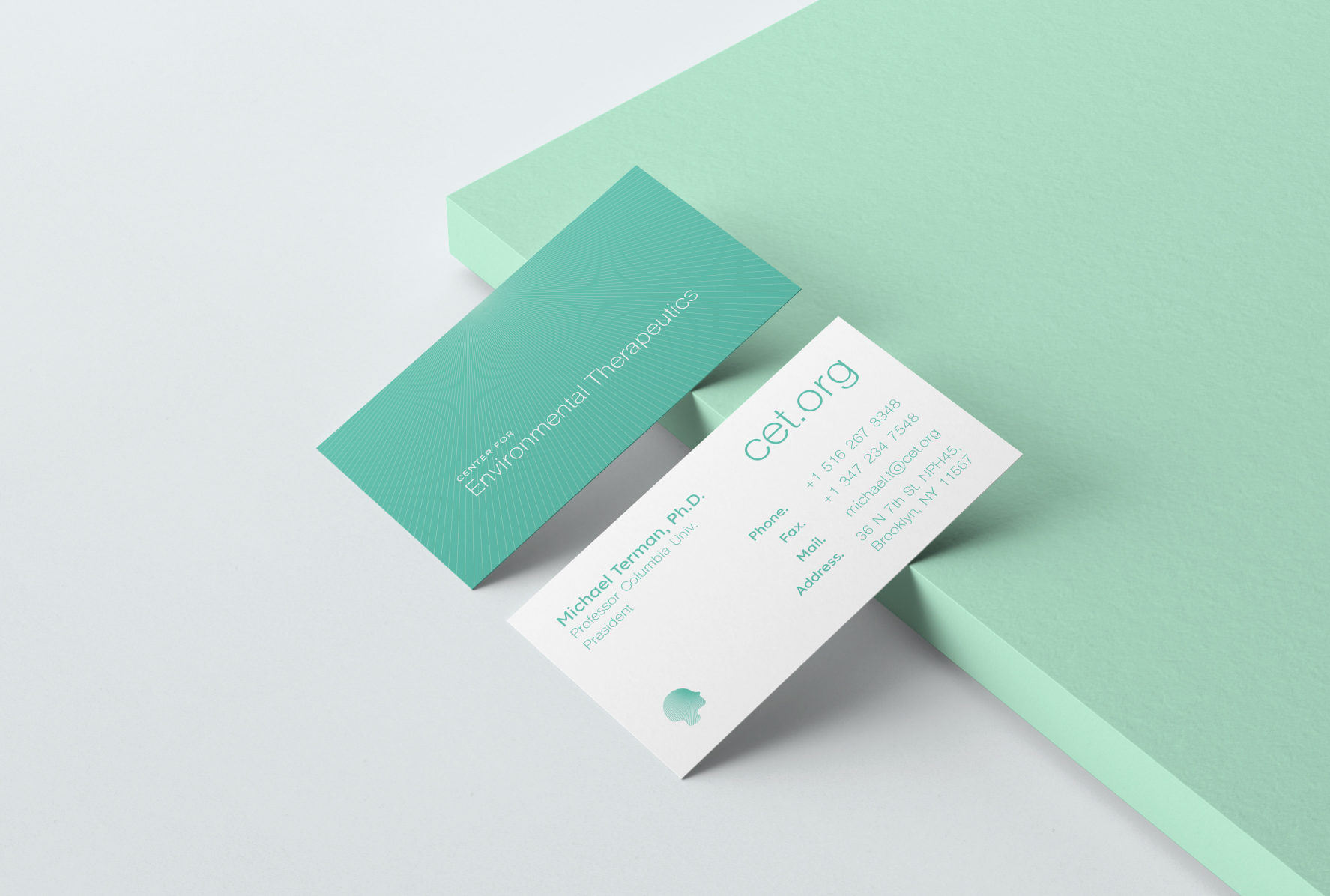
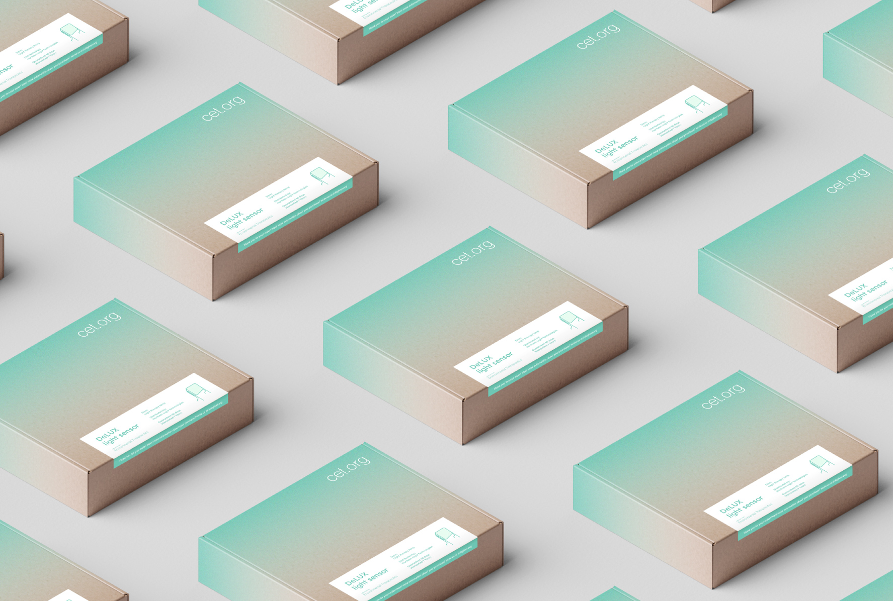
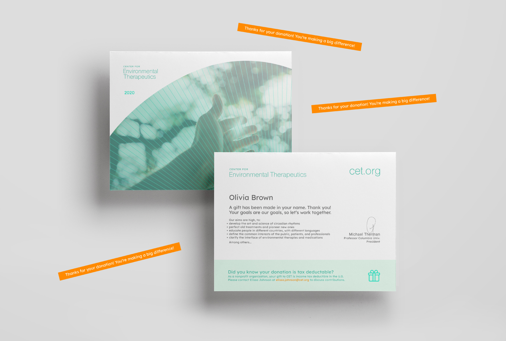
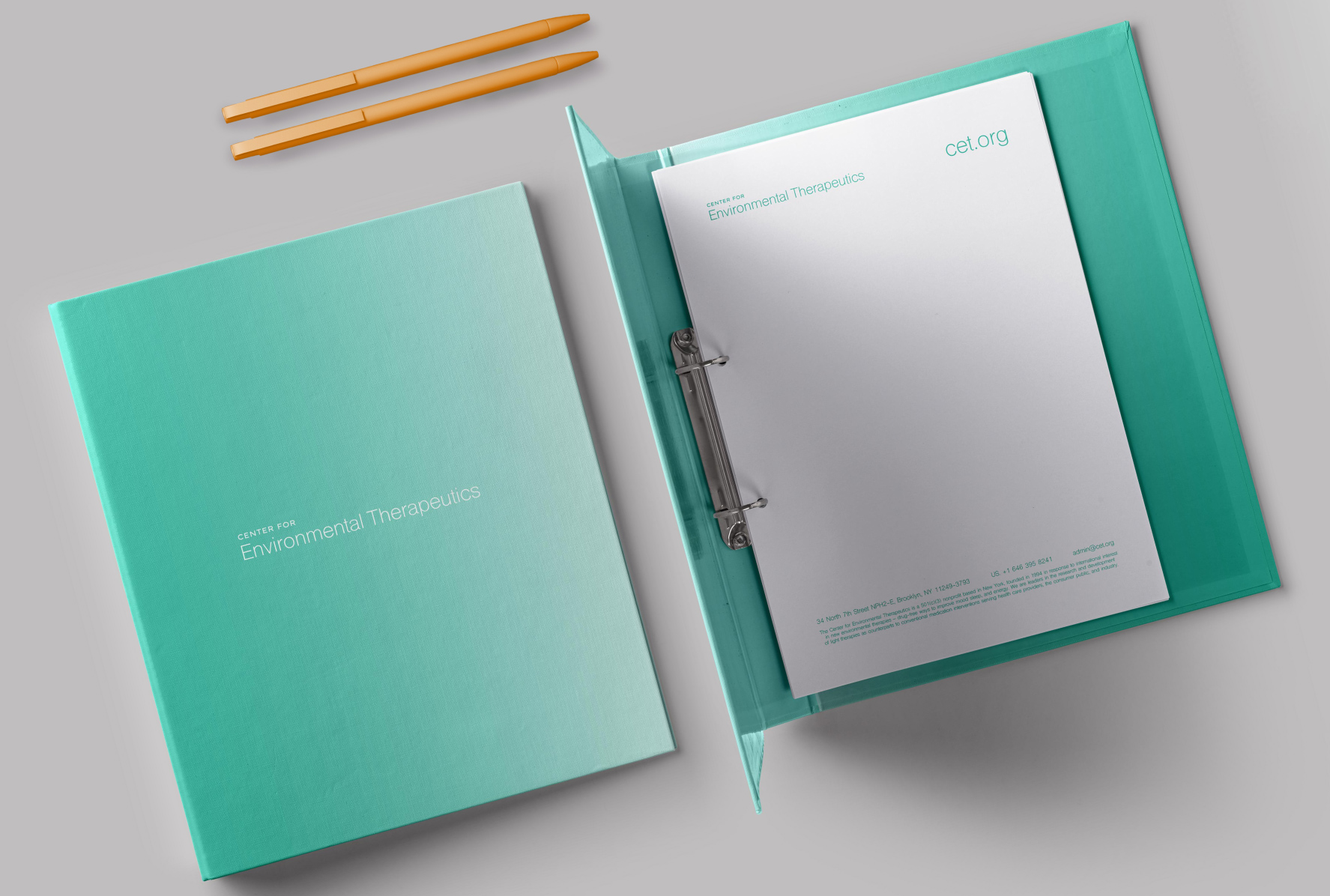
For the branding, we were inspired by the art of Olafur Eliasson and his incredible ability to alter perception through light. Just as Olafur uses it as a tool to evoke emotions, the center uses it as a therapy to alleviate them. The orientation of the lines distributed radially through the identity alludes to the light emitted by the therapeutic boxes, which must be placed at 45º above the user’s head. When creating a sense of depth, the use of lines and color gradient are two visual representations of the same principle: Light as an intangible element that influences the receiver. The more explicit graphic representation of this principle is reflected in the isotype itself. The user’s profile is illuminated by the light emitted by the therapeutic box.
CREDIT
- Agency/Creative: Estudio Manila
- Article Title: Rebranding of CET’s New Identity Designed by Estudio Manila
- Organisation/Entity: Agency, Published Commercial Design
- Project Type: Identity
- Agency/Creative Country: Mexico
- Market Region: Global
- Project Deliverables: Brand Architecture, Brand Creation, Brand Experience, Brand Guidelines, Brand Identity, Brand Redesign, Brand Refinement, Brand Rejuvenation, Brand World, Branding, Graphic Design, Identity System, Packaging Design, Product Architecture, Rebranding, Research, Structural Design
- Industry: Non-Profit
- Keywords: Psychology, Medical, Organization, Mental health


