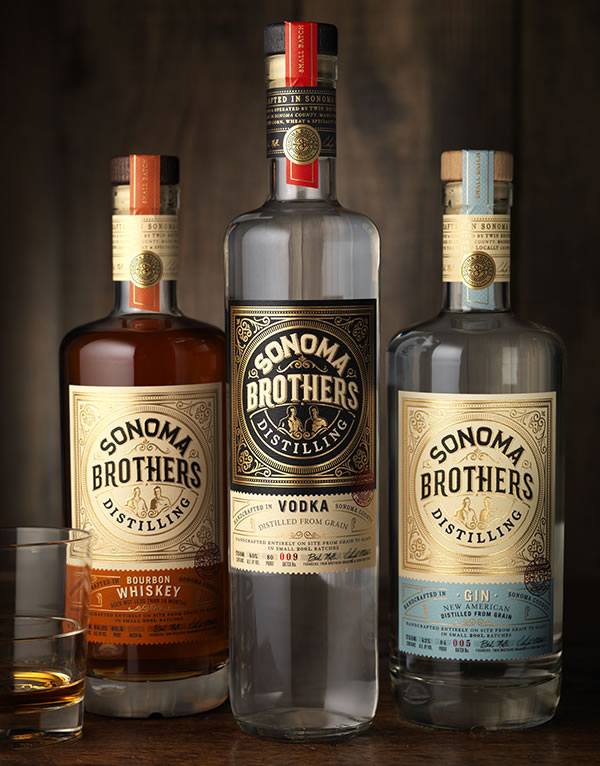
“Challenge: As twin brothers born and raised in Sonoma County, Chris and Brandon Matthies have dedicated their lives serving their community as a firefighter and police officer. In 2012 the two launched Sonoma Brothers Distillery, an artisan distillery, focused on crafting handmade spirits in small batches. After working with a freelance designer on their original labels, the brothers realized some early success, but always felt the label fell short on communicating the brand story, and the quality craftsmanship that went into each bottle. Furthermore, as the craft spirits space became more competitive, they started receiving mixed reviews from distributors and consumers on their “look”. When they reached out to CF Napa, the challenge for this project was to develop a branding solution that more effectively conveyed the unique, small batch quality of the product, the premium position of the brand and its humble Sonoma roots.”
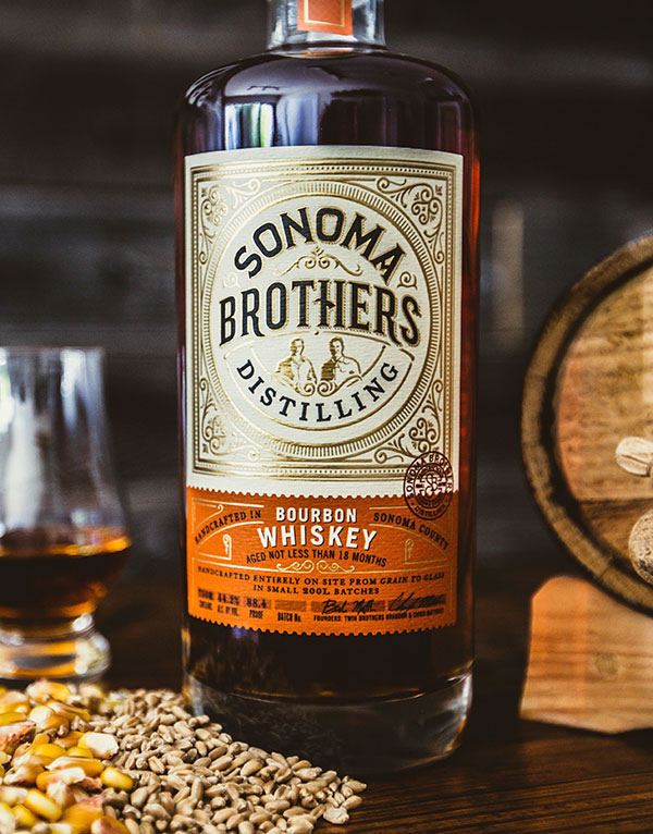
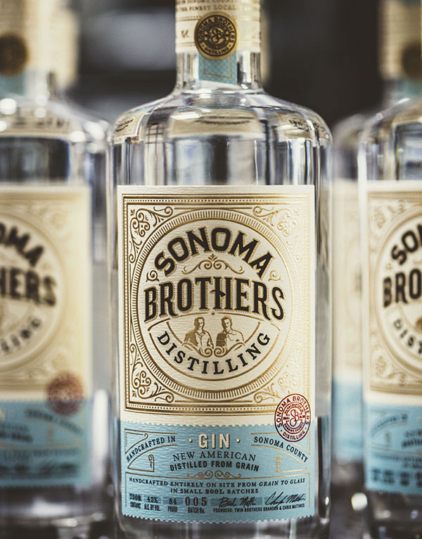
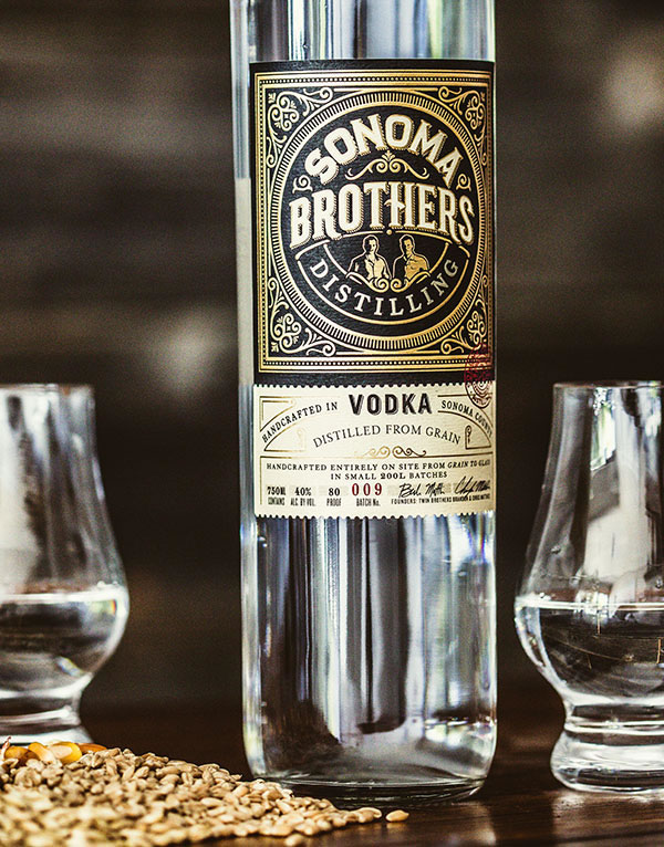
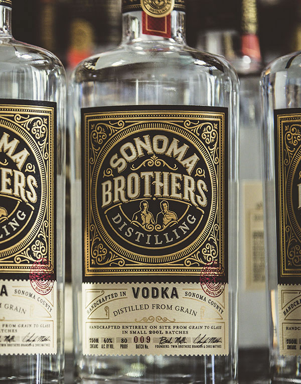
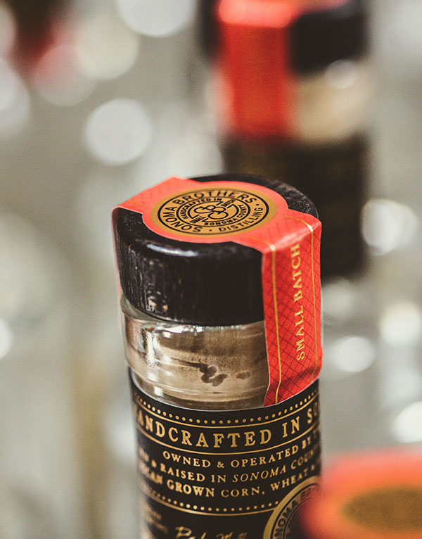
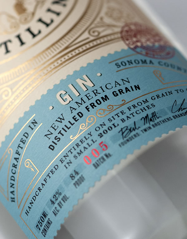
“Solution: CF Napa incorporated a nostalgic, turn of the century look to give the brand an authentic, and genuinely Sonoma craft feel. It was important to ensure that the new designed looked premium, and small batch, yet approachable and inviting to the consumer. CF Napa adjusted the label hierarchy to make the brand name “Sonoma Brothers Distilling” the primary read, allowing for greater readability from behind a bar or on the retail shelf. To give the brand a more proprietary look, we removed the barrel icon which didn’t have a strong tie to the product, the distillers, or the brand position, and instead incorporated an illustration of the two brothers, which better communicates the core of the brand story, and the craftsmen behind the product. Intricate detailing and gold foil treatment elevate the quality perception and communicates the detailed care that goes into the product itself, while a color system differentiates product SKUs, allowing for better product identification with the target consumer.”
“Testimonial: “When my brother and I first reached out to CF Napa we were hesitant to hire a professional agency to help us redesign our packaging – as a family business, we were on a budget and were wary of the potential risk in changing our image after only being in business for a couple years. We had seen CF Napa’s amazing portfolio and knew it was a risk that would be beneficial to our brand. Based on the rave reviews on the new package from trade and consumers alike, not only was hiring CF Napa worth it, it was one of the best business decisions we’ve made for our brand. Now, The first thing out of almost everyone’s mouth is ‘Wow! I love your packaging! You did a great job with the label!’ I only wish we had hired CF Napa from the beginning!””
CREDIT
- Agency/Creative: CF Napa Brand Design
- Article Title: CF Napa Brand Design – Sonoma Brothers Distilling
- Project Type: Packaging


