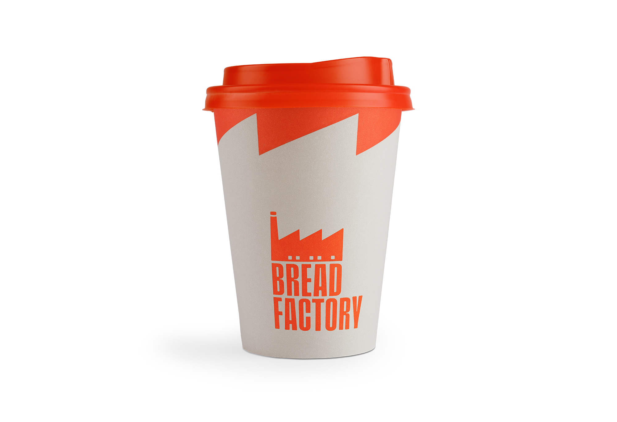
Bread Factory is a multi-purpose hall combining a bakery, a pastry shop, and a restaurant, now listing six branch stores, and they assigned us the design of their new visual identity in order to obtain a fresh look & feel.
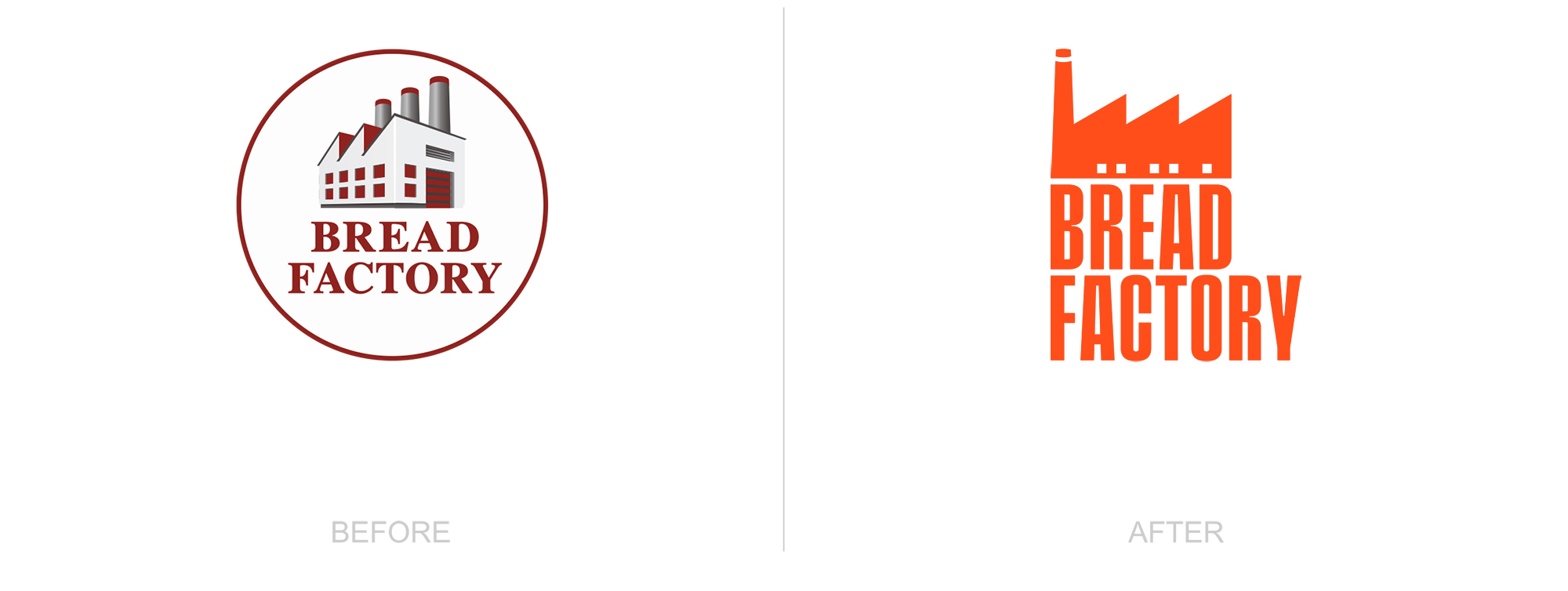
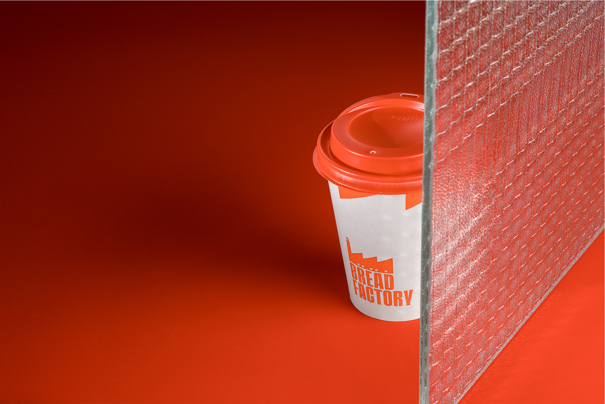
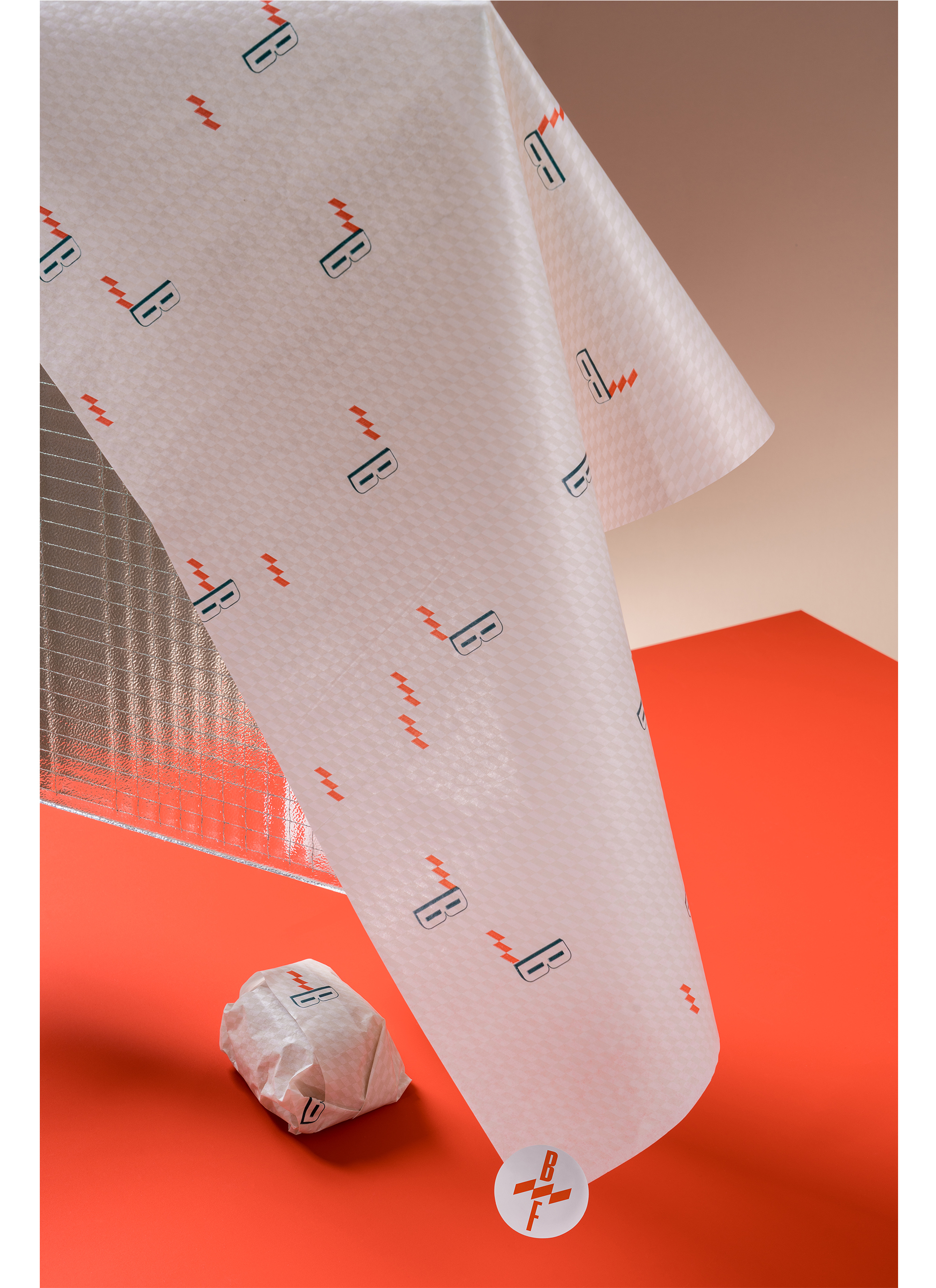
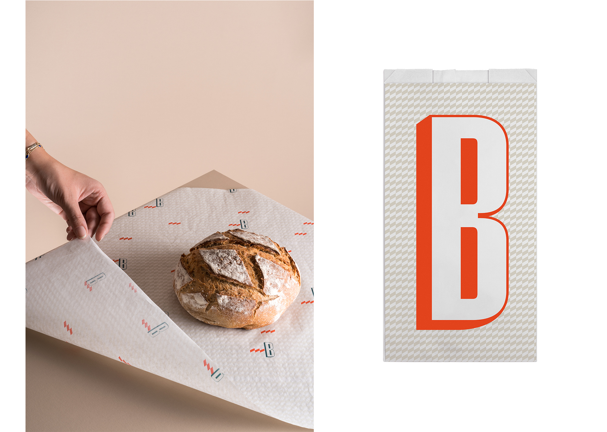
While keeping the concept of the factory, we chose an abstract path in order to create a bold logo. This allowed us more freedom and flexibility on its uses.
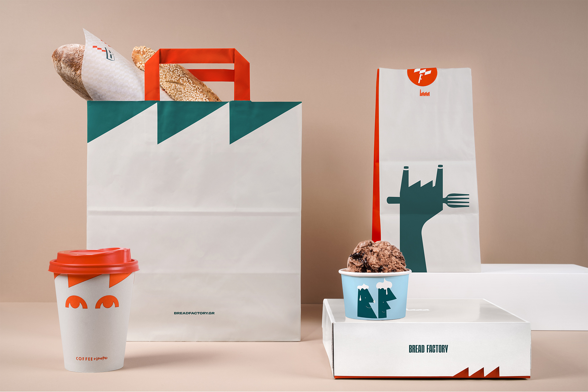
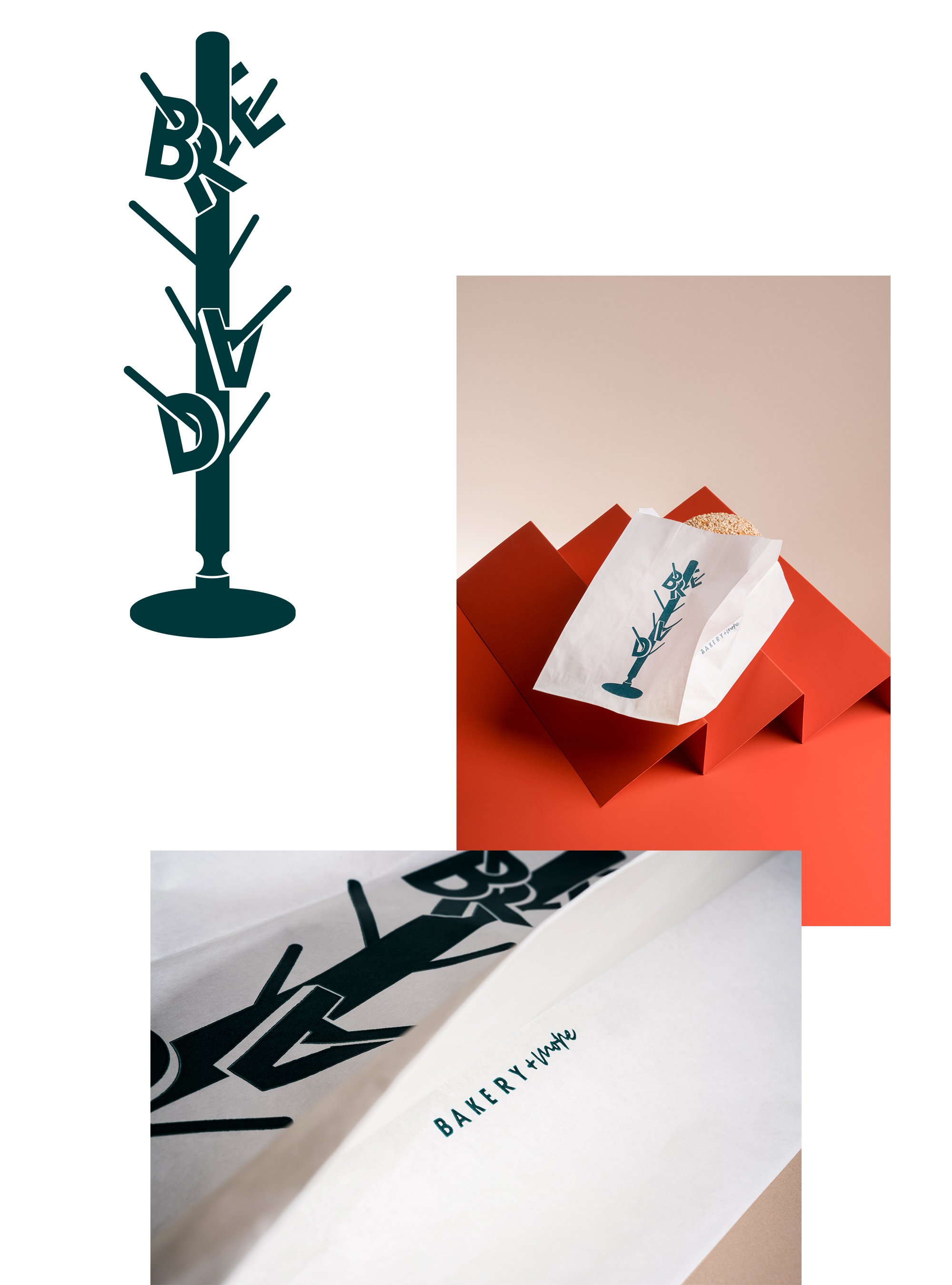
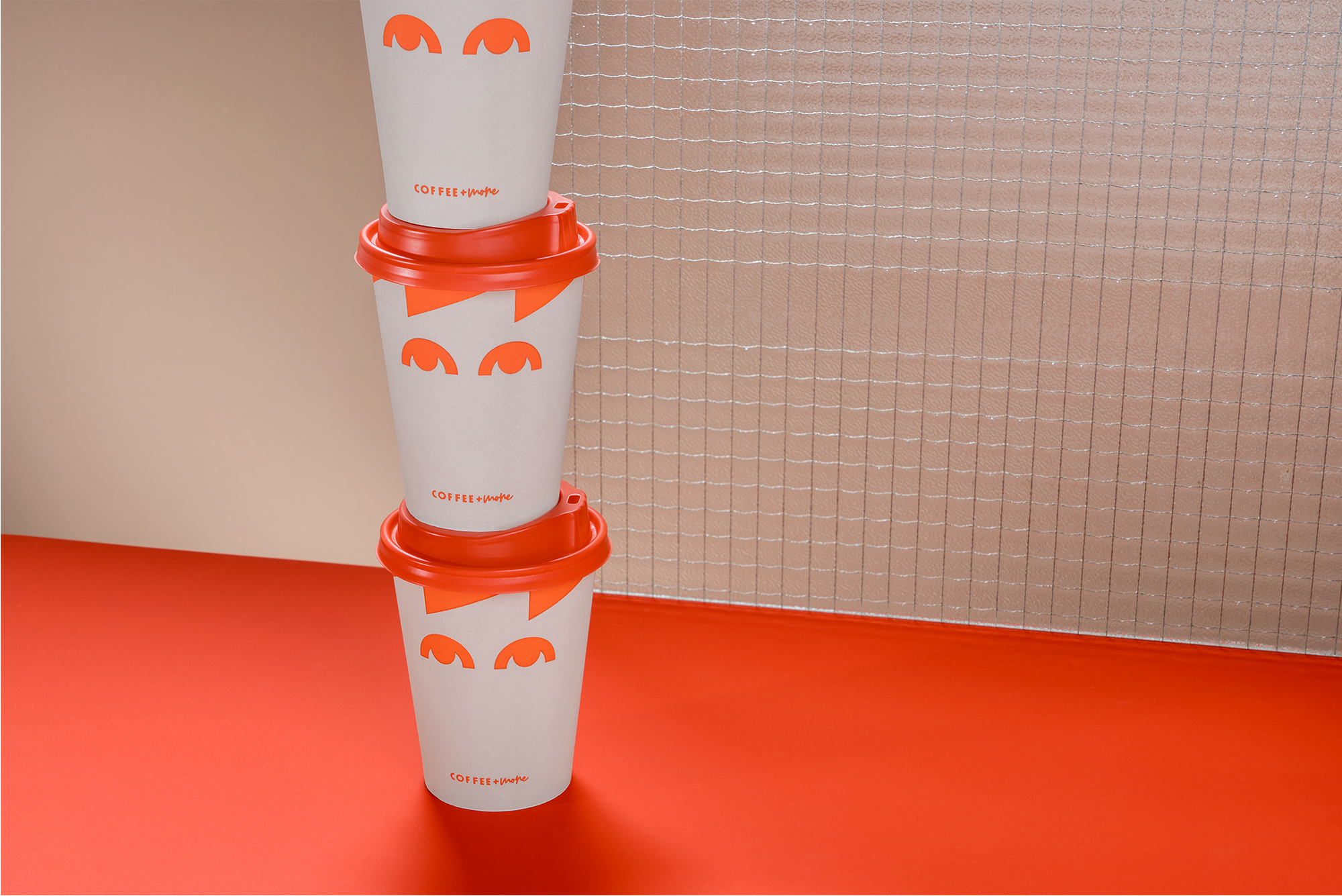
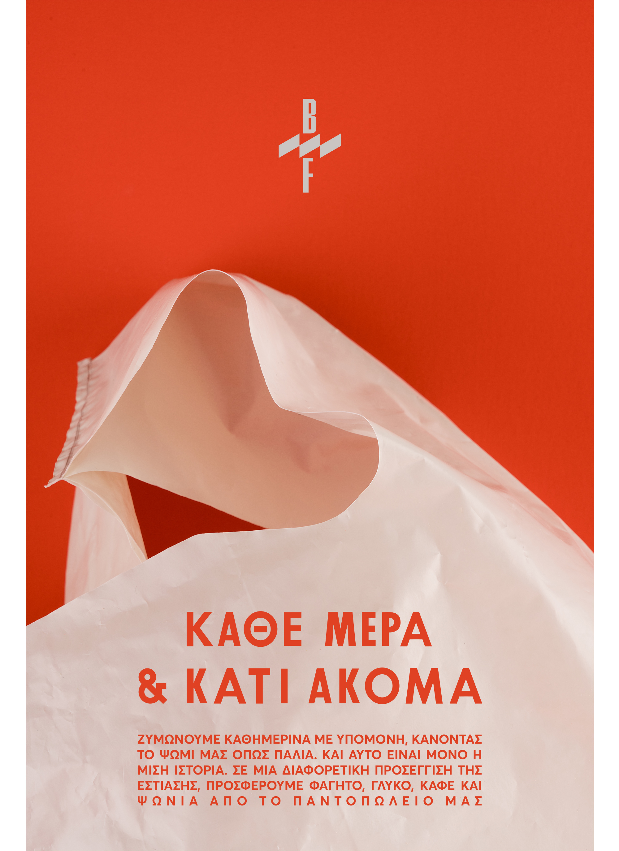
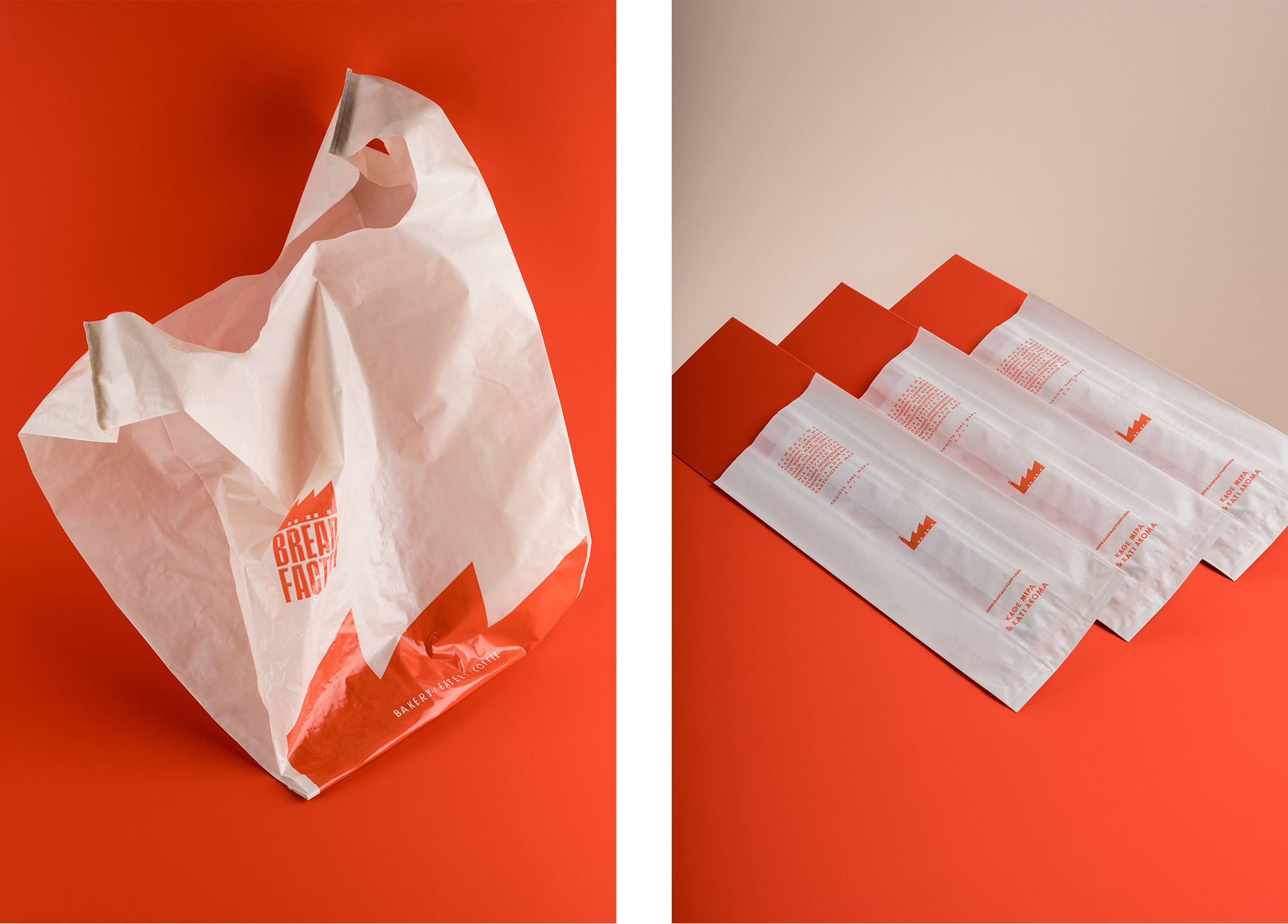
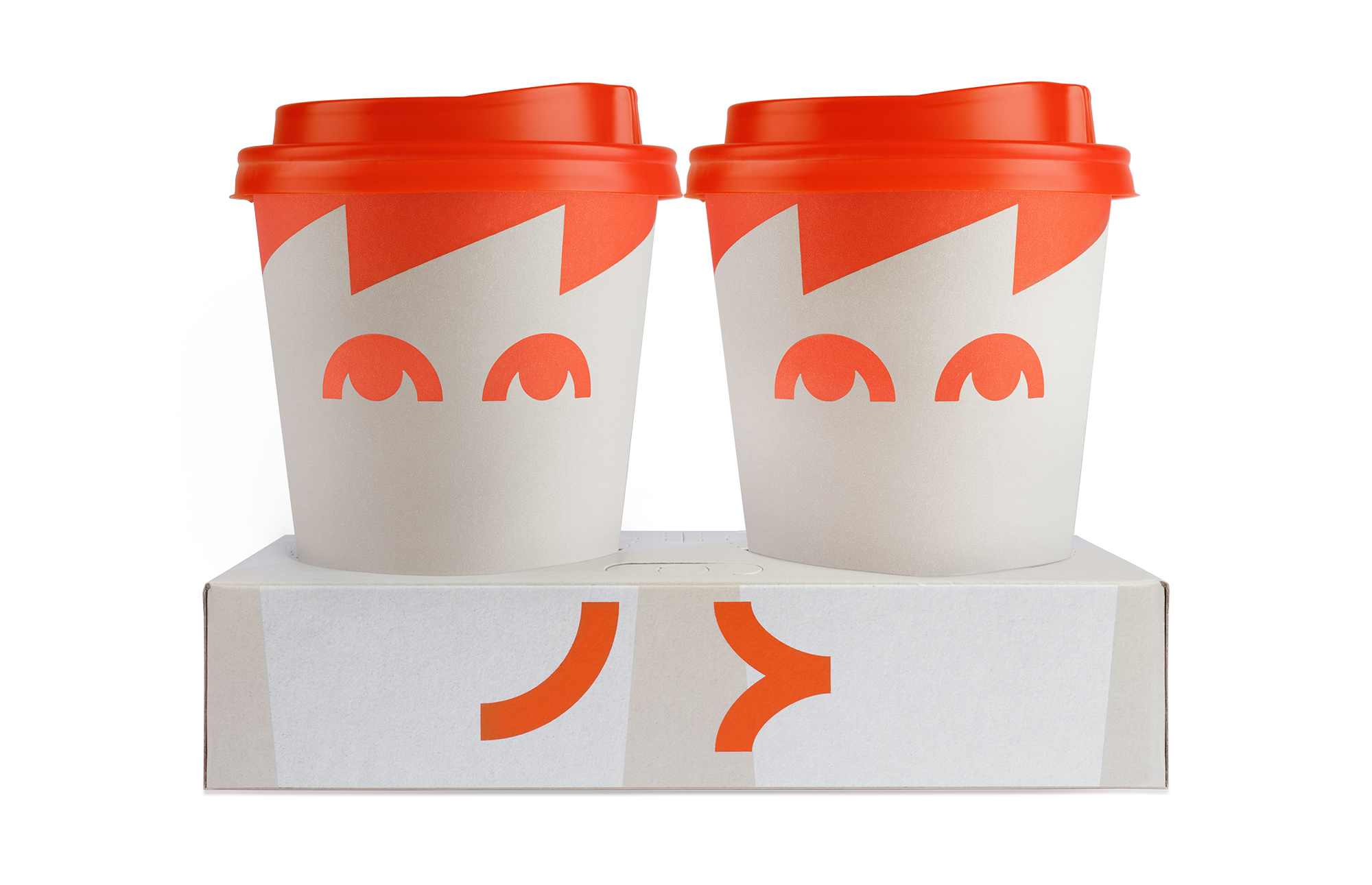
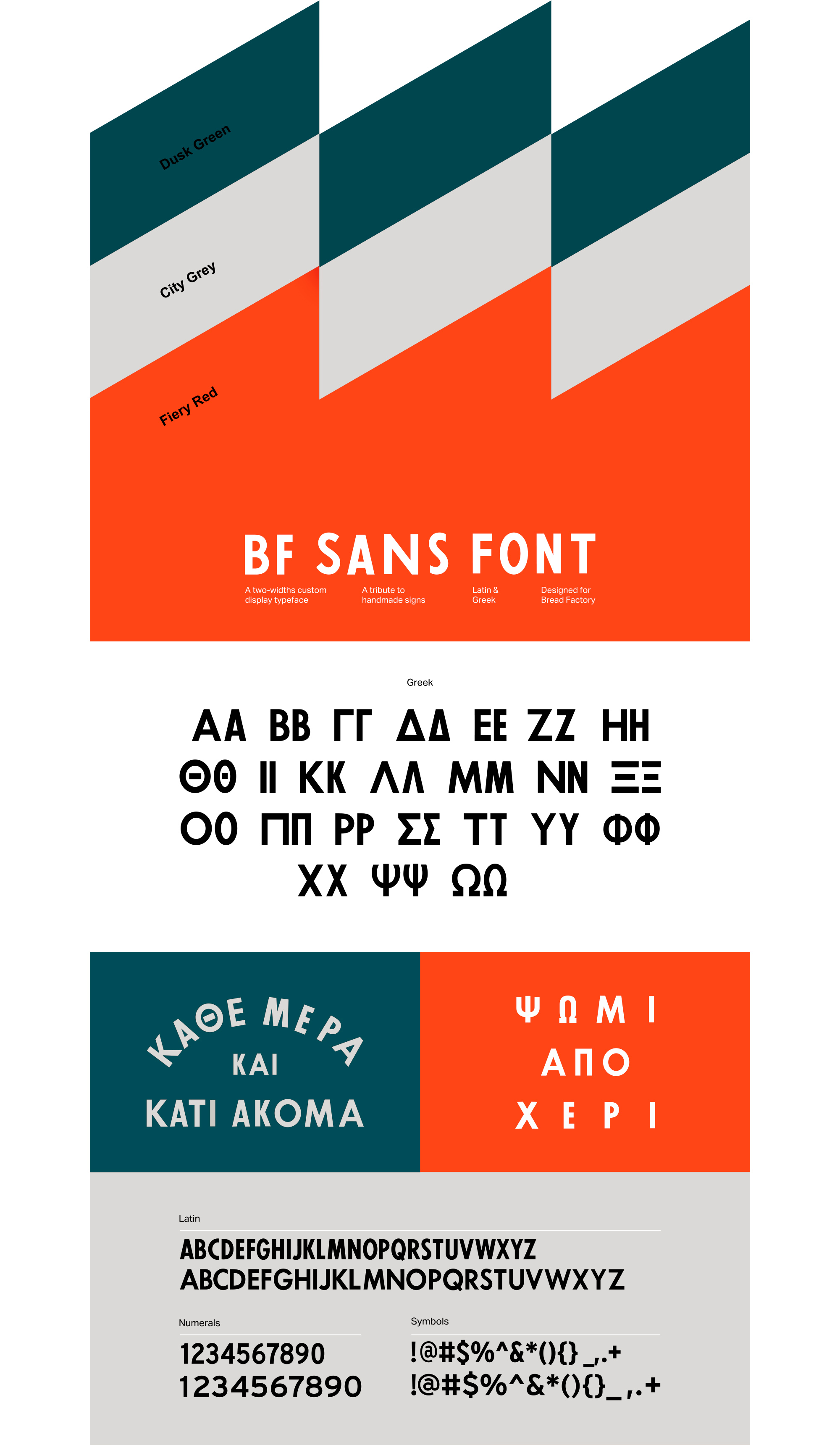
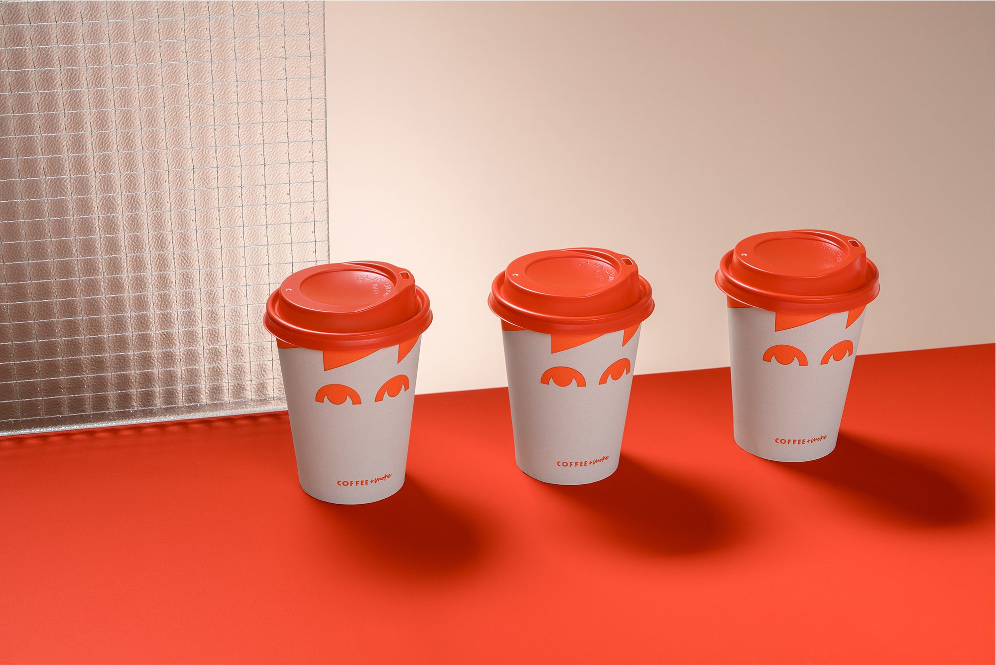
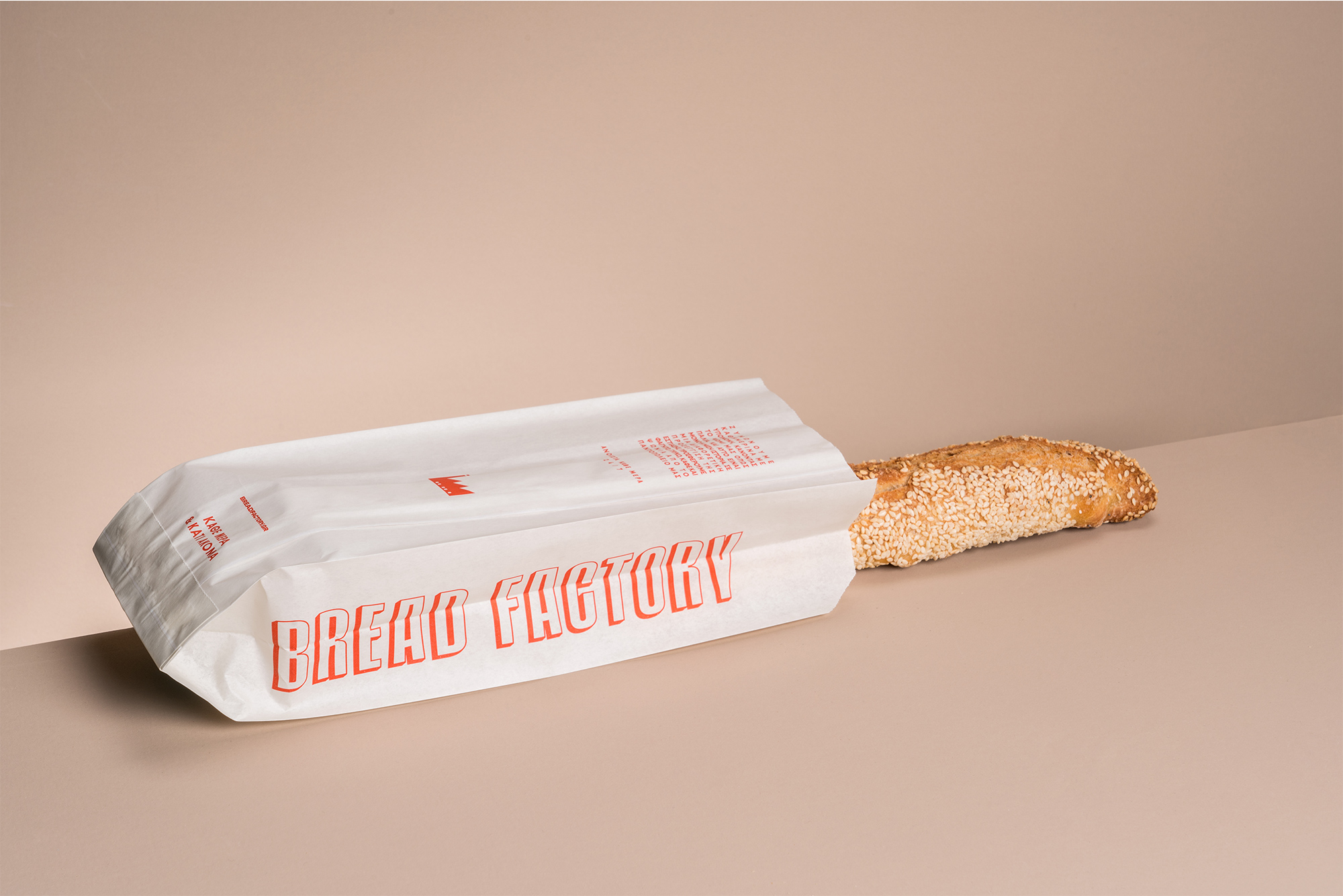
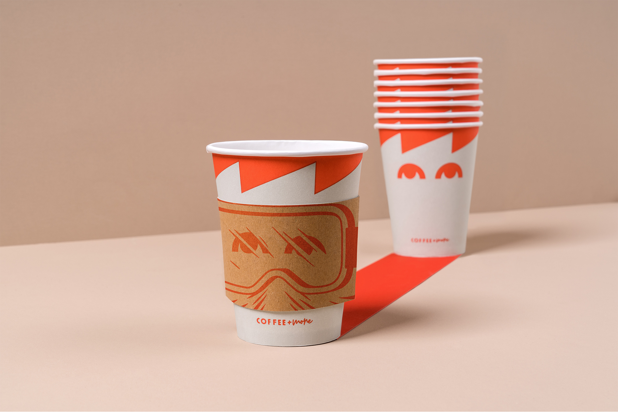
Alongside this, we selected a stylish color palette that enhances the formation of an easily discernible identity. The custom, double-width typography we created is inspired by the aesthetic of hand-made signs, expressing the handcrafted procedure of the brand’s offerings. The conceptual eye-catching illustrations that can be found on the packaging are generating exuberant feelings, complementing the brand’s new inventive universe.
CREDIT
- Agency/Creative: Luminous Design Group
- Article Title: Luminous Design Group Recreates Bread Factory’s Logo in Redesign
- Organisation/Entity: Agency, Published Commercial Design
- Project Type: Identity
- Agency/Creative Country: Greece
- Market Region: Europe
- Project Deliverables: Brand Guidelines, Brand Identity, Brand World, Rebranding
- Industry: Food/Beverage
- Keywords: Branding, Illustration, Branding Design


