Fabula Branding – KIKIRIKI
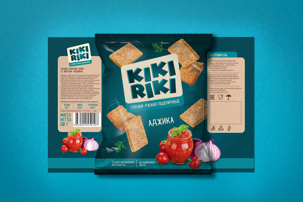
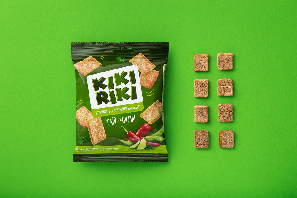
“Croutons are well-known, popular and laconic product and we decided to present it with the similar laconic visual solution.
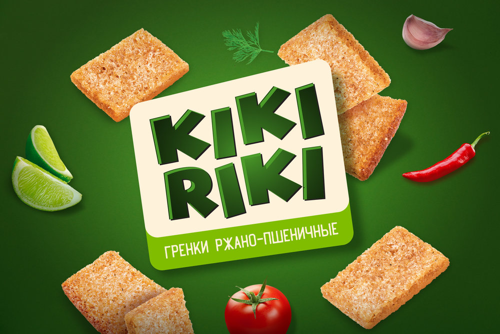
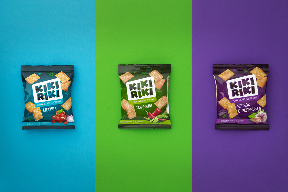
Our main tools are color and minimalistic geometric forms. This approach required the rebuilding of the logo and we made it more modern looking with improved readability. The flavor is carried out with main and supporting colors on the package and with the help of the food zone.
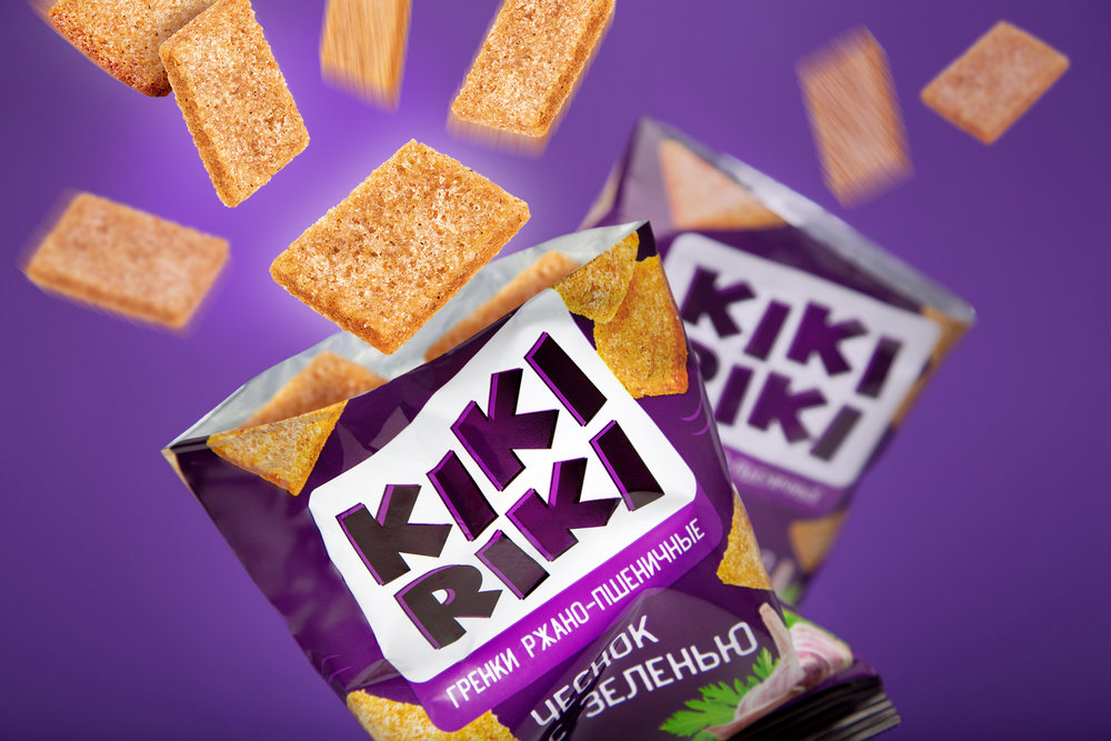
This approach showed all the advantages of KIKIRIKI snacks: the packaging is not overloaded with additional elements, so the product draws all the attention – big, mouth-watering croutons look very appetizing.”

CREDIT
- Agency/Creative: Fabula Branding
- Article Title: Consumer Graphic Packaging Design with Large Crispy Croutons Products being Centre Stage
- Organisation/Entity: Agency Commercial / Published
- Project Type: Packaging
- Agency/Creative Country: Belarus
- Market Region: Europe
- Format: Flow-Pack
- Substrate: Plastic
FEEDBACK
Relevance: Solution/idea in relation to brand, product or service
Implementation: Attention, detailing and finishing of final solution
Presentation: Text, visualisation and quality of the presentation


