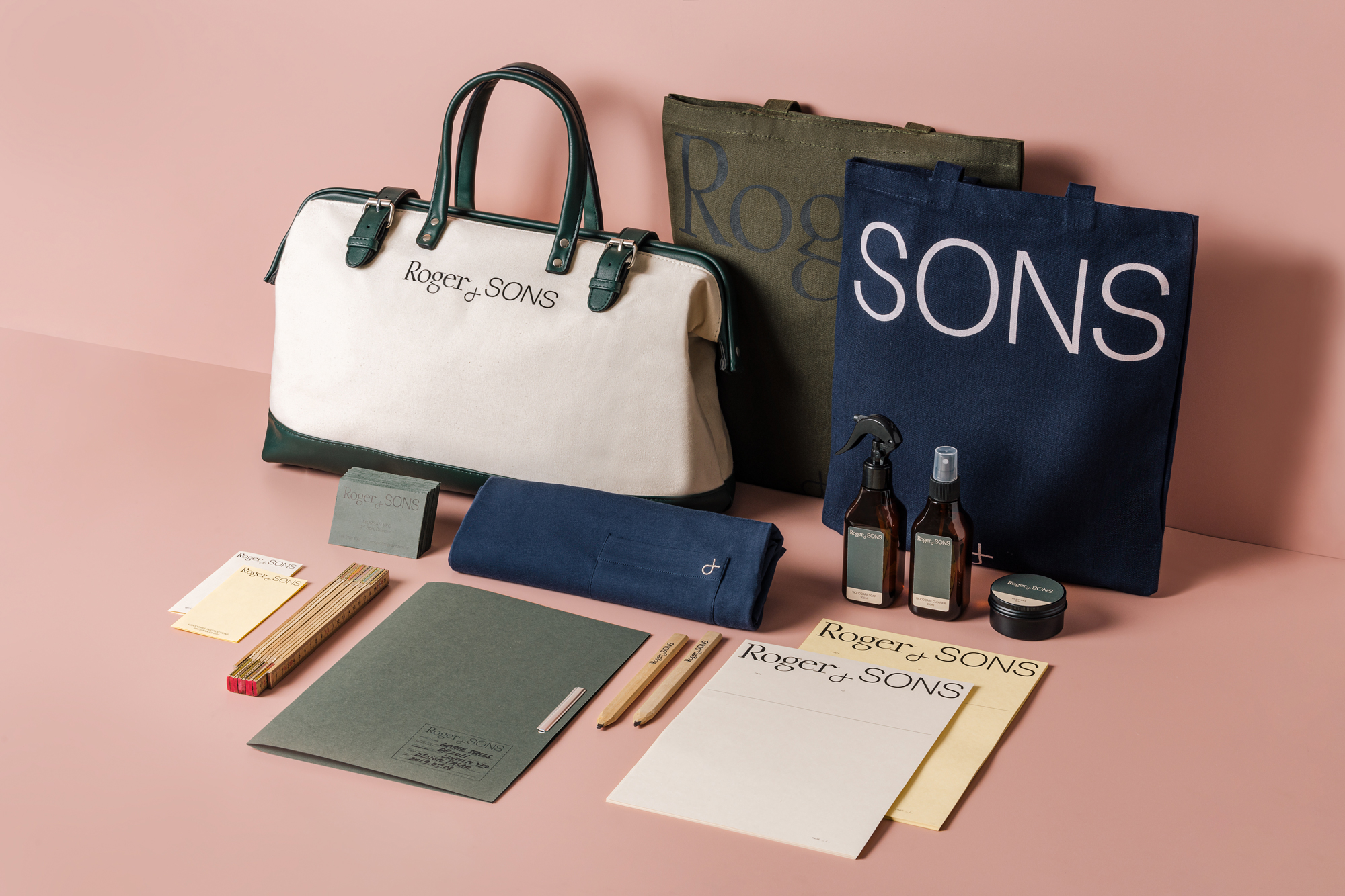
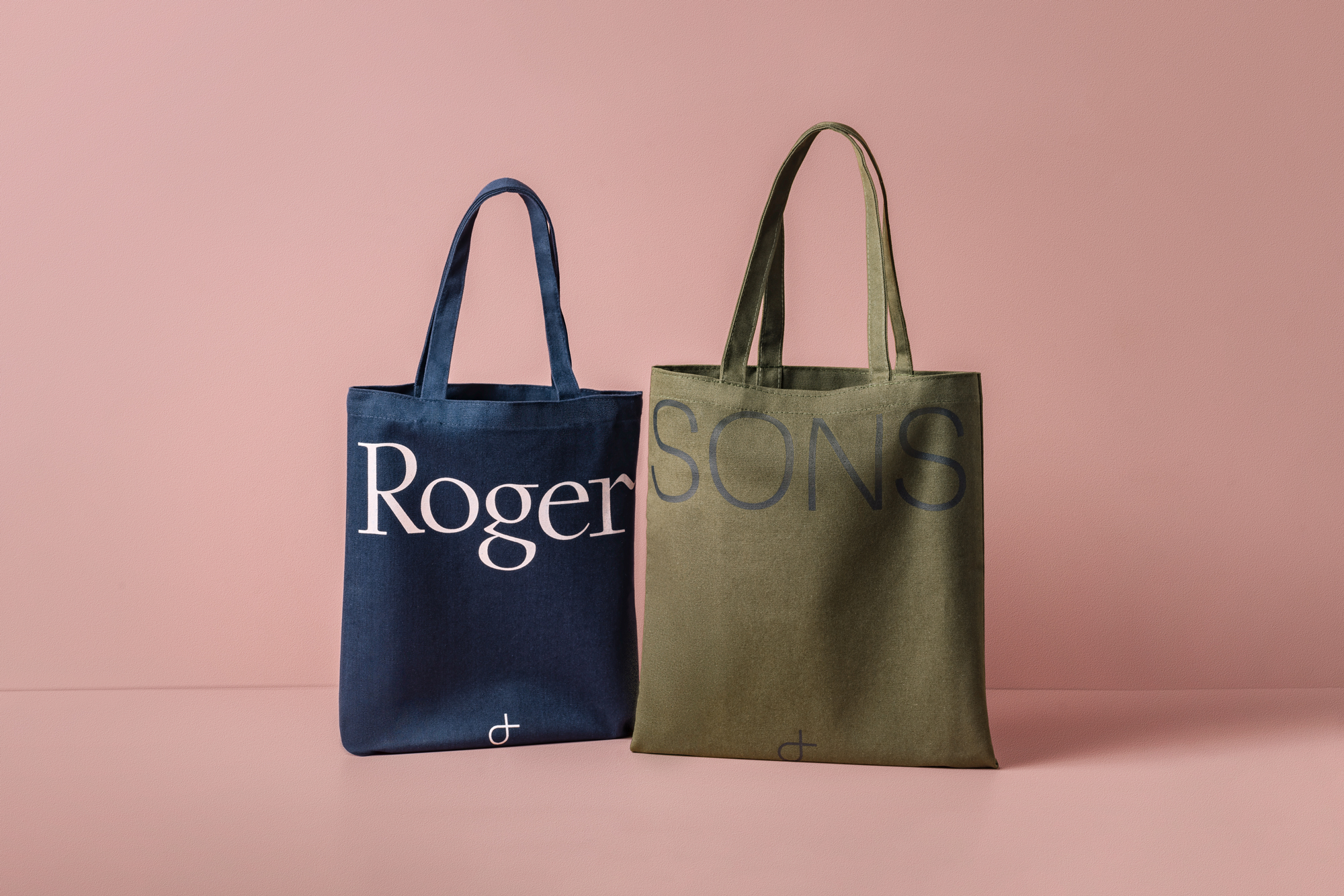
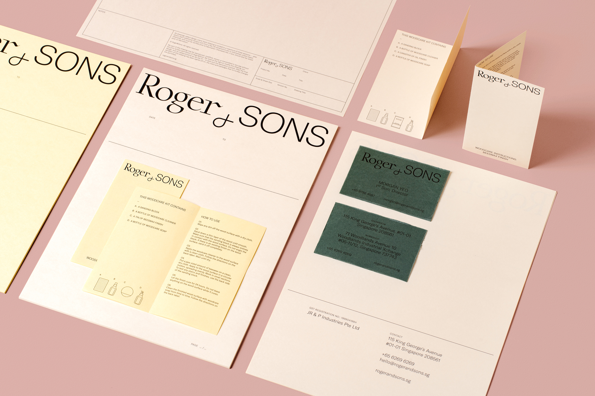
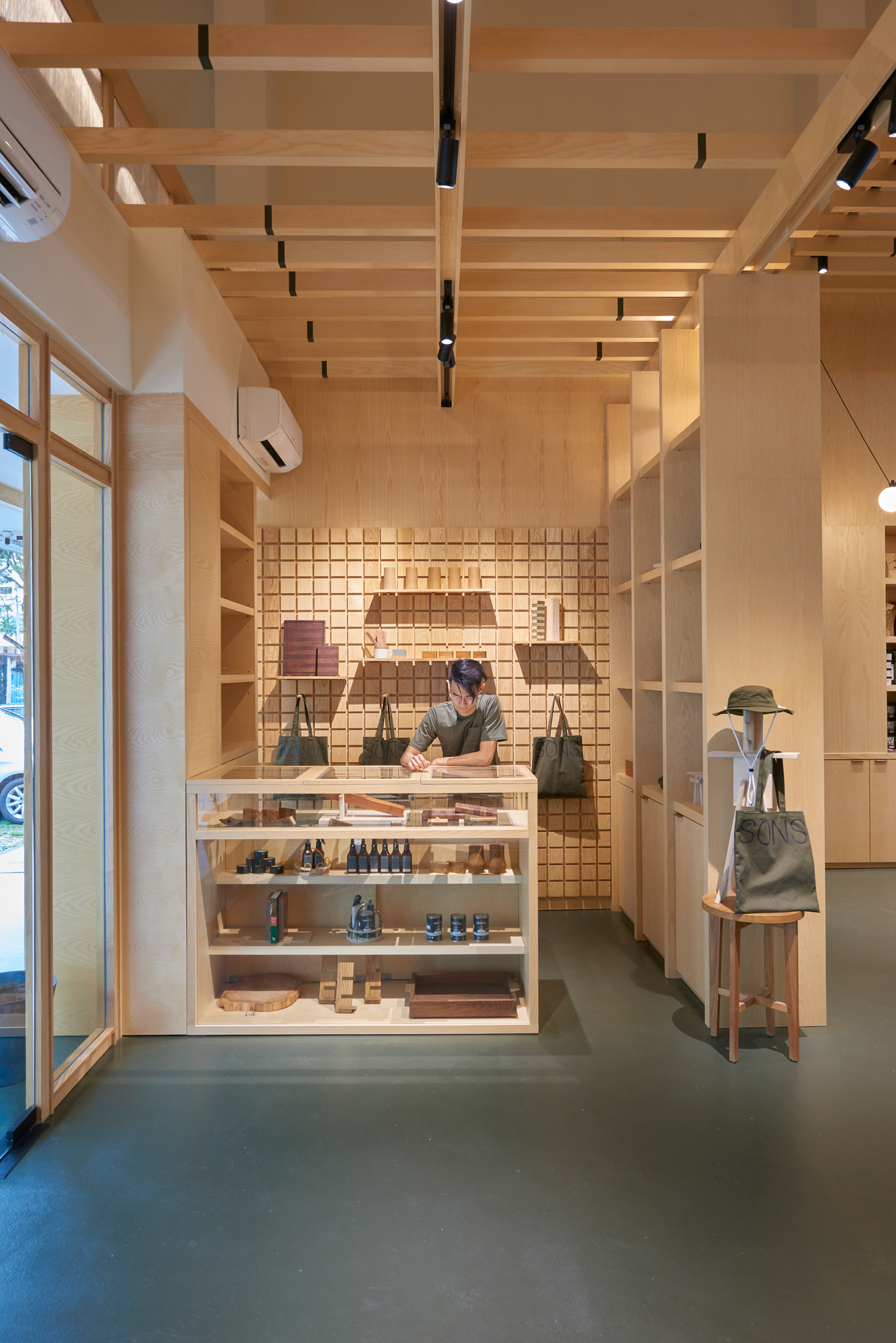
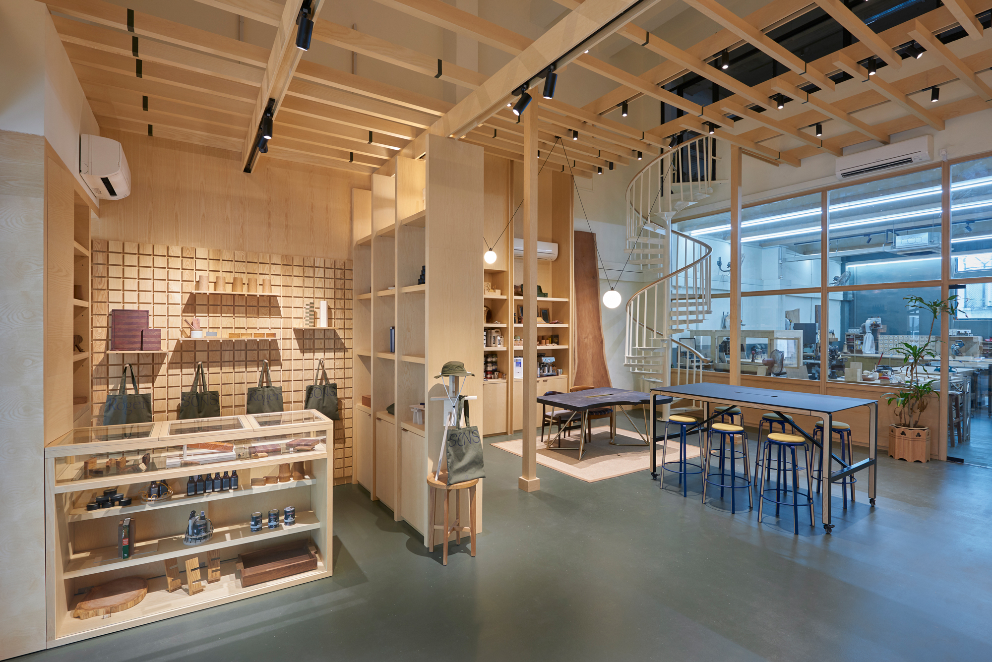
Roger&Sons are the next generation carpenters. A business founded by their father now helmed by three young brothers. They are a blend of old and new where established carpenters work alongside younger woodworkers, experimenting with modern techniques and pushing boundaries of woodworking craft. The updated logo mark consists of a more simplified version of the ampersand – an important symbol of the family business and kinship. The usage of a serif and a sans serif font in the logo underscores the traditional craft of woodworking with a new spirit taking it forward.




CREDIT
- Agency/Creative: Foreign Policy Design Group
- Article Title: Foreign Policy Design Rebrands Roger&Sons the Next Generation Carpenters
- Organisation/Entity: Agency, Published Commercial Design
- Project Type: Identity
- Agency/Creative Country: Singapore
- Market Region: Asia
- Project Deliverables: Brand Experience, Brand Identity, Brand Redesign, Brand Refinement, Brand Rejuvenation, Brand Strategy, Branding, Graphic Design, Identity System, Packaging Design, Rebranding, Retail Brand Design
- Industry: Construction
- Keywords: Branding, Rebranding, Logo, Brand Identity, Brand Design, Identity Design, Logo Design, Branded Interior Design, Singapore, Carpenters, Foreign Policy Design Group, Roger&Sons
FEEDBACK
Relevance: Solution/idea in relation to brand, product or service
Implementation: Attention, detailing and finishing of final solution
Presentation: Text, visualisation and quality of the presentation


