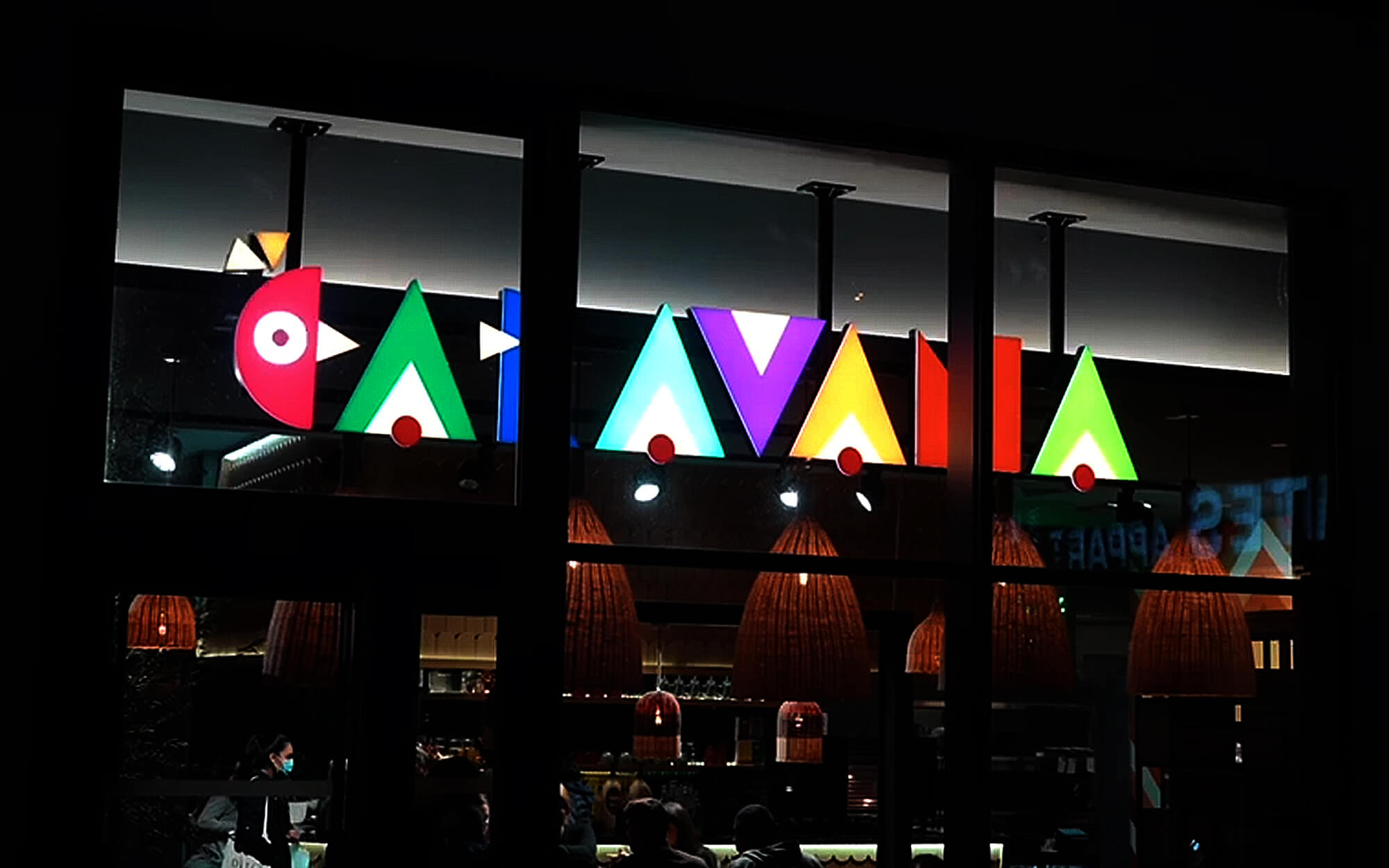
Brief: Quick Service Restaurants with chicken centred menus have been a runaway success in the last few years, and today they are adored all over the world. This unexpected success has put ideas in the minds of many entrepreneurs who want to try their own luck in this business – making this market a particularly competitive and crowded place. This was true for the French market as well – and the fact was clear to the people of Caravana, who wanted to start on the best terms possible. Their own version of the quintessential chicken-menu QSR had to be based on established and well recognised codes of the industry, but also had to introduce elements of freshness and distinctiveness.
Target Group: Casual diners of all backgrounds and groups, but especially young adults and families, based in Paris, France.
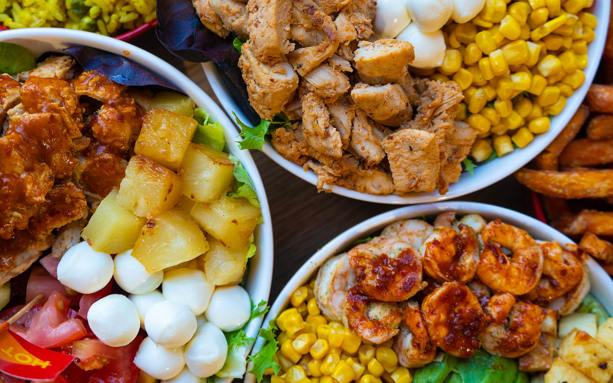
Concept: Though the menu of Caravana is obviously based almost entirely on chicken, predictability and boredom have absolutely no place here. And this is because a core characteristic of the Caravana offering is the extreme variety of preparation and serving alternatives, as well as the combos and sauces available. This is a celebration of choice, diversity and variability gone wild. Having such a wide range of choice is uplifting in its own right. Add to the picture the rich, colourful dishes that have the same effect on your mood and you have a great conceptual base in your hands.
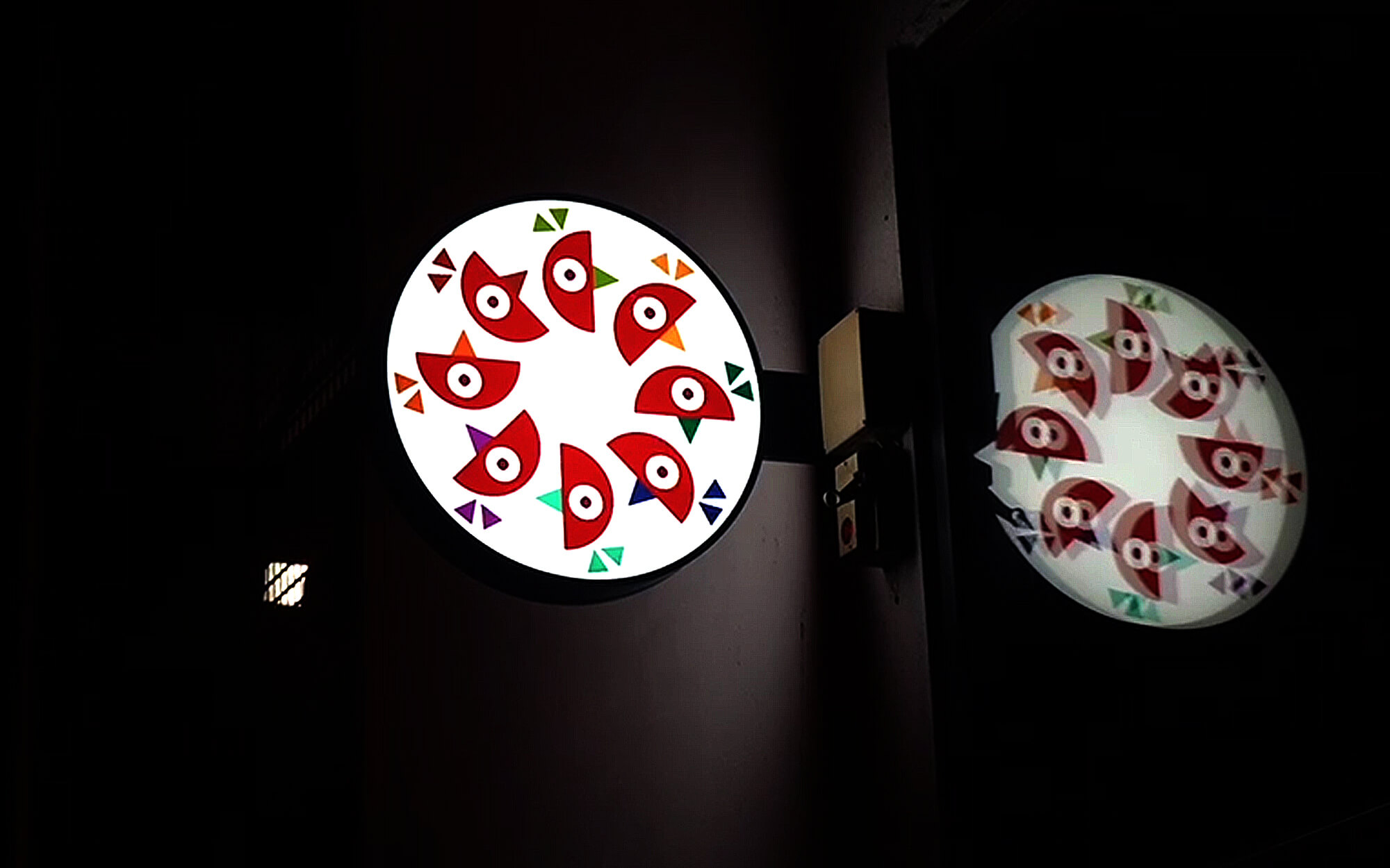
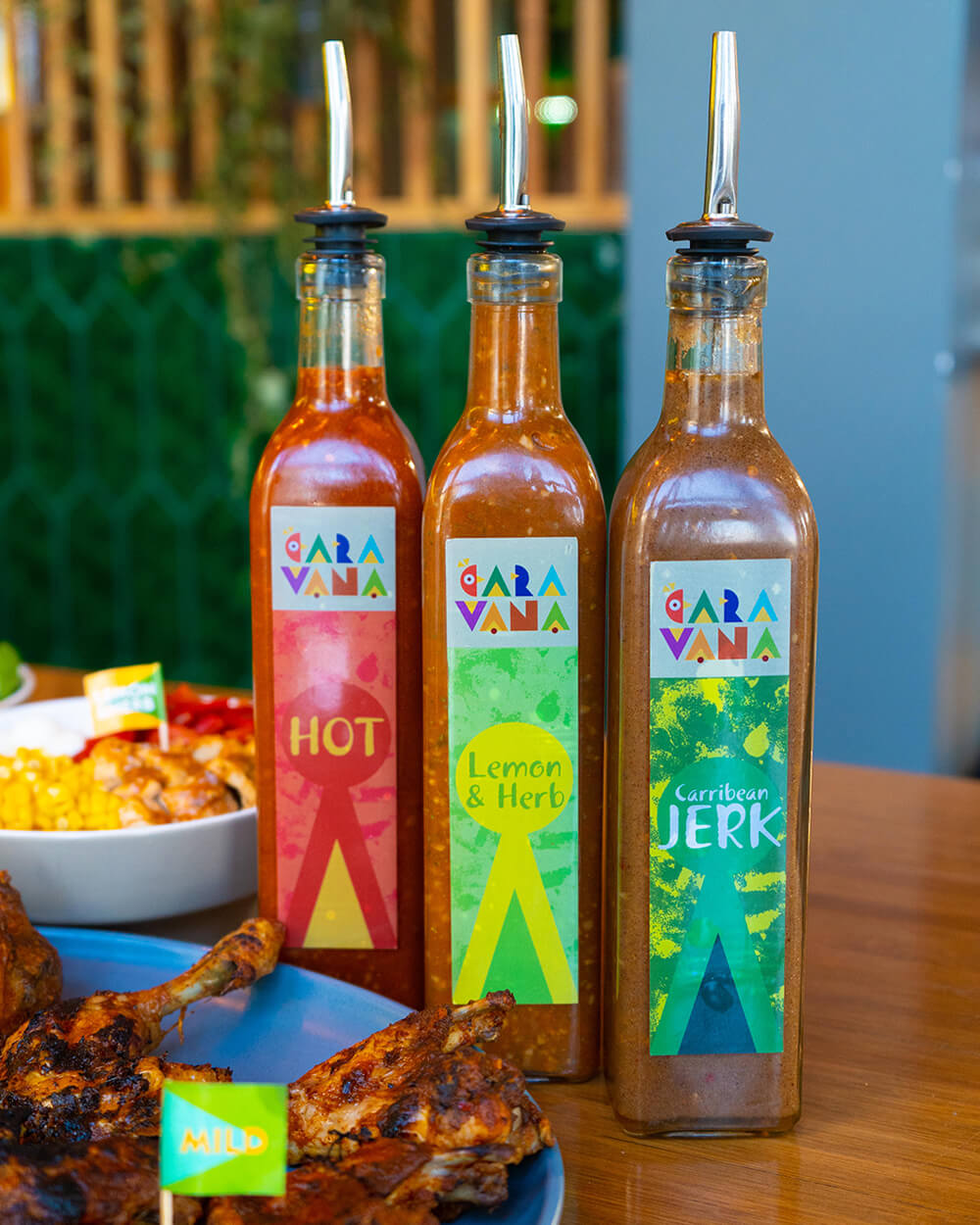
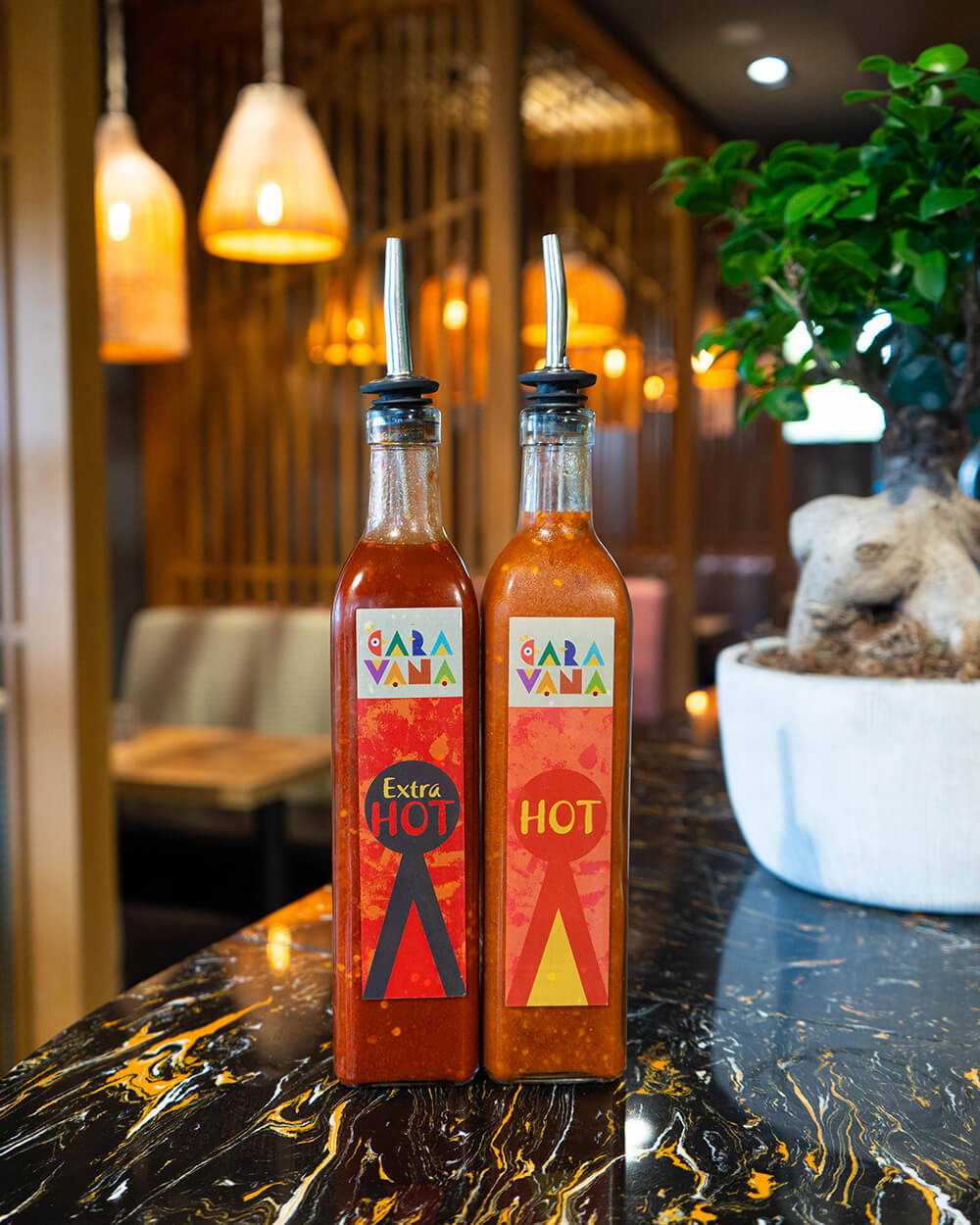
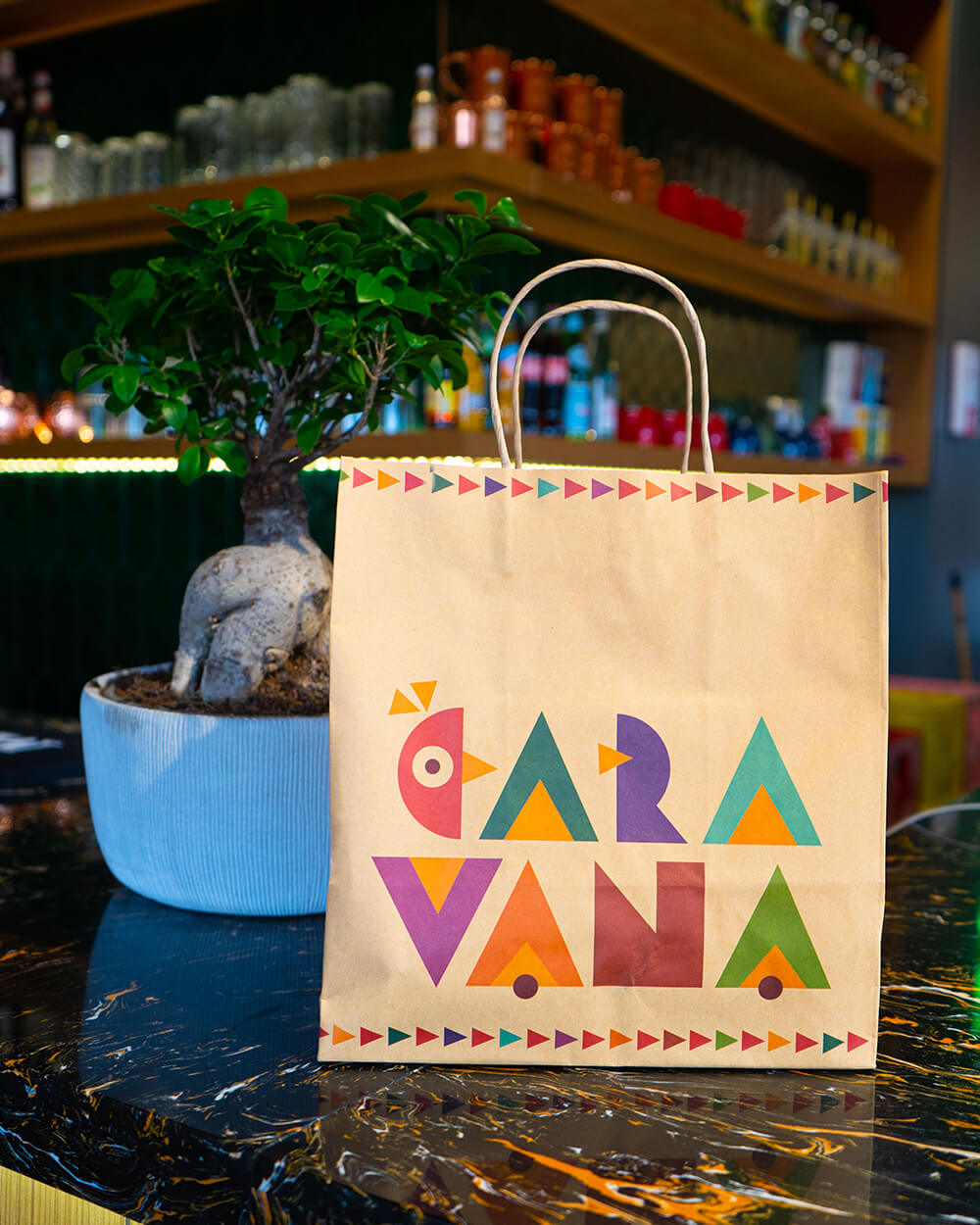
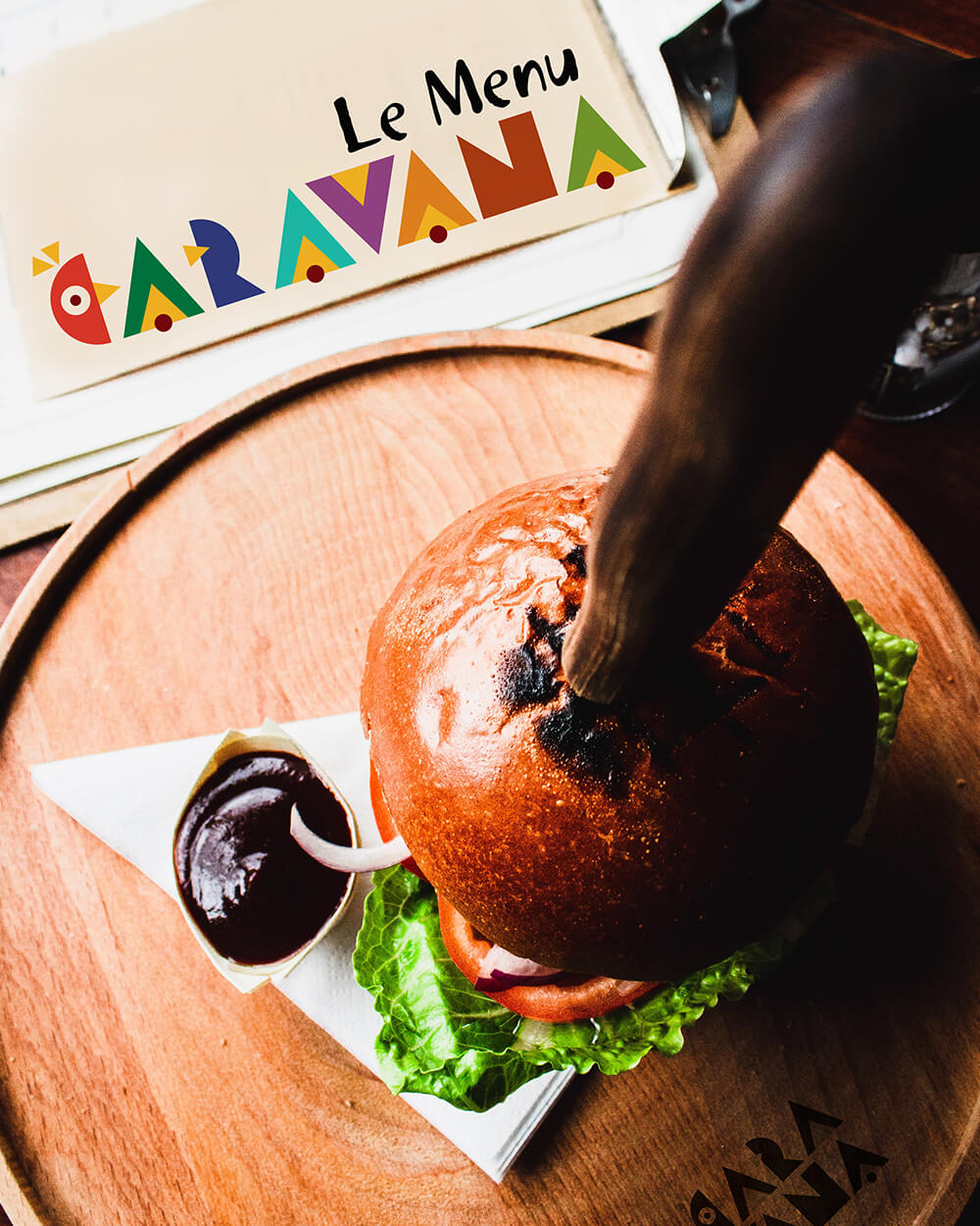
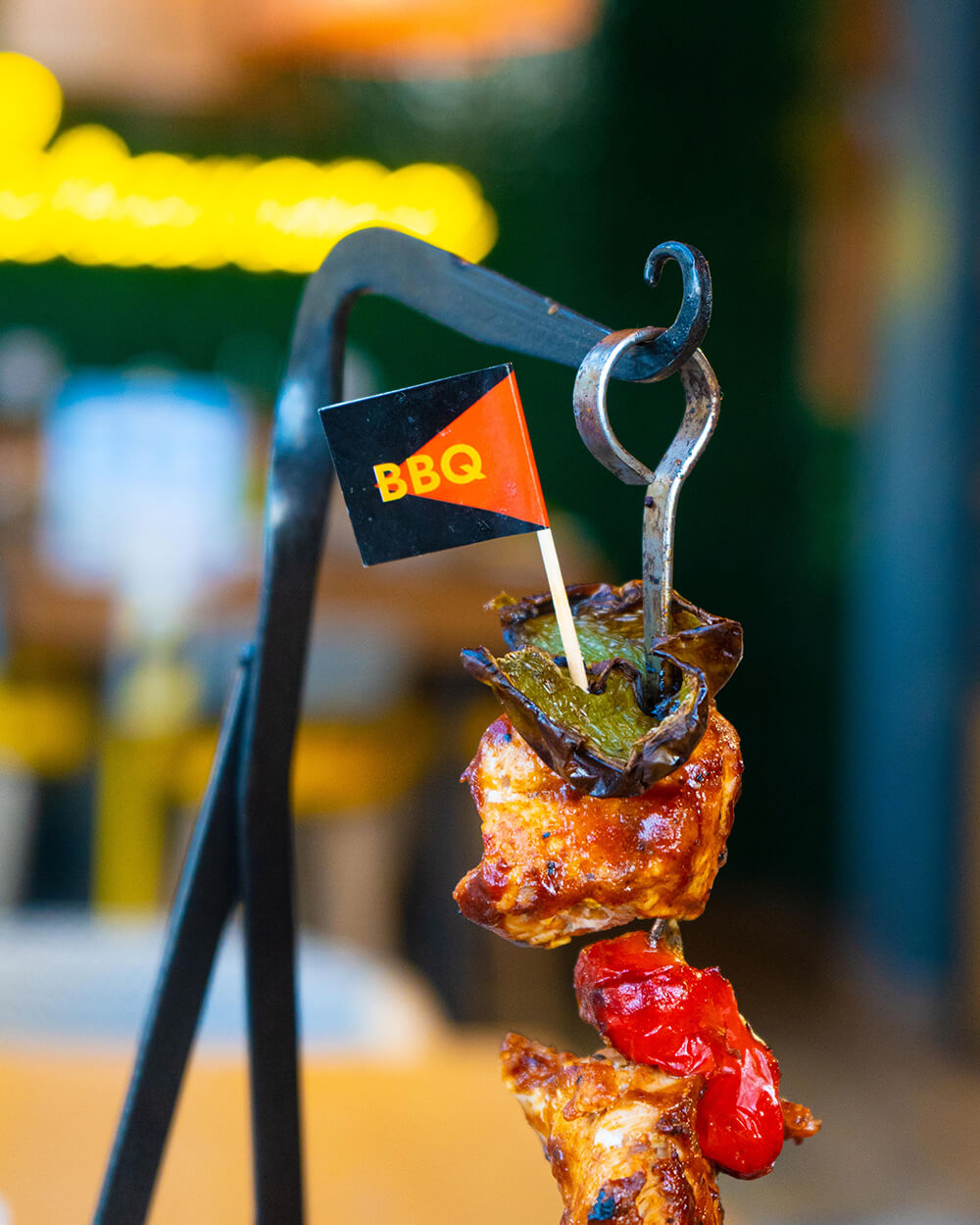
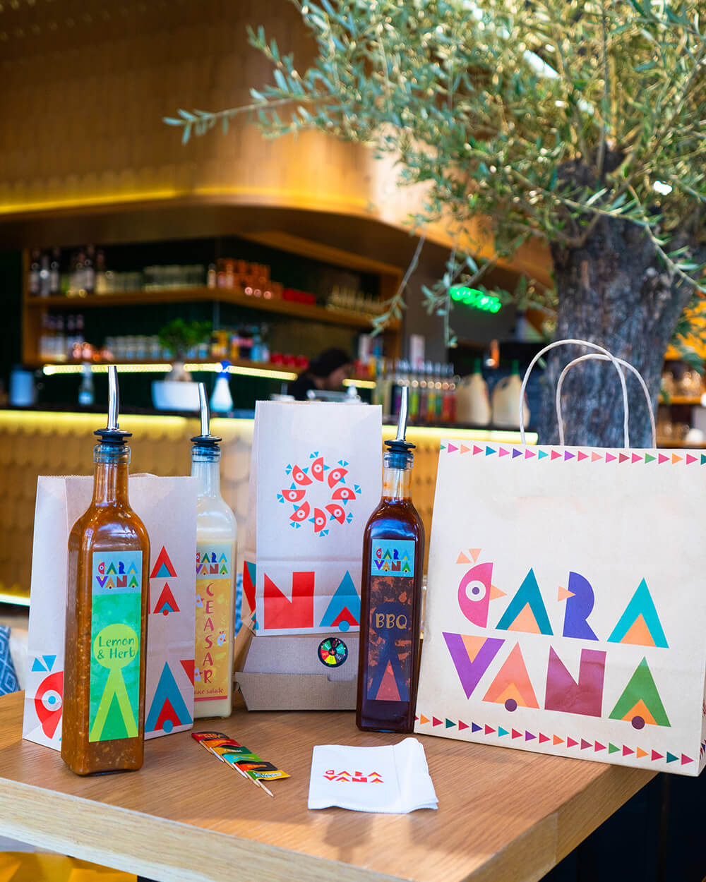
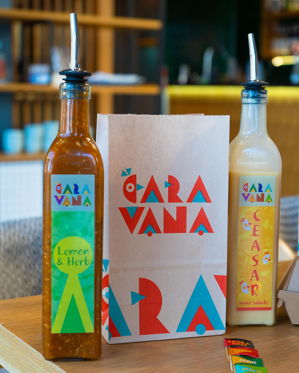
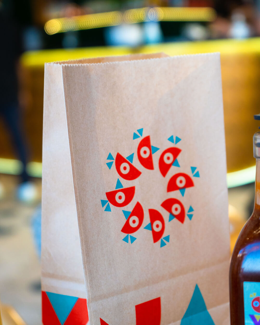
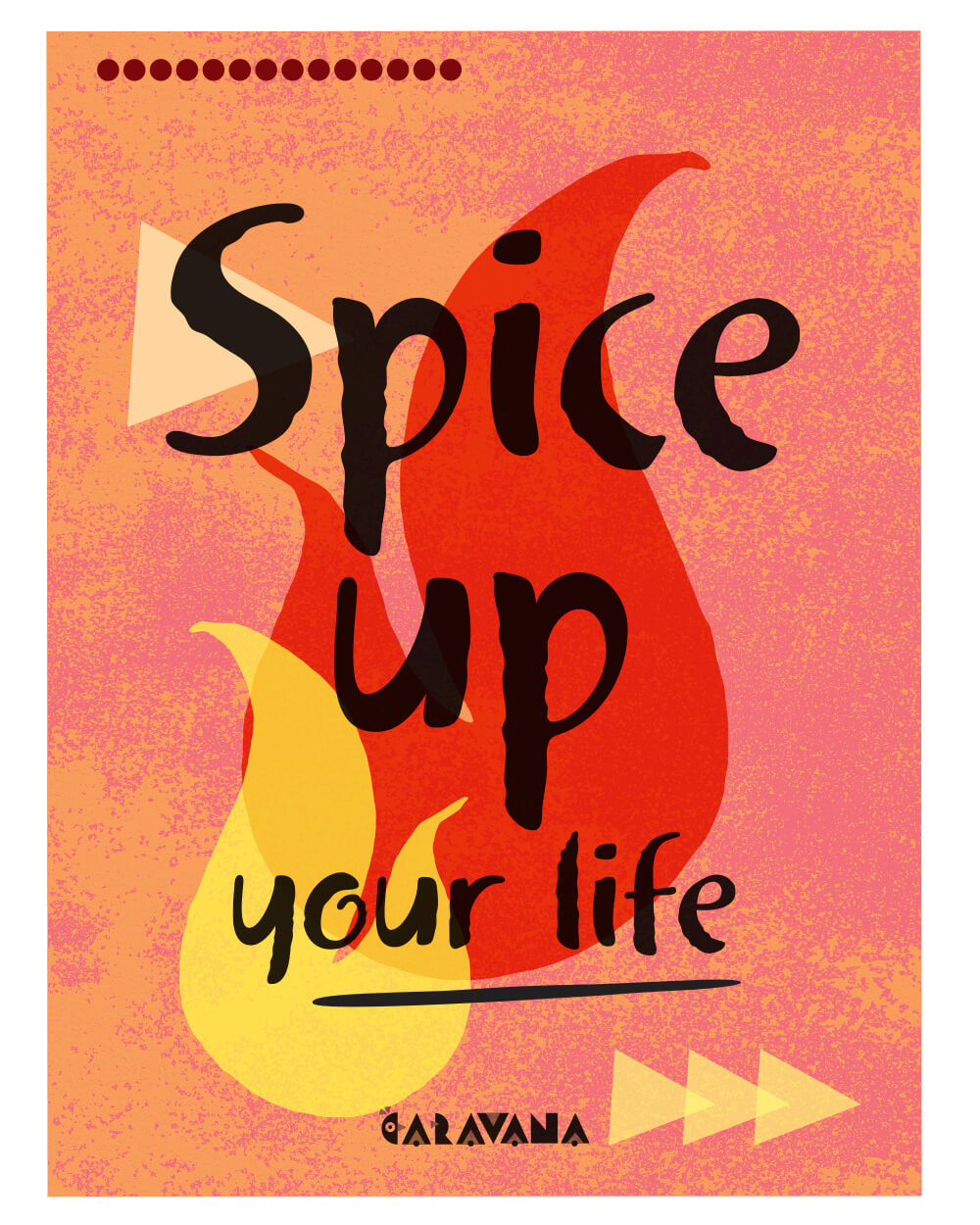
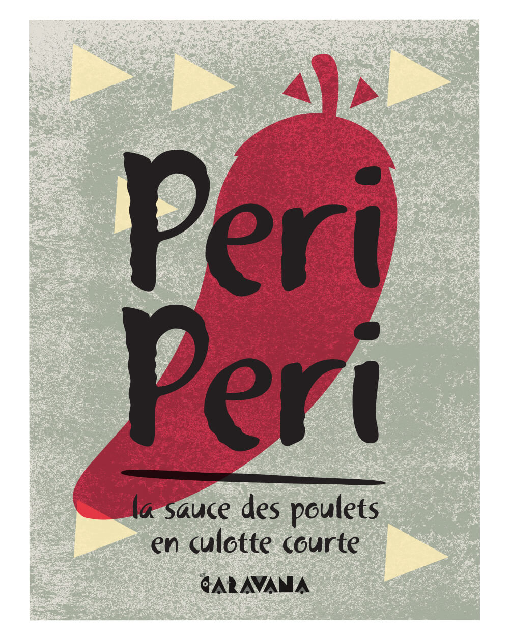
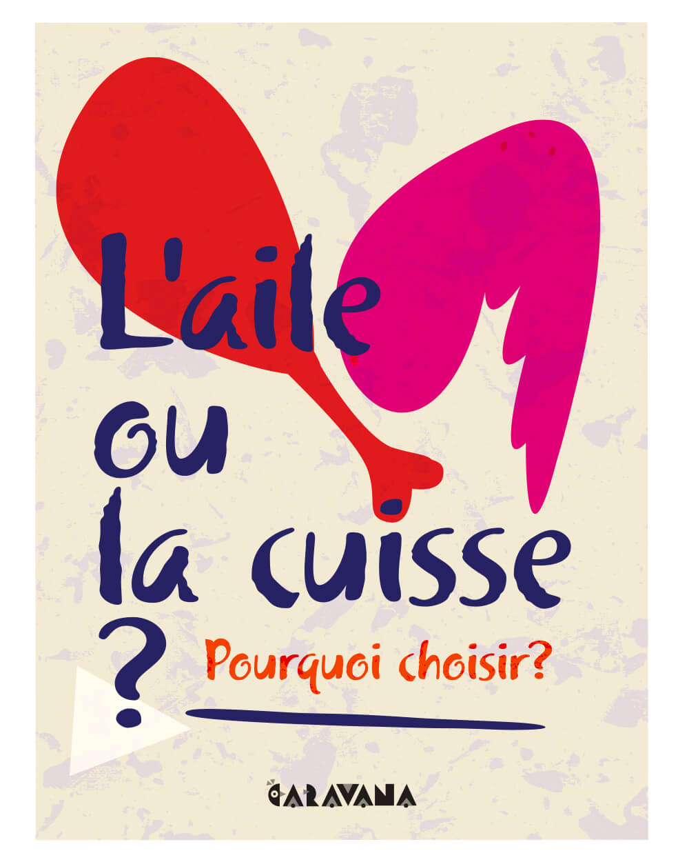
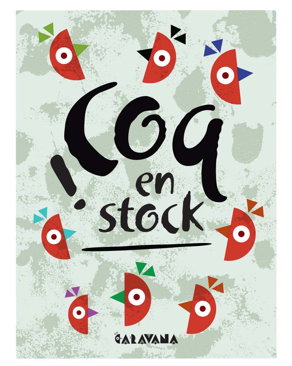
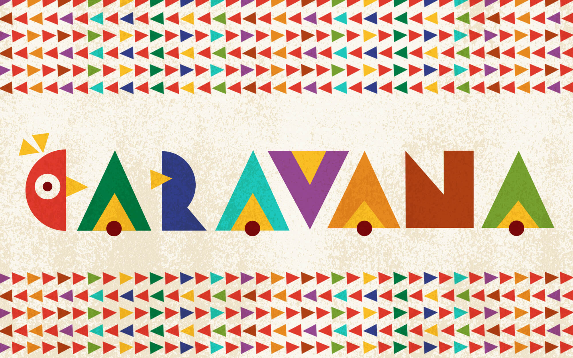
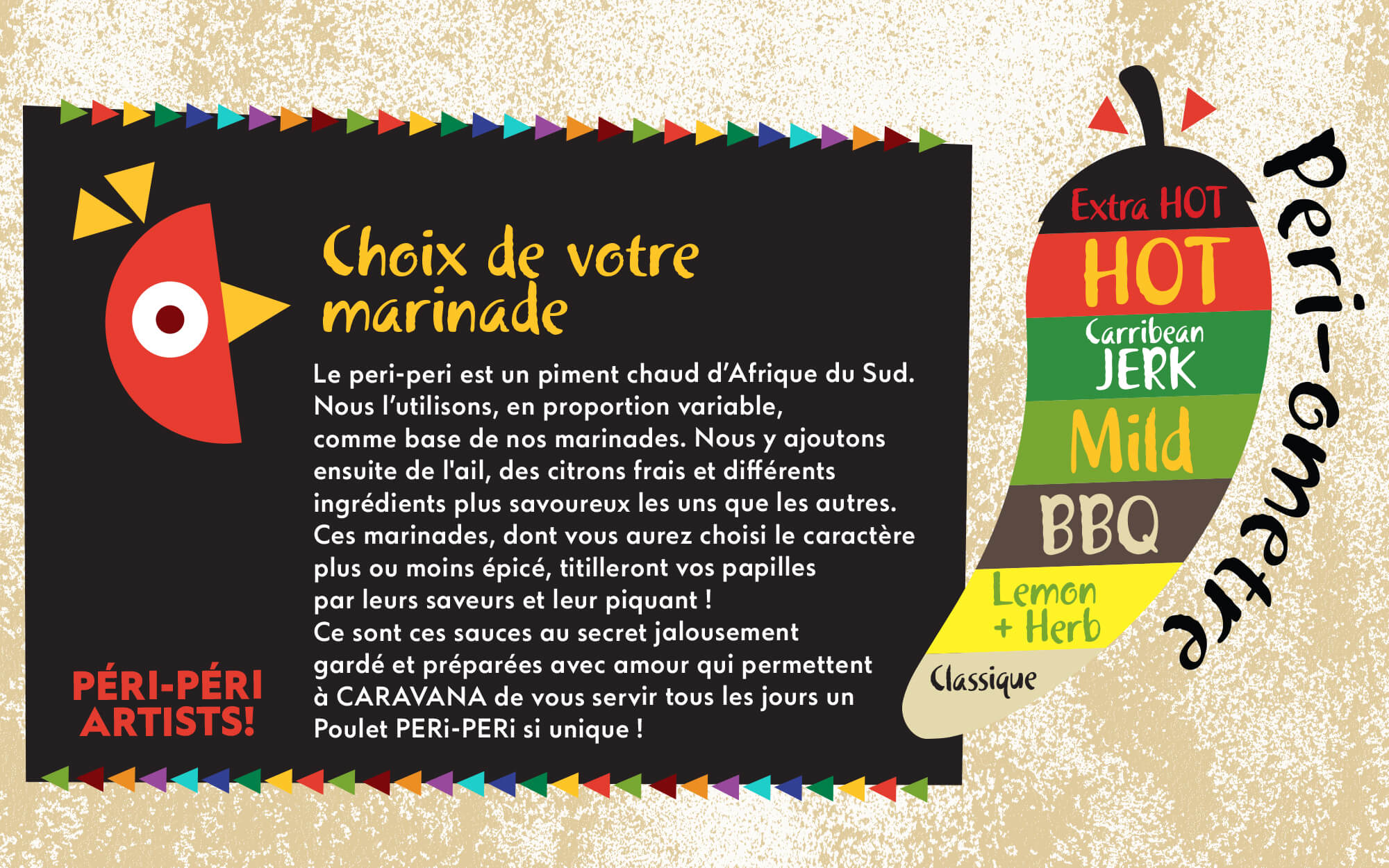
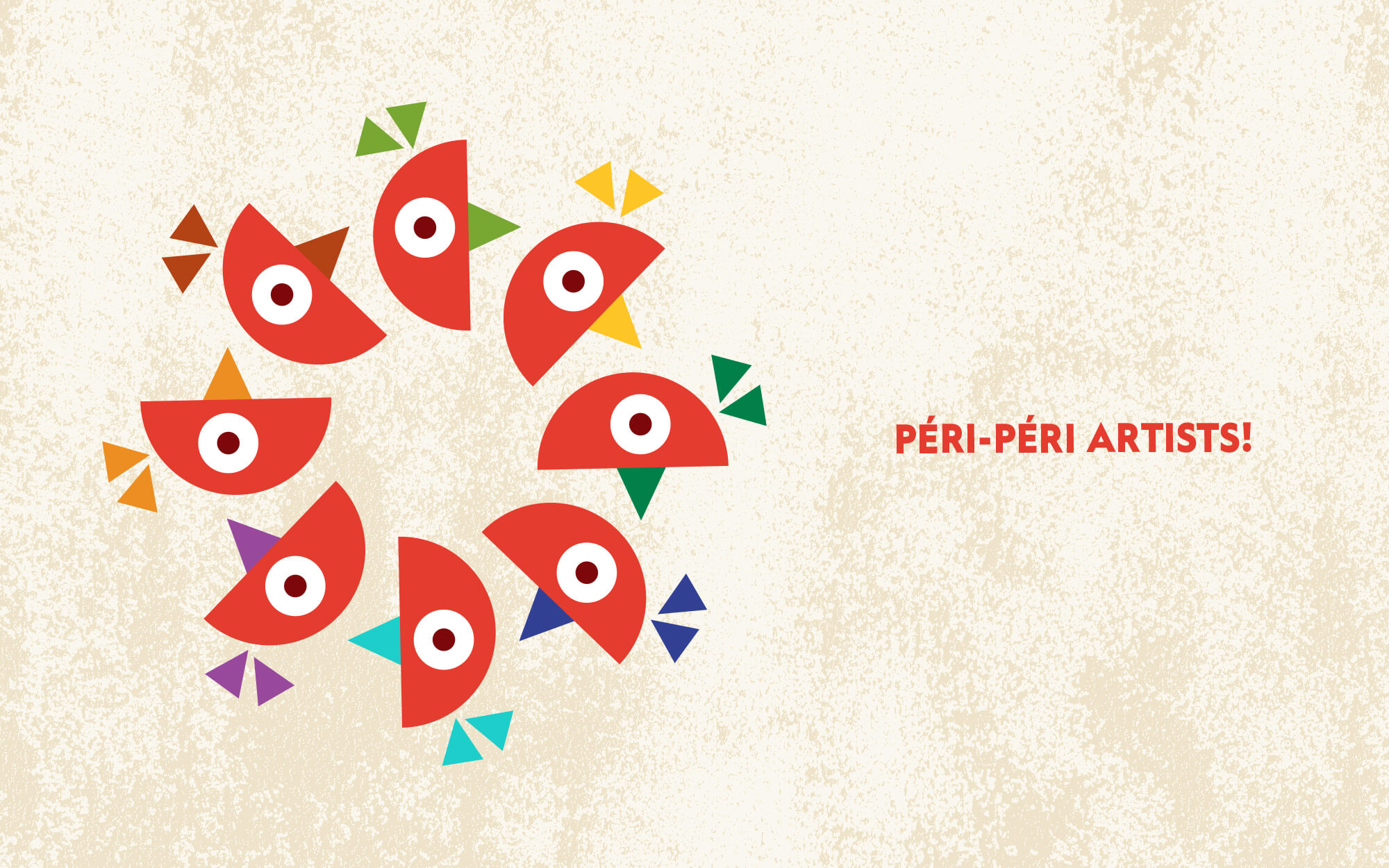
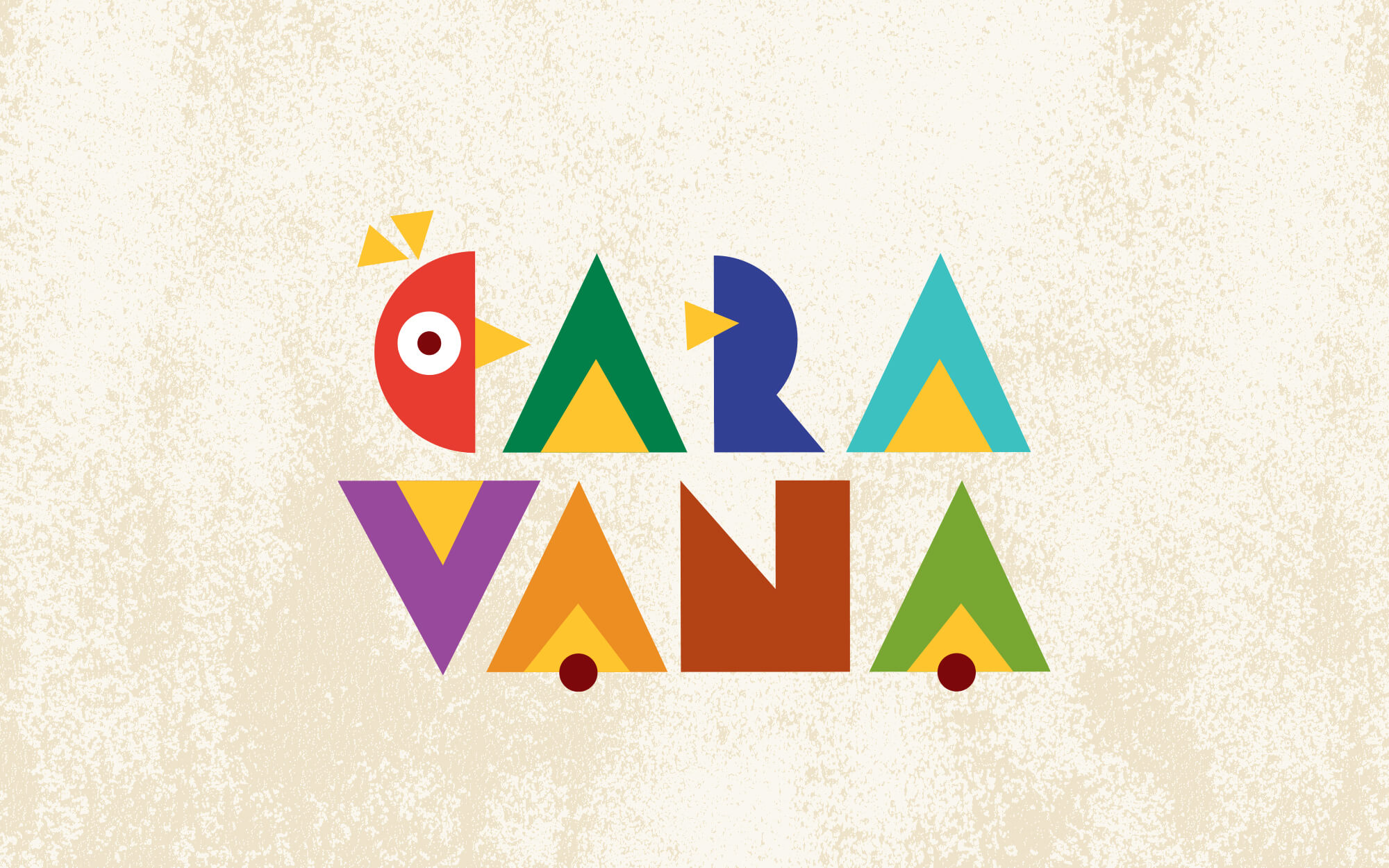
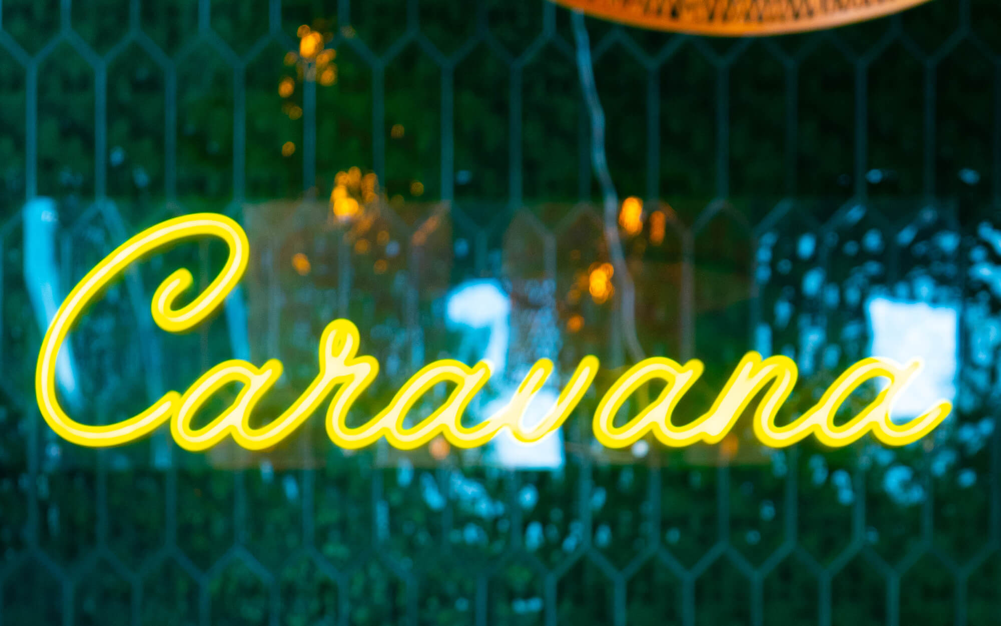
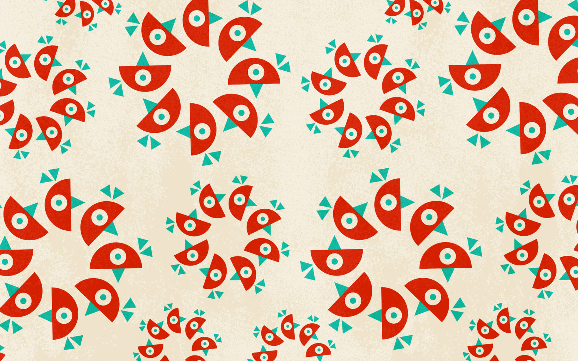
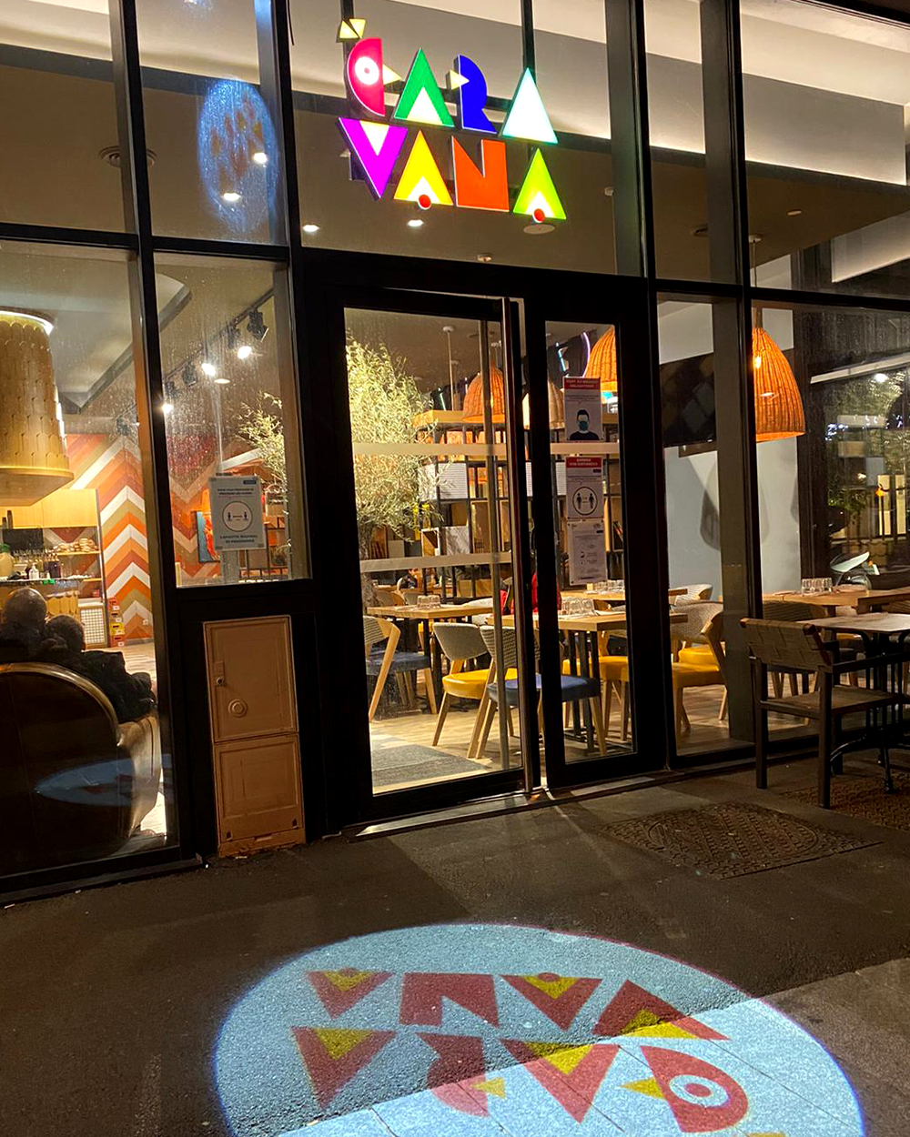
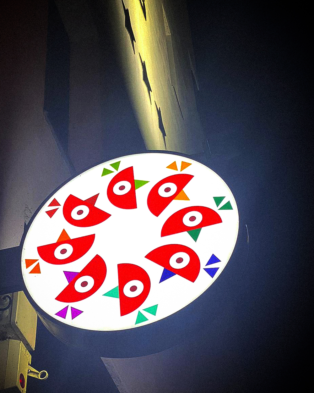
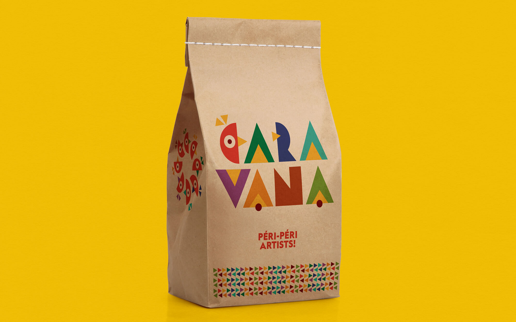
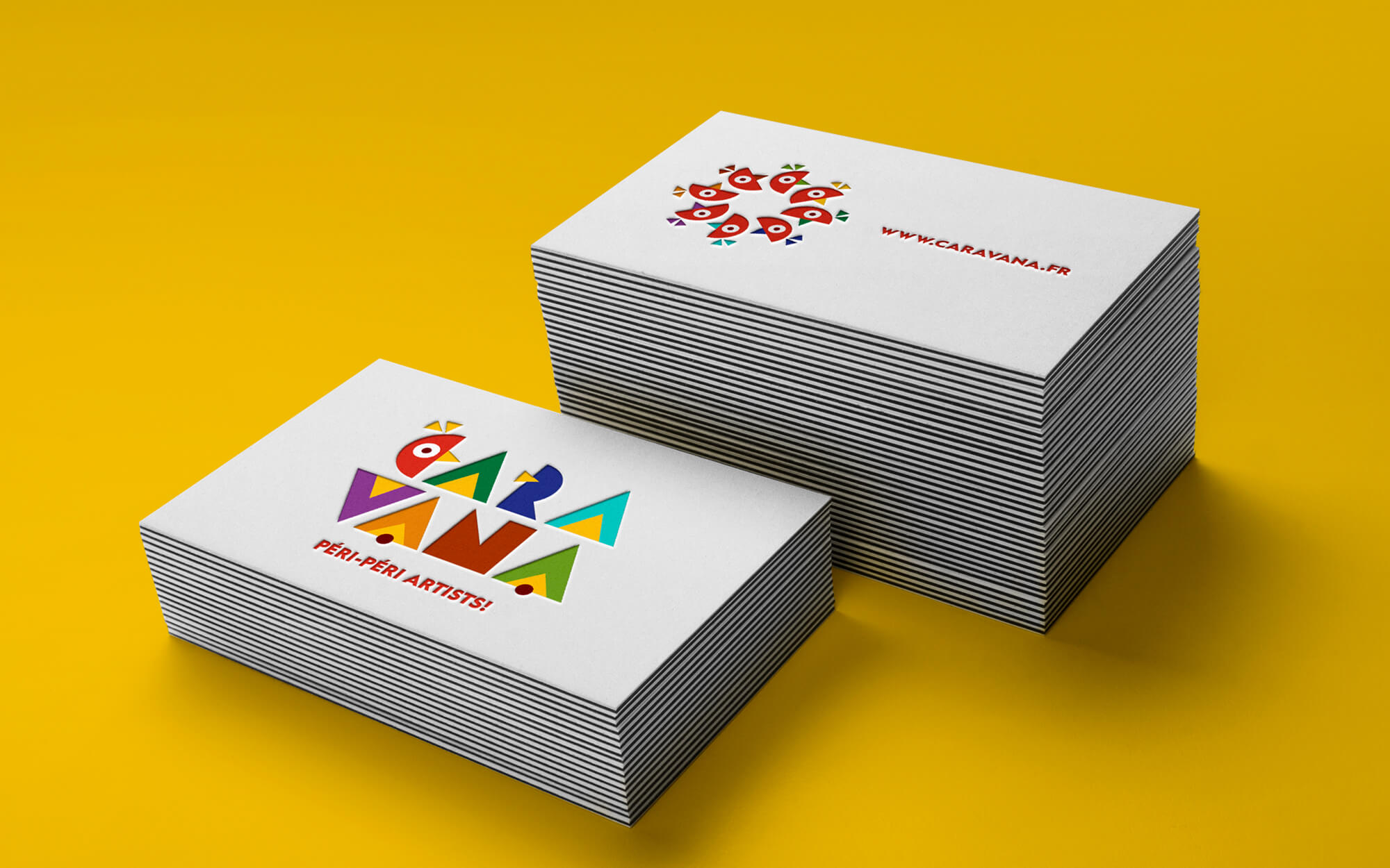
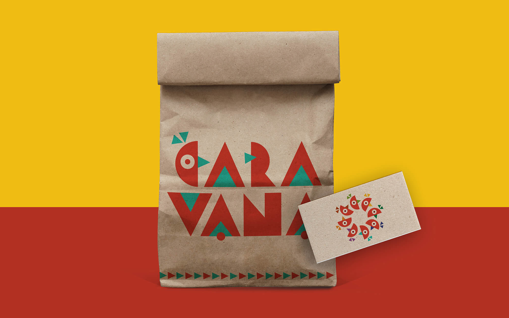
Design Approach: The proposed brand identity celebrates the wild recipes and flavours, the frenzy of shapes and colours that makes you salivate and makes your day. The specific palette used, seals the desired Latin American references, while the shapes of the lettering make the end-result even more friendly, everyday and inviting. Finally, an abstract chicken head in various permutations locks the focus of the restaurant chain. Importantly enough, the key concept was rolled out to dozens of applications. These followed strictly the same design spirit and emotional effect – from menus to sauce labels to takeaway bags, an uplifting colourful burst burns into your retina and makes the brand’s presence seriously felt.

CREDIT
- Agency/Creative: Sophia Georgopoulou | Design
- Article Title: Caravana Chicken Centred Restaurant With Branding by Sophia Georgopoulou
- Organisation/Entity: Freelance, Published Commercial Design
- Project Type: Identity
- Agency/Creative Country: Greece
- Market Region: Europe
- Project Deliverables: Brand Creation, Brand Identity, Brand World, Branding, Graphic Design, Identity System, Illustration, Packaging Design, Product Naming, Retail Brand Design
- Industry: Food/Beverage
- Keywords: chicken, restaurant, chicken restaurant, Paris, france, food, take away, fast food, shopping bag, craft, paper bag, paper box, label, restaurant identity, visual identity, brand identity, brand, branding, Sophia Georgopoulou design, sophiagdotcom


