Brief: We were asked breathe new life into an old brand that needed refreshing.
Solution: Our approach lead us to evolve and not wholly redesign the label, this wine had been listed for some time and to redesign would risk confusing existing buyers. So we decided to create a more abstract and modern version of the label and tale.
Produced in the hot South Australian climate, this full-bodied Shiraz has a rich taste with black fruits, a twist of pepper and hints of vanilla.
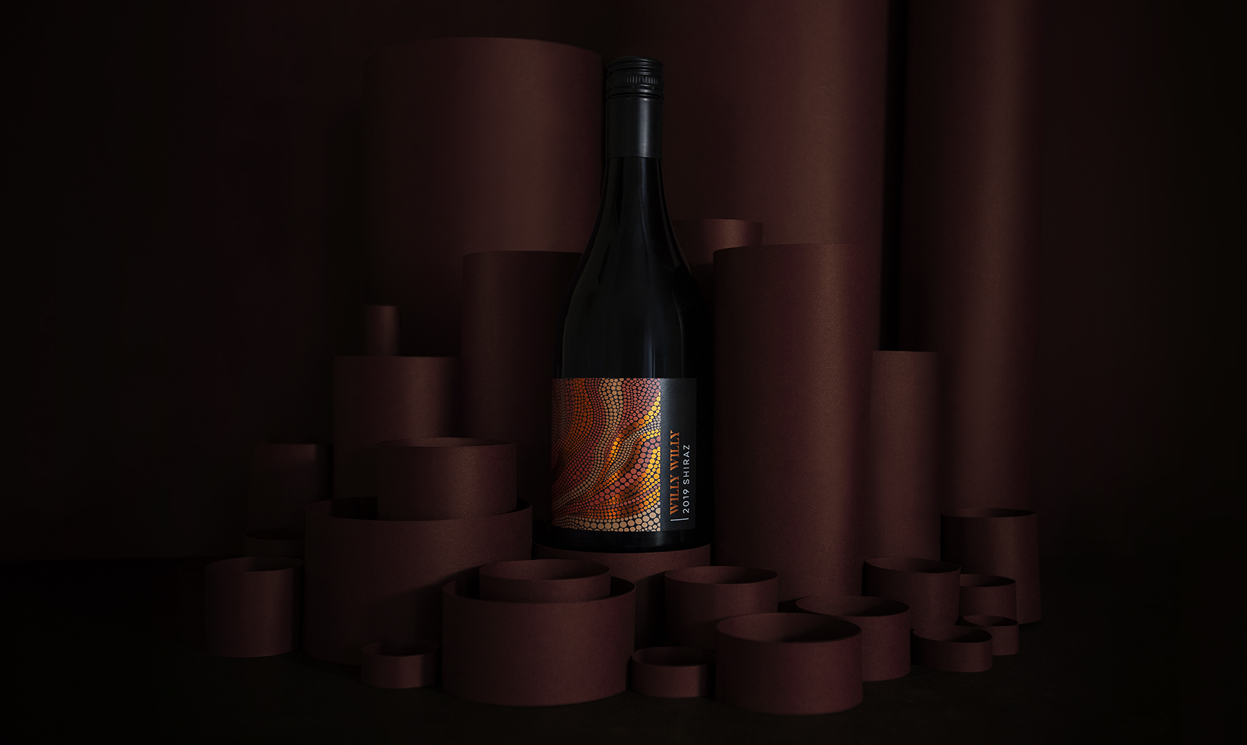
In the aboriginal language, ‘Willy Willy’ translates to ‘Dust Devil’, a tornado formed from the red and orange shades of soil found in Australia. Wanting to play on this exciting heritage, we decided to create something directly inspired by ancient aboriginal art, using a warm, deep colour palette inspired by the land.
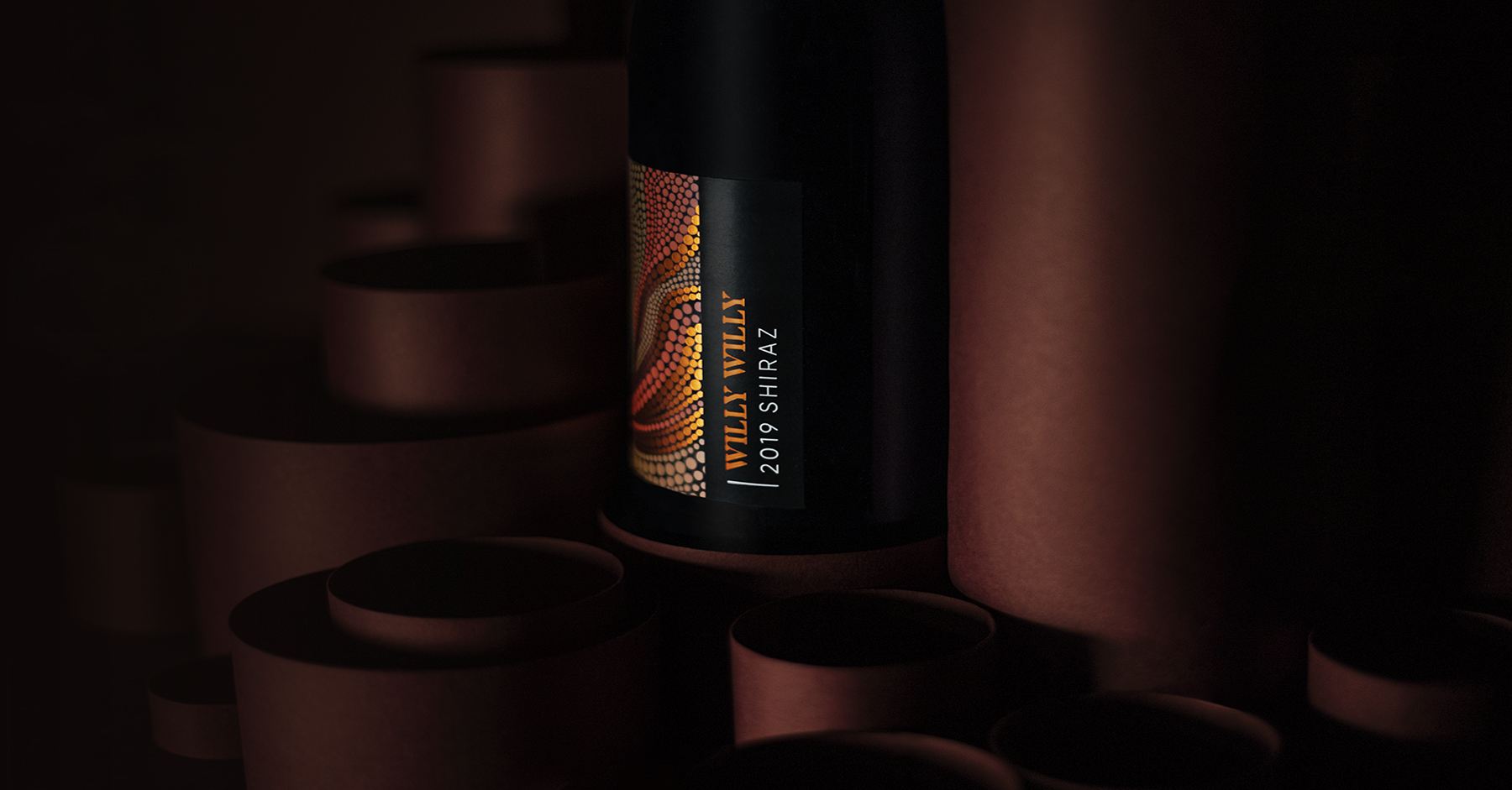
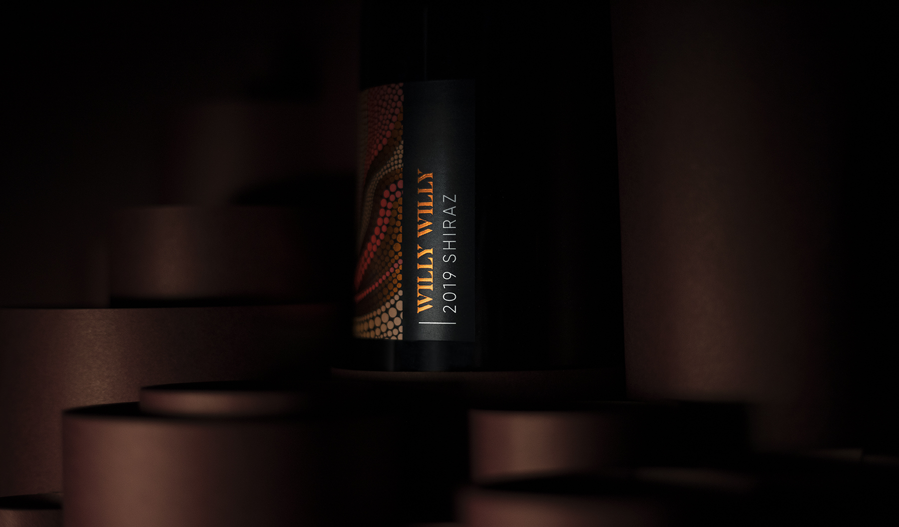
Crafted on a textured ebony paper, the brand name and wine type have been elegantly positioned vertically down the side of the label in a copper and white foil. We then created a robust aboriginal pattern that splits into different shades to show the rising tongues of fiery wind. These were set in striking Pantone colours as well as a burnt copper foil that makes the art glisten across the side of the bottle.
Overall, the striking design and contrast of bold colours has elevated the product not only visually, but commercially for our client, showing that first impressions make all the difference.


CREDIT
- Agency/Creative: Masters of Brands
- Article Title: Masters of Brands Evolves Willy Willy Brand to Reach New Heights
- Organisation/Entity: Agency, Published Commercial Design
- Project Type: Packaging
- Agency/Creative Country: United Kingdom
- Market Region: Global
- Project Deliverables: Brand Redesign, Brand Rejuvenation, Branding, Graphic Design, Illustration, Packaging Design, Photography, Rebranding, Research, Retail Brand Design, Tone of Voice
- Format: Bottle
- Substrate: Glass Bottle


