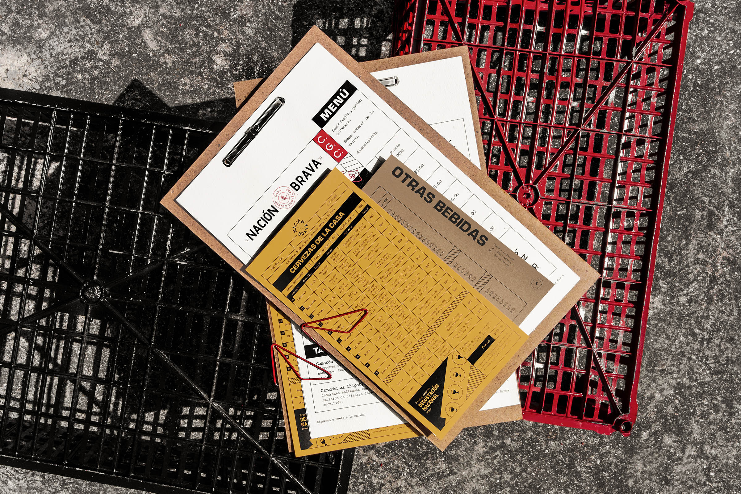
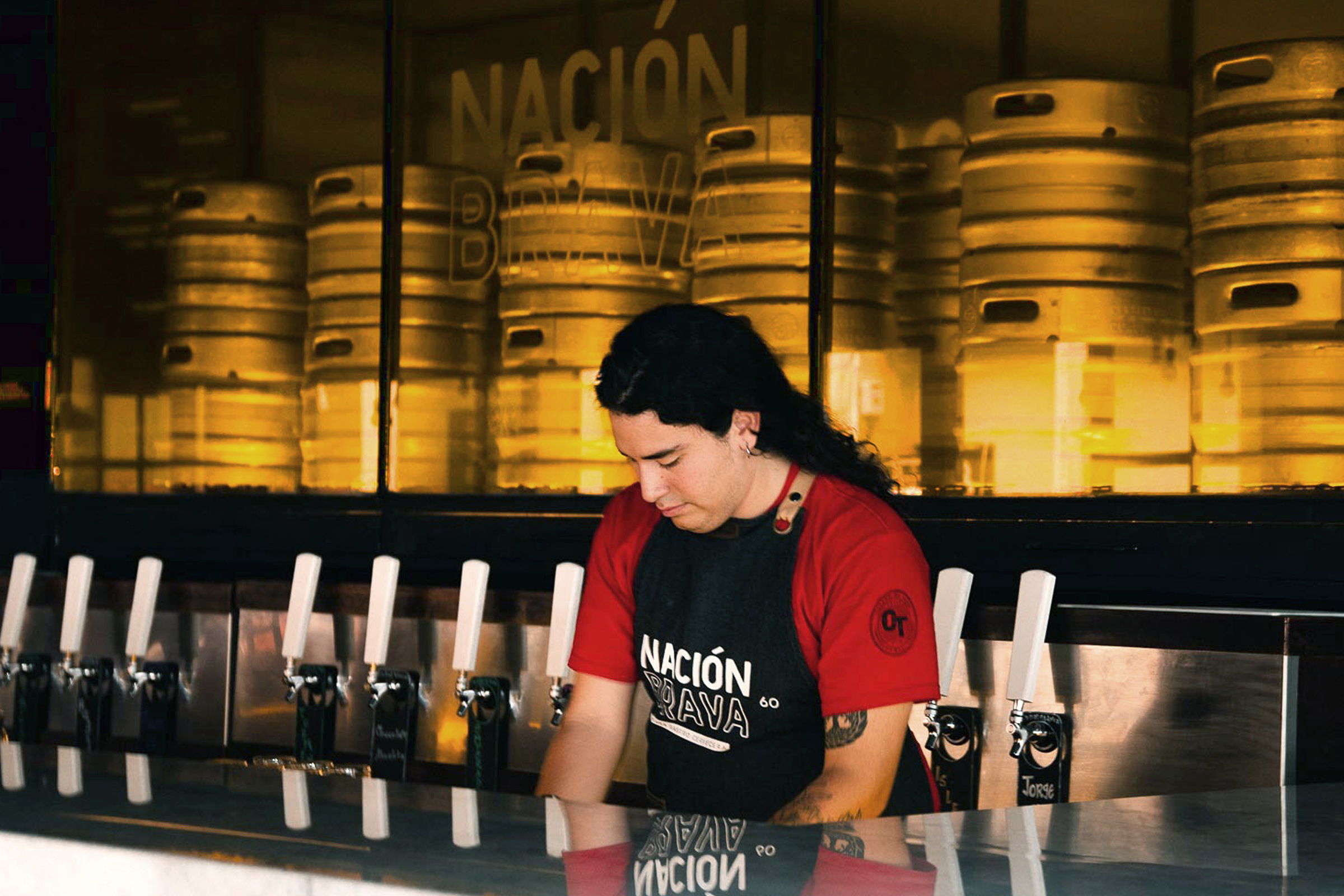
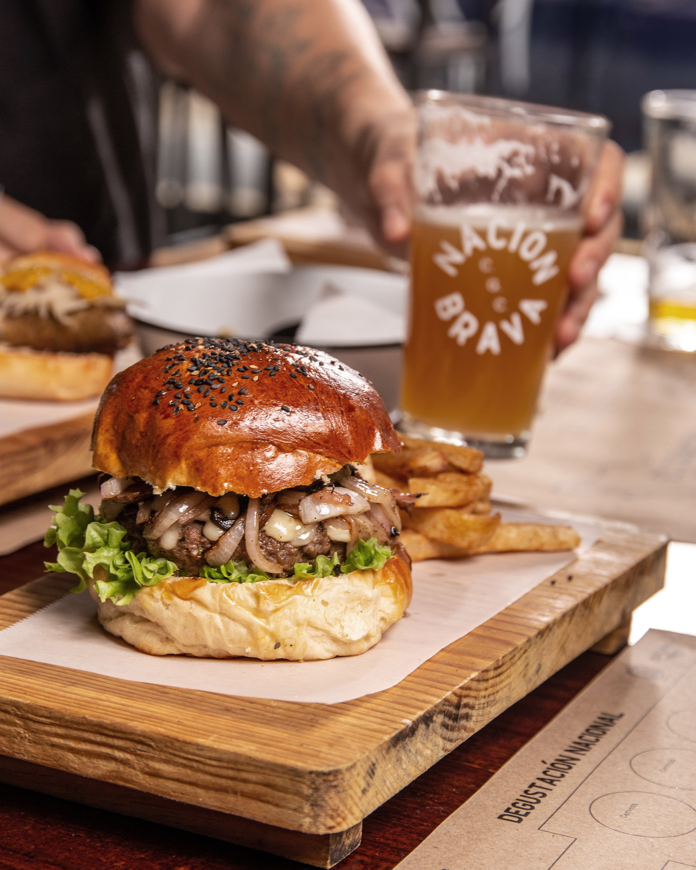
Nación Brava is a gastro-brewery that offers authentic taste experiences in a warm and accessible atmosphere, full of attitude.
This brave space is the result of the fusion between two breweries, which united their identities to create the energy that makes this Nation unique.
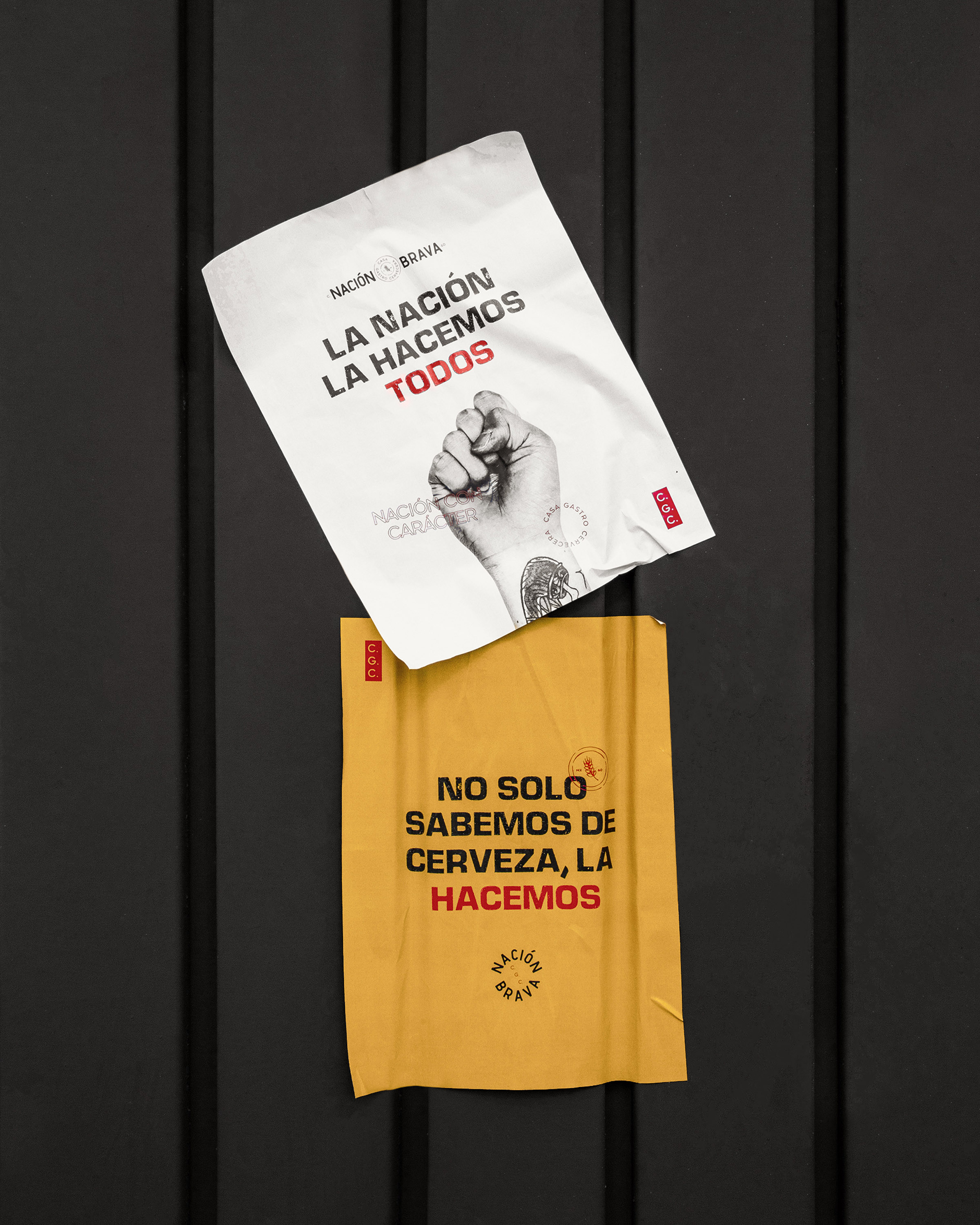
Inspired by the sense of belonging, we created an identity for those seeking a home away from home, for locals who are tourists in their own city, and for rebels with a cause who are passionate about food and beer.
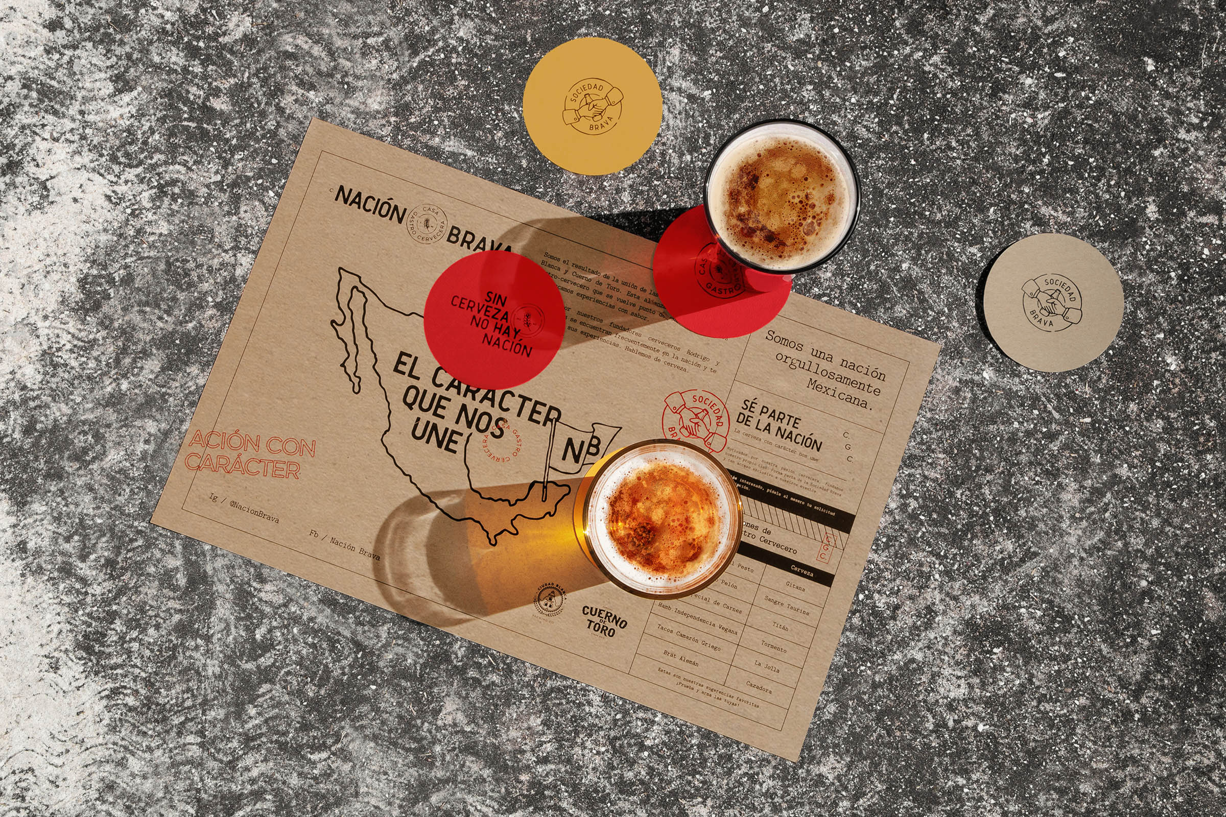
The name Nación Brava came from the fusion of two breweries. The first, Ciudad Blanca, evolved into Nación to form a territory that does not distinguish borders, where everyone shares the passion for artisanal beer. On the other hand, the bravura that characterizes the second brewery, Cuerno de Toro, creates a rebellious attitude that fills every corner of this nation of flavor with energy.
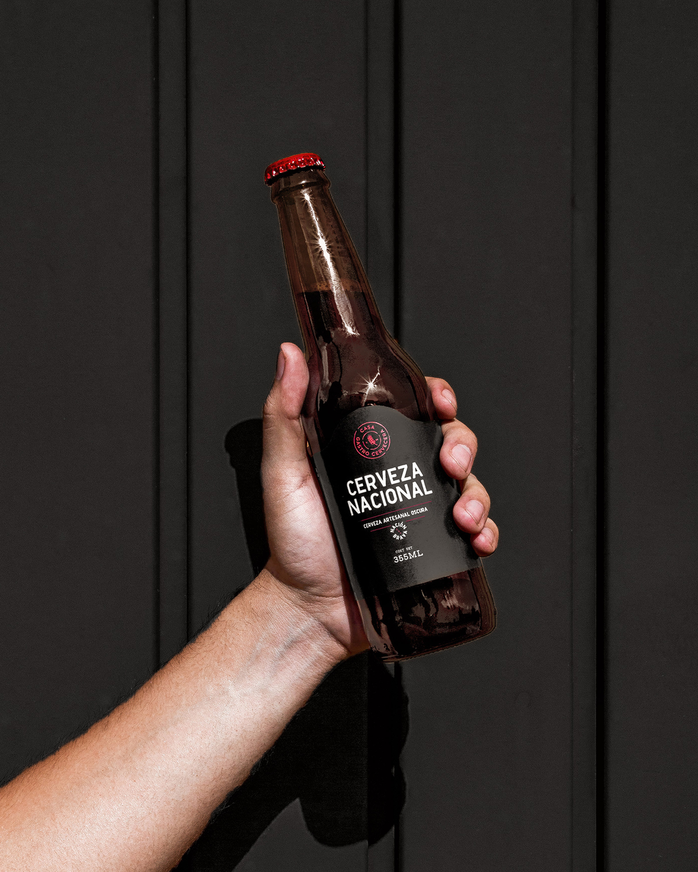
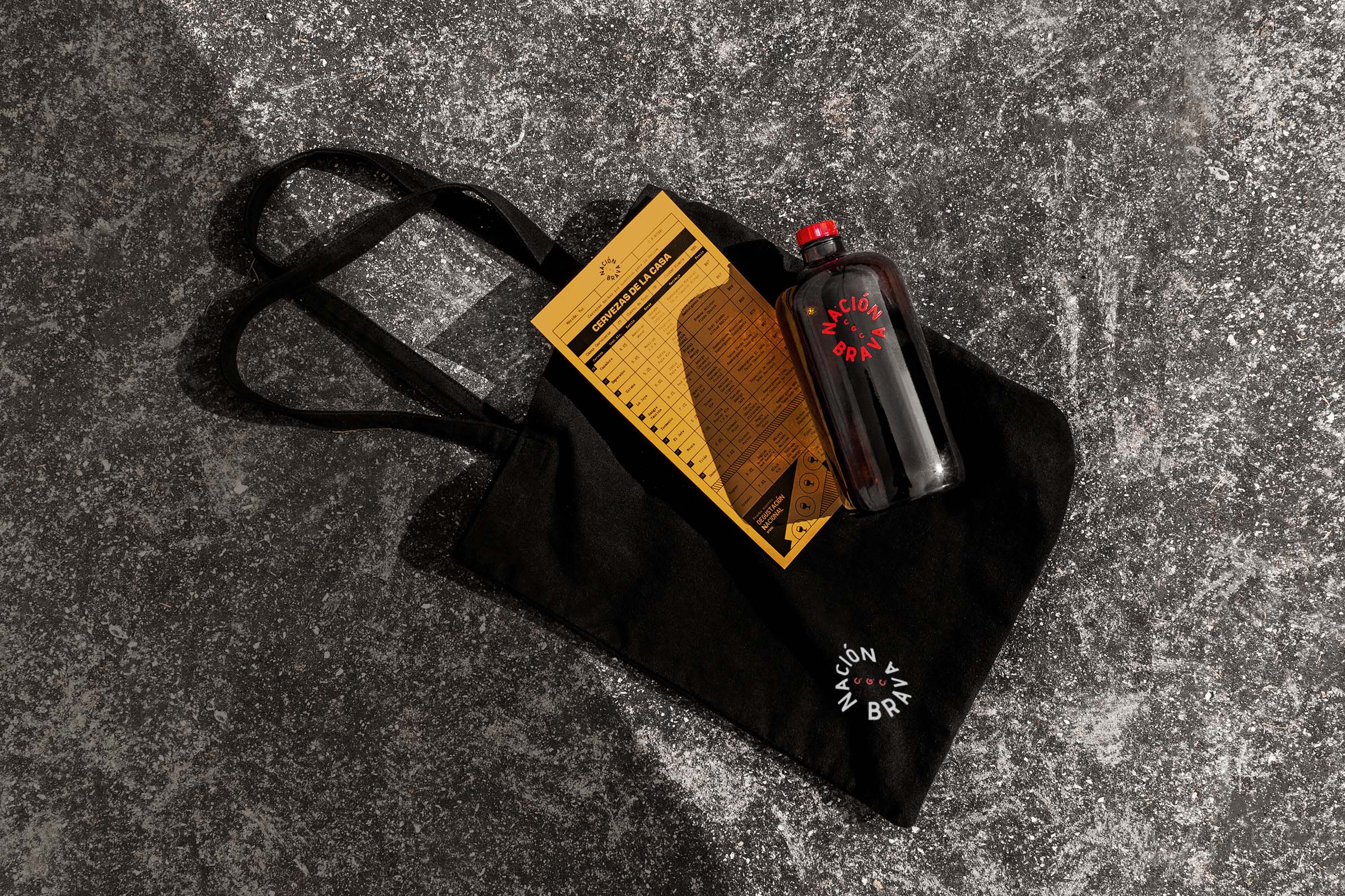
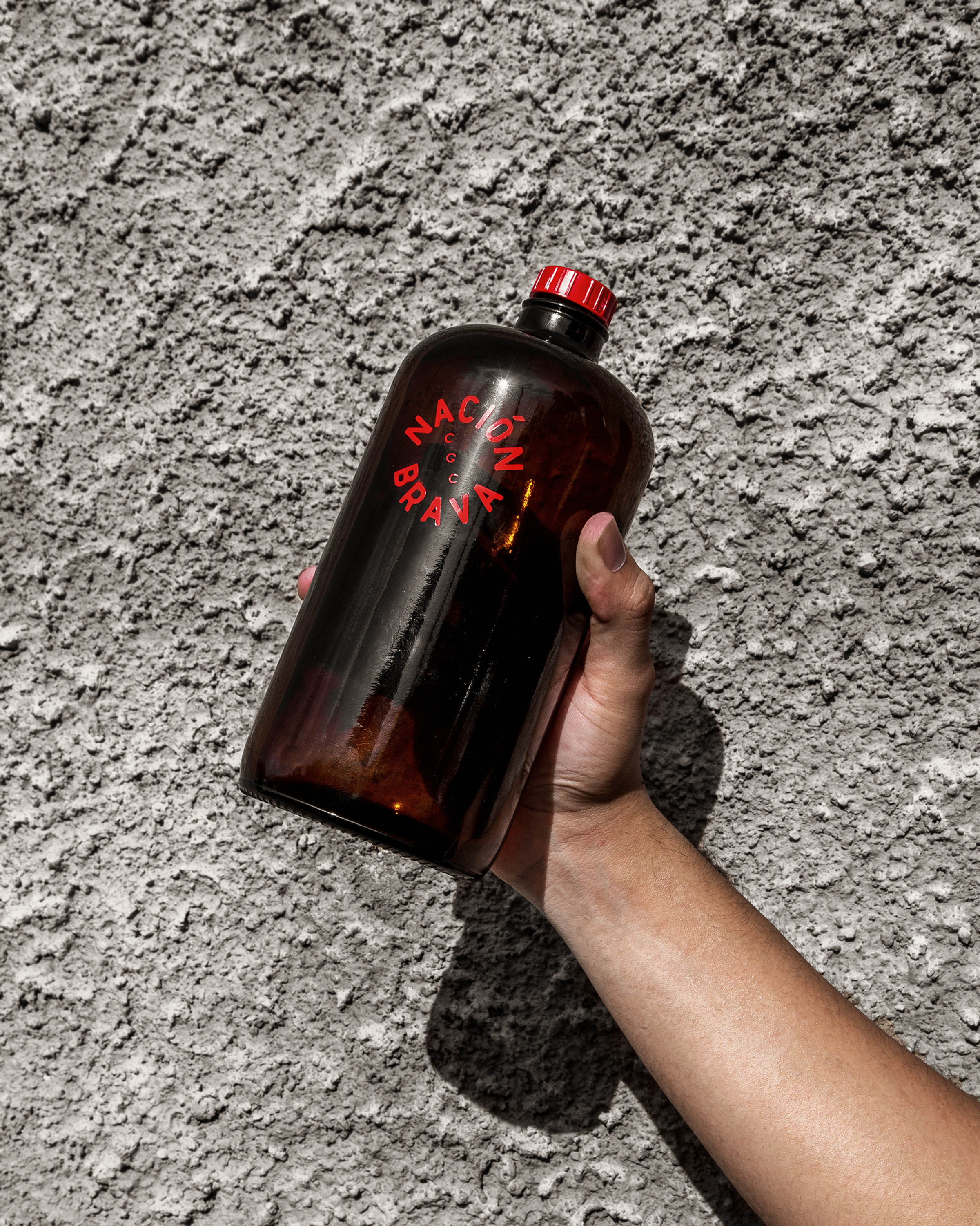
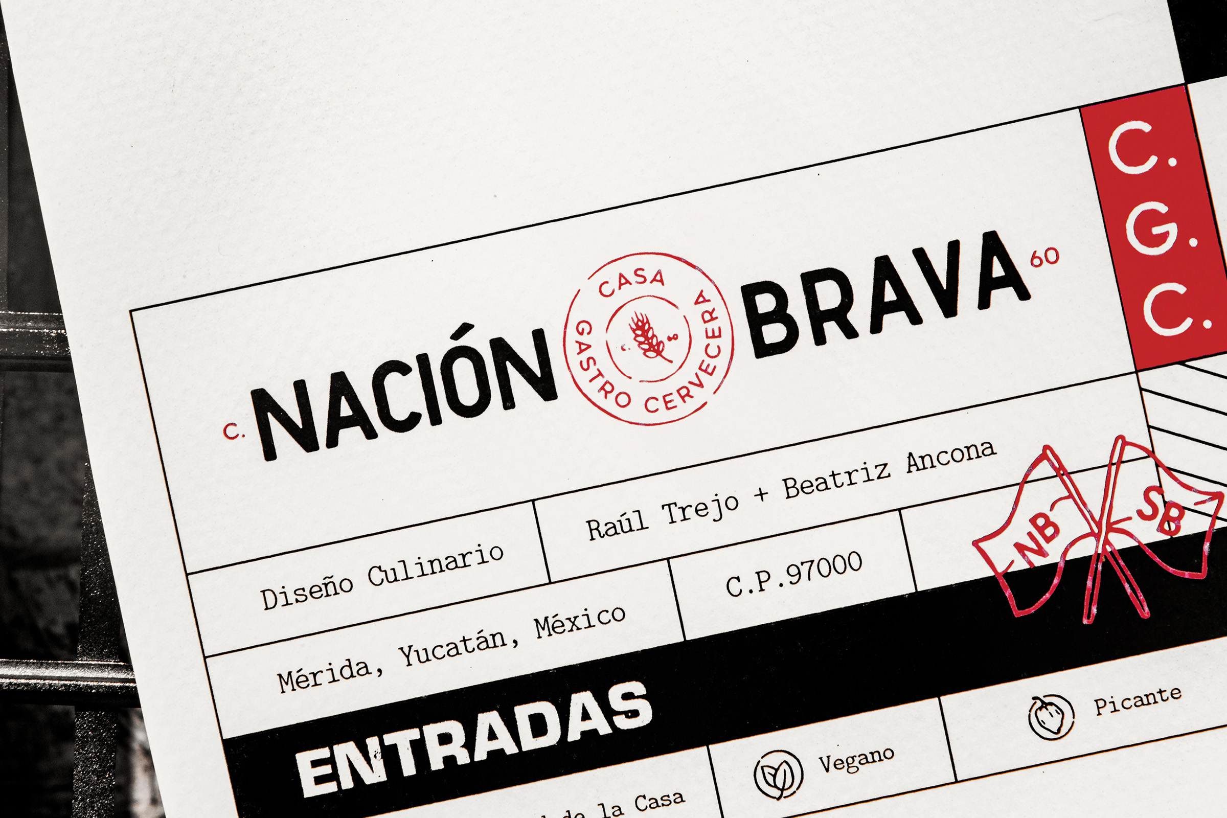
We designed the logo by hand, digitizing it later to preserve the small imperfections that arose in the process, thus capturing the artisan touch that characterizes Nación Brava’s beer.
For the color palette, we started with one of the elements that represent the brand’s personality – it’s brave attitude.
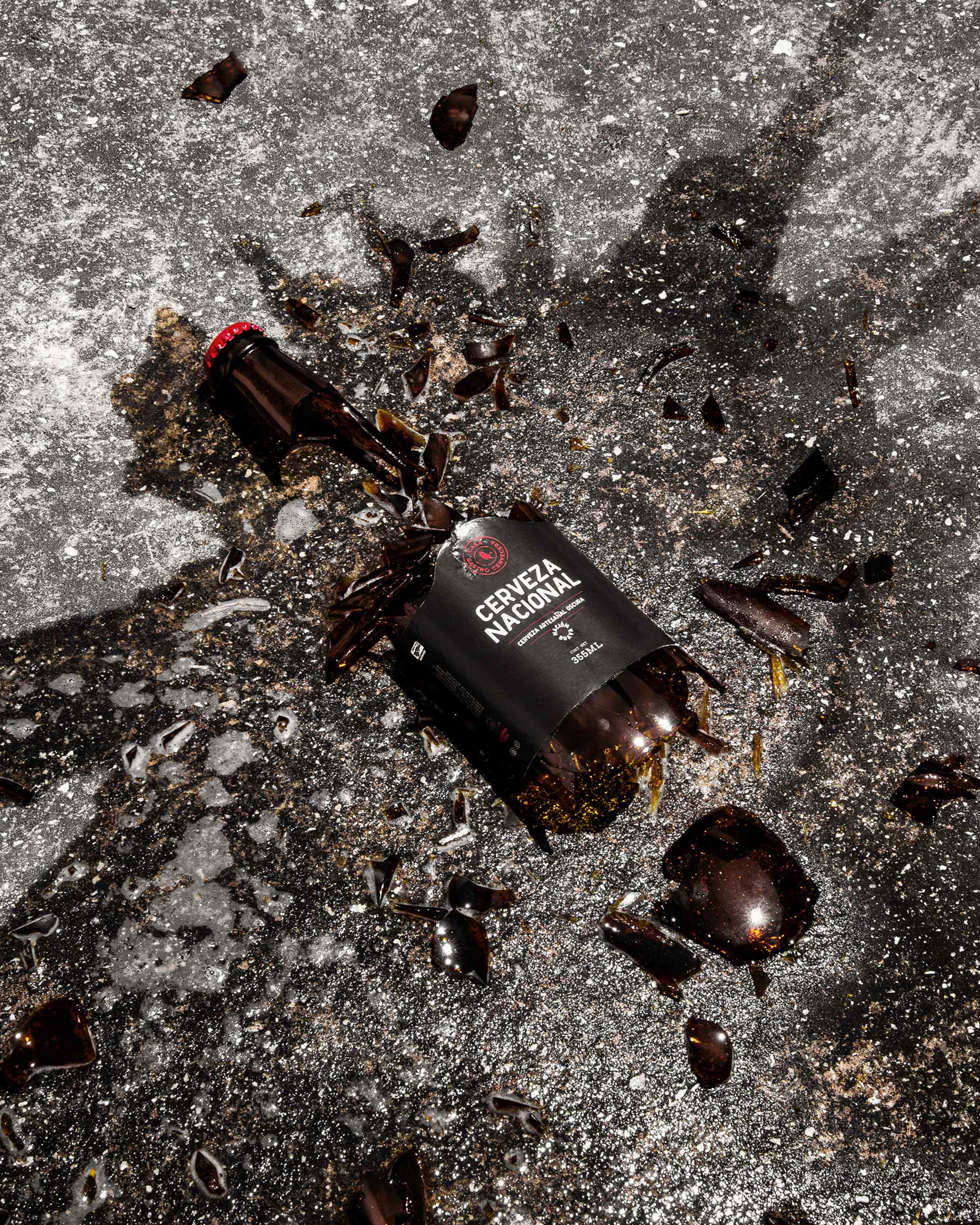
We maintained neutrality with black and white backgrounds, adding loud touches of color in vibrant red and yellow-brown.
CREDIT
- Agency/Creative: Mantra
- Article Title: Nación Brava Branding and Packaging Design by Mantra
- Organisation/Entity: Agency, Published Commercial Design
- Project Type: Identity
- Agency/Creative Country: Mexico
- Market Region: North America
- Project Deliverables: Brand Architecture, Brand Creation, Brand Guidelines, Brand Identity, Brand Naming, Branding, Graphic Design, Identity System, Photography, Tone of Voice
- Industry: Food/Beverage
- Keywords: Branding, Restaurant, Bar, Beer, Mantra, Somos Mantra, Burgers, Craft Beer


