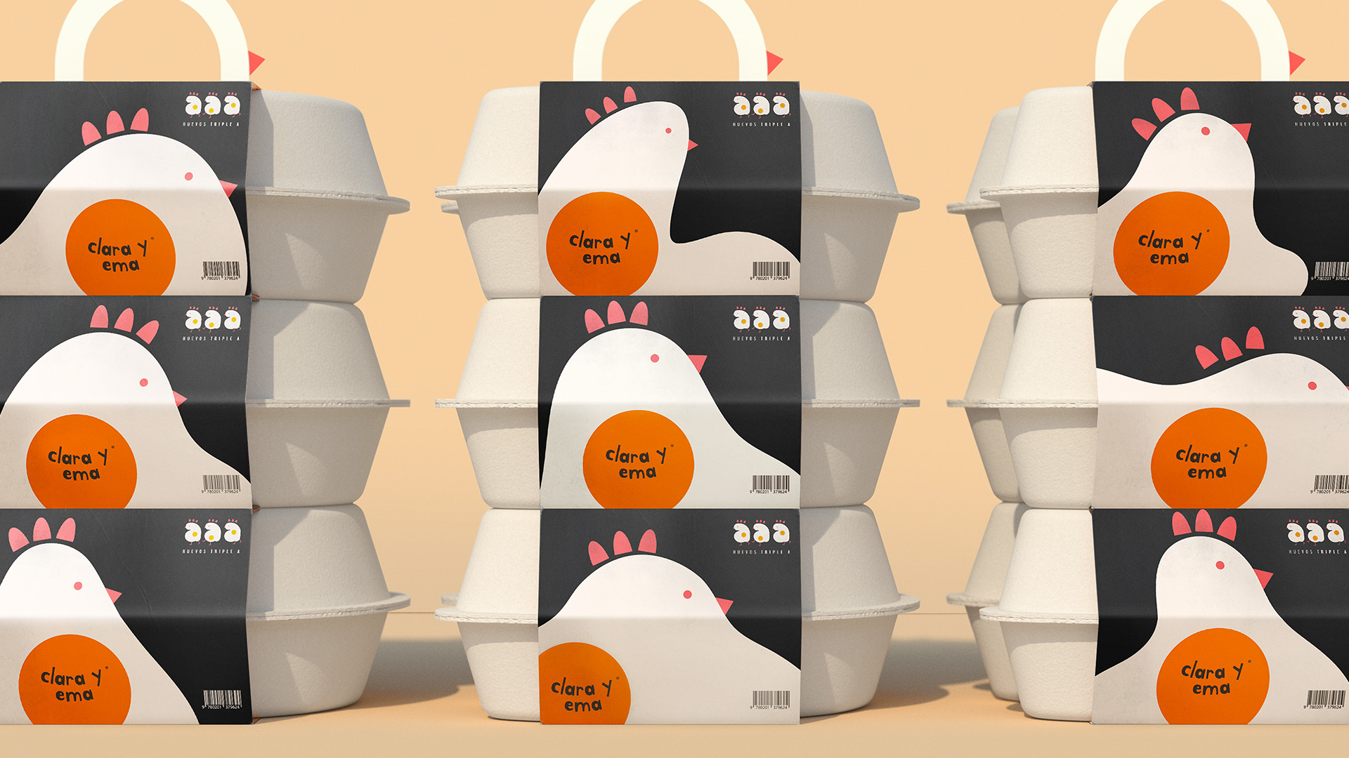
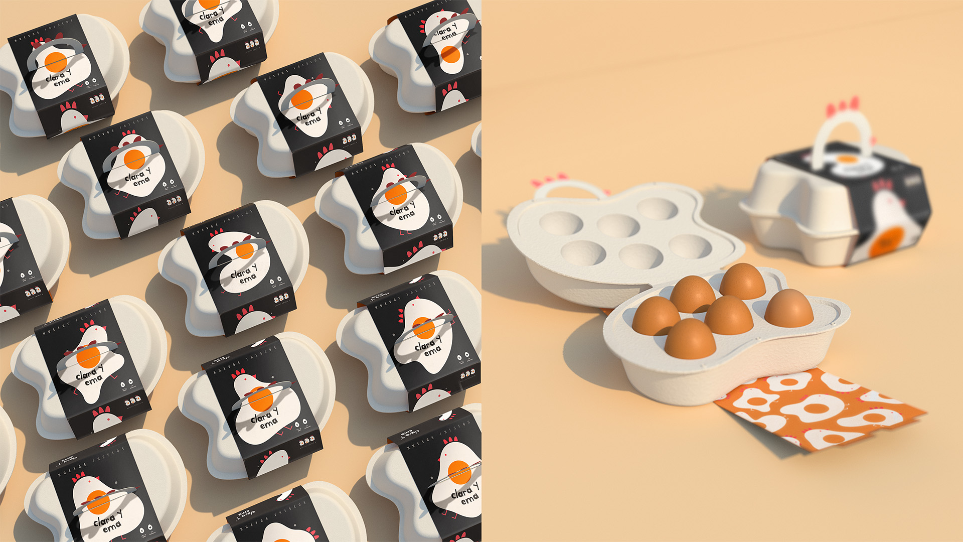
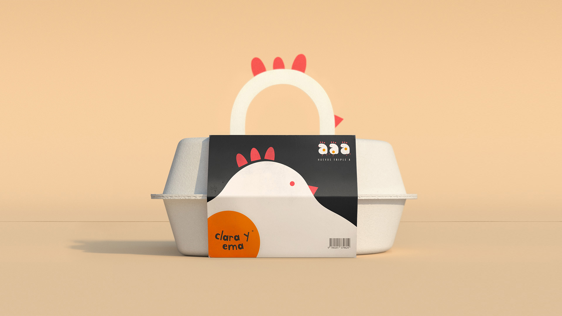
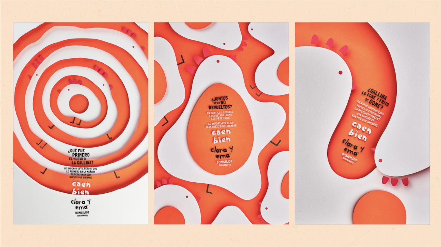
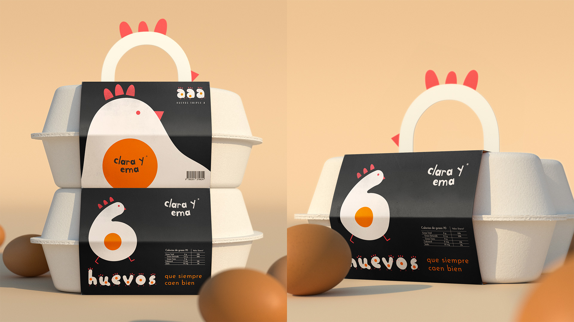
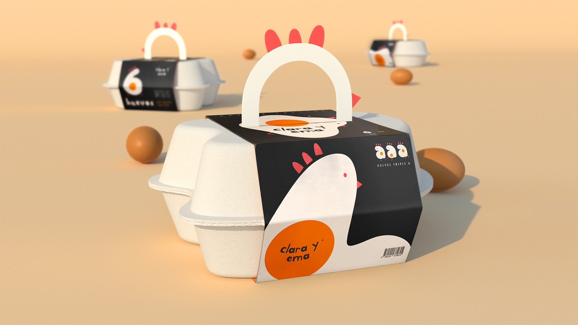
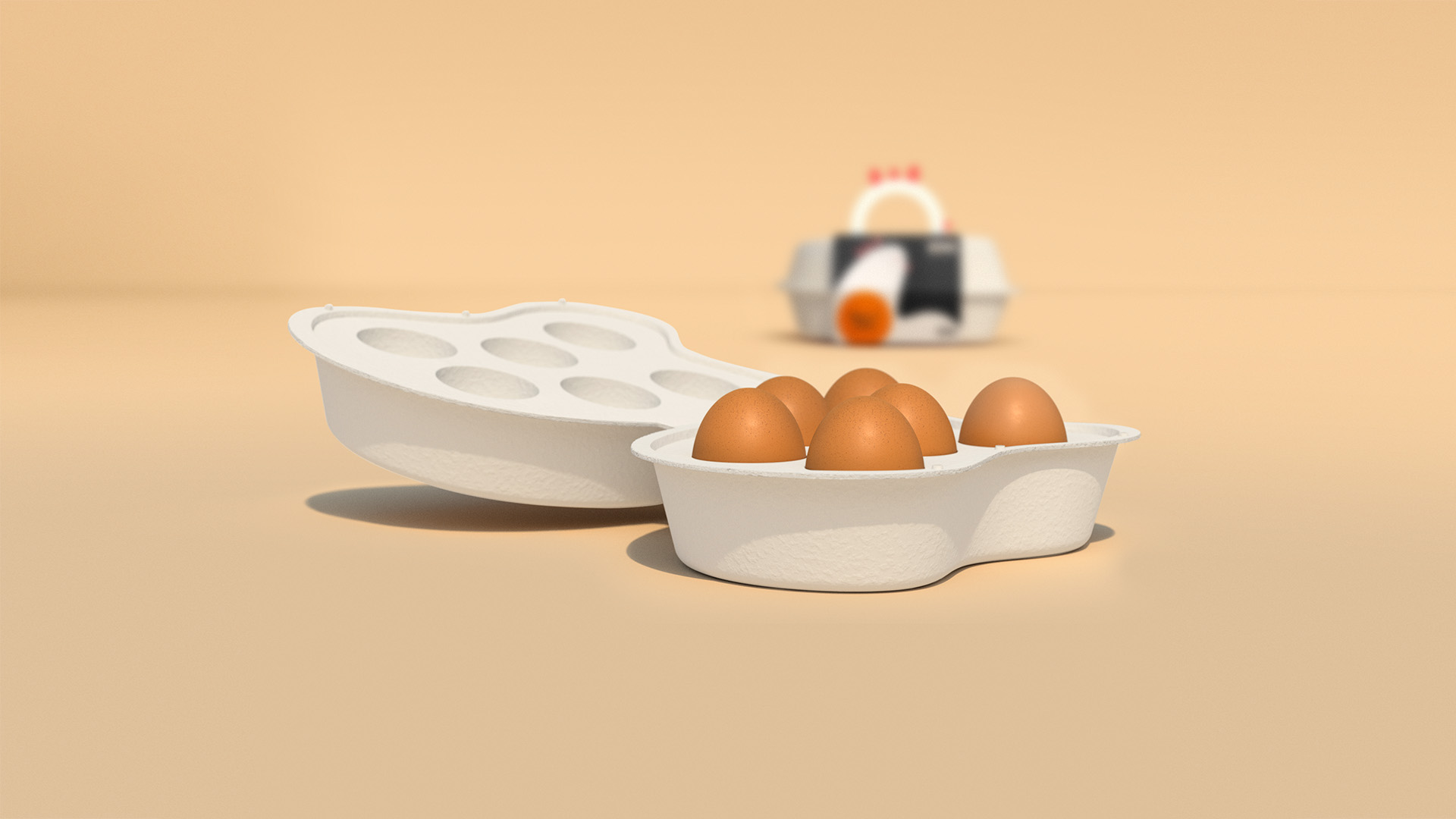
All eggs are the same, all have the same shape, but there is something that makes them unique, the way they fall into the frying pan. This inspired us to create a new liquid branding for a brand of free range hens and eggs free to fall any way they want, even in the form of Typography. Here you can see a package that plays with the different shapes that are generated under this concept.
CREDIT
- Agency/Creative: Creamos
- Article Title: Liquid Flowing Branding for Eggs Created by Creamos
- Organisation/Entity: Agency, Published Commercial Design
- Project Type: Packaging
- Agency/Creative Country: Colombia
- Market Region: South America
- Project Deliverables: Brand Advertising, Brand Architecture, Brand Design, Brand Guidelines, Brand Identity, Brand Redesign, Brand Strategy, Brand World, Branding, Graphic Design, Identity System, Illustration, Packaging Design, Rebranding, Research, Retail Brand Design, Structural Design
- Format: Box
- Substrate: Pulp Carton
FEEDBACK
Relevance: Solution/idea in relation to brand, product or service
Implementation: Attention, detailing and finishing of final solution
Presentation: Text, visualisation and quality of the presentation


