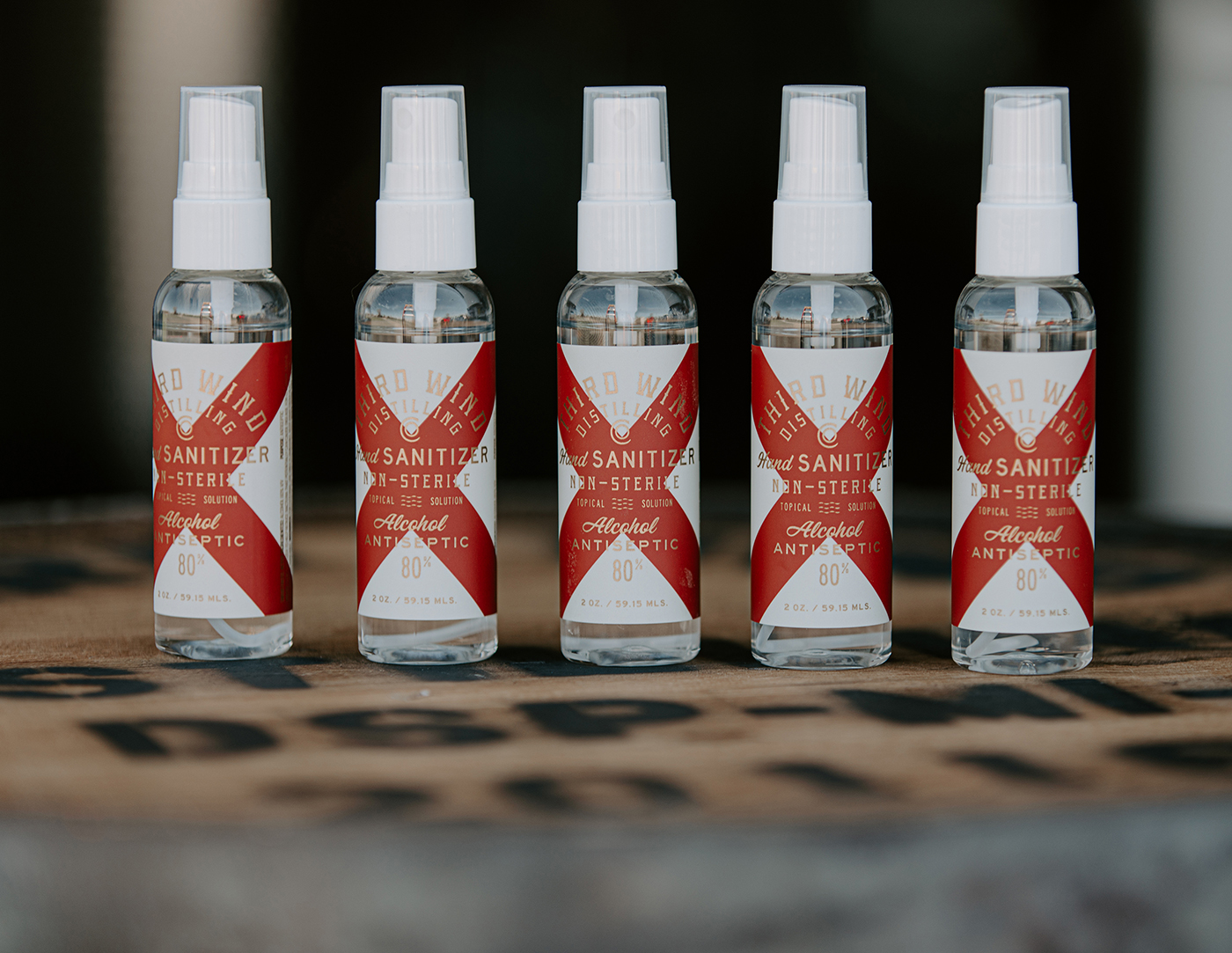
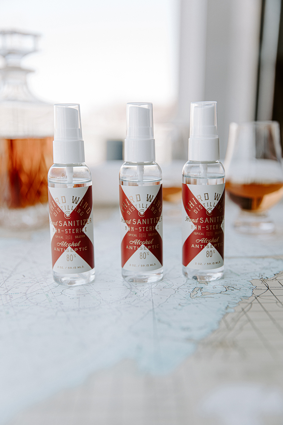
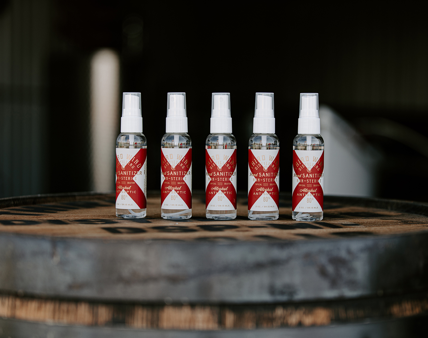
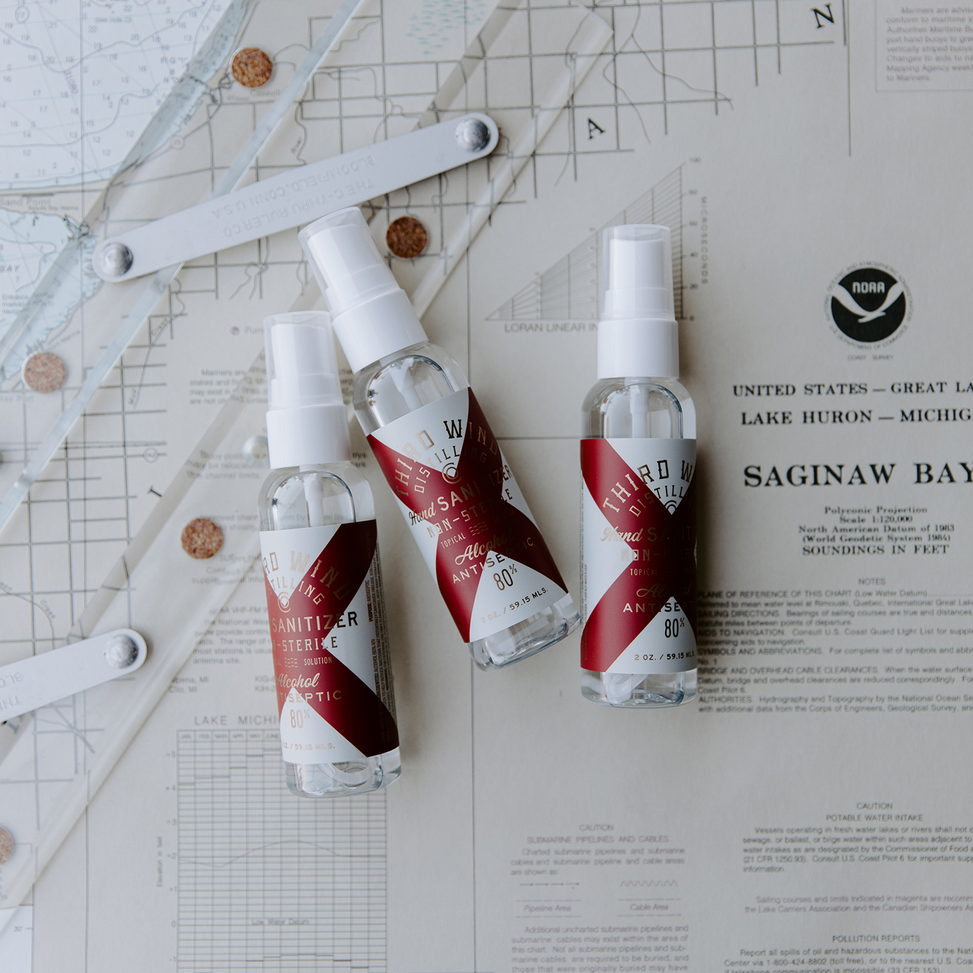
When the folks at Third Wind Distilling Co. originally reached out to discuss collaborating on branding their new distillery we never expected their first batch to be hand sanitizer. However, it showcased the true flexibility of the packaging system we were creating for their spirits. The brand leverages nautical flags as marks of distinction and for their first release being hand sanitzer the letter “V” of the nautical alphabet meaning “in need of assistance” was the perfect answer.


CREDIT
- Agency/Creative: Device Creative Collaborative
- Article Title: Third Wind Distilling Co. Hand Sanitizer Created by Device Creative Collaborative
- Organisation/Entity: Agency, Published Commercial Design
- Project Type: Packaging
- Agency/Creative Country: United States
- Market Region: North America
- Project Deliverables: Brand Experience, Brand Identity, Brand Naming, Brand Strategy, Branding, Graphic Design, Packaging Design, Product Architecture, Research
- Format: Bottle
- Substrate: Plastic
FEEDBACK
Relevance: Solution/idea in relation to brand, product or service
Implementation: Attention, detailing and finishing of final solution
Presentation: Text, visualisation and quality of the presentation


