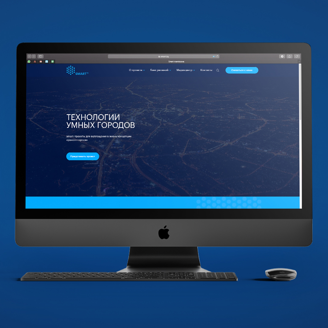
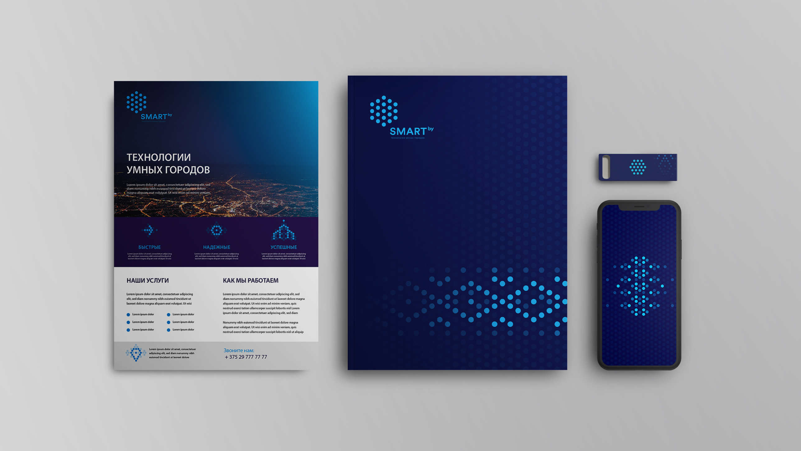
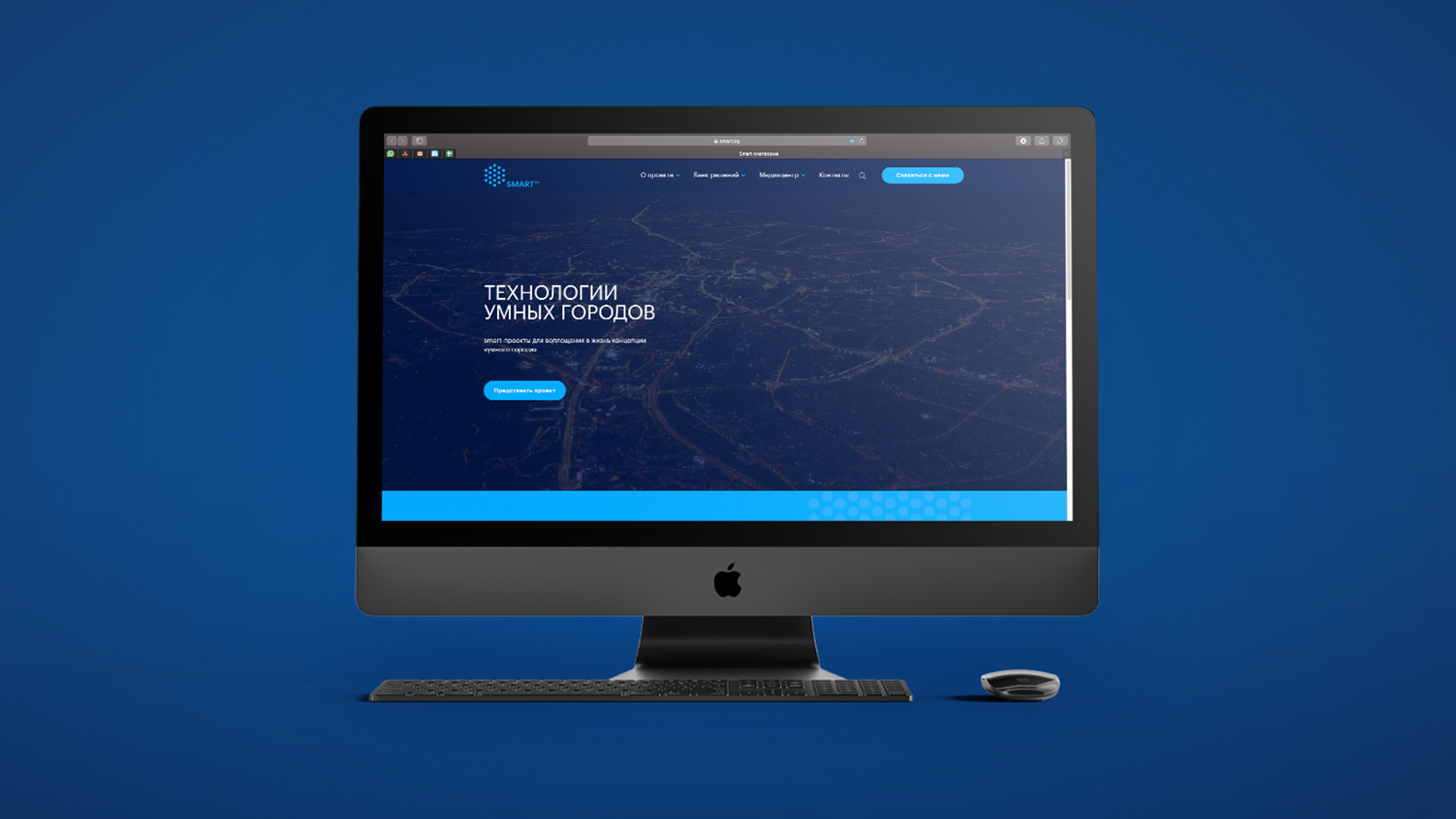
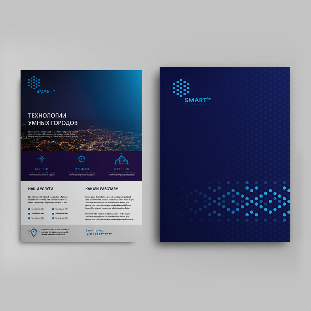
Task: to develop an identity for a project uniting companies for the development of “smart cities” in Belarus. Decision: Smart.by is an Internet platform for presenting smart projects and implementing the concept of a “smart city” in all corners of the Republic of Belarus, demonstrating solutions based on innovative technologies such as the Internet of Things (IoT), machine learning, big data (Big Data), cloud computing, artificial intelligence, 5G, and others designed to efficiently and sustainably use urban life systems.
So Smart.by has a large list of services, the PG team decided that a particular iconic symbol would not reflect the entire diversity of the company. Therefore, the main idea of design is the process of interaction of system elements. The sign is represented by a hexagonal structure – protected and strict. It consists of separate points of contact, which reflects the “smart city” as a complex system consisting of hundreds and thousands of well-coordinated devices and technological solutions. The hexagon symbolizes 5G cells, elements inside reflect IoT and Big Data technologies and numerous digital data. The use of animation in the logo shows the clarity of the interaction of system elements. The “Smart.by” typeface uses the classic geometric sans serif, which corresponds to a strict sign and has good readability.


CREDIT
- Agency/Creative: PG Brand Reforming Company
- Article Title: PG Brand Reforming Has Developed an Identity for Smart.by
- Organisation/Entity: Agency, Published Commercial Design
- Project Type: Identity
- Agency/Creative Country: Poland
- Market Region: Europe
- Project Deliverables: Brand Creation, Brand Design, Brand Guidelines, Brand Identity, Brand World, Branding
- Industry: Technology


