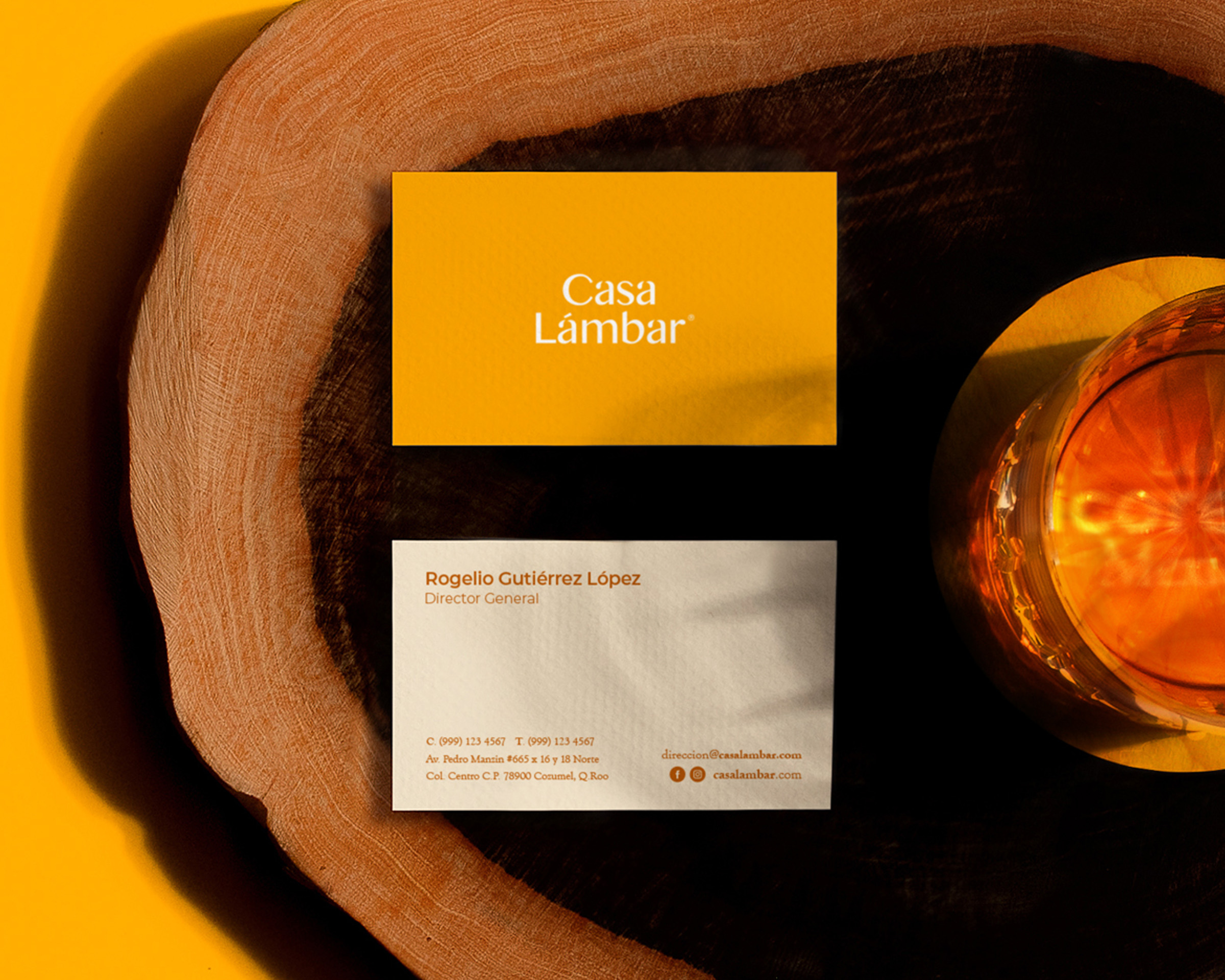
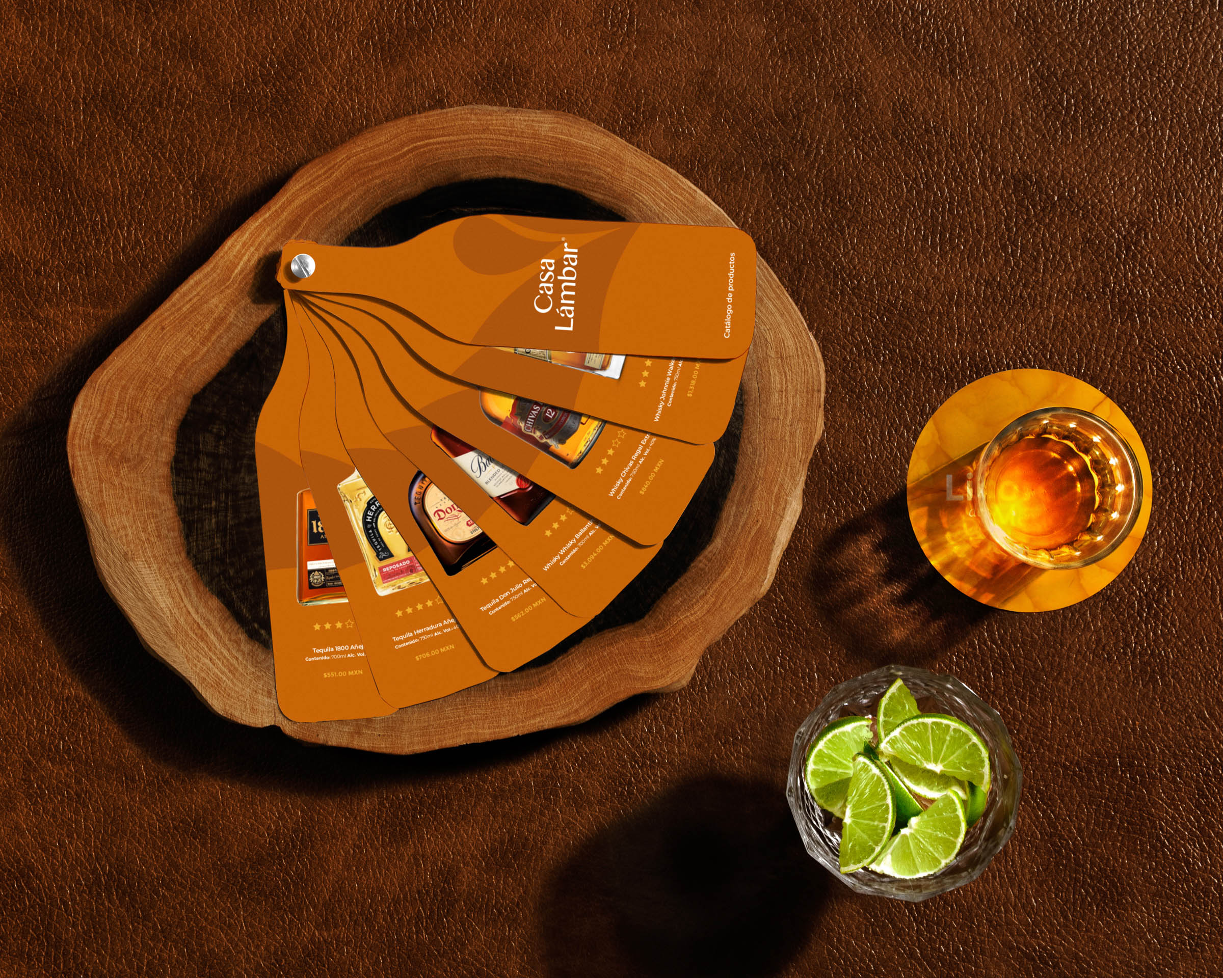
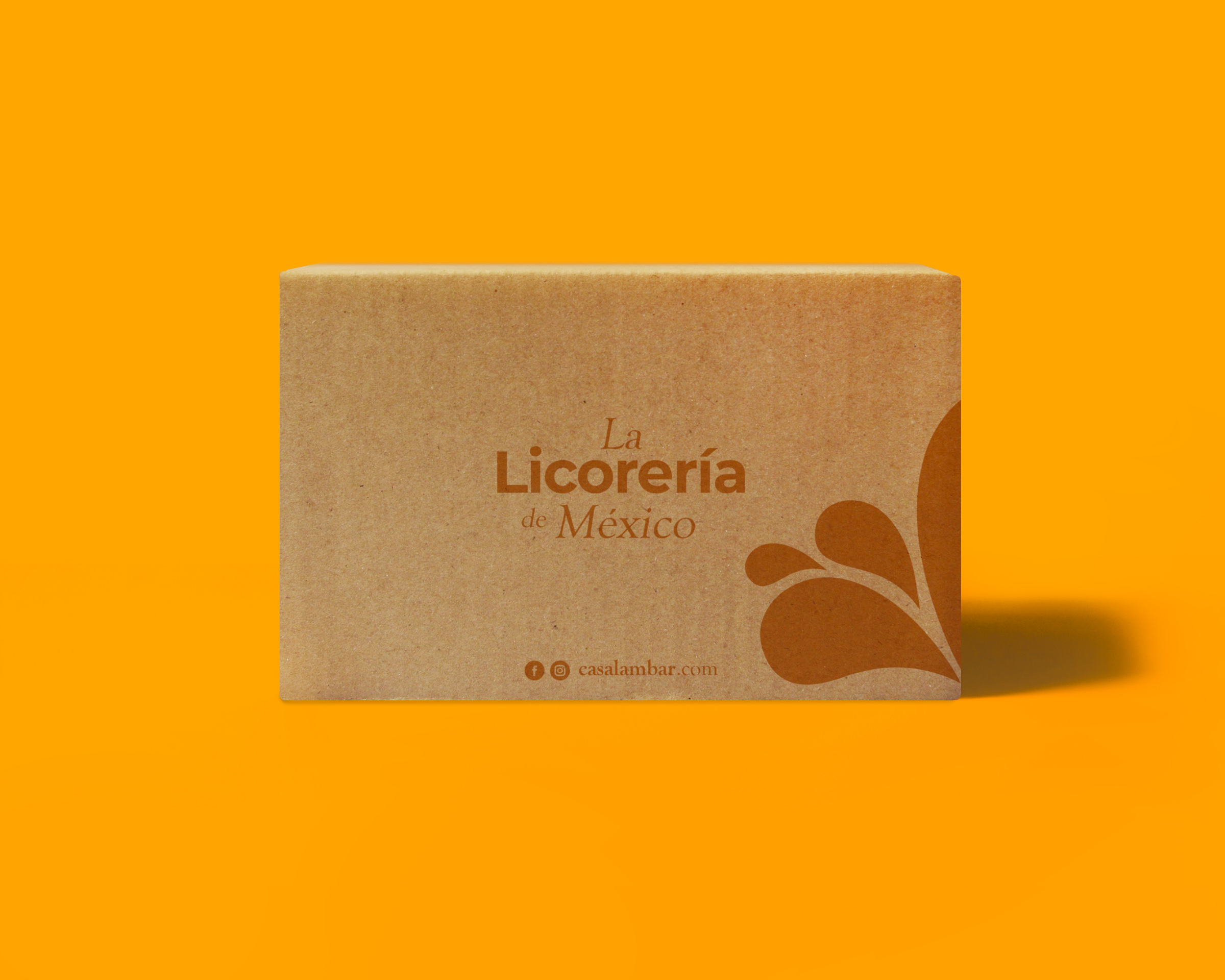
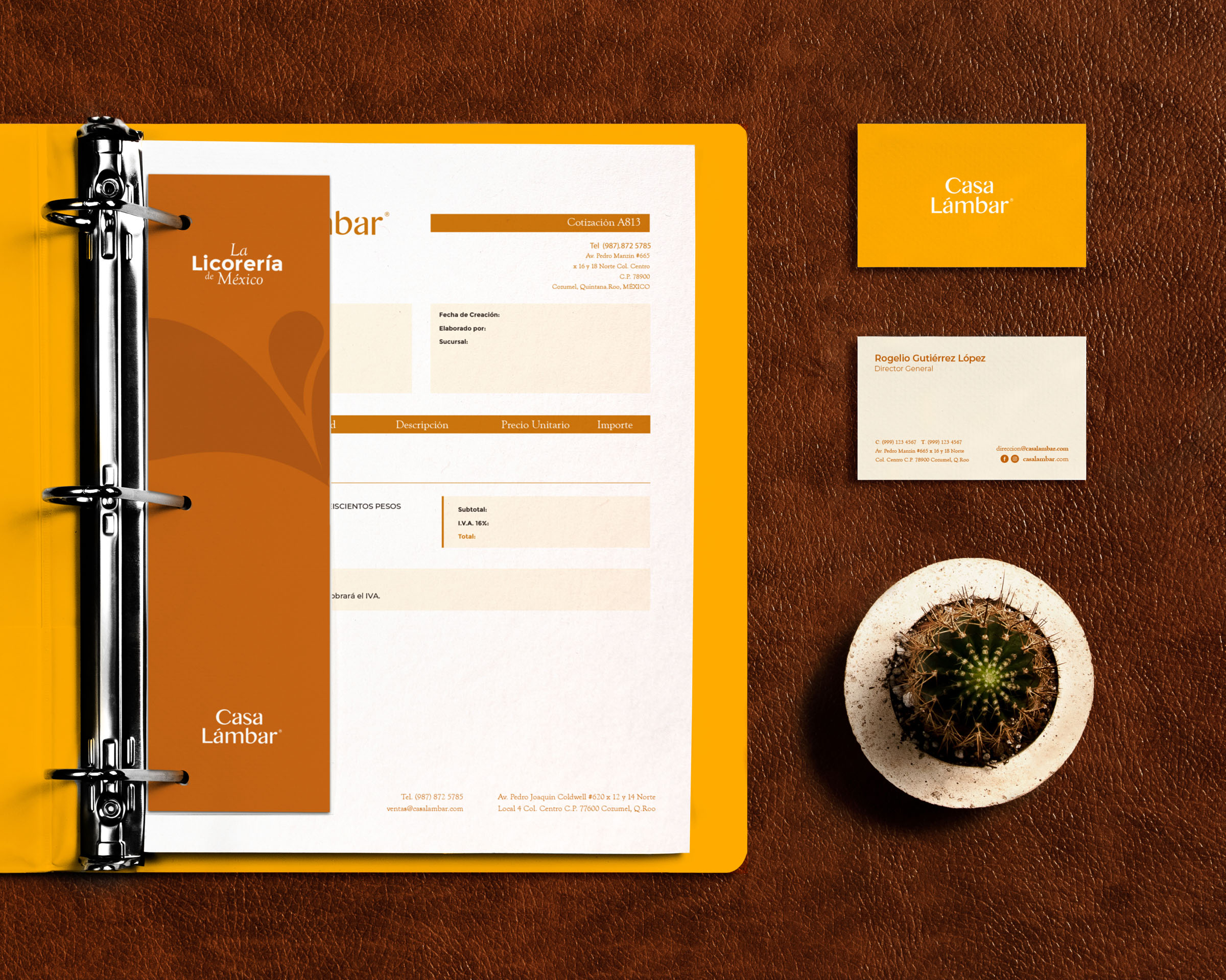
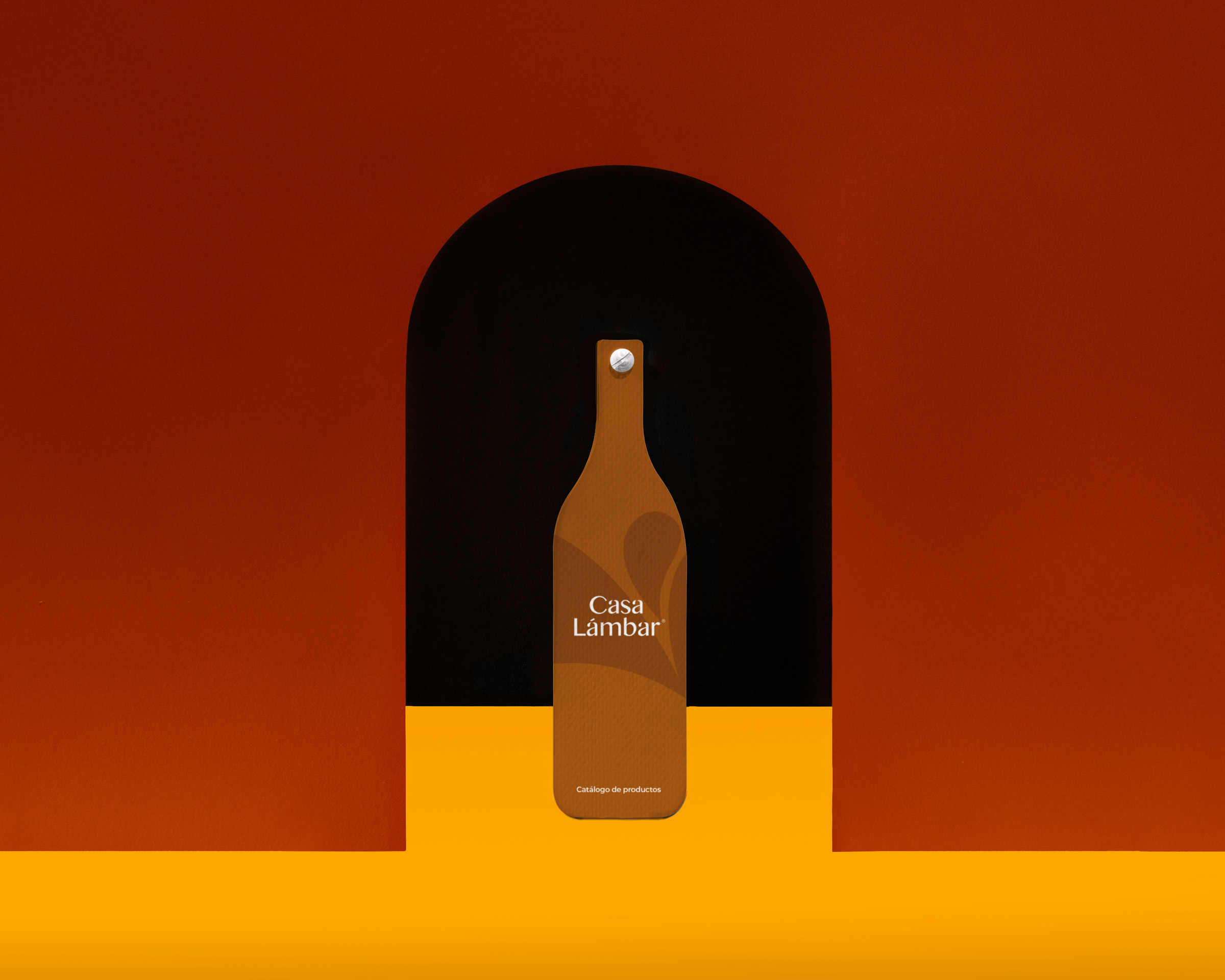
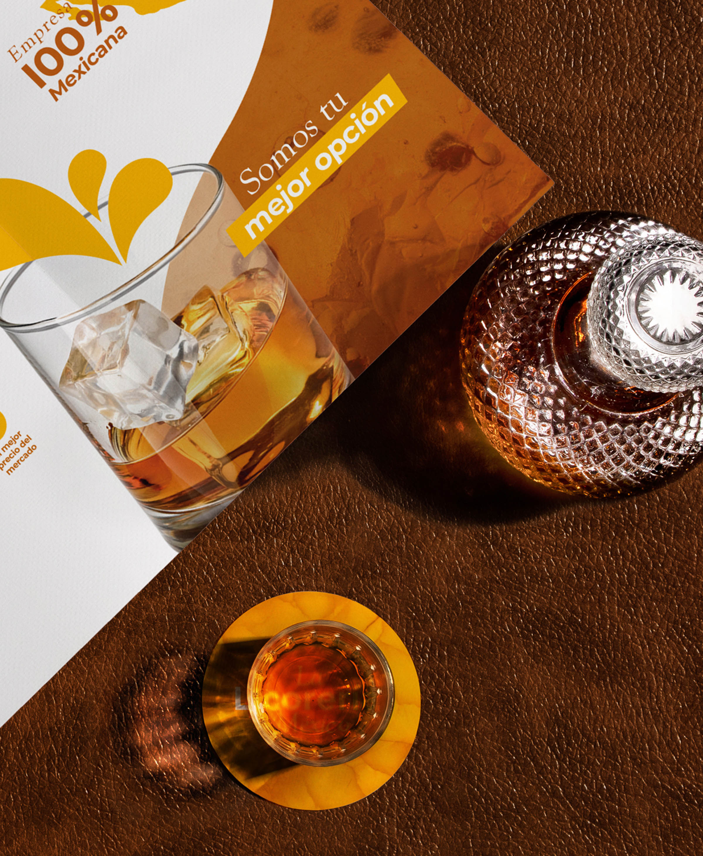
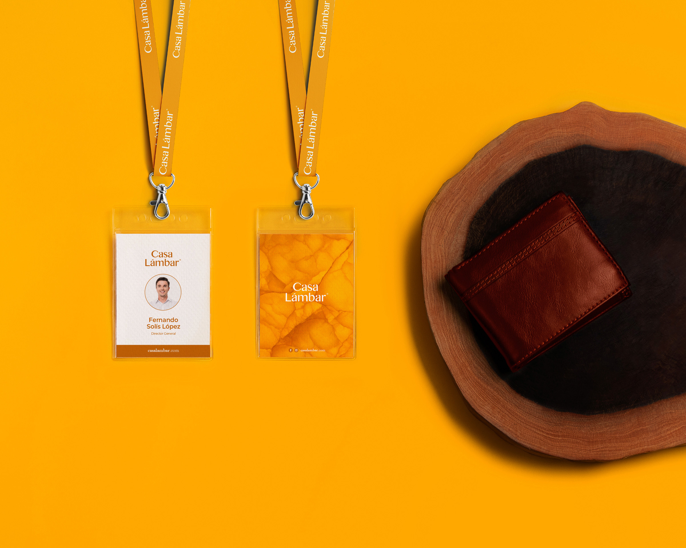
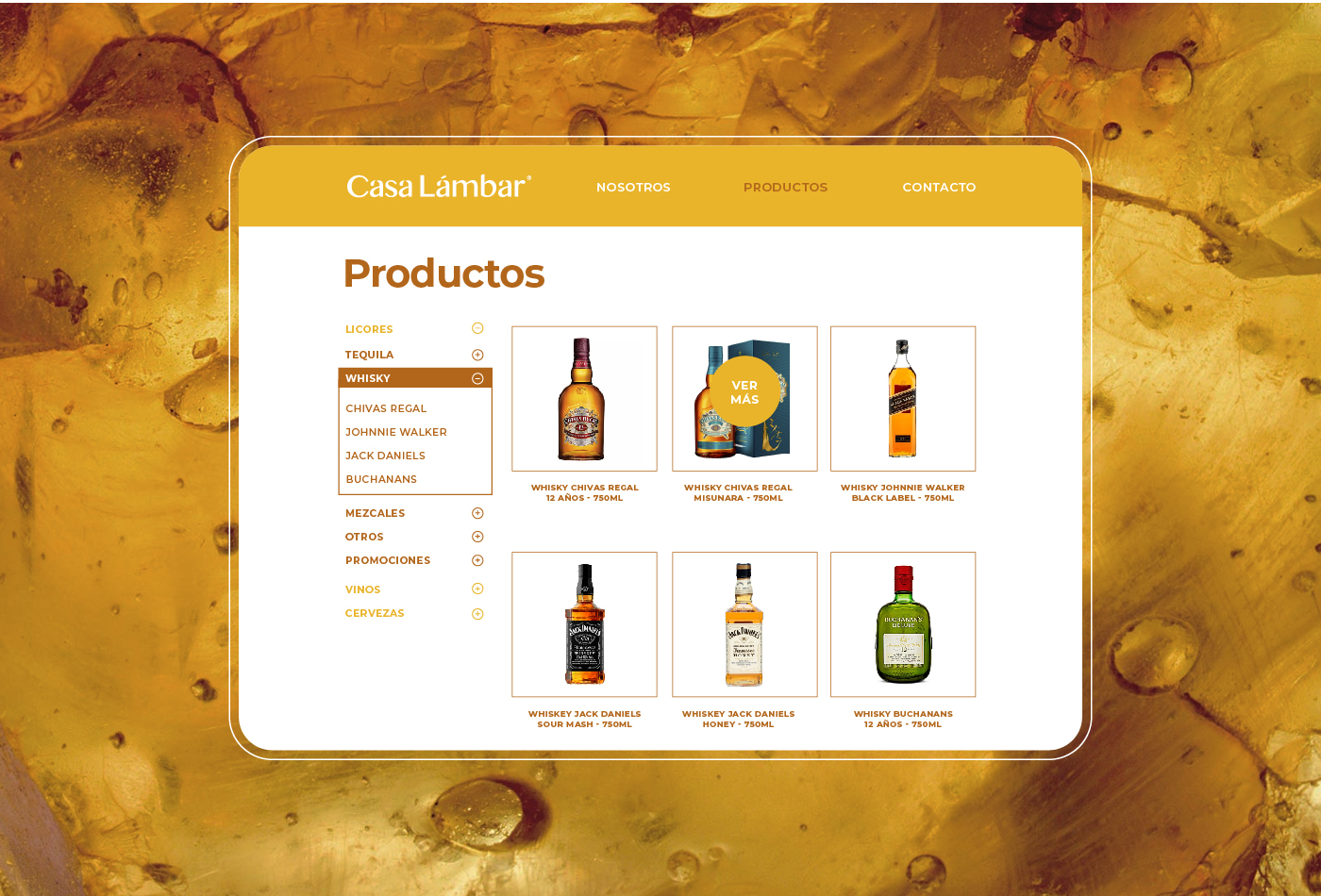
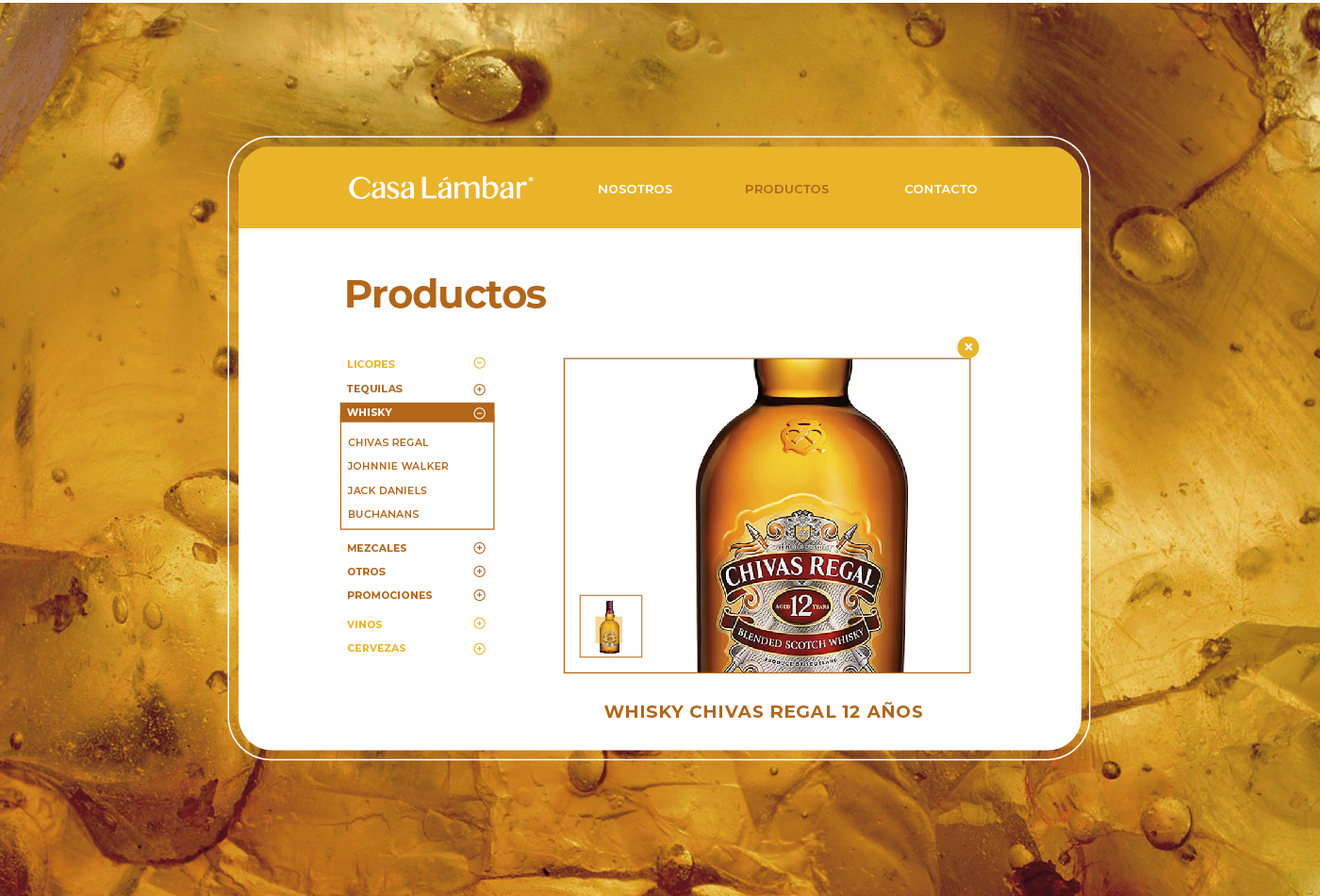
Casa Lámbar is a proudly Mexican liquor store full of joy, colour and flavour. Focused on wholesale, Casa Lámbar offers a professional and friendly service to its diverse client base. Inspired by the landscapes, colors and textures of the north of the country, we created an identity that combines the traditional style of Mexican mansions with the natural wealth that abounds in our territory.
We created a composite name for the brand. Lámbar comes from the union of liquor and amber. Amber, a semi-precious stone characteristic of Mexico, is similar in color to certain popular liquors and beverages. On the other hand, the word “Casa”-house- creates a quality of place, a physical space in which one can live and enjoy.
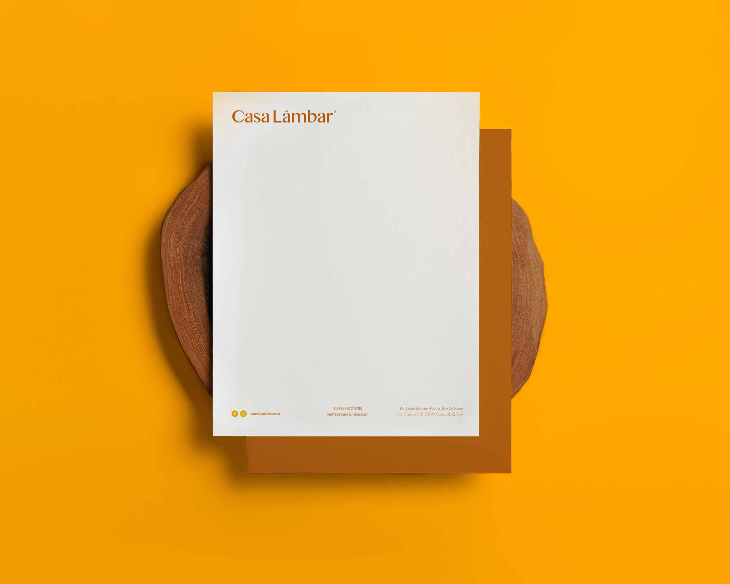
We selected a transitional bold font for the brand name, with straight strokes that contrast with the friendly curves of the different letters. The style of the typography gives the logo an elegant, simple and dynamic personality.
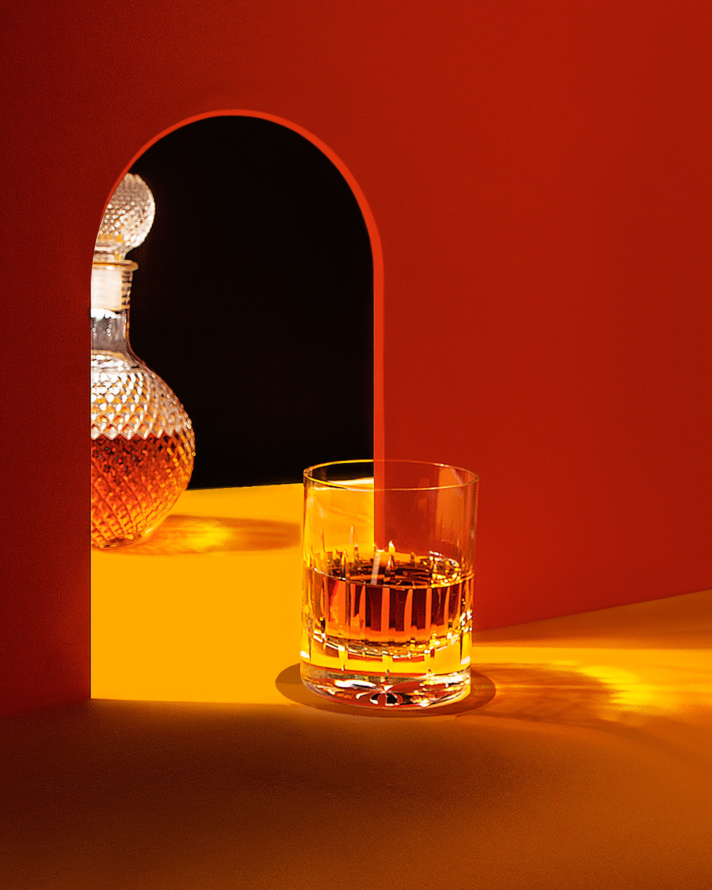
For the color palette, we selected brown and yellow tones inspired by the combination of sunlight and Mexican amber, tones that complement each other creating an antique style dye that conveys tradition, reminiscent of an era of haciendas and casonas.

CREDIT
- Agency/Creative: Mantra
- Article Title: Casa Lámbar Branding Designed by Mantra
- Organisation/Entity: Agency, Published Commercial Design
- Project Type: Identity
- Agency/Creative Country: Mexico
- Market Region: North America
- Project Deliverables: Brand Architecture, Brand Guidelines, Brand Identity, Brand Naming, Branding, Graphic Design, Identity System
- Industry: Food/Beverage
- Keywords: Mantra, Branding, Graphic deign, Liquor, Alcohol, Mexico, Tequila, Whisky, Set Design


