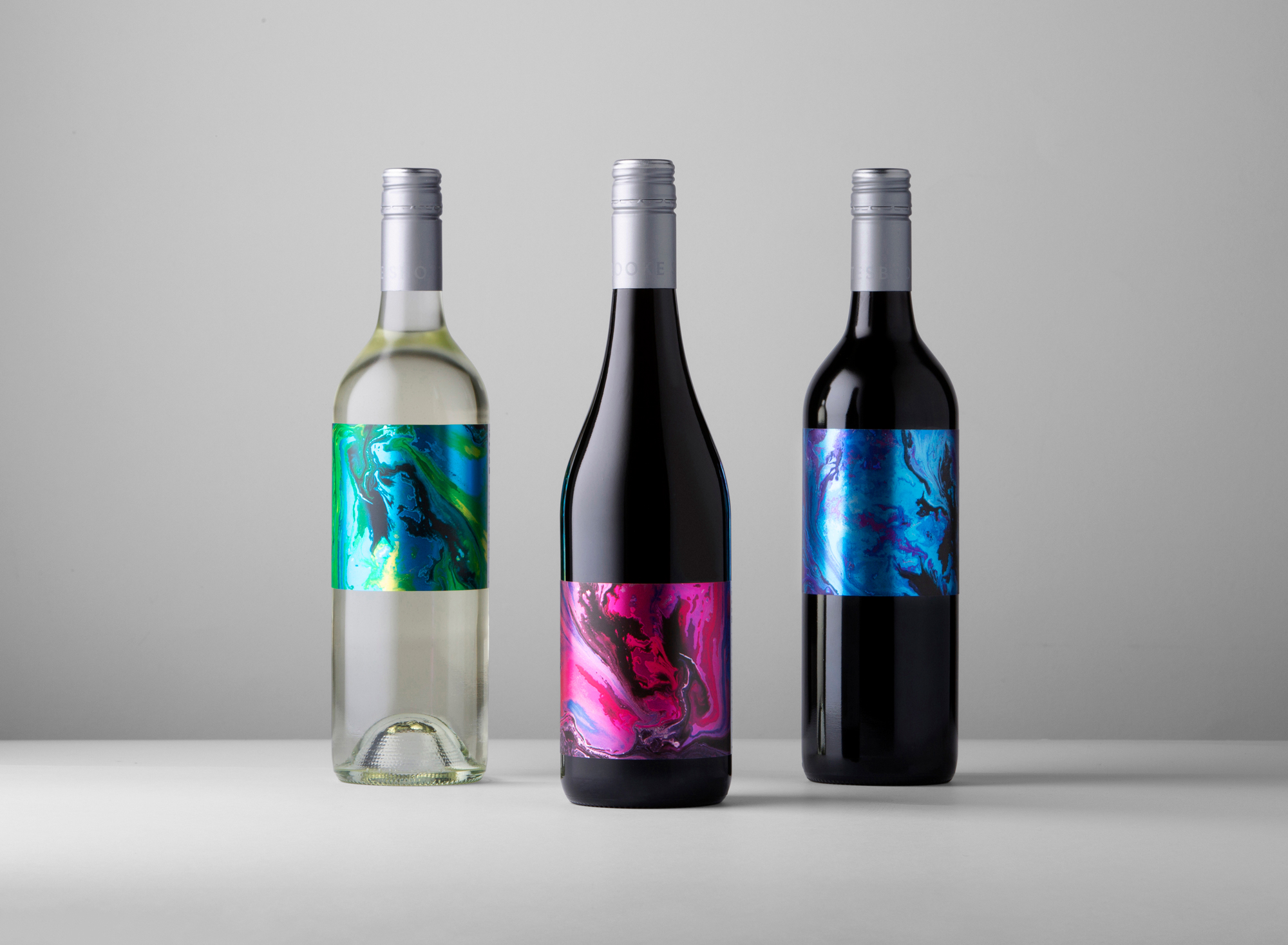
Shottesbrooke required a new look for an exclusive line sitting outside their usual brand parameters. The aim was to create a unique and intriguing wine range under the brand – a creative series of wines targeting a more ‘daring’ demographic.
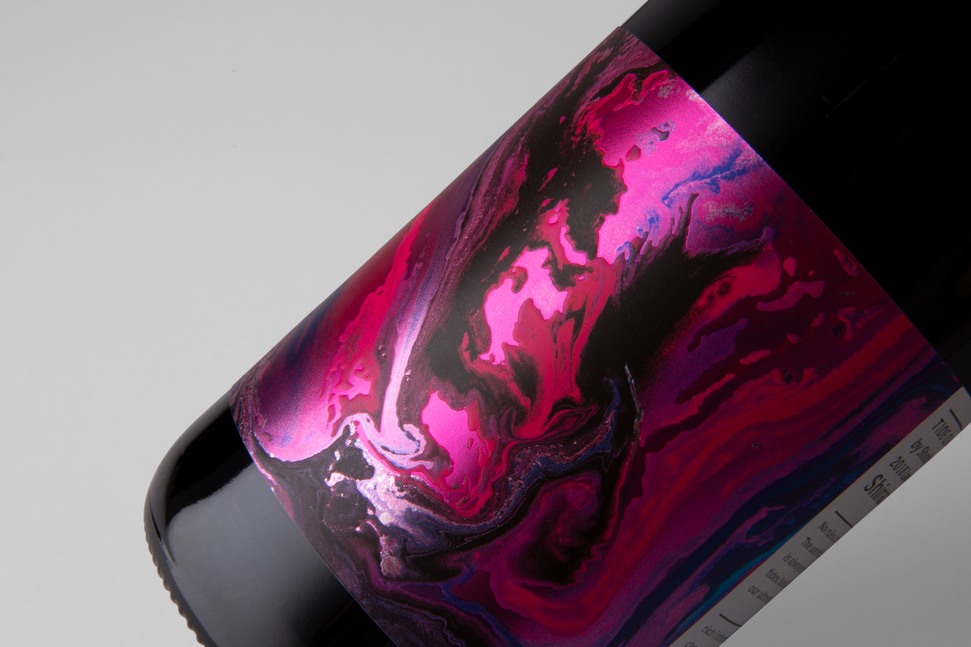
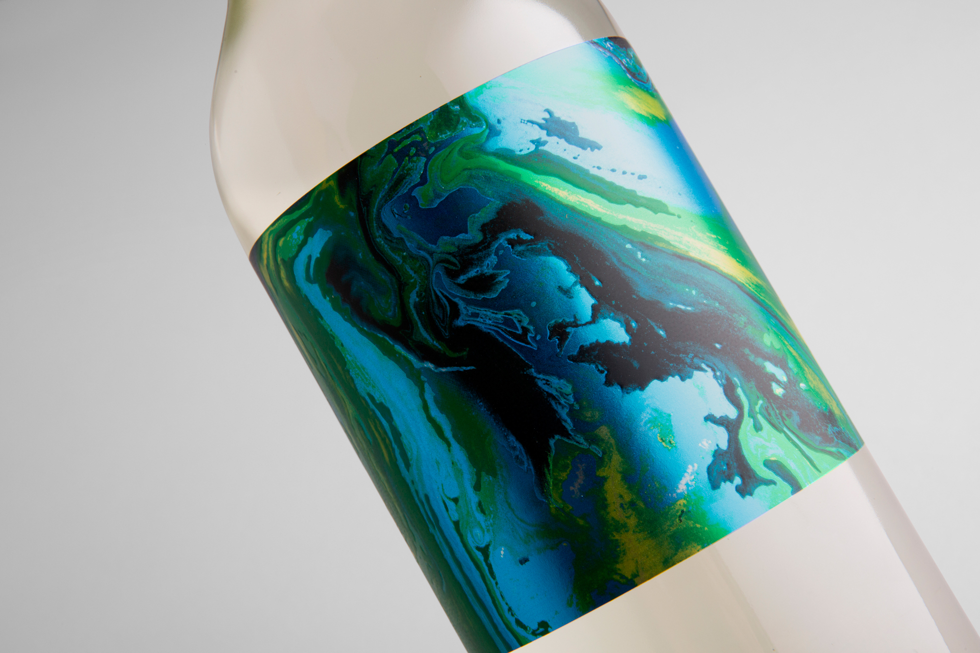
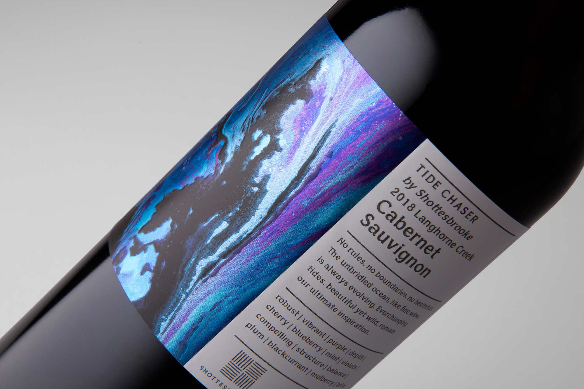
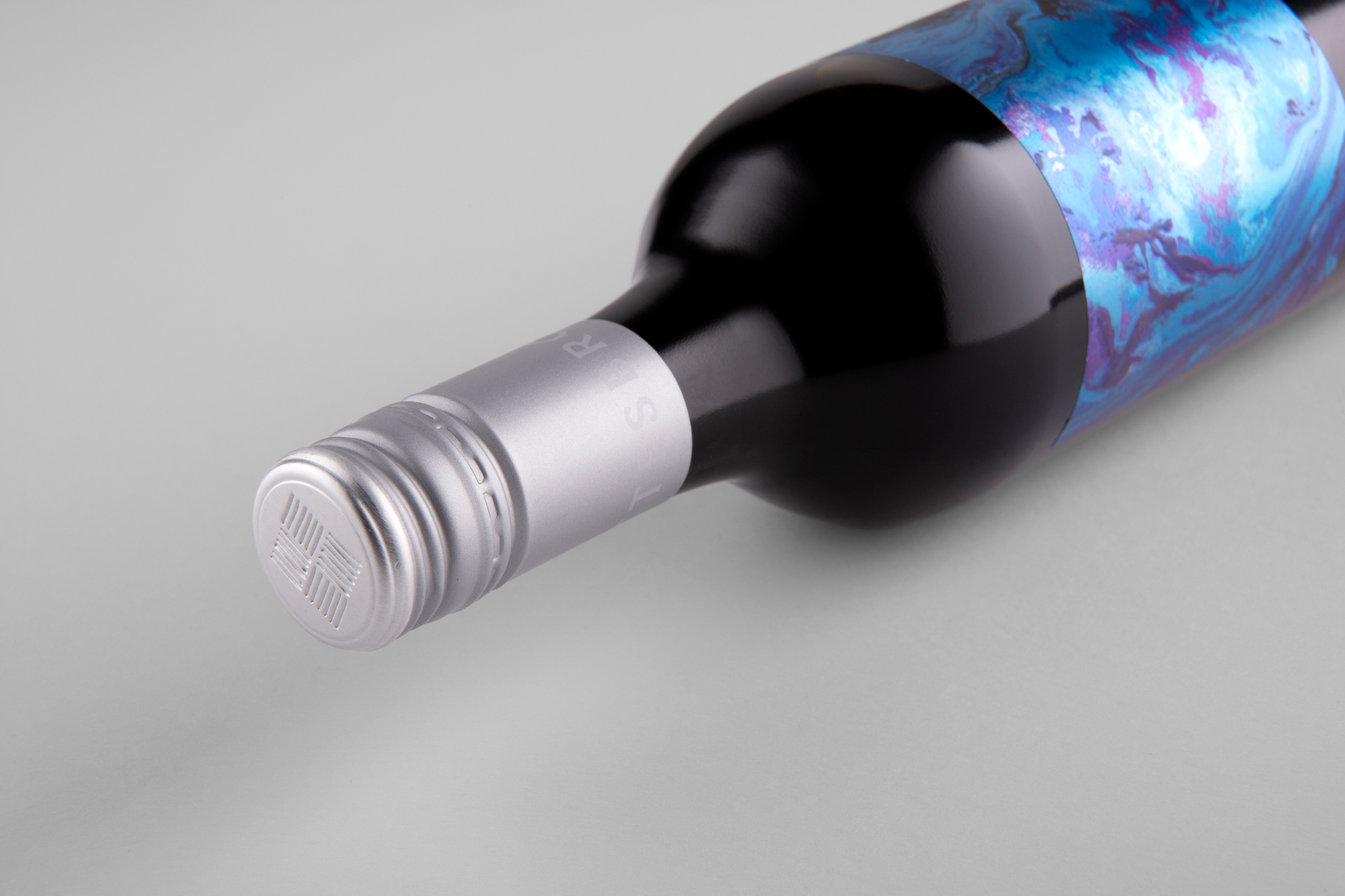
Intended as an ode to the winemaker’s love of the ocean, the labels feature a series of abstract ‘fluid’ artwork. Accompanied by purposely minimalist branding – unconventionally allowing the art maximum and undivided attention. Brought to life via reflective stock and matt high-build varnishes – it gains maximum shelf-stand-out by sparking the consumer’s interest and imagination.
CREDIT
- Agency/Creative: David Byerlee Design
- Article Title: Shottesbrooke Tide Chaser Series of Wine Labels Designed by David Byerlee Design
- Organisation/Entity: Agency, Published Commercial Design
- Project Type: Packaging
- Agency/Creative Country: Australia
- Market Region: Multiple Regions
- Project Deliverables: Brand Strategy, Branding, Graphic Design, Illustration, Packaging Design
- Format: Bottle
- Substrate: Pulp Paper
FEEDBACK
Relevance: Solution/idea in relation to brand, product or service
Implementation: Attention, detailing and finishing of final solution
Presentation: Text, visualisation and quality of the presentation


