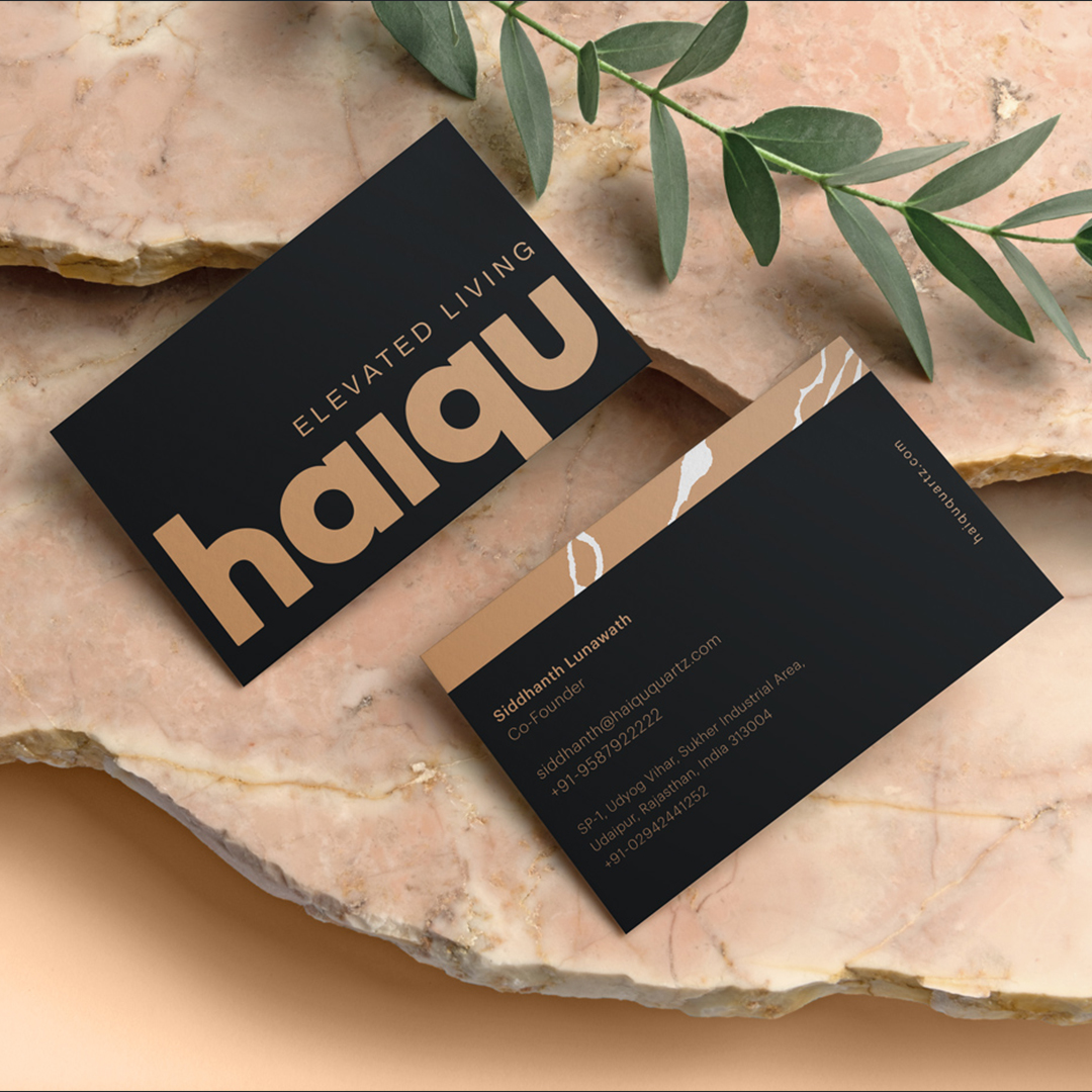
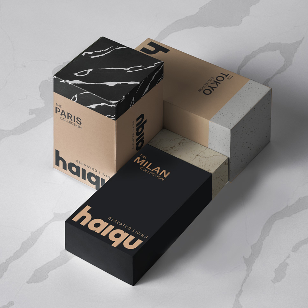
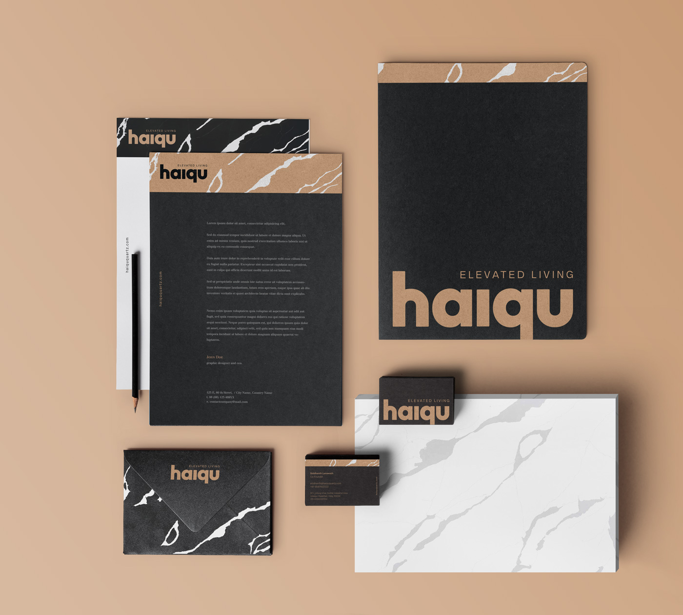
Haiqu’s philosophy reflects principles of minimalism, with aesthetics rooted in simplicity. The brand’s value lies in creating fashion-forward spaces for an ‘elevated living’ experience. We designed a bold & modern wordmark that perfectly complements the brand philosophy. The customised typography features thick, geometric letterforms with subtle rounded edges to communicate strength & robustness, minus the rigidity, which makes for a unique, contemporary logo.


CREDIT
- Agency/Creative: dots&dash
- Article Title: Dots and Dash Creates Visual Branding for Haiqu
- Organisation/Entity: Agency, Published Commercial Design
- Project Type: Identity
- Agency/Creative Country: India
- Market Region: Multiple Regions
- Project Deliverables: Brand Architecture, Brand Creation, Brand Guidelines, Brand Identity, Brand Naming, Brand Strategy, Branding, Graphic Design, Product Naming, Tone of Voice
- Industry: Construction
- Keywords: Quartz, Interior Design, Branding, Logo Design, Stationery Design
FEEDBACK
Relevance: Solution/idea in relation to brand, product or service
Implementation: Attention, detailing and finishing of final solution
Presentation: Text, visualisation and quality of the presentation


