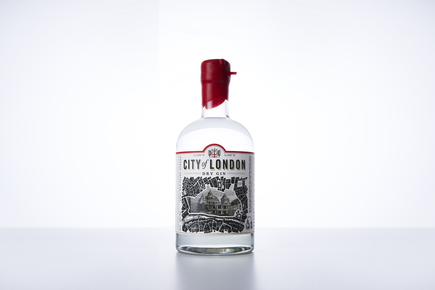
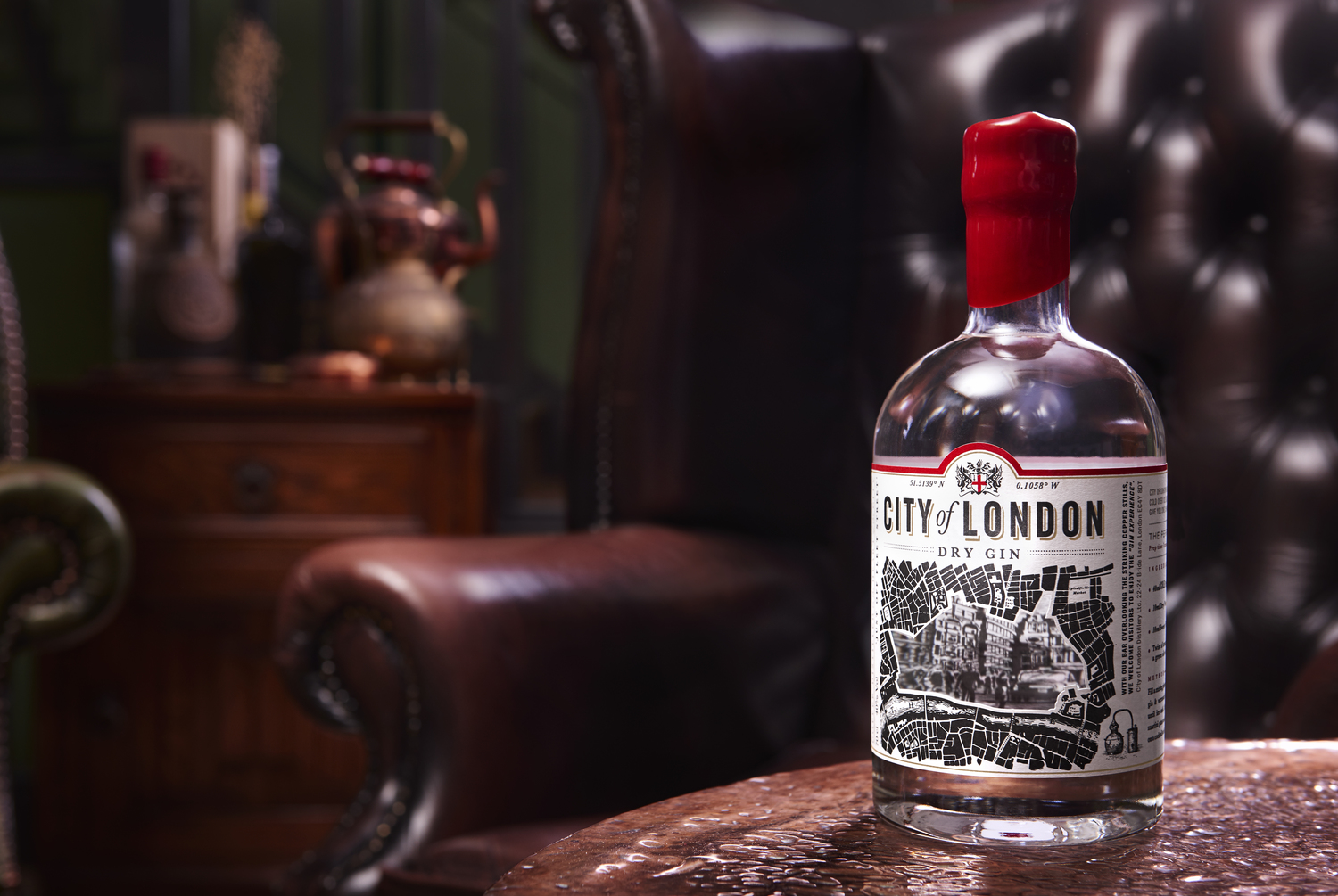
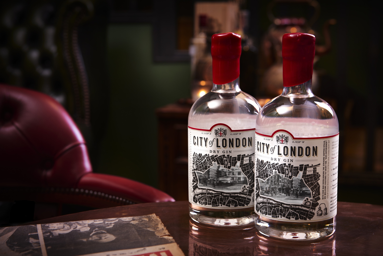
“After an absence of almost 200 years, The City of London Distillery is producing gin again. Handcrafted, using artisan techniques and quality ingredients, this premium gin needed a brand identity that embodied the spirit’s rich legacy.”
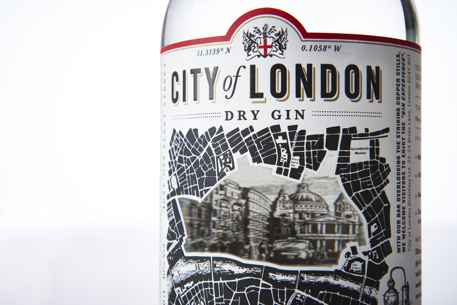
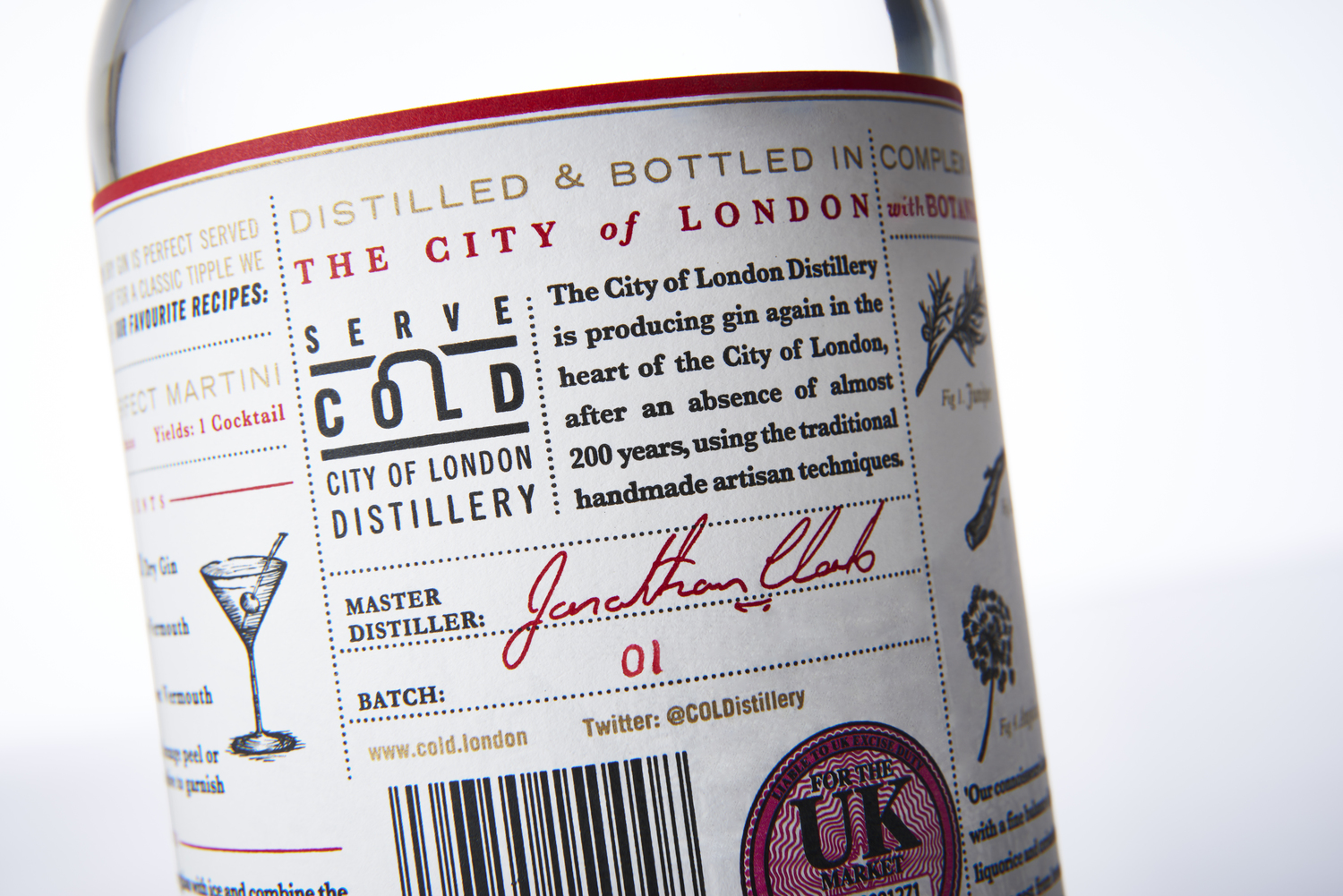
“Central to the design is a cut-out of the City of London area on an old Victorian map. Through this window, you are taken back 200 years to London’s infamous Fleet Street. The wordmark was inspired by old newspapers and acts as a masthead on the bottle. To reinforce the City of London’s location, the exact coordinates of the distillery surround the crest. The story continues on the back of the bottle with beautiful and scientific-like illustrations that convey the quality of the spirit. While the black and white colour palette adds sophistication, touches of red and gold accent the design and express authenticity.”


CREDIT
- Agency/Creative: Bluemarlin
- Article Title: Bluemarlin – City of London Gin
- Project Type: Packaging


