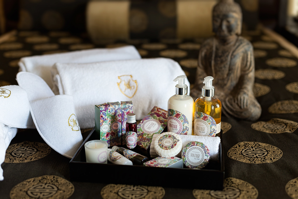
“The essence of the 20´s is back
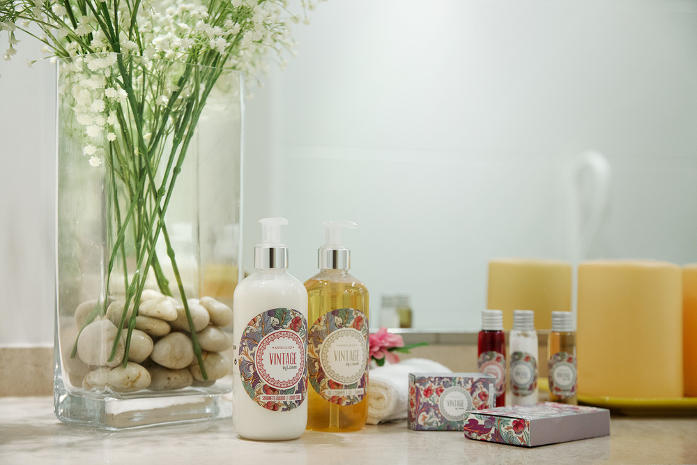
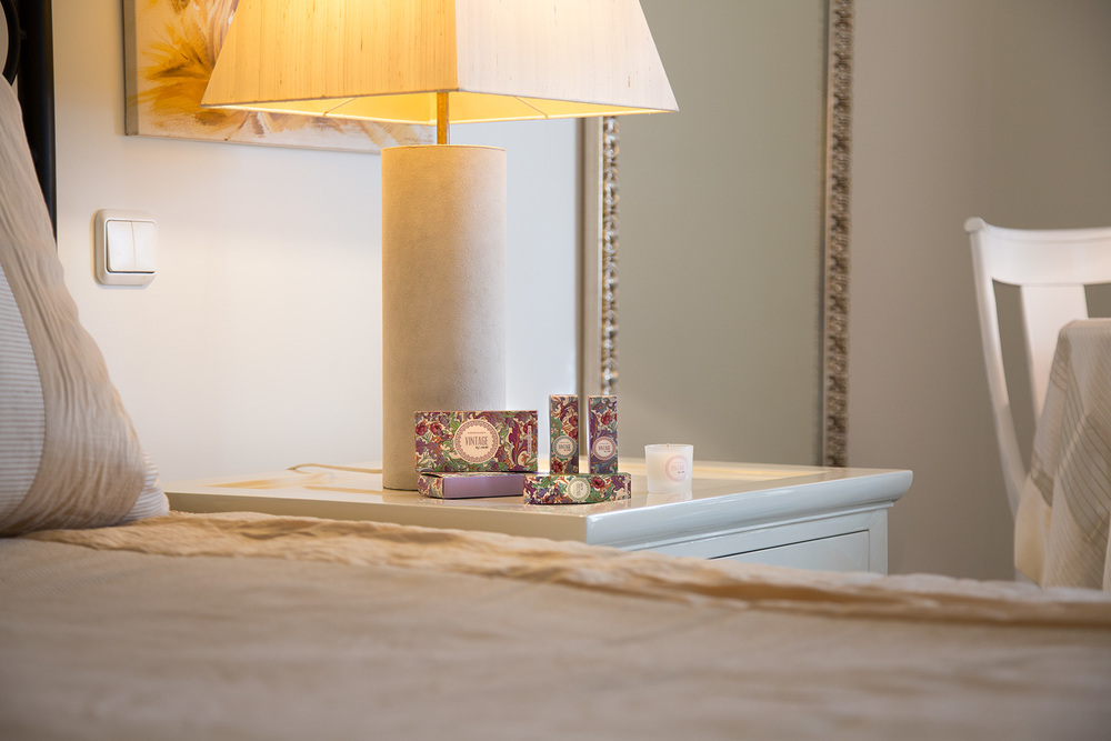
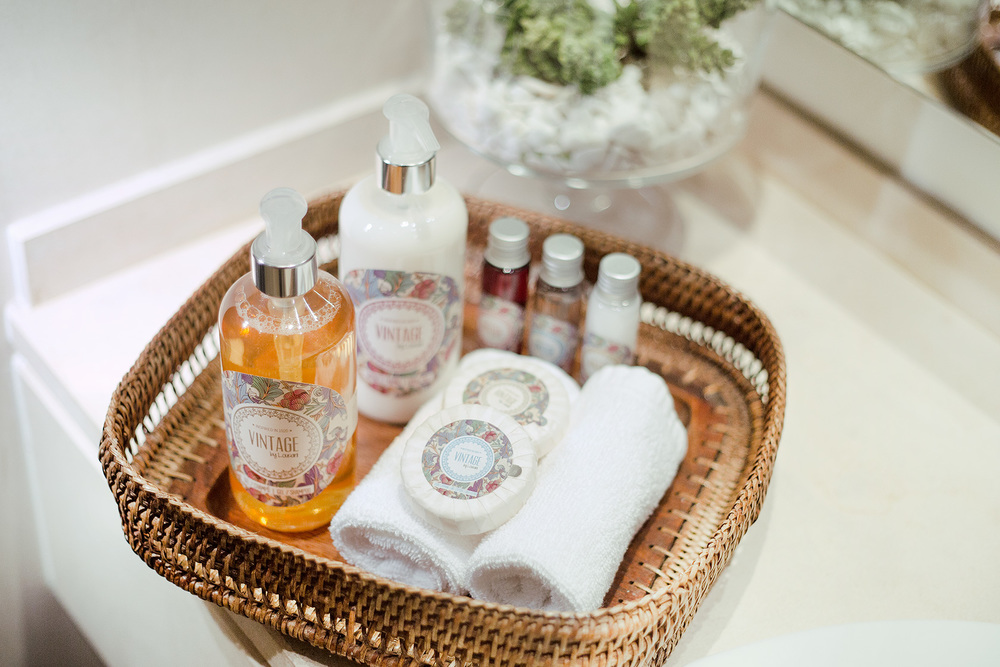
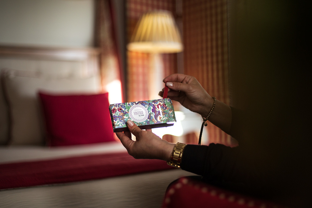
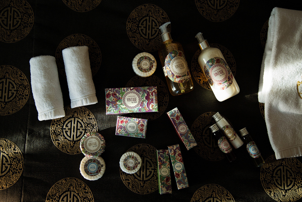
Inspired by the details of the 20s, graphics and aesthetic elements associated with this time and inevitably with Art Nouveau style, the M&A Creative Agency developed the graphic line for this amenities to be used in hotel chains and rural tourism.”
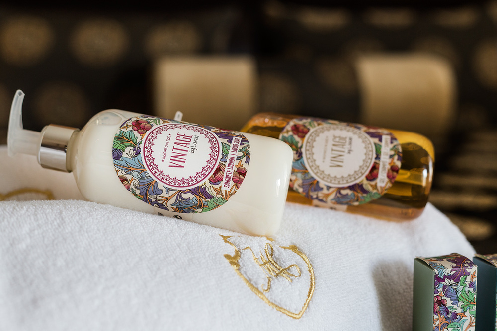
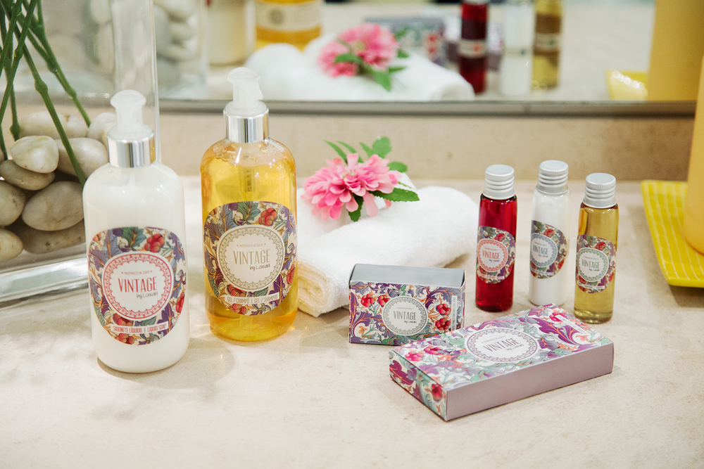
“The colors and graphics used reflect a time and the diversity of flavors and textures of the products in this range, focusing on the use of bold colors and floral patterns going against the product type.
The floral pattern was designed in order to combine up perfectly with the various pantone shades chosen for the products that make up this line.”
CREDIT
- Agency/Creative: M&A Creative Communication Agency
- Article Title: M&A Creative Communication Agency – Amenities Vintage by Lousani
- Project Type: Packaging
- Format: Bottle
- Substrate: Plastic


