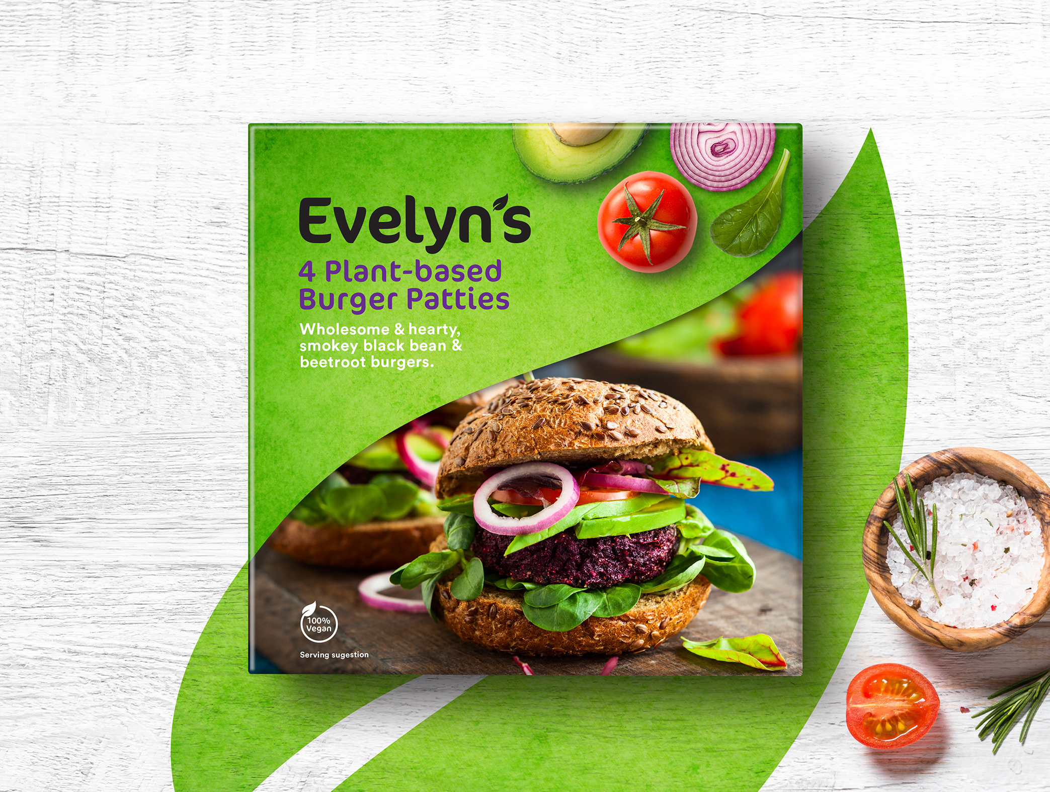
Todd Anderson Design has created a powerful new look for Evelyn’s Plant Based Foods. Todd worked on the project from concept through to the final design presentation.
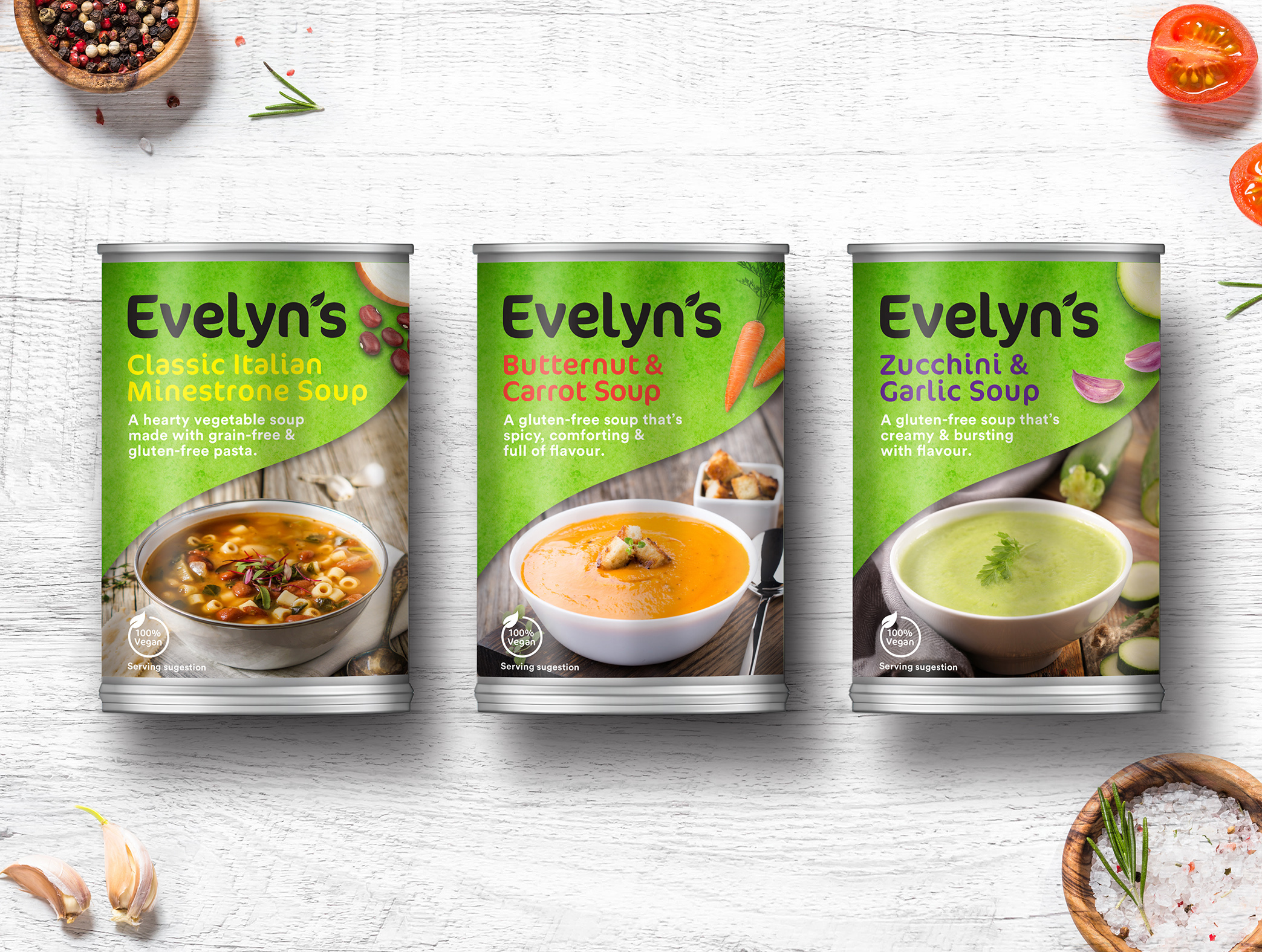
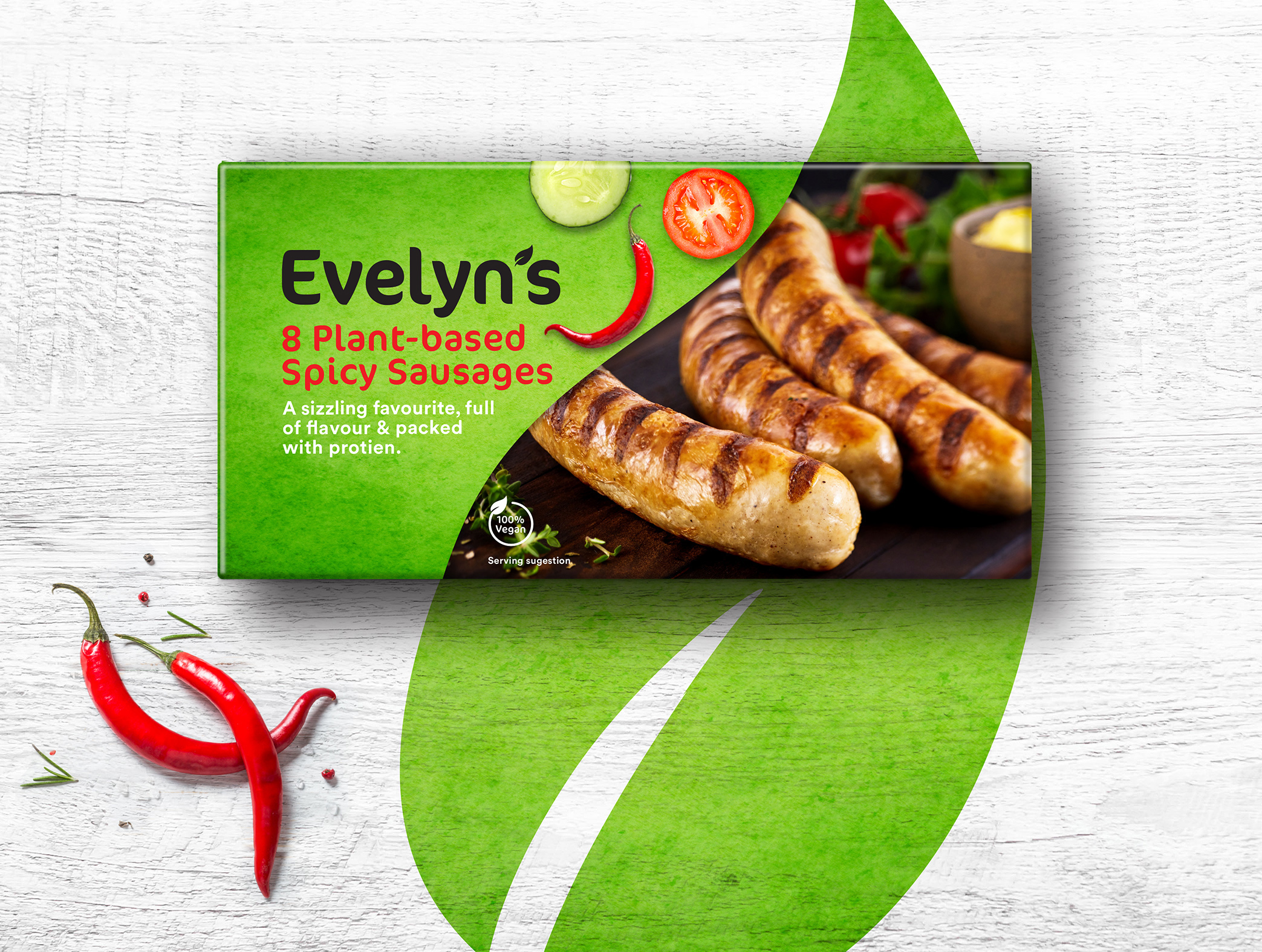
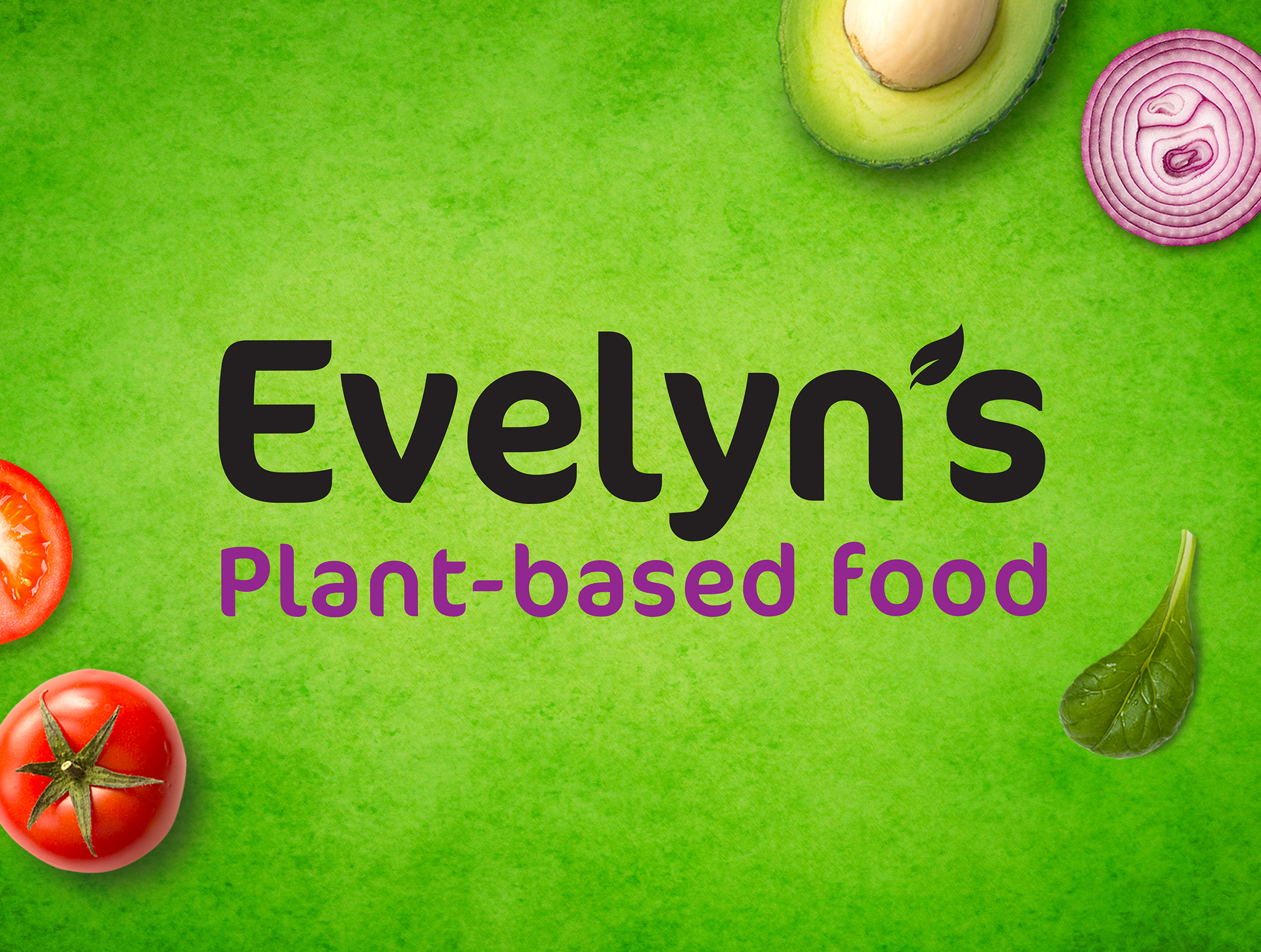
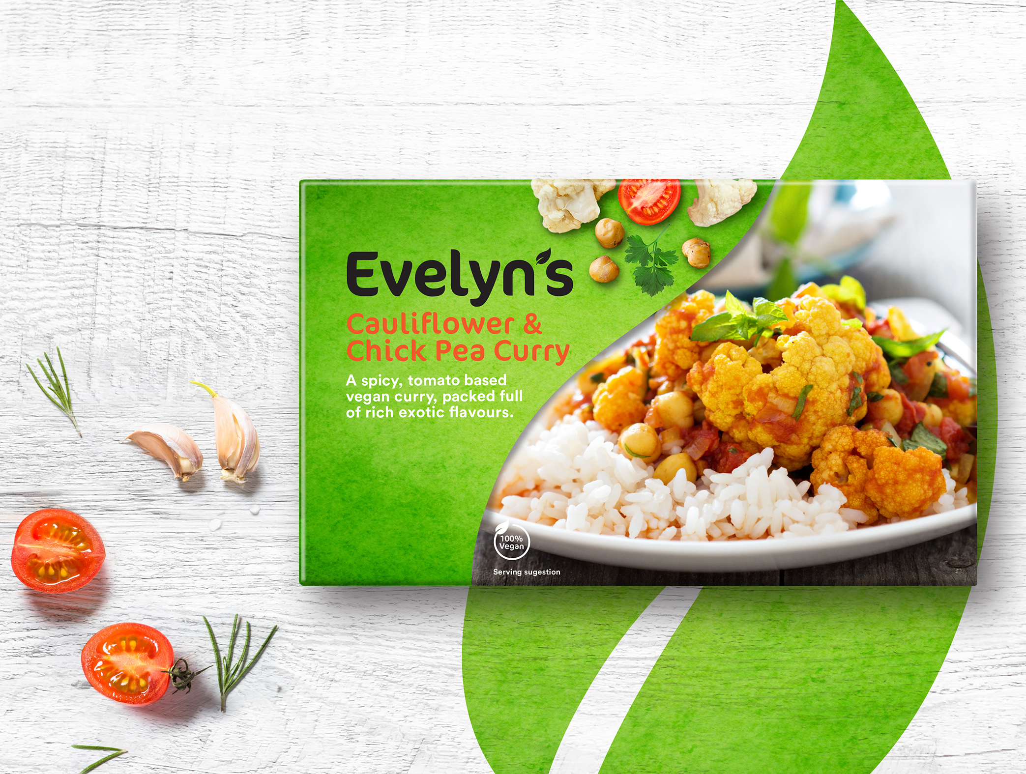
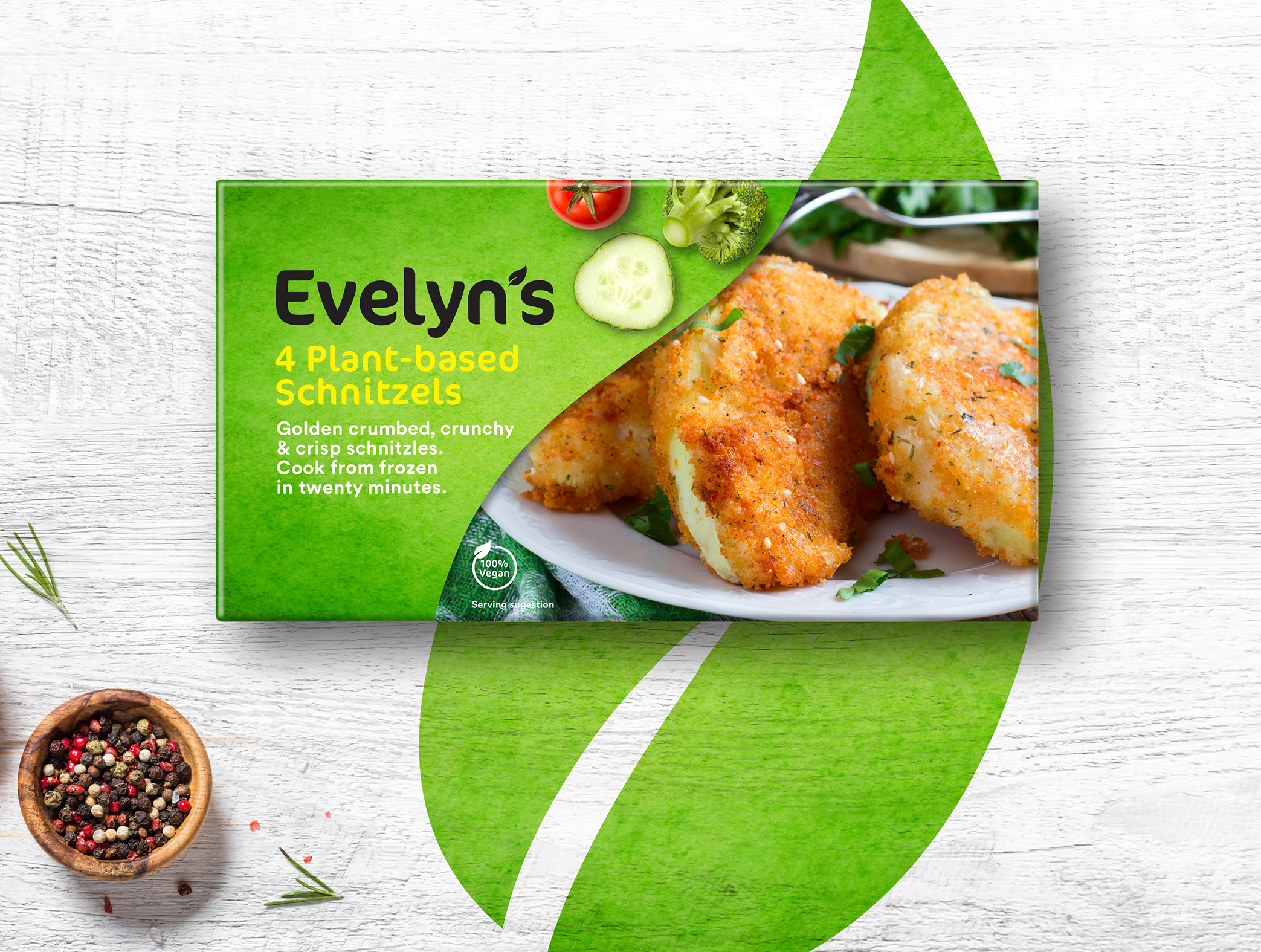
The designs friendly and organic feeling is created through the vibrant use of color and a specific choice of typeface. Taking the leaf motif from the word-mark and using it as an aspect of the packaging design, creates a tool to showcase the ranges stunning photography. Imagery is also employed in the top right hand corner adding a further three dimensional and eye-catching element to the overall identity.
It was essential for the design to be versatile enough; that it could be applied to many different sizes and shapes of packaging formats, including landscape and portrait boxes, bags and labels for tin cans and bottles.
CREDIT
- Agency/Creative: Todd Anderson Design
- Article Title: Evelyn’s New Brand and Packaging Designed by Todd Anderson
- Organisation/Entity: Agency, Non Published Concept Design
- Project Type: Packaging
- Agency/Creative Country: South Africa
- Market Region: Global
- Project Deliverables: Brand Architecture, Brand Creation, Brand Experience, Brand Identity, Brand Naming, Brand Strategy, Brand World, Branding, Graphic Design, Identity System, Packaging Design, Product Architecture, Product Naming, Research, Retail Brand Design, Tone of Voice
- Format: Box, Tin
- Substrate: Pulp Board, Pulp Paper


