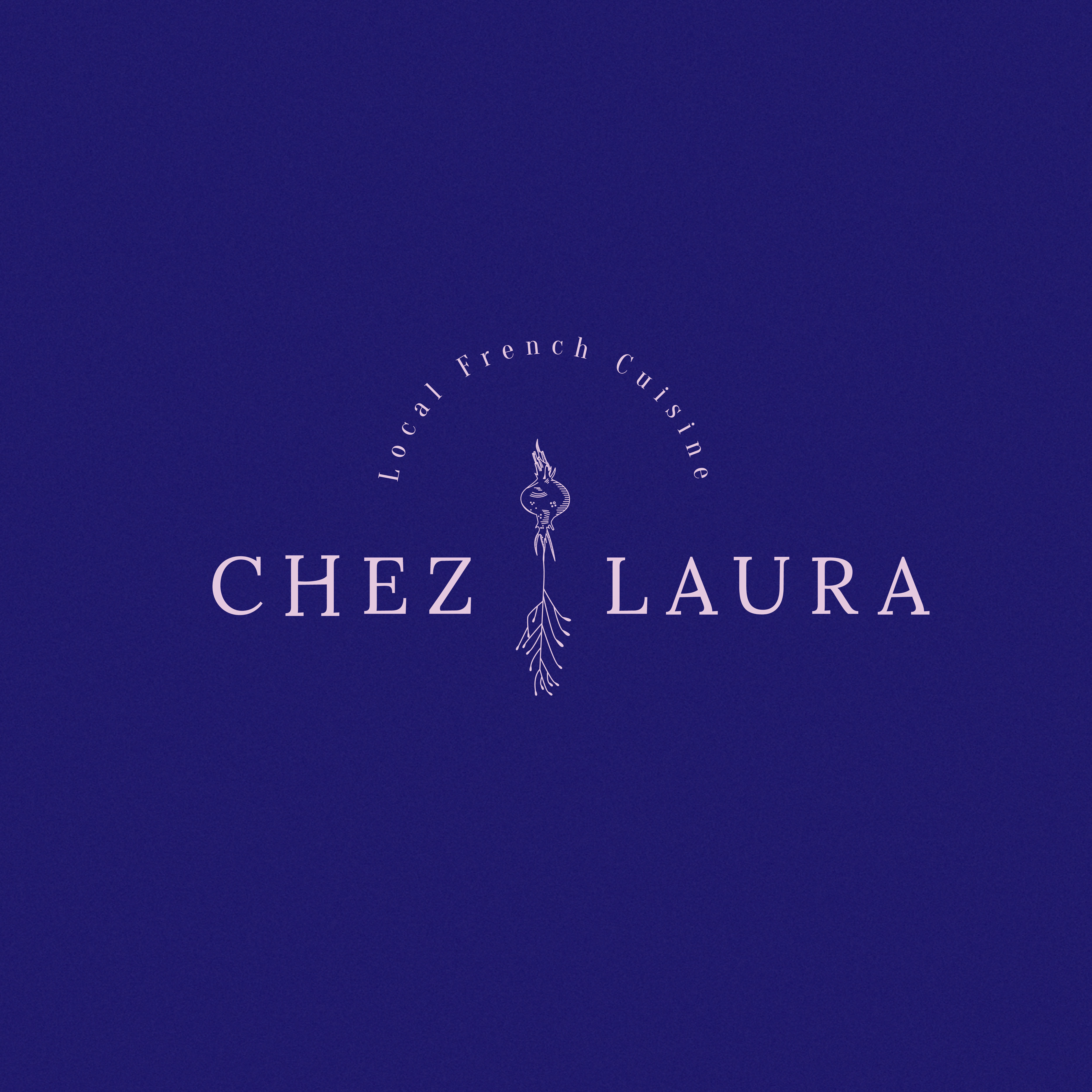
For us the concept “root” means beginning, care, patience, perseverance and above all nature. Everything that the Chez Laura team transmitted talking to us about their food, that is why we chose this concept for the creation of the branding and its graphics.
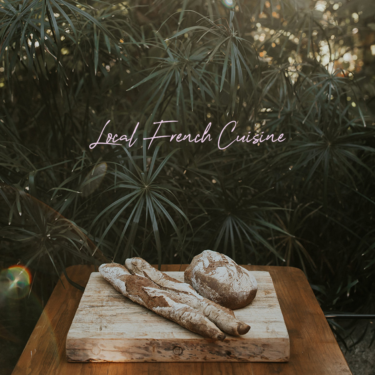
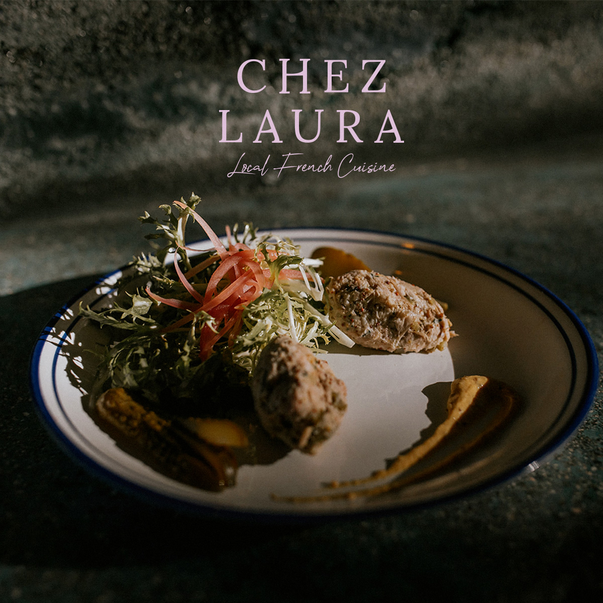
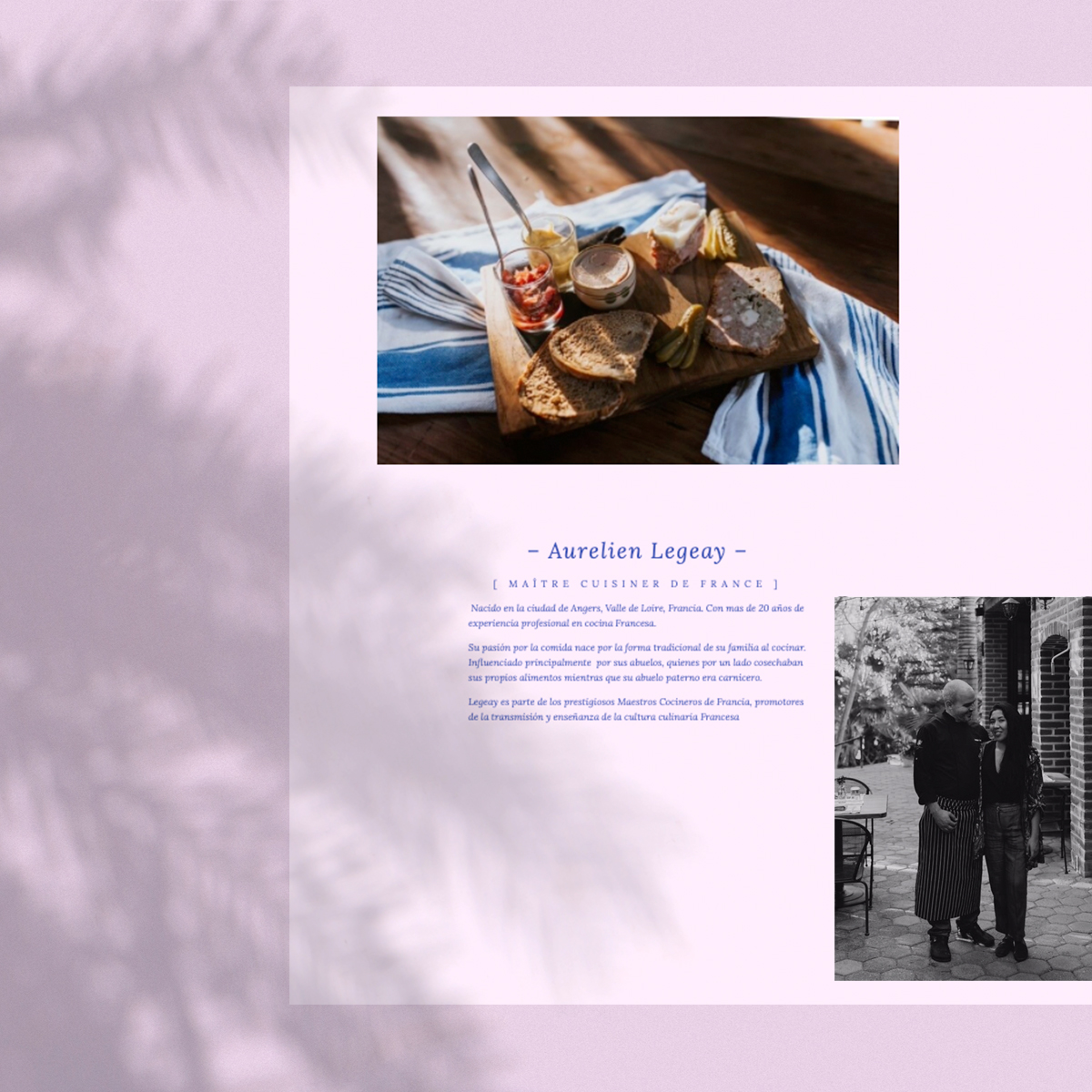
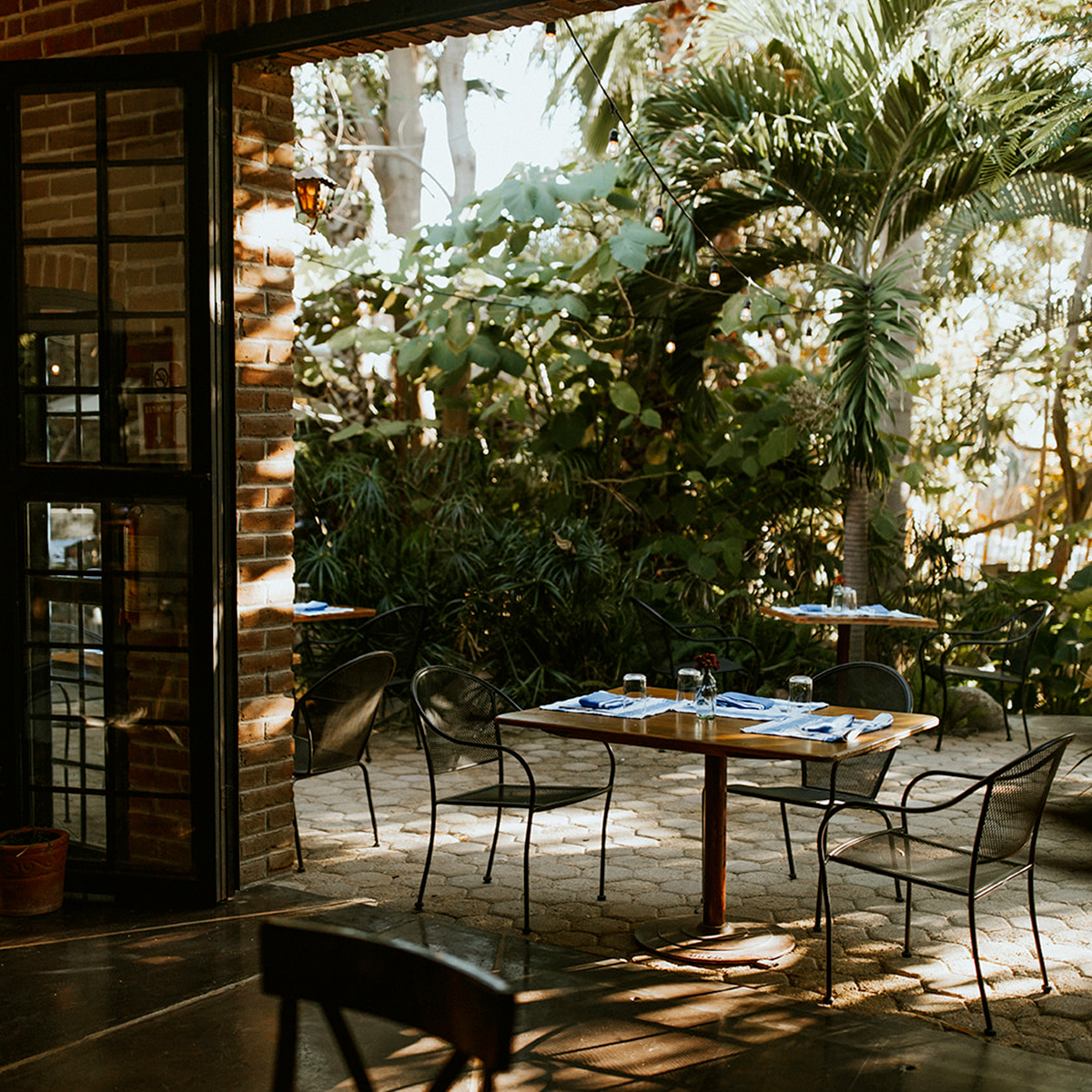
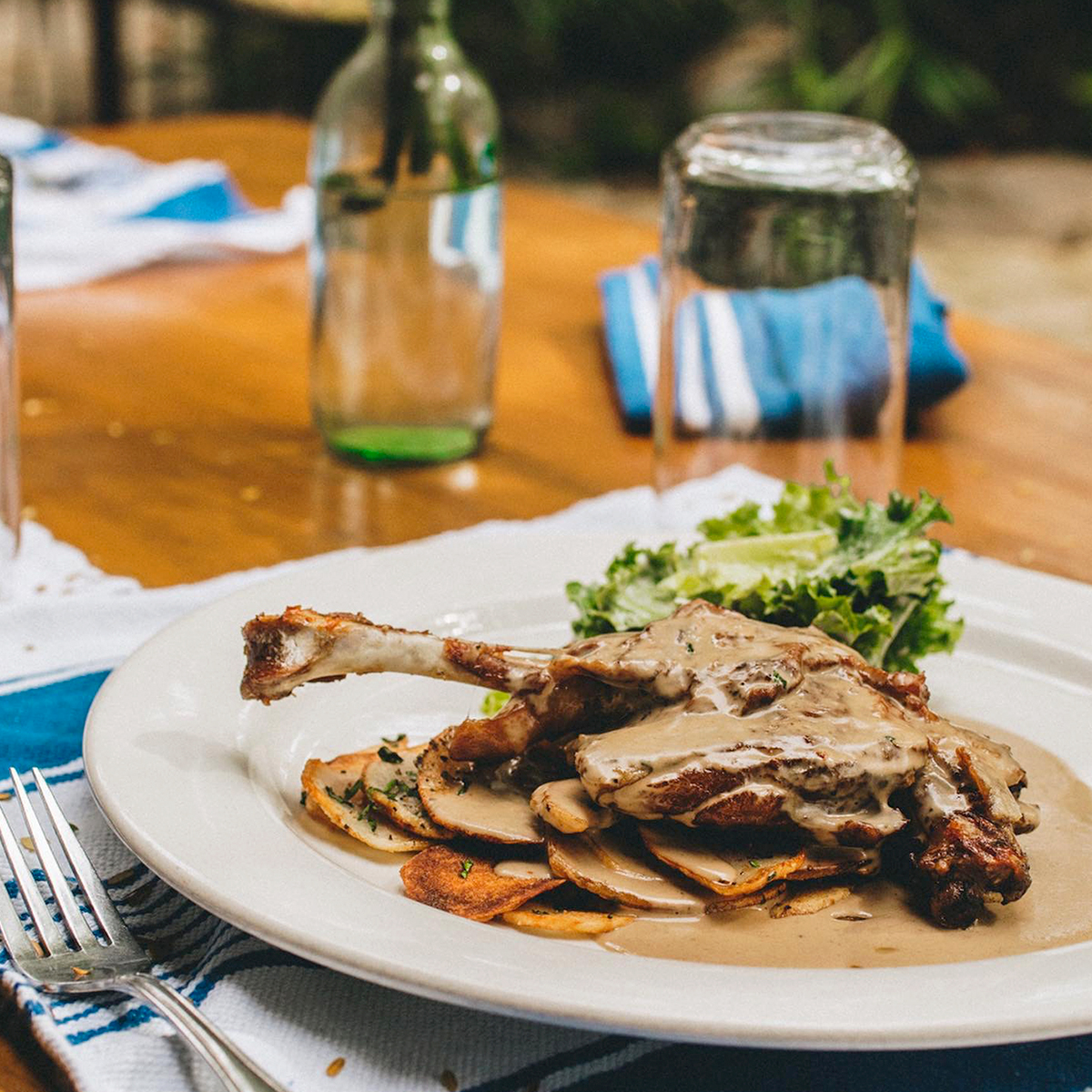
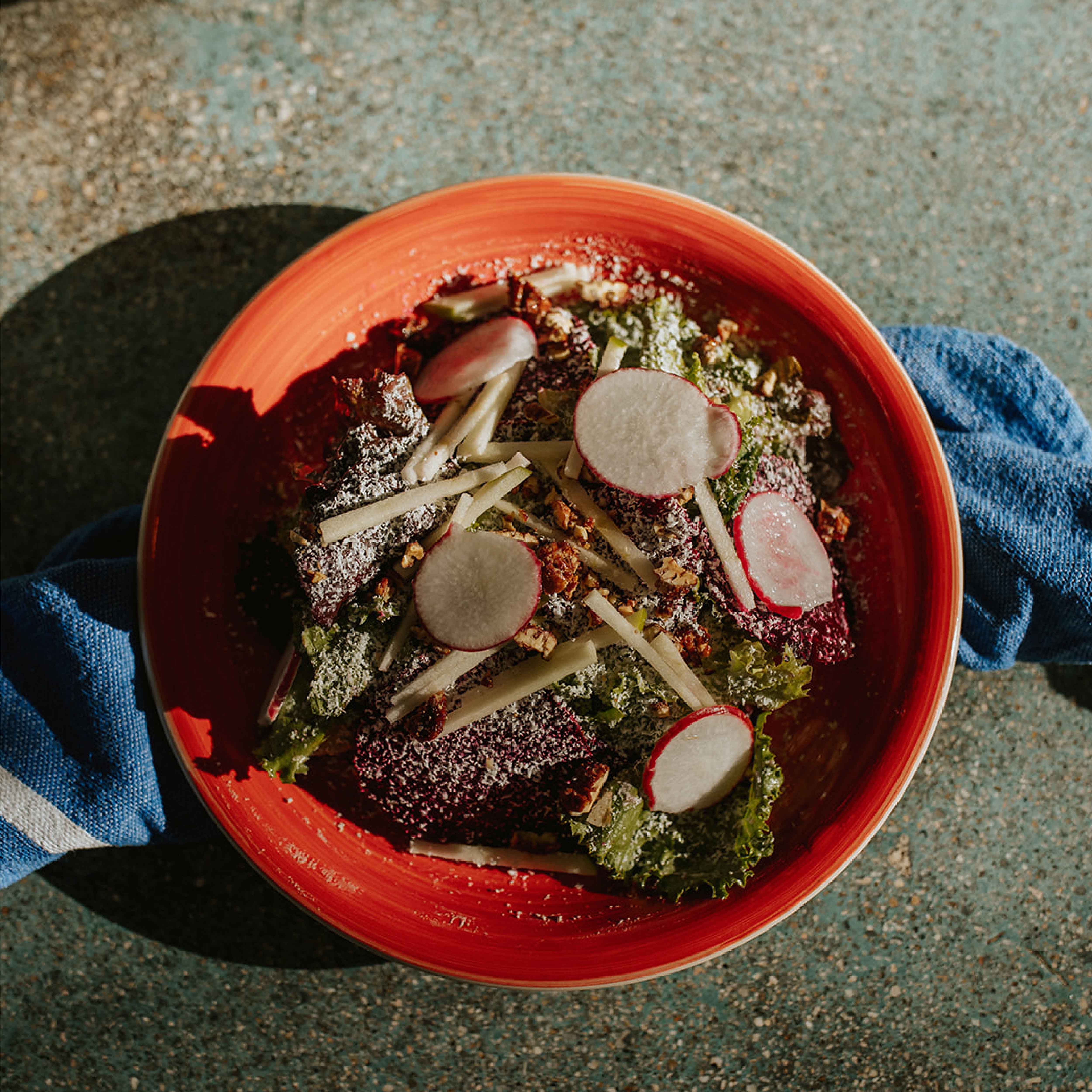
Combining traditional French cuisine with the richness of Mexican products, Chez Laura seeks to promote fresh ingredients purchased directly from local producers, supporting the region’s farmers and delivering quality food from the Maître Cuisiner de France Aurelien Legeay.
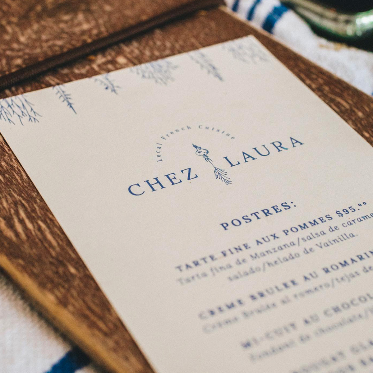
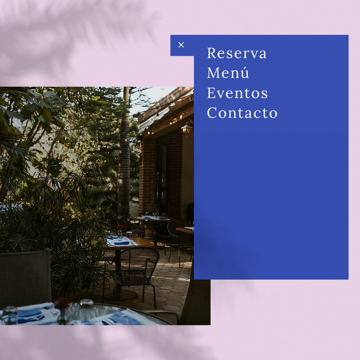
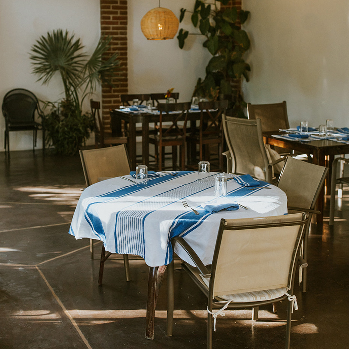
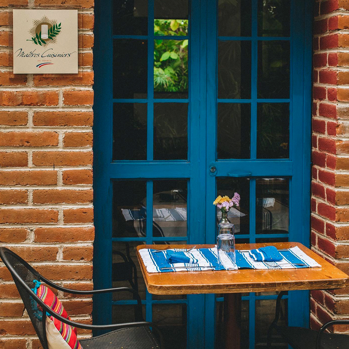
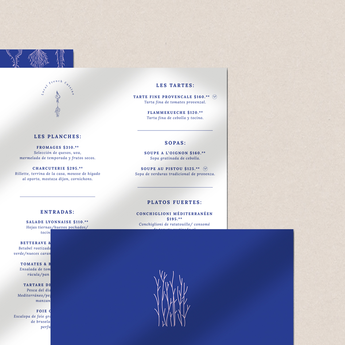
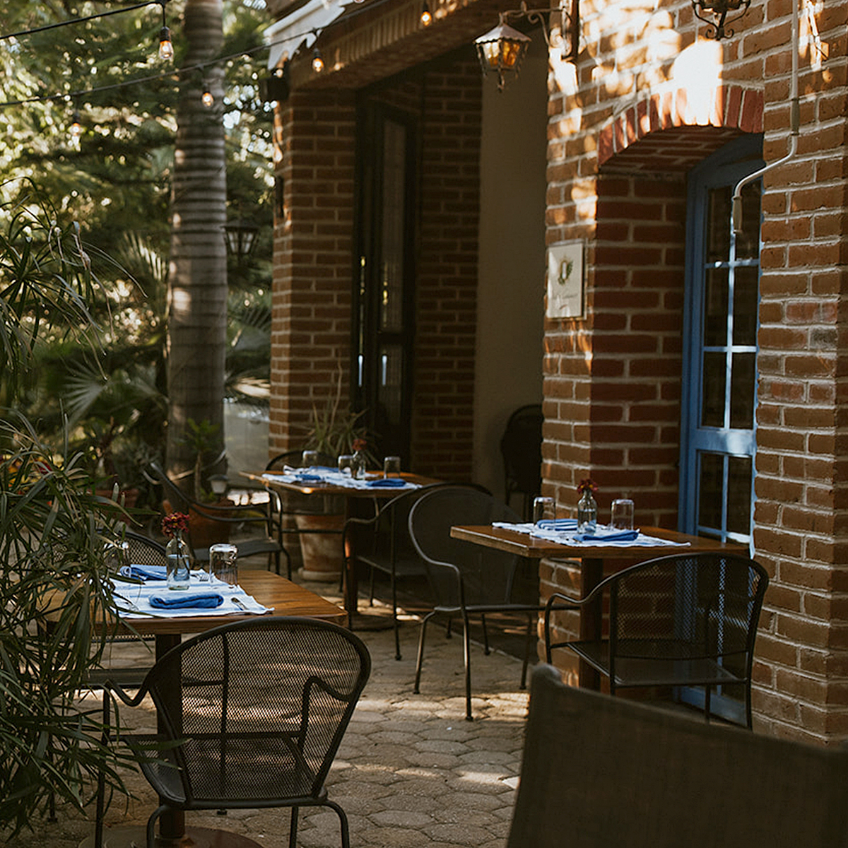
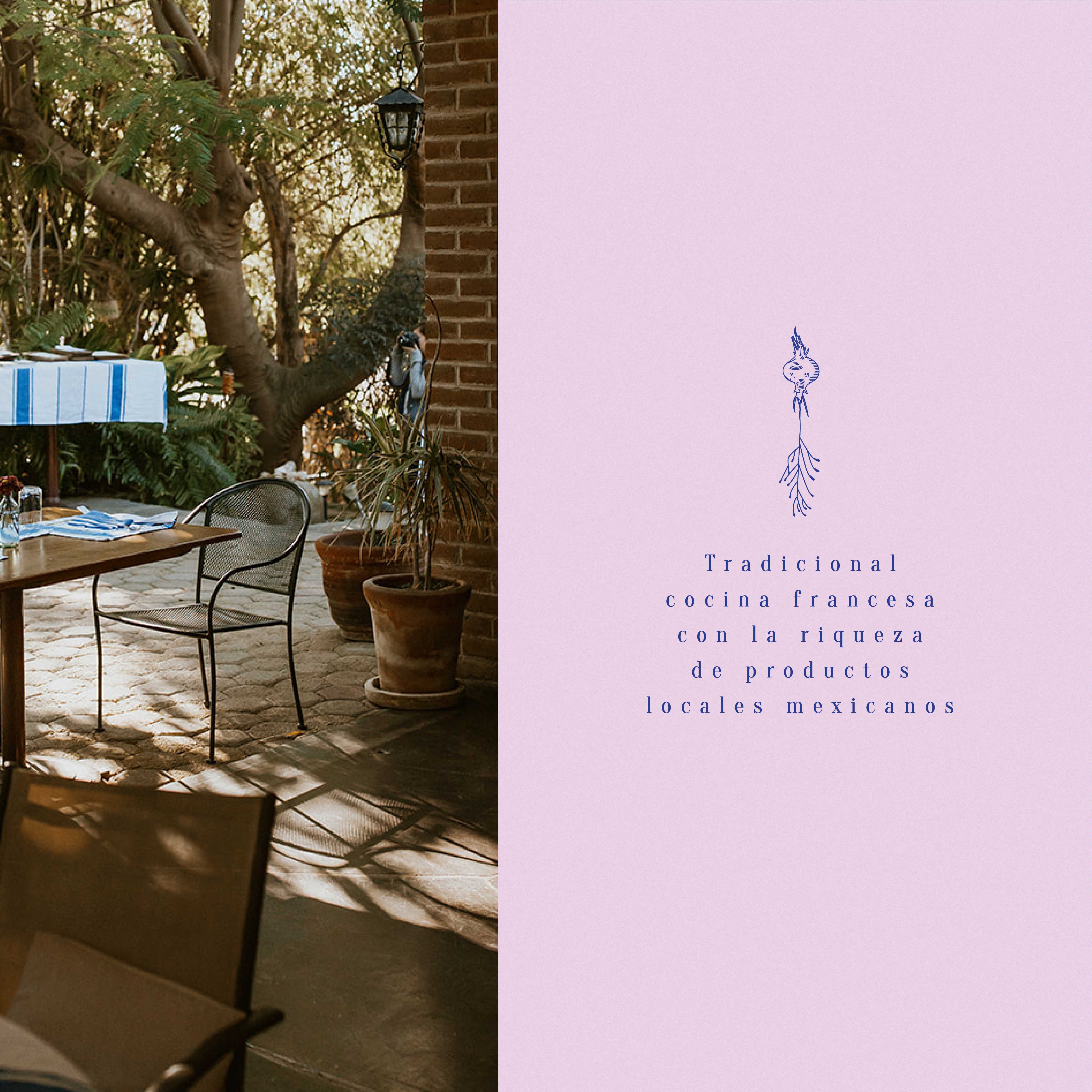
For the brand we wanted to add the parisian vibe in the blue colors and in frames that evoke vintage French pastry shops. For the graphics we express the main concept by adding organic lines that express the different roots of vegetables, combining with pastel colors to achieve a current and fresh image.
CREDIT
- Agency/Creative: Zuncho Studio
- Article Title: Zuncho Studio Branding for Restaurant Chez Laura Local French Cuisine
- Organisation/Entity: In-house, Published Self Promotional Design
- Project Type: Identity
- Agency/Creative Country: Spain
- Market Region: Global
- Project Deliverables: Brand Creation, Brand Design, Brand Experience, Brand Guidelines, Brand Identity, Brand Strategy, Branding, Graphic Design, Identity System, Illustration, Packaging Design, Research, Retail Brand Design
- Industry: Food/Beverage
- Keywords: branding, graphic design, baja california sur, french restaurant, cuisine, blue branding, roots, french cuisine, zuncho studio branding, todos santos bcs, logo brand, logo concept, farm to table


