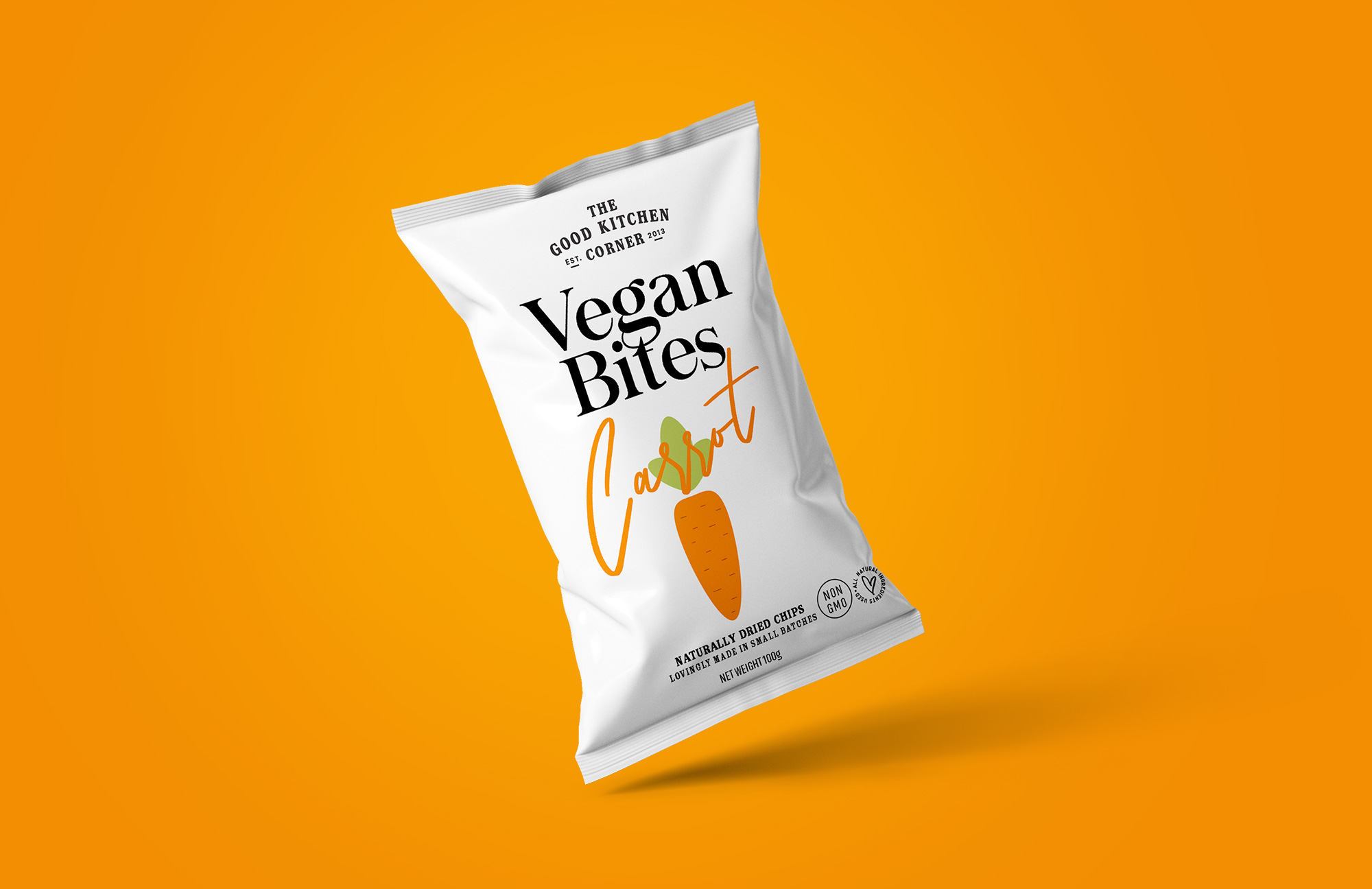
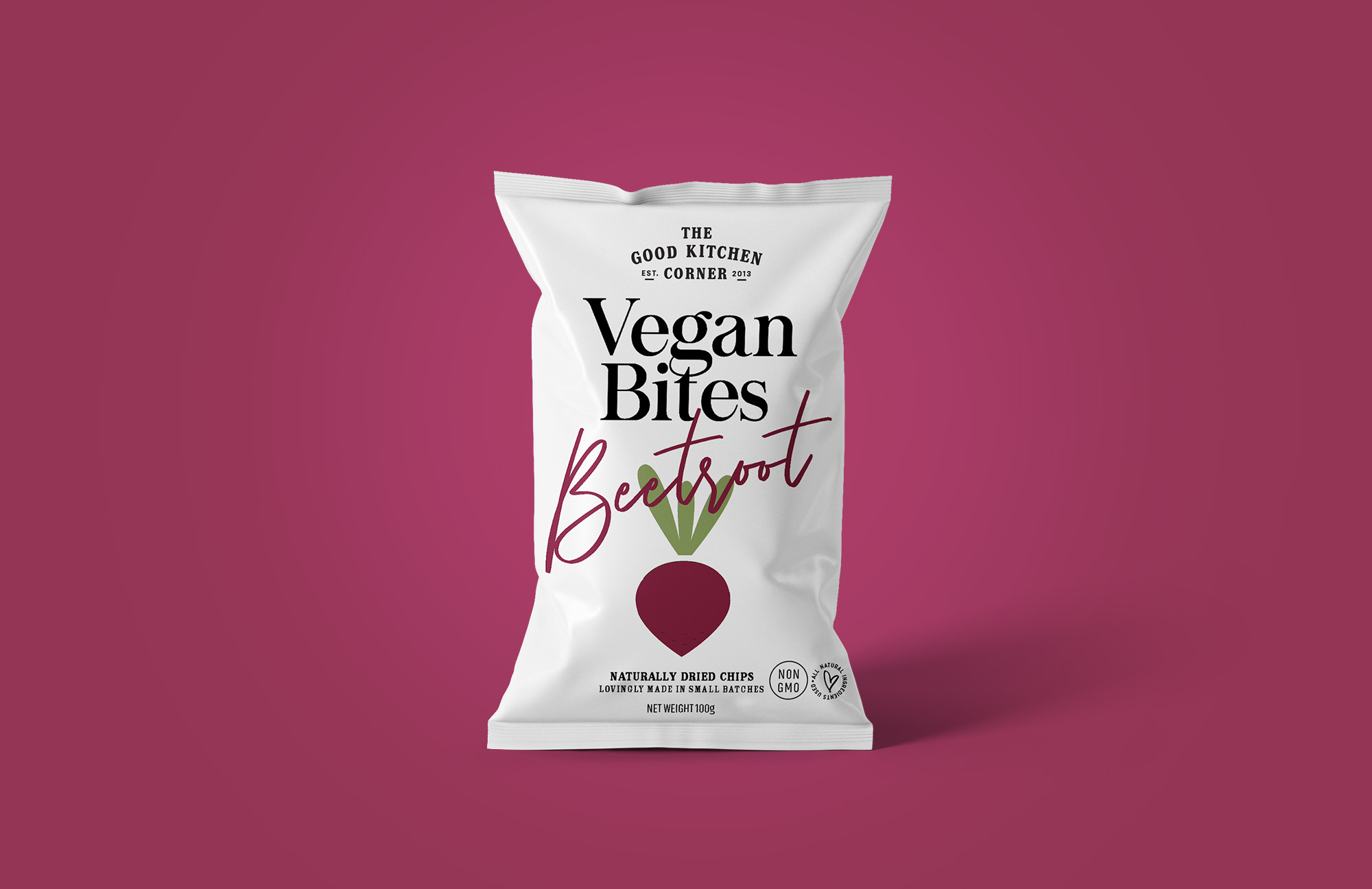
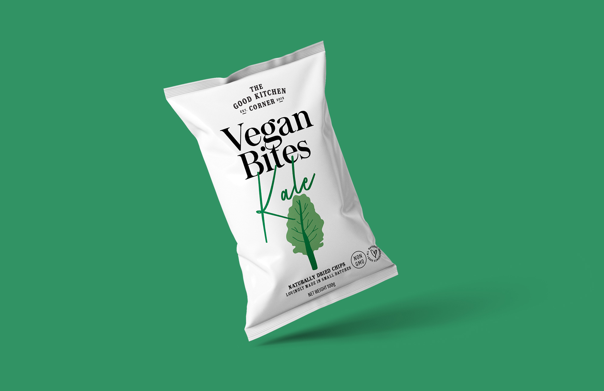
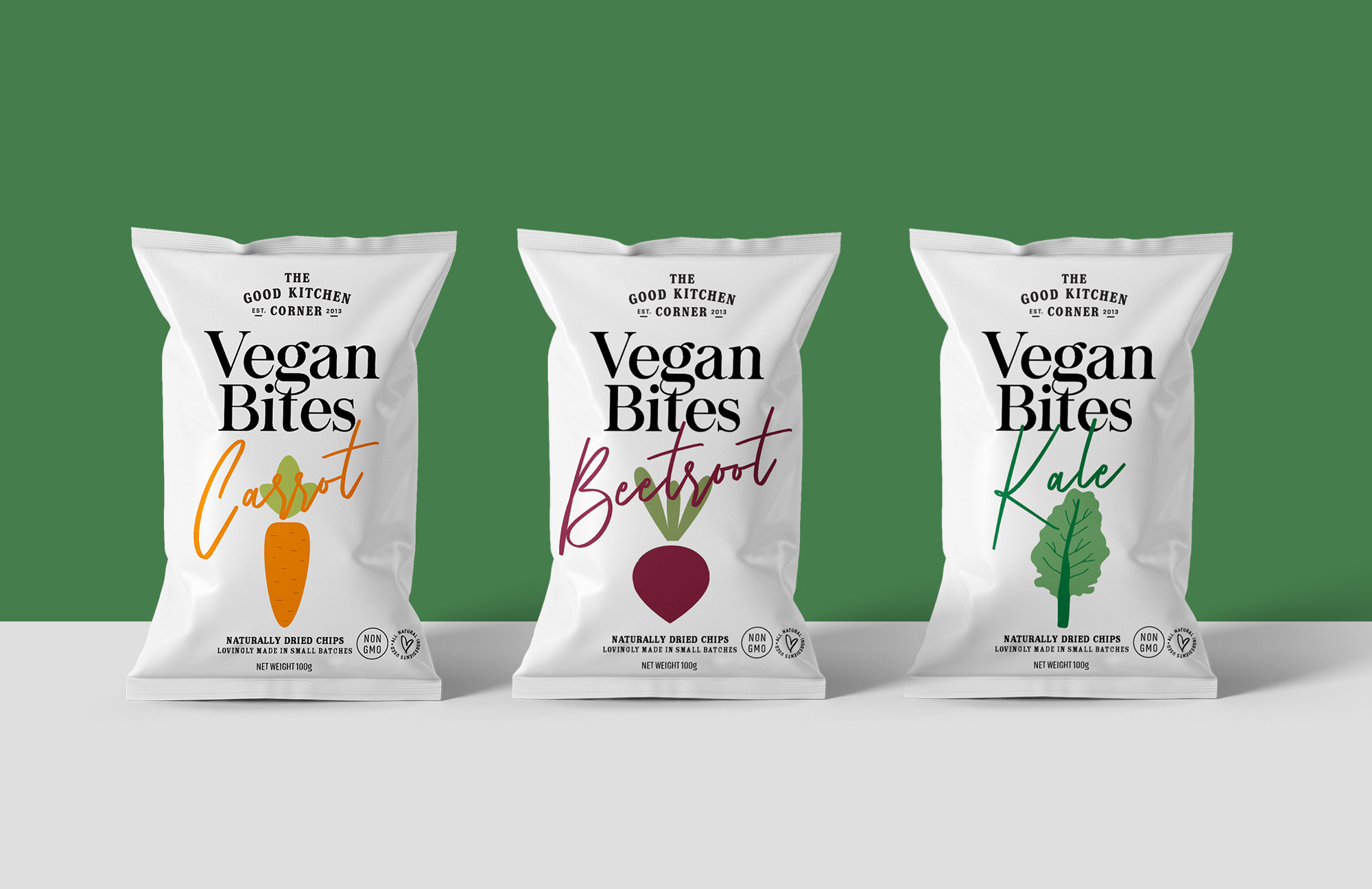
The Good Kitchen Corner is a brand that promotes clean eating. The client was looking for a packaging that not only stands out on the shelves but also stands for the brand value and character. It’s easy to understand why – there are hundreds of products out there, all competing for consumers’ attention. The only way to set your brand apart is to be different, to be authentic. We aligned the design with the vision of the company by using fresh colors, hand drawn illustrations and clean typography. We stayed away from information overload and reduced the packaging to its bare essentials that truly projects the brand story. Keeping it simple.


CREDIT
- Agency/Creative: Firstbase
- Article Title: The Good Kitchen Corner Packaging Design by Firstbase
- Organisation/Entity: Agency, Published Commercial Design
- Project Type: Packaging
- Agency/Creative Country: India
- Market Region: Multiple Regions
- Project Deliverables: Brand Architecture, Brand Creation, Brand Naming, Brand Strategy, Branding, Illustration, Packaging Design, Research, Tone of Voice
- Format: Pouch
- Substrate: Plastic
FEEDBACK
Relevance: Solution/idea in relation to brand, product or service
Implementation: Attention, detailing and finishing of final solution
Presentation: Text, visualisation and quality of the presentation


