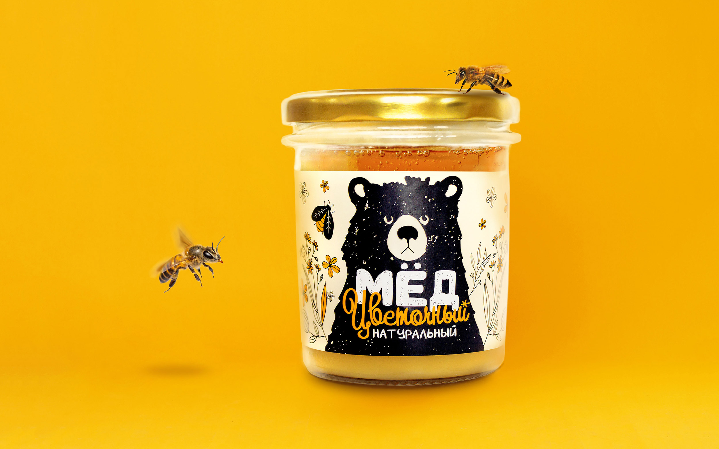
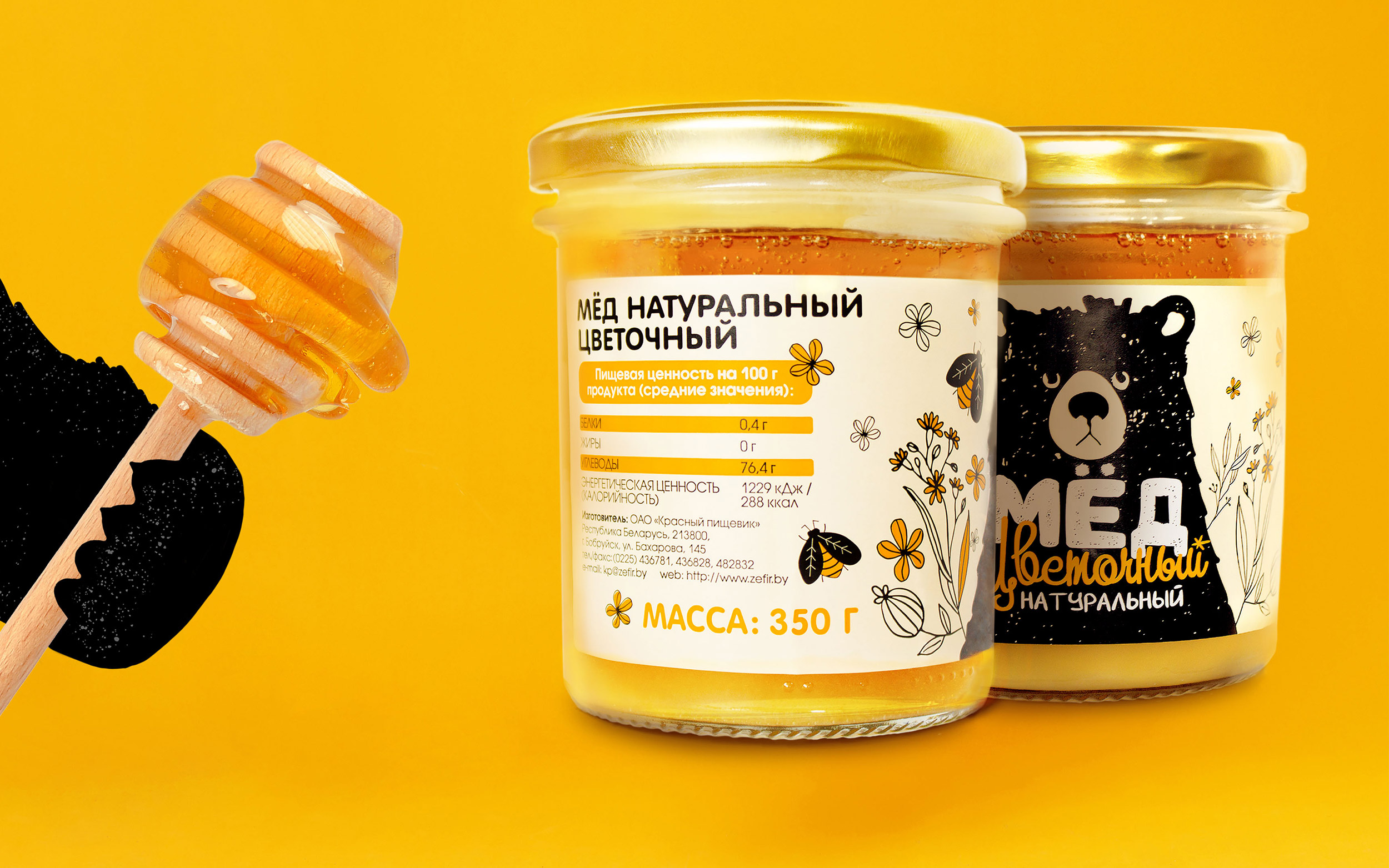
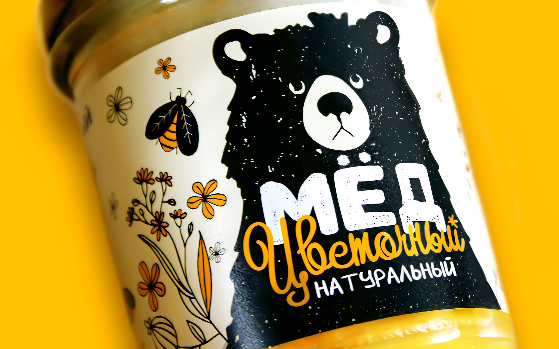
Flower honey label design development. Our brand character is a bear. Its serious appearance is immediately clear: he is a real expert, a professional in choosing high-quality and delicious honey. Flower honey! We emphasized this by depicting cute painted flowers on the label.
The main colors, of course – 50 shades of honey. That gives warmth to the overall composition and awakens a sweet thrill in the stomach.
The font is streamlined and soft, in-line with the product itself.


CREDIT
- Agency/Creative: Muffin Group
- Article Title: Muffin Group has Developed a Floral Honey Label Design
- Organisation/Entity: Agency, Published Commercial Design
- Project Type: Packaging
- Agency/Creative Country: Belarus
- Market Region: Europe
- Project Deliverables: Packaging Design, Product Architecture
- Format: Tin
- Substrate: Glass Bottle
FEEDBACK
Relevance: Solution/idea in relation to brand, product or service
Implementation: Attention, detailing and finishing of final solution
Presentation: Text, visualisation and quality of the presentation


