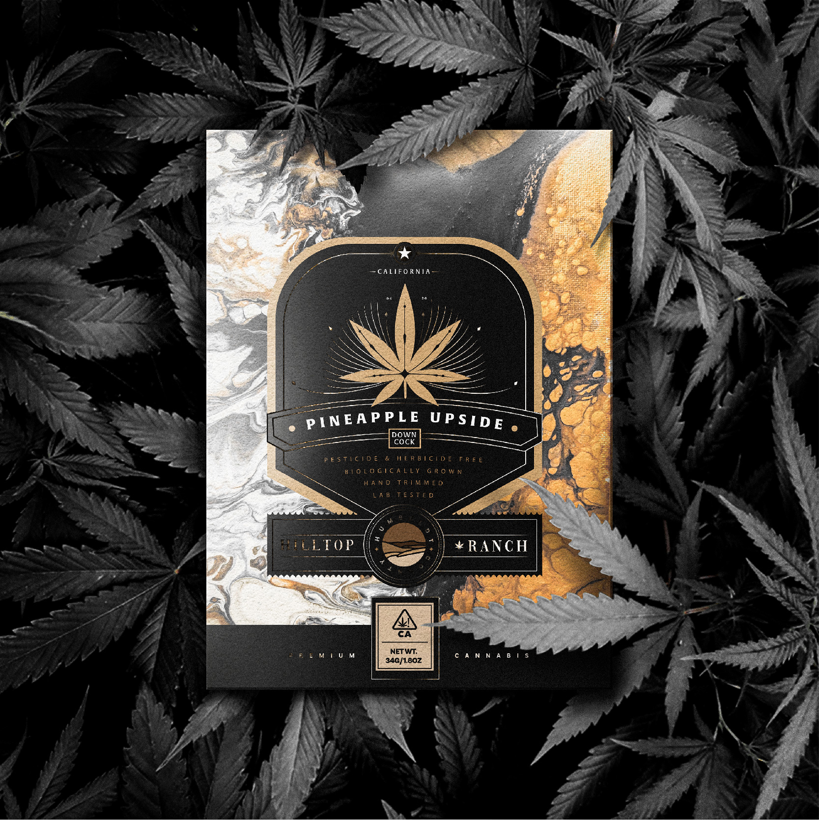
Hilltop Ranch is a brand of premium organic cannabis free of herbicide pesticides, biologically grown, hand-trimmed and laboratory tested. This cannabis producing brand is licensed in Humboldt County, California, United States.
The problem to be solved starts from the need to substantially improve the packaging system, being able to identify the different varieties of the product, that make up this product line and attribute differential characteristics and values to those of its competition.
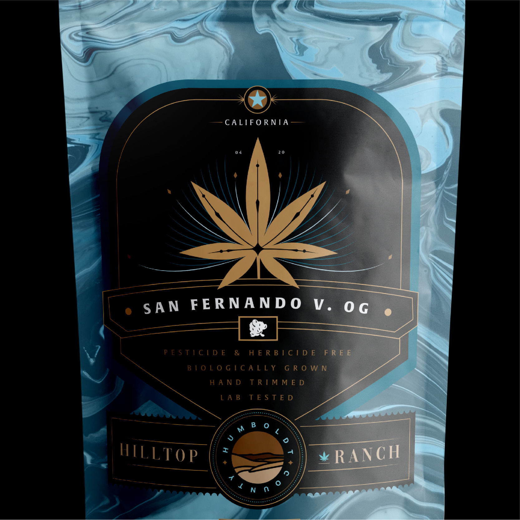
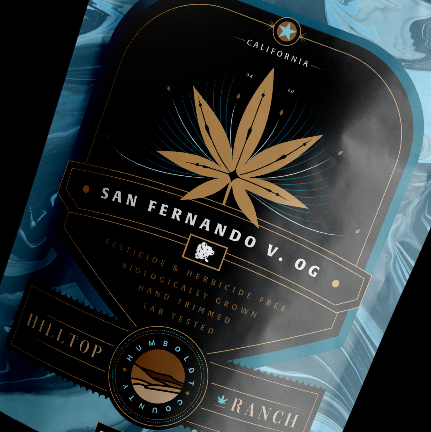
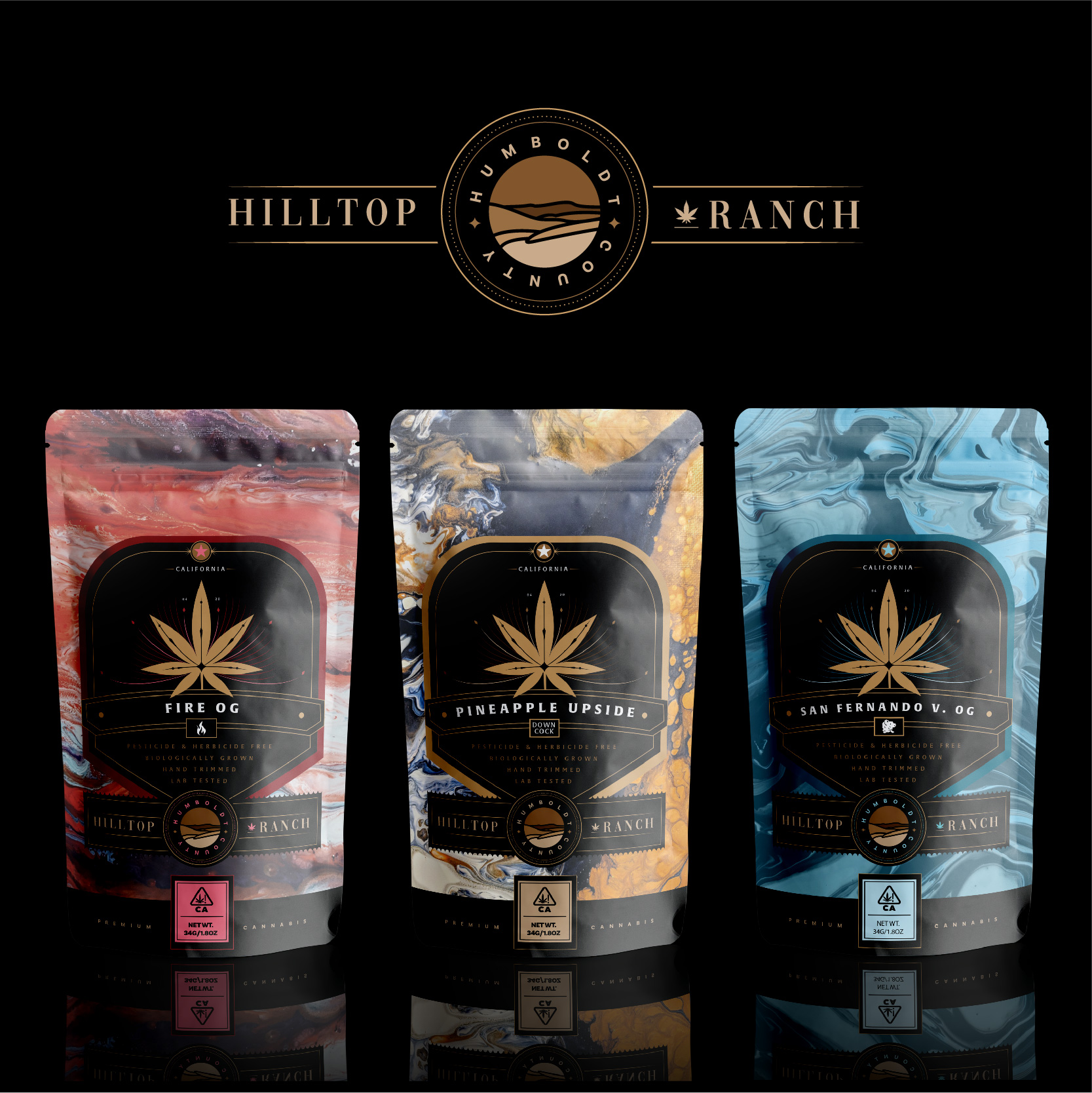
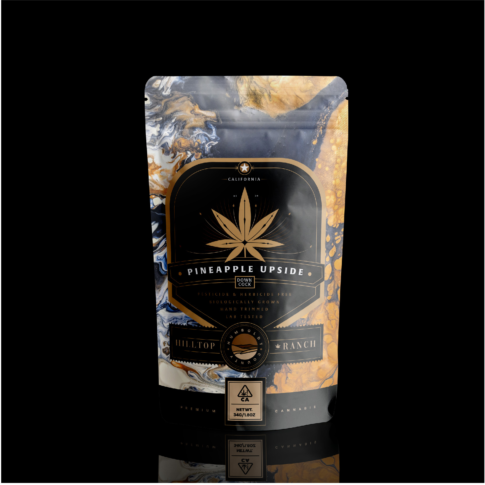
The redesign presented proposal, proposes a new central label structure made up of graphic elements that refer to a high-quality, organic and cared product throughout its production process. This central label is accompanied by an enveloping organic texture that covers the rest of the packaging, differentiating the different products (Pineapple Upside, San Fernando Valley OG, Fire OG.) Within the same line, respecting the graphic system. The result obtained is that of a packaging that reflects the high quality of the product it carries, differentiation within the product line and a high perceived aesthetic level in the brand connoting the elegance and quality characteristic of a premium product.
CREDIT
- Agency/Creative: Vantablack Creative Studio
- Article Title: Packaging Design for Hilltop Ranch by Vantablack Creative Studio
- Organisation/Entity: Agency, Published Commercial Design
- Project Type: Packaging
- Agency/Creative Country: Argentina
- Market Region: North America
- Project Deliverables: Brand Strategy, Identity System, Packaging Design, Rebranding, Tone of Voice
- Format: Pouch
- Substrate: Plastic


