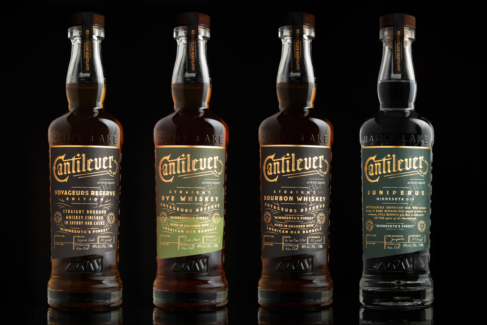
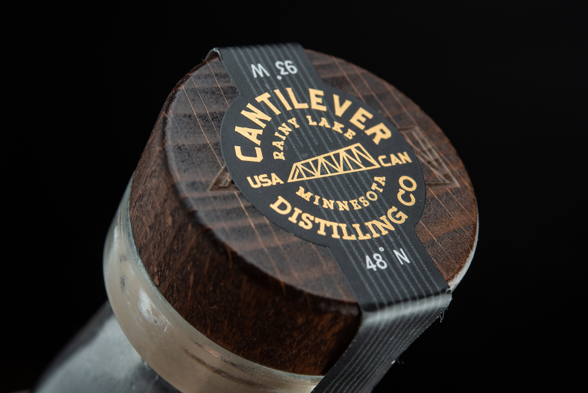
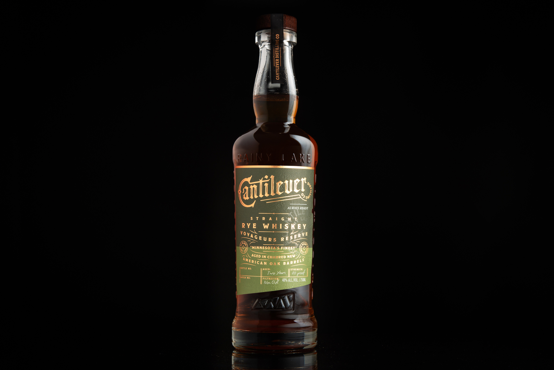
Meaningful connections are the cornerstone of the Cantilever Distilling Company’s brand. Drawing from a fascinating and fabled local history, Cantilever Distilling Company is named for the Historic Cantilever Bridge – a lifeline for smugglers of spirits in the 1920s.
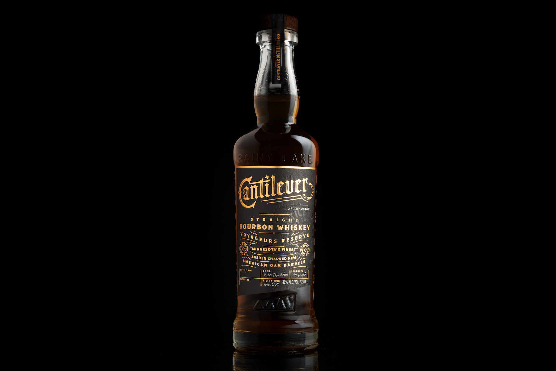
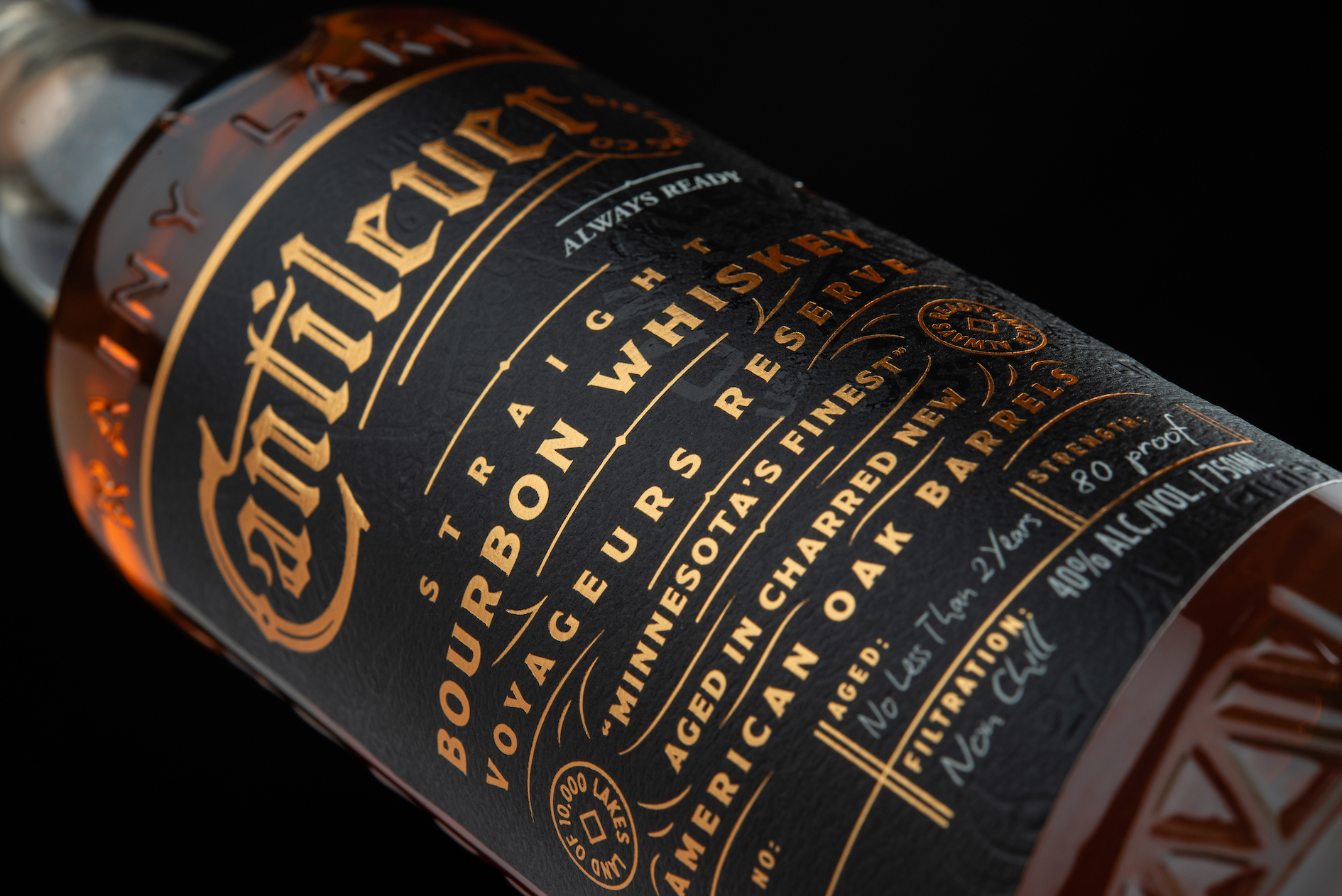
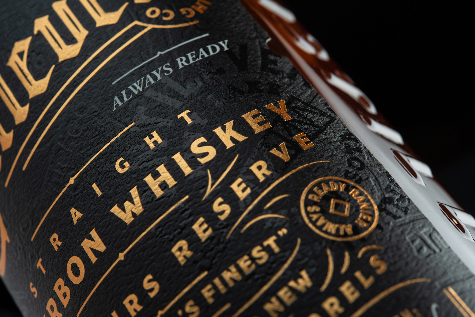
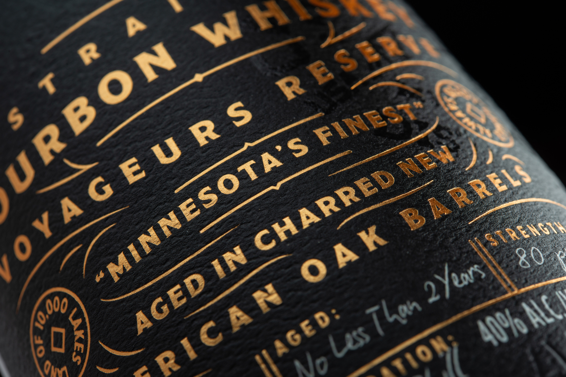
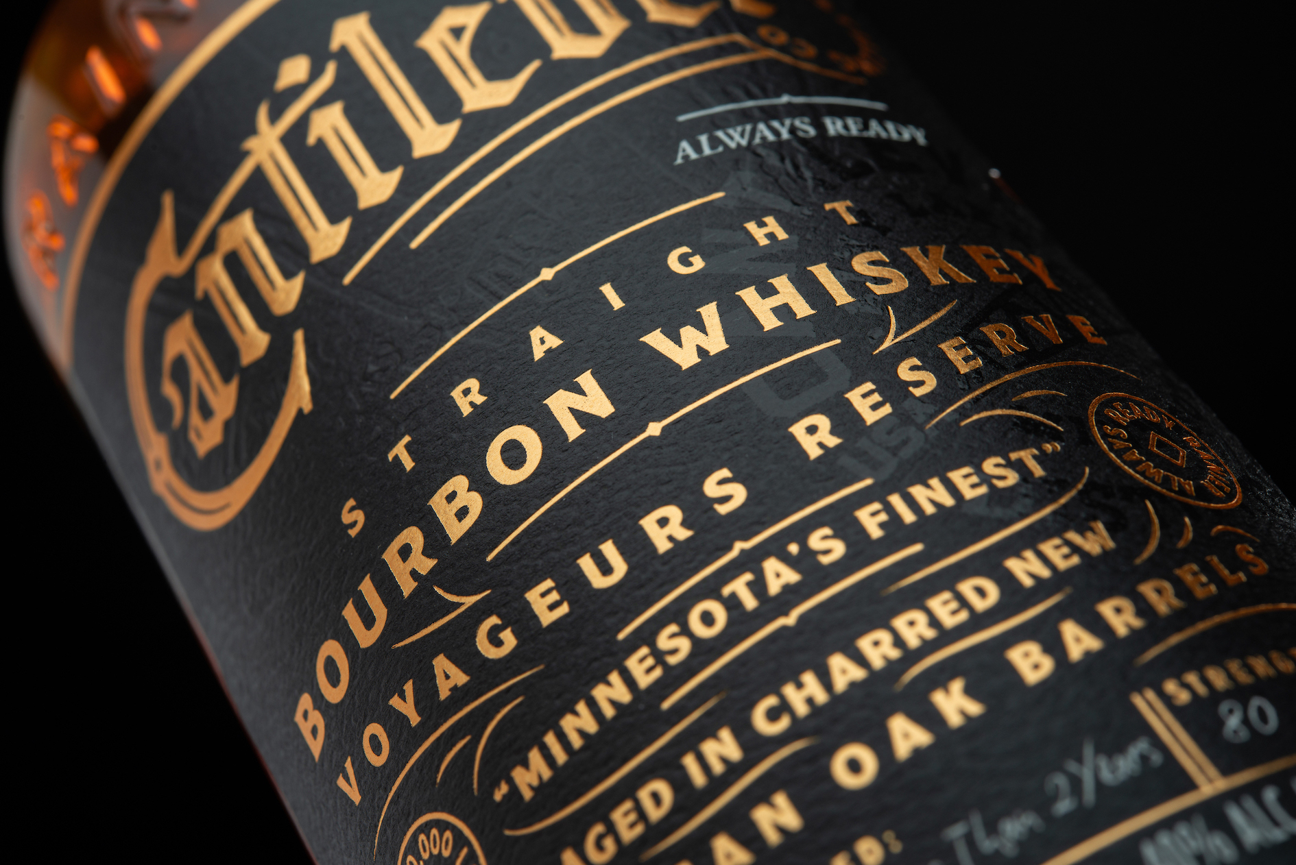
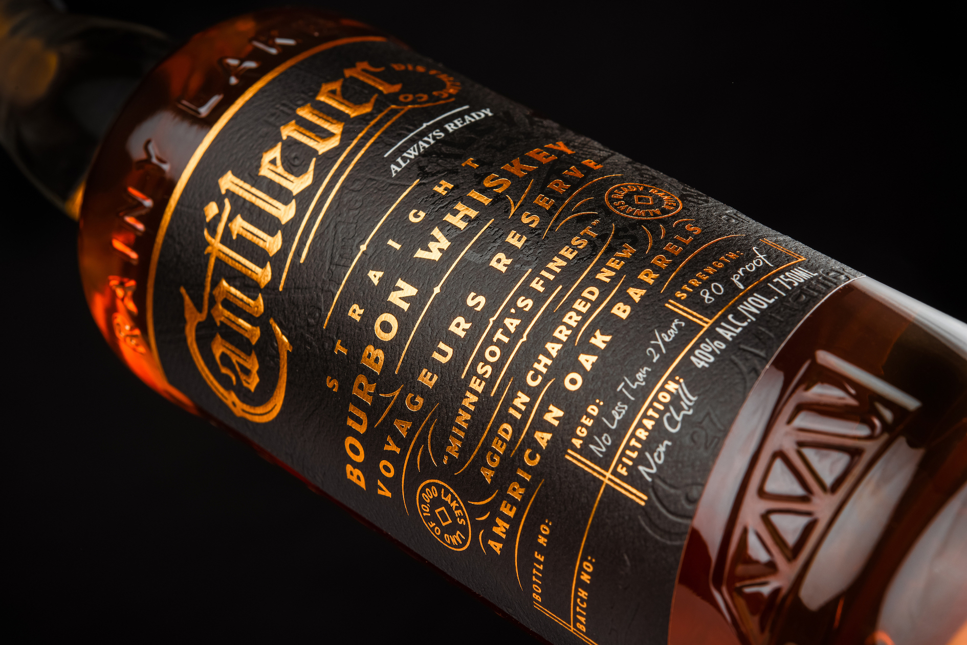
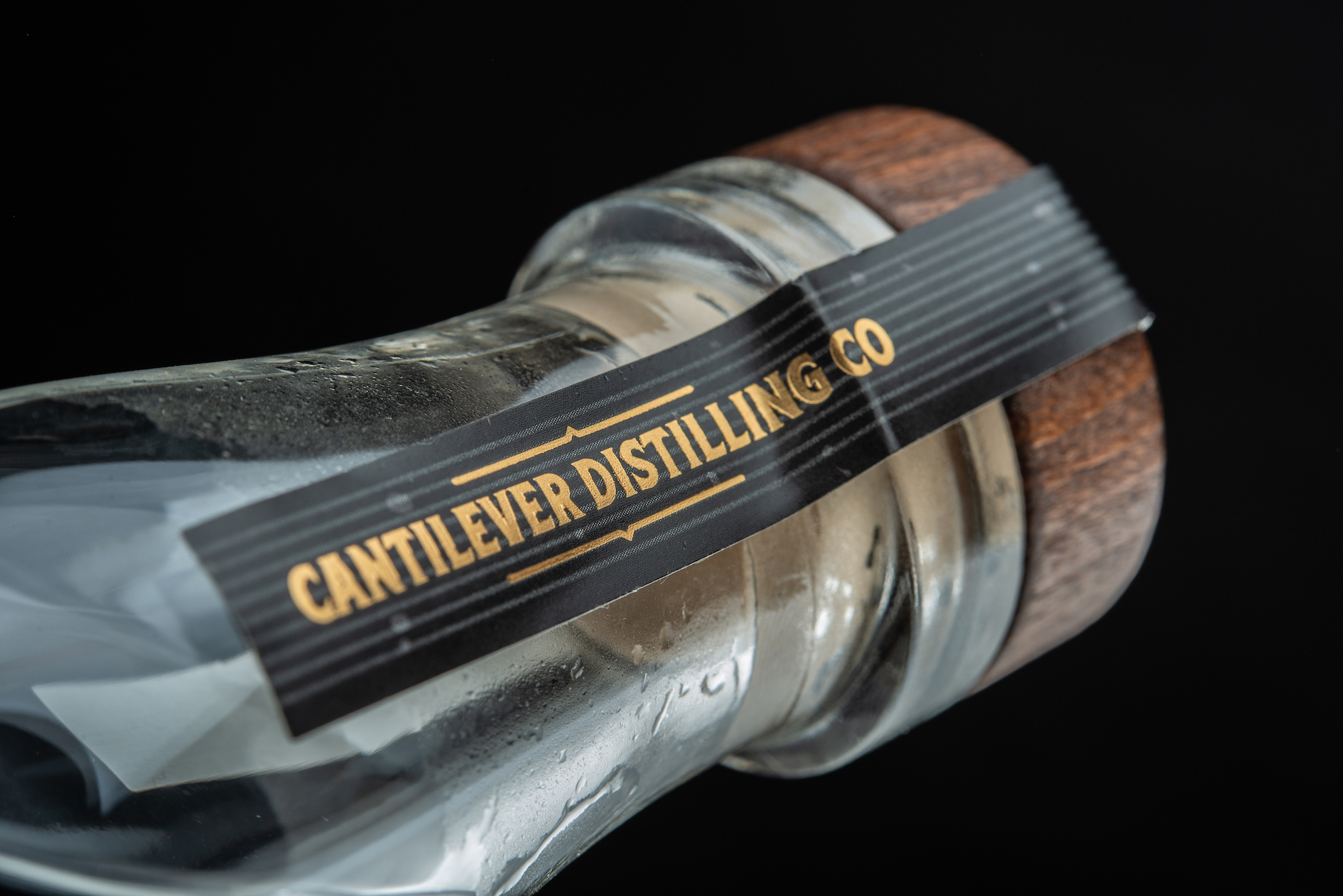
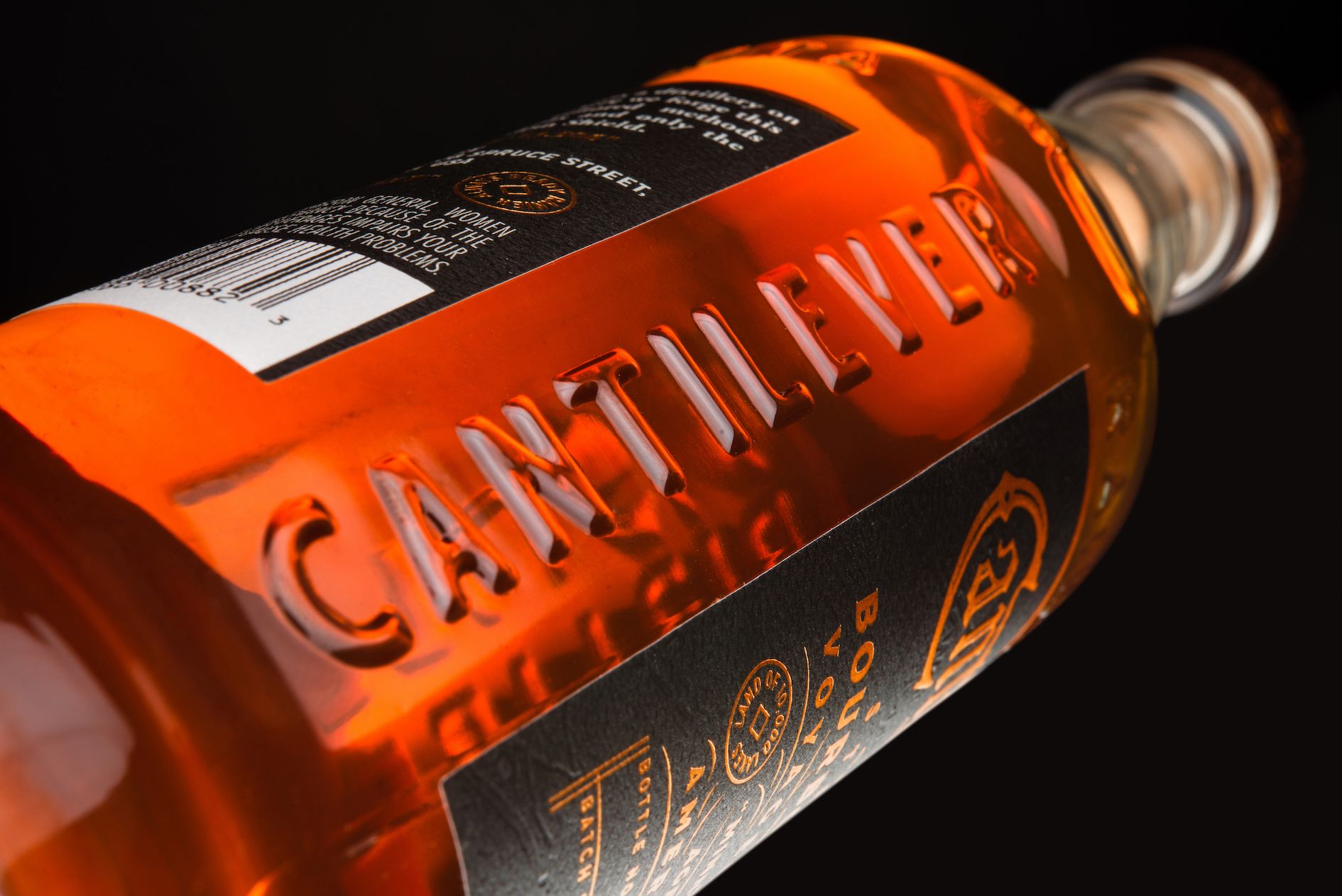
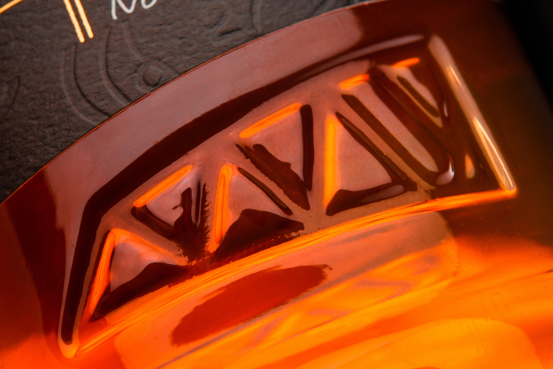
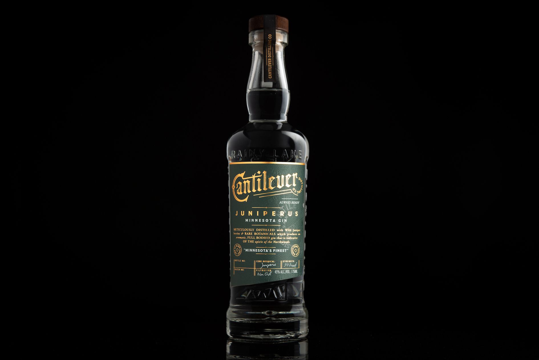
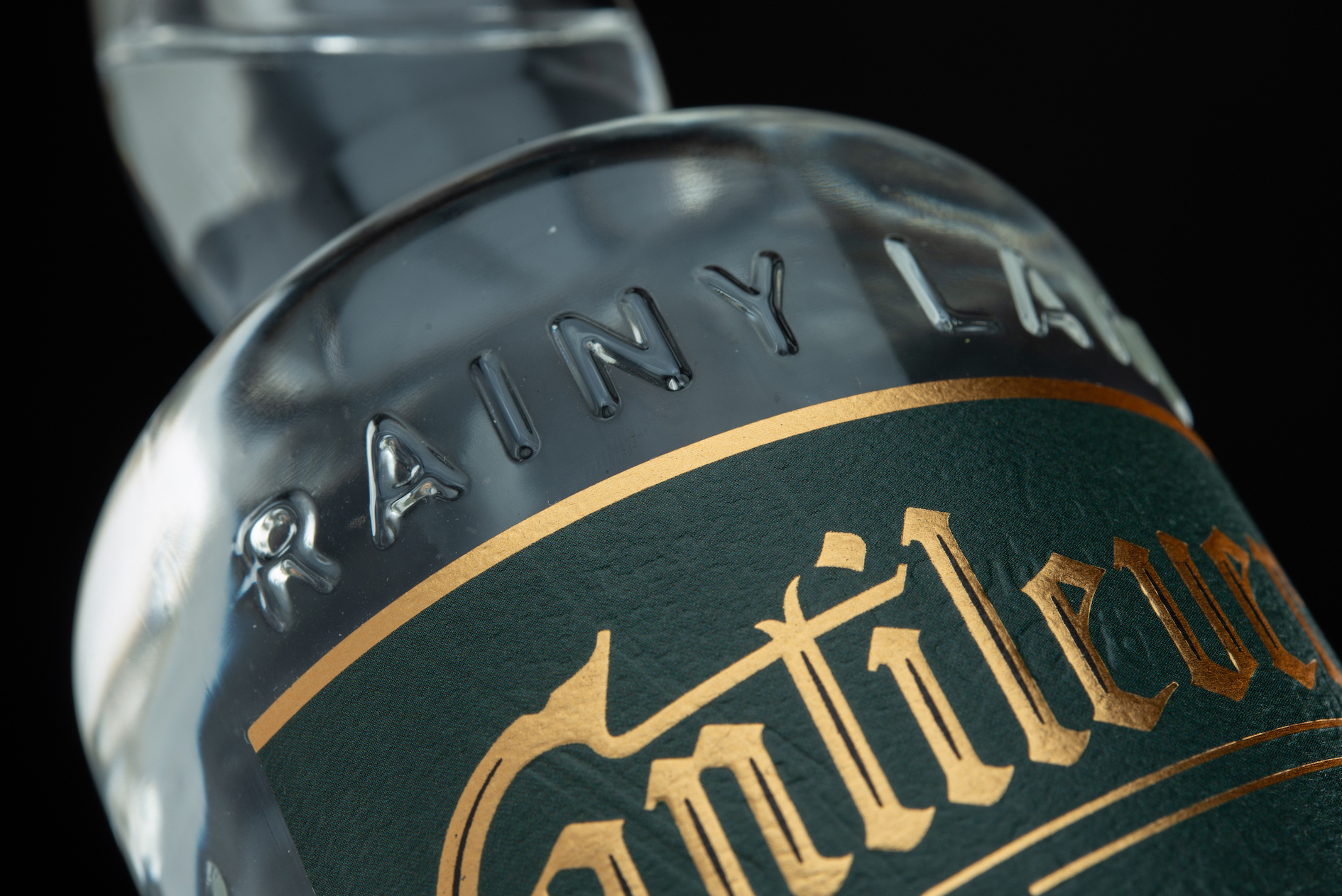
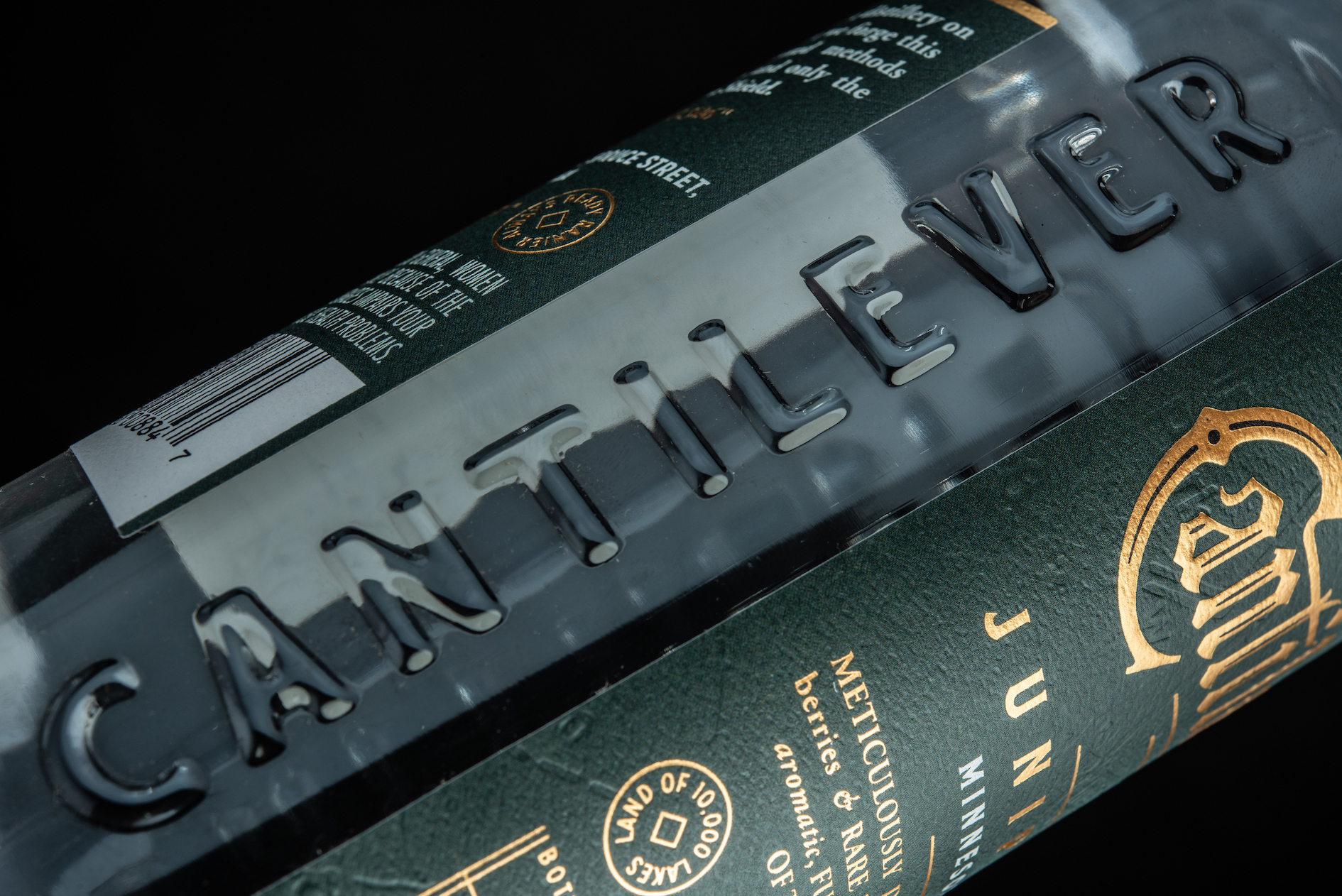
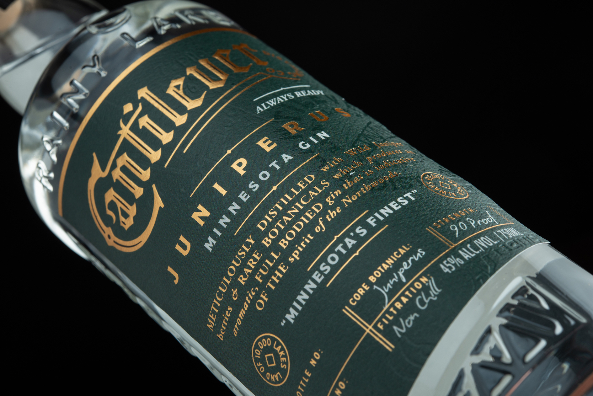
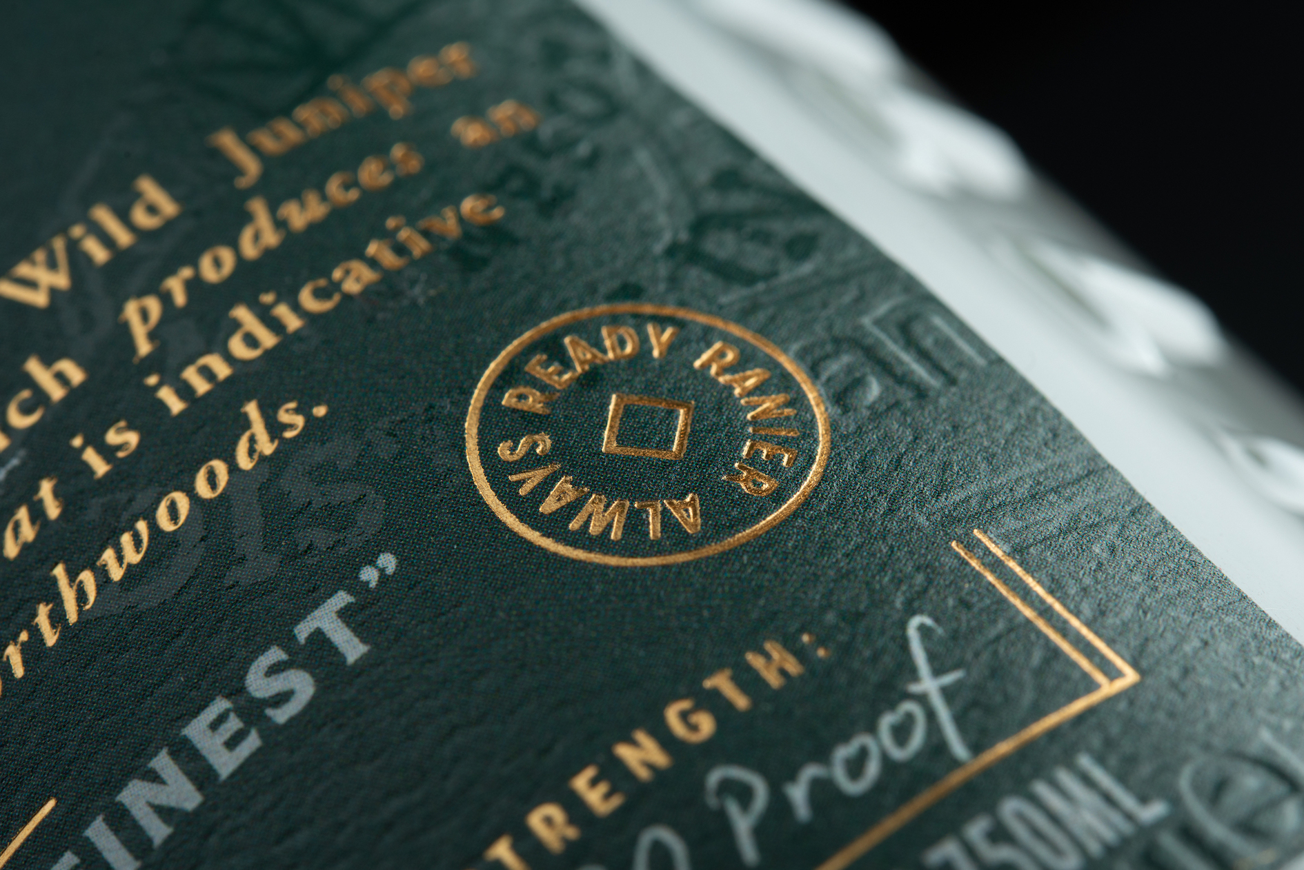
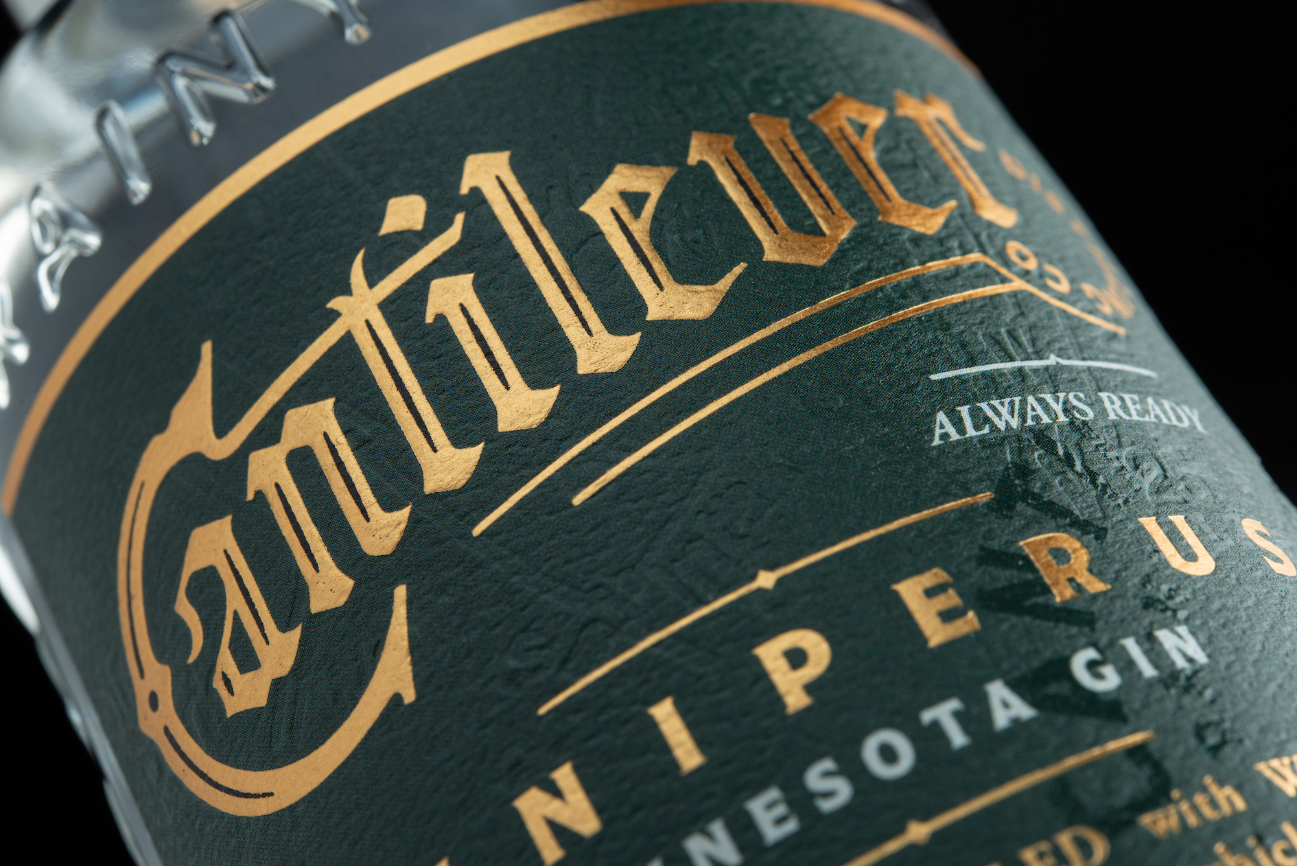
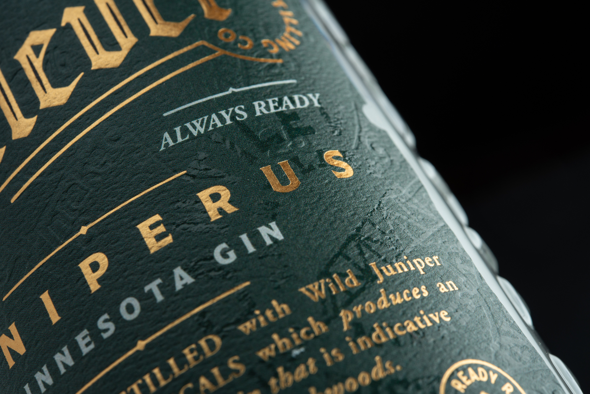
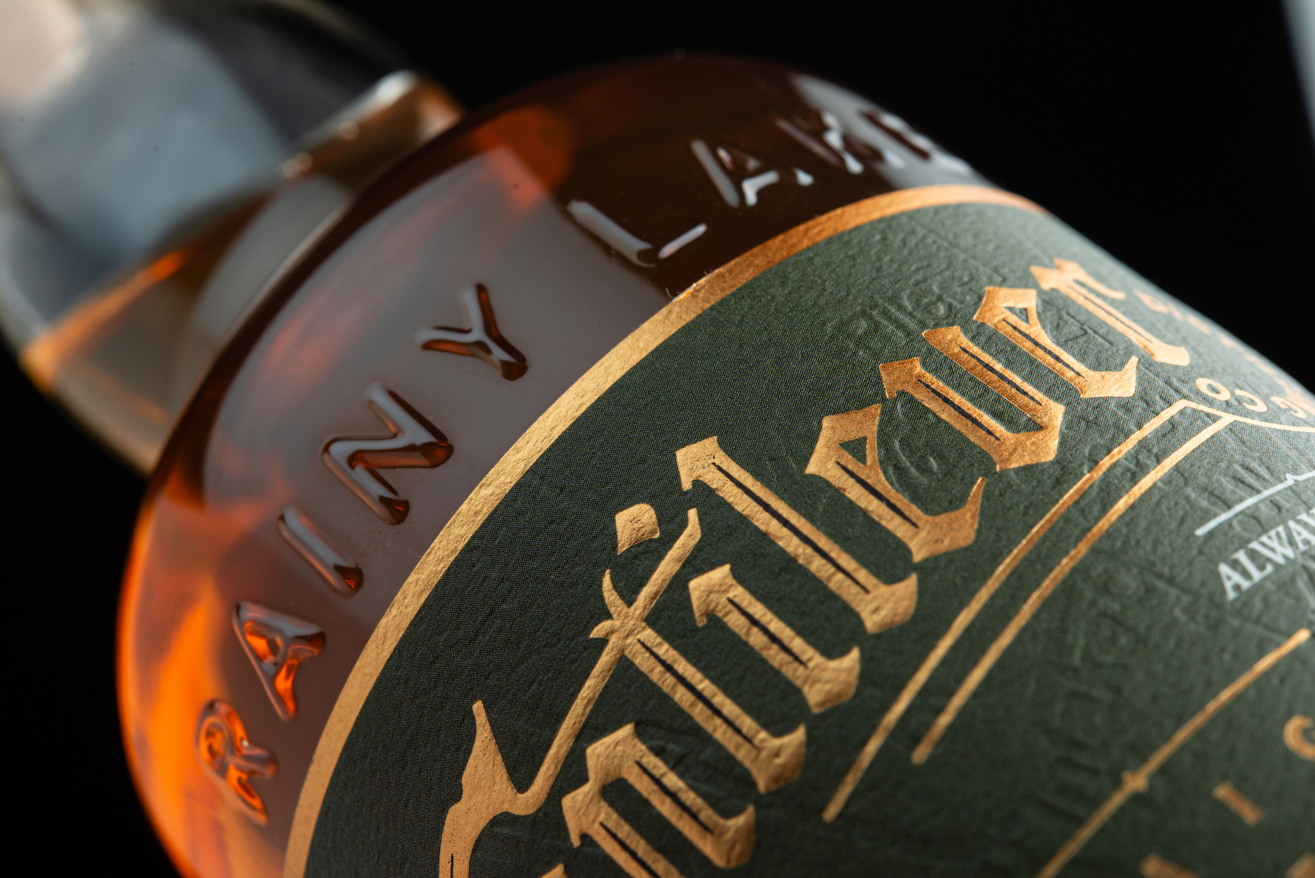
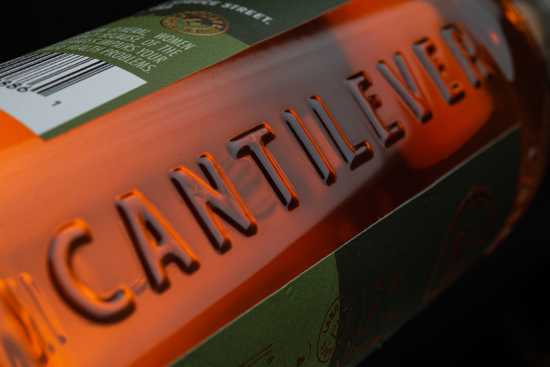
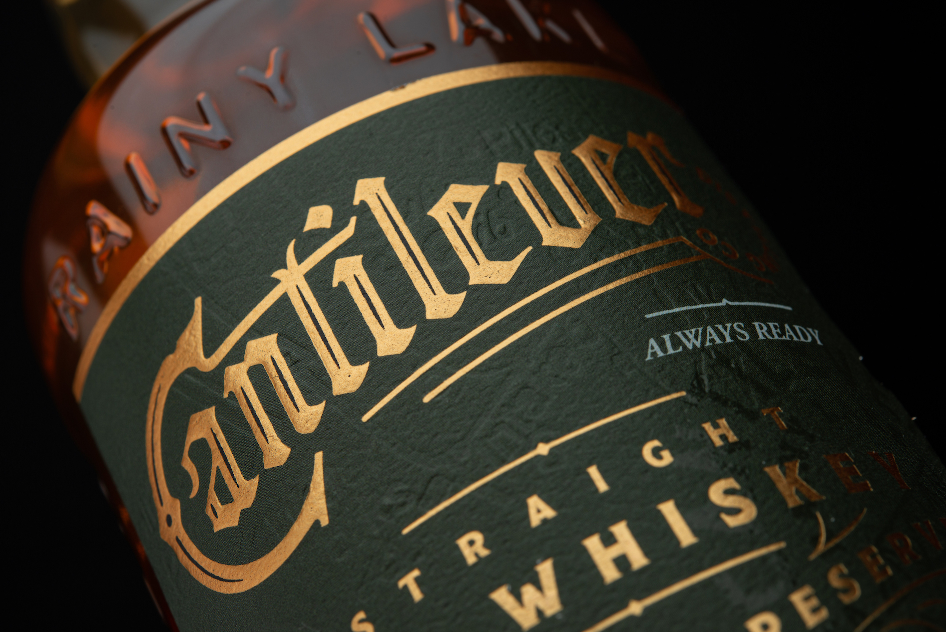
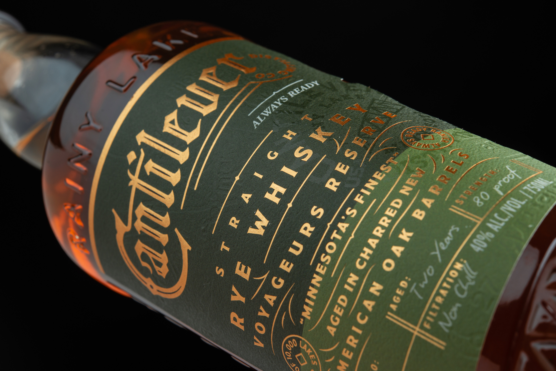
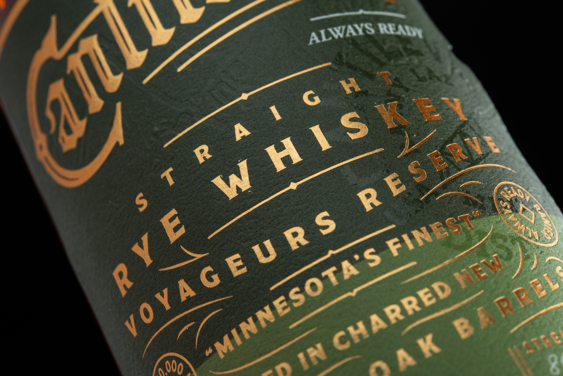
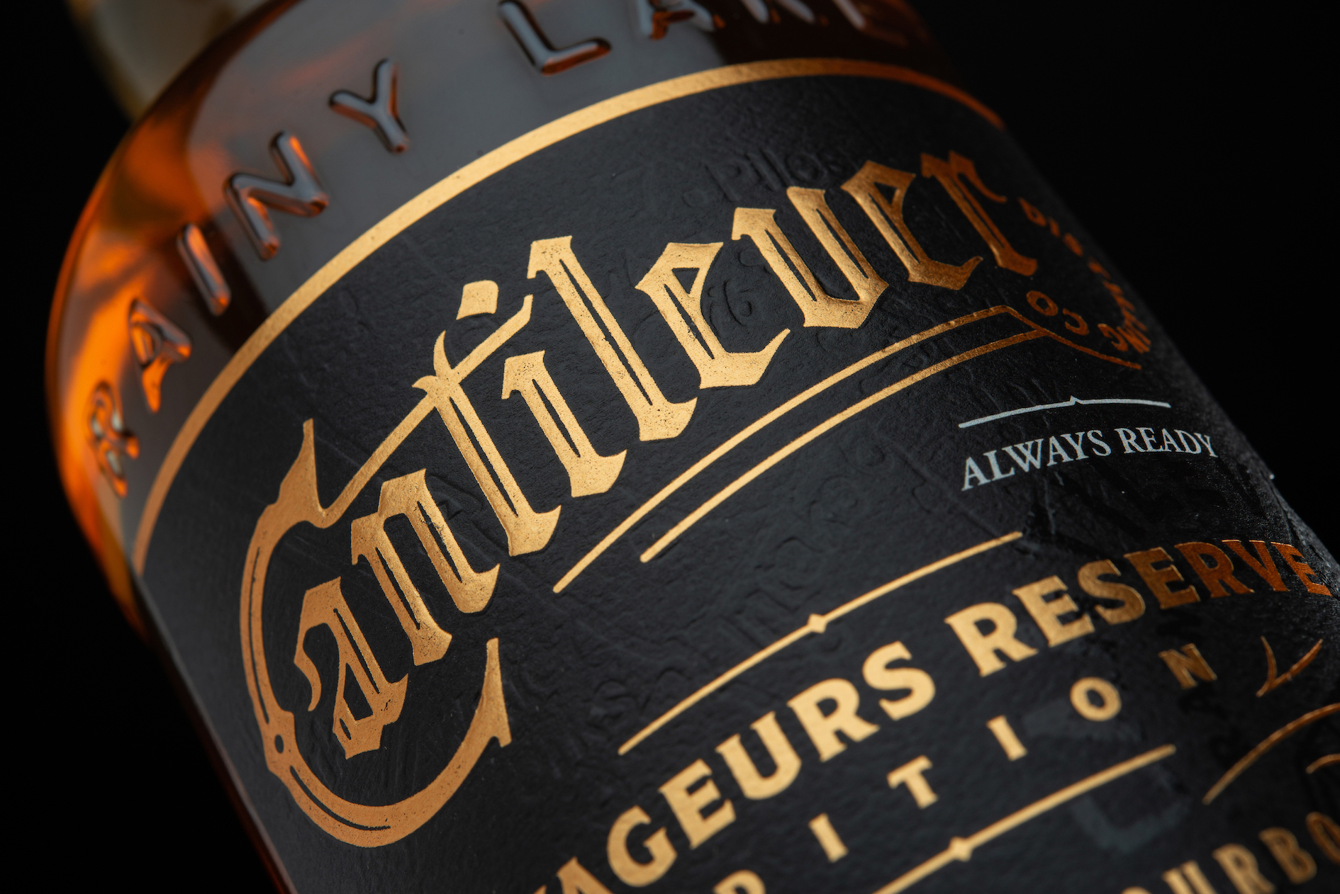
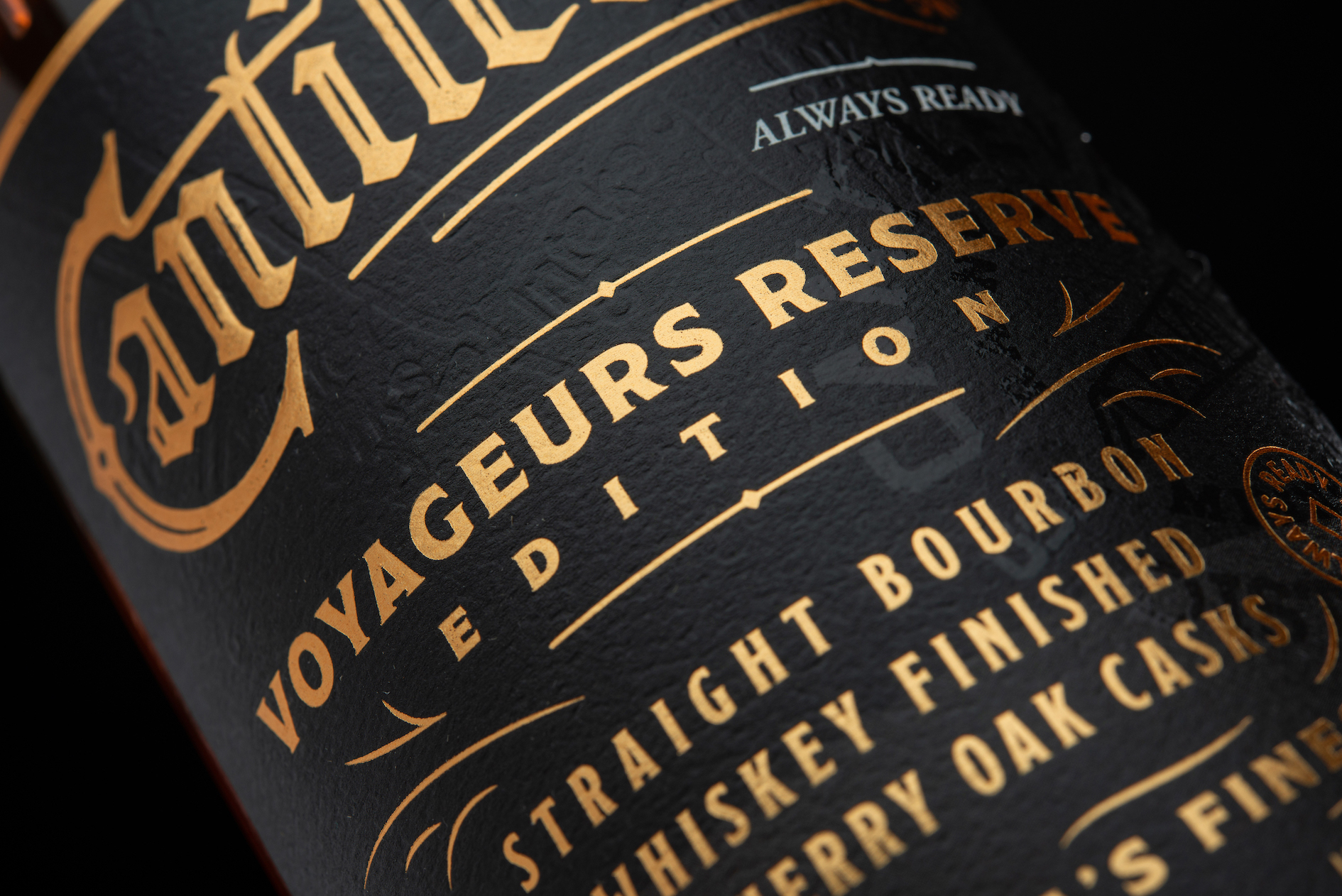
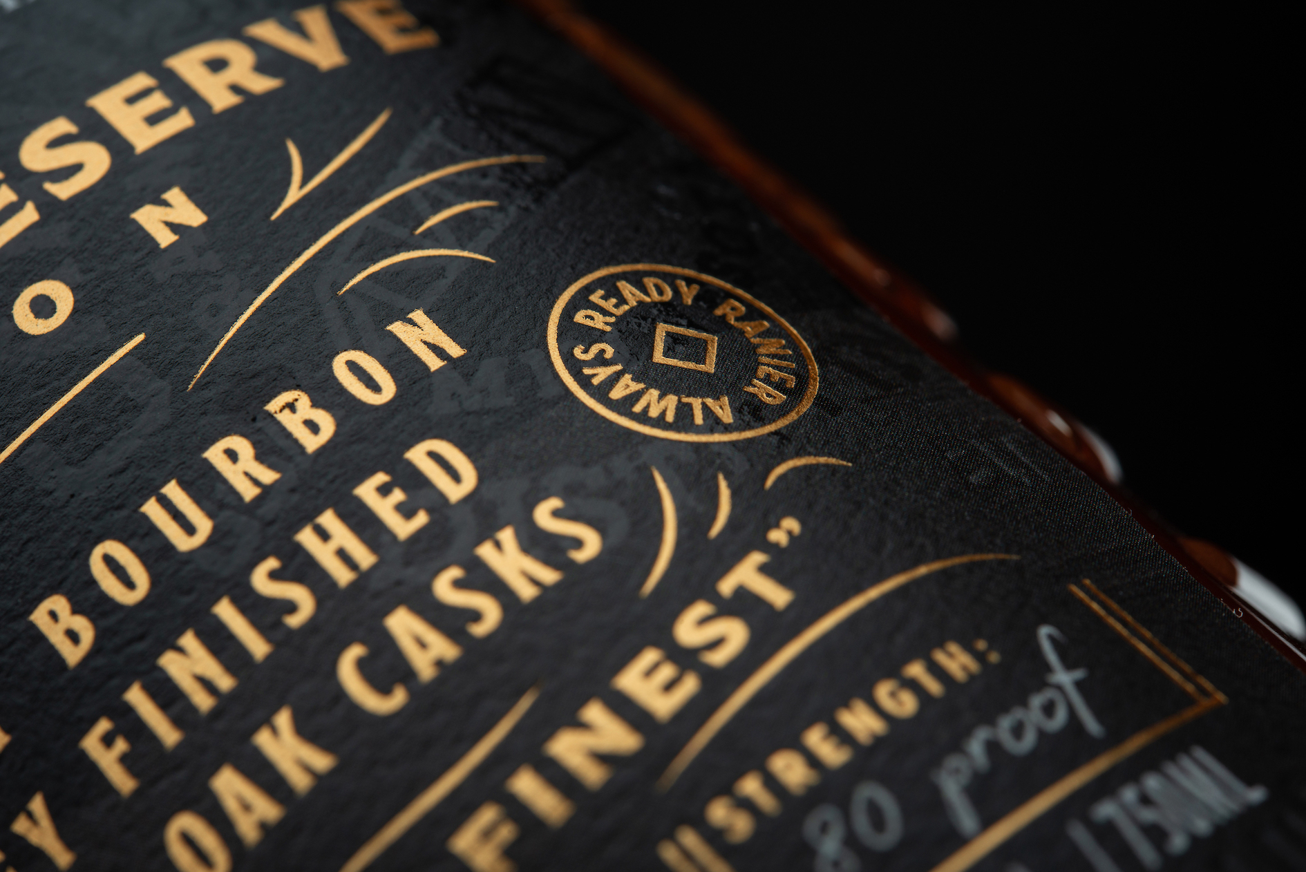
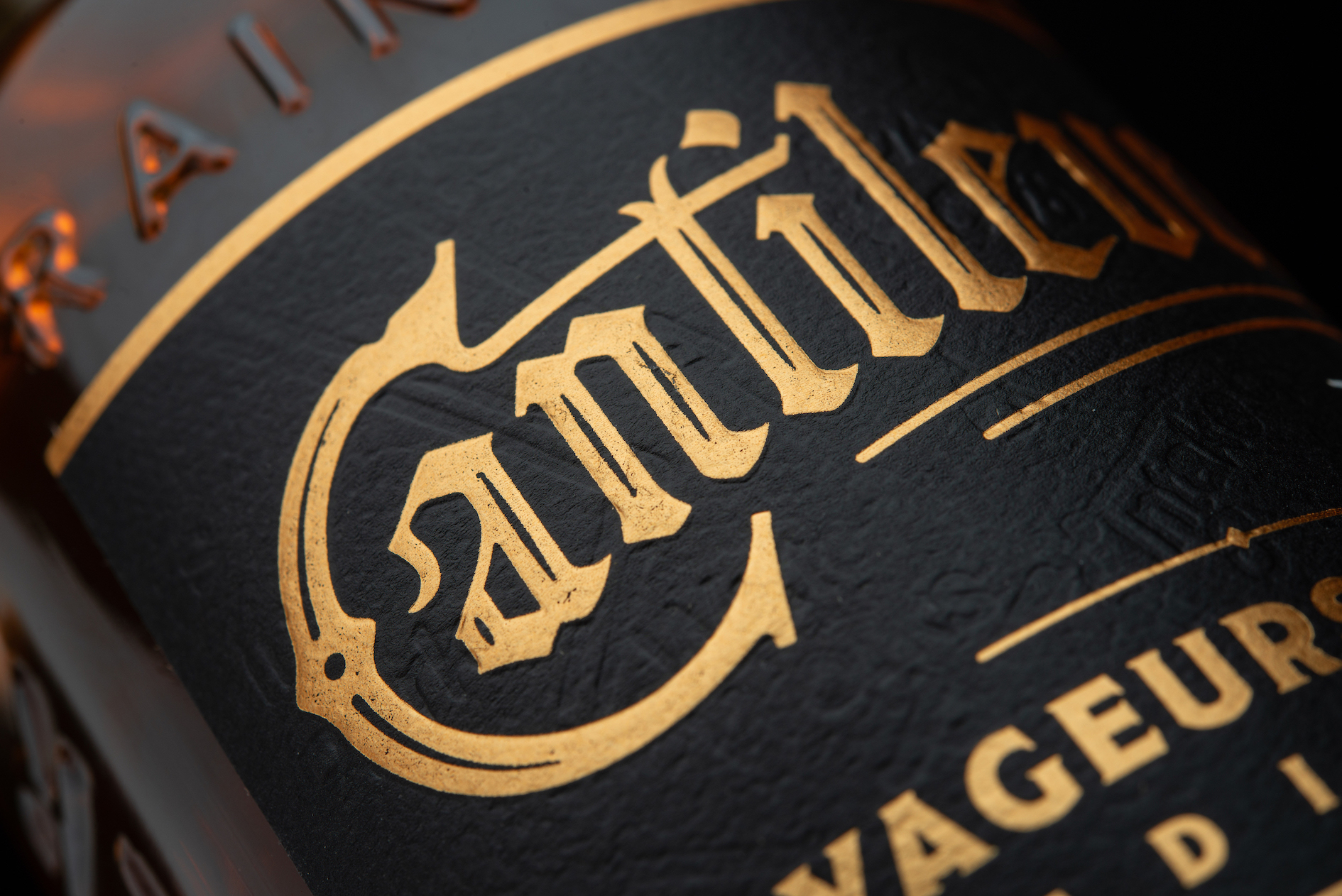
Inspired by the intriguing story of the quaint town where the distillery is located, it only seemed right to nestle elements of this ephemera into the brand and packaging design. From the railroad maps debossed on the labels to the embossed bridge on the custom glass, this brand and bottle is full of creative connections.

CREDIT
- Agency/Creative: Thoroughbred Spirits Design
- Article Title: Cantilever Distillery Custom Bottle and Packaging Design by Thoroughbred Spirits Design
- Organisation/Entity: Agency, Published Commercial Design
- Project Type: Packaging
- Agency/Creative Country: United States
- Market Region: North America
- Project Deliverables: Brand Architecture, Brand Creation, Brand Guidelines, Brand Identity, Brand Strategy, Brand World, Branding, Graphic Design, Identity System, Illustration, Packaging Design, Product Naming, Structural Design, Tone of Voice
- Format: Bottle
- Substrate: Glass Bottle
FEEDBACK
Relevance: Solution/idea in relation to brand, product or service
Implementation: Attention, detailing and finishing of final solution
Presentation: Text, visualisation and quality of the presentation


