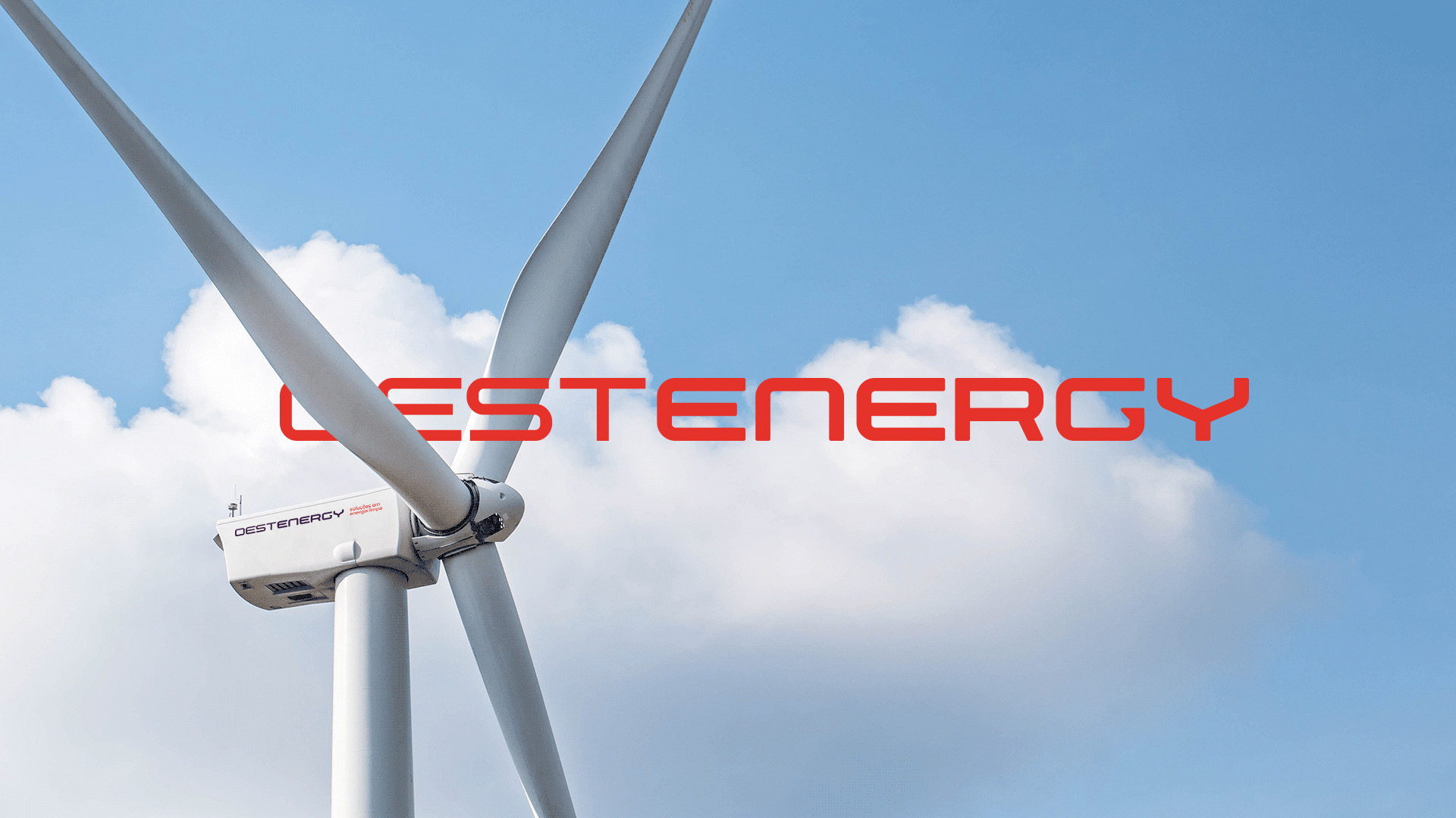
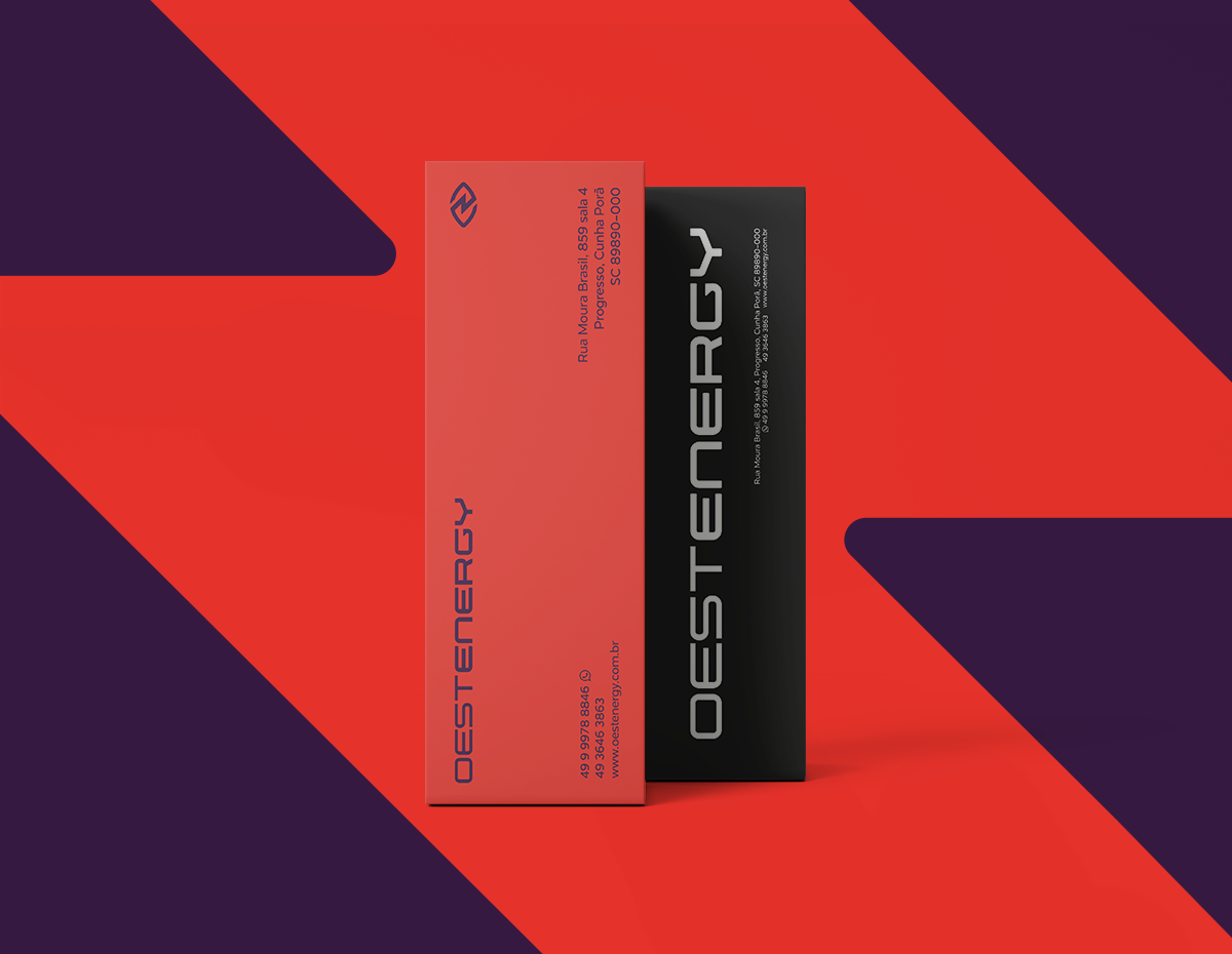
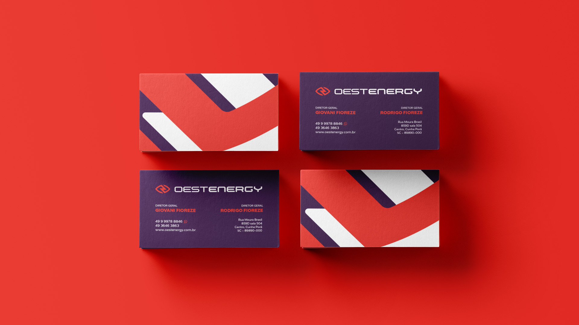
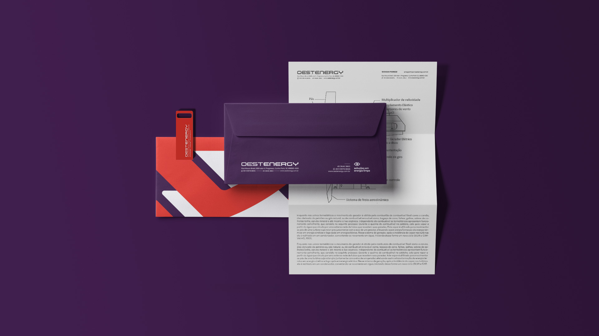
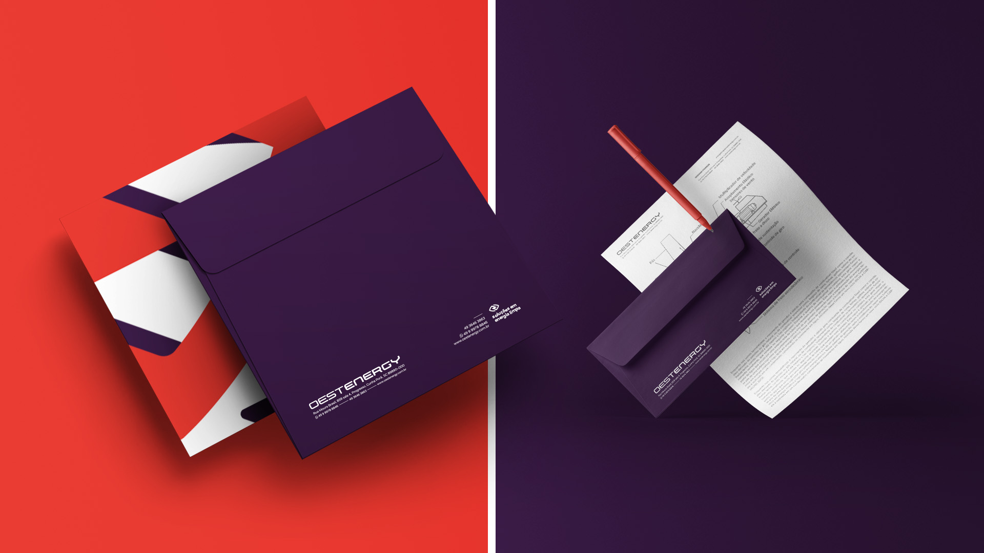
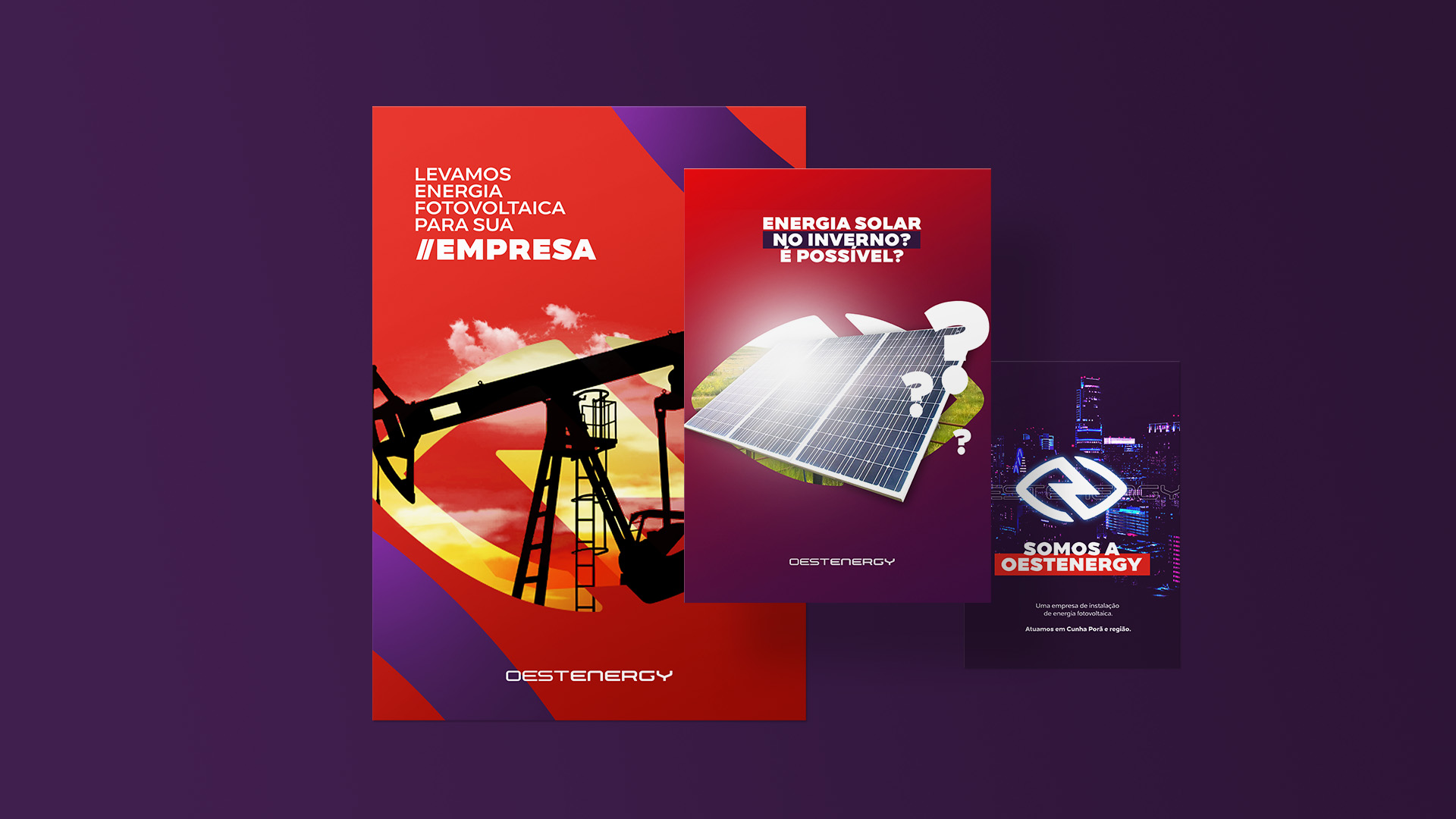
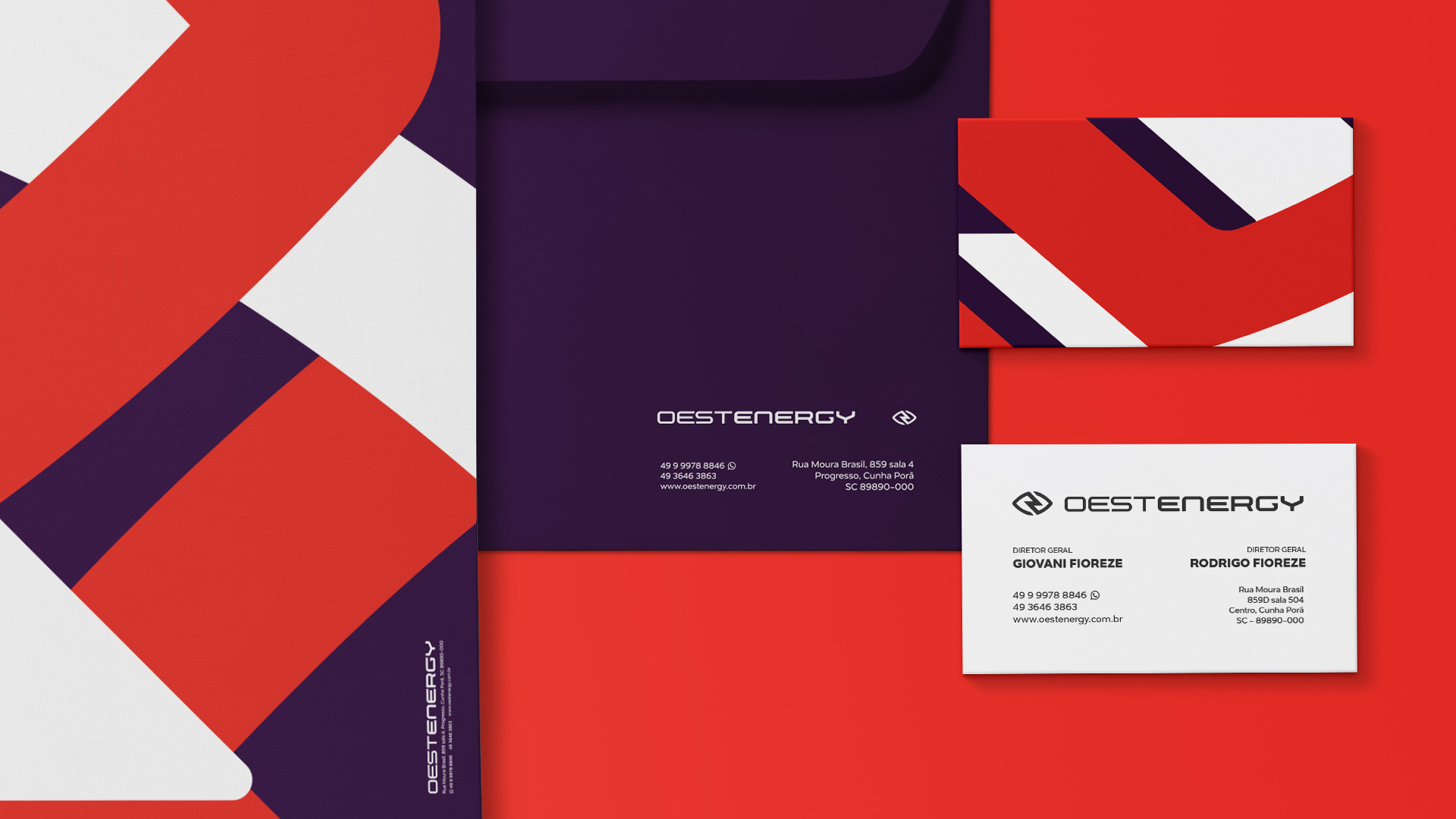
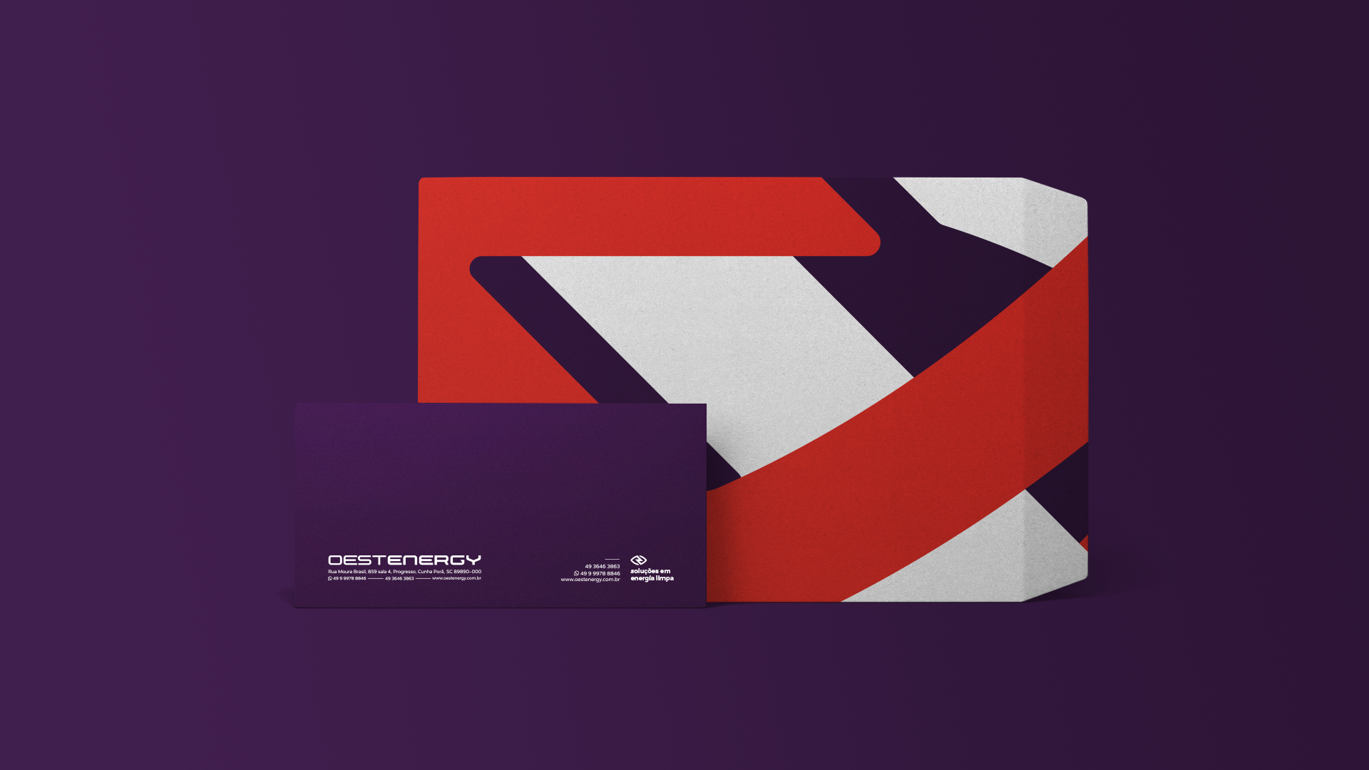
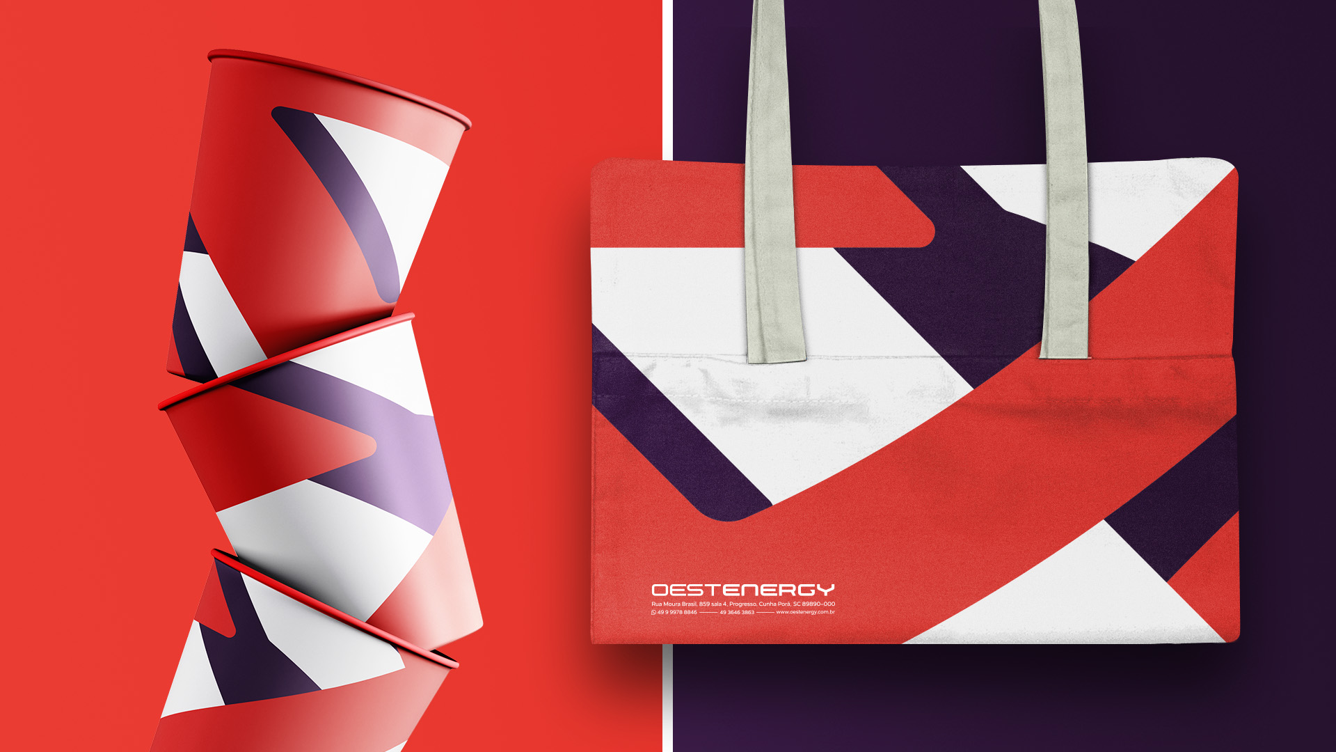
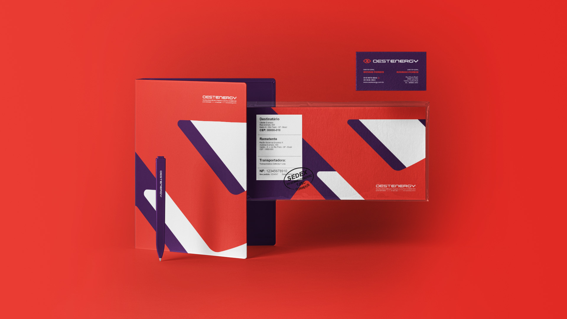
Oestenergy is a clean energy company located in the city of Cunha Porã/SC/Brazil. For the creation of the brand the first step was the definition of its DNA: Serious, Vital, Economy, Dreamy and Beneficial. From this, the design can be built following the main characteristics of the company that was conveyed in its logo, using symbols that represent vision and energy. The end result is a brand with contrasting colors that transmit strength, determination and creativity, in addition to the minimalist design and unique typography.
CREDIT
- Agency/Creative: Neo Saga
- Article Title: Neo Saga Creates New Brand Identity for Oestenergy
- Organisation/Entity: Agency, Published Commercial Design
- Project Type: Identity
- Agency/Creative Country: Brazil
- Market Region: South America
- Project Deliverables: Brand Advertising, Brand Creation, Brand Identity, Brand Naming, Brand Refinement, Brand Strategy, Brand World, Branding, Graphic Design
- Industry: Energy
- Keywords: Energy, Clean, Electric, Electricity, Photovoltaic, Company, Industry
FEEDBACK
Relevance: Solution/idea in relation to brand, product or service
Implementation: Attention, detailing and finishing of final solution
Presentation: Text, visualisation and quality of the presentation


