LIBRE Branding & Design – Pêsta
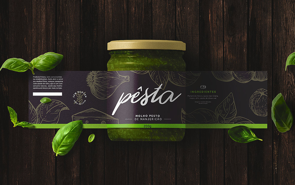
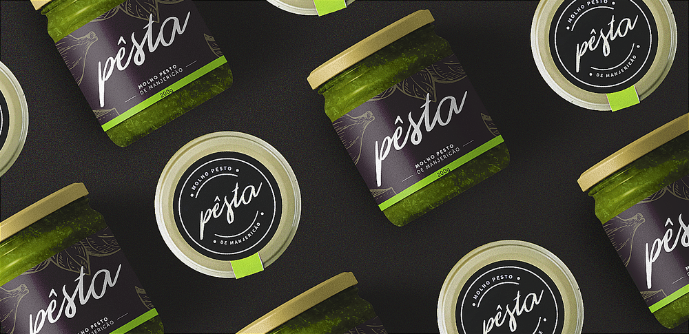
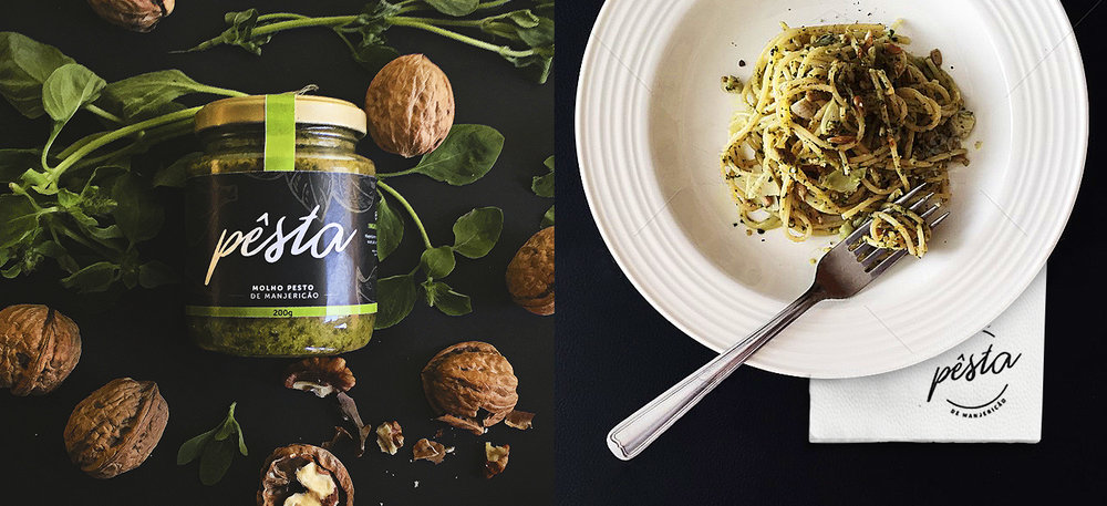
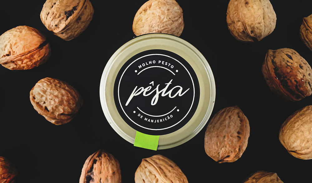
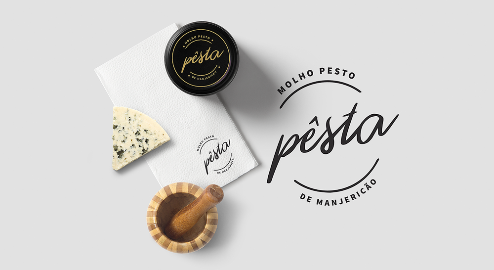
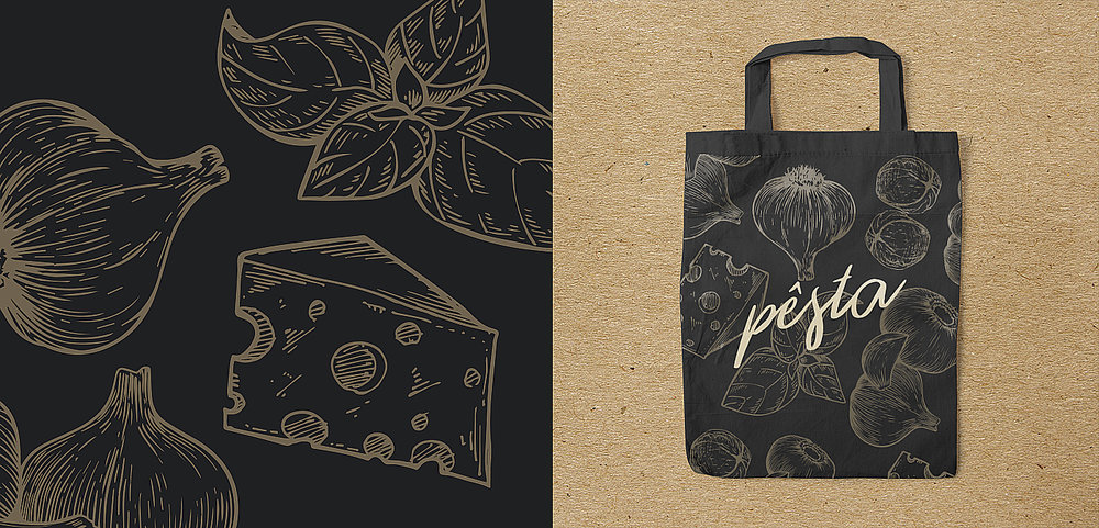
“Pêsta was born of the desire that two local producers had to insert their family’s pesto sauce into the market.The challenge was to translate the refining on the preparation and the quality of the ingredients of the Cesa family’s recipe. The pesto sauce is a condiment with expressive taste appeal, and our conception was that the labels and other pieces of the brand should potentialize it.The solution came in the choice of the palette – and the contrast it has in the applications – and the style of the illustration to dictate the aesthetics of the pieces. The illustrations, among several functions, are used to highlight the ingredients of the recipe. The use of a color ribbon that attaches the label to the cap serves to transcend the common space of the label, and also to enable subsequent variations of other types of pesto (e.x. tomato pesto; spinach pesto.).”
CREDIT
- Agency/Creative: LIBRE Branding & Design
- Article Title: Packaging Design for Brazilian Sauce Company
- Organisation/Entity: Consumer Brand Creation
- Project Type: Packaging
- Agency/Creative Country: Brazil
- Market Region: South America
- Format: Pot
- Substrate: Glass


