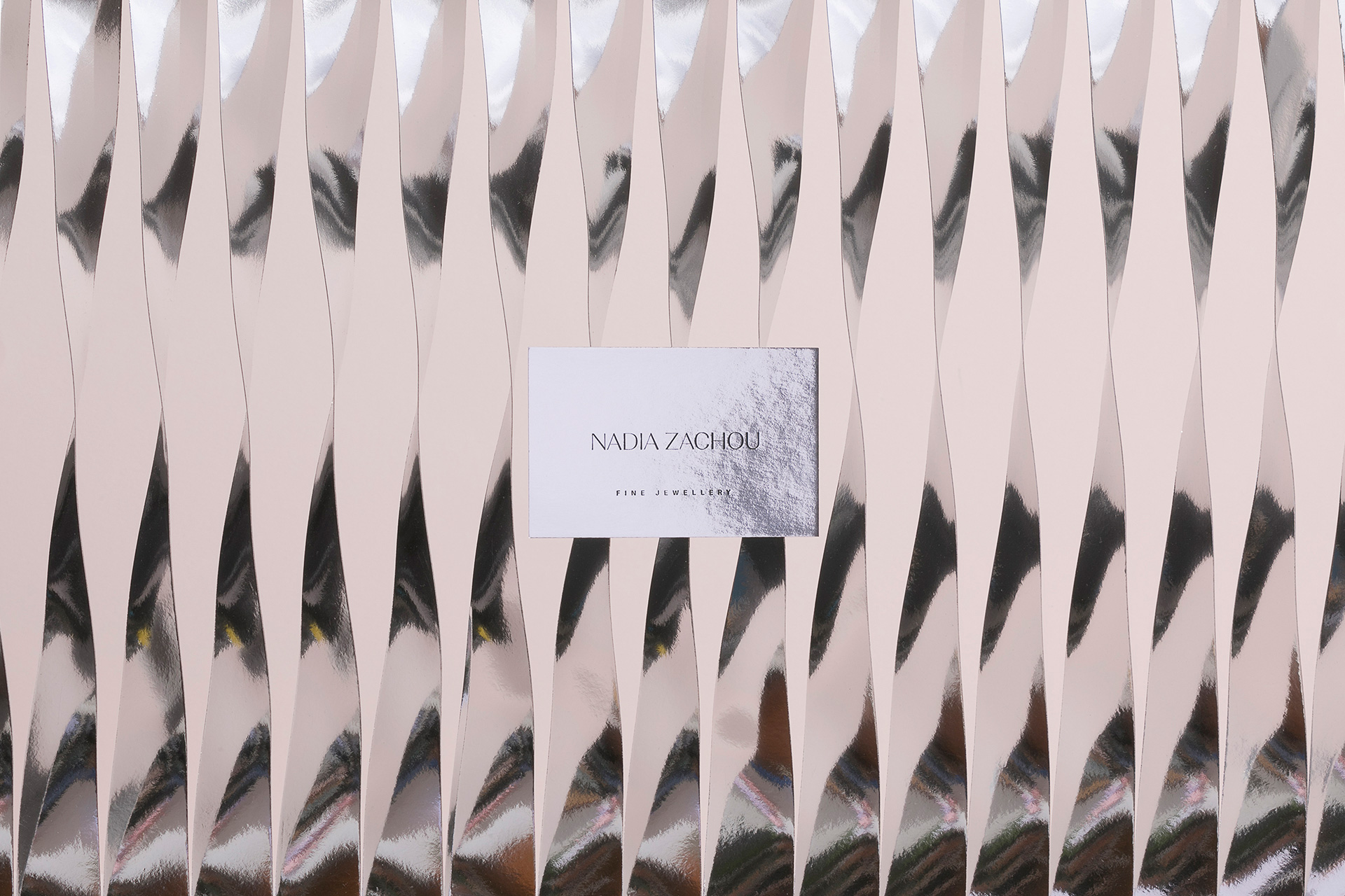
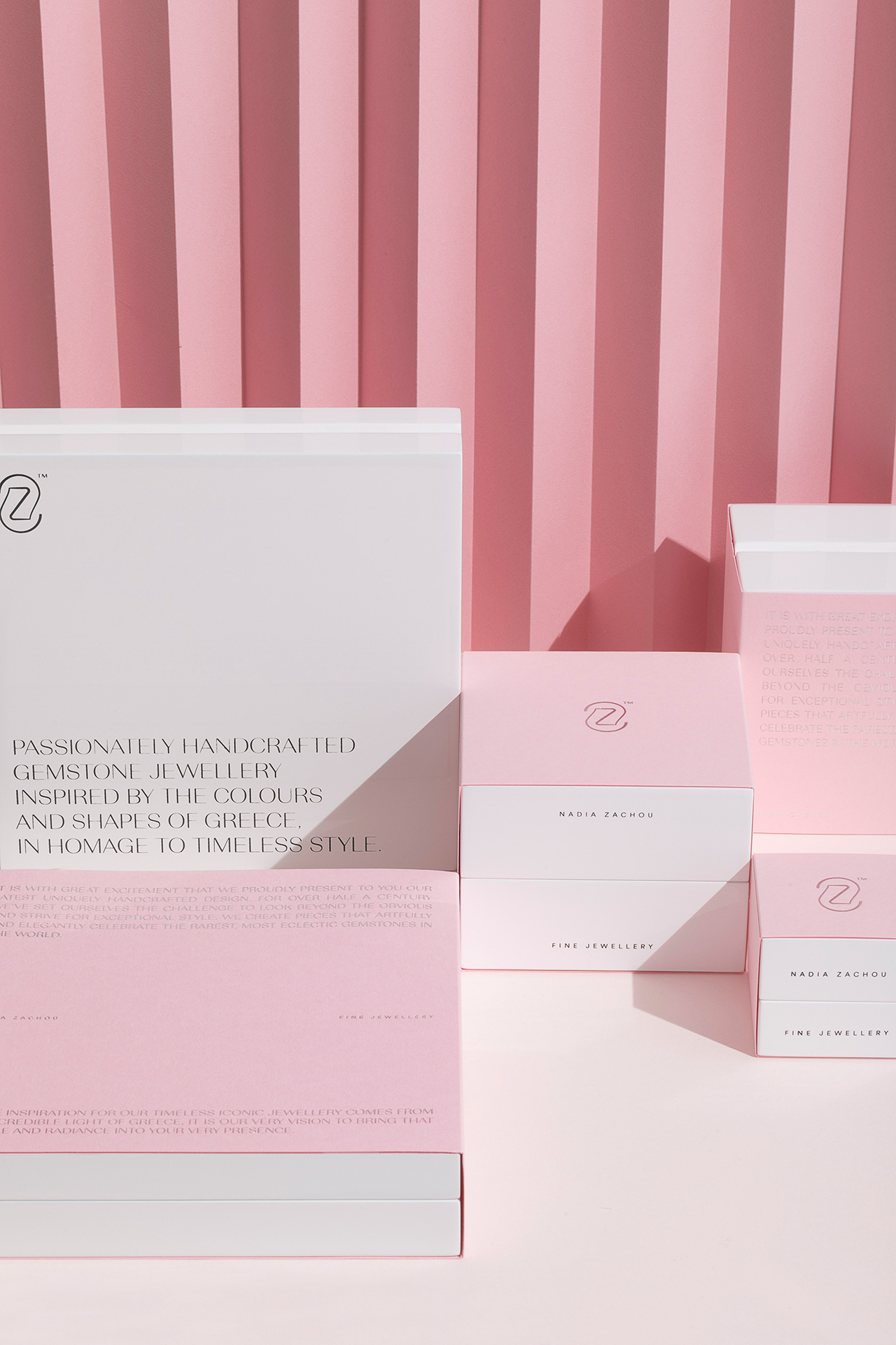
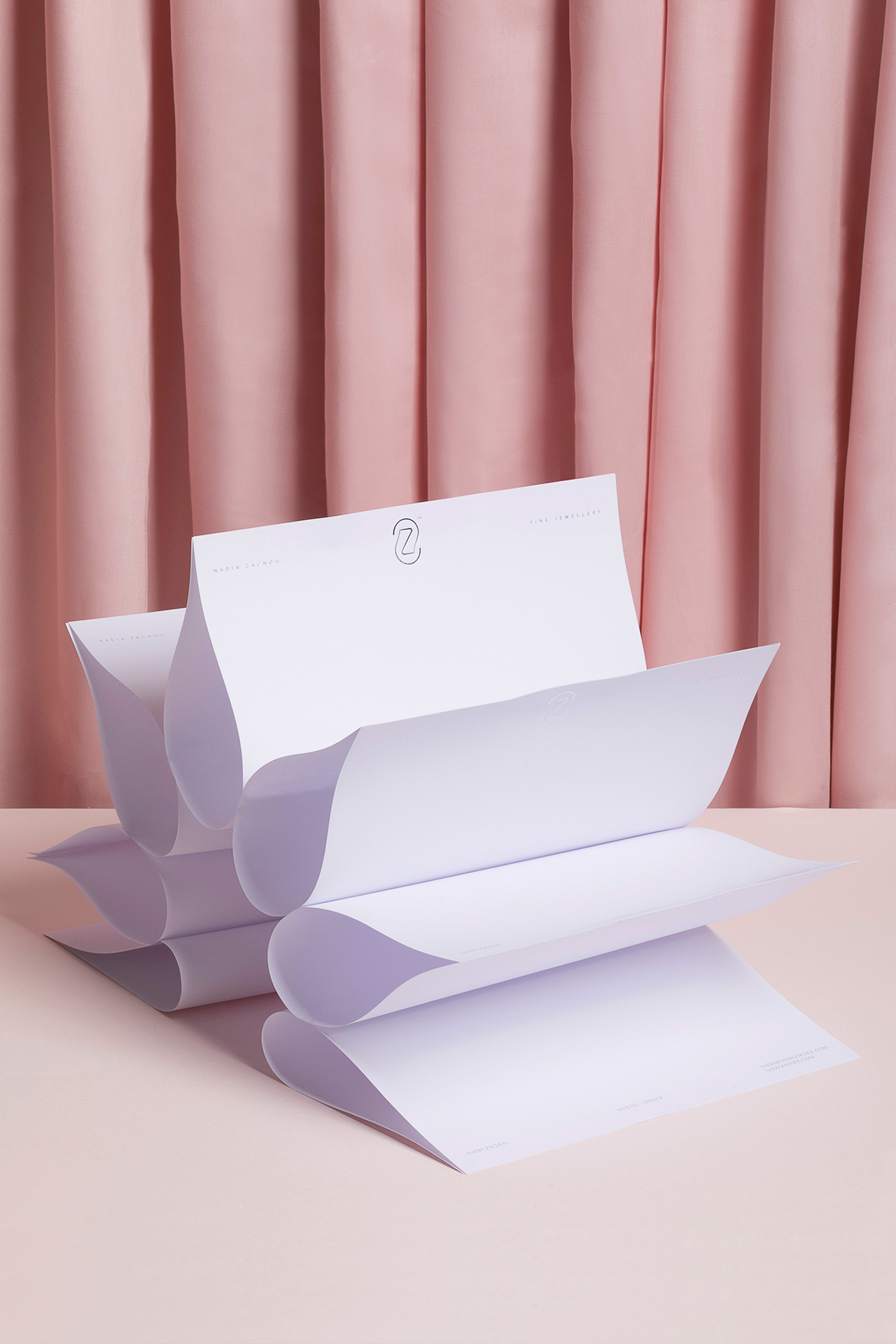
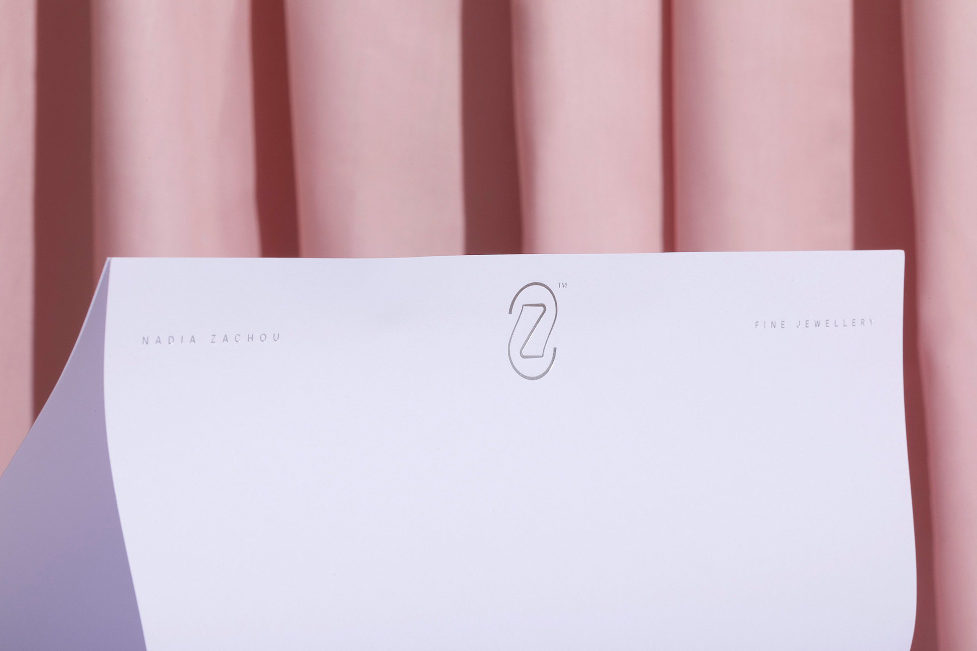
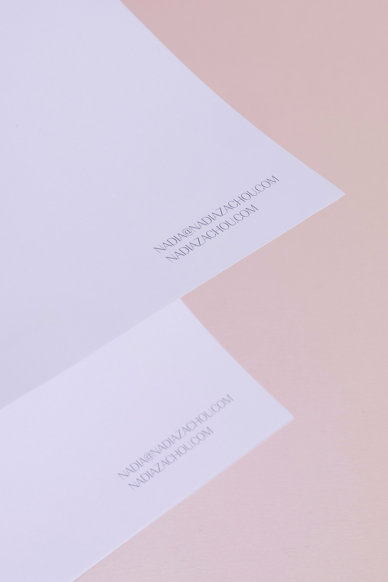
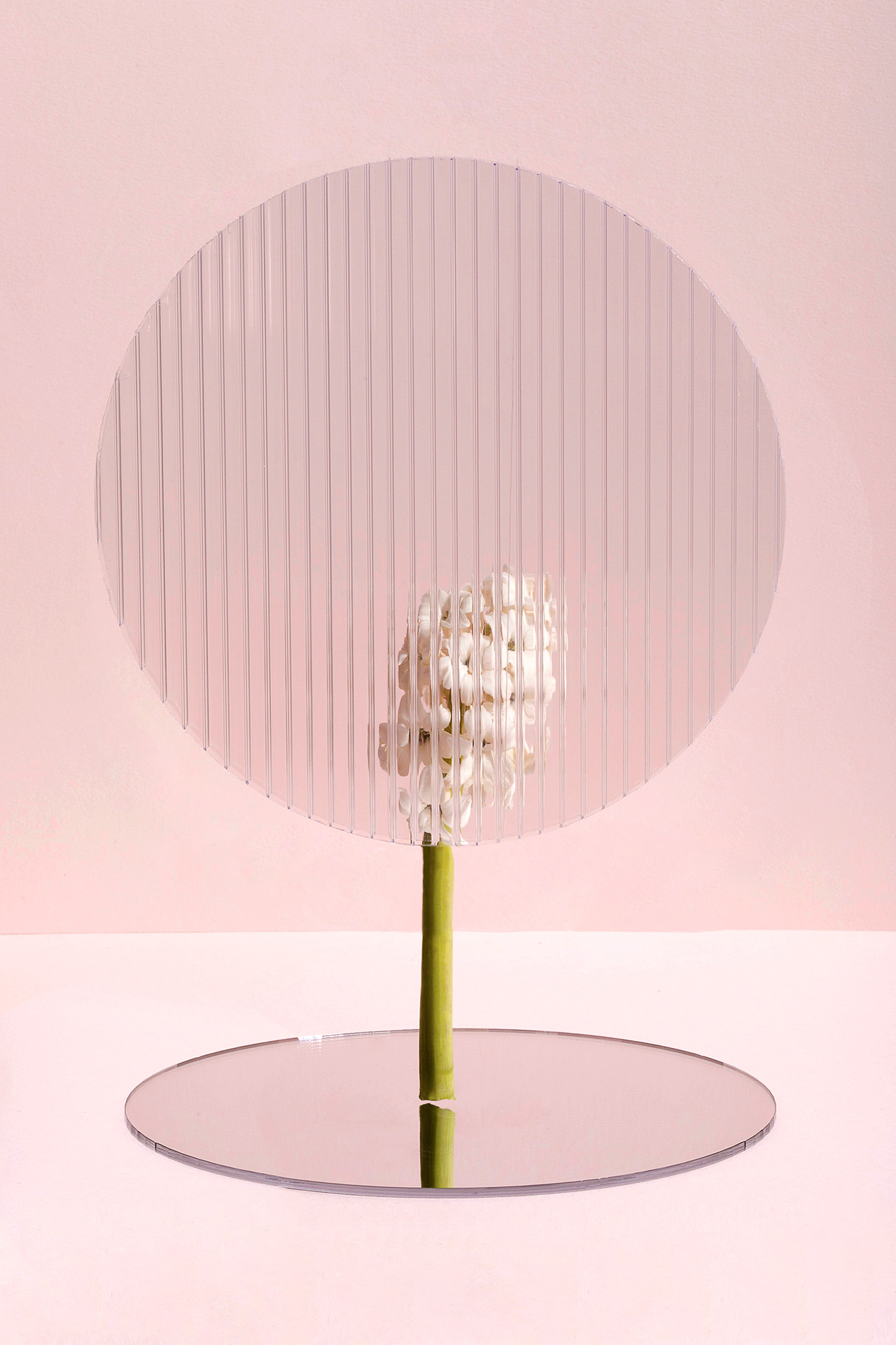
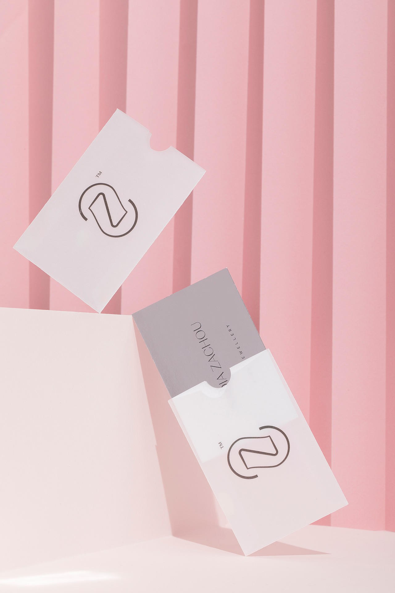
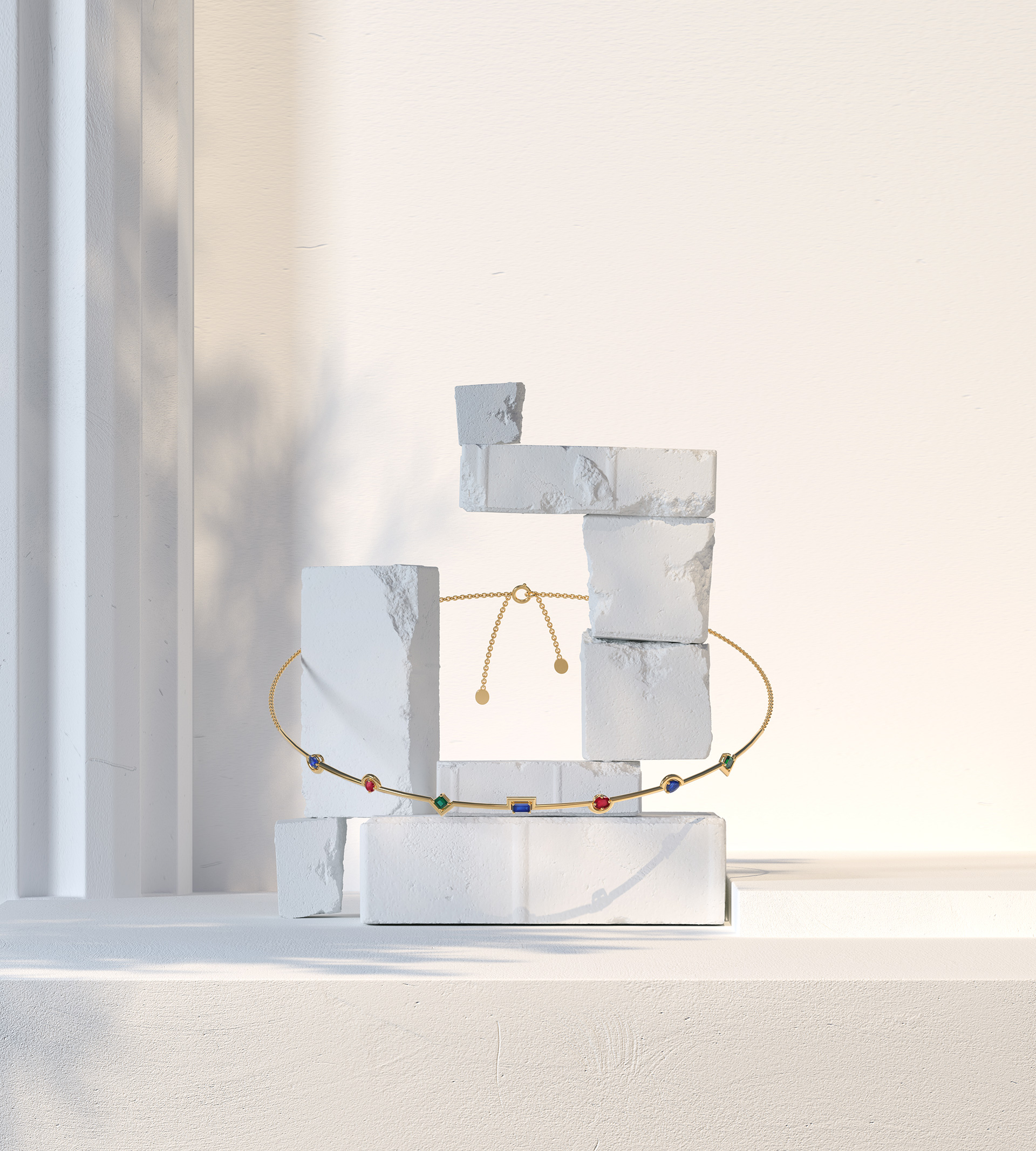
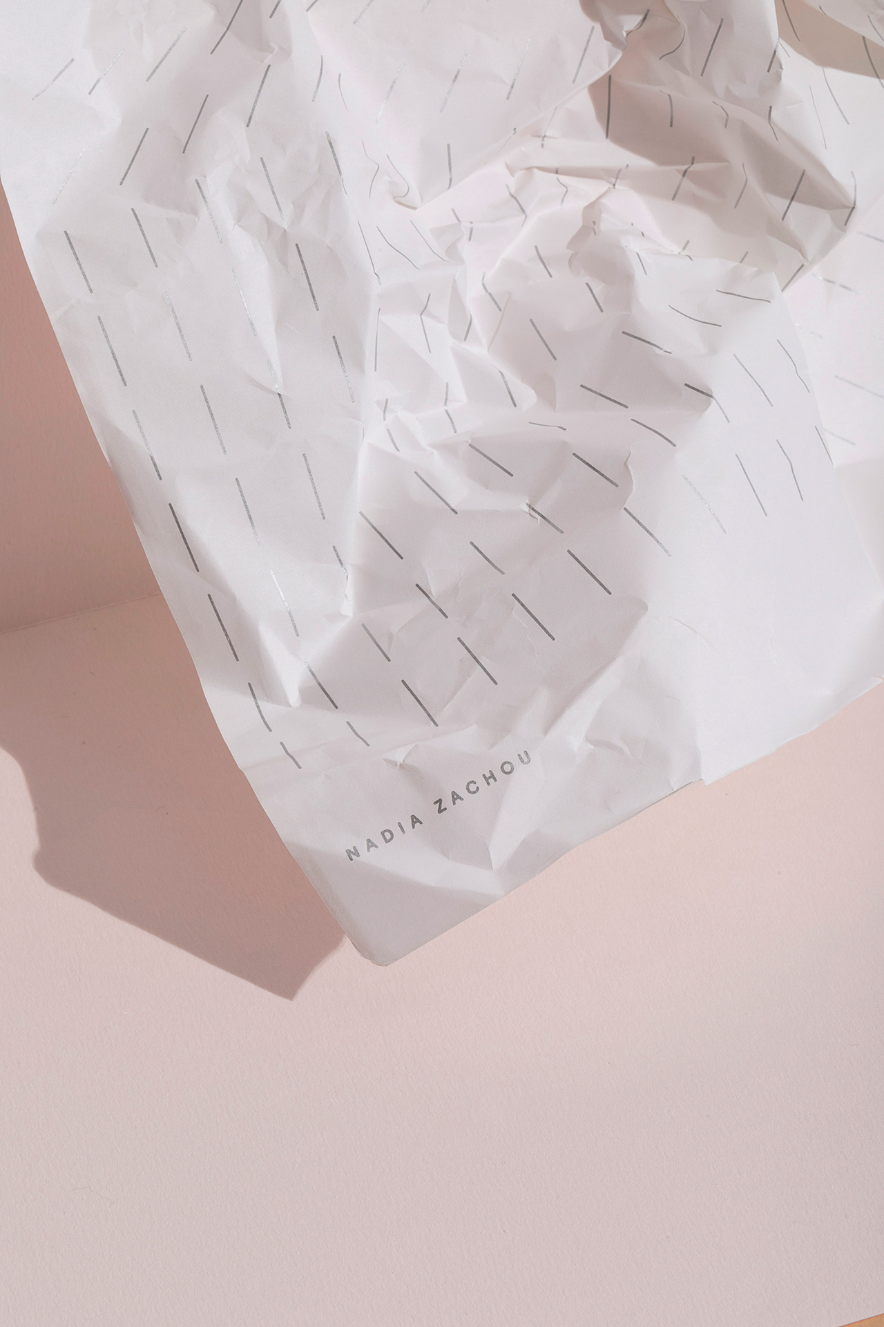
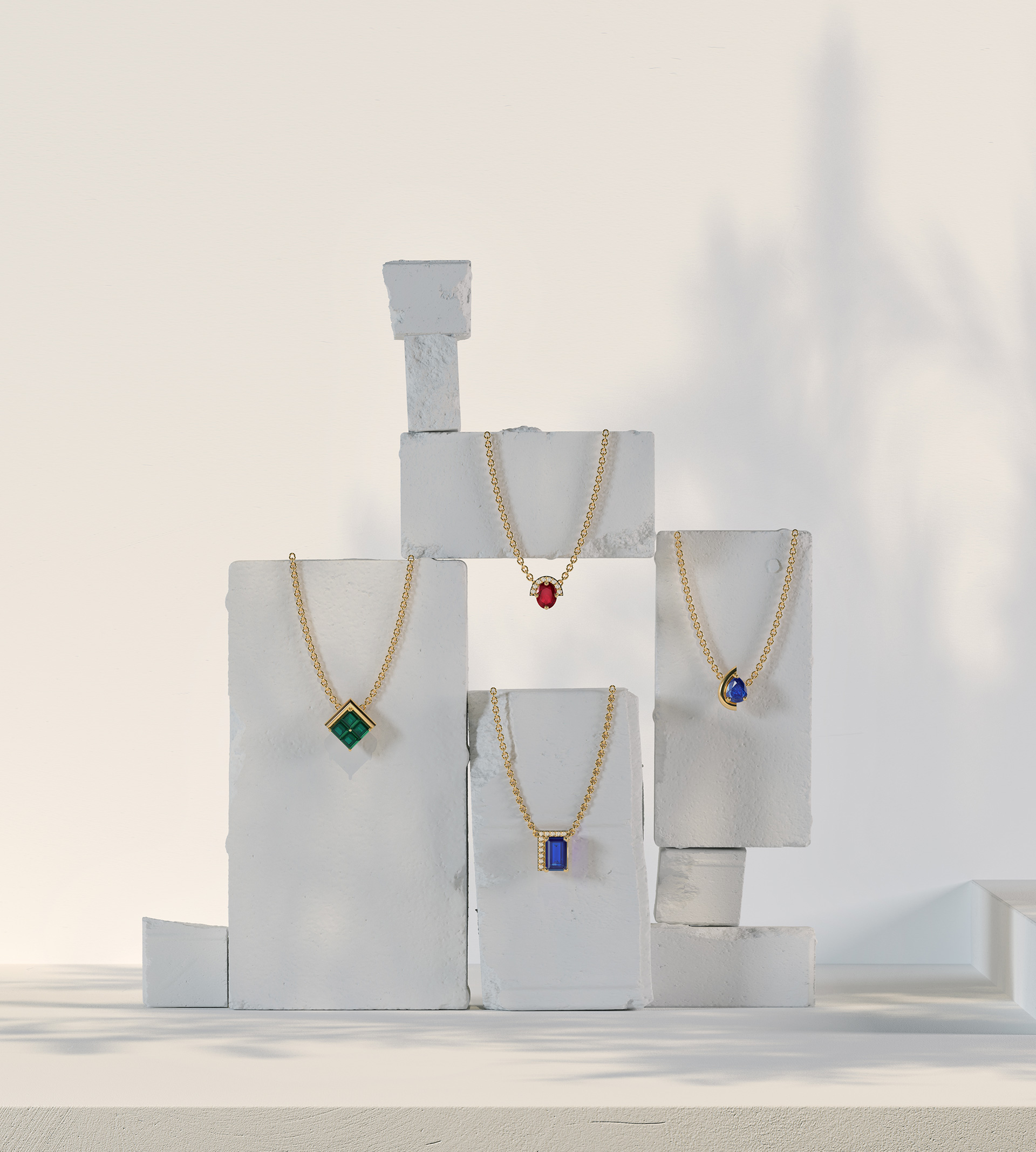
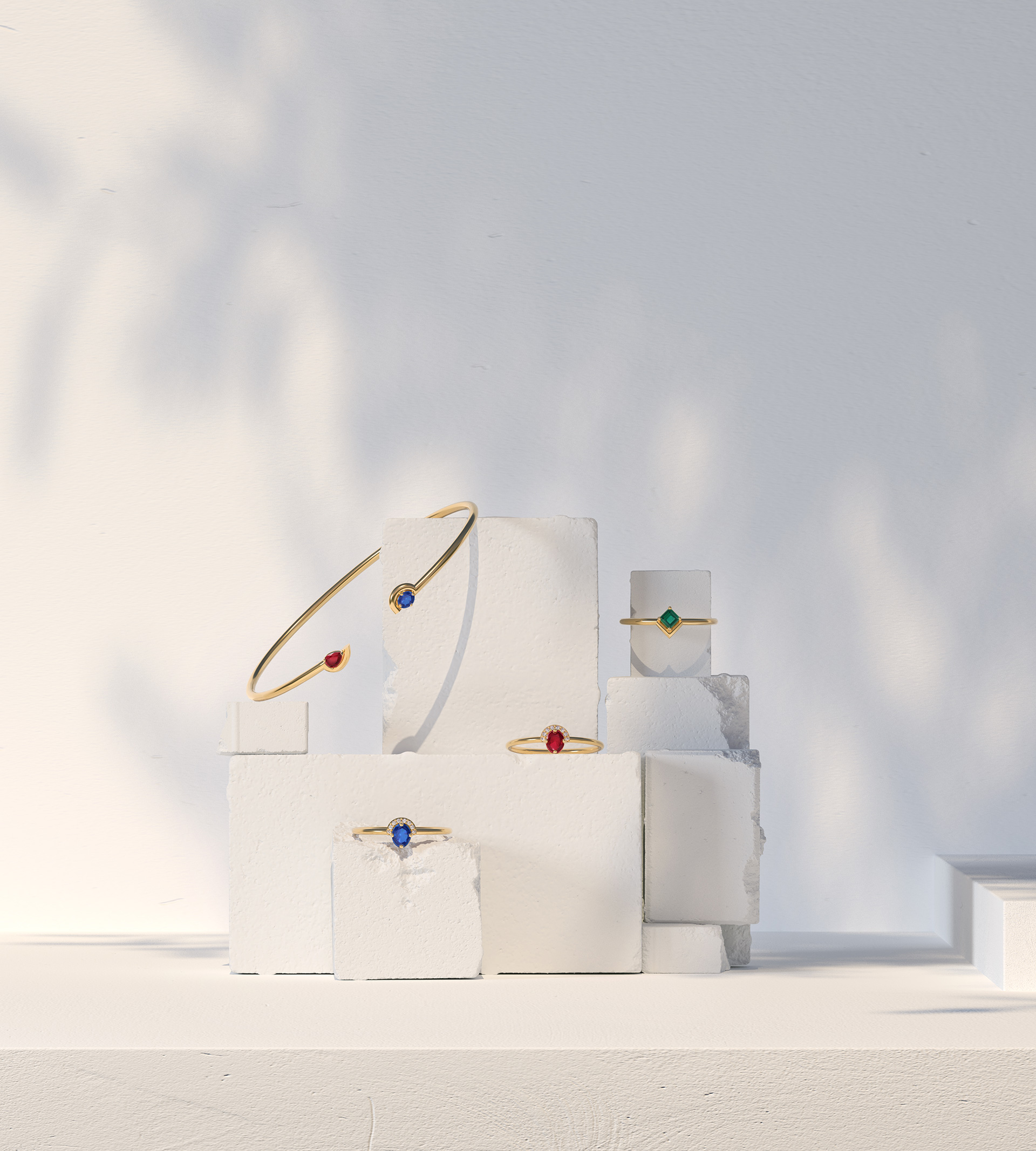
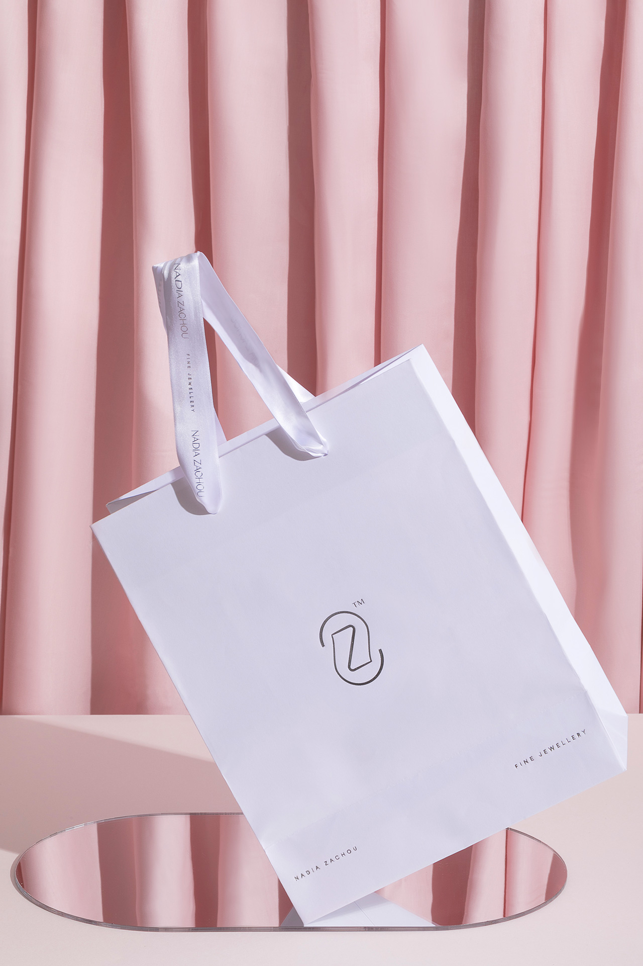
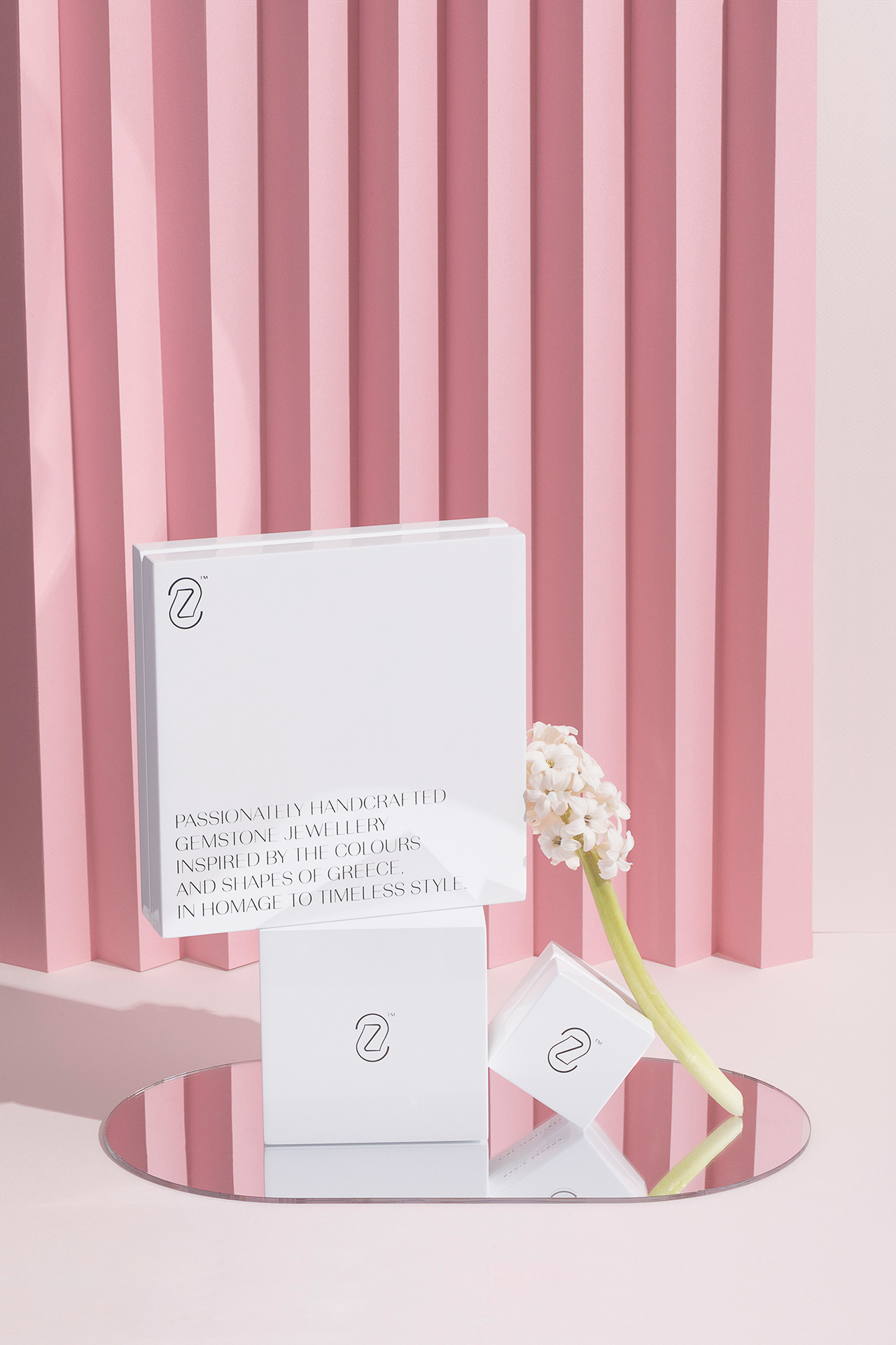
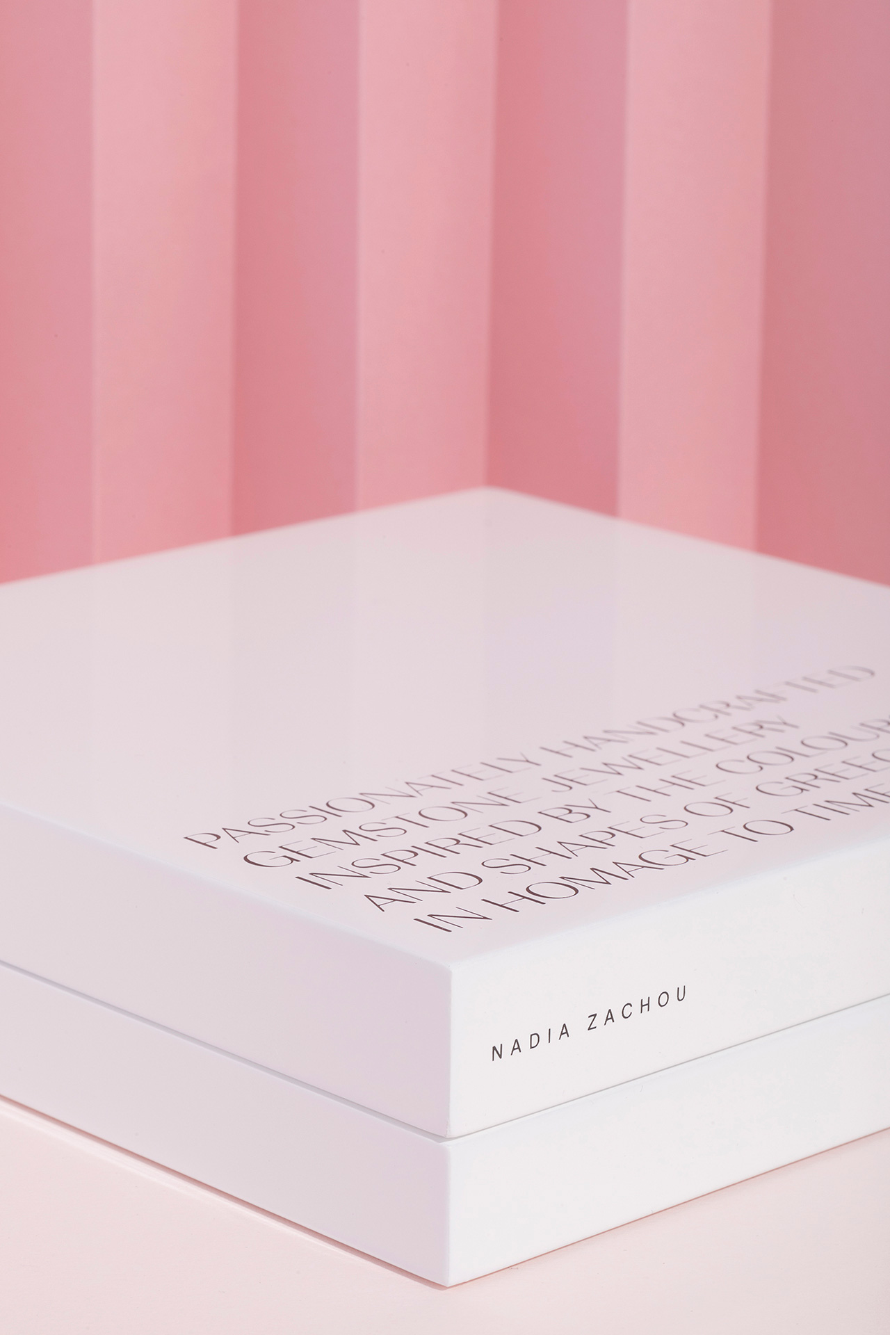
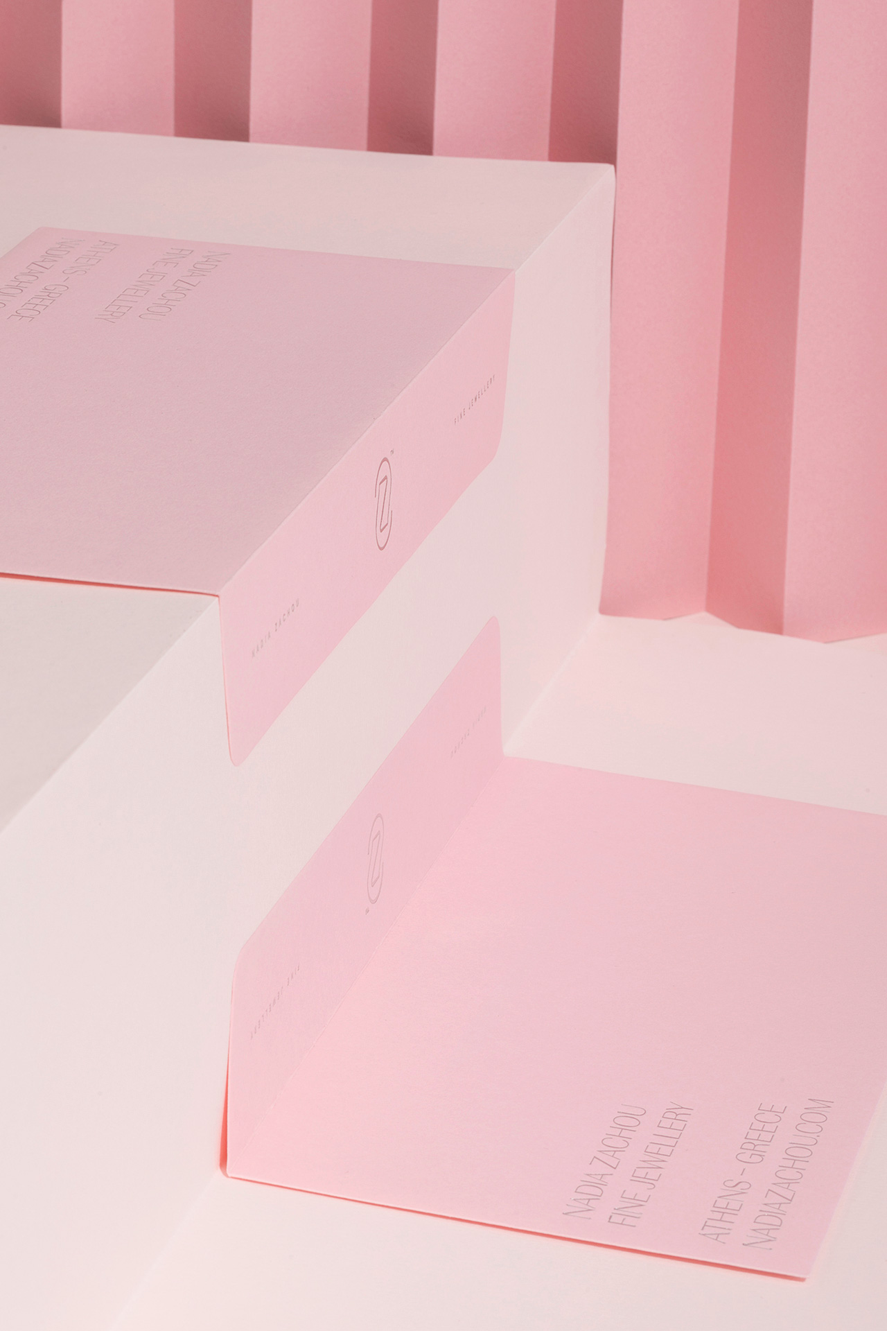
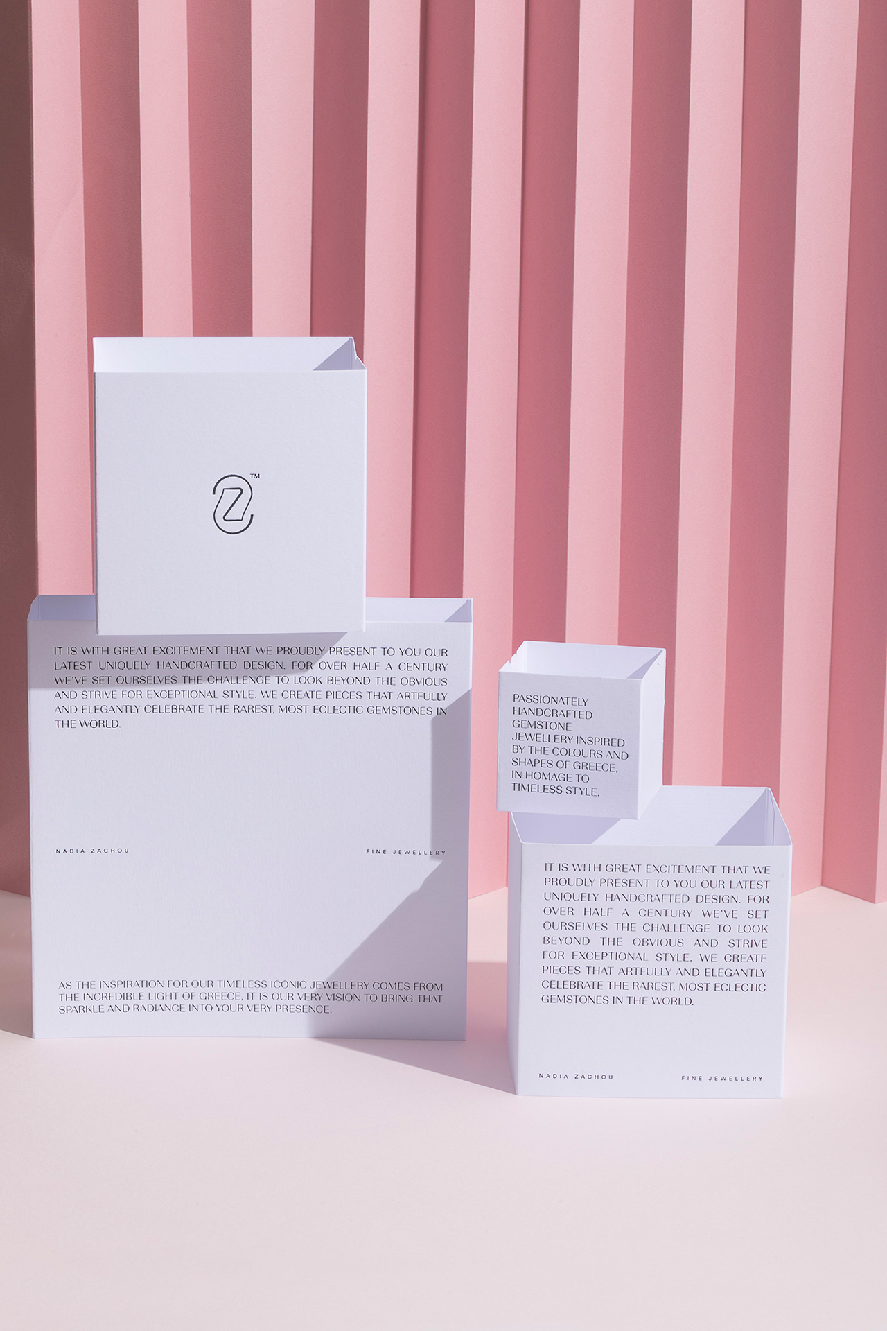
Nadia Zachou fine jewellery is the result of years of experience with precious stones by the Zachou family. Nadia Zachou, being the third generation representative of a family of precious stone merchants, is introduced to the market as a high end luxury jewellery house, focused on gems, gold and silver, through the new brand that was designed by our team and carries the owner’s name. The house’s logo is based on the idea of an ambigram, where one can read the letter N -the vertical direction, and the letter Z -in horizontal direction. A direct reference to the owner’s name, Nadia Zachou. Clean lines and a delicate font, define a discreet whole where the materials, paper, textures and reflections play a major role in Nadia Zachou fine jewellery identity. Hot-foil stamping on pink box sleeves, lacquered white wooden boxes with velvet lining, mirror-like laminated business cards and metallic printed tissue paper create a sense of seamless luxury, throughout brand applications. The translucency results from the tissue paper is a visual analogy to the unboxing experience. Just as the precious gift is revealed through the wrapping, the company’s card is revealed through the semi-translucent sleeve that accommodates it. In reference to women’s fashion and translucencies which excite the imagination, the identity of Nadia Zachou fine jewellery is introduced as a brand with a feminine touch. For the male audience, the brand’s applications acquire a duotone character and work in timeless black & white.










CREDIT
- Agency/Creative: Boo Republic
- Article Title: Family of Precious Stone Merchants Introduces Luxury Jewellery House
- Organisation/Entity: Agency, Published Commercial Design
- Project Type: Packaging
- Project Status: Published
- Agency/Creative Country: Greece
- Market Region: Global
- Project Deliverables: Brand Architecture, Brand Identity, Brand Strategy, Branding, Graphic Design, Packaging Design
- Format: Bag, Box, Clamshell, Sleeve, Wrap
- Substrate: Fabric, Pulp Paper, Wood


