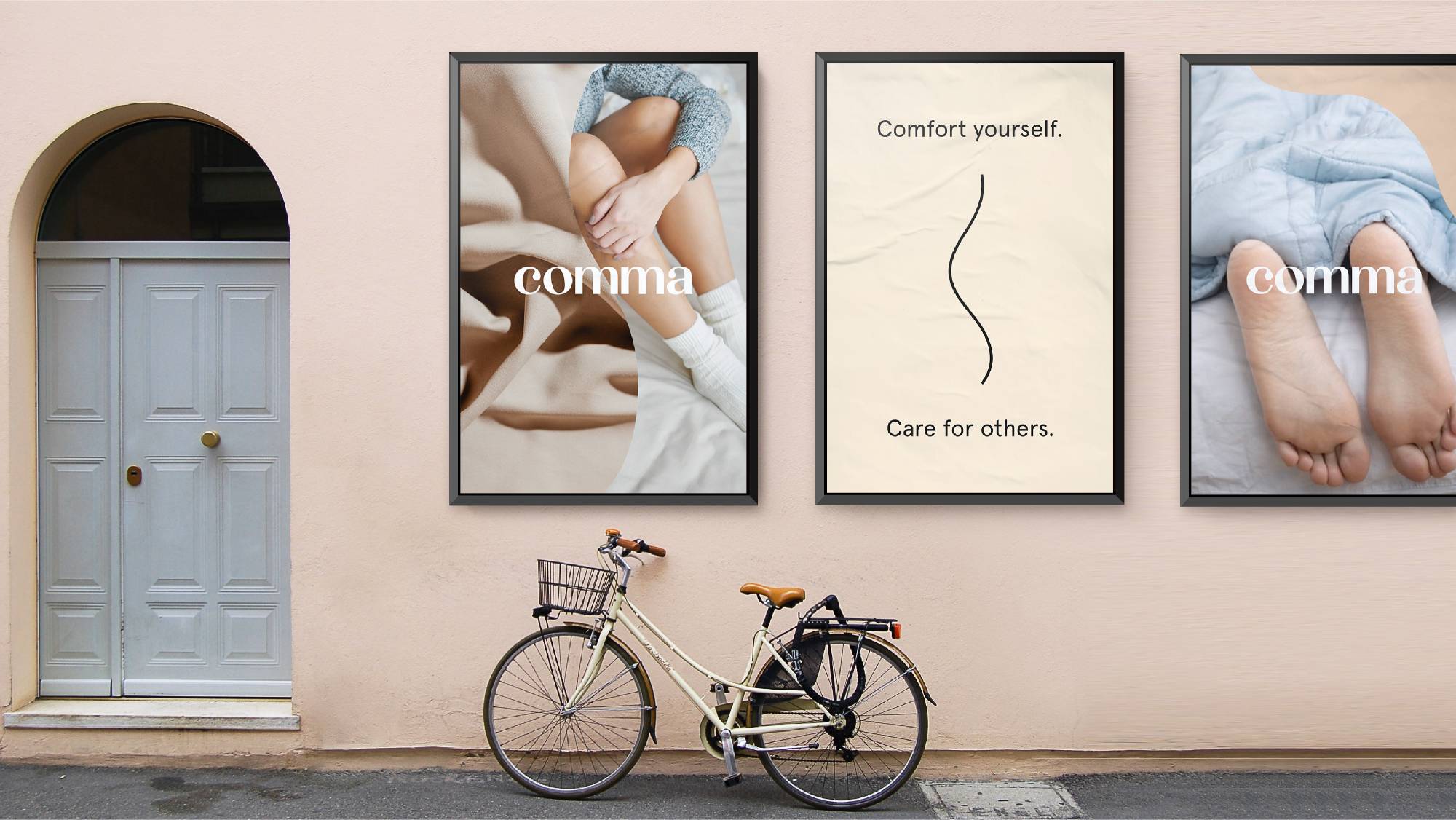
In early 2020, the direct-to-consumer bedding start-up Comma approached Elmwood New York to define the foundations of the Comma brand. Through a focused two-week design sprint, the strategic design agency worked with Comma to align its identity with its vision and imagine how to bring the brand to life across all channels. As consumers turn more readily to comfort products during this uncertain season, Comma’s new brand story of embracing rest, pause and reflection resonates now more than ever.
Comma is a mission-driven start-up that gives back 10% of earnings to organizations that help the homeless. Their initial product offering of high-quality weighted blankets had grown to include comforters and throws as well. While their team had a clear vision for the brand’s future, they were eager to develop foundational brand tools to define Comma’s purpose and unique perspective in an already crowded direct-to-consumer marketplace. Additionally, they wanted to create room to grow their product landscape to include other innovative bedding and home products.
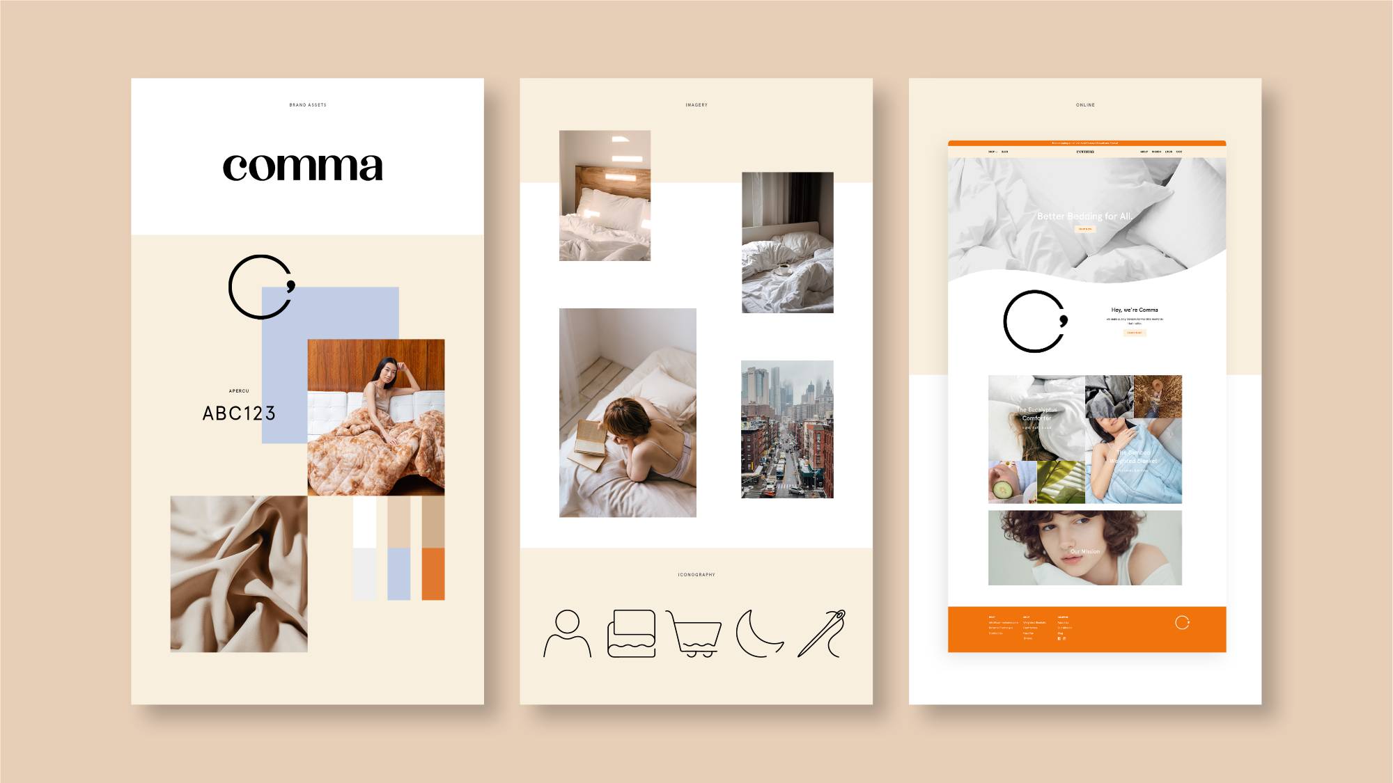
Elmwood NY partnered with Comma to design all facets of its brand identity, including brand positioning, visual identity, logo and wordmark design, activation assets and brand guidelines. The agency took inspiration from the story behind Comma’s name: a punctuated cue to pause and take a moment for oneself.
Elmwood NY crafted the guiding brand story and visual language for Comma of turning a restful moment into a movement. Taking time to savor the things that really matter allows one to wake up refreshed, more alive and ready to take on the day with kindness. Comma’s quality home products help people sleep better, feel better and do better—from their homes to their communities. With this purpose-based brand story in place, the agency then found ways to express the vision through Comma’s visual identity.
Meg Beckum, Executive Creative Director at Elmwood NY, said: “Comma is a brand that helps you pause and savor life. It’s a refreshing attitude in a hustle culture that celebrates the ever-busy schedule and always-on productivity. The Comma visual identity is built on the idea of guilt-free comfort and rejuvenation—soothing colors, cozy shape language, refined but casual typography and intimate imagery. It’s about appreciating the slower, quieter moments in life—the ones that give us peace and space to breathe.”
In addition to designing the start-up’s expanded name of Comma Home, new logo and wordmark, Elmwood NY crafted activation materials for the brand to use for physical means on its packaging and collateral as well as digital brand assets to leverage across its social media, advertisements and website.
Henry Chen, Founder and CEO of Comma Home, said: “Elmwood really helped us think about our brand strategically, centering and focusing our minds on the right questions and issues we needed to address when building a brand. They led us down a smart path with the utmost care and professionalism.”
Comma Home’s new brand identity proudly launched in May of this year. To see it in action, visit www.commahome.com.


CREDIT
- Agency/Creative: Elmwood New York
- Article Title: Elmwood New York Crafts Brand Identity for Bedding Start-Up Comma Home
- Organisation/Entity: Agency, Published Commercial Design
- Project Type: Identity
- Agency/Creative Country: United States
- Market Region: North America
- Project Deliverables: Brand Design, Brand Guidelines, Brand Identity, Brand Naming, Brand Redesign, Brand Refinement, Brand Strategy, Brand World, Branding, Graphic Design, Identity System, Photography, Rebranding, Retail Brand Design, Tone of Voice
- Industry: Retail
- Keywords: Brand Identity, Rebrand, Visual Identity, Brand World


