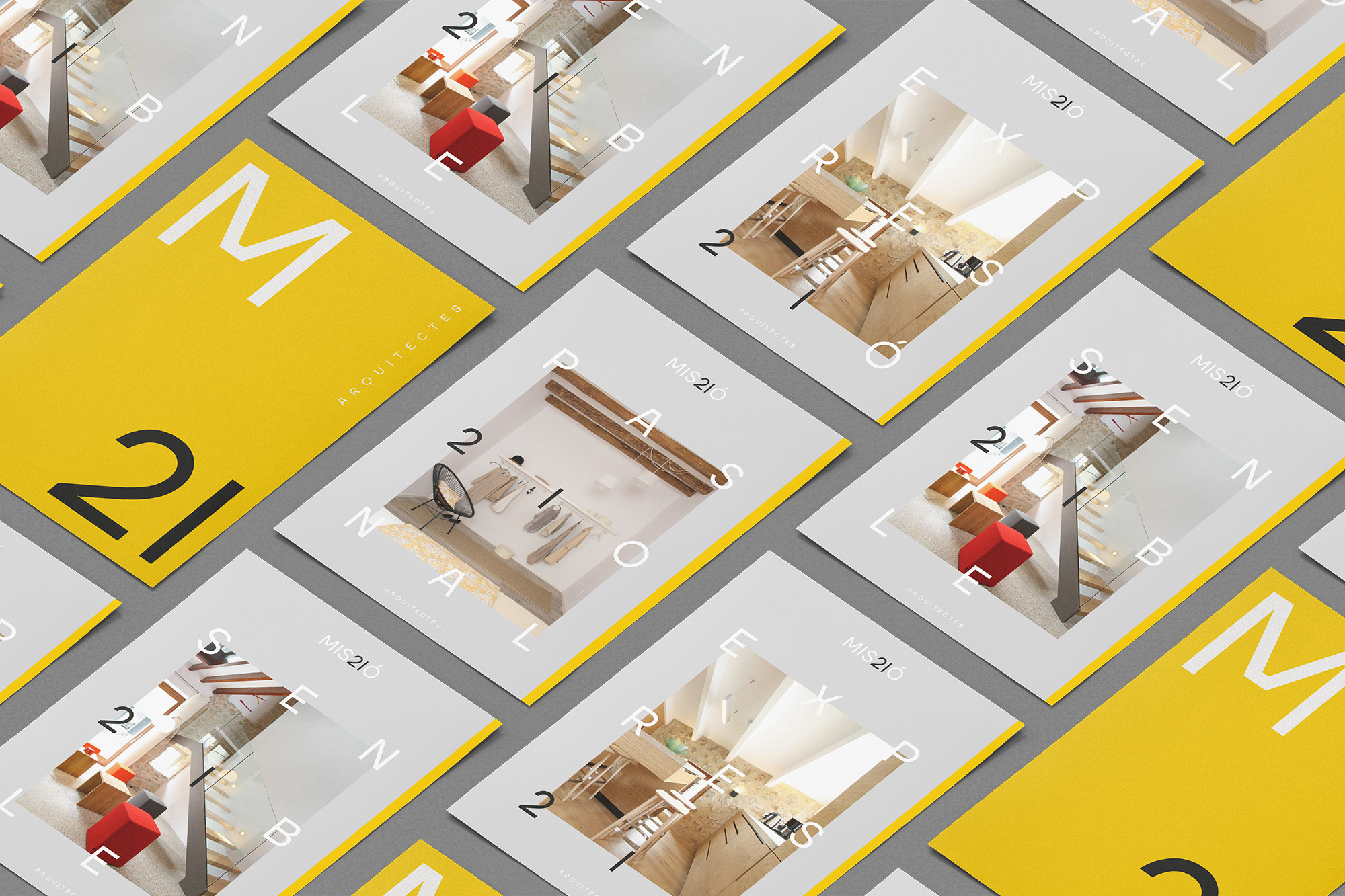
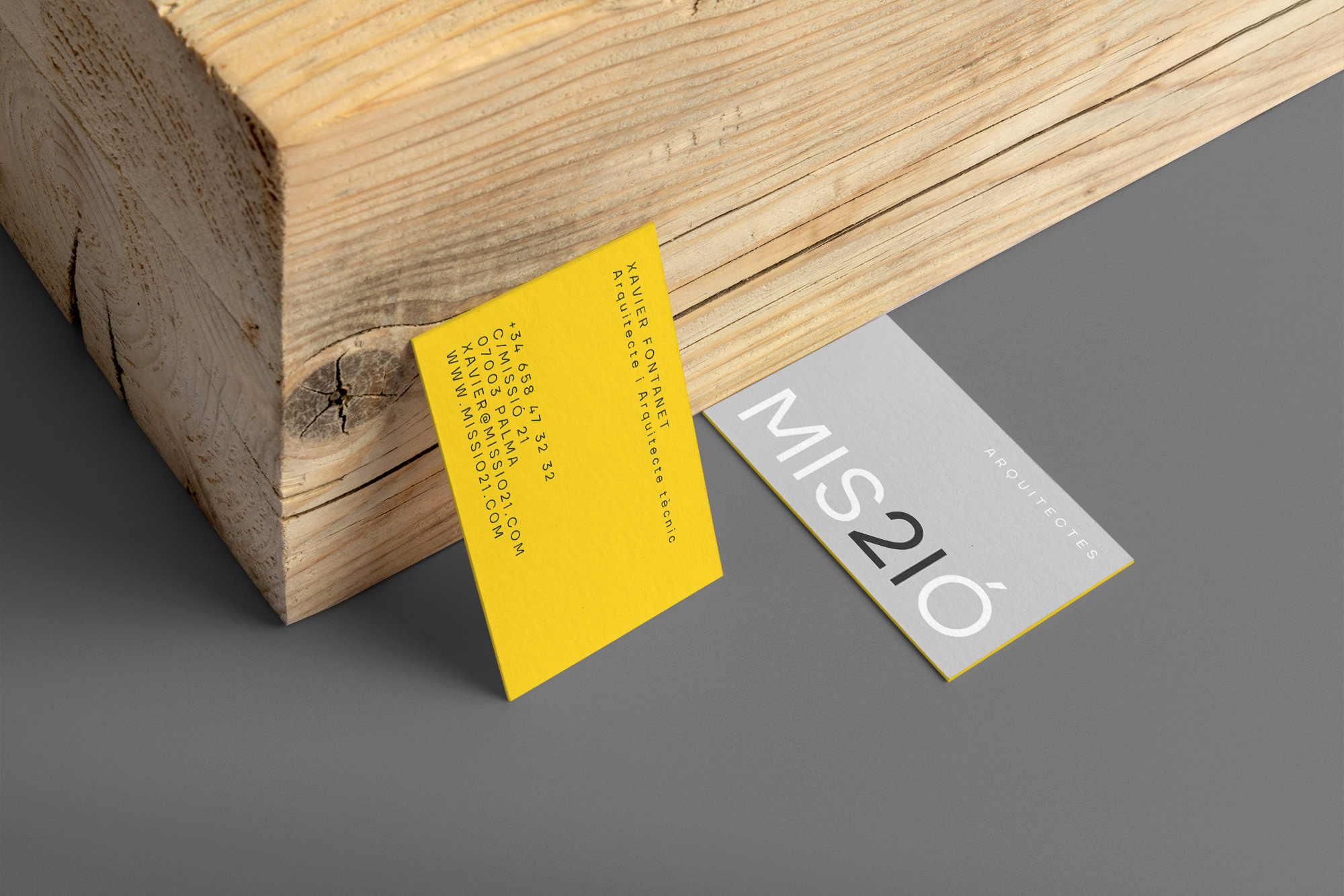
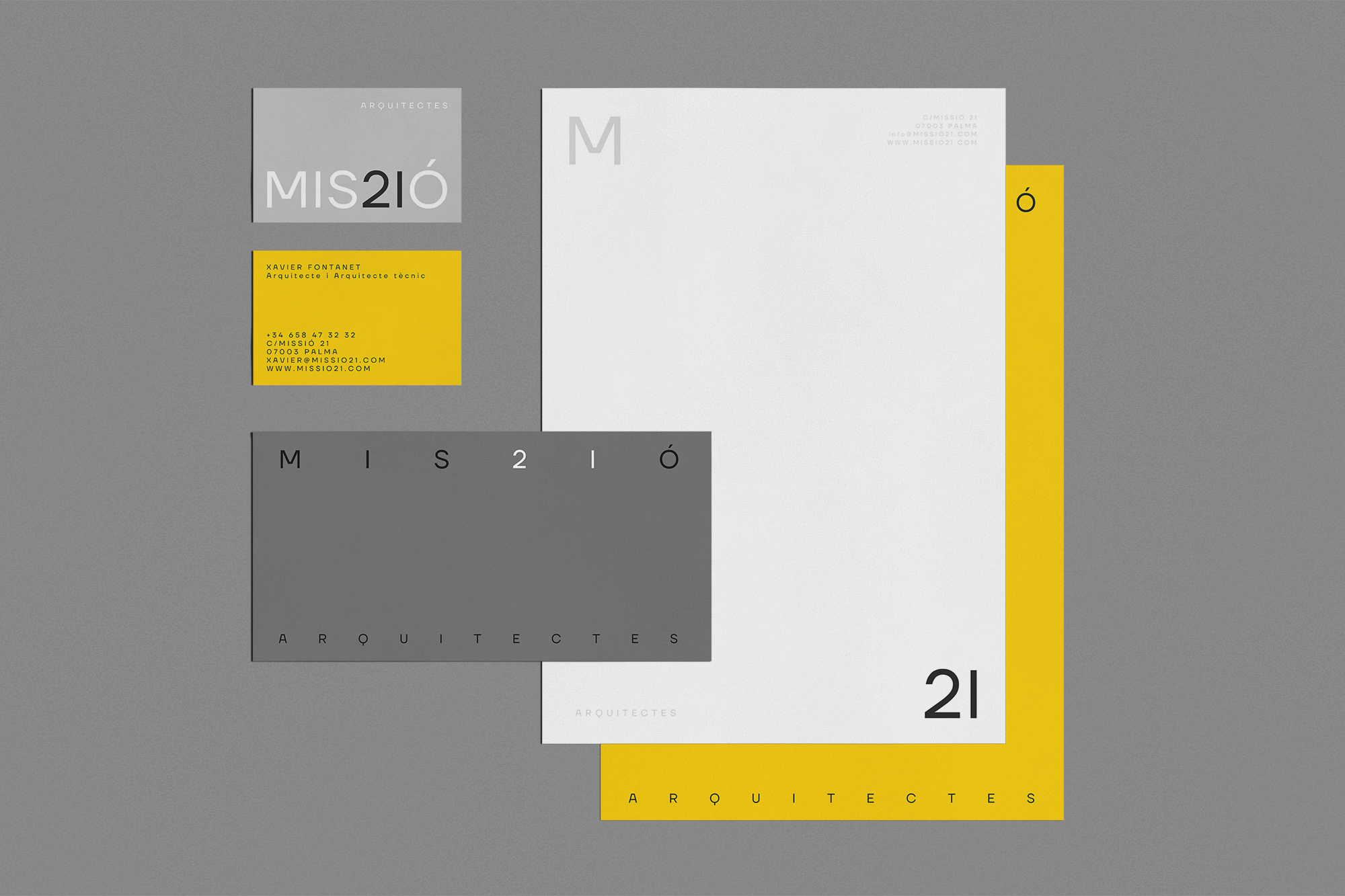
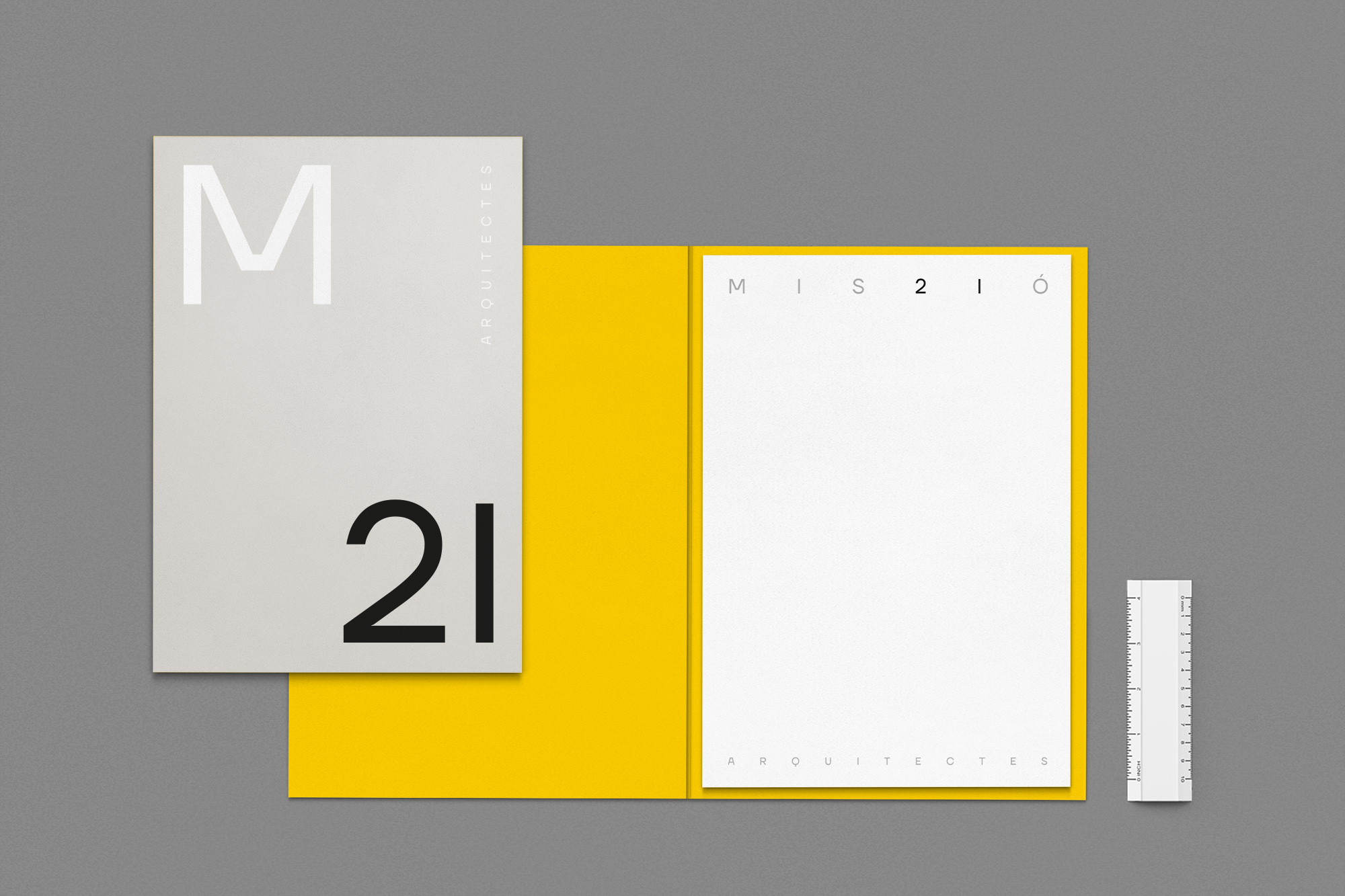
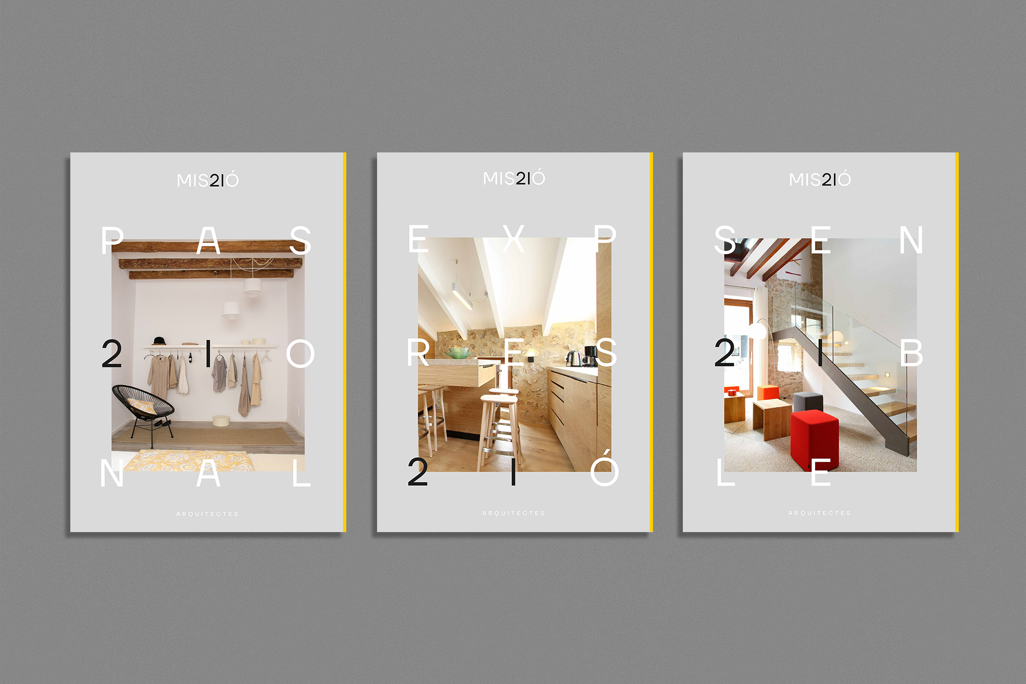
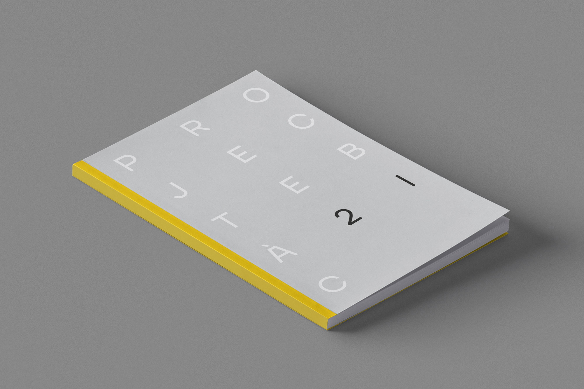
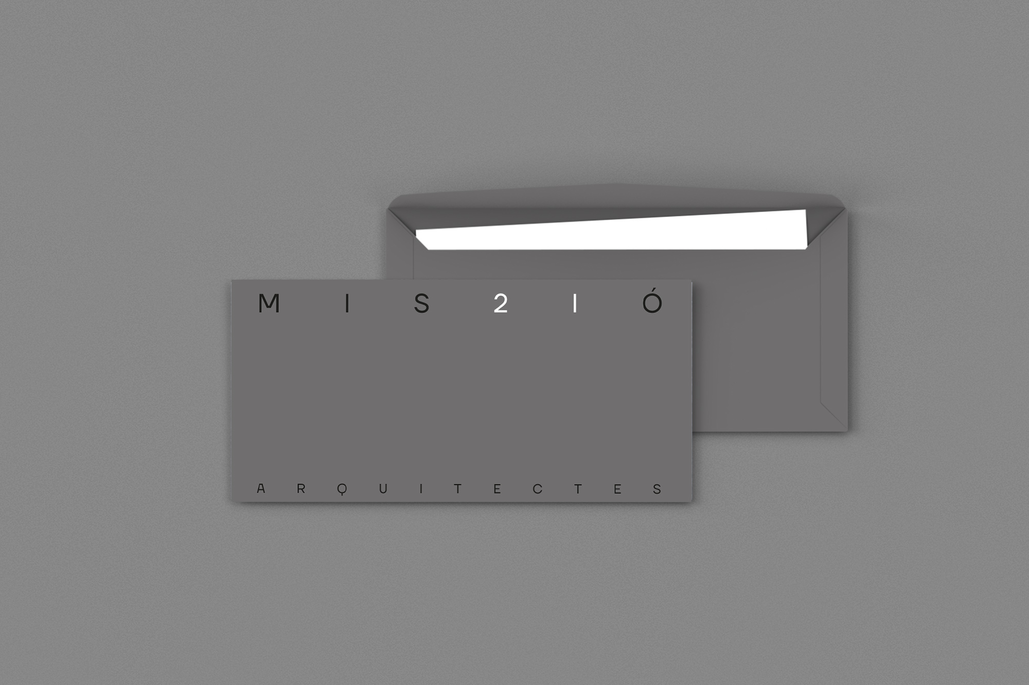
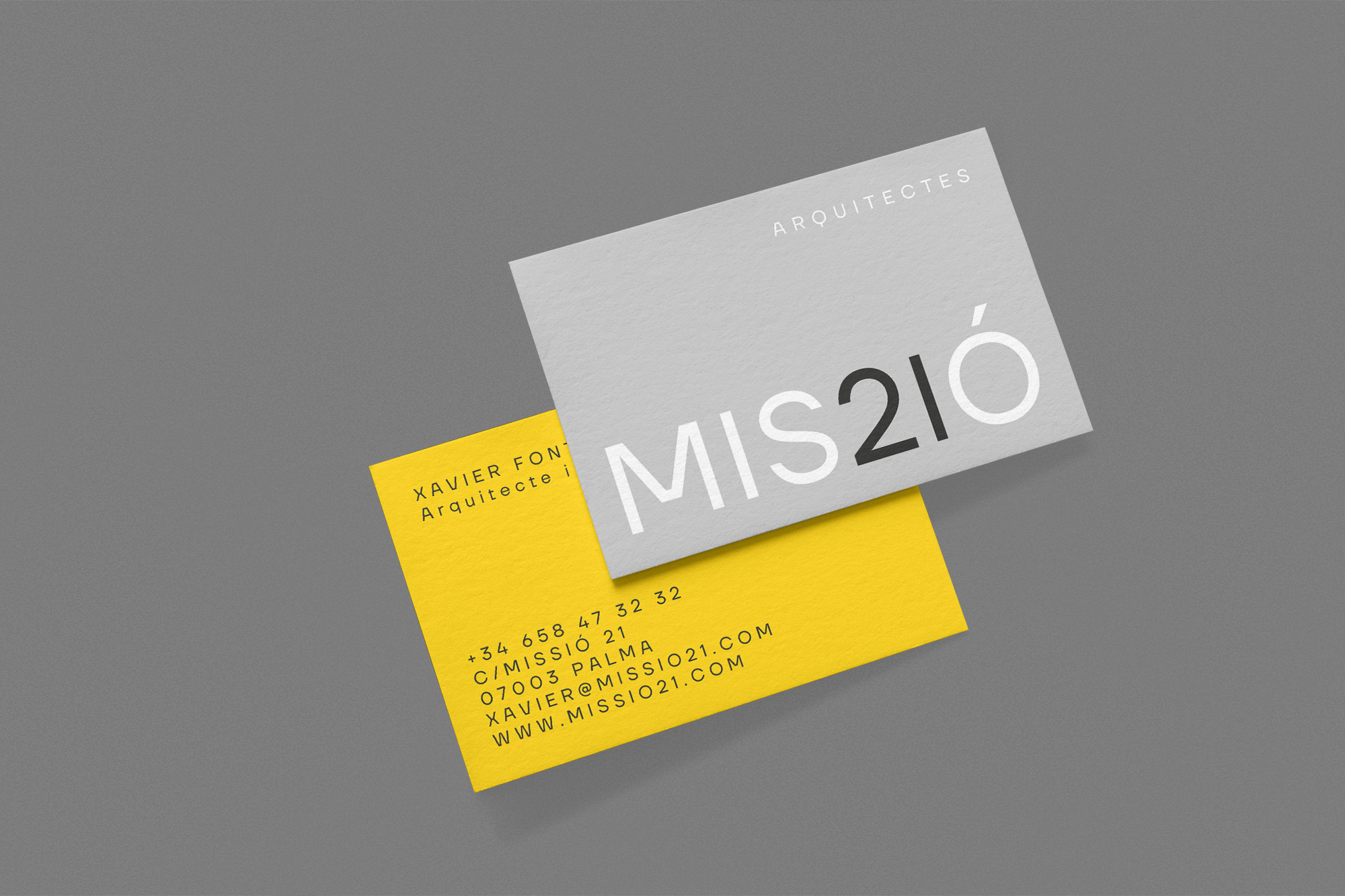
Brand for the architectural studio Missió 21. Subtle way of projecting the architectural language of the studio. The design is a typographic game through the juxtaposition of 21 and the characters “SI” of the name itself due to their similarity of forms. A creative and simple way to represent the subtle and almost invisible mark that the architect leaves on a project.
CREDIT
- Agency/Creative: Barceló estudio
- Article Title: Brand For The Architectural Studio Missió 21
- Organisation/Entity: Agency, Published Commercial Design
- Project Type: Identity
- Agency/Creative Country: Spain
- Market Region: Europe
- Project Deliverables: Brand Guidelines, Brand Strategy, Brand World, Branding, Graphic Design, Identity System, Tone of Voice
- Industry: Construction
FEEDBACK
Relevance: Solution/idea in relation to brand, product or service
Implementation: Attention, detailing and finishing of final solution
Presentation: Text, visualisation and quality of the presentation


