


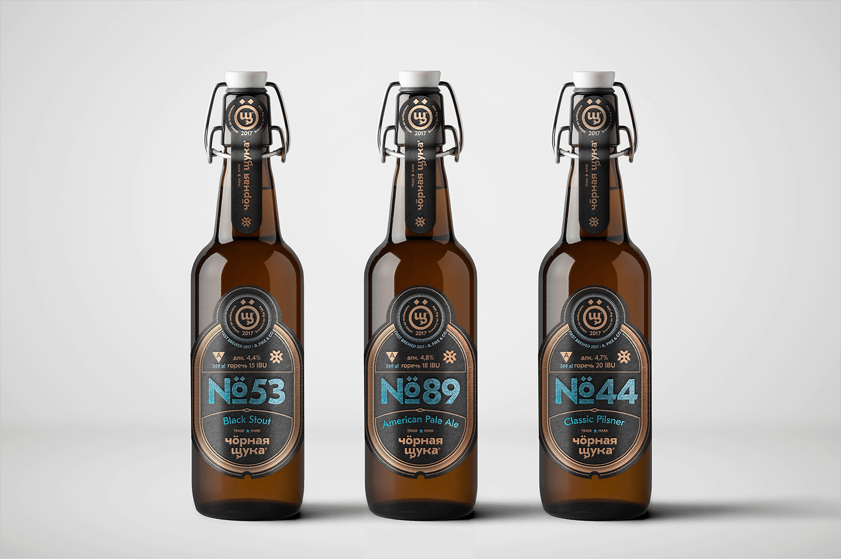
Black pike is a young brand that is known so far to a small audience. We decided not to create individual product brands and produce beer under the brand name of the brewery. This will increase brewery brand recognition. The main elements of identification are numbers that denote a unique style of beer.
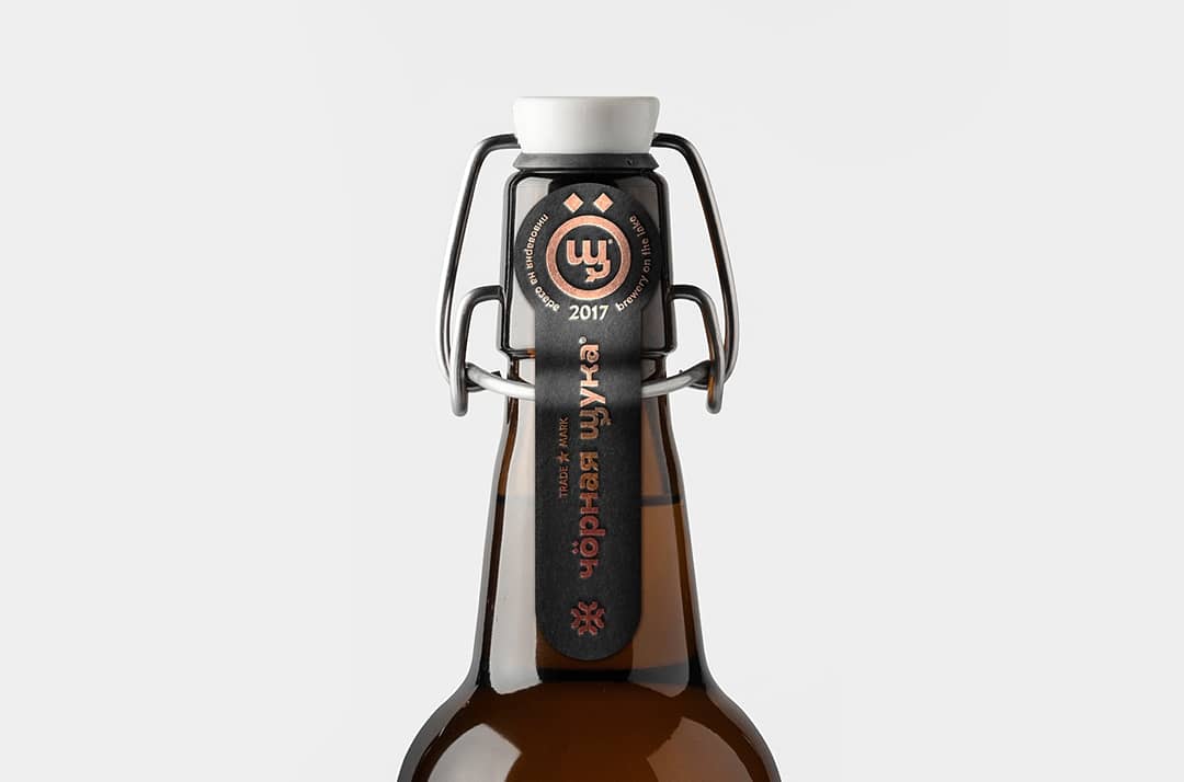
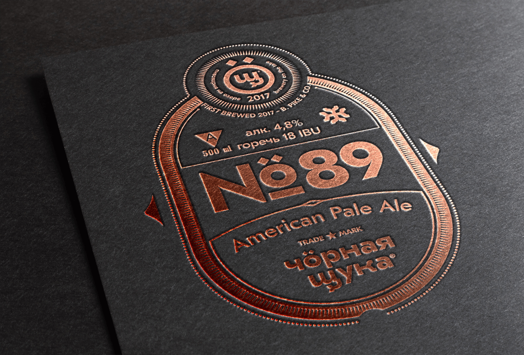
The premium line is distinguished by a bottle with a ceramic yoke stopper and black labels embossed with copper and sky blue foil. A paper seal that is placed on a metal bridle and protects the product from unauthorized opening.
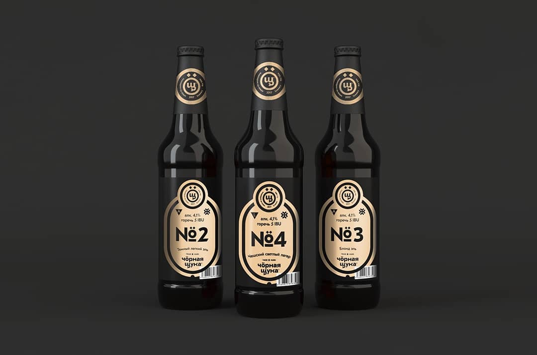
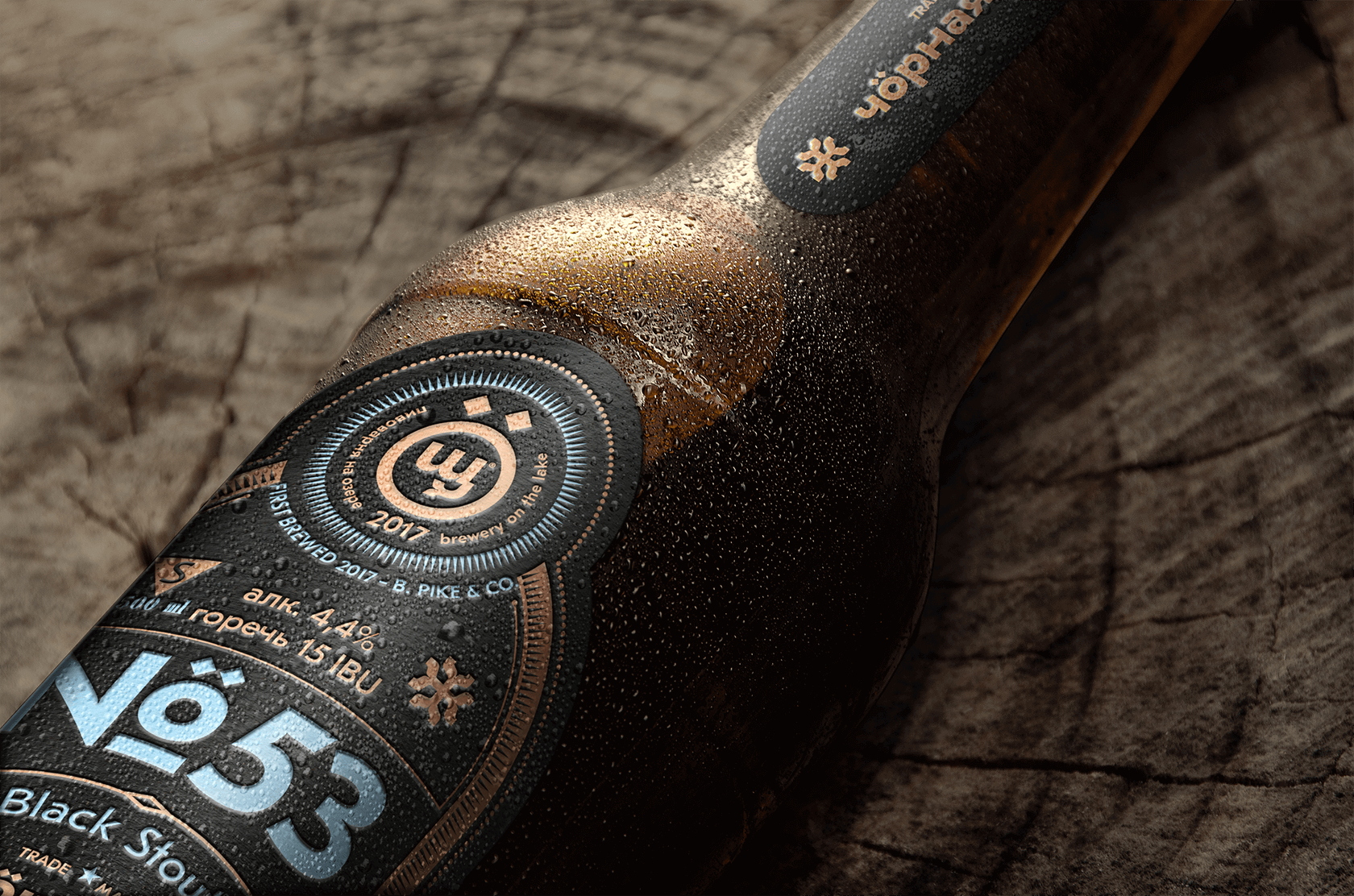
The main beer line is much more concise. Classic bottle with crown caps, not overloaded with graphics details and printing in one graphite color. All this makes the line visually simpler and affordable but stylistically not different from the premium line.
The company plans to launch the production of a budget line in aluminum cans.
CREDIT
- Agency/Creative: RED BLACK DESIGN
- Article Title: Red Black Creates New Packaging for Black Pike Beer
- Organisation/Entity: Agency, Published Commercial Design
- Project Type: Packaging
- Agency/Creative Country: Russia
- Market Region: Europe
- Project Deliverables: Brand Architecture, Branding, Graphic Design, Packaging Design, Product Architecture
- Format: Bottle
- Substrate: Glass Bottle


