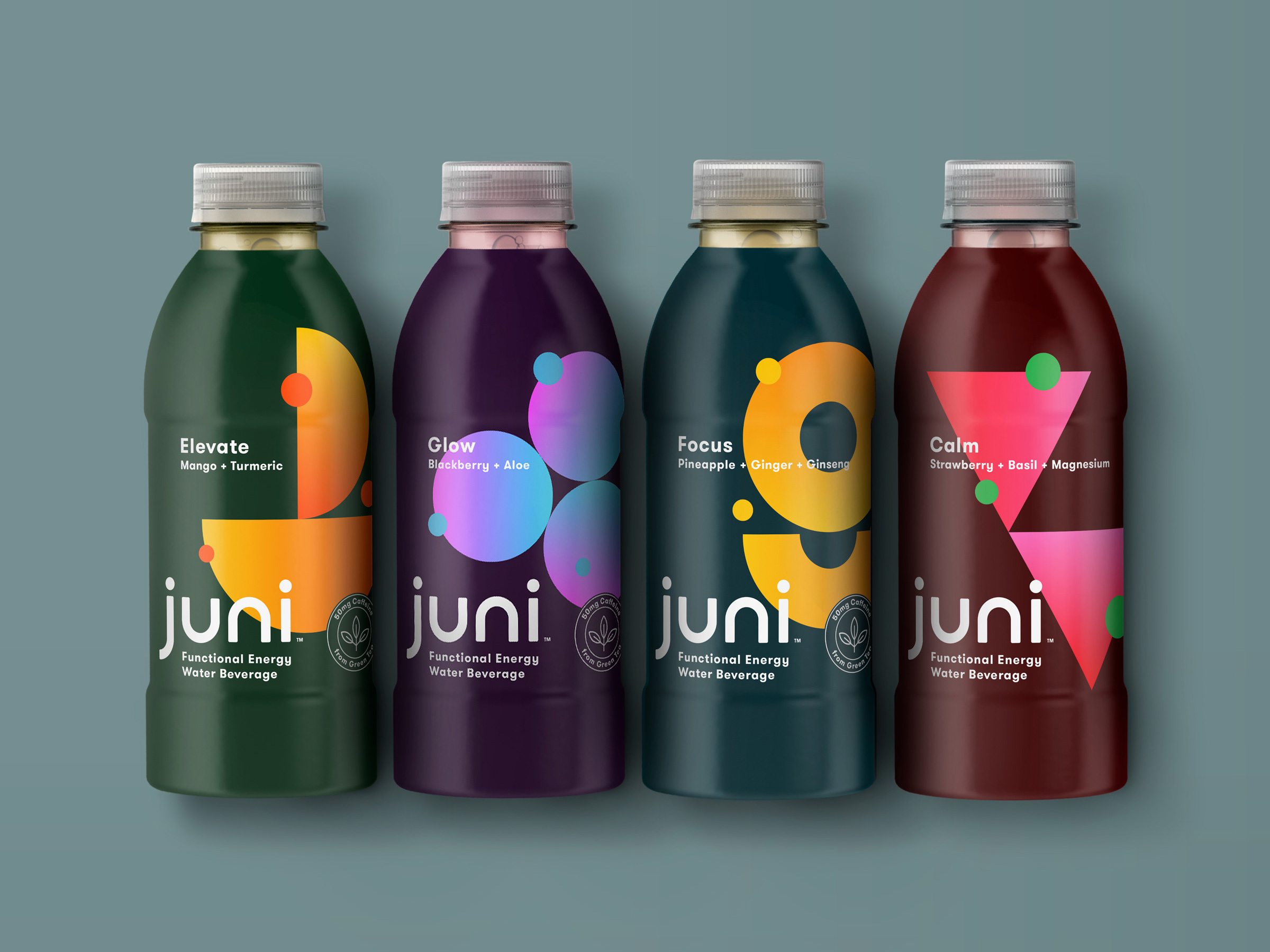
Now more than ever, consumers are proactively seeking energy with benefits. Juni, launching this week at Target, is a functional energy water that was specifically created to deliver on those needs.
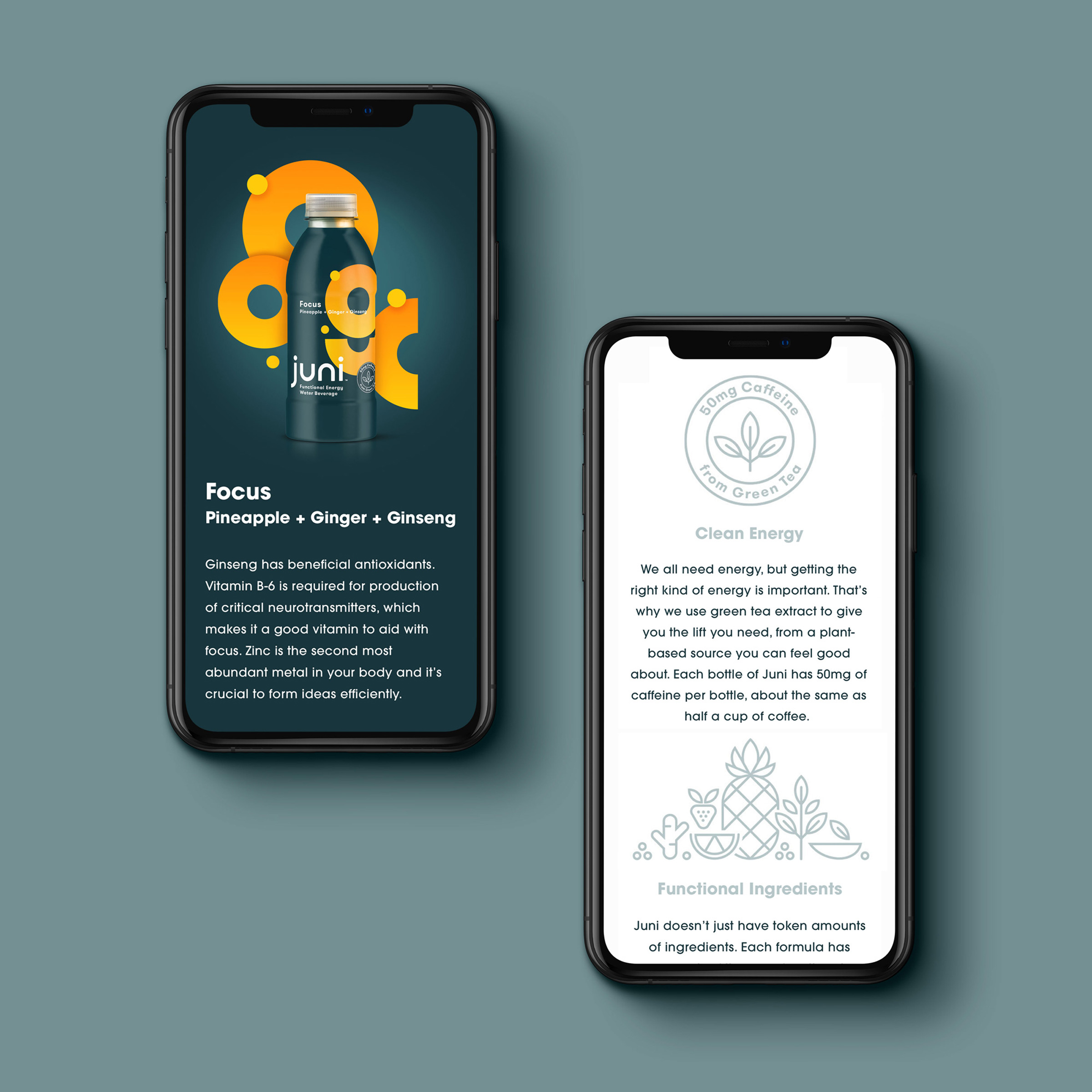
Juni uses green tea extract to give consumers the lift they need, from a plant-based source they can feel good about. Each 16.9 ounce bottle has 50mg of caffeine, about the same as half a cup of coffee.
Functional ingredients are more important now than ever, and this is where Juni really shines. Juni doesn’t just have token amounts of ingredients like zinc, magnesium, turmeric, aloe, ginger or ginseng. Each formula has enough of these core functional ingredients to ensure it is making a positive difference, be it mental or physical.
It also tastes amazing, with no artificial anything, just recognizable ingredients.
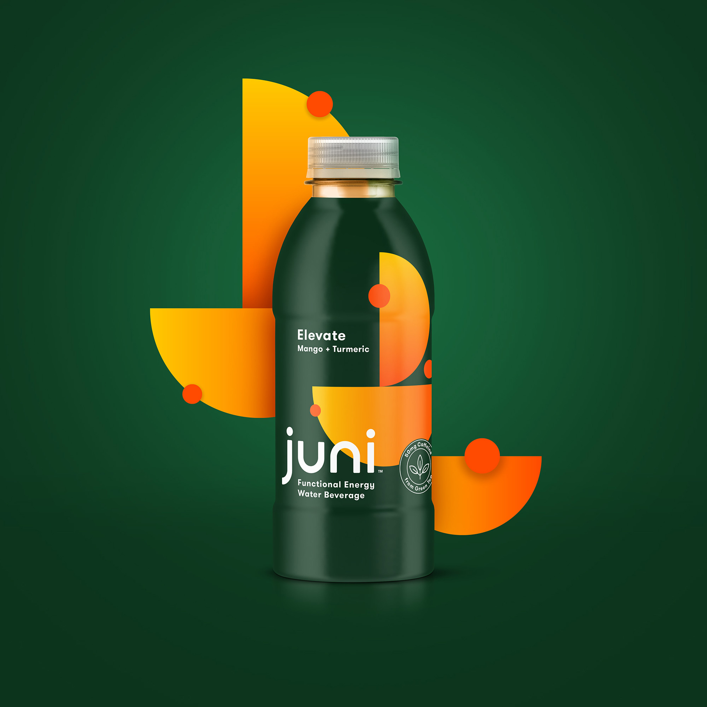
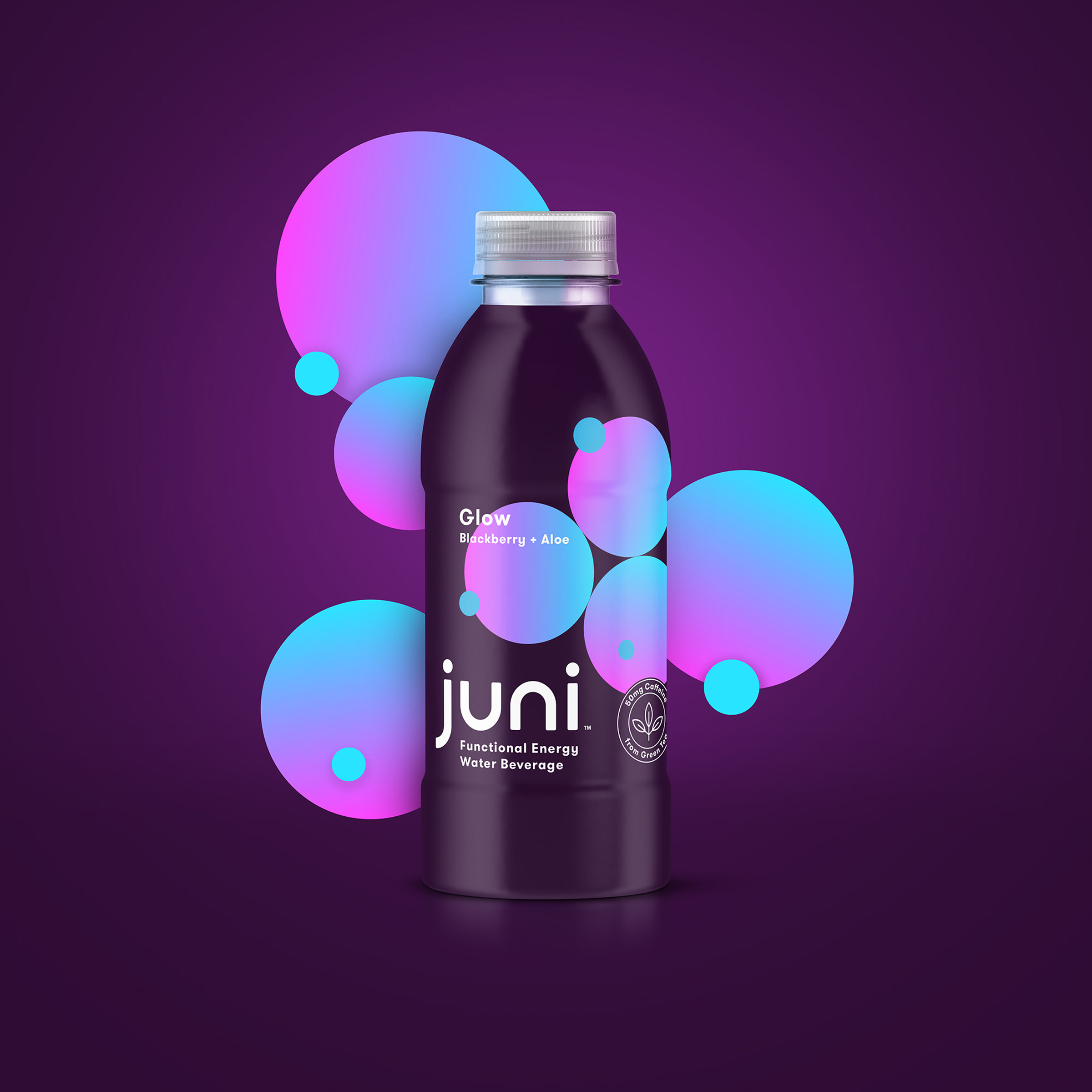
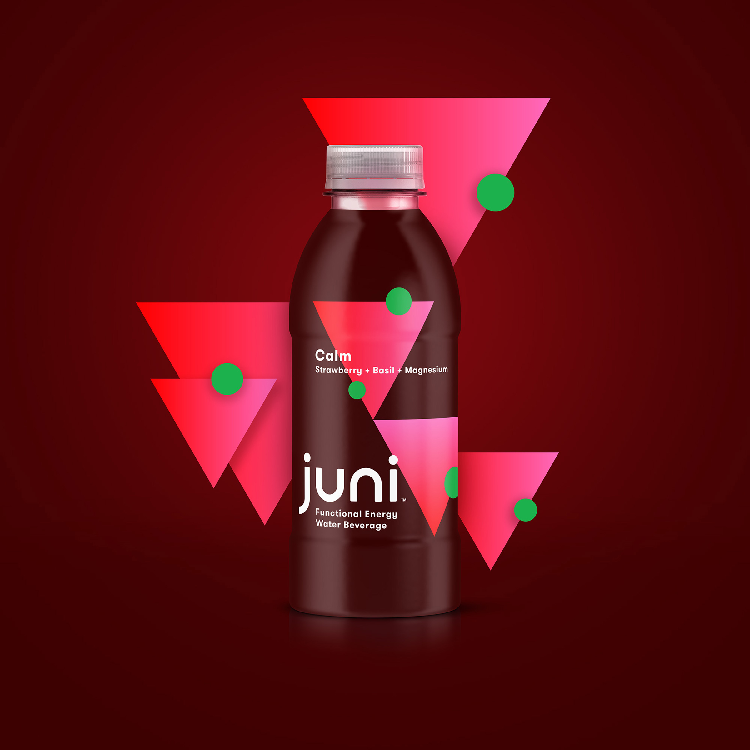
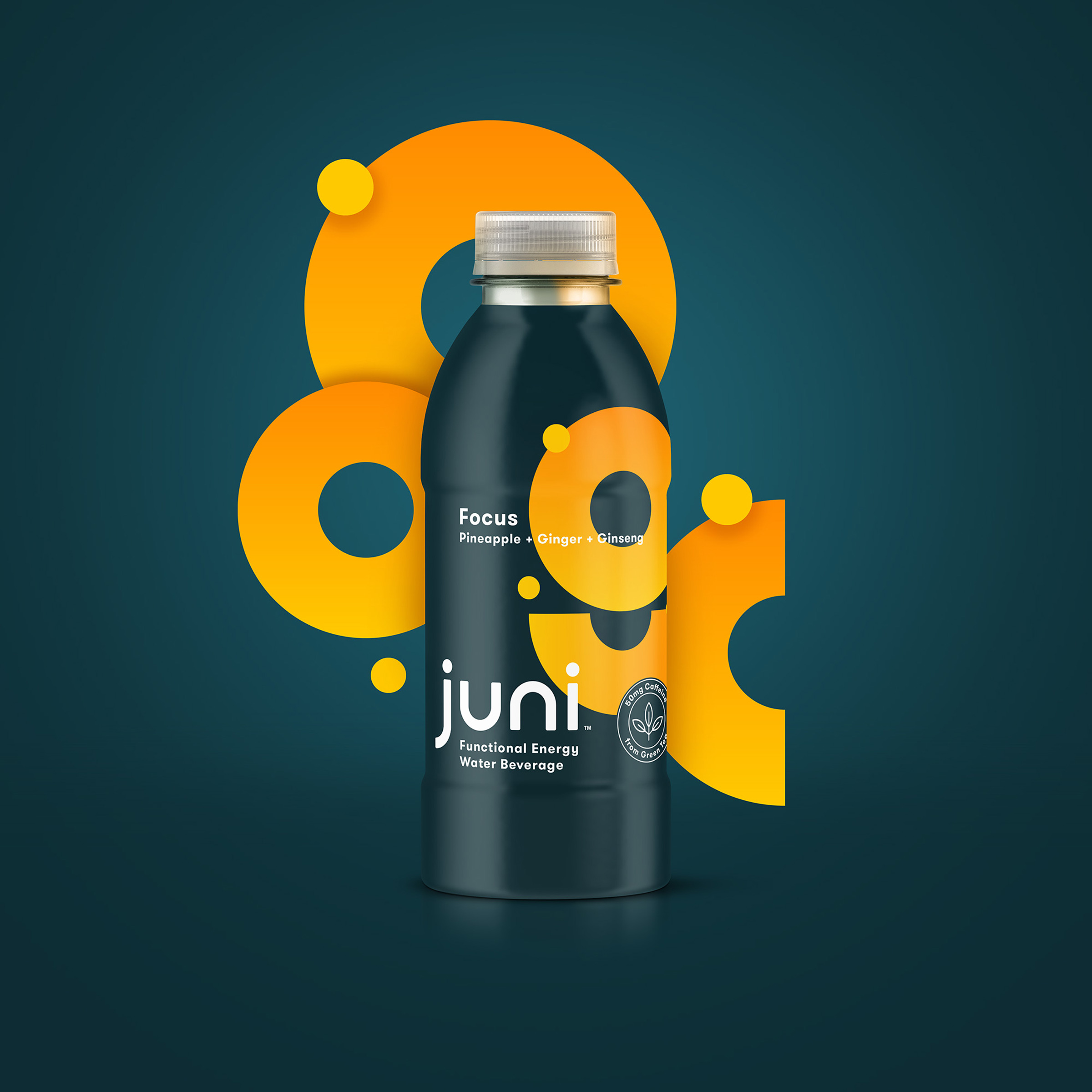
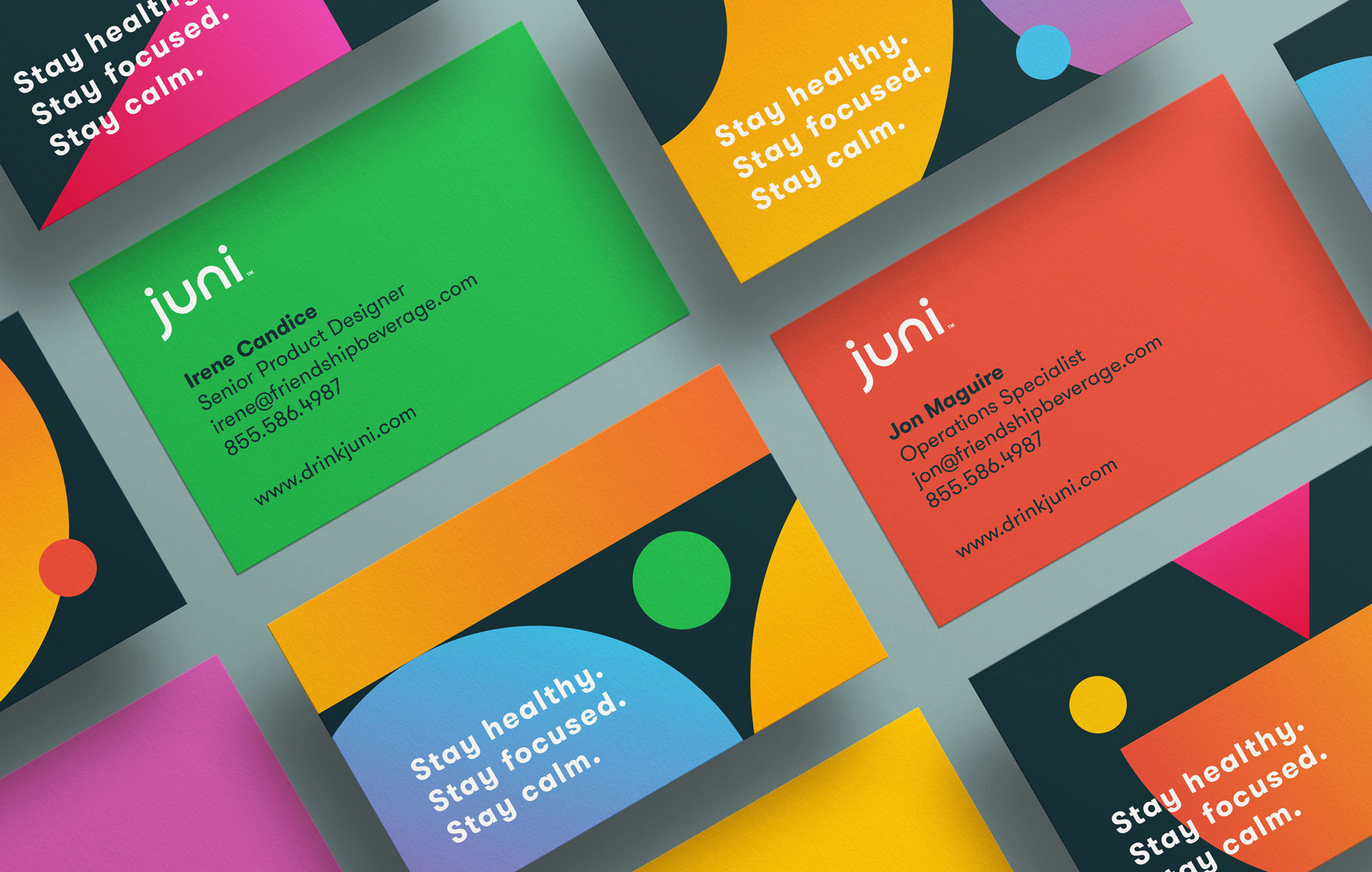
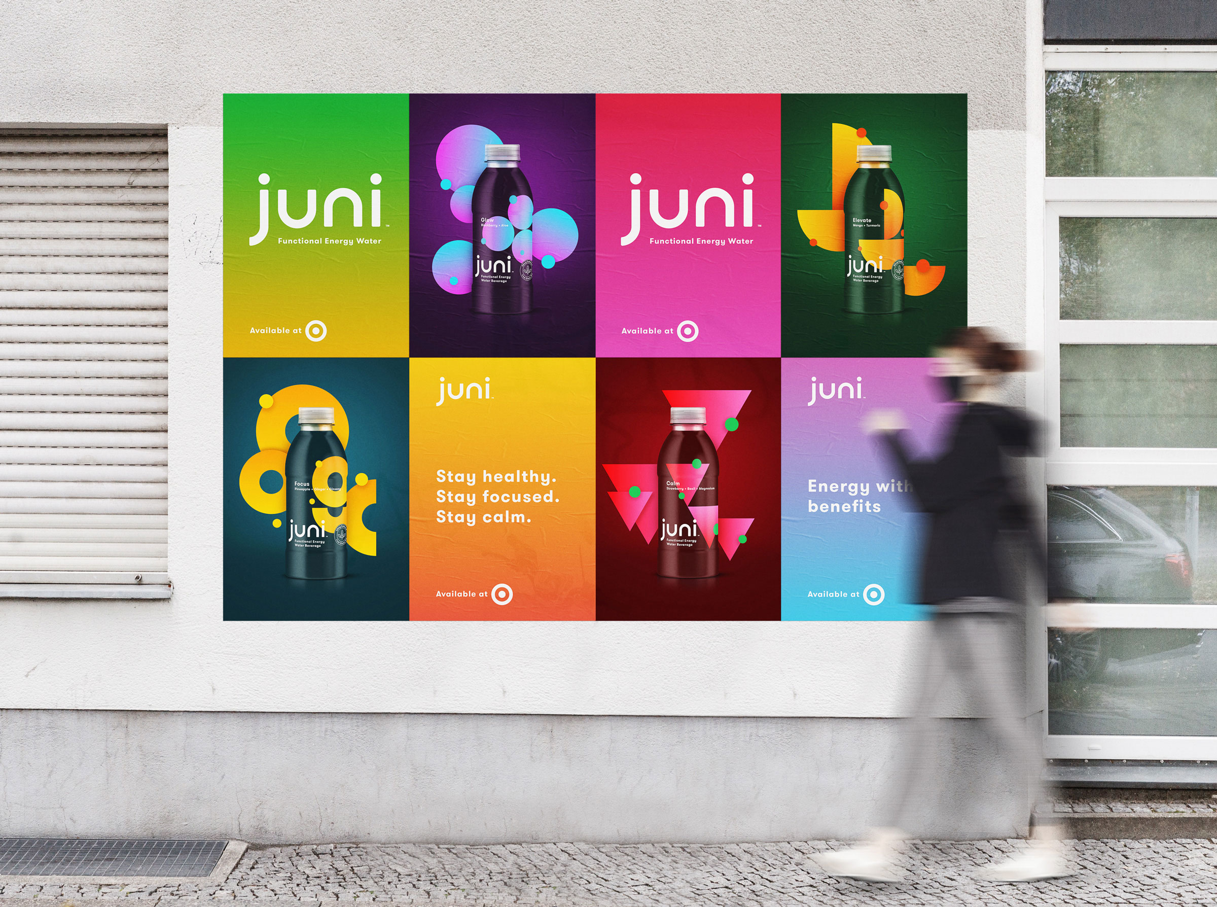
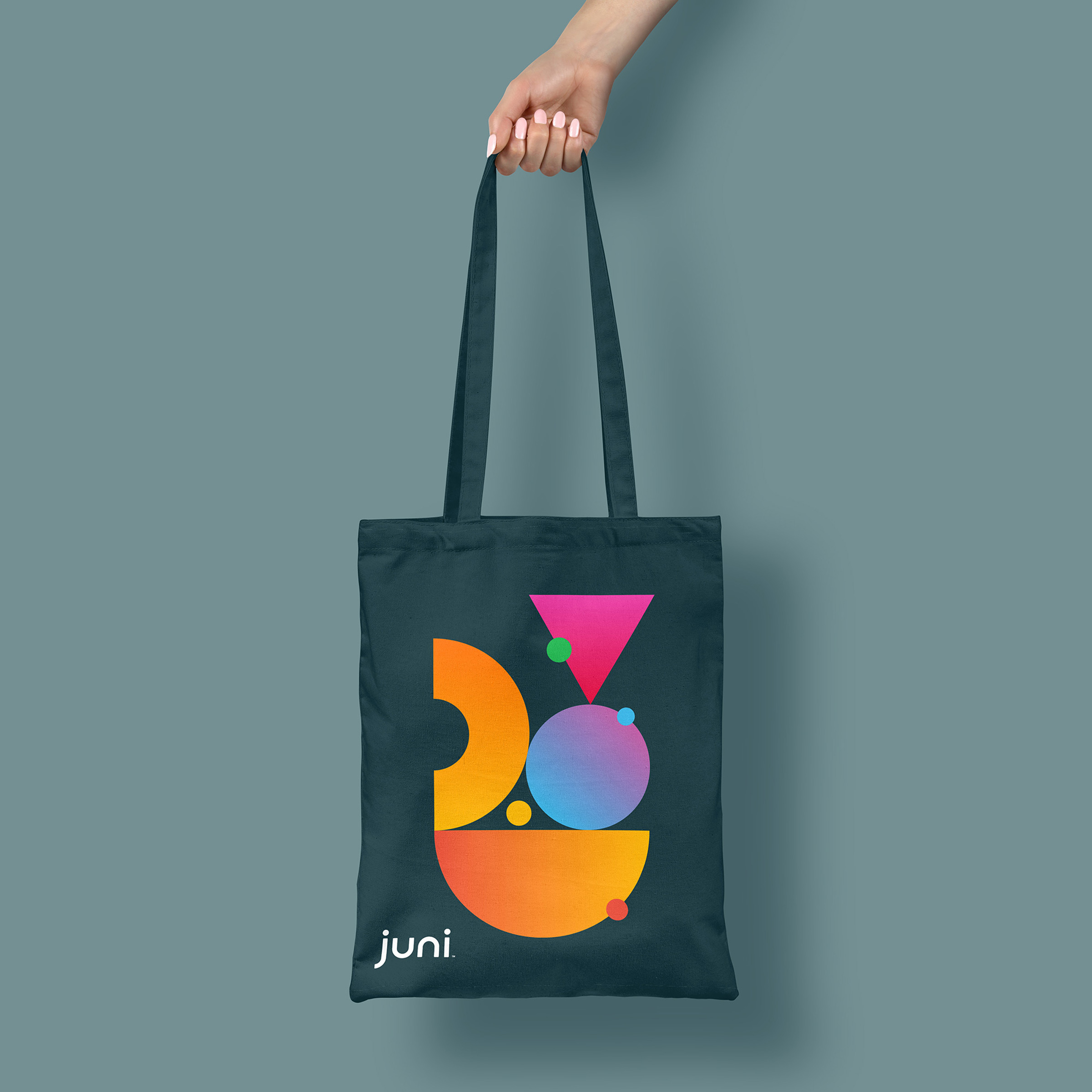
A new product like Juni should feel fresh and exciting the moment you encounter it on shelf. The design team at Friendship Beverage set out to create a product that spoke to Juni’s core audience, while standing apart from its competitors. While most brands utilize literal depictions of ingredients, the Friendship team opted for something that feels more abstract and artful. Those bright, geometric forms are set against a dark backdrop to create a striking contrast. Throughout the design process, a group of core users were periodically tapped to ensure the packaging was striking the right balance of style and taste appeal. The result is a design that feels unlike anything else in the Target water aisle.
CREDIT
- Agency/Creative: Friendship Beverage
- Article Title: Juni Packaging and Brand Design
- Organisation/Entity: In-house, Published Commercial Design
- Project Type: Packaging
- Agency/Creative Country: United States
- Market Region: North America
- Project Deliverables: Brand Design, Brand Identity, Brand Naming, Brand Redesign, Branding, Graphic Design, Identity System, Packaging Design, Product Architecture, Retail Brand Design
- Format: Bottle
- Substrate: Plastic


