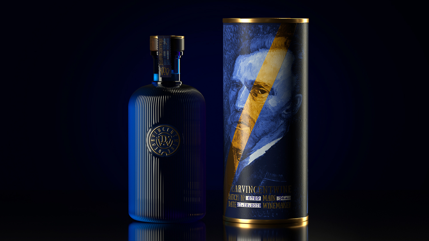
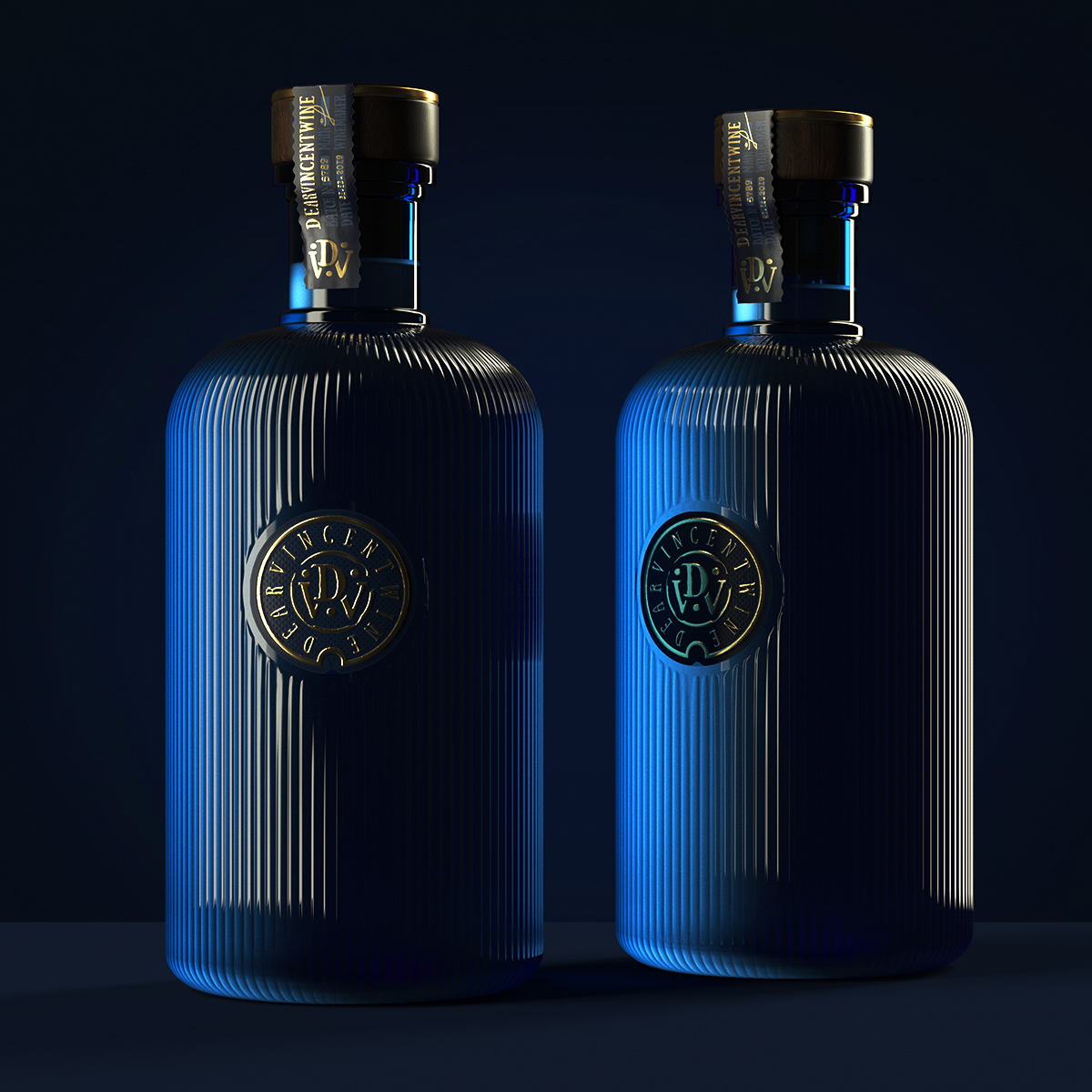
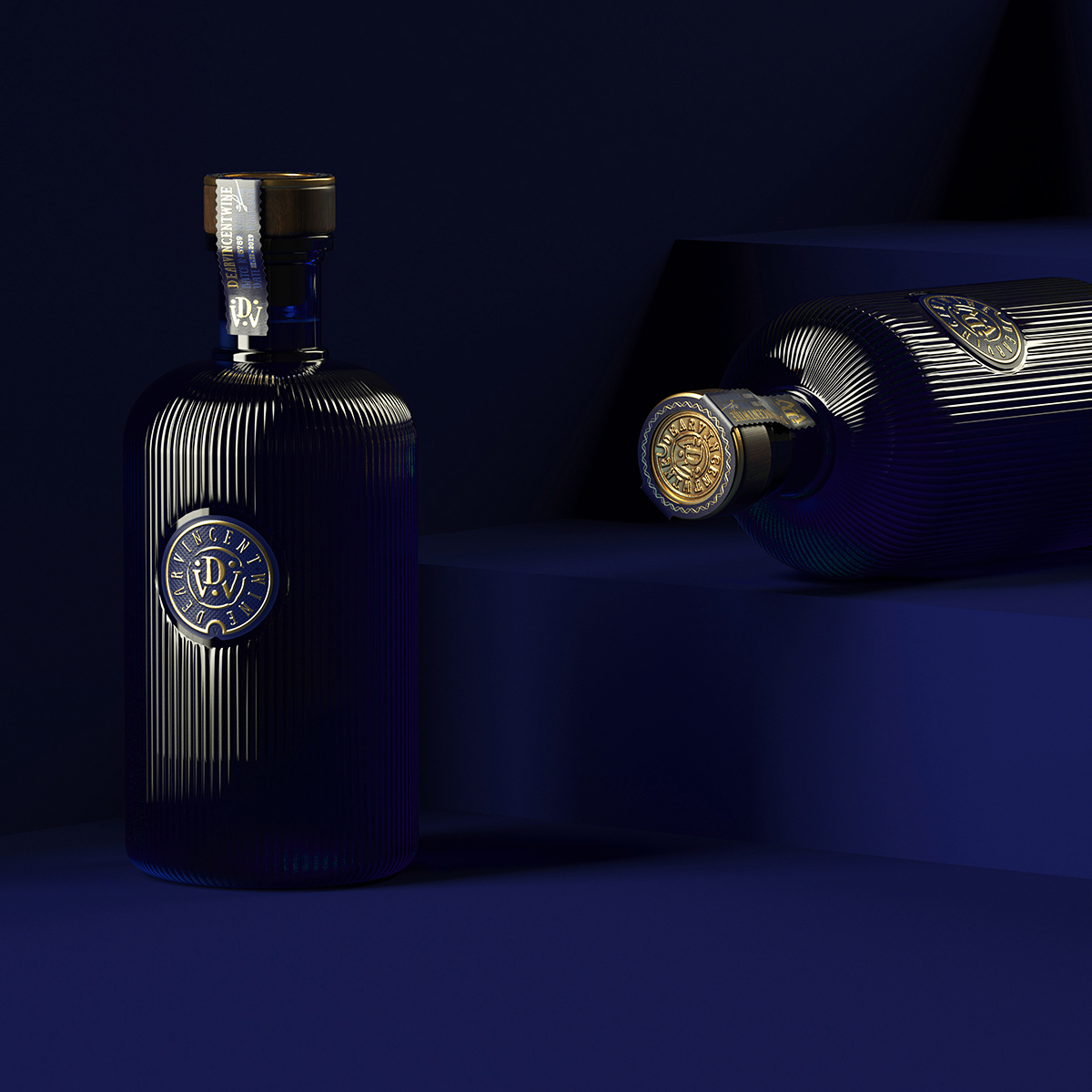
Barely noticeable details are often at the heart of great projects. They may not be visible, but this does not reduce their value. Dearvincent embossing perfectly decorates the bottom of the bottle. You definitely should be more attentive.When project details are worth their weight in gold. The use of gold elements in the design of Dearvincent further emphasizes the premium quality of the product and places small accents.
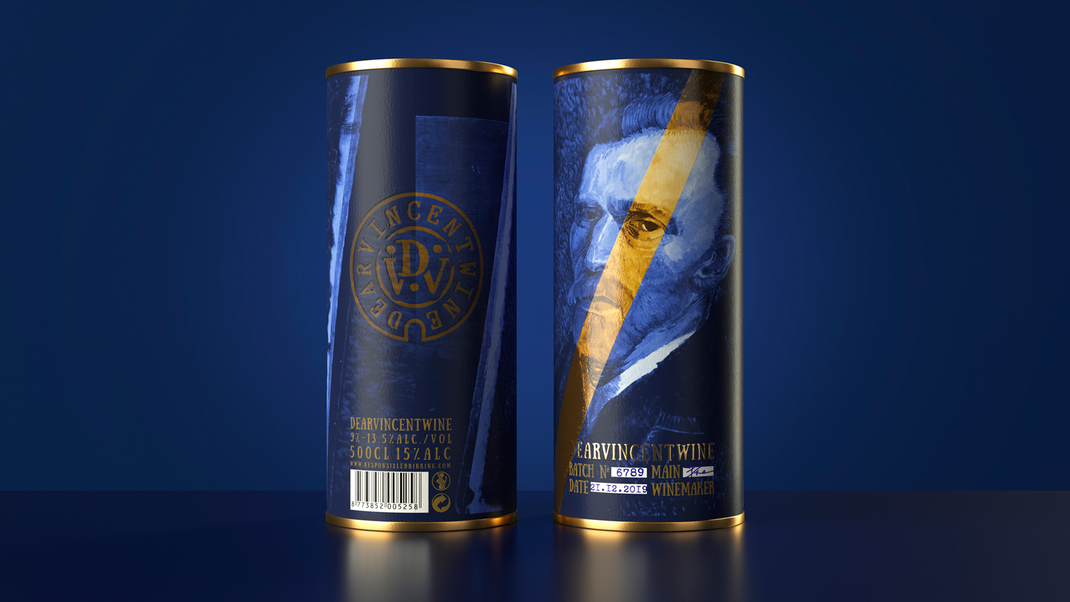
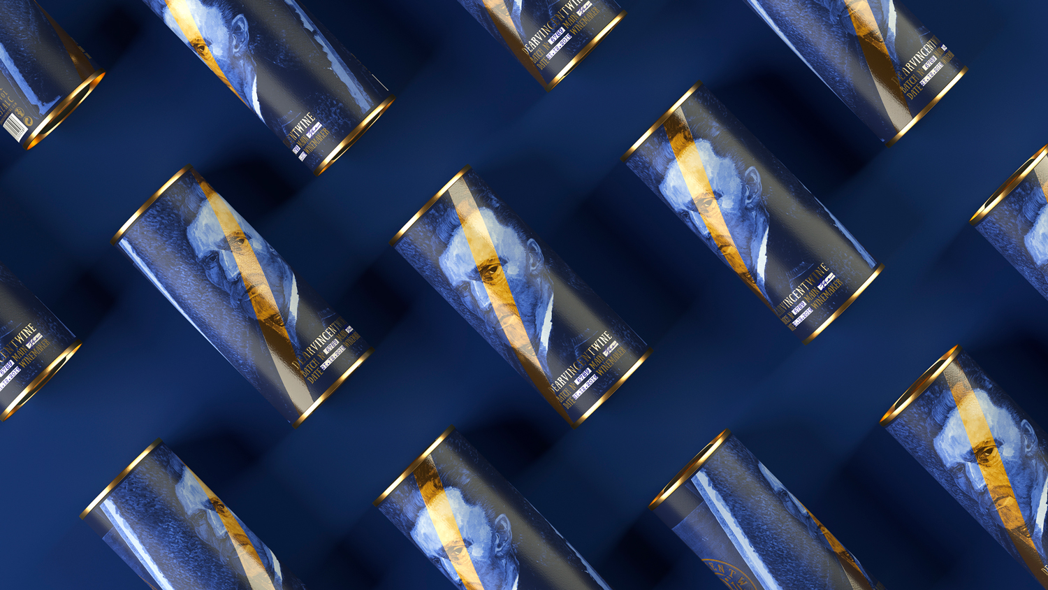
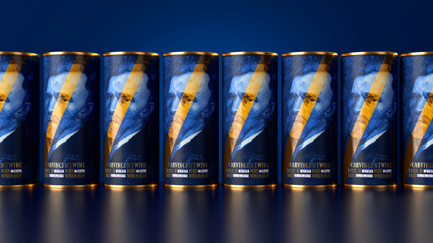
Dearvincent carefully packed in a tube with a bold design. The design is based on a copy of the great Van Gogh’s self-portrait with a dynamic yellow stripe – a successful combination of colors distinguishes this product and make it so memorable. The Dearvincent tube is a bright prelude that prepares us for new discoveries.
By the way, the tube is quite informative, it displays the batch number and its date, and confirms all this with the signature of the chief winemaker. Simple shapes, strict lines, deep shades. Rhythm, minimalism, accents. All this creates a unique image of the premium line of Dearvincent wines inspired by the great artist Vincent van Gogh.


CREDIT
- Agency/Creative: ZNAKOVY
- Article Title: Dearvincent Wine Concept Based on Van Gogh
- Organisation/Entity: Agency, Non Published Concept Design
- Project Type: Packaging
- Agency/Creative Country: Belarus
- Market Region: Global
- Project Deliverables: Brand World, Packaging Design
- Format: Bottle, Tube
- Substrate: Glass Bottle, Pulp Carton


