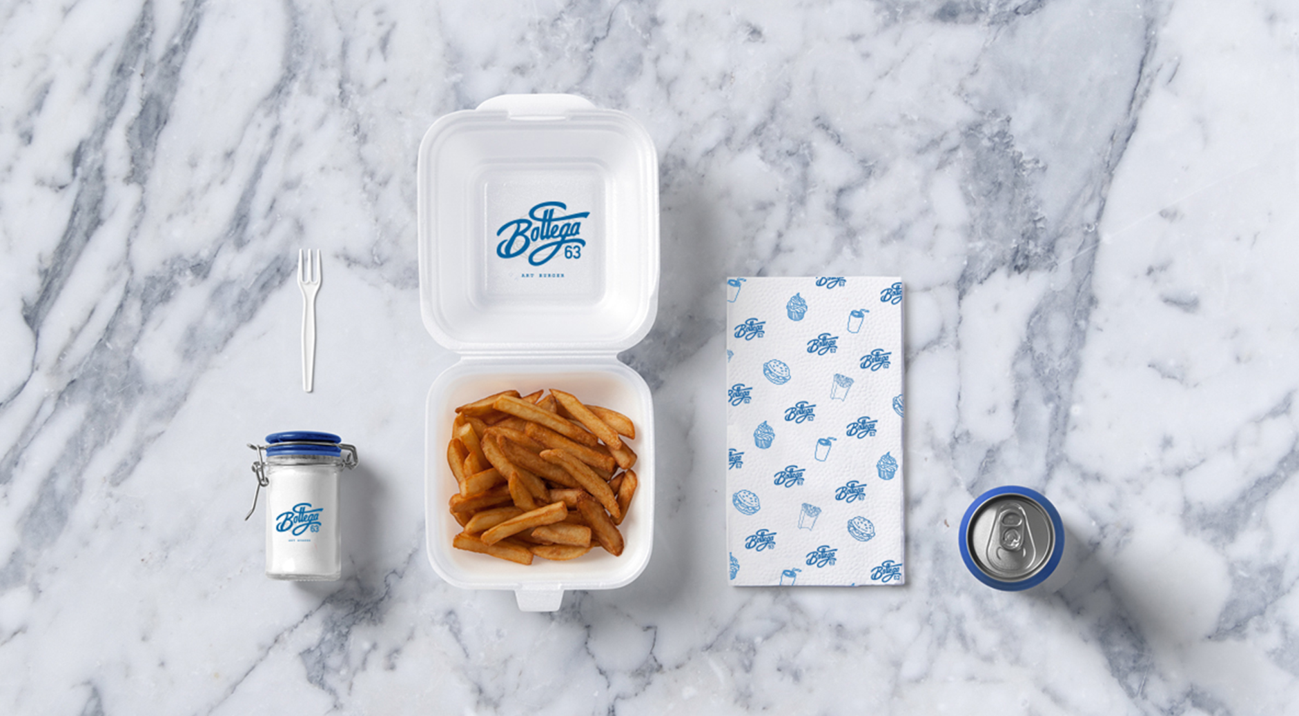
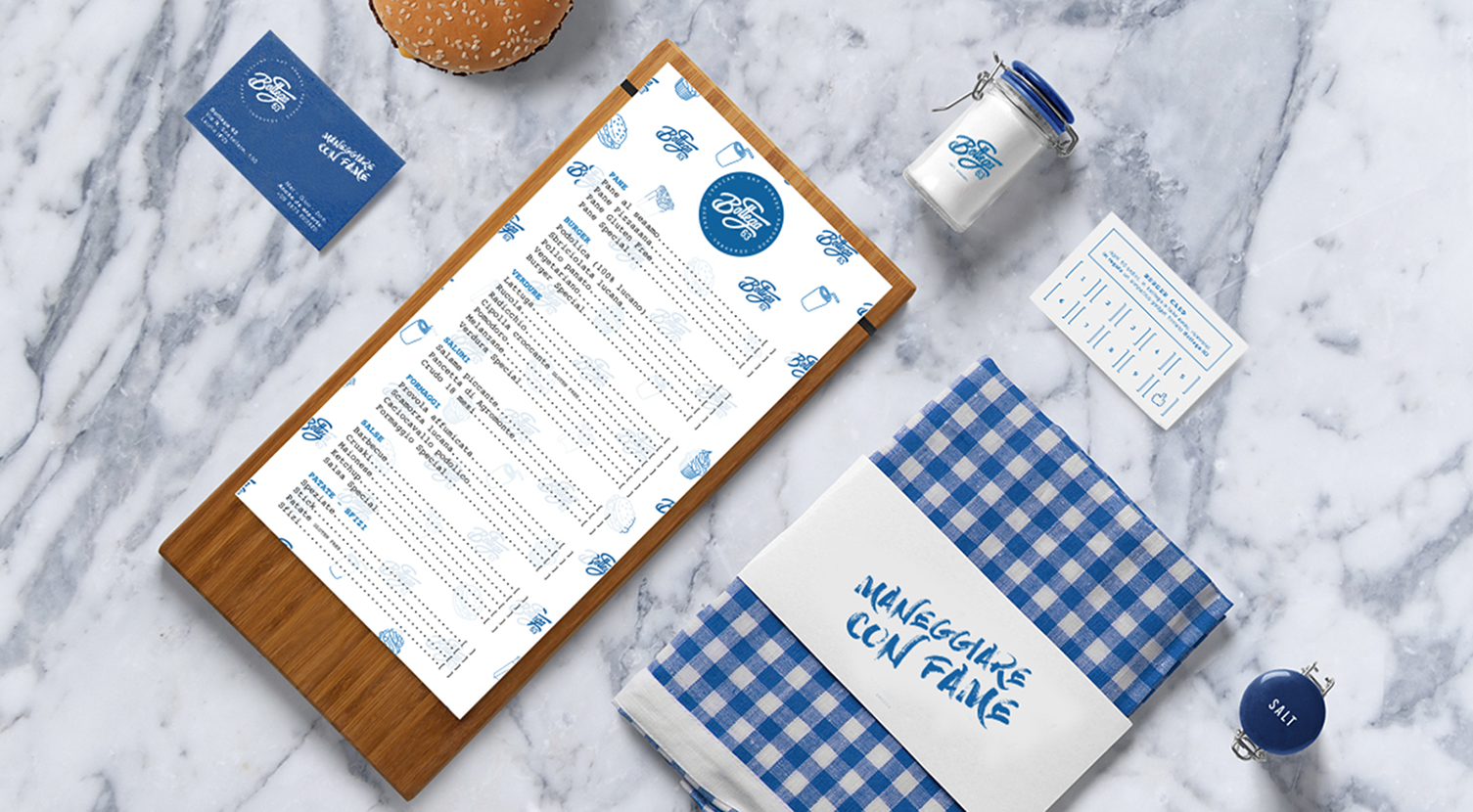
Bottega 63 offers authentic and delicious hamburgers made with local products. We were asked to restyle branding and create their entire packaging. The aim was to reflect the high quality of their local food with freshness and healthiness aspects.
PROJECT
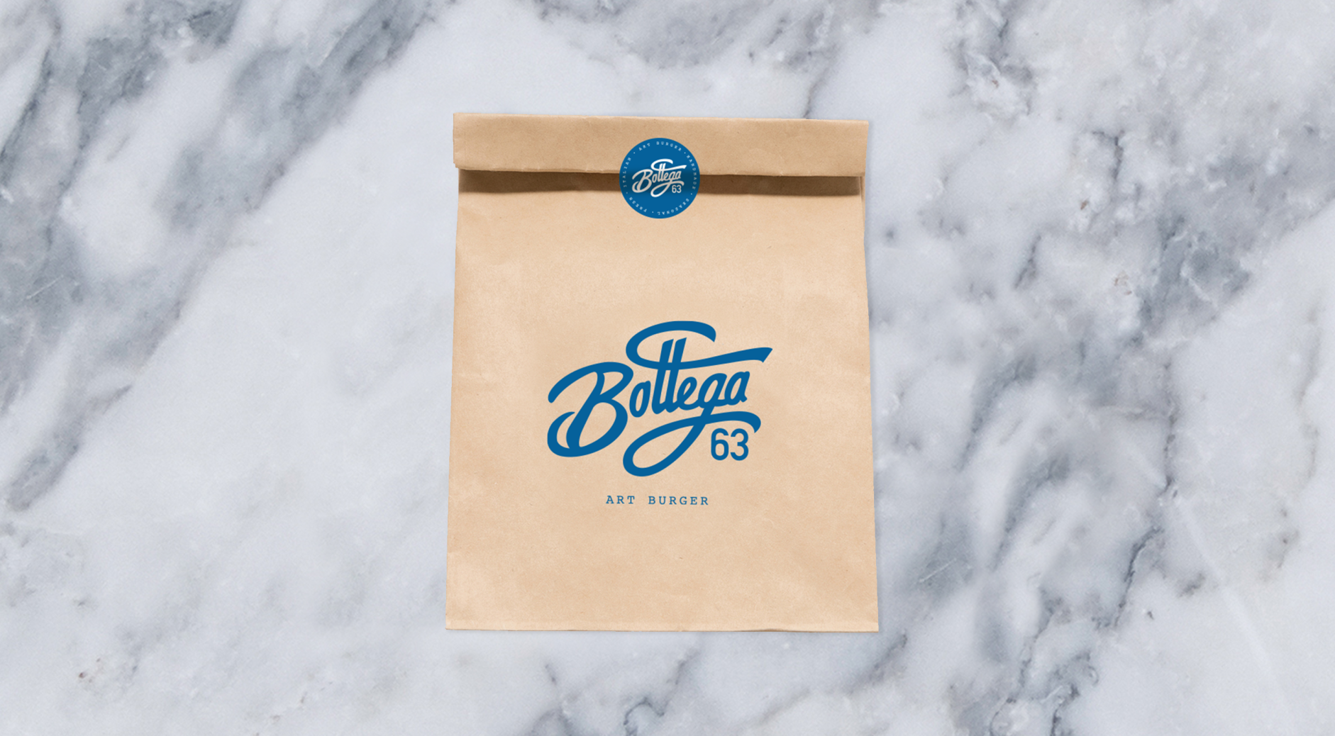
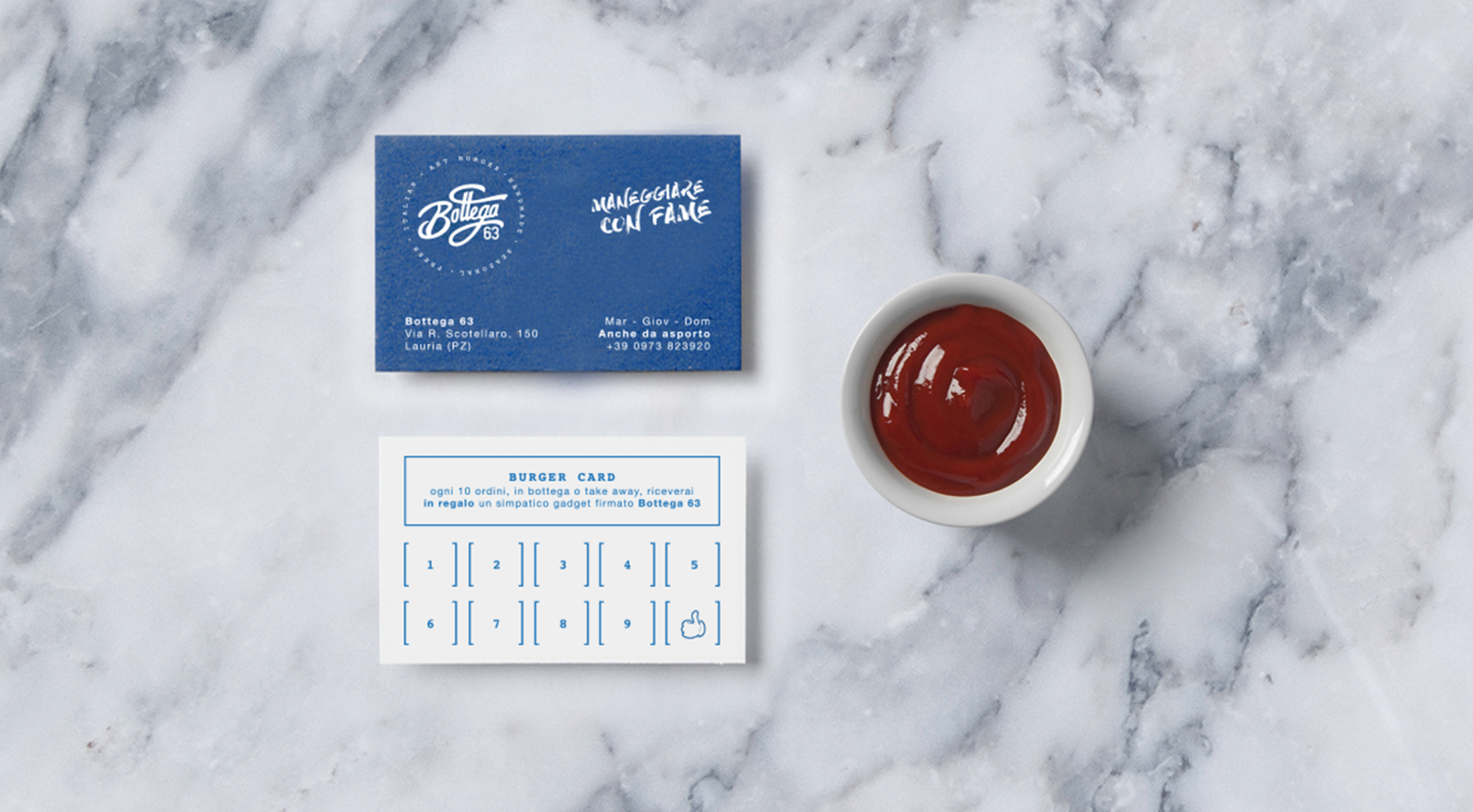
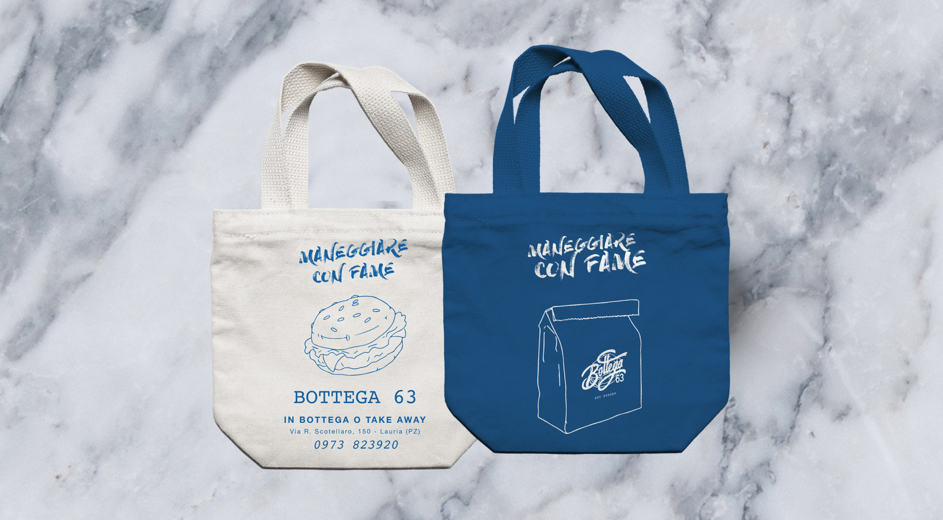
For Bottega 63 we restyled the logo making it more dynamic and young. It also exalts the freshness and quality of the food they serve. We also worked on the menus, packaging, and gadgets. We worked with the help of the illustrator Biagio Feraco, which designed all the menu elements
CREDIT
- Agency/Creative: Giovanna Di Verniere
- Article Title: Rebrand Project for Bottega 63
- Organisation/Entity: Freelance, Published Commercial Design
- Project Type: Identity
- Agency/Creative Country: Italy
- Market Region: Europe
- Project Deliverables: Brand Architecture, Brand Design, Brand Guidelines, Brand Identity, Brand Refinement, Brand Rejuvenation, Brand Strategy, Brand World, Branding, Graphic Design, Illustration, Packaging Design, Rebranding
- Industry: Food/Beverage
FEEDBACK
Relevance: Solution/idea in relation to brand, product or service
Implementation: Attention, detailing and finishing of final solution
Presentation: Text, visualisation and quality of the presentation


