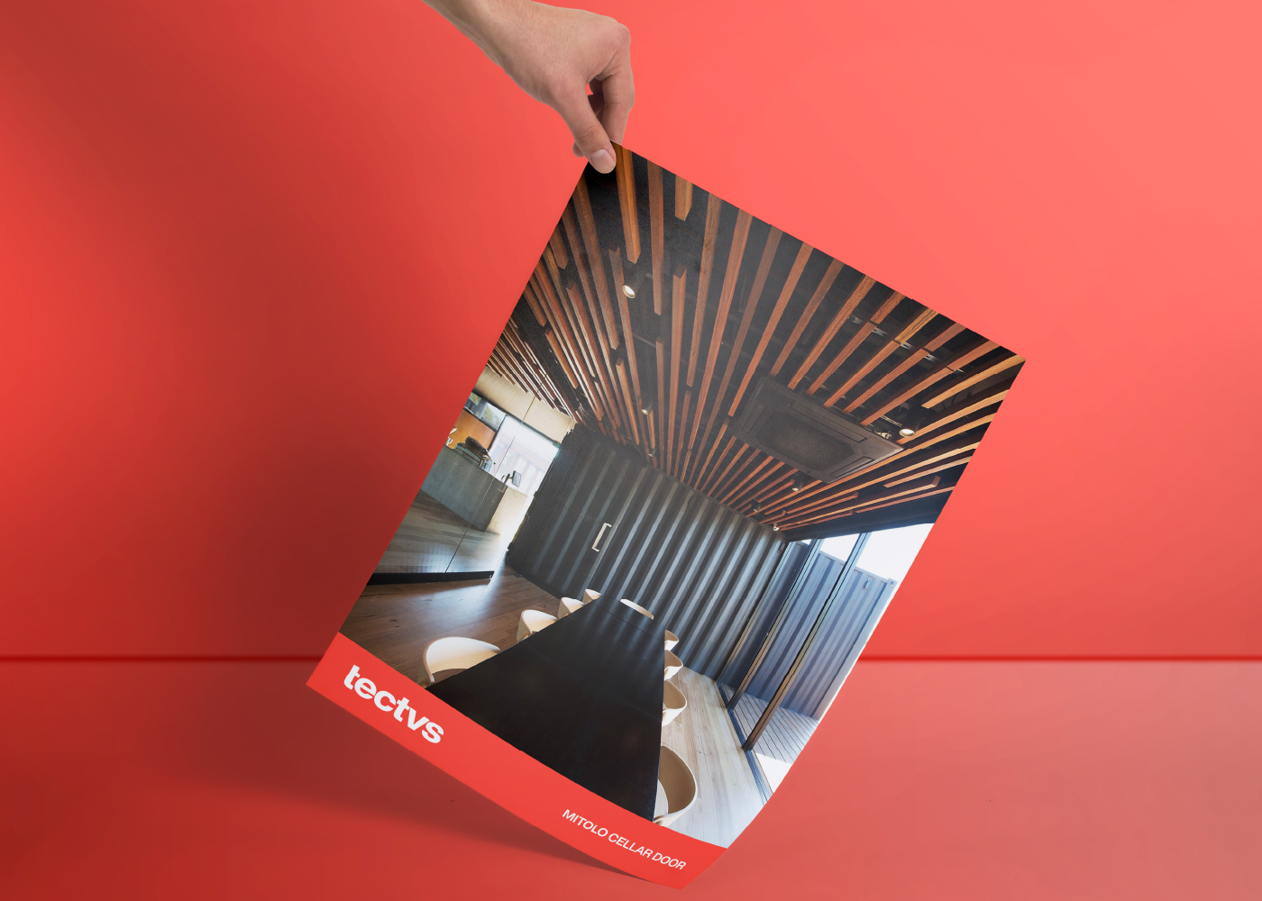
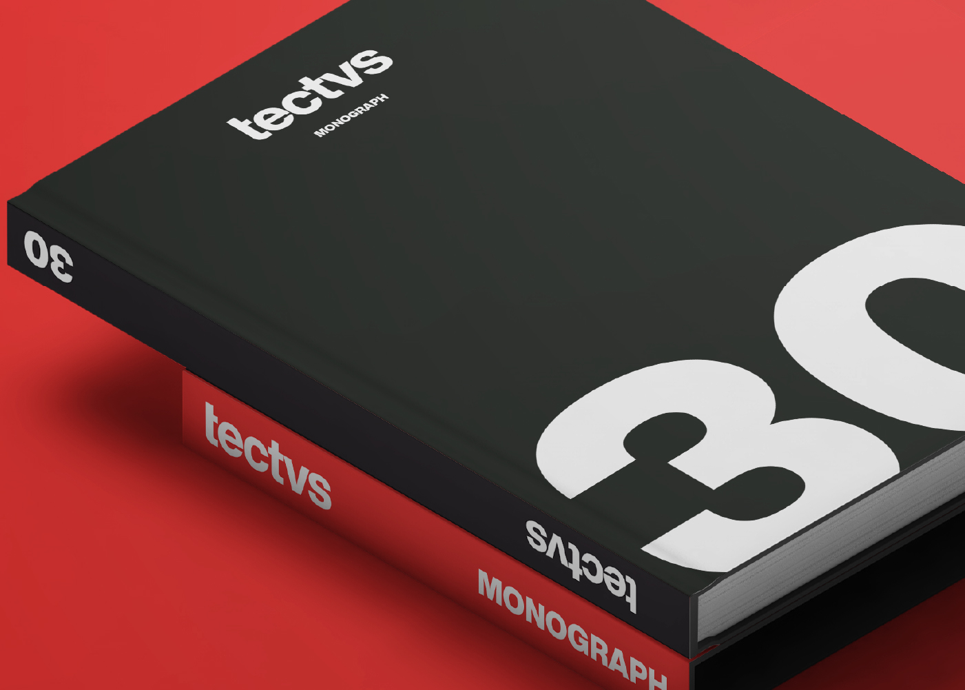
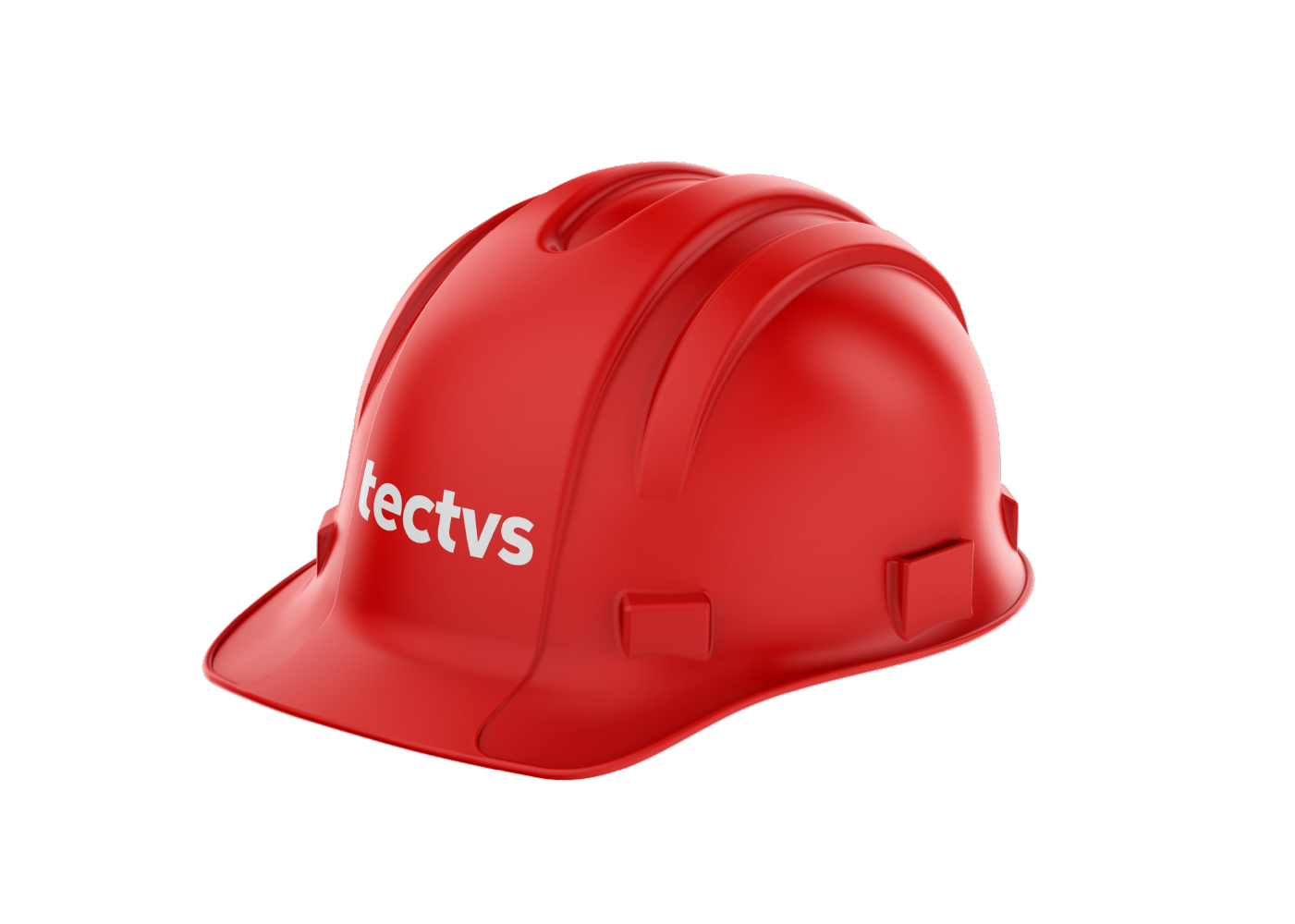
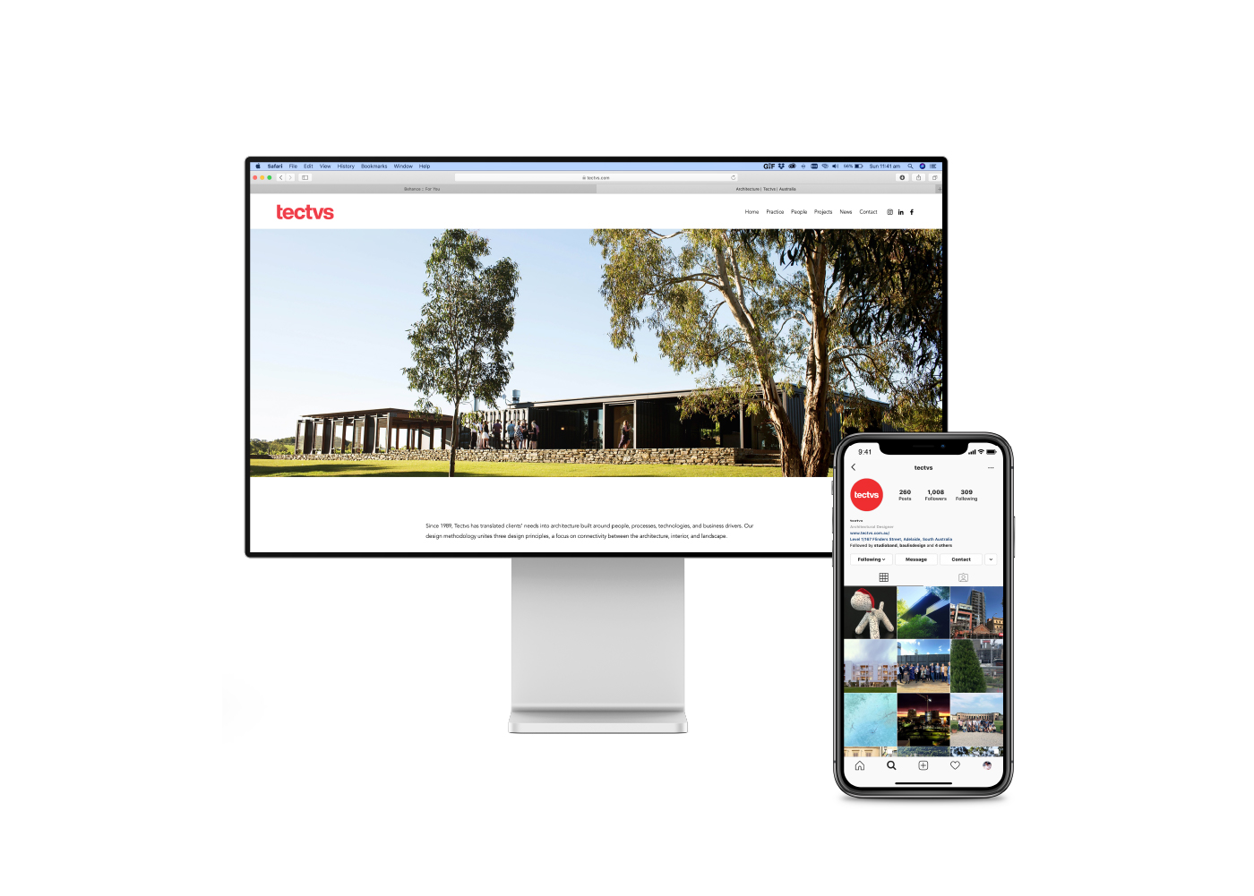
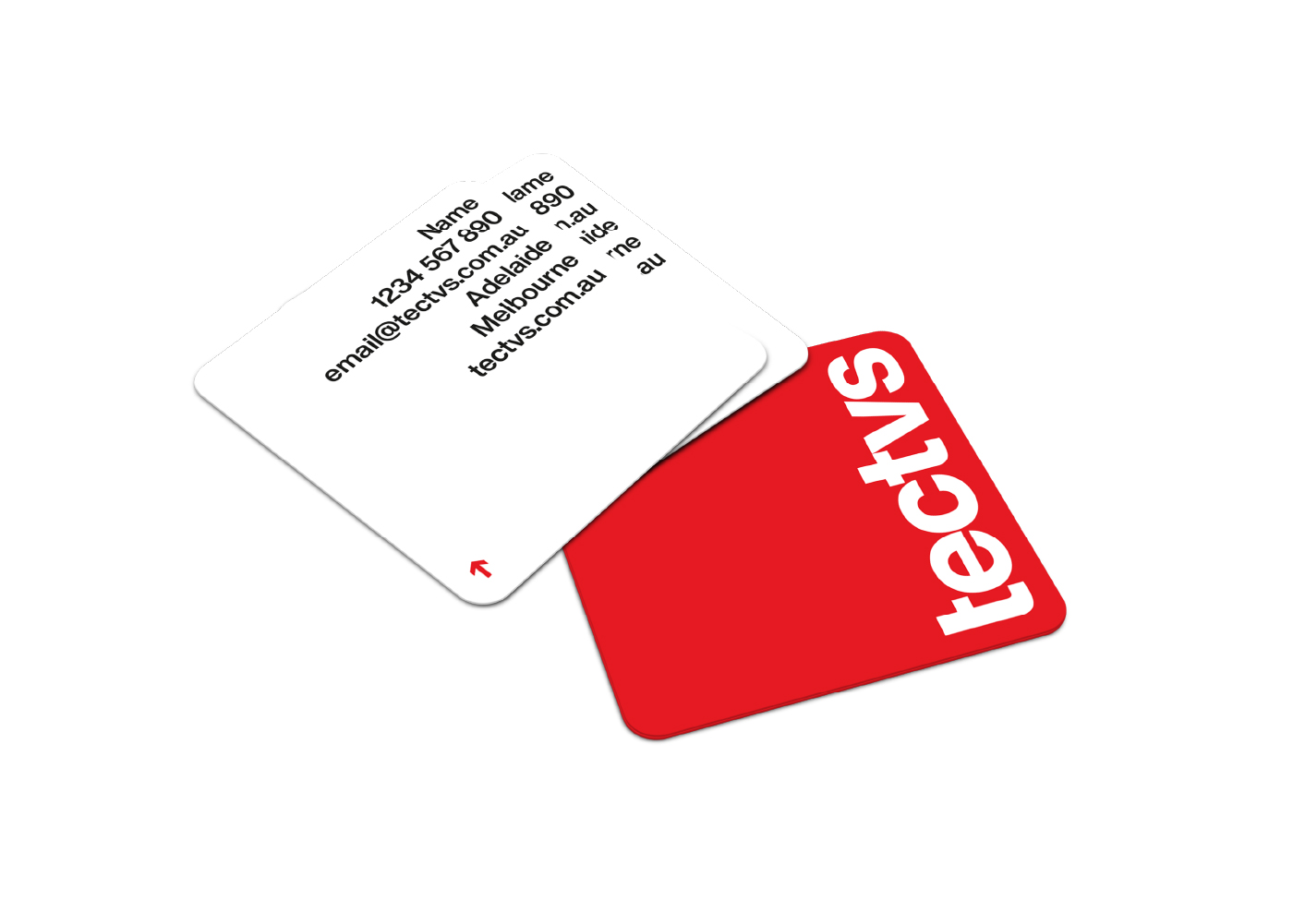
After 30 years of successful architectural practice, Tectvs decided it needed to catch up with the digital age. Their old logo lacked adaptability and fell apart in digital applications, so they came to us looking for a refreshed look for their company and most importantly, a logo that stood the test of time in both digital and printed media.
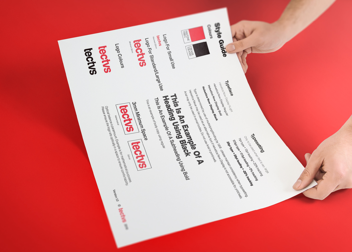
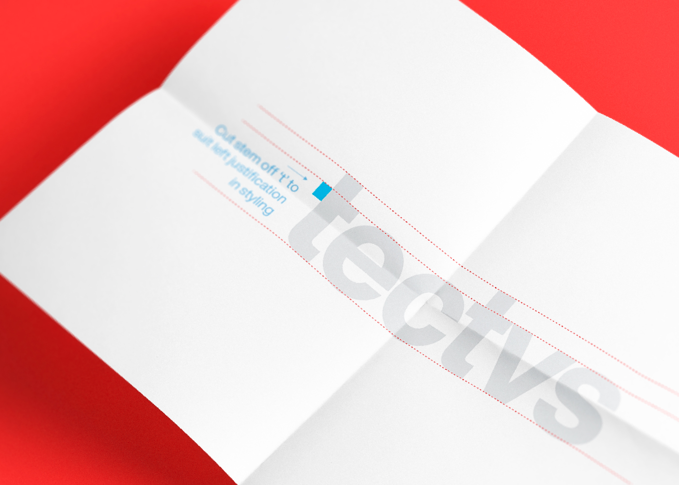
It was important to maintain the integrity of the Tectvs brand and not to stray far from home. The old logo used Helvetica Regular and we wanted to use Helvetica again… sometimes the universe sends you gifts and what was completely magical was the perfectly timed release of Helvetica Now. Their story was Tectvs’ story and we used this in our pitch for the new logo. A new era for an already well-established typeface, refined for the digital age. It became the foundation for the new identity and it worked perfectly.

CREDIT
- Agency/Creative: Daniel Bonato Design Company
- Article Title: Tectvs Enters New Era With Refined Brand Identity After 30 Years of Success
- Organisation/Entity: Freelance, Published Commercial Design
- Project Type: Identity
- Agency/Creative Country: Australia
- Market Region: Global
- Project Deliverables: Brand Guidelines, Brand Refinement, Brand Strategy, Branding, Graphic Design, Identity System, Research
- Industry: Construction
- Keywords: Tectvs, architecture, architectural branding, brand identity, brand refresh, logo, logo design, logo refresh


