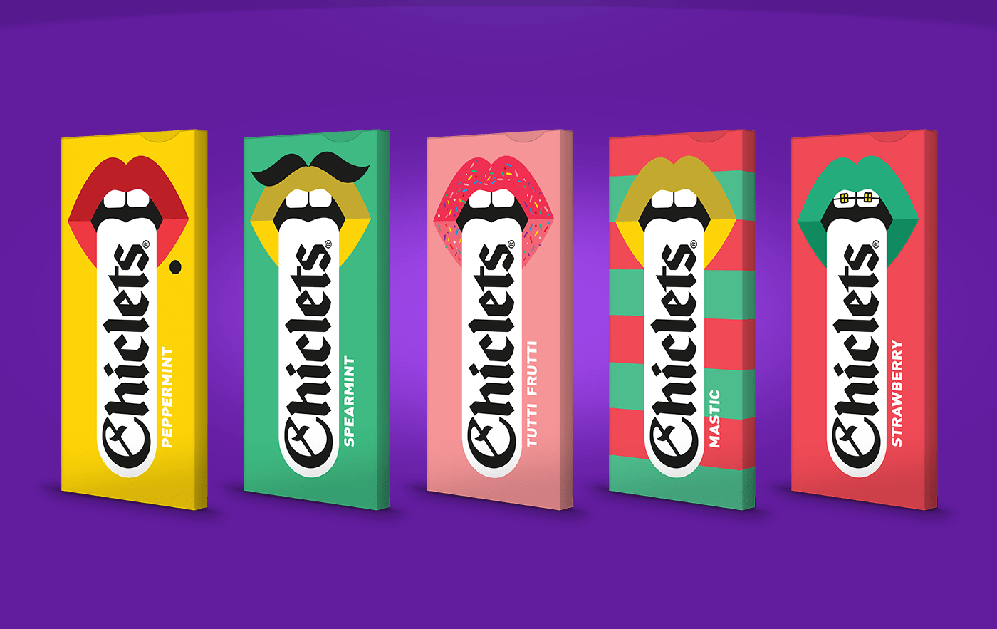
Amro Thabit – Chiclets
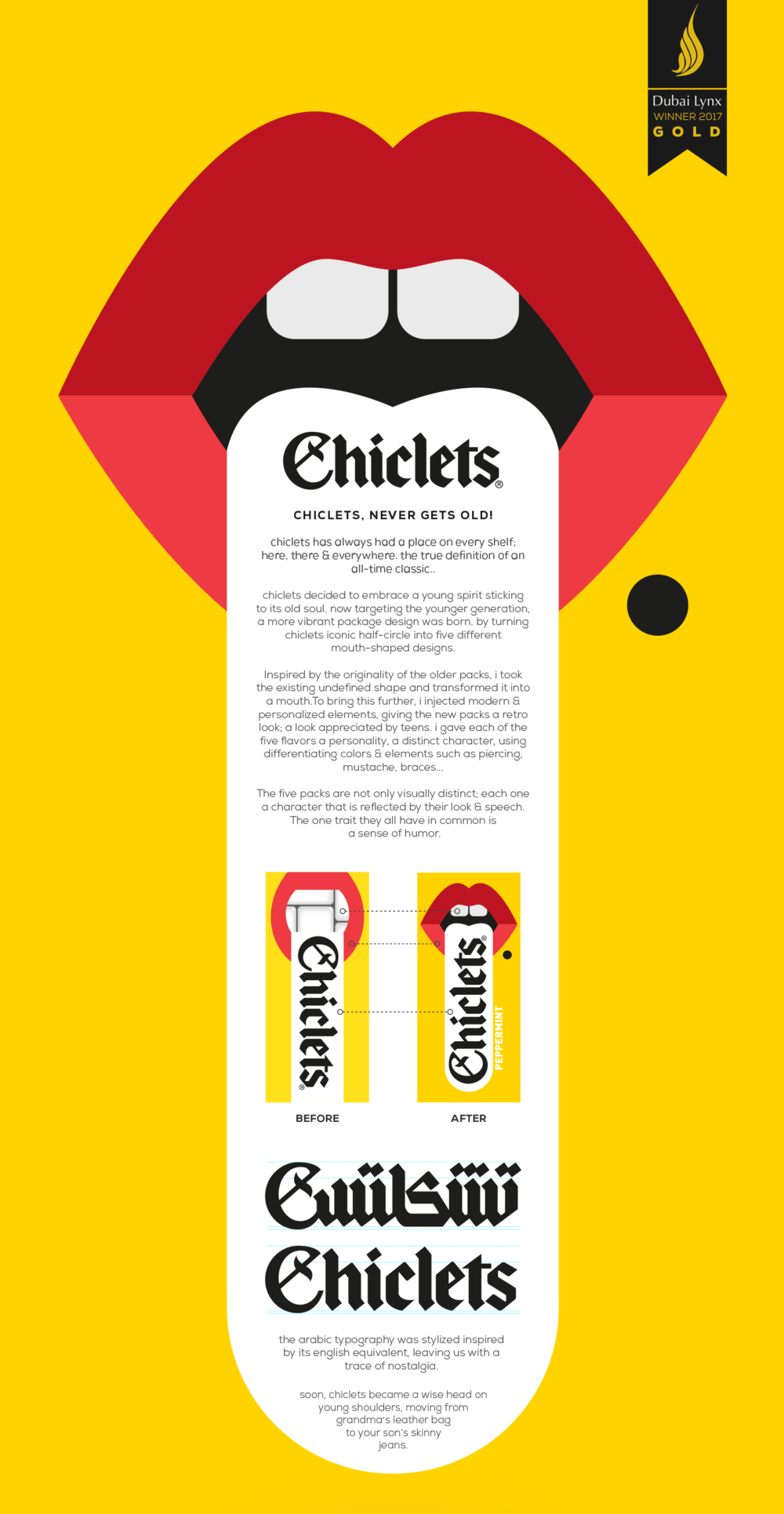
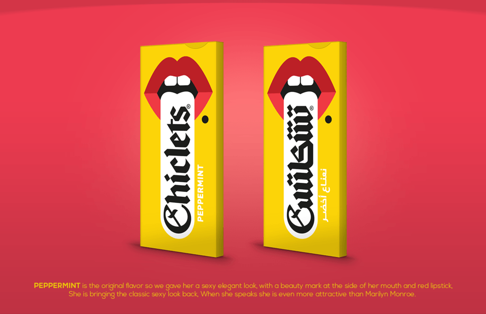
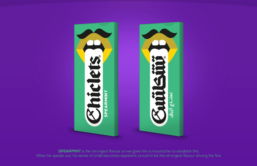
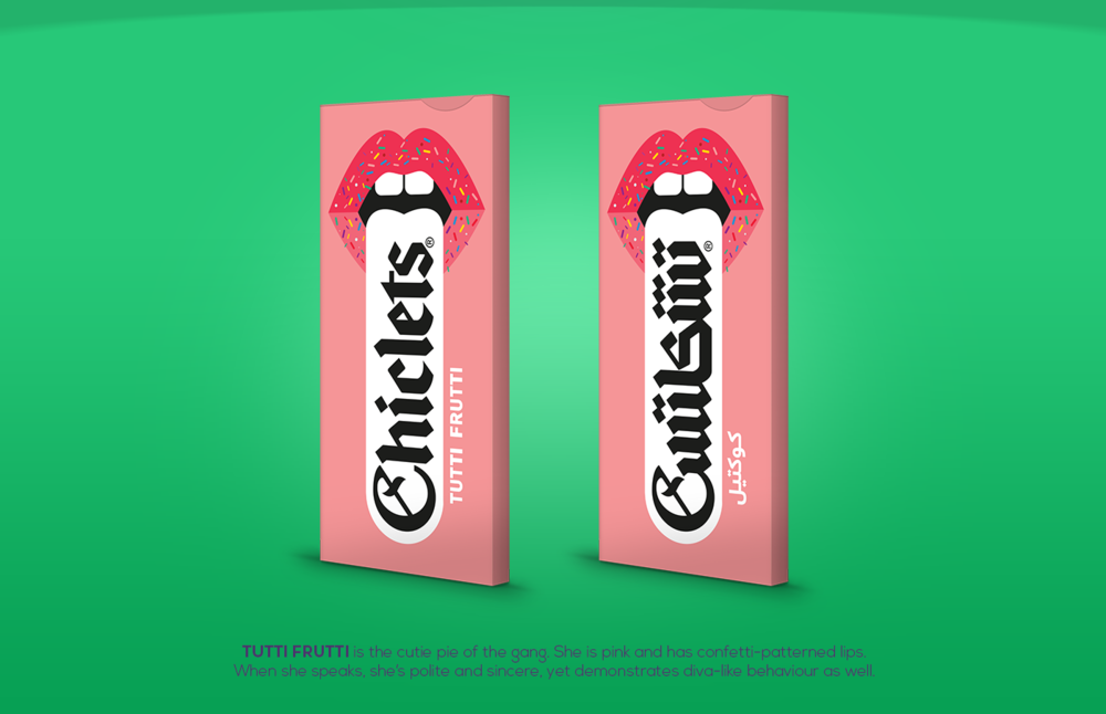
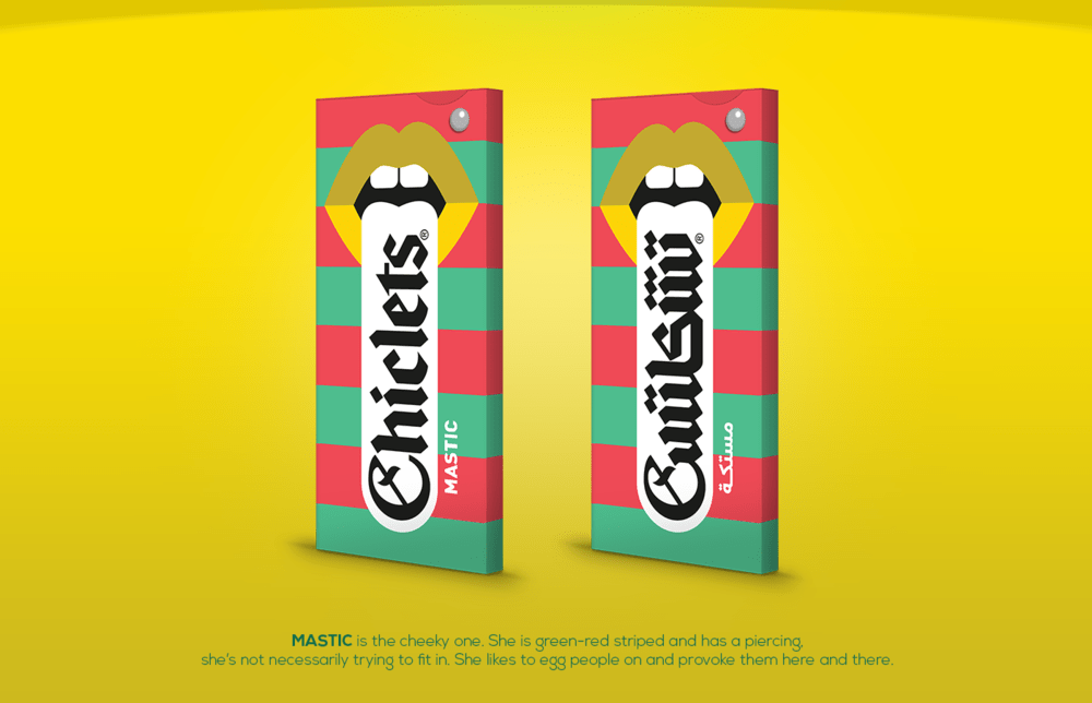
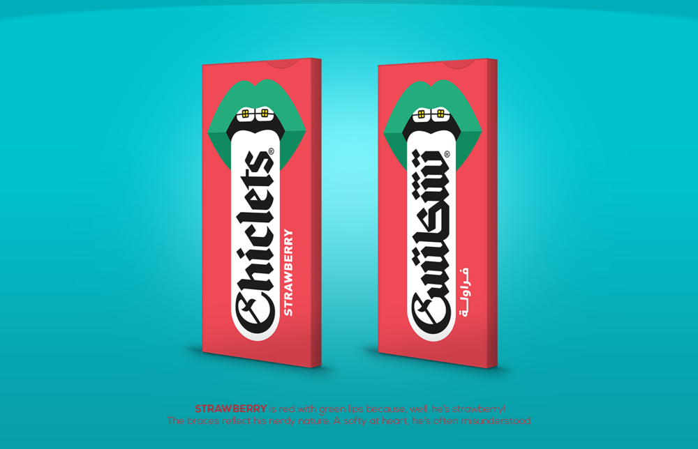
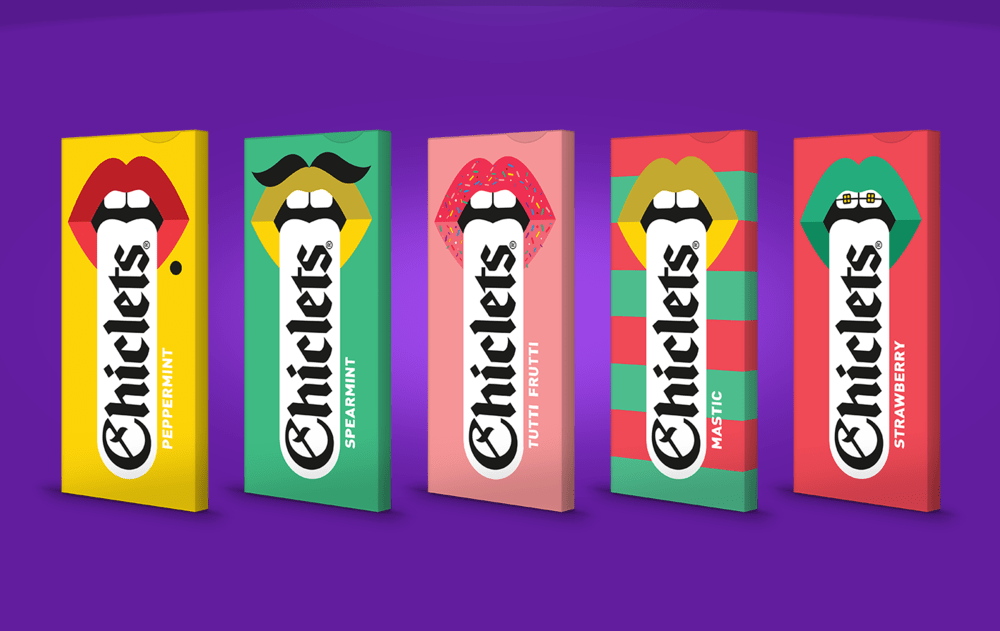
“CHICLETS, NEVER GETS OLD! chiclets has always had a place on every shelf; here, there & everywhere. The true definition of an all-time classic.. chiclets decided to embrace a young spirit sticking to its old soul. Now targeting the younger generation, a more vibrant package design was born. by turning chiclets iconic half-circle into five different mouth-shaped designs. Inspired by the originality of the older packs, i took the existing undefined shape and transformed it into a mouth.To bring this further, i injected modern & personalized elements, giving the new packs a retro look; a look appreciated by teens. I gave each of the five flavors a personality, a distinct character, using differentiating colors & elements such as piercing, mustache, braces… The five packs are not only visually distinct; each one a character that is reflected by their look & speech. The one trait they all have in common is a sense of humor.”
CREDIT
- Agency/Creative: Amro Thabit
- Article Title: Chiclets show their Humorous Side Through Younger Targeting and more Vibrant Packaging Design
- Organisation/Entity: Agency Commercial / Published
- Project Type: Packaging
- Agency/Creative Country: Egypt
- Market Region: Middle East
- Format: Box
- Substrate: Pulp Paper


