TASK
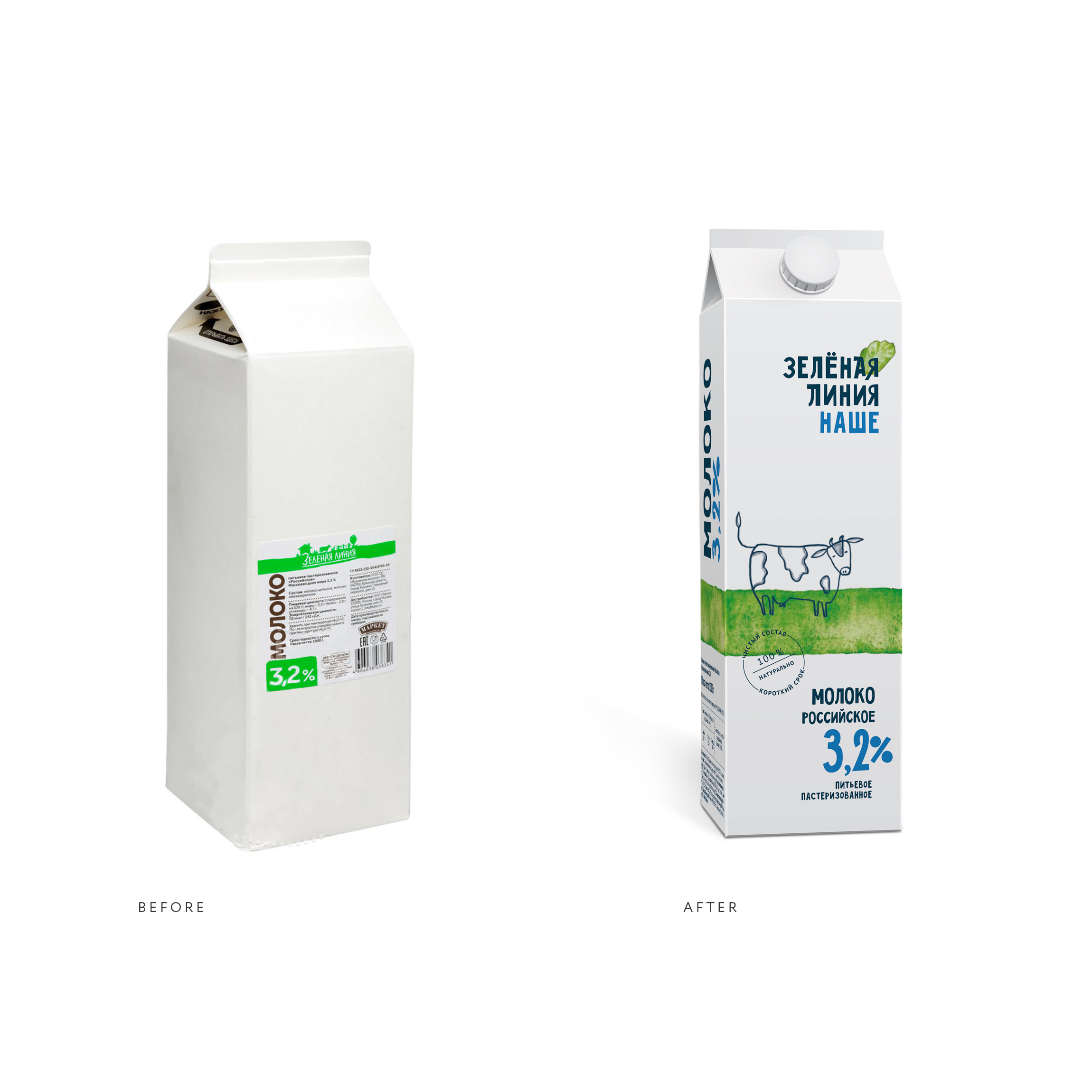
“Zelenaya Liniya” is a private label brand of the Perekrestok supermarkets in the healthy food segment. The brand appeared almost two years ago, and at that time it consisted only of dairy products, but now it has more than 170 items in different categories (bread, pastry, meat, sausages, grains, delicatessen). Expanding the range immediately revealed the limitations that the style created:
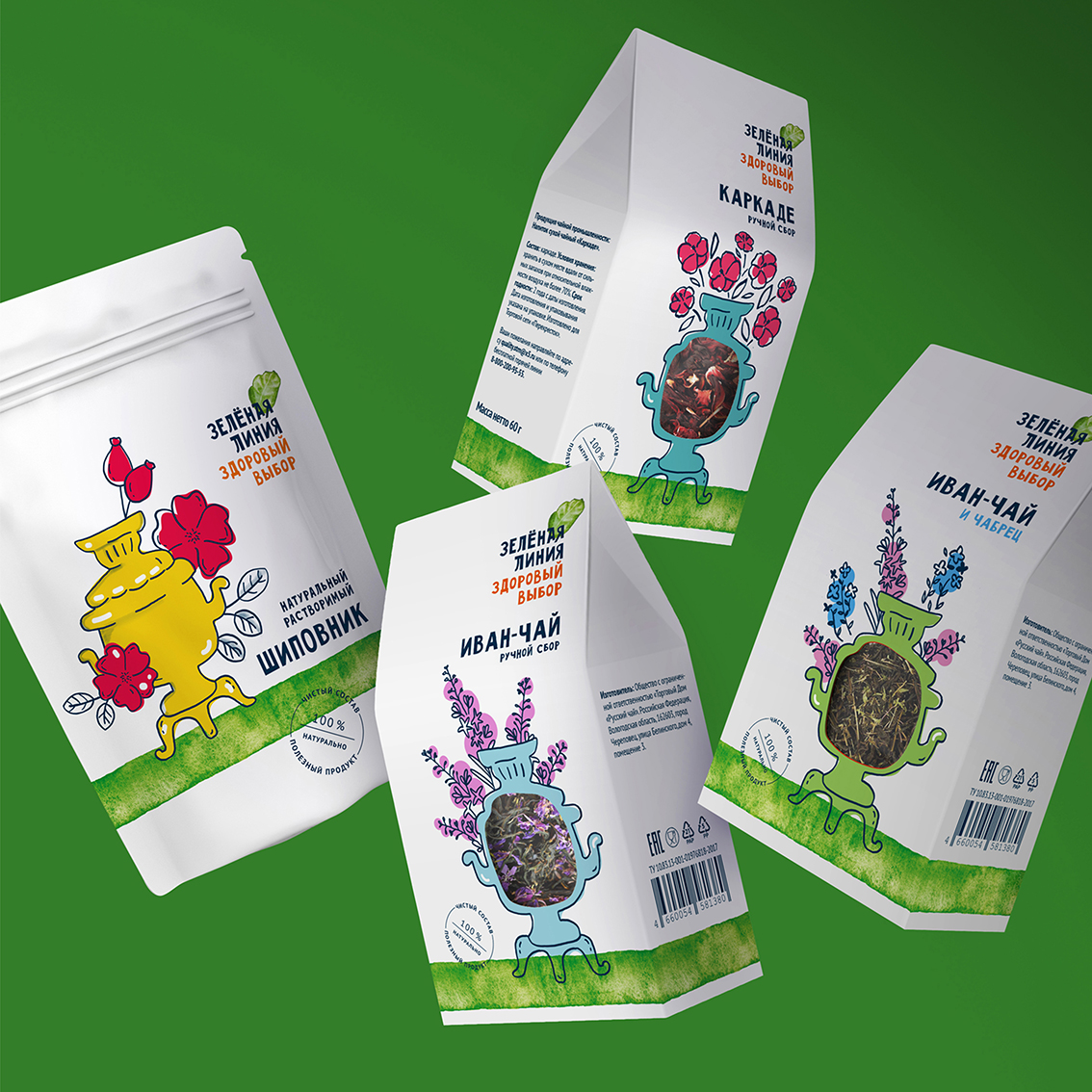
— the main graphic element of the logo — a rural landscape with a cow — is suitable for dairy products but looks strange in other categories (for example, on a tea package),
the style is difficult to scale, there are no opportunities to work in other lines and packaging formats,
— discreet and utilitarian design is invisible on the shelf.
The brand needed a new identity. The task of the new style was to create an image of a healthy lifestyle brand – very tasty, super good for you, always fresh.
SOLUTION
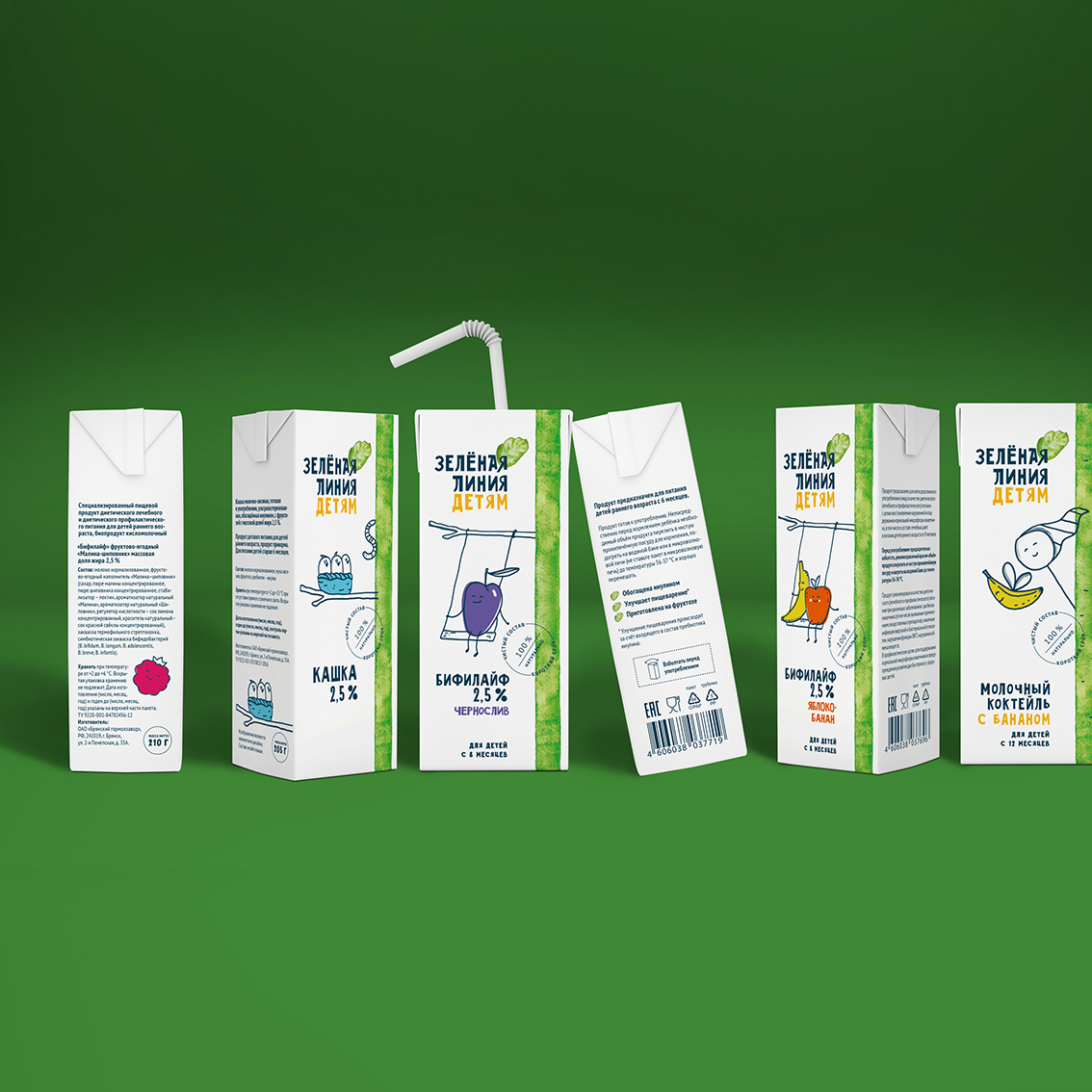
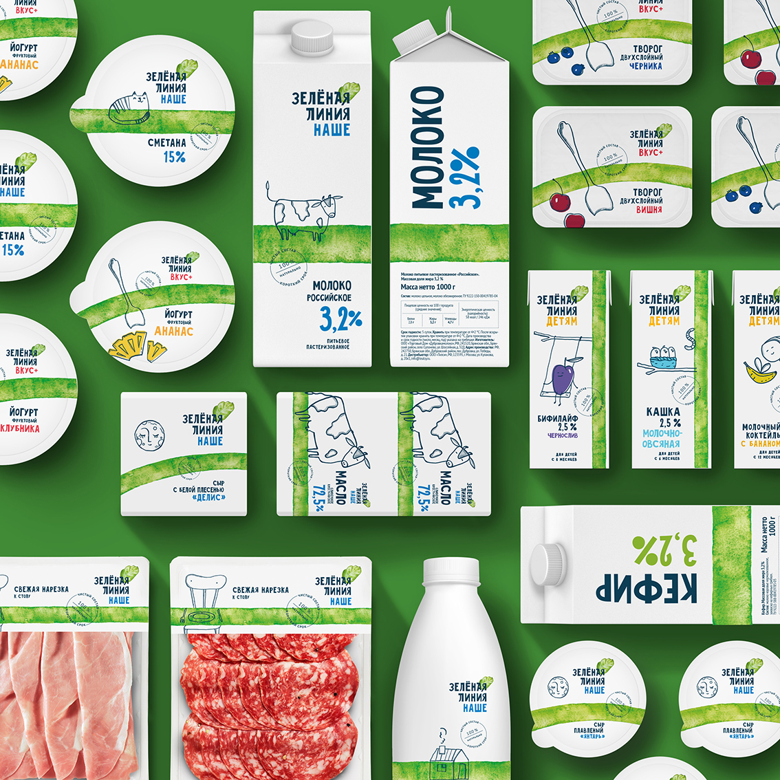
The teams of Perekrestok and Ohmybrand have done a lot of work on organizing the product matrix, distributing 170 product items into lines, each with its own name (farm products — “Local”, dietary foods – “Light”, etc.), its own branded color accents, mini-plots and heroes of illustrations. This flexible system of differentiation helps the consumer to accurately recognize and choose the necessary product.
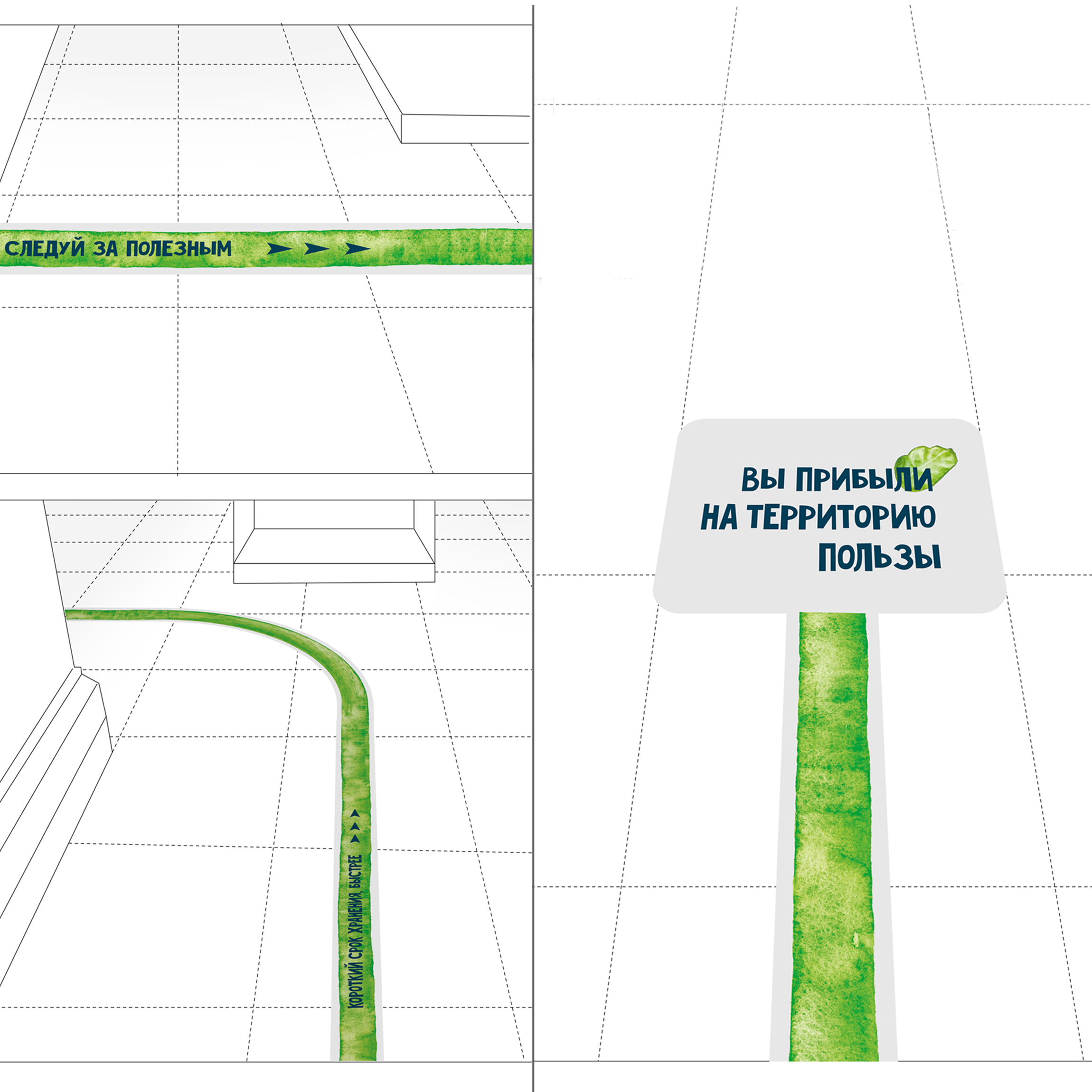
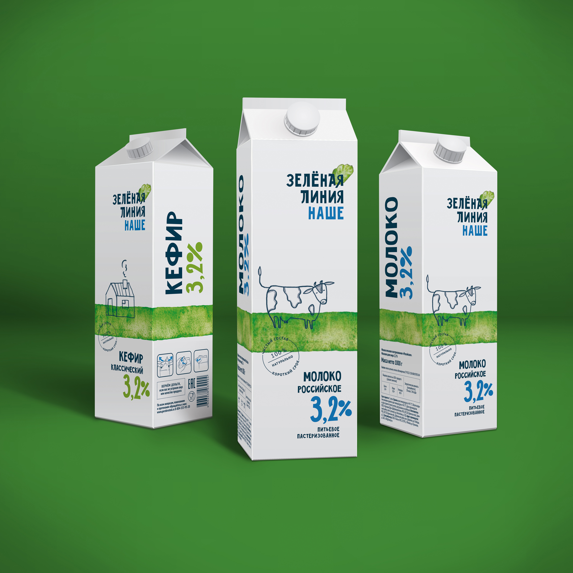
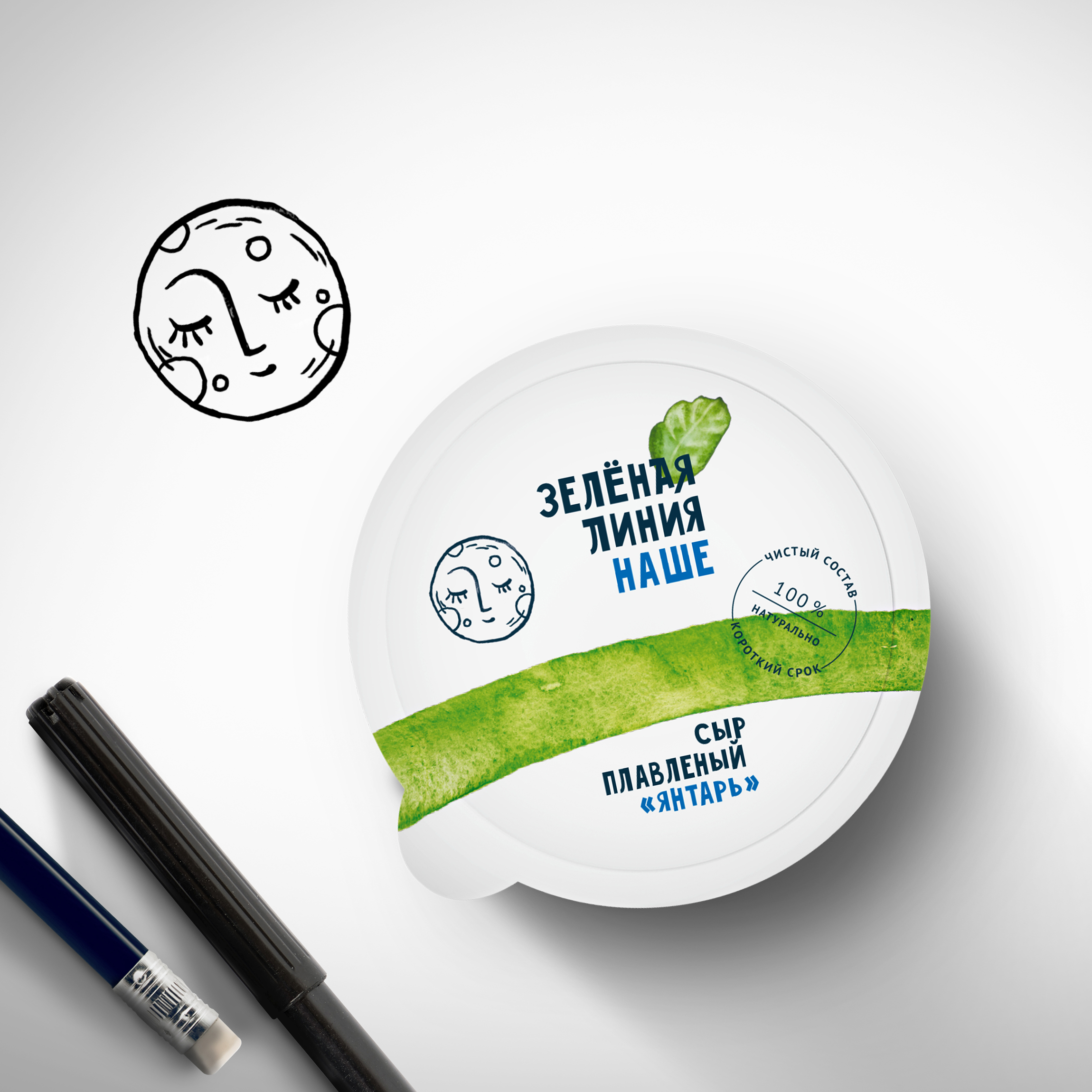
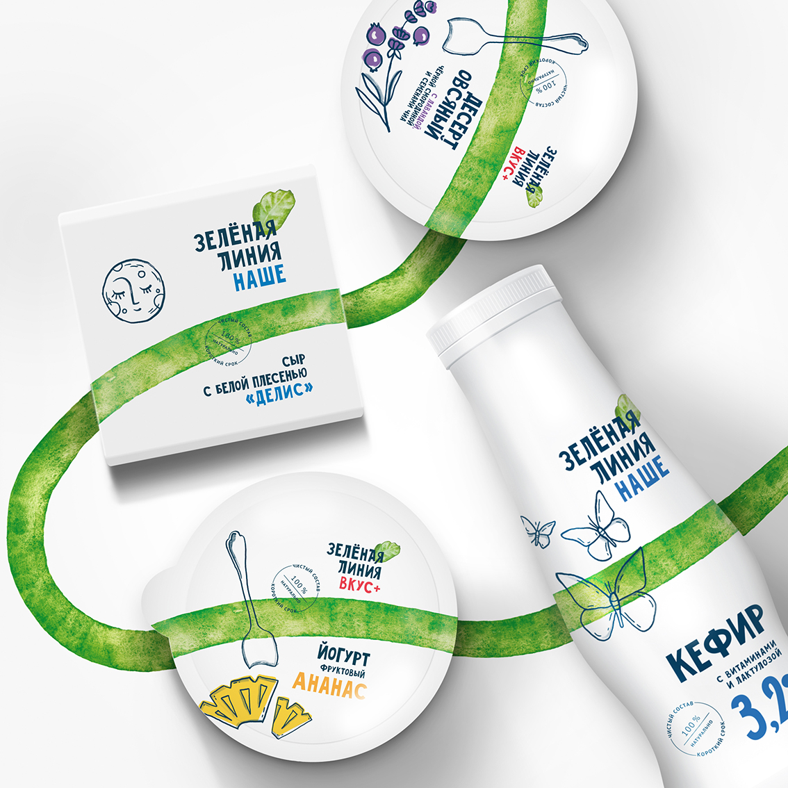
The main element of the new style is (literally) a green line — its hand-drawn watercolor texture conveys a sense of naturalness, lightness and lively dynamics. Flexible and pliable, it can be embedded in the composition on any object and easily becomes a part of any drawing, turning into a field, a spread tablecloth or a green wave.
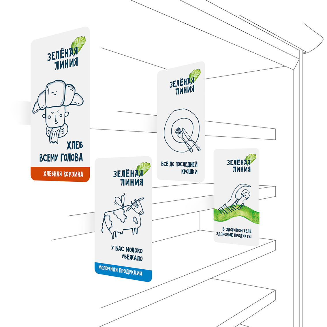
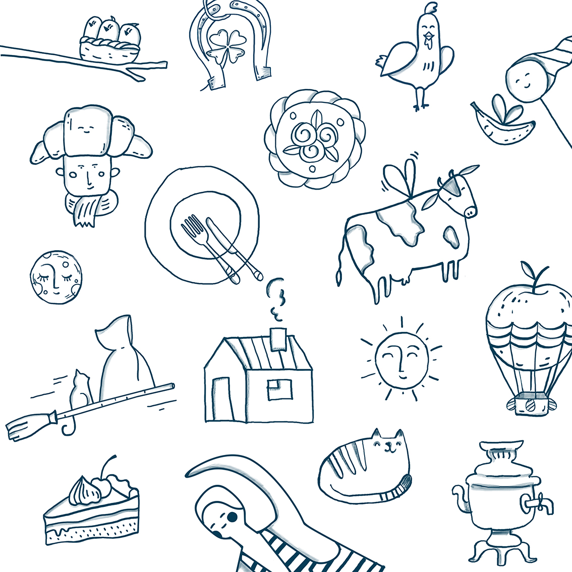
Signature illustrations — a winged cow, a samovar combined with a bunch of flowers, a croissant turning into an ear-flaps hat and other fun images in a naive hand-drawn style help to feel the atmosphere of warm, natural, handcrafted quality.
The range of the brand is constantly being updated, so we created a bank of illustrations that can be used in the future and drew up guidelines for the development of old and new stories.
All points of contact with the brand, from typography to product icons, seem to be made by hand: drawn, colored, cut and glued. This handmade style helps to recognize the brand on any shelf.
The new style does not have photorealistic food zones, bright illustrations or flashy colors, but it still attracts attention and forms the image of a sincere brand offering real, healthy products.
https://www.youtube.com/watch?v=OzsqkxRr4Ek
CREDIT
- Agency/Creative: Ohmybrand
- Article Title: Redesign Of “Zelenaya Liniya” (“Green Line”) Private Label
- Organisation/Entity: Agency, Published Commercial Design
- Project Type: Packaging
- Agency/Creative Country: Russia
- Market Region: Europe
- Project Deliverables: Brand Architecture, Branding, Packaging Design, Retail Brand Design, Tone of Voice
- Format: Bag, Bottle, Box, Can, Flow-Pack, Jar, Pouch, Sachet
- Substrate: Glass, Glass Jar, Plastic, Pulp Carton


