


Building brand in 2019 is tough. Not only do you have to stand out against the myriad other companies all being equally as quirky and different, you also have to be sustainably minded and mindful of your impact on the planet. Cult London juice brand, CPRESS, founded by Timothy Stevenson, worked closely with Creative Director of Guadalupe, Laura Fele, to solidify their brand identity, creative vision and storytelling whilst incorporating a new, sustainability-focussed approach to their business model. They wanted to be at the forefront of conscious consumerism and that required technical innovation and a design-led packaging redesign.
CPRESS needed a way to unify the brand experience for a customer eating avocado on toast in store with a customer ordering their favorite millennial cliché for brunch delivery, whilst capitalising on space and making the packaging more eco-friendly.
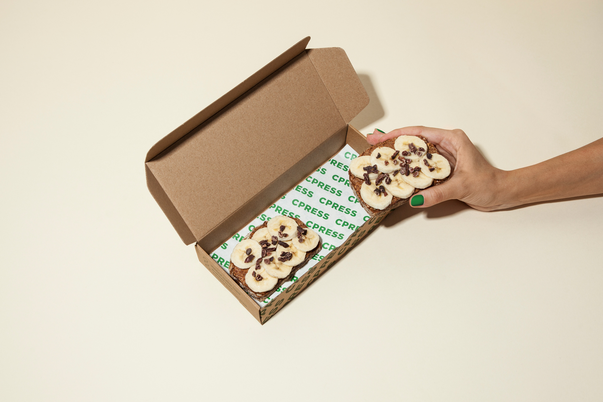
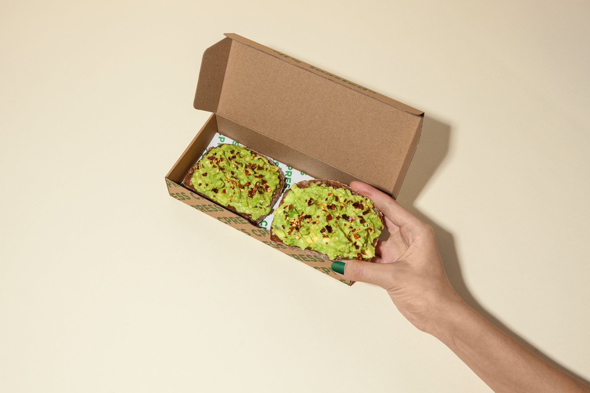
Their previous packaging for take away toasts was made of two pieces: a cardboard tray and a plastic lid that would allow them to see what kind of toast was inside and prevent the toppings to get smashed. That solution wasn’t really eco-friendly though and it was also very bulky to store.
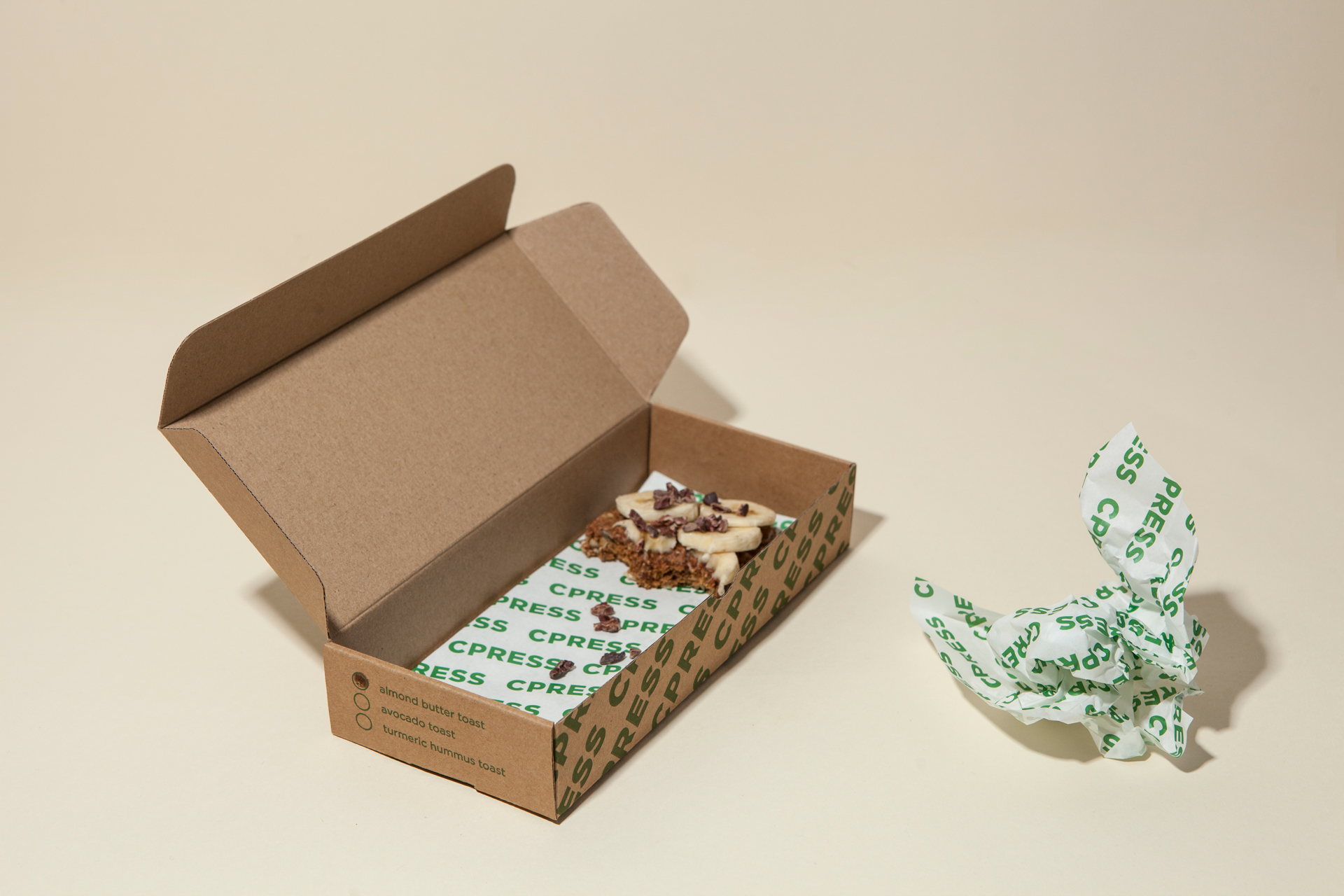
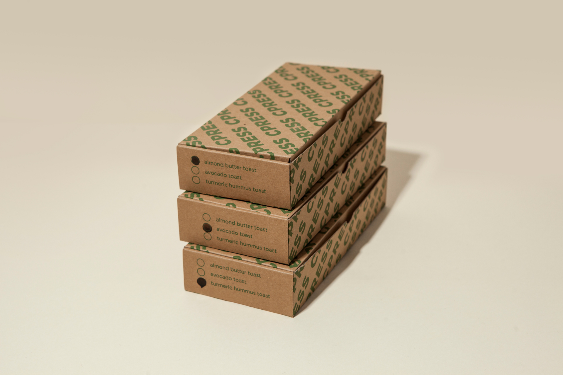
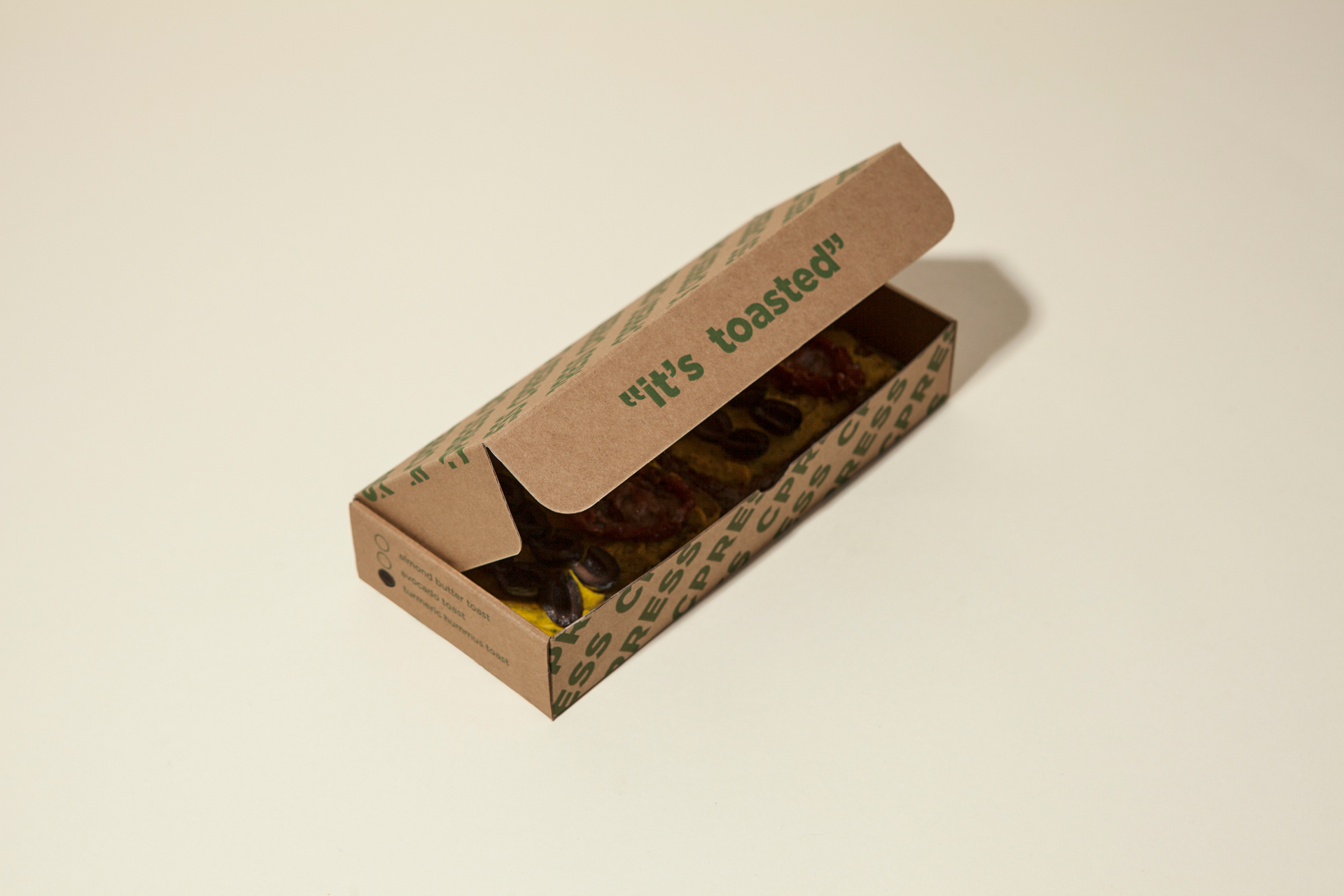
This new project required some careful design research and, what began as a simple #sustainableswap, culminated in a minimal design solution: An origami style flat-pack box. The box is completely made of cardboard, it is foldable and printed with one-color ink and it features on the side some useful check boxes to quickly spot what’s inside.
This solution saves CPRESS space in store and doubles up as a plate for when you don’t want to spill your smashed avo on your work outfit.
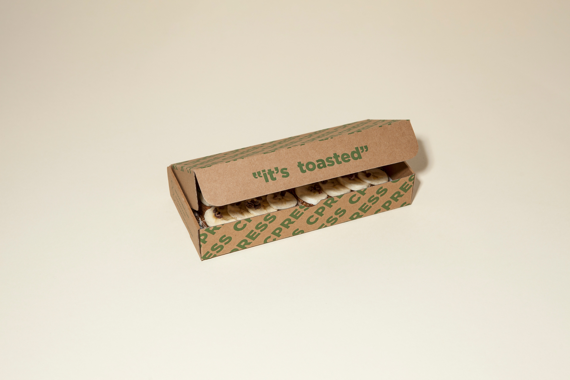
The new design delivers the same branded customer journey to both ‘online’ and ‘offline’ customers and maintains the same ironic tone of voice the brand’s instagram page is known for: movie memes and organic food. In fact, when you open it, you’ll know that “It’s Toasted!” – a tribute to Mad Men but also a play on words since they actually serve toasted bread in it.
We wanted to be cheeky and pay homage to our favorite tv show, but even if you’ve never watched Mad Men, you’ve probably heard the phrase “It’s toasted.”, the real tagline for Lucky Strikes cigarettes, adopted by the brand in 1917.
CREDIT
- Agency/Creative: Guadalupe SRLS
- Article Title: A Sustainable Packaging With A Big Personality
- Organisation/Entity: Agency, Published Commercial Design
- Project Type: Packaging
- Agency/Creative Country: Italy
- Market Region: Europe
- Project Deliverables: Brand Experience, Brand Strategy, Branding, Industrial Design, Packaging Design, Tone of Voice
- Format: Box
- Substrate: Pulp Board


