BRIEF
As economies and societies evolve rapidly, conventional education gradually reaches certain limits. The key issue is that it is not anymore in position to prepare people sufficiently for a future that is equally exciting as it is challenging. Moving School e.V. addresses the core of this issue. Founded in Kassel (Germany), Moving School is an experimental educational and artistic program that lays the foundations for lifelong learning and the development of creative skills so much needed in our common future. It is based on a worldwide community that brings together students, trainers, professionals, entrepreneurs and artists from different fields and educational centres.
TARGET GROUP
A wide, international and contemporary mix of students and educators, but also Corporate Stakeholders as this is a not-for profit initiative and is after donations.
CREATIVE CONCEPT
The identity that we had to leave behind was seen as too static, conventional and indistinctive – exactly what Moving School was not. We wanted an identity that would clearly express the fluidity, future-facing logic and distinctiveness that were so central to the initiative. Something clearly recognized as pertaining to education but without the easy ways out, symbolically speaking.
DESIGN APPROACH
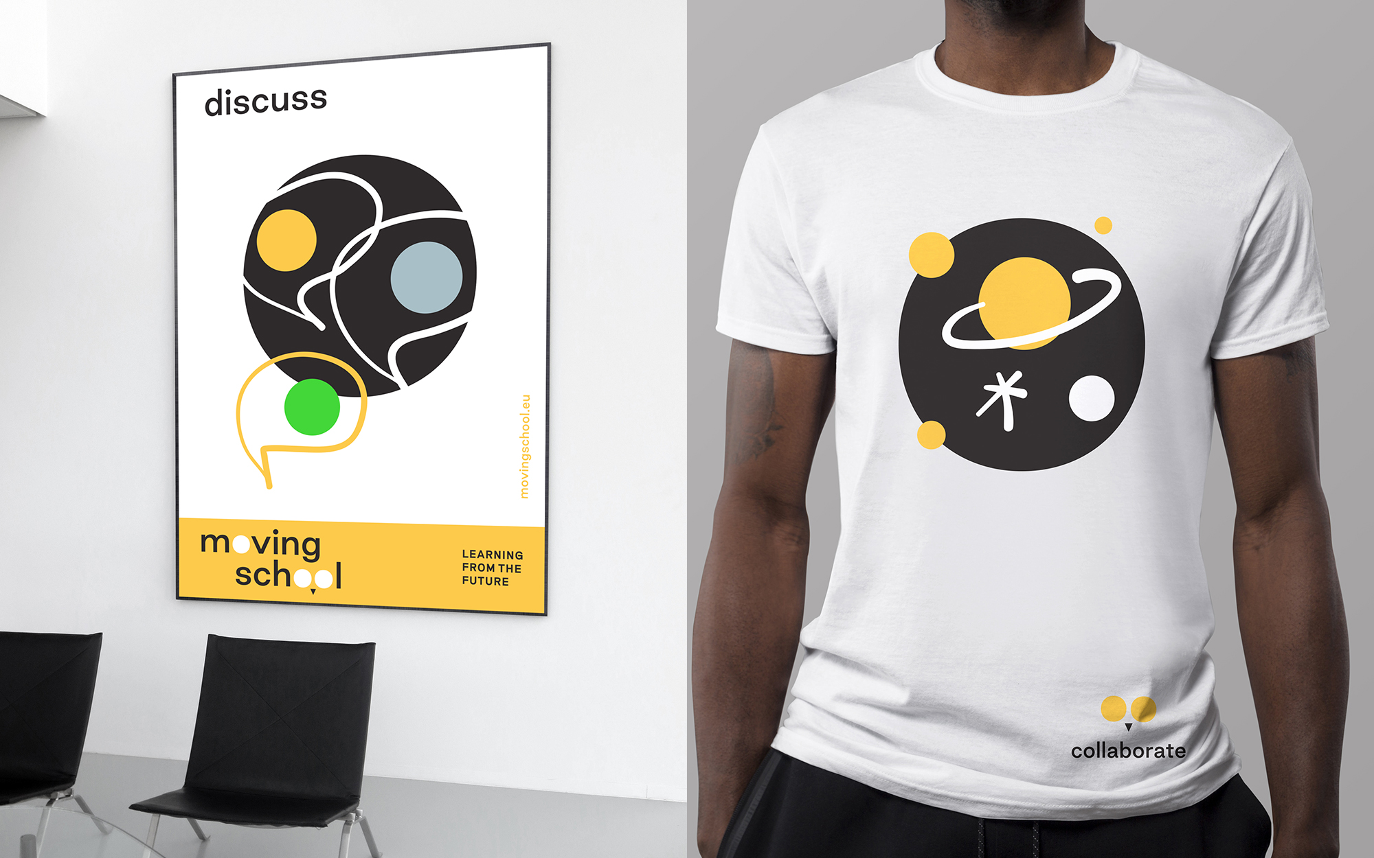
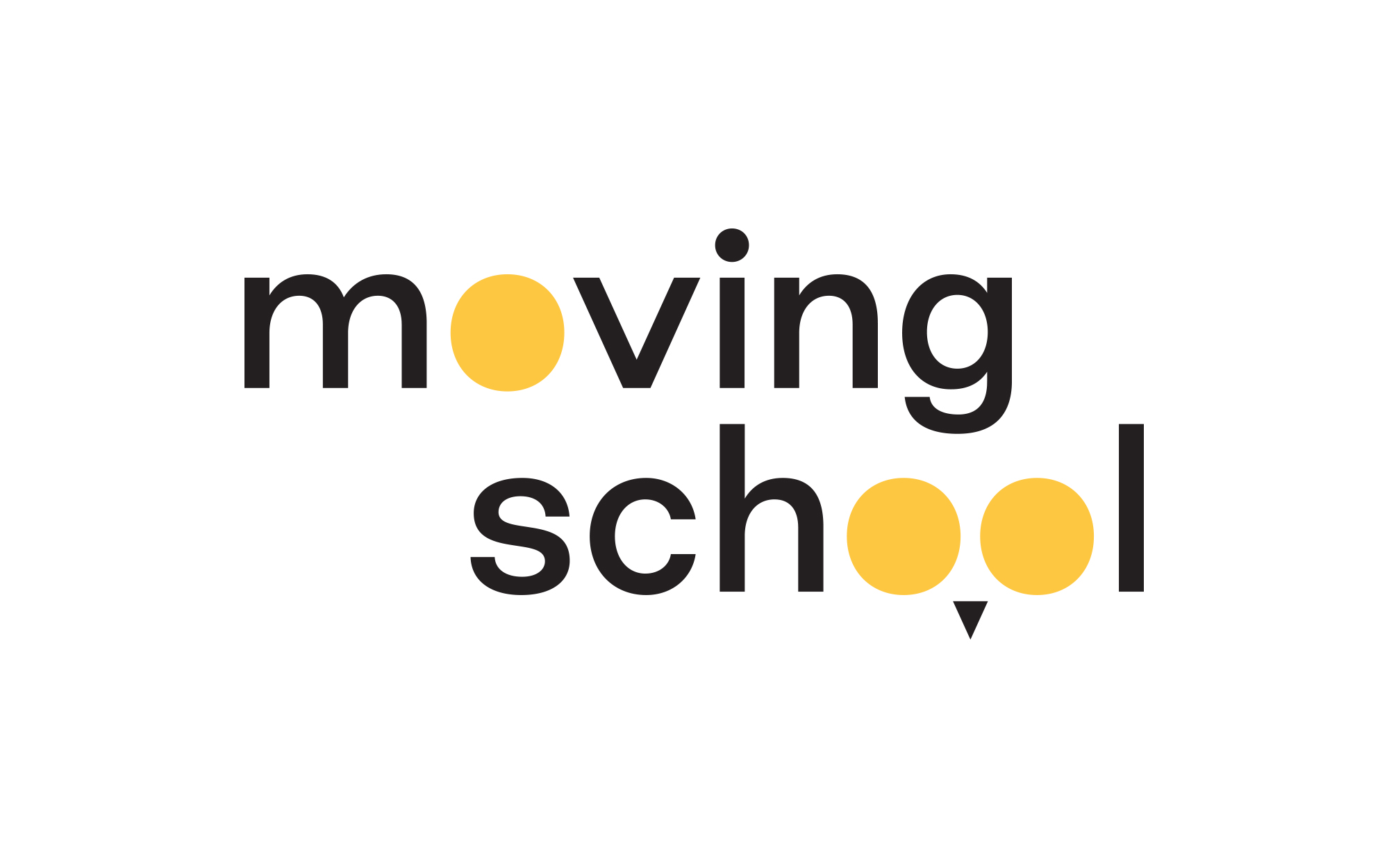
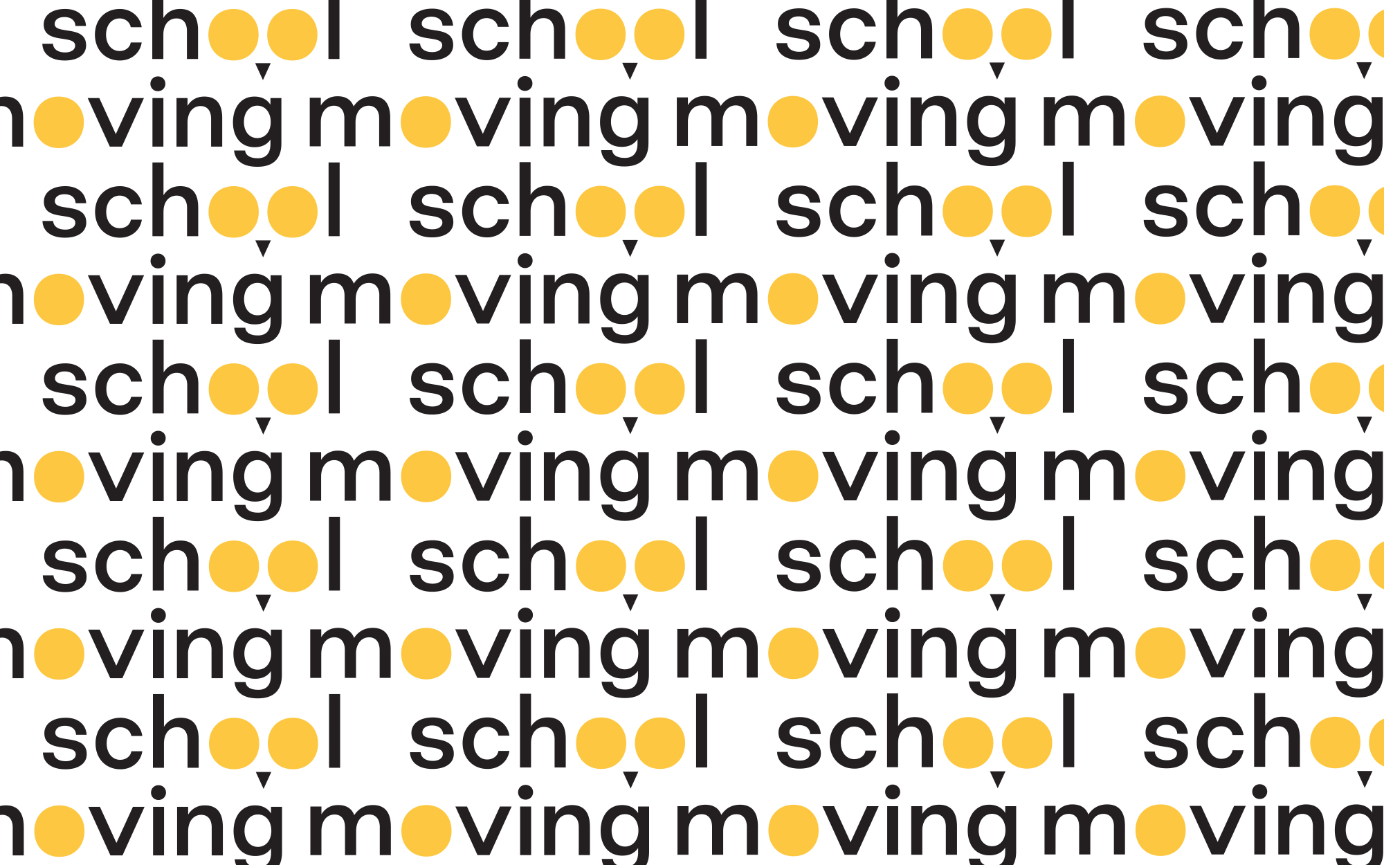
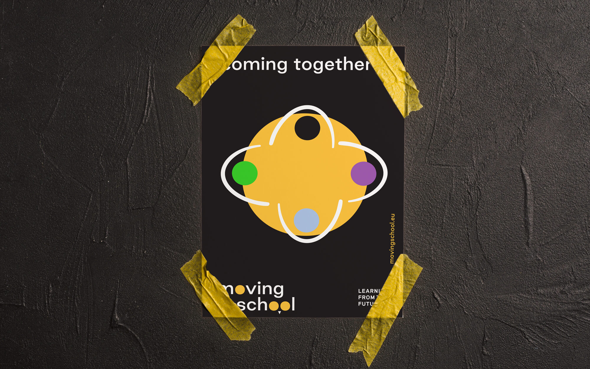
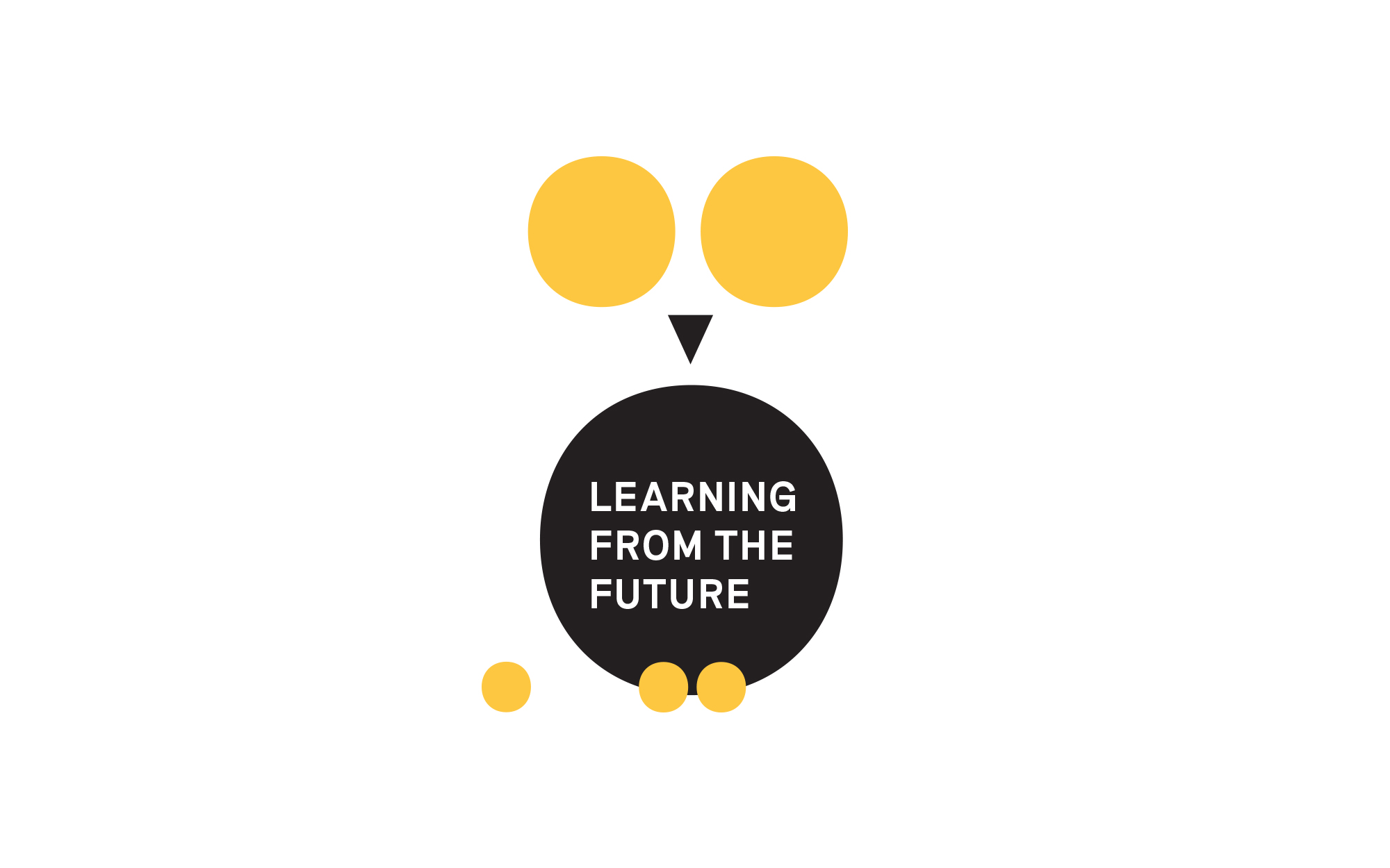
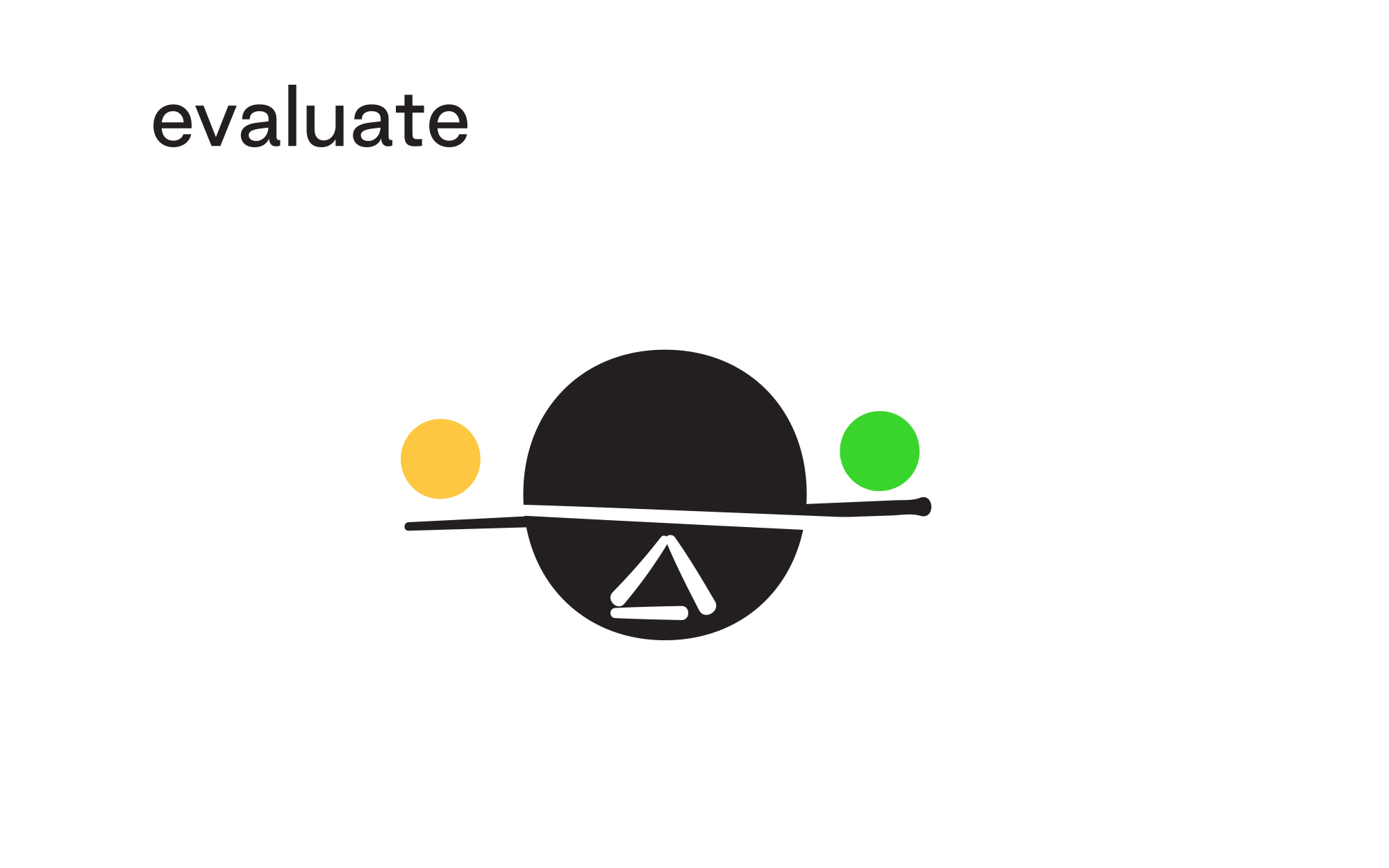
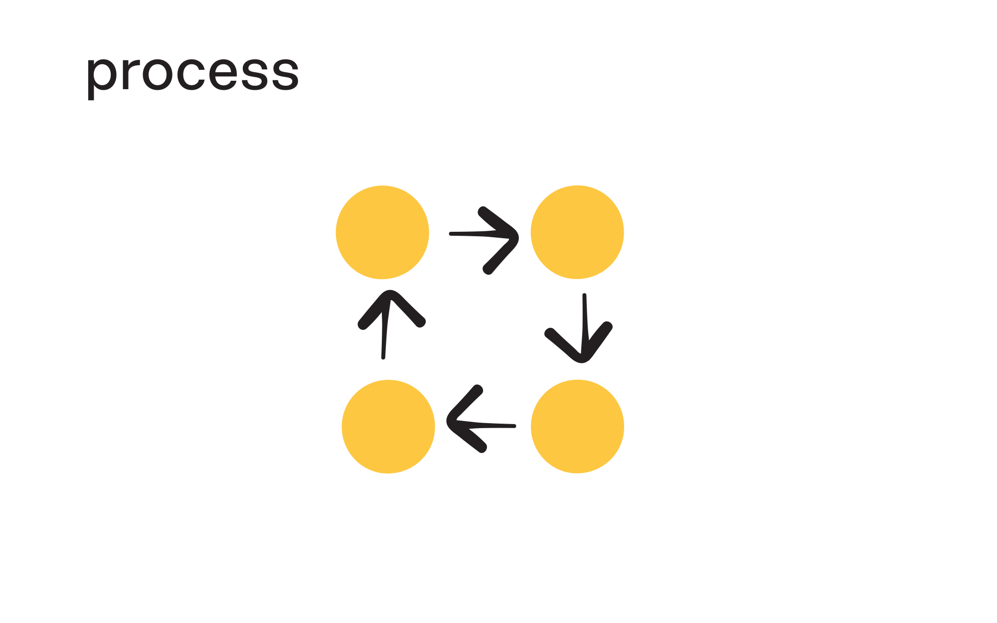
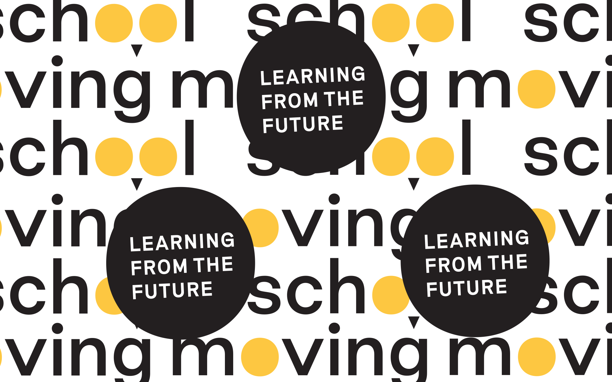
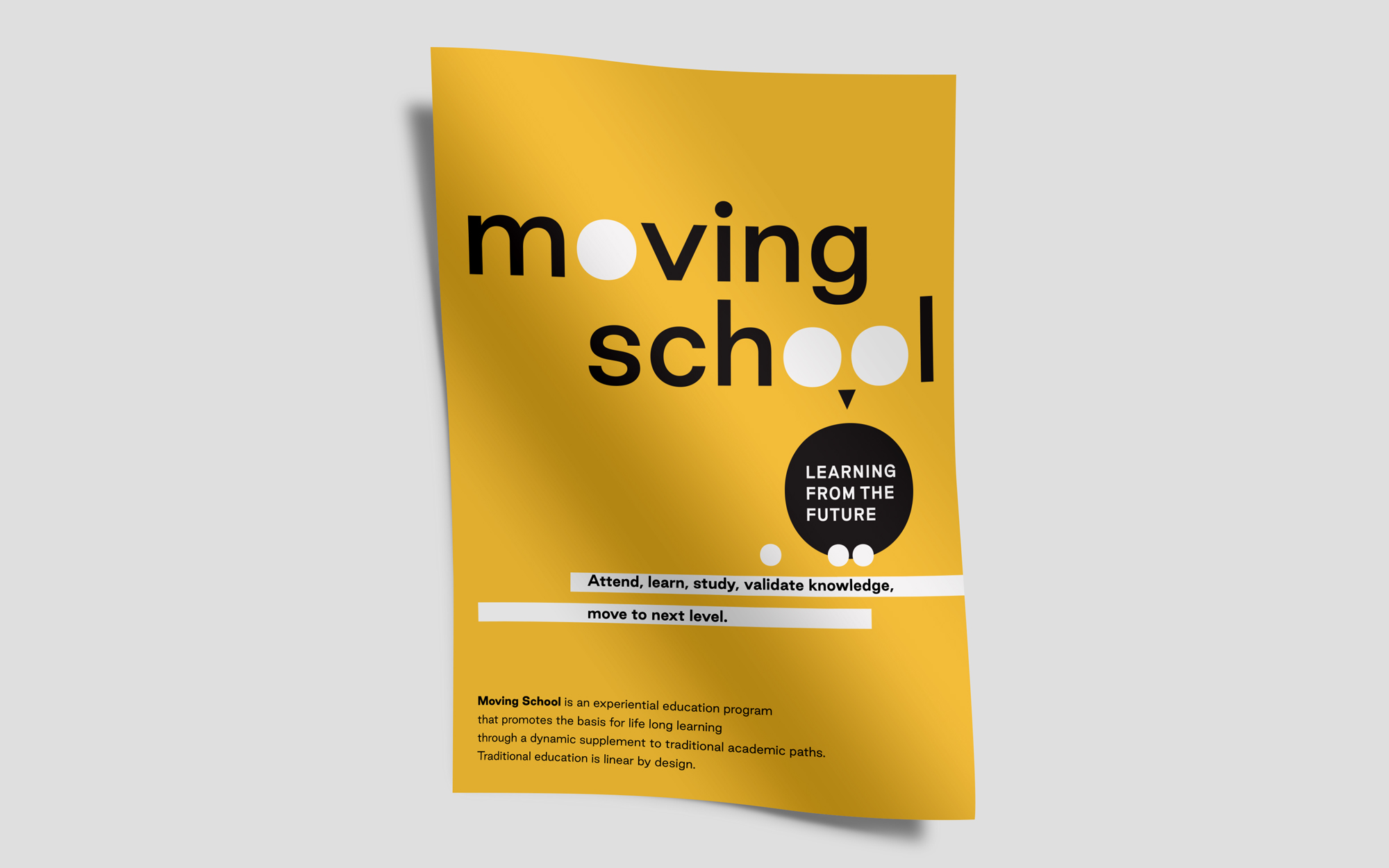
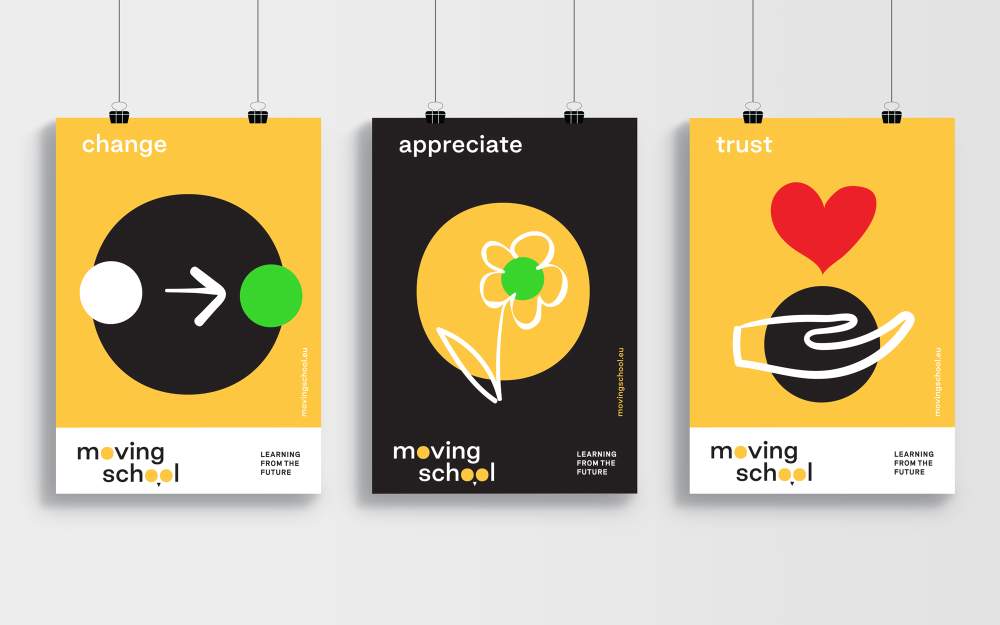
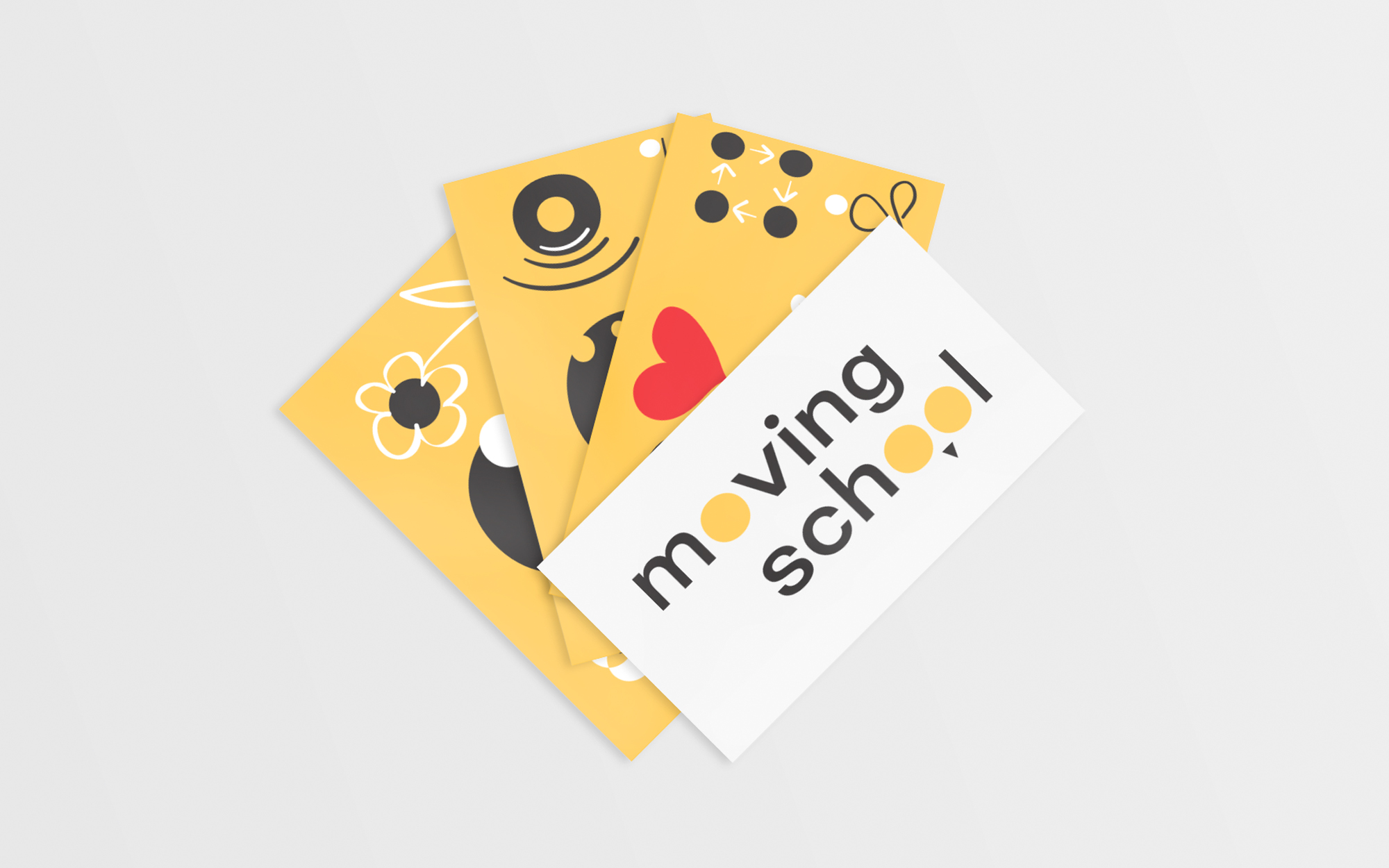
In the new, fresh identity, we incorporated visual elements that constitute a straight reference to the owl, the symbol of education and wisdom (two eyes and a beak). The reference is nevertheless given in a very minimalistic manner, in line with the contemporary spirit that is closer to the heart of the Moving School initiative. The inclusion of the three dots in the identity suggest the continuity of the educational process – a process that is basically life-long and is far from over once the ‘official’ studies are concluded. It was decided that the bright yellow should be the key color of choice – lively, inviting, and associated with enlightenment. Finally, in the same vein, a series of purpose-built pictograms/illustrations were designed on order to express key aspects of the Moving School offerings.













CREDIT
- Agency/Creative: Sophia Georgopoulou | Design
- Article Title: A wise move foreword
- Organisation/Entity: Freelance, Published Commercial Design
- Project Type: Identity
- Agency/Creative Country: Greece
- Market Region: Global
- Project Deliverables: Brand Creation, Brand Identity, Brand Redesign, Brand World, Branding, Graphic Design, Identity System, Illustration
- Industry: Education
- Keywords: moving school, life, lifelong, learning, education, art, create, awl, wise, education, educational program, yellow, icons, pictograms, poster, design, challenge, innovation, sophia georgopoulou design, sophiagdotcom, athens, greece, kassel, university, germany, global, worldwide


