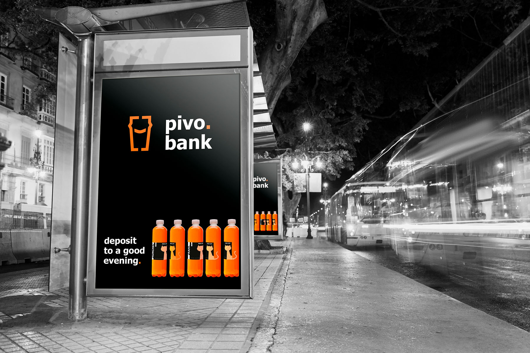
Pivo.bank is a successful beer retail chain that has more than 60 stores. Its aim was to correspond visually to all current trends and to consolidate their market positions. We accepted this challenge.
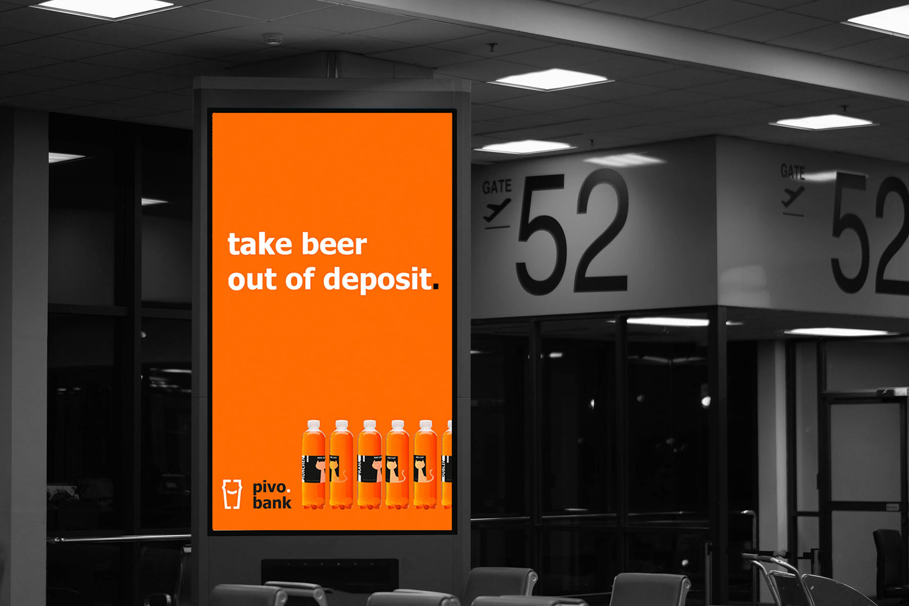
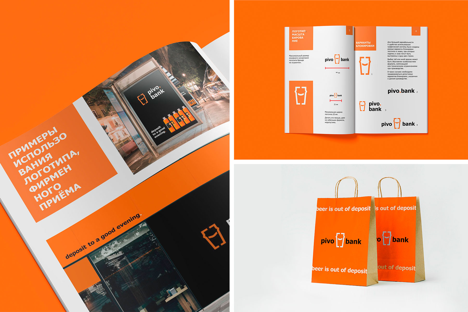
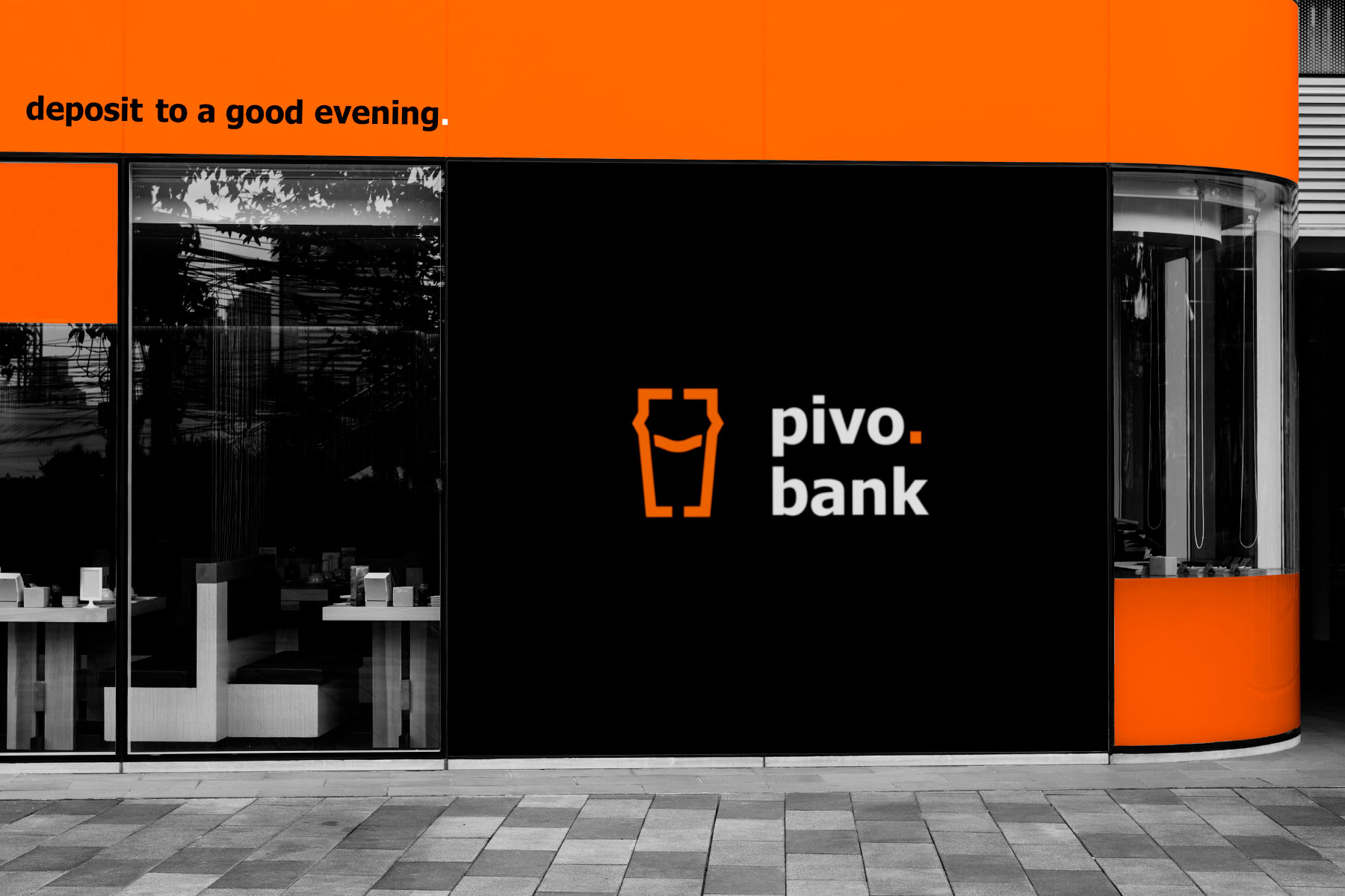
Not to lose recognition, the brand color stayed the same. Already familiar to the consumer beer mug turned into a modern pint with a friendly smile.
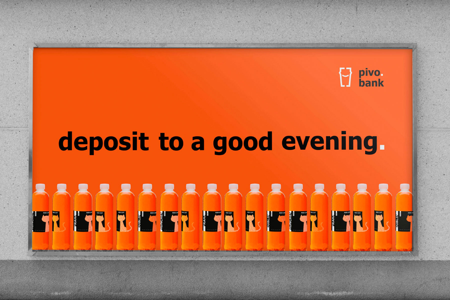
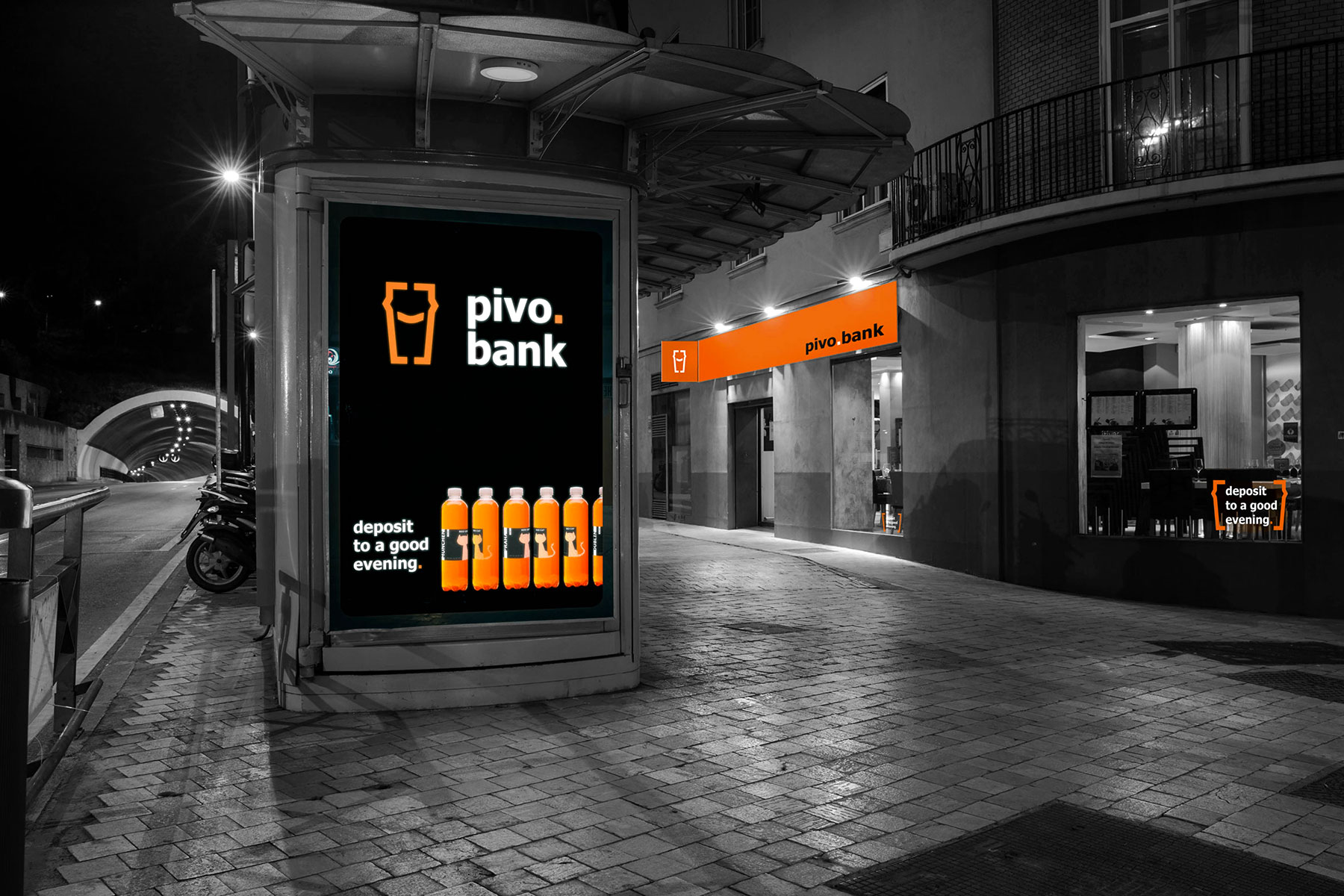
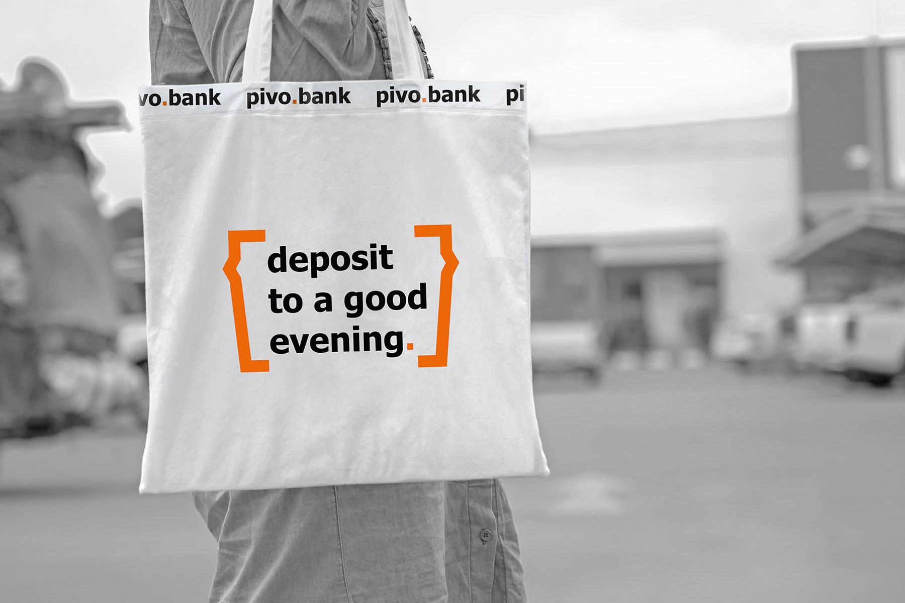
The new visual system reflects the dynamics. It also adapts to different media. So, the accent point and pint, that can transform into brackets, became the elements of new brand identity. This visual solution helps to focus on main text massages.
Pivo.bank also wanted to emphasize their reference to banking. That is why the fonts are strict, laconic and the developed verbal communication system also corresponds bank terminology. It helps to reflect the main essence of the brand 😉
CREDIT
- Agency/Creative: Wishnia
- Article Title: Visual Identity for Beer Retail Chain
- Organisation/Entity: Agency, Published Commercial Design
- Project Type: Identity
- Agency/Creative Country: Ukraine
- Market Region: Europe
- Project Deliverables: Brand Identity, Brand Strategy, Identity System, Rebranding, Research, Tone of Voice
- Industry: Retail
- Keywords: Visual Identity, Rebranding, Beer, Beer Store, Retail Chain


