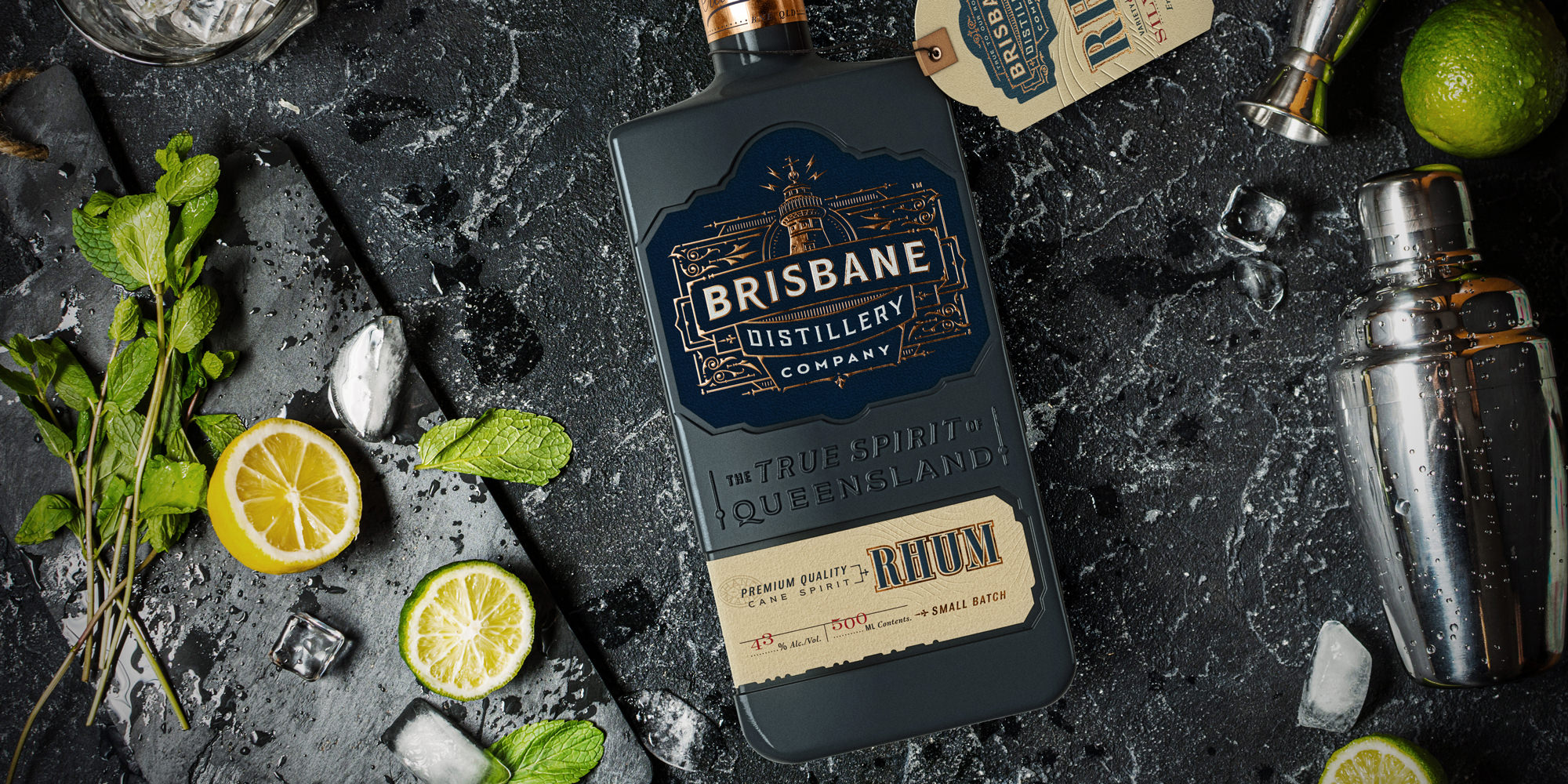
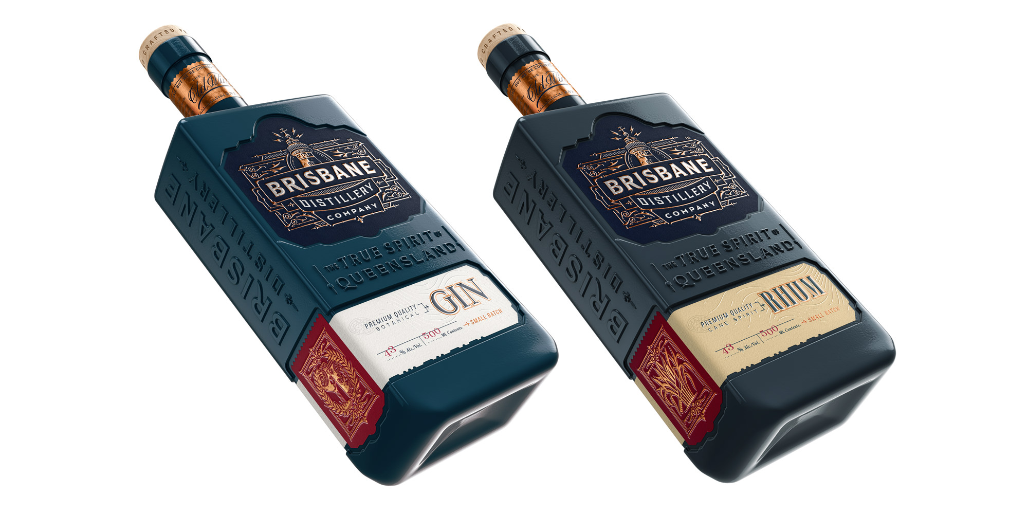
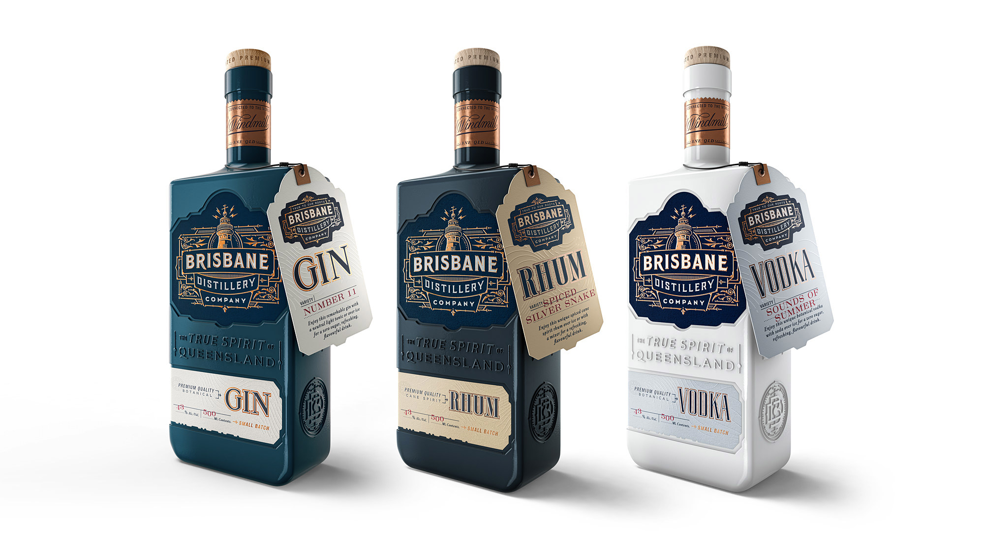
A start-up in the craft liquor category, Brisbane Distillery Company needed an identity to truly represent its brand, and a suite of packaging designs for its first three products.
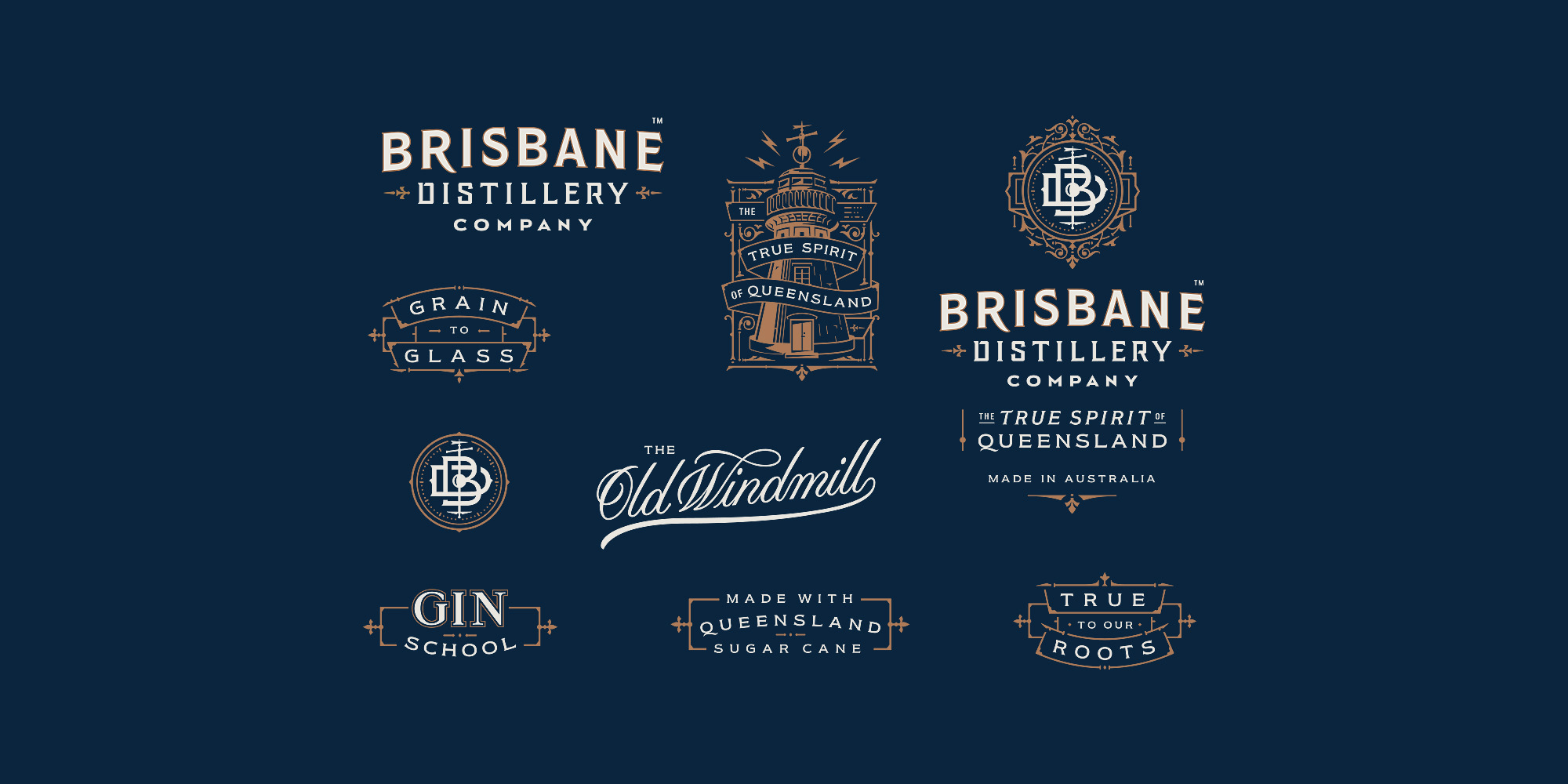
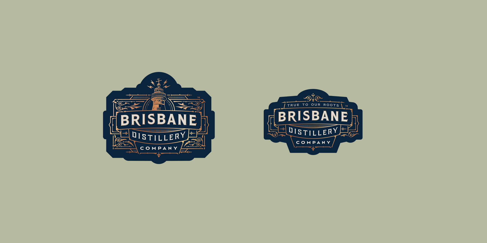
Working closely with BDC we drilled down into the company’s ethos and roots to refine a look and copy style that reflects its approach and ambitions. A carefully honed main logo and various secondary branding devices have been created, plus a series of flexible bottle and label designs for BDC’s first gin, rhum and vodka releases.
Brand mission:
We’re Brisbane Distillery Company – the city’s first grain to glass craft distillery. Soon, we’ll be opening our gin school where you’ll be able to experience the distilling process first hand and craft your botanical gin.
What we’re doing is new and exciting, but we’re also staying True to our Roots. We make our liquors using pure, natural Queensland ingredients, taking inspiration from the history and heritage of our great state.
So, what better icon to put at the heart of our logo than The Old Windmill in Brisbane? One of the oldest landmarks in Queensland, it was built by convicts to grind grain for the colony but was also a communications tower.
The time ball on its mast helped navigators down in the port set their instruments, it had Brisbane’s first telegraph machine, and later became
a radio and television broadcast tower. Just like the old mill, Brisbane Distillery Company is rooted in Queensland but connected to the rest of the world.
The True Spirit of Queensland is reflected in everything we do. It’s there in the way we craft each of our unique gin, vodka and rum flavours, and in the care we put into every batch we make. As a company we’re friendly, welcoming and 100 per cent independent. We do things our way – different and original.
CREDIT
- Agency/Creative: Tom Lane / Ginger Monkey
- Article Title: Tom Lane / Ginger Monkey – Brisbane Distillery Company
- Agency/Creative Country: United Kingdom


