Popp Studio redesigns the visual identity and packaging for Free From brand, Creative Nature, by going on a taste adventure.
Popp Studio has created an inclusive, joyful and bold visual identity system and packaging designs for UK-based Free From brand, Creative Nature.
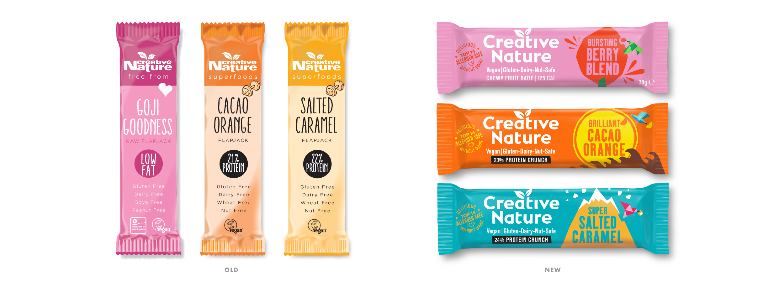
With a broad portfolio of products spanning snack bars, baking mixes and superfoods – and exciting NPD in the pipeline – founder Julianne Ponan wanted to set the brand up for the next level of growth. It needed stronger shelf stand-out, improved cohesion across ranges, improved taste appeal, and easier navigation.
Being uniquely free of the top 14 allergens, and also vegan and palm oil-free, the brand had established a functional bedrock to build from, but it lacked an emotionally compelling idea and visual identity. Popp Studio was briefed to express Creative Nature’s new brand idea, personality and broader vision of good food for everyone – not just allergy sufferers – while still reassuring its core audience this is a brand they can buy without doubt.
The logo has been evolved so it is stronger on packaging and in the brand world, while ensuring its various trademarks are not compromised.
It retains many of the distinctive elements of the original, but is now crafted with a friendly, hand-drawn feeling, and the leaves have been repositioned to reveal a tree growing from the negative space between the ‘a’ and the ’t’ of ‘creative’.
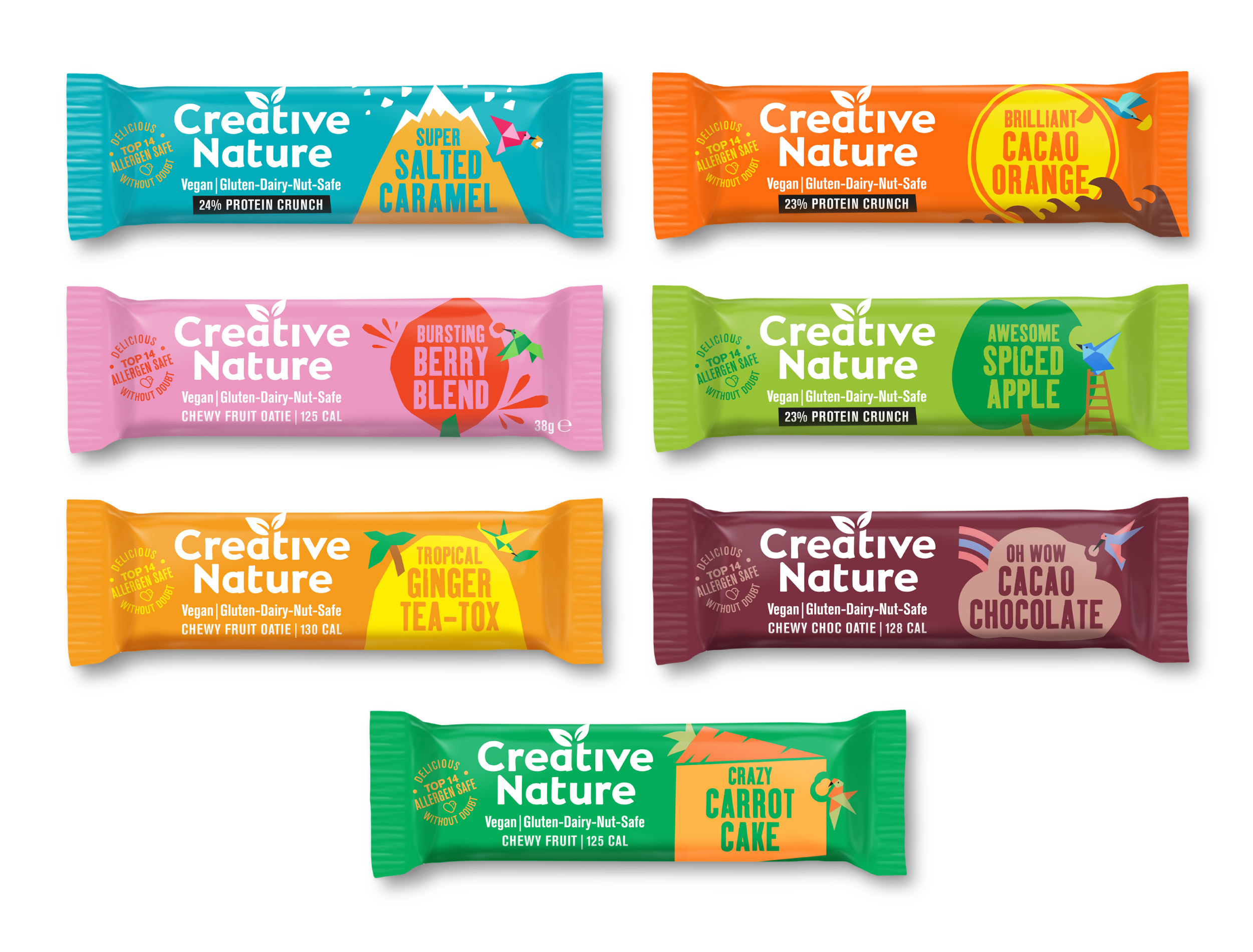
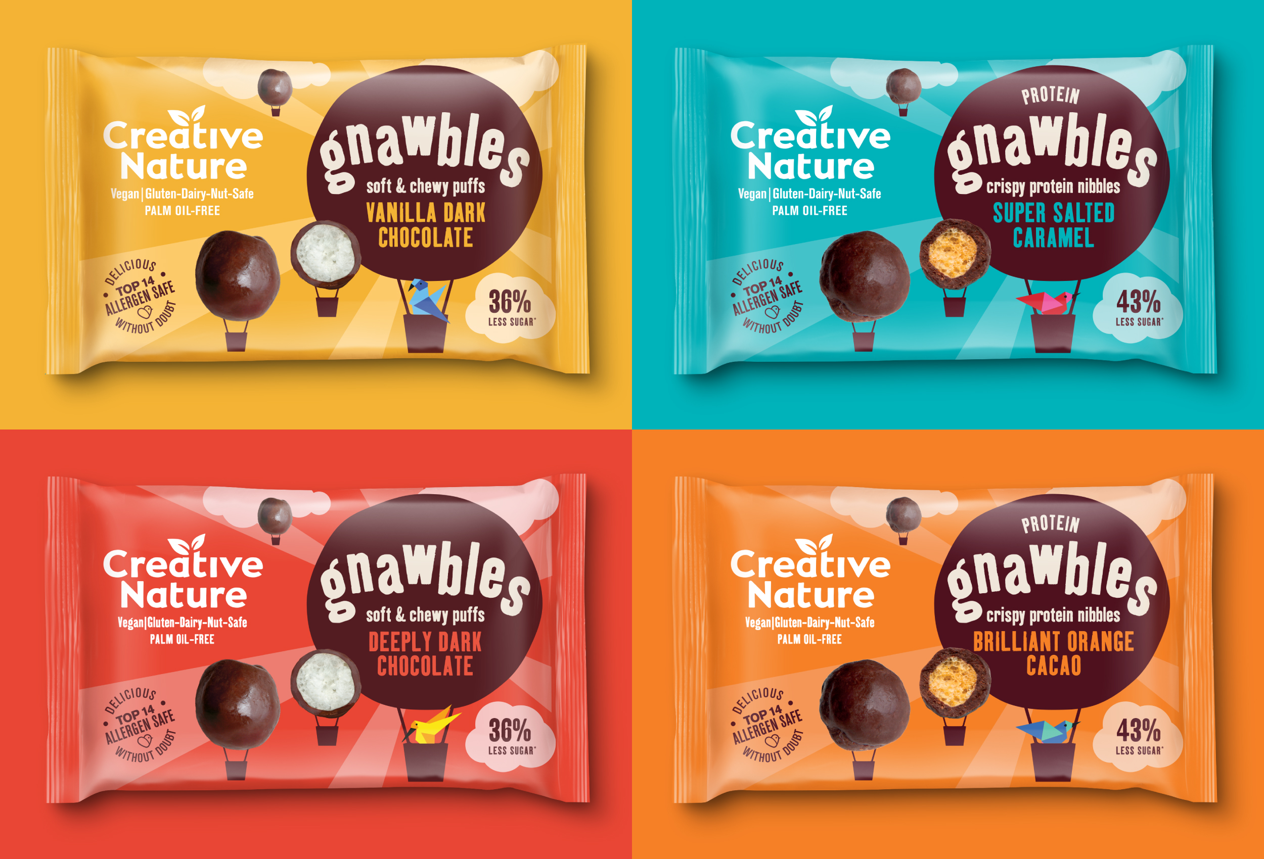
The new visual identity and packaging designs are inspired by the idea “taste adventure”, brought to life as charming, brightly coloured illustrations that imagine the story of playful little birds, travelling to the ends of the earth to find the most delicious ingredients.
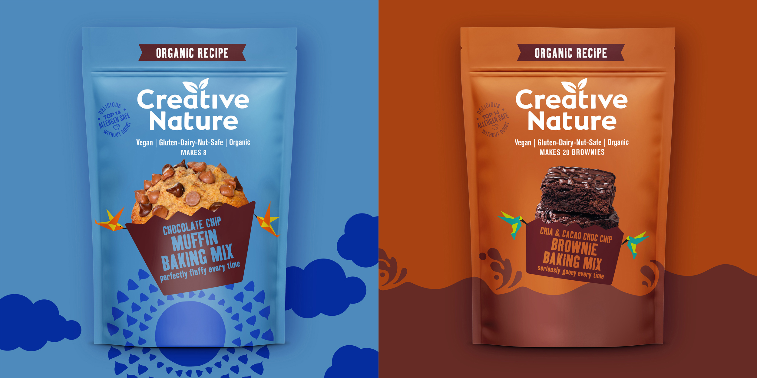
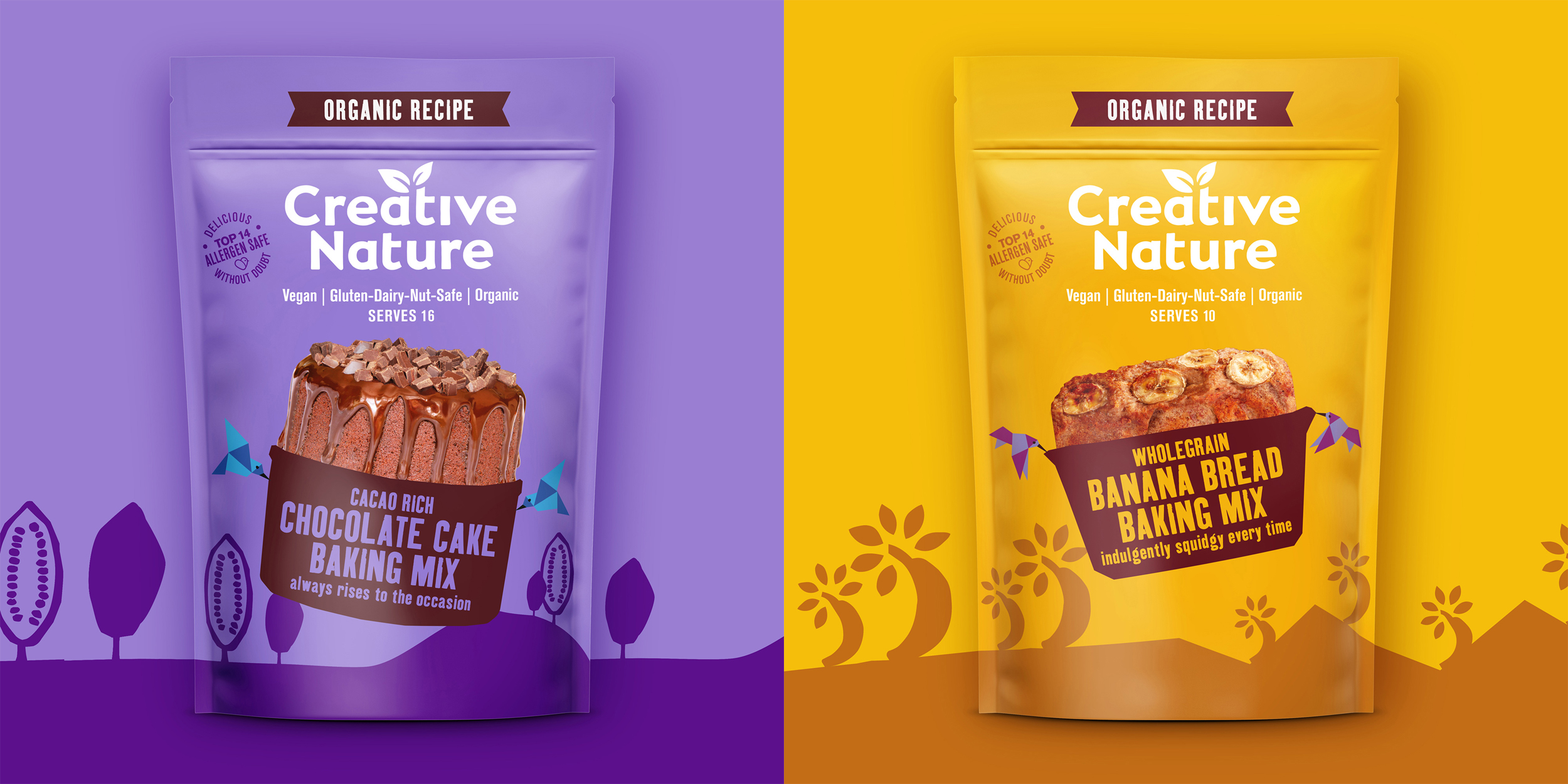
Birds are symbolic of the freedom Creative Nature gives its normally diet-restricted core consumers. This flock has a charm and personality all of its own. With origami-inspired style, they look both natural and precise. They can be more generic, like the birds on snack bars and mixes, or they can tell provenance stories, like the Kiwi picking New Zealand Barley grass on a superfood tub.
On snack bars, each bird carries away a piece of the landscape made from ingredients, on baking mixes, they deliver delicious, pre-baked goodies from a distant land, and in superfoods, they’re set amongst their local habitats with the purest ingredients in the foreground.
On Creative Nature’s newest, most indulgent product, Gnawbles, the birds are relaxing in a hot air balloon, alluding to the lightness of the new, chocolate-coated puffed lotus seeds or pea protein that make them a delicious, healthier alternative to other chocolate treats.
Off-pack, the birds really come into their own, standing out and helping out wherever consumers interact with them.
Across all ranges, functional messaging has been simplified, variant navigation has been optimised with bold typography, and a new colour palette has been developed that delivers taste appeal while flexing to feel at home in different categories.
The “Top 14 Allergen Free” stamp combines this hugely powerful functional benefit with the reassuring slogan “Delicious Without Doubt”, punctuated with a new symbol – the Lovebird – promising freedom, great taste, and reassurance.
Julianne Ponan, founder and Allergy Angel at Creative Nature says:
“The brief we set Popp was varied and complex, but through their deep packaging design expertise, and ideas-driven approach, we now have a system and idea that not only solves our in-store objectives, but will help establish Creative Nature as the definitive allergen-free food brand by presenting our bigger vision in a memorable, engaging way to both our core and mainstream audiences.”
Poppy Stedman, Creative Director and co-founder of Popp Studio, says:
“Creative Nature has a genuinely compelling difference, but they weren’t expressing the “creative” part of their brand. The new design brings taste, joy and playfulness to the visual identity and packaging in a way they’ve not yet been able to, and it is flexible enough to really open up creative possibilities for future ranges and the bigger brand world. We can’t wait to see it take flight.”
The new designs have launched in Tesco, with a staggered rollout in place across other retailers to minimise packaging waste.

CREDIT
- Agency/Creative: Popp Studio
- Article Title: Popp Studio Redesigns the Identity and Packaging for Free From Brand Creative Nature
- Organisation/Entity: Agency, Published Commercial Design
- Project Type: Packaging
- Agency/Creative Country: United Kingdom
- Market Region: Multiple Regions
- Project Deliverables: Brand Identity, Brand Redesign, Brand World, Branding, Graphic Design, Illustration, Packaging Design
- Format: Flow-Pack, Pouch
- Substrate: Pulp Paper


