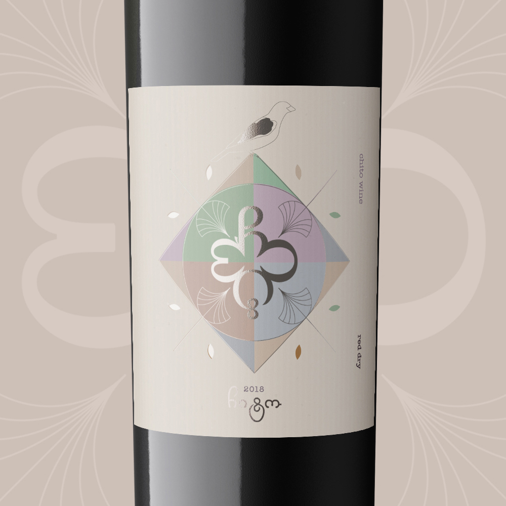
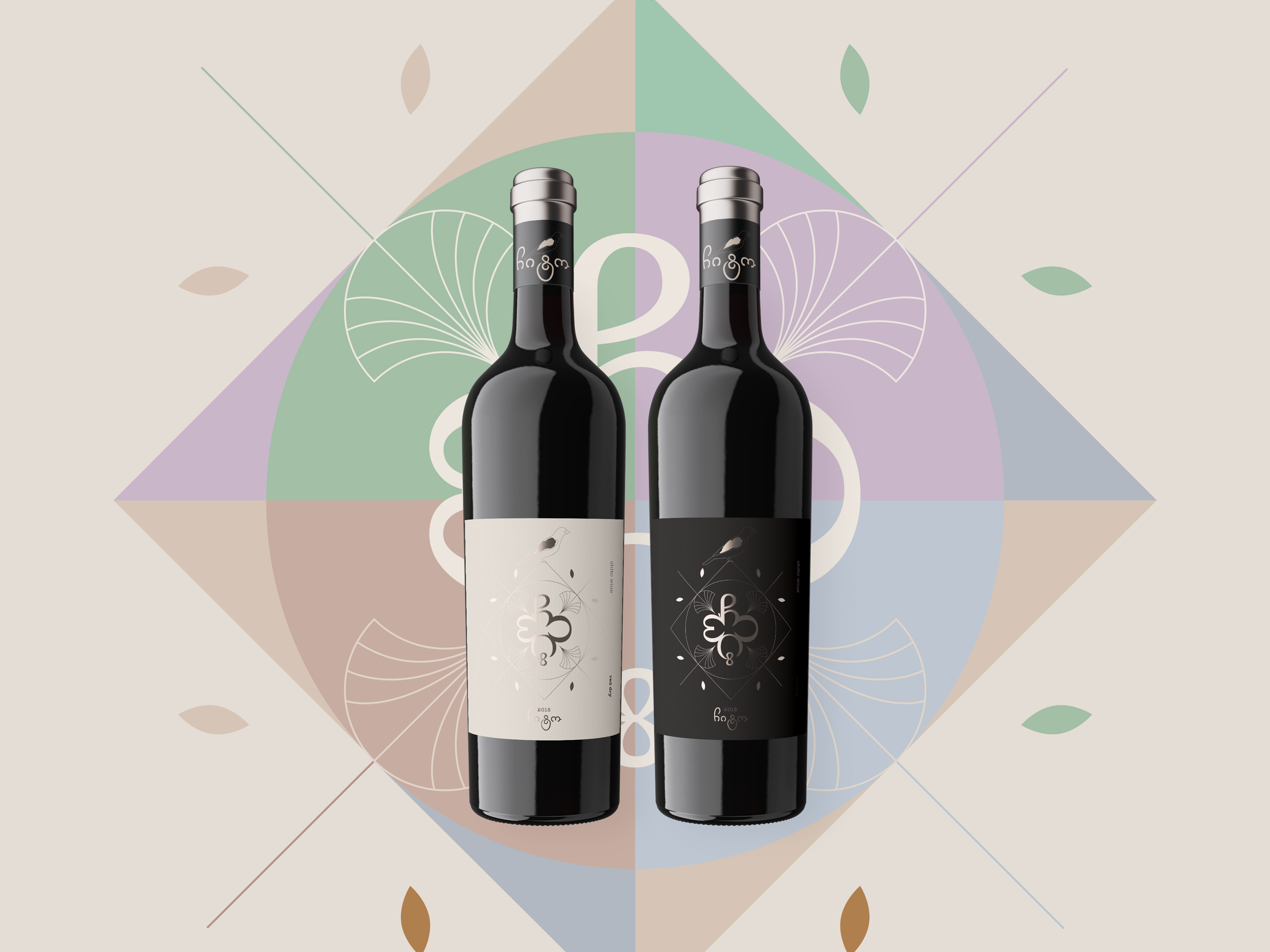
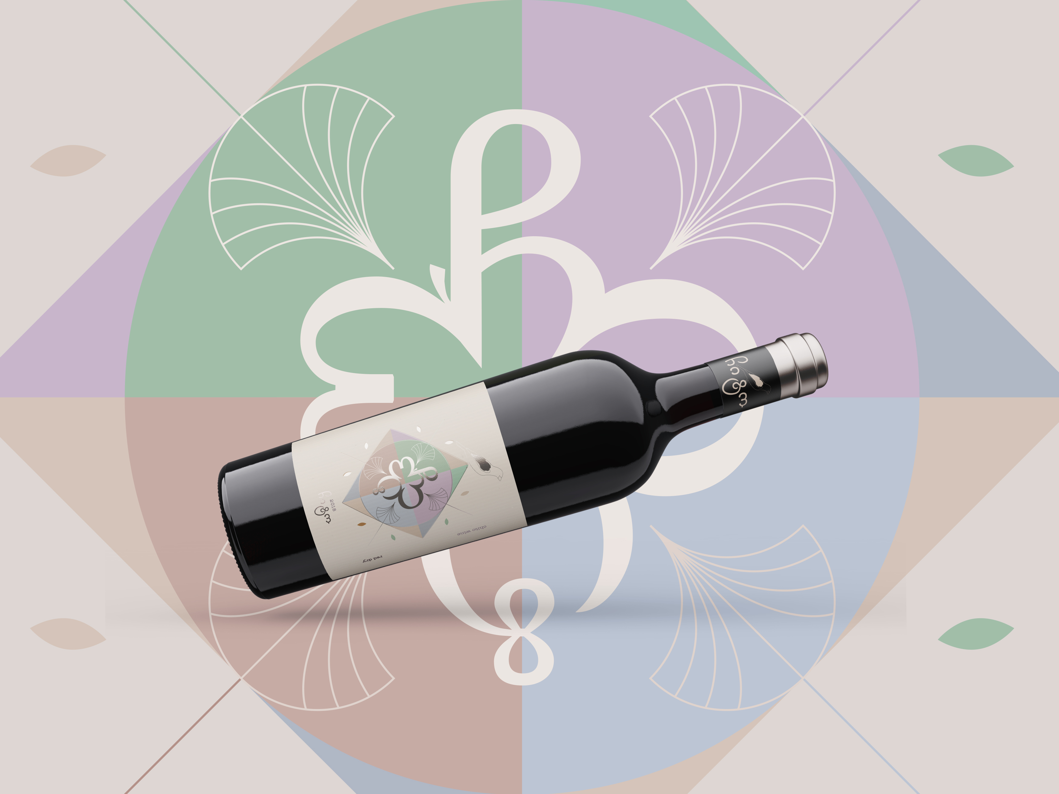
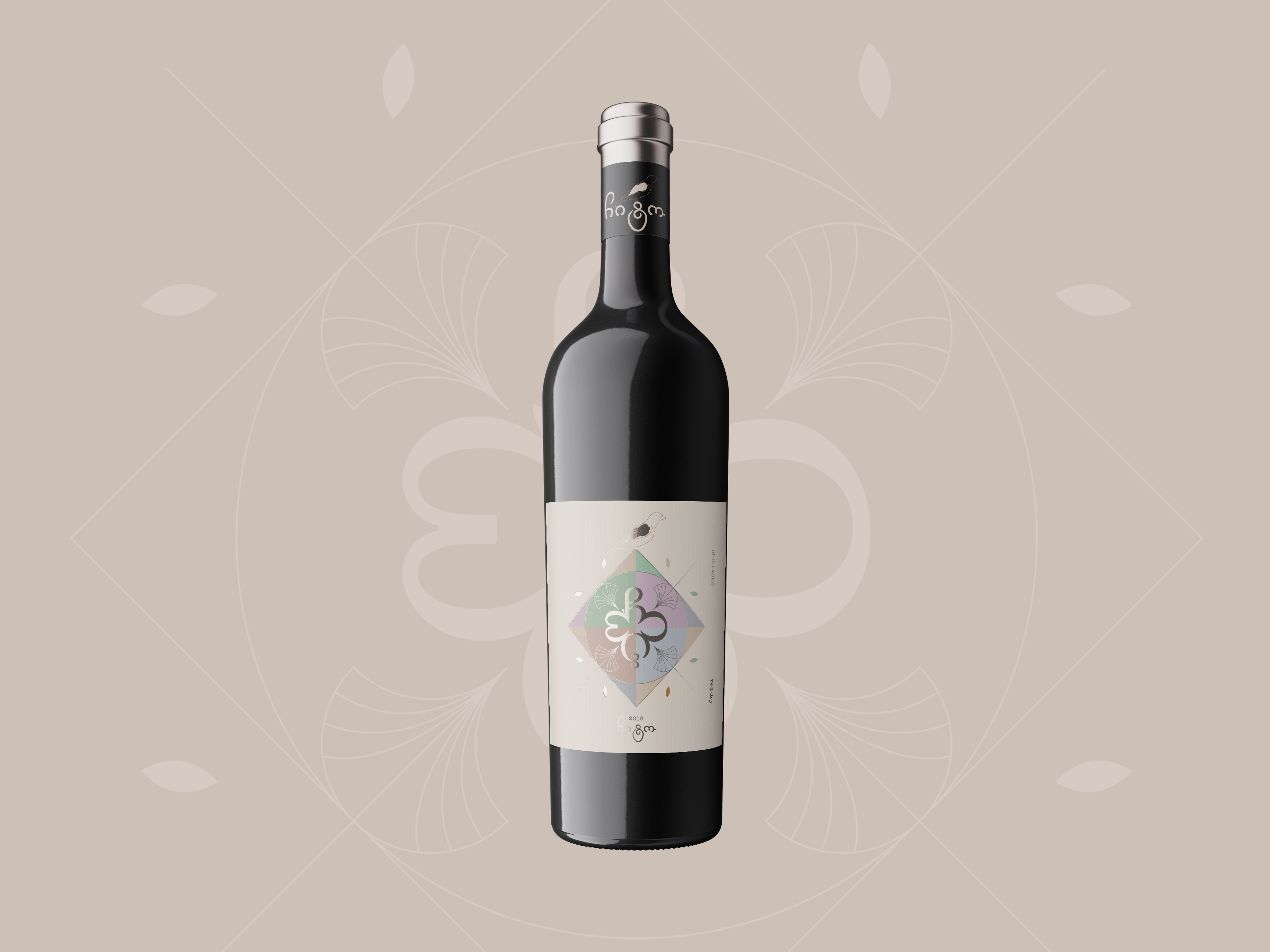
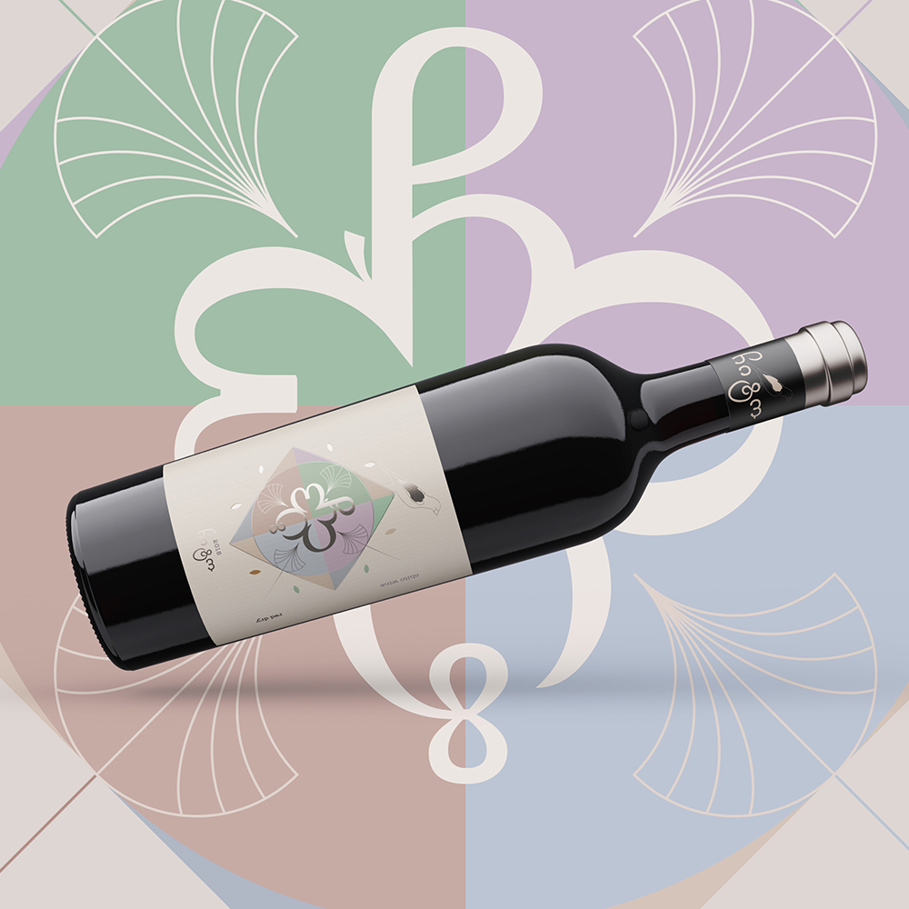
Chito Wine is a new Georgian wine seria which is made for Asian market. The main task was to make a label which will be differ from standard georgian design (landscapes and religion establishments as usual ) and should be more European. Also it should be contain so beautiful traditional Georgian symbols. So the decision was to write down in a circle Georgian word “ჩიტო”. It is sounds like ‘Chito’ and translated like “little bird”. And its became a name of this wine. This wine seria represented by three different types of packaging – color, black and white labels.
CREDIT
- Agency/Creative: Shevelyok
- Article Title: Georgian Chito Wine Label Design
- Organisation/Entity: Freelance, Published Commercial Design
- Project Type: Packaging
- Agency/Creative Country: Ukraine
- Market Region: Europe
- Project Deliverables: Packaging Design, Research
- Format: Bottle
- Substrate: Glass Bottle
FEEDBACK
Relevance: Solution/idea in relation to brand, product or service
Implementation: Attention, detailing and finishing of final solution
Presentation: Text, visualisation and quality of the presentation


