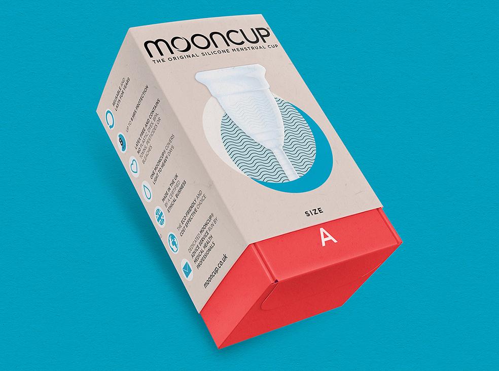
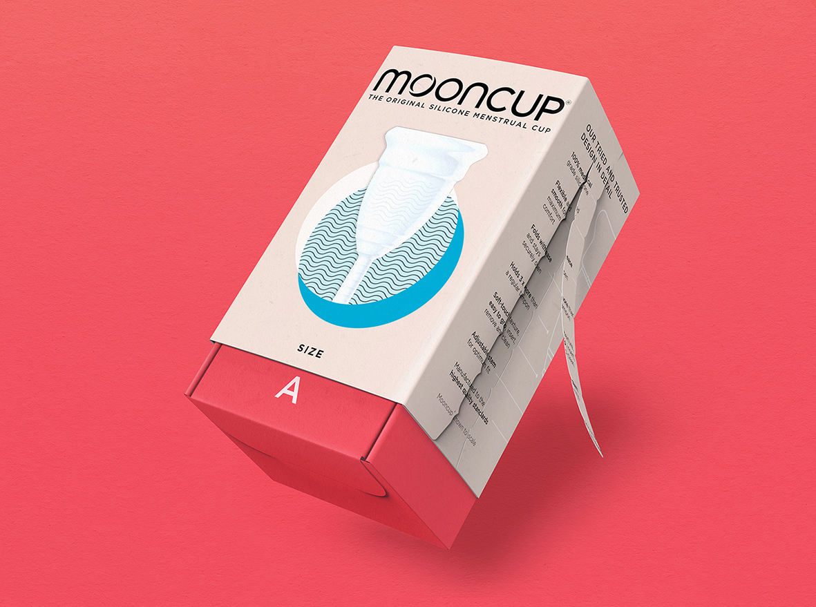
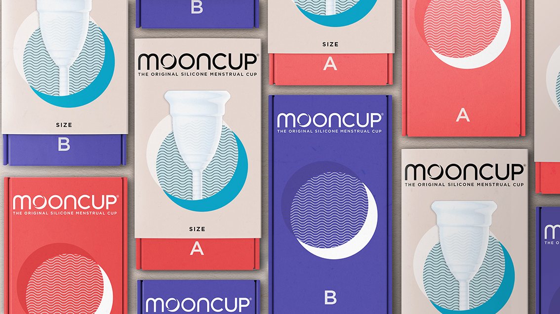
Mooncup has undergone a complete brand refresh created by brand acceleration agency bluemarlin. The rebrand supports the period care company’s shift from a discreet alternative to a confident category leader, strengthening its stand out in the growing menstrual cup market that it was instrumental in establishing.
Created in 2002, the Mooncup® was the first reusable medical grade silicone menstrual cup in the world. With the mission to radically transform how things are done, Mooncup makes the experience of periods more positive, healthy and eco-friendly. Championing sustainable growth, the brand aims to help consumers break their ‘autopilot’ habits to make more conscientious choices.
“Mooncup pretty much invented alternative sanitary protection, creating and leading the category,” comments Dan Monteith, Executive Strategy Director at bluemarlin. “Inevitably, competitors appeared, and the brand found itself going up against a sea of imitators and challengers, all trying to do the same thing – appeal to a liberated Millennial audience who desire open conversation around periods and demand more sustainable products.”
Speaking of this challenge, Kath Clements, Company Director at Mooncup comments: “How do you compete when you’re used to operating in a vacuum, which is what Mooncup has done until now? So much of the ground had been taken with cause-related marketing. For us, it feels like our authentic territory, it’s our true driver. But it makes it quite hard to know how to position yourself within that. It’s like when you change the bottom line.”
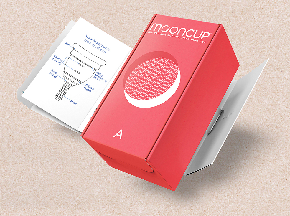
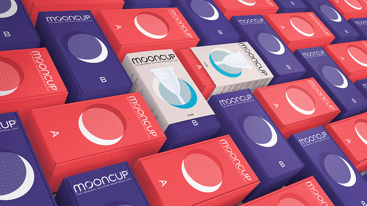
The answer is a contemporary, captivating and (planet) conscious brand expression that is utterly premium without pretentiousness, inspiring a contemplative approach to periods and successfully communicating Mooncup’s leadership in the category. The new logo elegantly incorporates the crescent moon to strengthen the link to the lunar cycle. Stunning new packaging combines earthy yet vibrant tones of teal, coral and blue with the simple, clean graphics of a phasing moon. The Mooncup product is central to the design, and showcased with pride.
“Our creative solution reaffirms Mooncup’s authority by being simple and intuitive, demystifying a subject full of apprehension and misinformation,” Monteith further comments. “By harmonising the functional with the emotional, it turned what was once a personal hygiene purchase into something desirable without seeming trendy and transitory.”
CREDIT
- Agency/Creative: Bluemarlin
- Article Title: Mooncup Enters a New Phase with Rebrand by Bluemarlin
- Organisation/Entity: Agency, Published Commercial Design
- Project Type: Packaging
- Agency/Creative Country: United Kingdom
- Market Region: Multiple Regions
- Project Deliverables: Brand Guidelines, Brand Redesign, Brand World, Graphic Design, Packaging Design, Rebranding
- Format: Box
- Substrate: Pulp Carton


