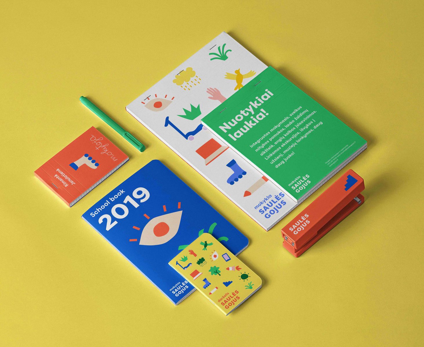
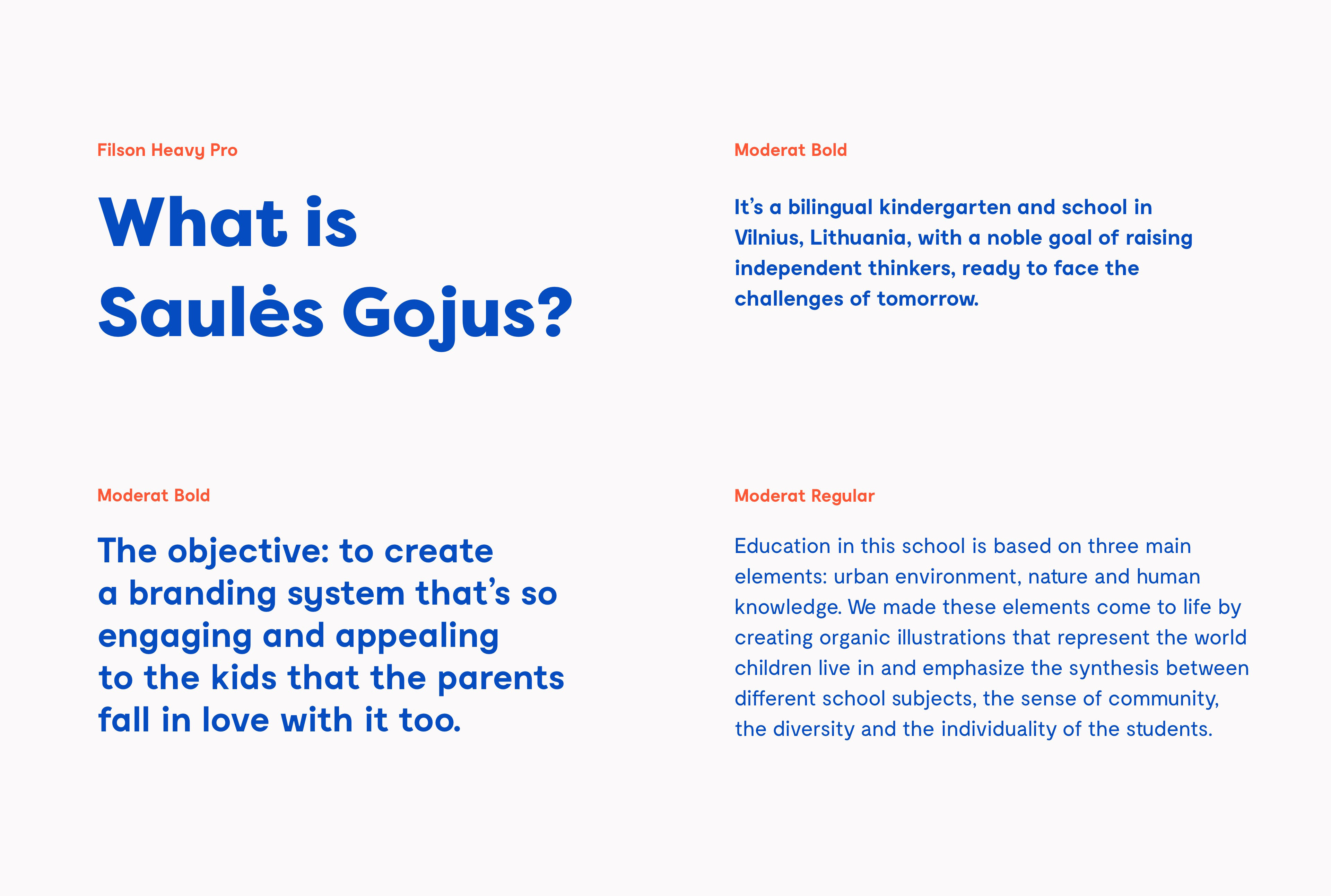
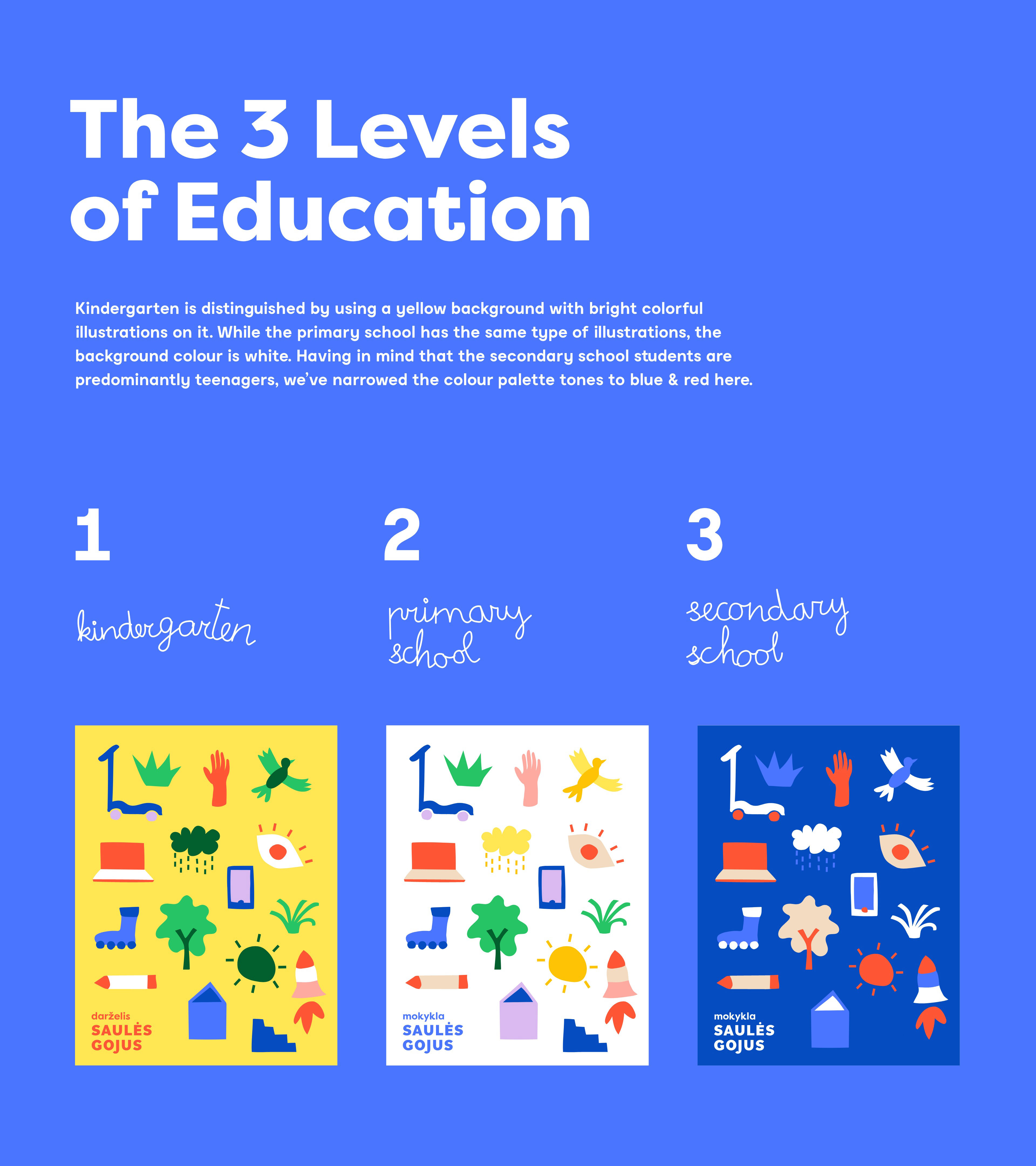
“Saulės Gojus” is a bilingual kindergarten and school in Vilnius, Lithuania, where education is based on three main elements: urban environment, nature and human knowledge. Having this school as their client, “Imagine Branding’s” team was faced with an exciting challenge of creating a dynamic visual system that not only illustrates these key elements but reflects the different education levels as well.
The word “gojus” means “a small, beautiful forest” and was chosen as a guiding direction, dictating the mood of the logo. The logo’s main accent – a distinctive, protruding, curved letter J – symbolizes curiosity. Combined with letters O and U, it resembles a stylized human face, giving the logo an effortless playful feel.
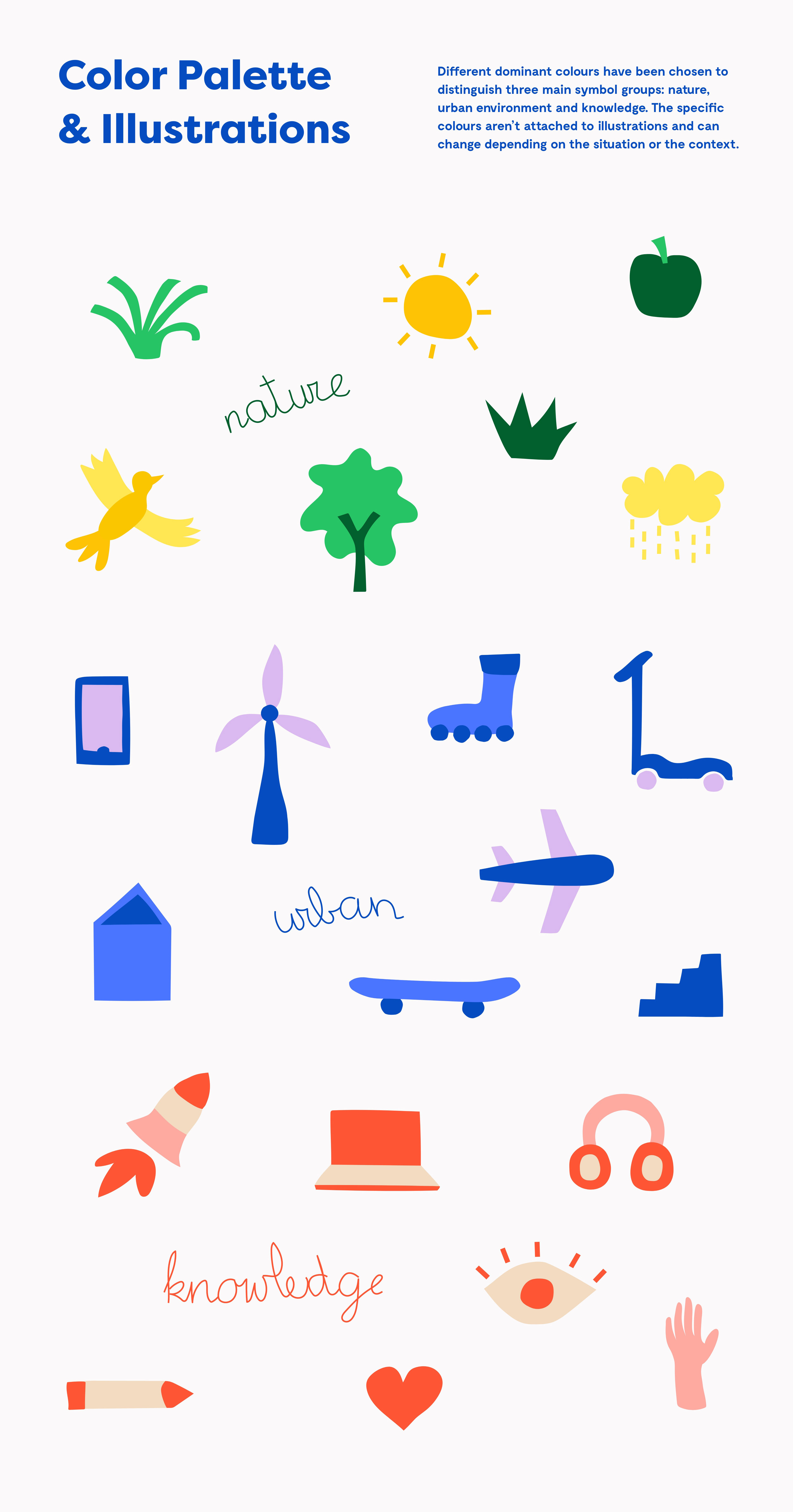
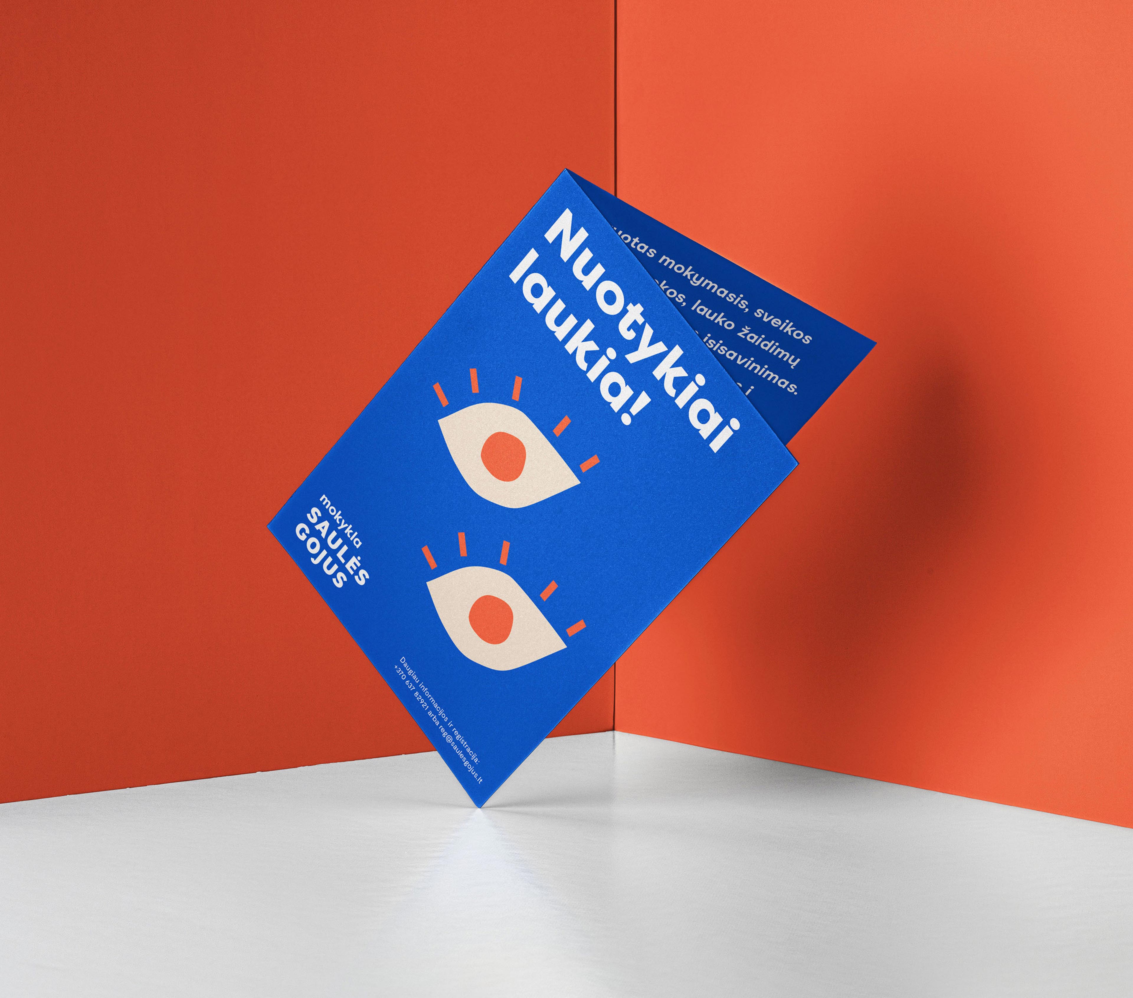
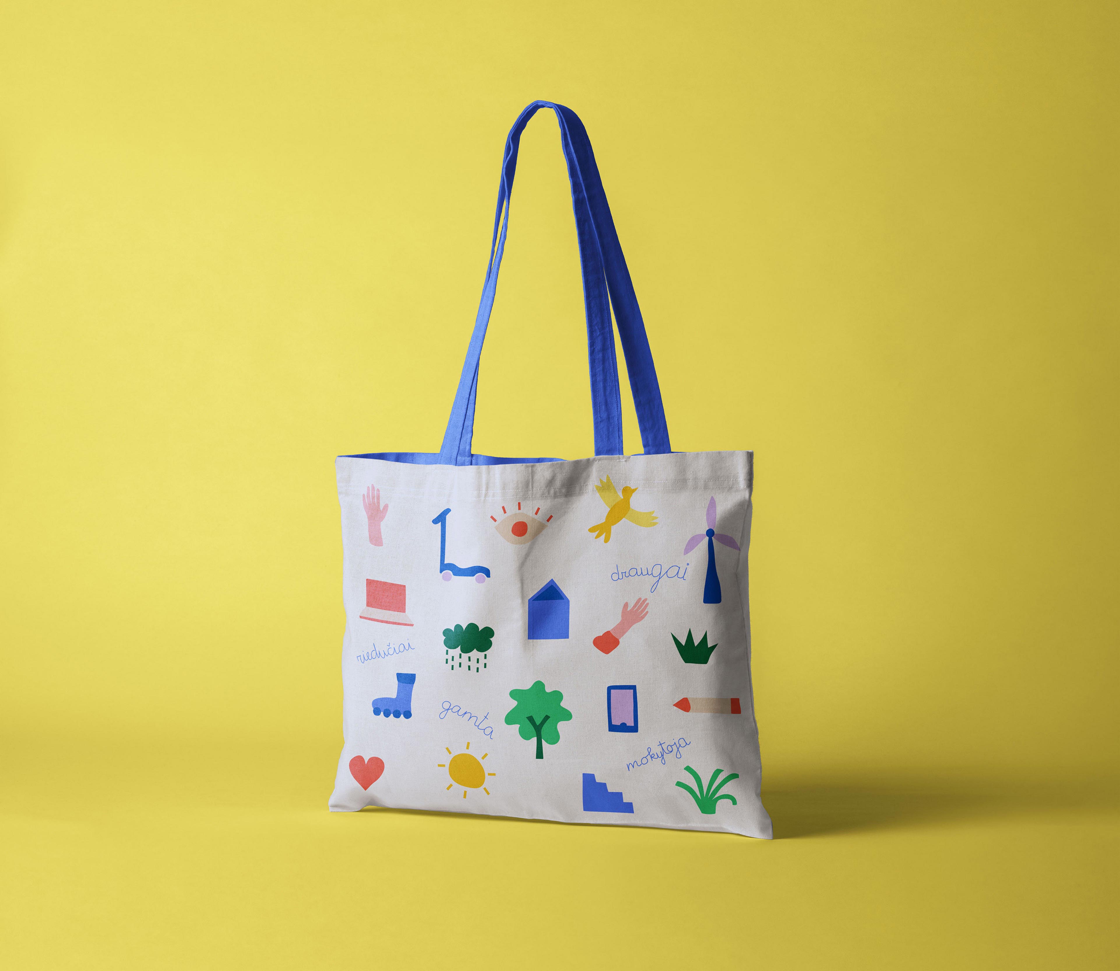
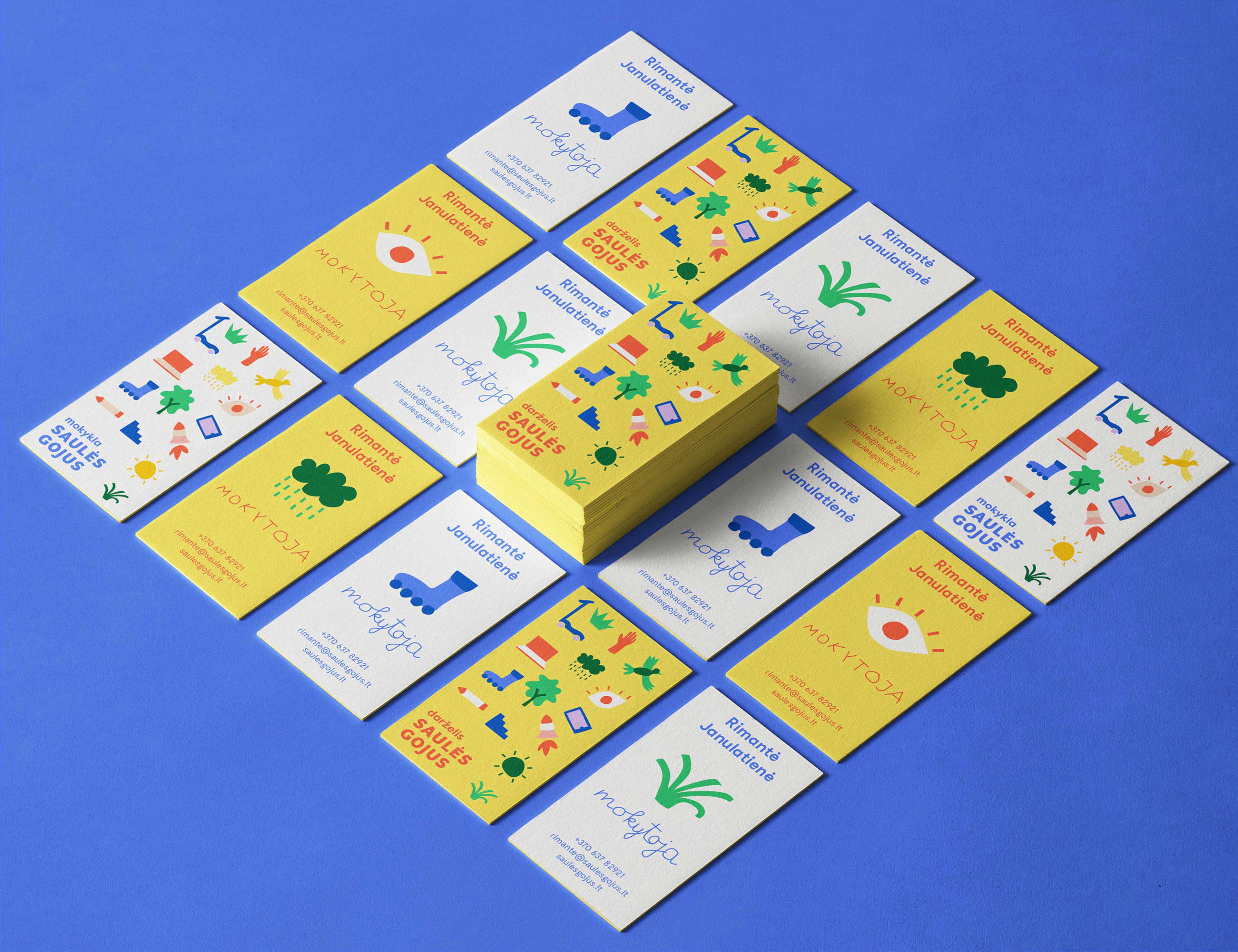
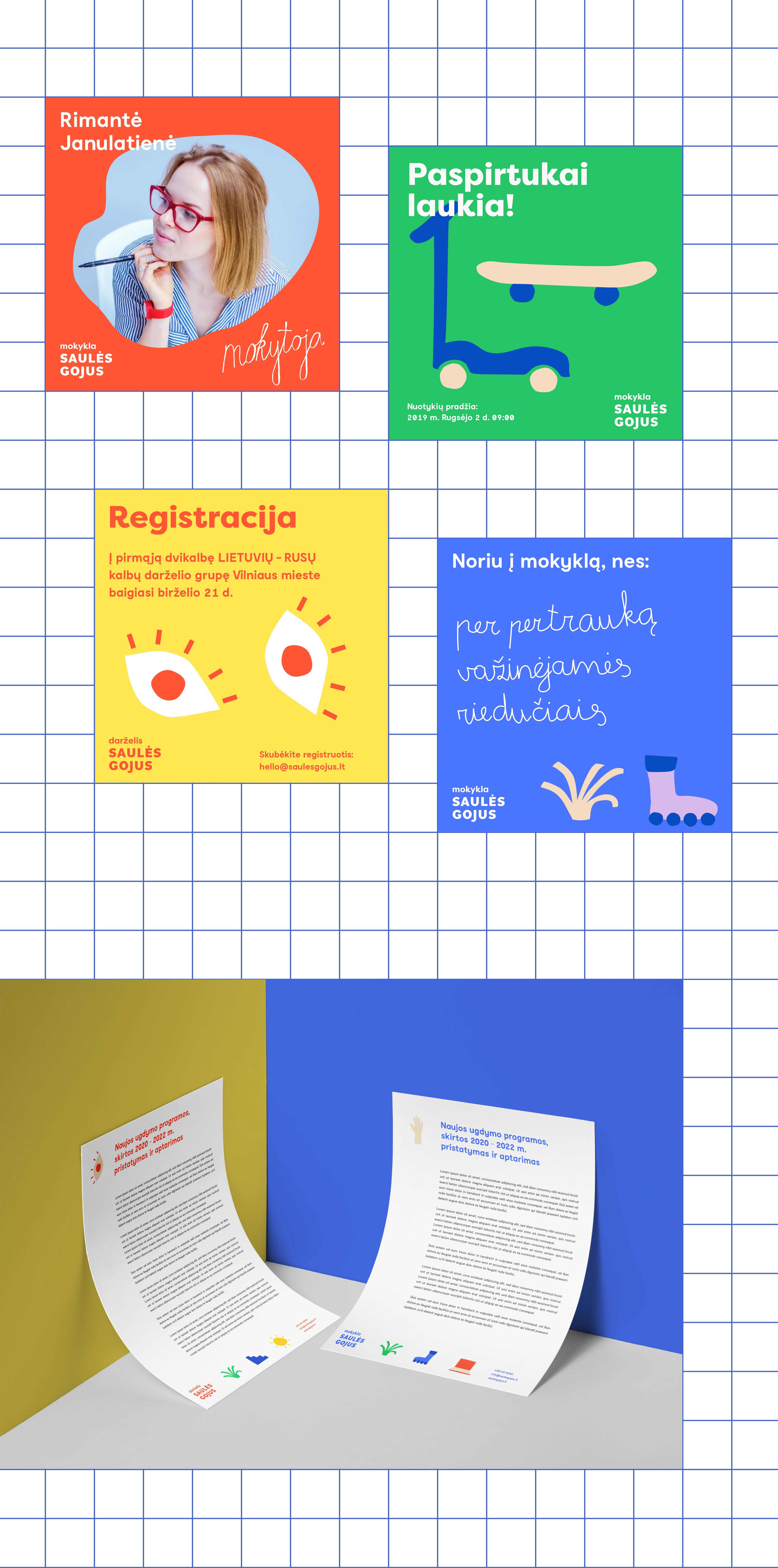
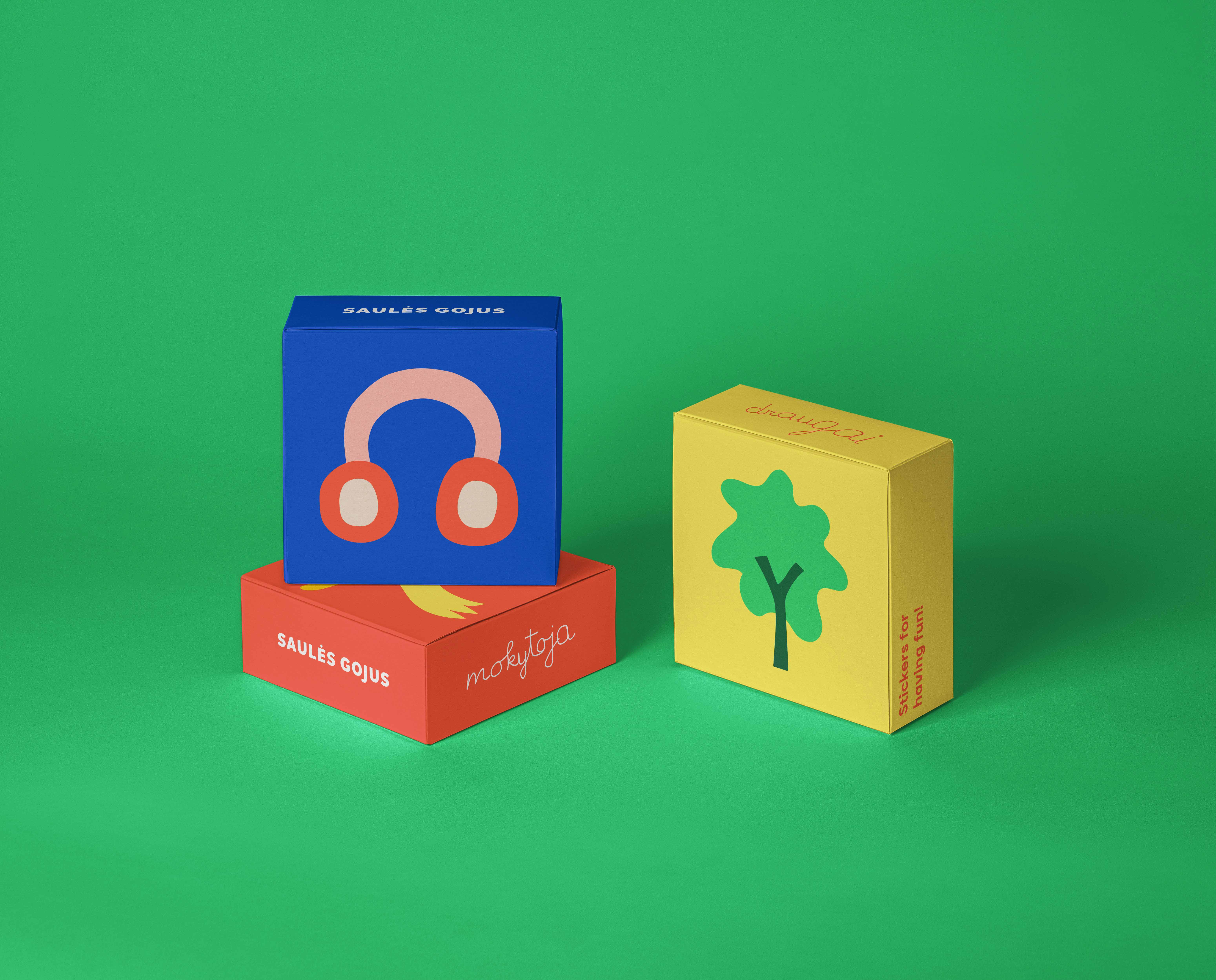
Furthermore, the key elements (nature, urban environment, and knowledge) were made to come to life by creating organic illustrations that represent the world children live in and emphasize the synthesis between different school subjects, the sense of community, the diversity and the individuality of the students.
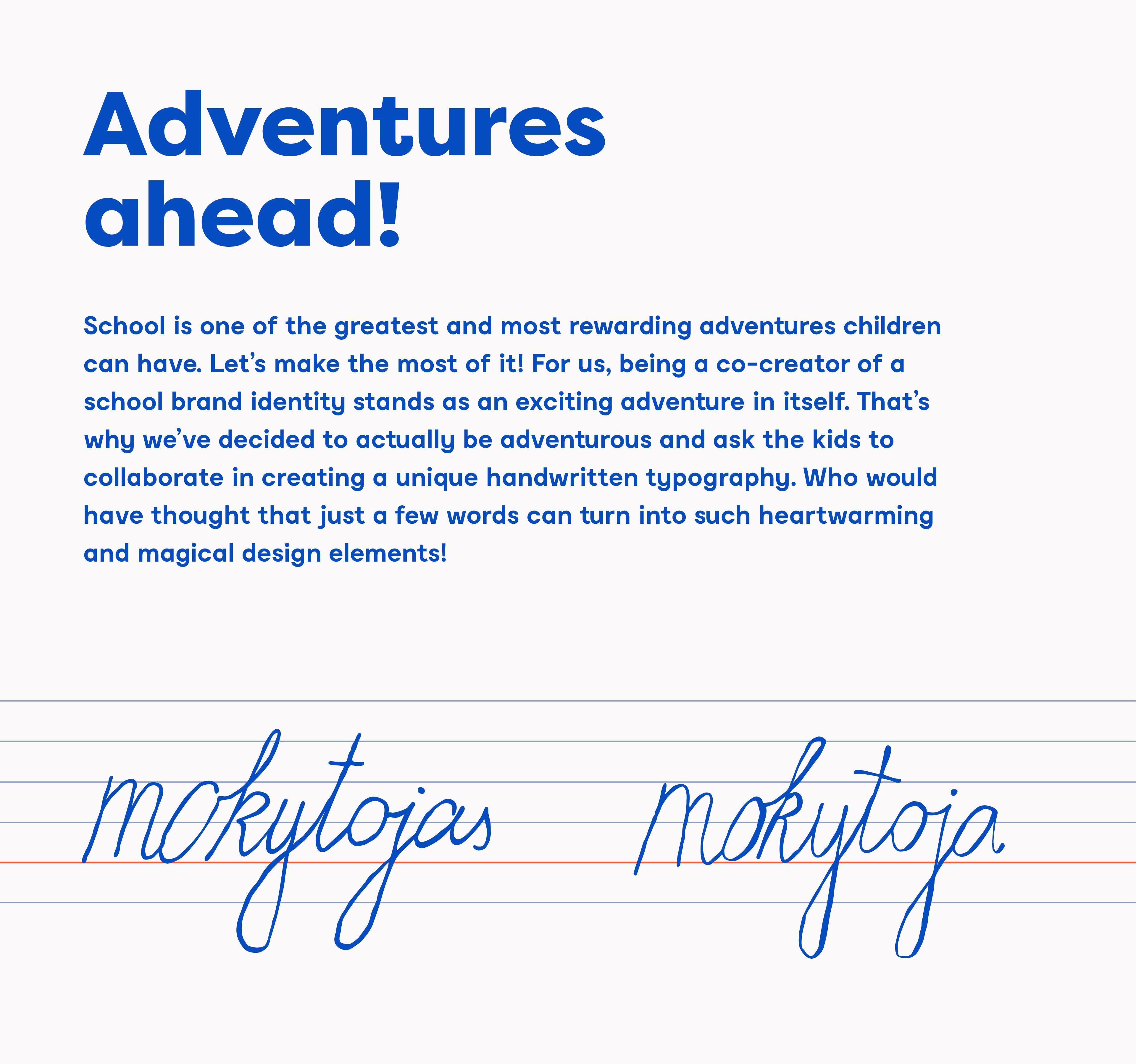
Being a co-creator of a school brand identity stands as an exciting adventure in itself. That was the main reason “Imagine’s” creative team decided to actually be adventurous and ask the kids to collaborate in creating unique handwritten typography. Who would have thought that just a few words can turn into such heartwarming and magical design elements!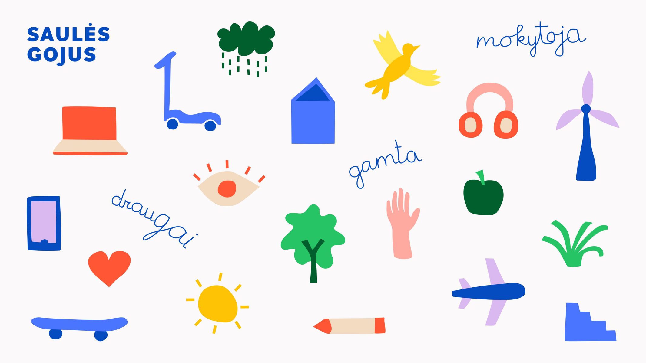


CREDIT
- Agency/Creative: Imagine Branding Studio
- Article Title: IMAGINE Brand Identity Agency – “Saules Gojus” Kindergarten and School Branding
- Organisation/Entity: Agency, Published Commercial Design
- Project Type: Identity
- Project Status: Published
- Agency/Creative Country: Lithuania
- Market Region: Europe
- Project Deliverables: Brand Experience, Brand Guidelines, Brand Identity, Brand Redesign, Brand Refinement, Branding, Graphic Design, Identity System, Illustration, Rebranding, Research
- Industry: Education
- Keywords: WBDS Agency Design Awards 2019/20
- Keywords: school, kindergarten, branding,brand identity, colors, illustrations, children, kids, playful, joyful, enviroment,urban, nature


