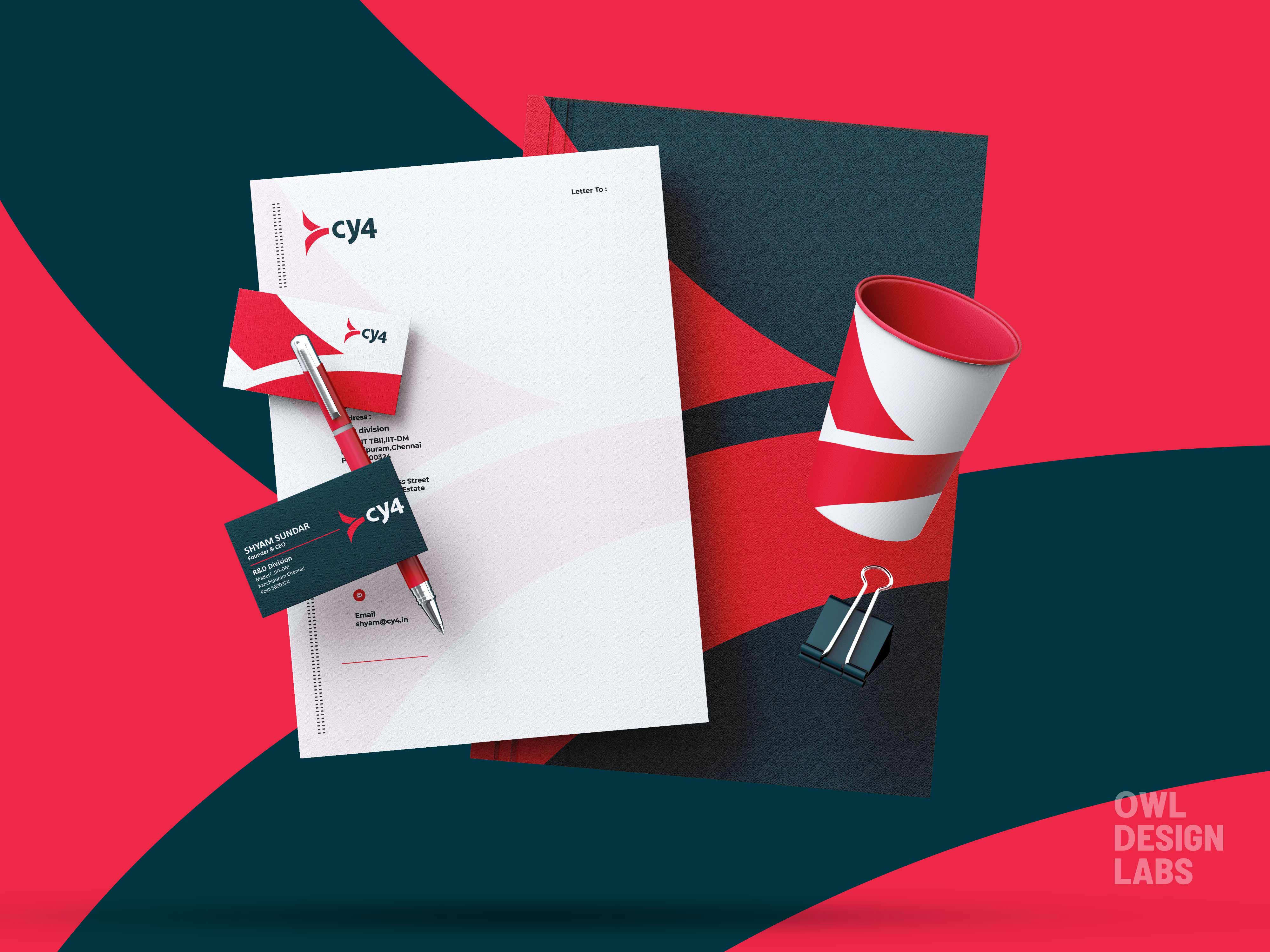
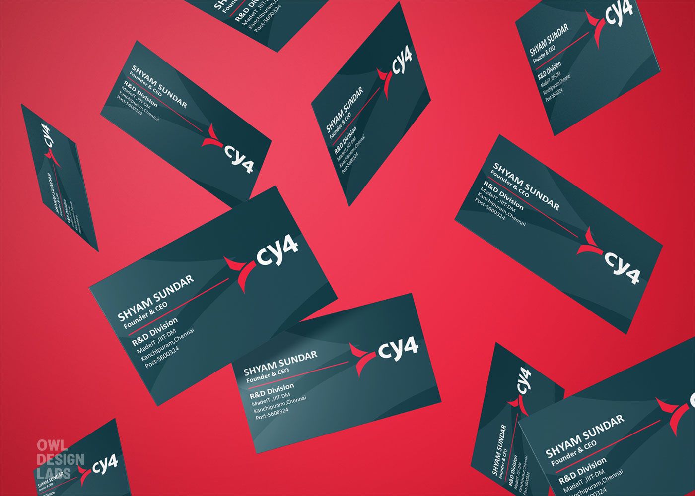
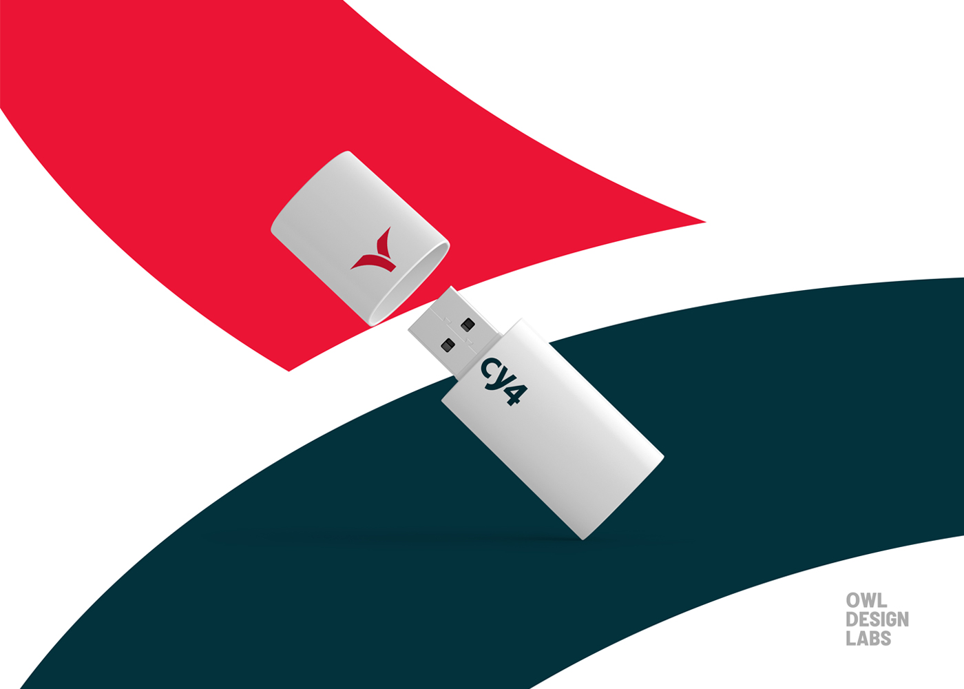
CY4 is a start-up that deals with IoT, Digital Twin & Manufacturing Services. They are intrigued to be a market leader in providing affordable Manufacturing services. The company plans to create a affordable smart Electrical bicycle in the near future. We have worked with CY4 to create a minimalist logo to evoke their company name and their vision simultaneously.
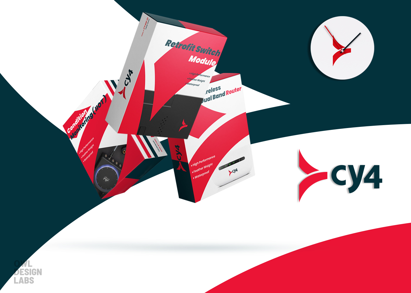
The logo is bold and easy to remember. It is a symbolic interpretation that reflects the core concept of the company. The concept of ‘Do more with less’ is streamlined in the company’s logo.
The logo is composed of a tilted ‘Y’ which represents a simple ‘why’ and a ‘bike handle’. The negative space within the lines of the ‘y’ sums up innovation. As the thought process will change with time, different solutions will be created. The placement of ‘Y’ illustrates moving into the future.
Moving on to the company name, CY4, ‘C’ stands for ‘see’ what overwhelming products are lined up. ‘Y’ stands for ‘why’ the customers should take interest in IoT. ‘4’ stands for ‘for’ all the varied reasons one should invest in products by CY4.
The tertiary colors have been aptly used as ‘Red color spectrum’ represents excitement and passion and ‘the blend of dark green and dark blue’ convey freshness and stability.


CREDIT
- Agency/Creative: Owl Design Labs
- Article Title: Owl Design labs Creates New Brand Identity System for CY4
- Organisation/Entity: Agency, Published Commercial Design
- Project Type: Identity
- Agency/Creative Country: India
- Market Region: Global
- Project Deliverables: Brand Identity, Brand Strategy, Branding, Identity System, Research
- Industry: Manufacturing
- Keywords: Brand Identity Design,Package Design


