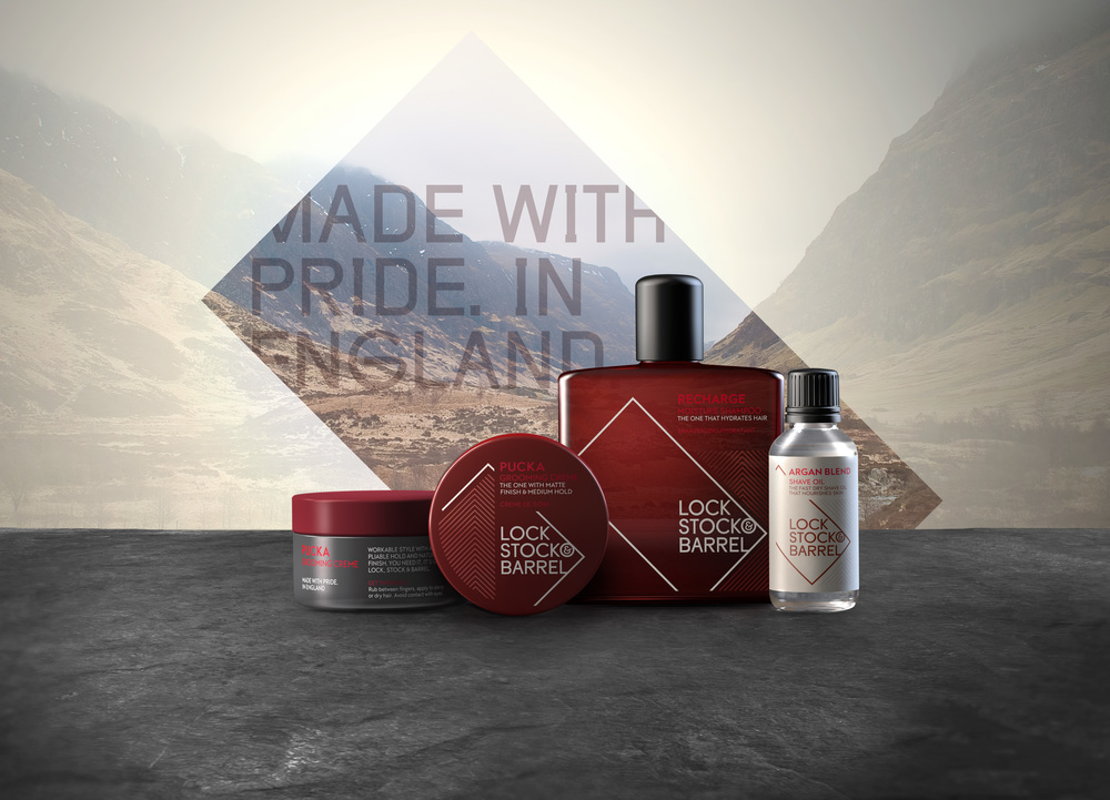
“Design Bridge create new brand identity, packaging and visual style for grooming range Lock Stock & Barrel.- New personality and meaning to the family brand underpinned by values of pride, passion and Englishness.
Brand design agency Design Bridge is pleased to announce details of its work in rejuvenating the brand identity, packaging and visual style for acclaimed British men’s grooming range Lock Stock & Barrel.
The family-run brand, formerly known as LS&B, has traditionally offered its professional hair styling products to salons, barbershops and high-end retailers. Although firmly established, particularly in America and Europe, Lock Stock & Barrel worked in partnership with Design Bridge to further emphasise the brand’s provenance, spirit and essence, and also maximise emotional engagement. It aspired to be both distinctive and memorable.
Design Bridge was tasked with creating a new brand identity articulating a narrative that would pay homage to both its humble English roots and the unfussy natural ingredients used in all its product formulations.
As part of its strategic approach, Design Bridge identified that Lock Stock & Barrel had unwittingly kept under wraps one of its most powerful assets – the name. John Wigham, design director at Design Bridge explained, “Through unlocking the abbreviated Lock Stock & Barrel name from LS&B, it unleashed a new identity and personality that brought this aspirational yet ‘everyman’s’ brand to life. This is a name with both attitude and pluck. A turn of phrase meaning ‘All. Everything”, Lock Stock & Barrel unabashedly reflects the no-holds-barred pride and fierce passion that pours into this family business and its products.”
Lock Stock & Barrel’s new strapline, “Made with pride in England”, embraces the humble provenance of the brand’s roots, born from the industrial heartland of England and developed by hand by its inventor – an ex-marine-turned-chemist. Accents of its apothecary origins and scientific foundations resonate subtly in the pack designs.
John Wigham commented, “Lock Stock & Barrel’s brand sentiment is straight talking, gritty, honest and proud, for the grounded, sharp, no-nonsense man who takes a considered approach to his appearance – well groomed, but with a rough diamond edge.”
As an extension to this, Design Bridge drew further creative inspiration from the craft and skill of the barber and the shape and angle of the barber’s mirror, and distilled this into the new logo design. The result is a clean, contemporary, stripped back aesthetic that speaks to the unfussy, unpretentious man.
Meanwhile, instead of scrapping the brand’s original distinctive red colour inherent in all its packaging, Design Bridge served to deepen the hue so it would hold greater depth and meaning and would complement the new identity. John Wigham explains, “The result achieved is not just ‘red’ but ‘oxblood red’ – a traditional tone associated with English heritage. The colour also echoes English design classics including the iconic Chesterfield sofa and traditional leather brogues – hallmarks of quality and world-class English craftsmanship. Delineating Lock Stock & Barrel’s identity using this heritage hue likewise alludes to this benchmark of British quality, as well as the homegrown skill and craftsmanship that has been invested in the creation of its products”.
Other core elements of the new brand identity include:- Visual language for printed collateral using fonts inspired by Gills Sans but with a contemporary twist – balancing tradition with modernity.- Photography that typifies the Lock Stock & Barrel man – an aspirational individual who strives for success and excellence but always remembers his roots.
Ben Snowdon, Managing Director at Lock Stock & Barrel Grooming Company commented, “Lock Stock & Barrel is a brand with passion and this really needed to come through in our packaging and visual style. Design Bridge have been the perfect partner in helping to communicate the brand’s charm and its unpretentious and understated approach to personal success, life and grooming.” “

CREDIT
- Agency/Creative: Design Bridge
- Article Title: Design Bridge – Lock Stock & Barrel
- Project Type: Packaging


