ButterflyCannon – Tom Parker Creamery
“Tom Parker Creamery is a new range of high quality dairy products inspired by the founder’s dairy farming Great Grandfather, who was something of a national farming legend. All the products are created using permeate free whole milk from the free-range, pasture fed cows that graze at the family farm in the Meon Valley, Hampshire.
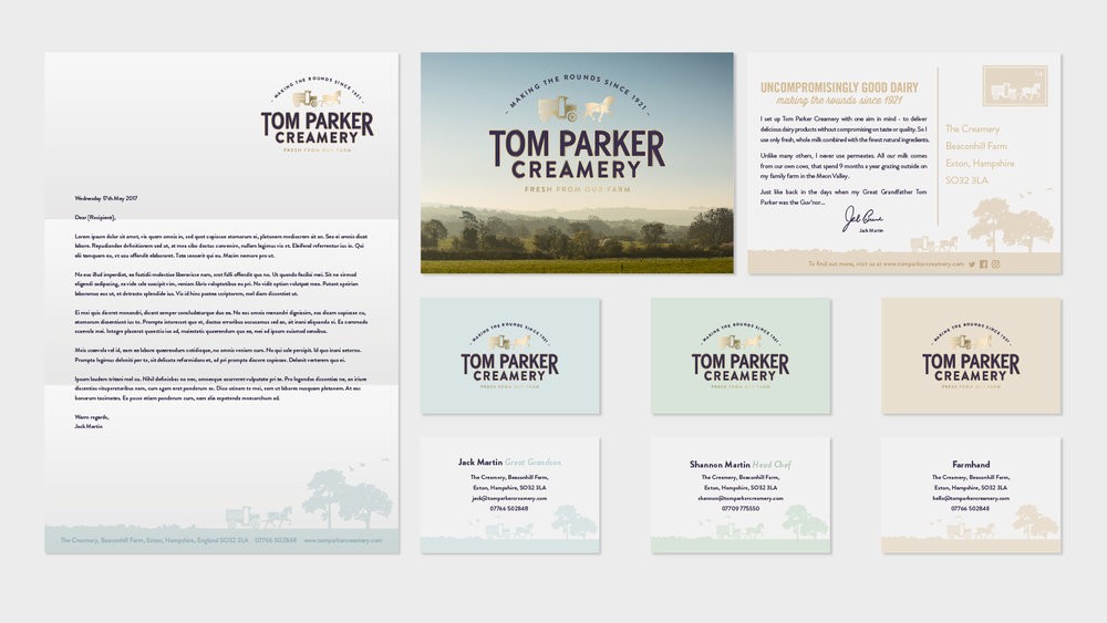
In order to build a brand worthy of the care and attention that had been invested into creating such quality dairy produce over several generations, we worked with founder Jack Martin and brand consultants Bricolage to identify a compelling positioning and tone of voice that instantly communicated the unique properties and heritage of the range. Inspired by the no-nonsense but genial character of the original Tom Parker, we rooted the brand in the notion of ‘Uncompromisingly Good Dairy’, which then informed every aspect of the brands communication, from the logo, graphic design and packaging, through to the website and corporate stationary.
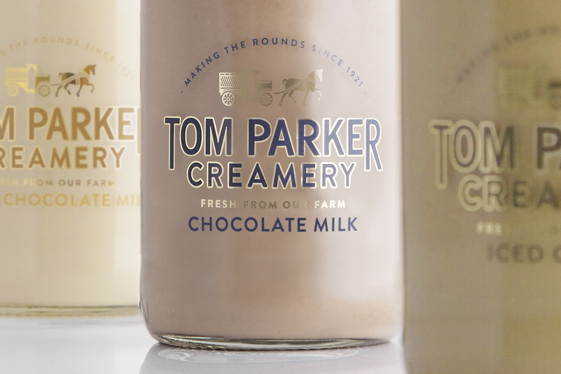
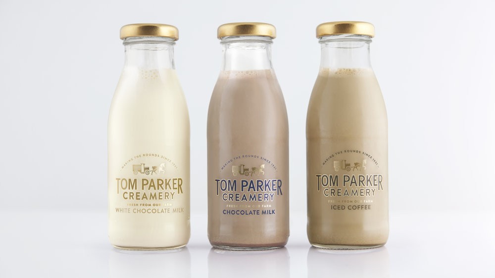
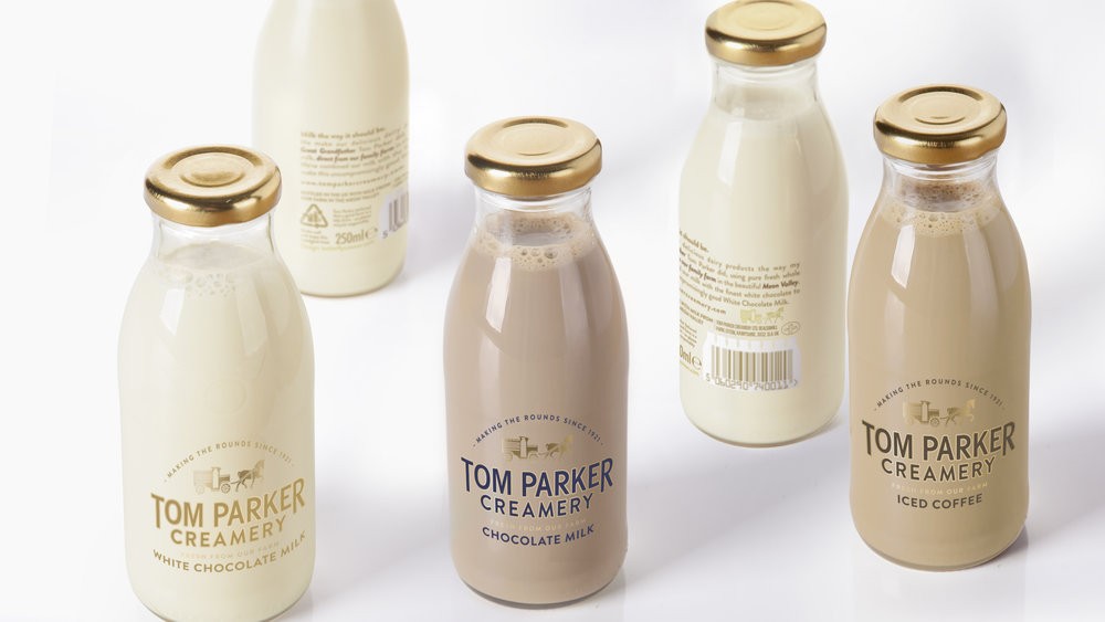
The positioning is brought to life on pack by way of a no-nonsense sans serif typeface, customized to bring character to the word marque and edged with gold foil to convey the premium nature of the products. The word marque is crowned by the brand icon, a graphical representation of the much-loved horse drawn milk floats that the founder’s great grandfather originally delivered milk in and is still used today. A glass bottle was chosen for both its authenticity and sustainability and as a last detail, the gold cap is a nostalgic nod to ‘gold top’ milk the local milky used to deliver.
This attention to the brand story is carried over to the back of pack, where standard informational copy such as recycling information and graphical mandatories such as the bar code are given esoteric, discoverable detailing that elude to Tom Parker’s legendary wit and genial nature.
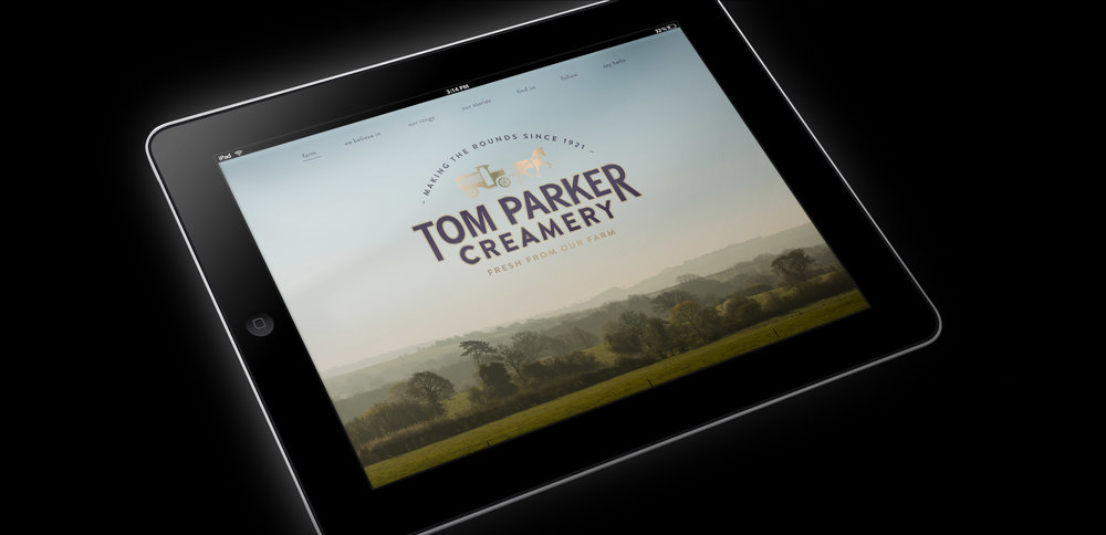
For the brands website and corporate stationary, a clean, self-assured aesthetic was created using subtle, shades of off-white to evoke the richness of cream, offset with dairy fresh, heritage colours used to create simple but evocative landscape illustrations inspired by the brands history and provenance.
With extremely positive feedback from press and consumers alike, the future looks bright for Tom Parker Creamery and plans for the future include extending the range to include cream, milk, ice cream and other dairy products.
Jack Martin, Founder of Tom Parker Creamery and great grandson of Tom Parker comments: “When I decided to breathe life back into my Great Grandfather’s dairy business I knew I had to create a brand that my Great Grandfather would have been proud of. It matters to me that the values of “uncompromisingly good dairy”, that lay at the heart of my Great Grandfather’s business and of Tom Parker Creamery today, are the foundation not only of our brand world and identity, but everything that we do. I have been impressed by how ButterflyCannon has built upon these essential values and created a great looking brand identity, pack and website. I know it would have gained the seal of approval from my Great Grandfather.”
Arron Egan, Associate Creative Director at ButterflyCannon adds, “By understanding the care and attention that goes into creating such great quality dairy products and getting to the heart of what Tom Parker Creamery stands for, we were able to deliver a solution that ensures that the wealth of heritage and back story behind the brand was brought to life in a way that is relevant and approachable across all touchpoints to today’s consumers.””
CREDIT
- Agency/Creative: ButterflyCannon
- Article Title: High Quality Dairy Products Designed with an Essence of British Nostalgia
- Project Type: Packaging
- Format: Bottle
- Substrate: Glass


