Ancient traditions, exclusivity, and even a pinch of pretentiousness – these qualities can often be found in the descriptions of various wine brands. Most wine producers strive to underline the exceptional character of their products, and to tell the consumer that by choosing their wines they get more than just a simple drink. However, for younger wine drinkers who are just discovering the fascinating world of wines, this emphasis on exclusivity can often feel a bit off-putting, excessive. Most of them would like to have something more accessible, democratic, simpler, and more approachable. Namely these characteristics were laid as the basis for the new line of wines Manolis.
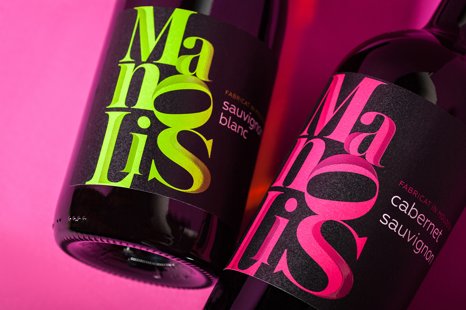
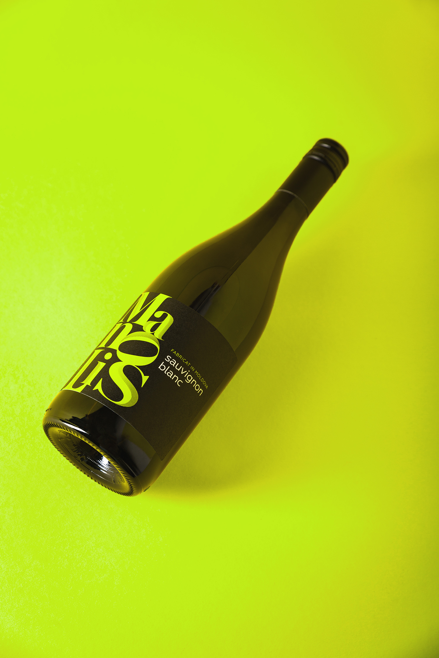
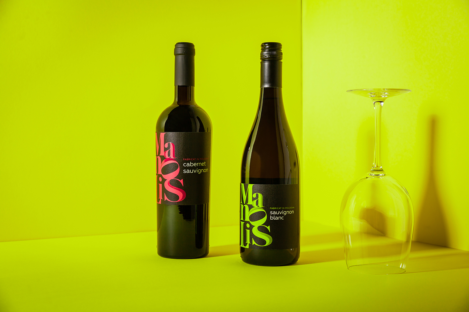
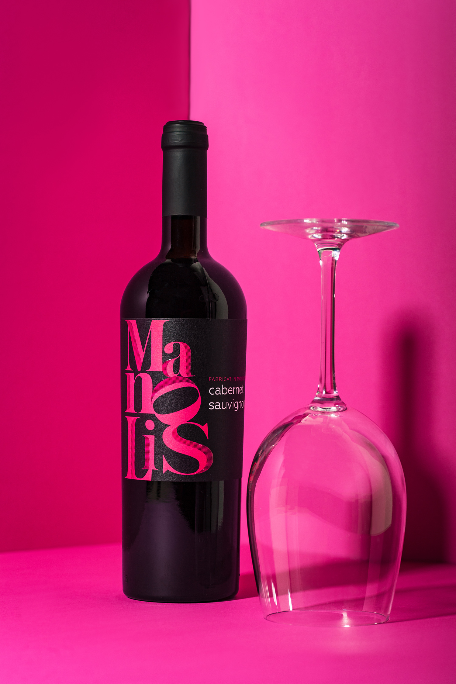
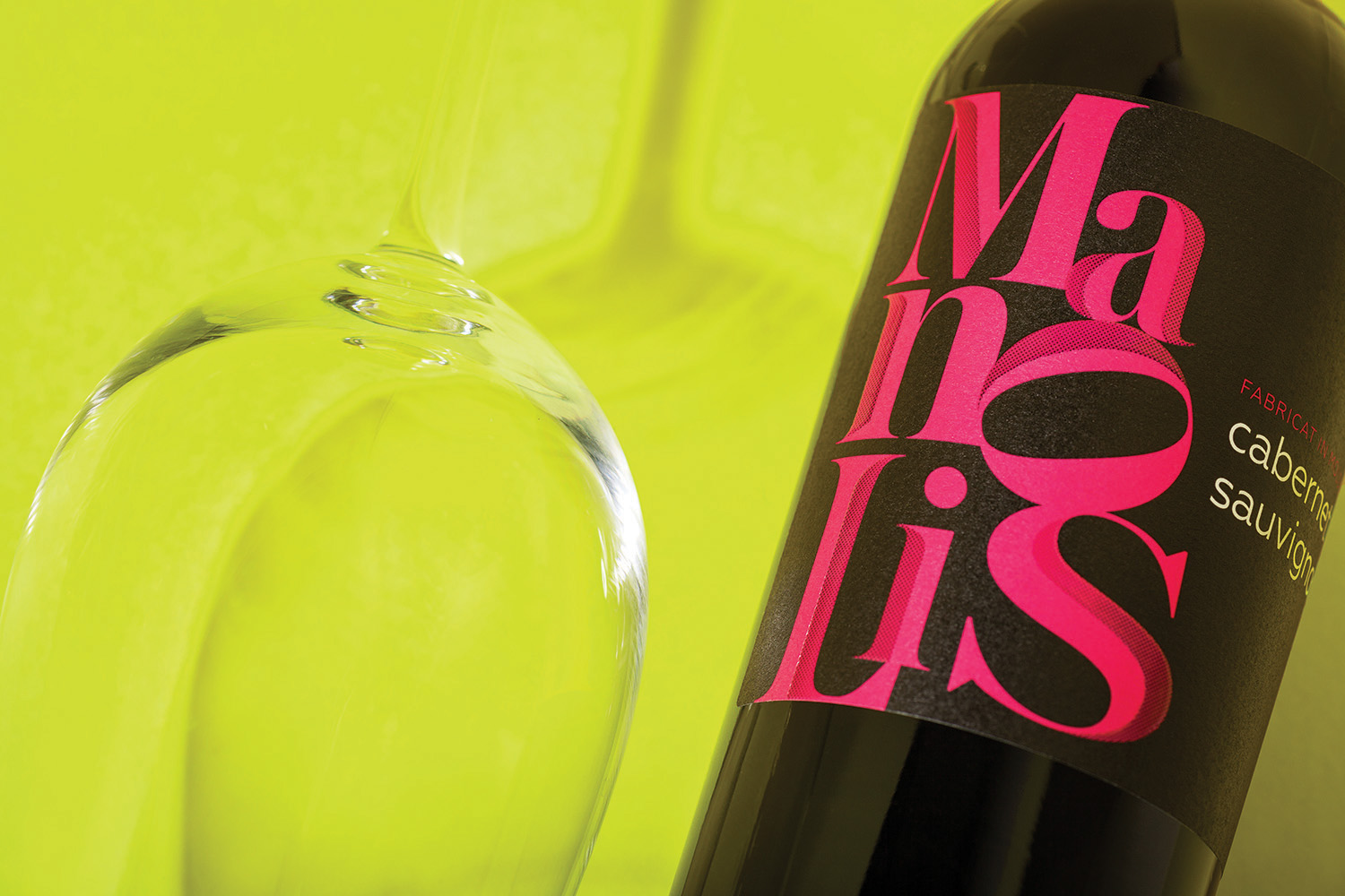
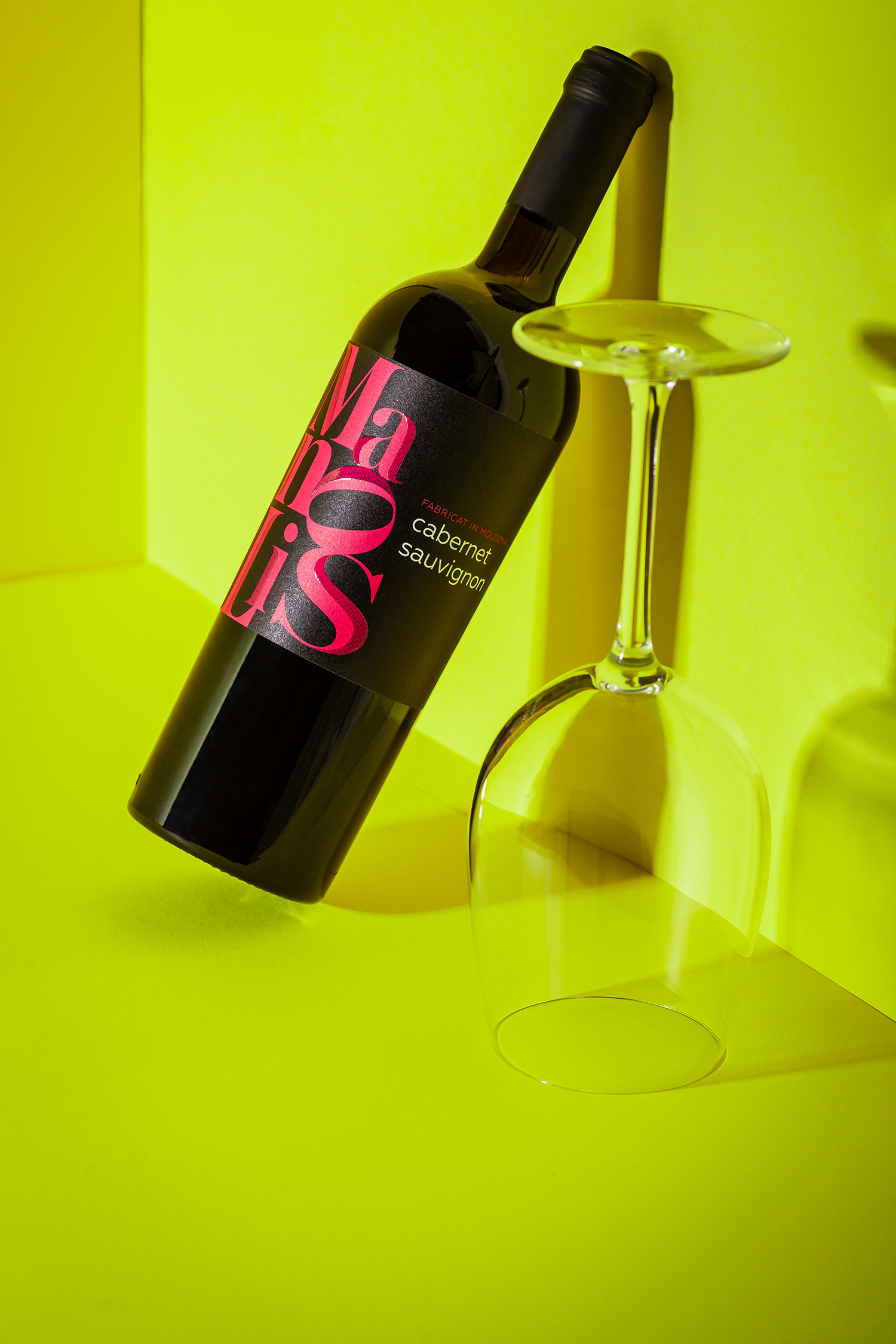
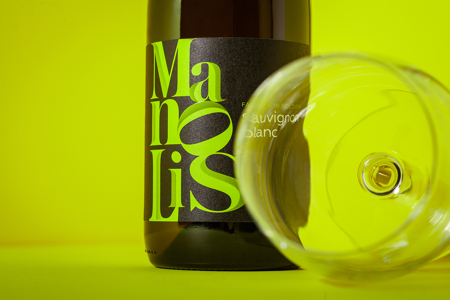
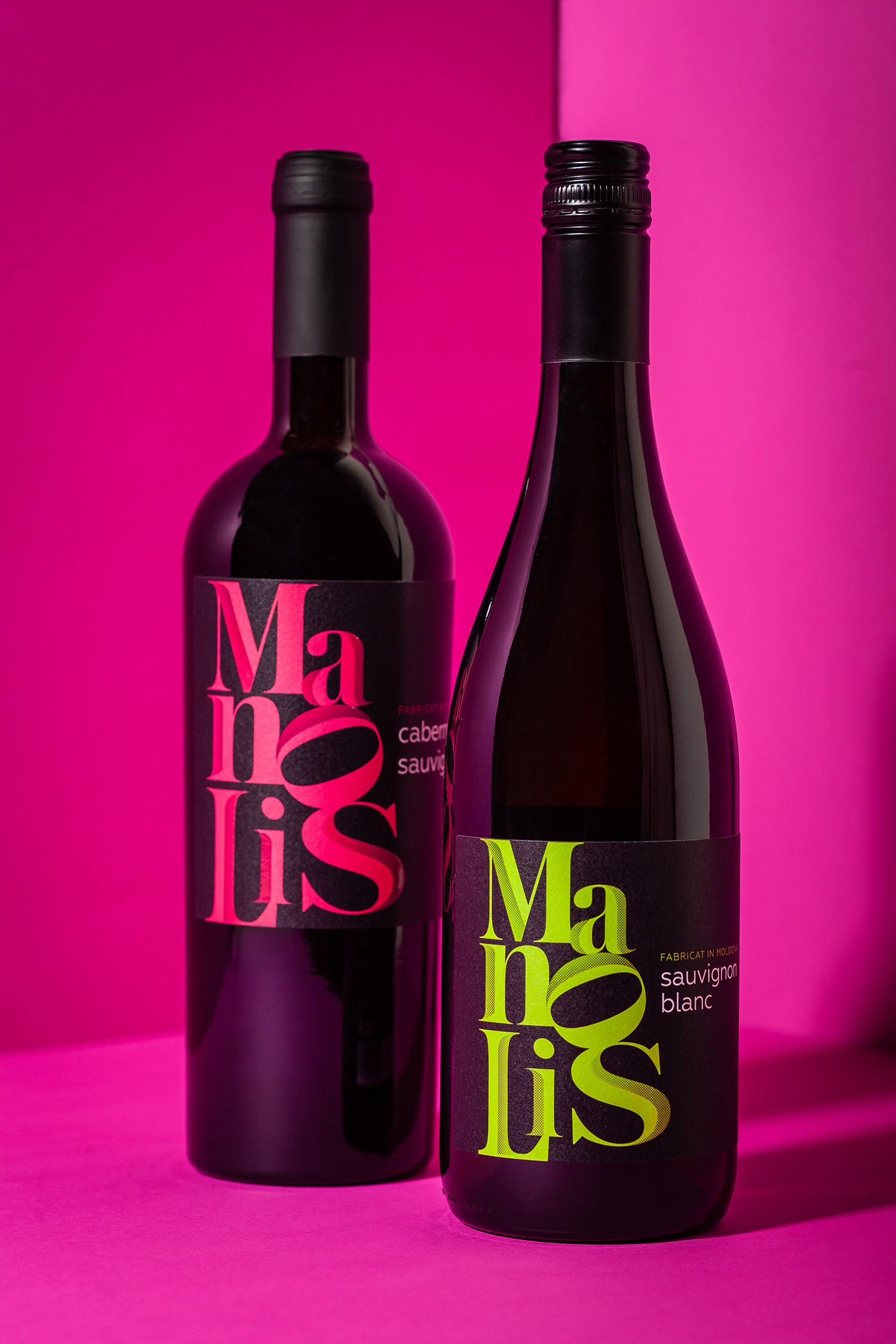
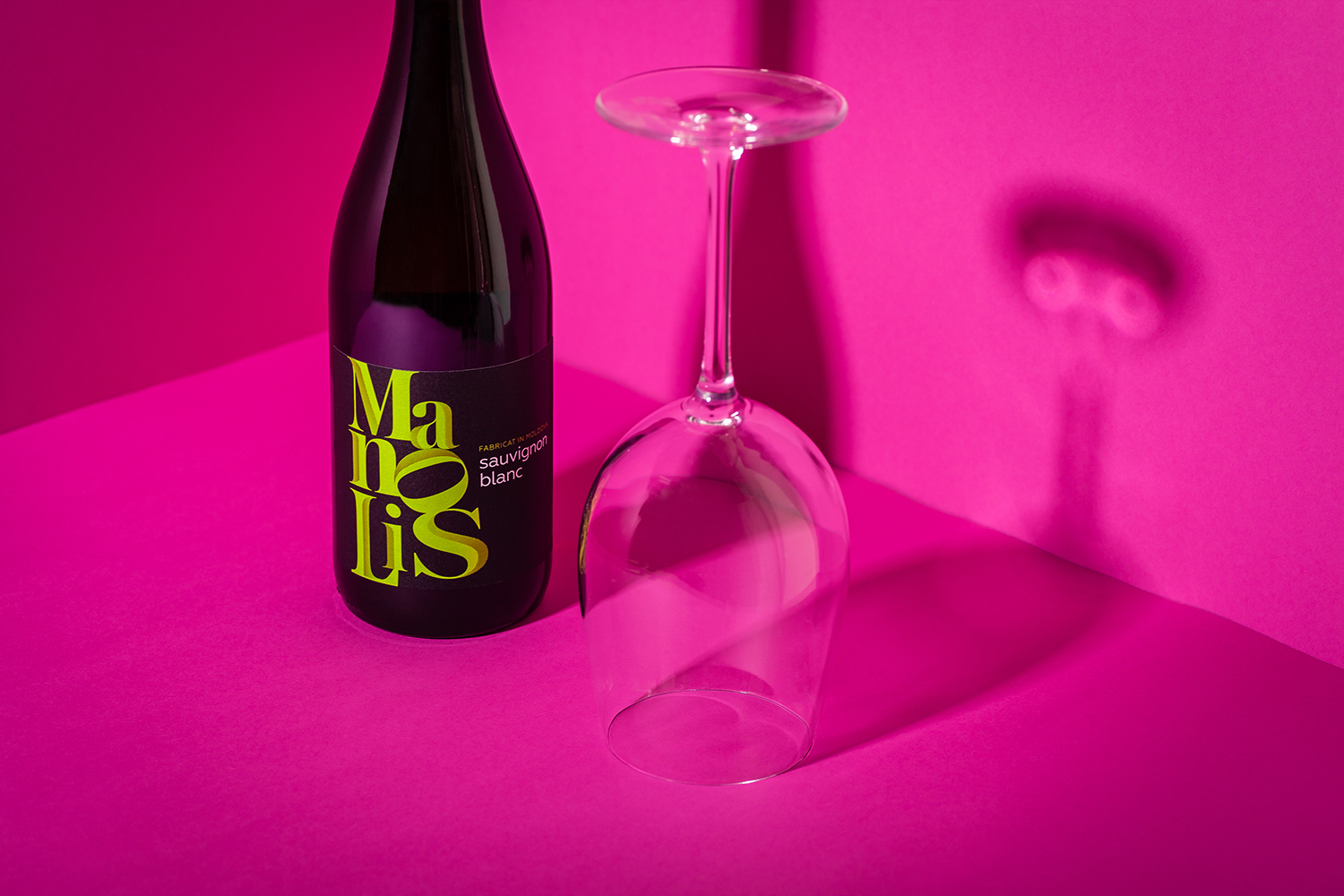
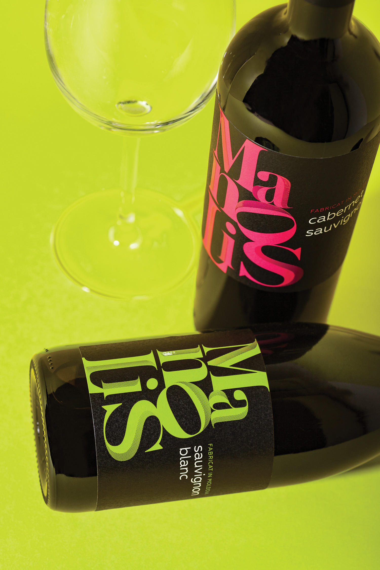
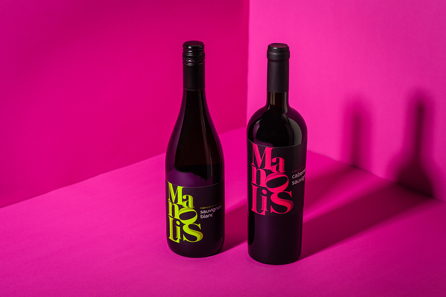
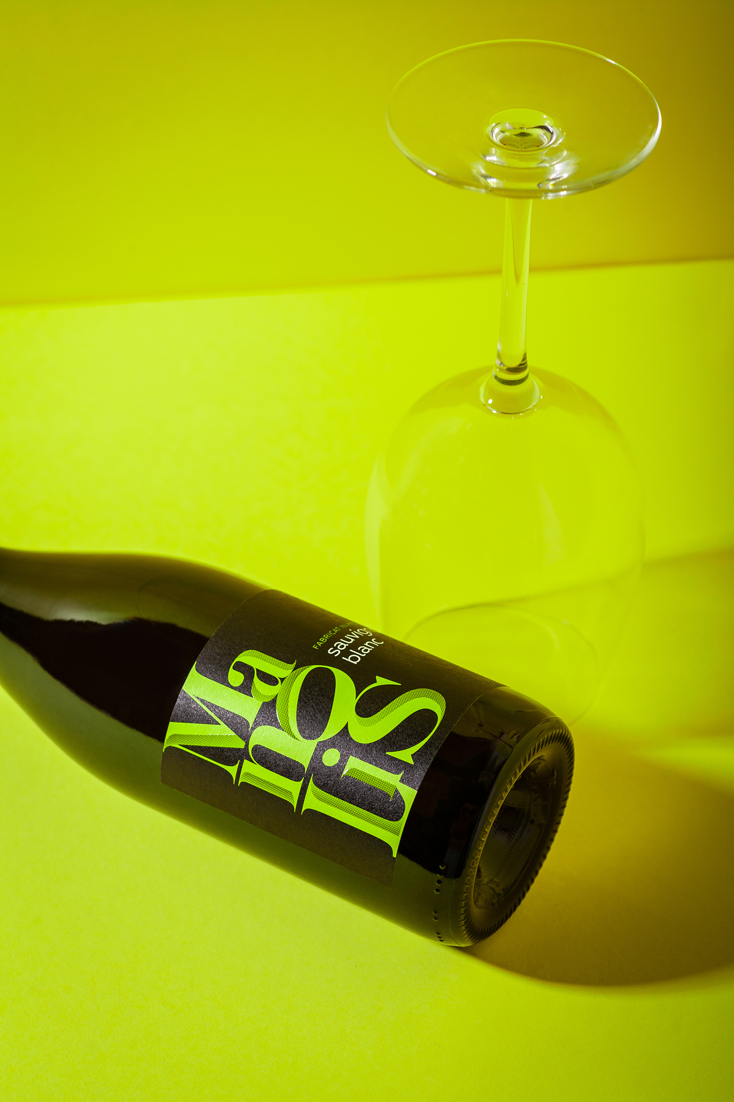
Manolis is a new line of accessible quality wines by Tartcomvin, created in collaboration with the winemaker Andrey Novak. Since the main qualities of the new product are accessibility and a broader approach, the label design was developed in a rather minimalistic fashion. The label features only the stylized logo and the grape variety – all you actually need to make your choice when facing a wine shelf. The vivid color scheme, on the other hand, makes it easier to single out the new product from the competition.
CREDIT
- Agency/Creative: 43oz.com Design Studio
- Article Title: “Manolis” Modern Wine Label Design
- Organisation/Entity: Agency, Published Commercial Design
- Project Type: Packaging
- Agency/Creative Country: Moldova
- Market Region: Europe
- Project Deliverables: Brand Creation, Brand Identity, Branding, Graphic Design, Packaging Design, Photography, Tone of Voice
- Format: Bottle
- Substrate: Glass Bottle


