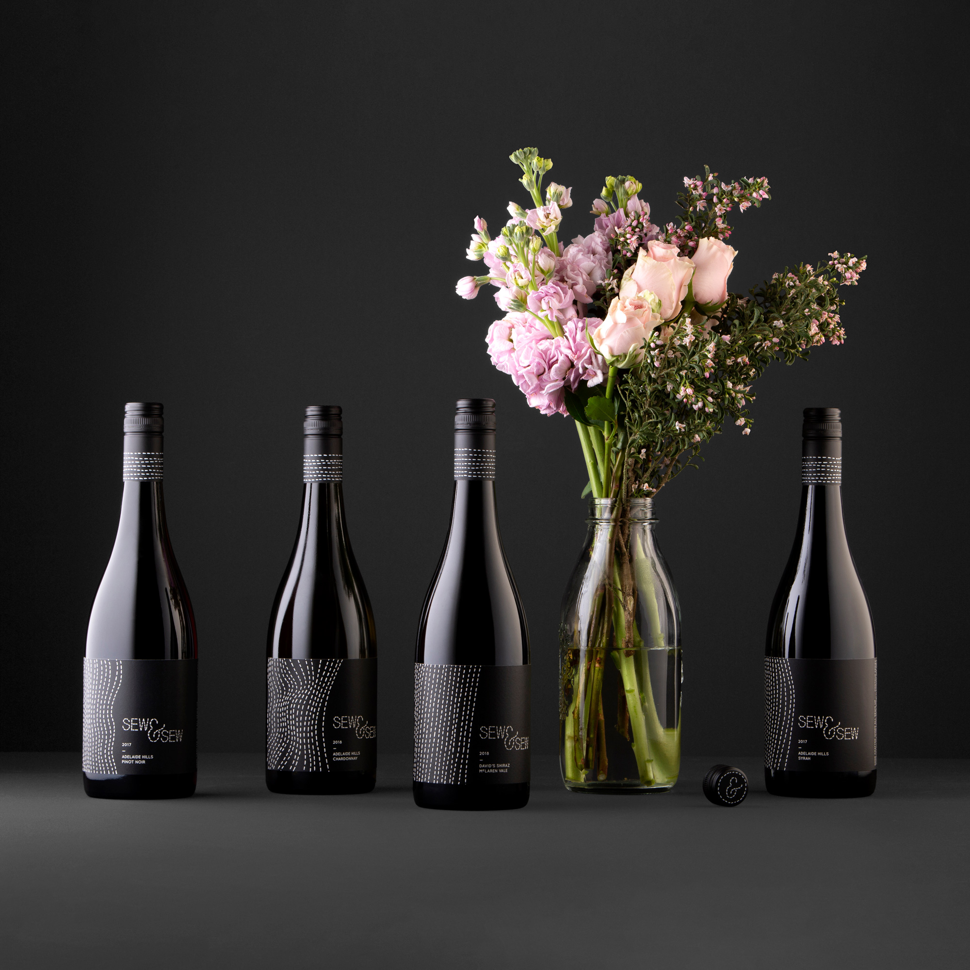
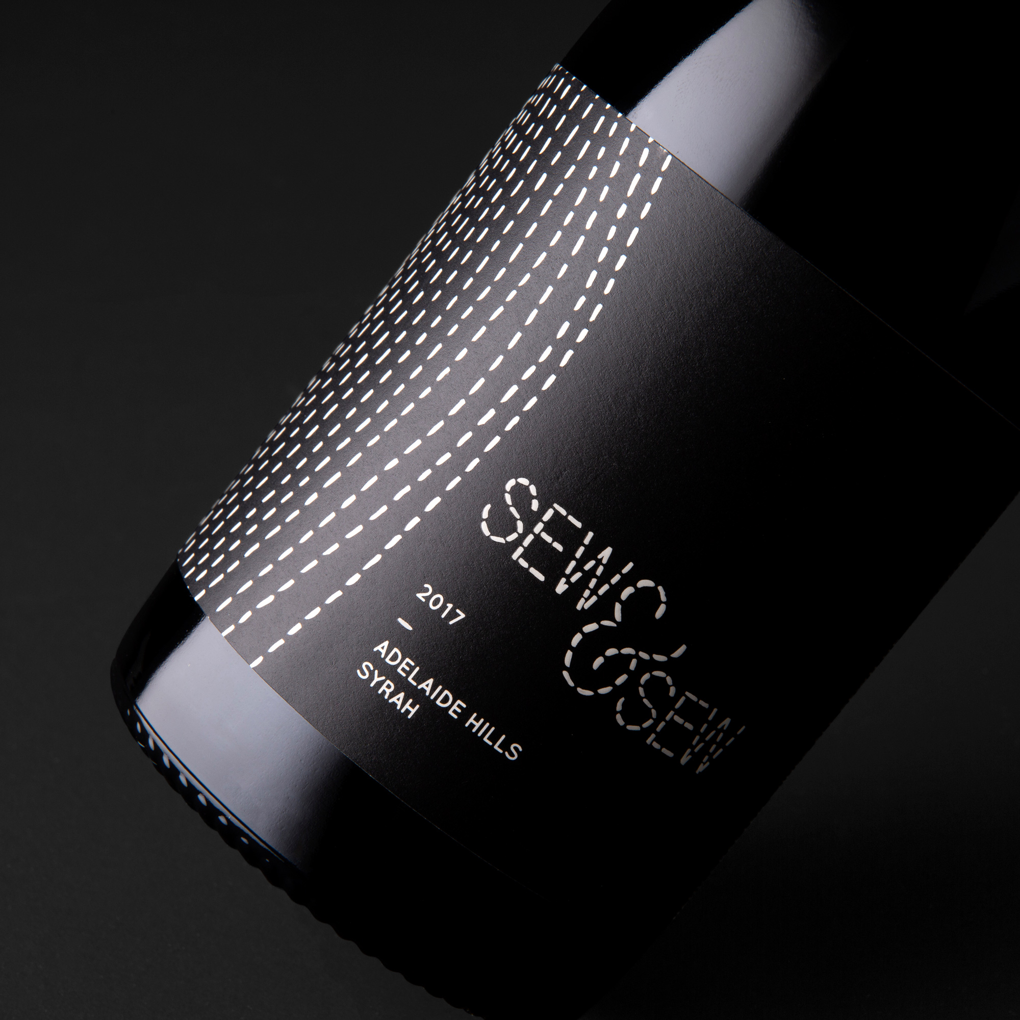
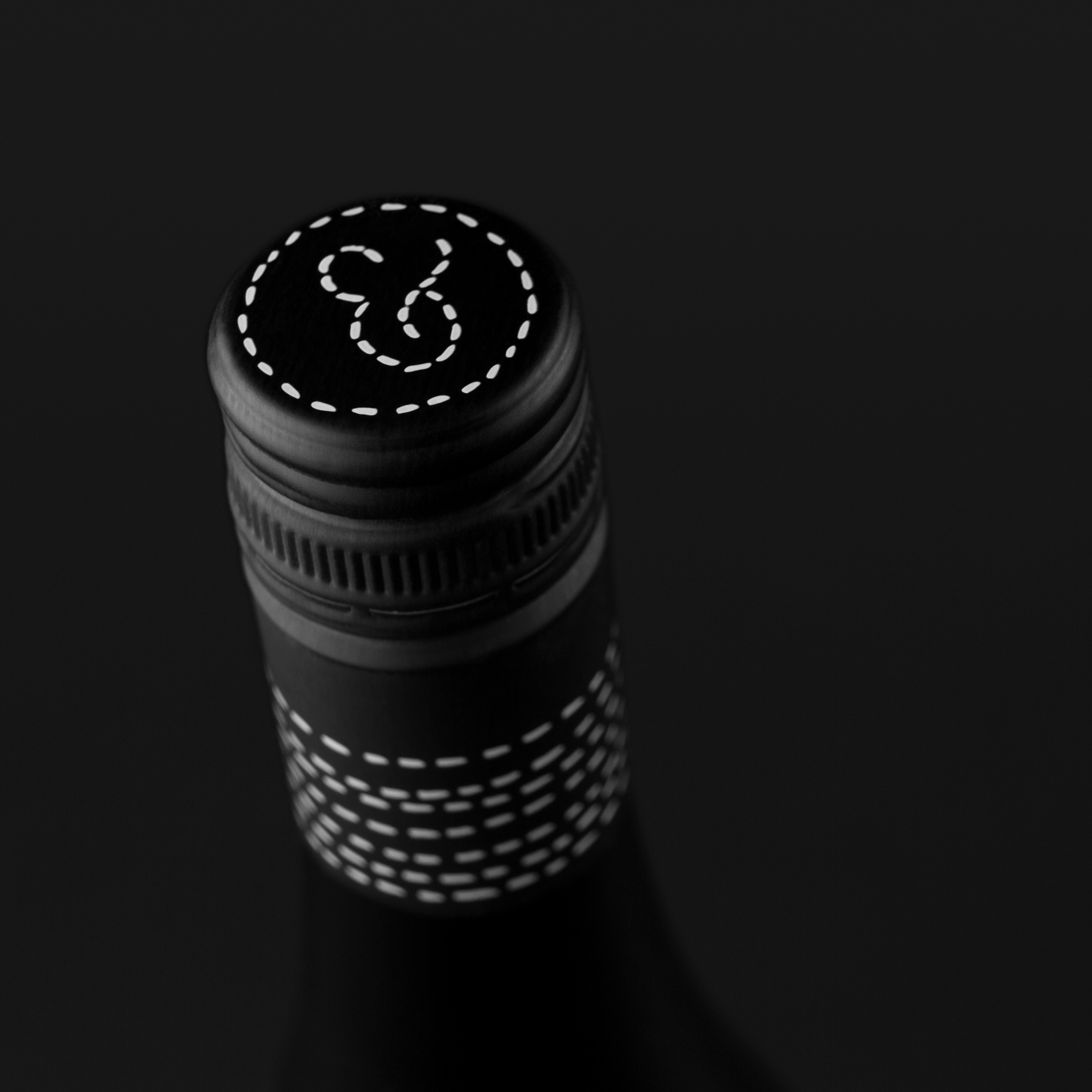
Sew & Sew’s branding represents a meticulous love for the entire wine process; with patience and precision like needle and thread. Each label design in Sew & Sew’s Contour range represents the terrain of the vineyard in which the wine originates. Featuring matt high-build varnishes over all stitch-work to create a tactile experience for the consumer.
Originally conceptualised back in 2013, the range still is still thriving and expanding today – and now sits as the brand’s premium offering.


CREDIT
- Agency/Creative: David Byerlee Design
- Article Title: Sew & Sew Contour Series
- Organisation/Entity: Agency, Published Commercial Design
- Project Type: Packaging
- Agency/Creative Country: Australia
- Market Region: Global
- Project Deliverables: Brand Architecture, Brand Creation, Brand Identity, Brand Naming, Brand Strategy, Branding, Graphic Design, Illustration
- Format: Bottle
- Substrate: Pulp Paper
FEEDBACK
Relevance: Solution/idea in relation to brand, product or service
Implementation: Attention, detailing and finishing of final solution
Presentation: Text, visualisation and quality of the presentation


