ATMOSS.
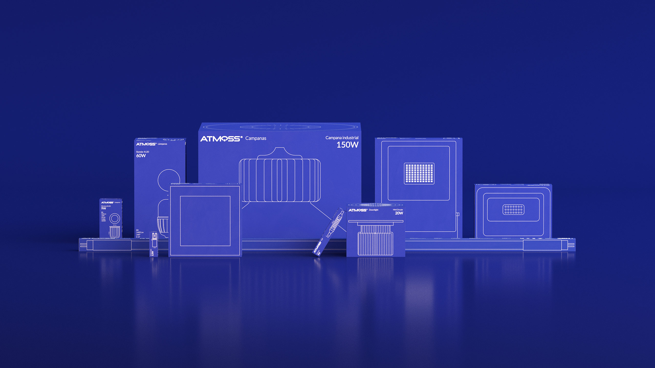
Atmoss is a great brand of lighting products and electrical equipment. They asked us to help them to change their whole product line packaging.
What was the goal? Facilitate to professionals their commercial and logistical work.
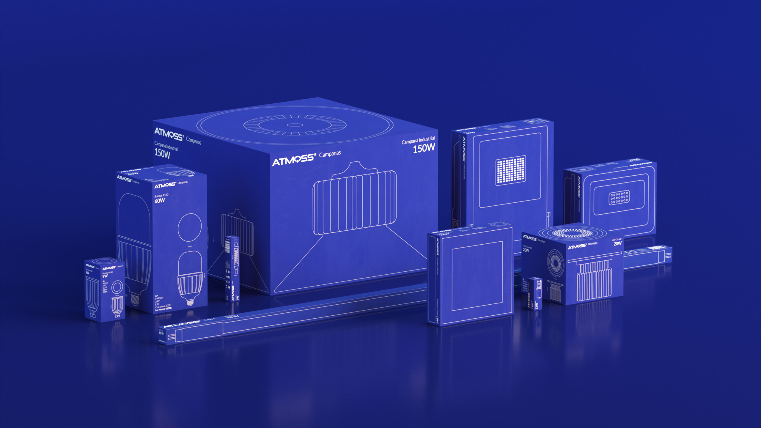
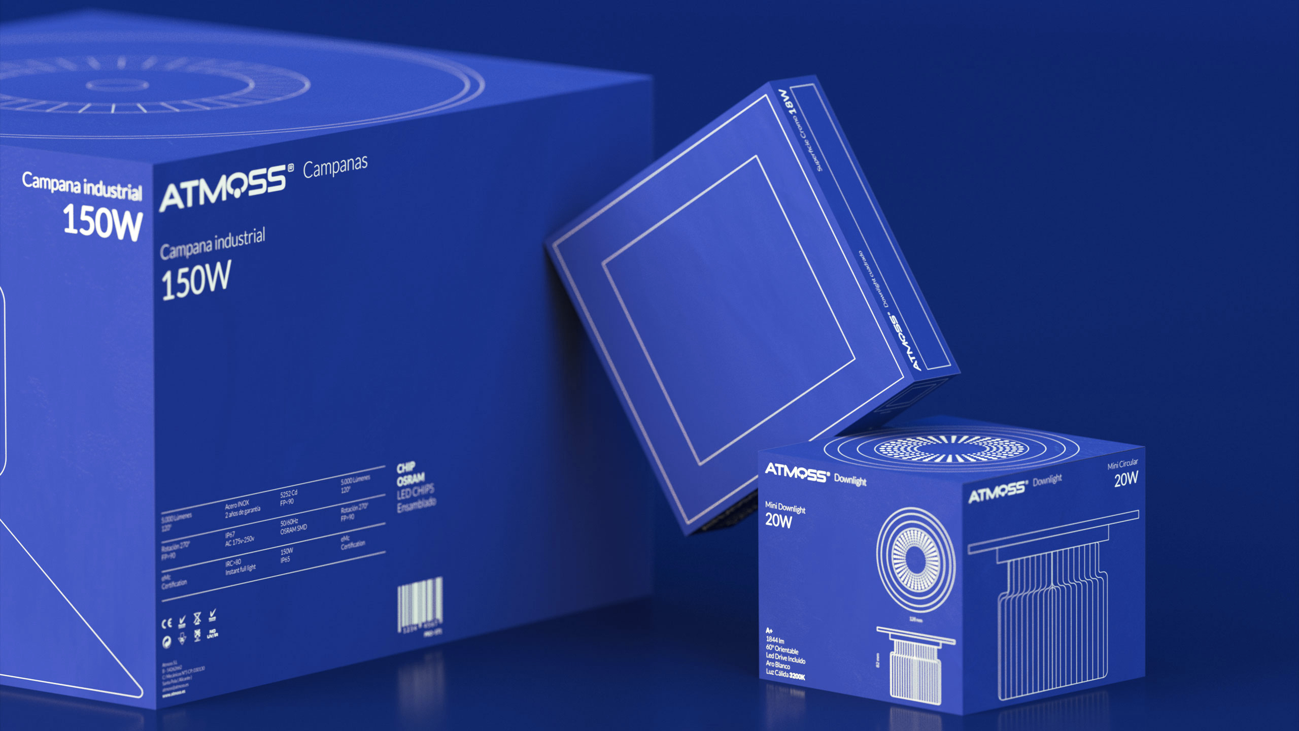
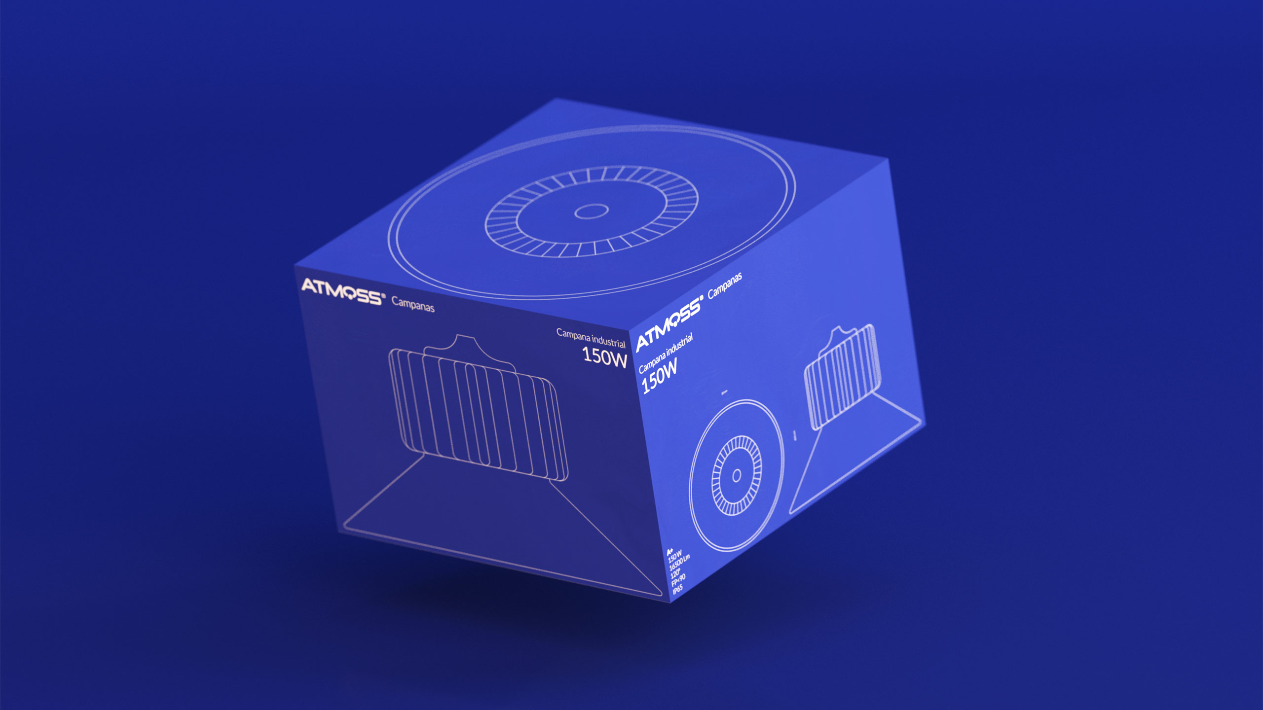
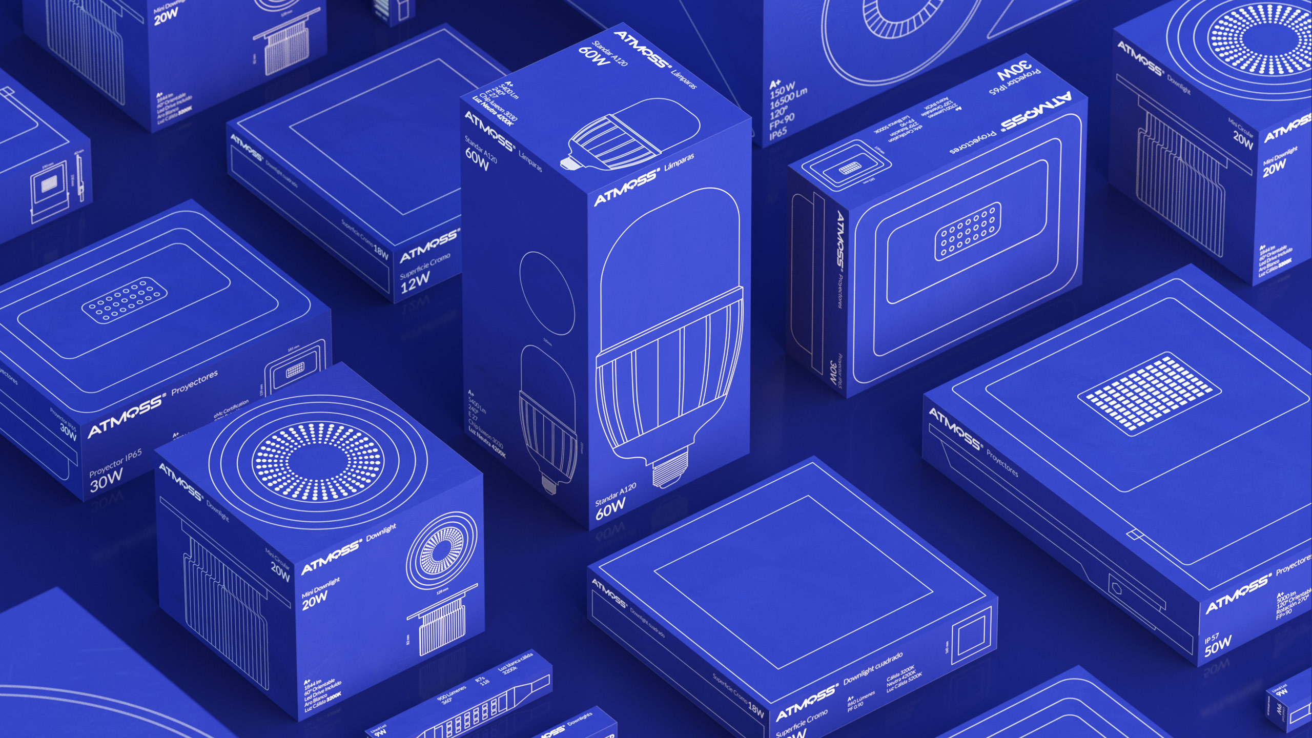
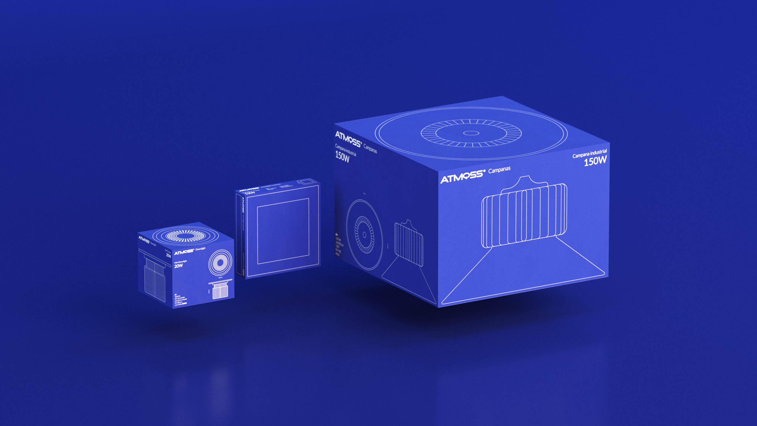
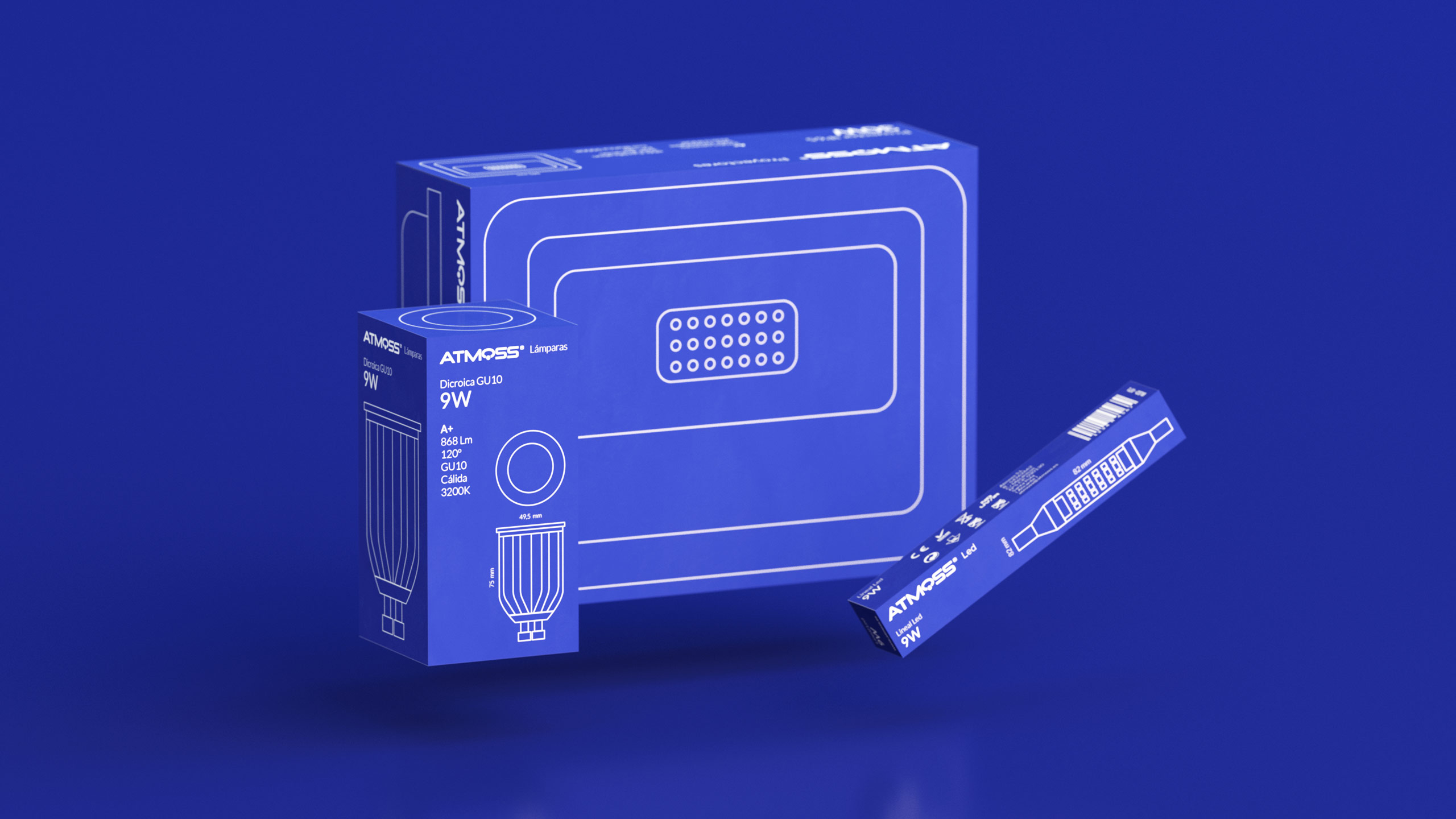
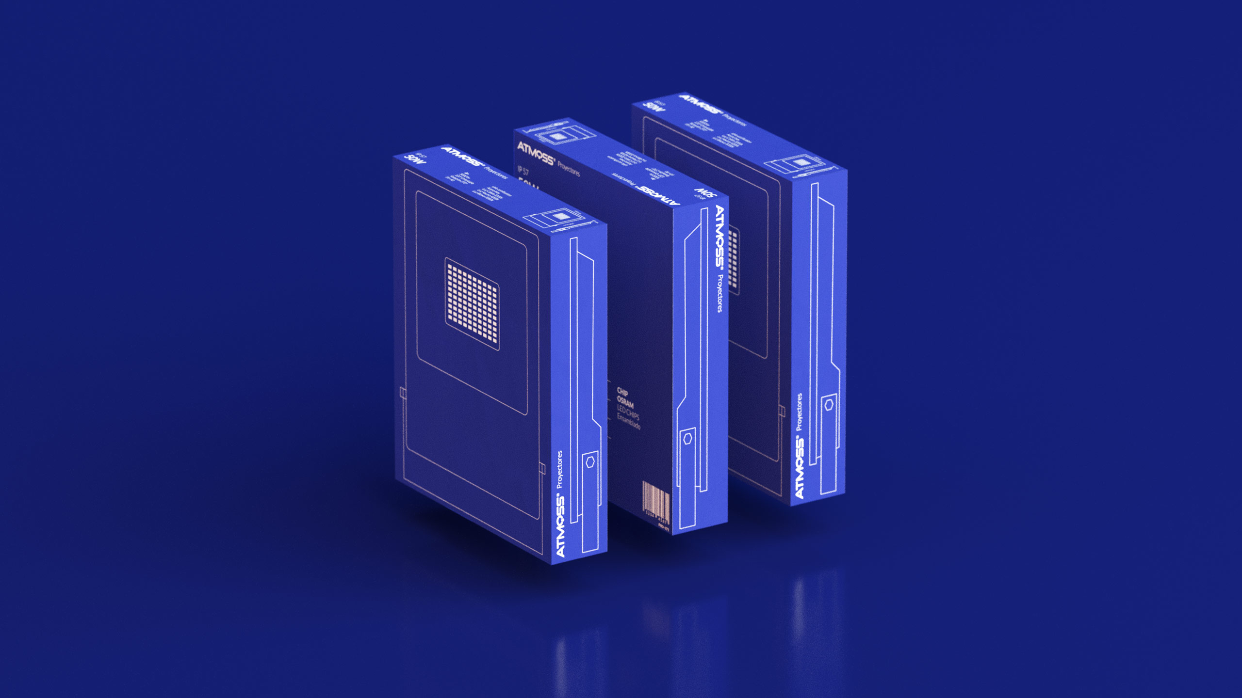
When we reviewed the packaging they had worked so far, we detected several problems (or we should say new challenges?) The last packaging included too much information. We missed visual coherence, and because of that Atmoss brand was unnoticed. It was clear to us that Atmoss should be a recognizable, simple and functional brand that answer professionals needs. And if we become these conclusions into actions we understand what we have to do. First of all, establishing a content hierarchy. Then, organizing and normalizing all the technical information of each product. And finally, highlighting features that are really useful for distributors. For this, we propose not to include any photo of the product and, instead, use a technical drawing of the piece that is inside each box. We transform the box into another tool that allows visualizing the product before even having it in our hands. Thus we take advantage of all the faces of the box and, on its front, we concentrate all technical information that the distributor needs to be able to choose the right product as soon as he looks for it. This proposal provides a distinguishing value compared to their competitors. In addition, it is fully aligned with the needs of final consumer because the important thing is not to differentiate one product from another, but to distinguish its features at a glance when you need it.
The result is an intelligent and efficient design, since it makes it easier for distributors and allows us to score points as your favorite brand. This project is a stimulating challenge: knowing how to underline the characteristics of each project to differentiate from competence and work out well for both the brand and the final consumer. And that is just what we wanted to achieve with the new Atmoss packaging.





CREDIT
- Agency/Creative: Evangelisti y Cía.
- Article Title: Evangelisti y Cía. – Restyling Atmoss Packaging
- Organisation/Entity: Agency, Published Commercial Design
- Project Type: Packaging
- Project Status: Published
- Agency/Creative Country: Spain
- Market Region: Europe
- Project Deliverables: Brand Strategy, Brand World, Branding, Graphic Design, Packaging Design, Product Architecture, Product Naming
- Format: Box
- Substrate: Pulp Carton
- Keywords: WBDS Agency Design Awards 2019/20


